Disney princesses reimagined as electoral maps
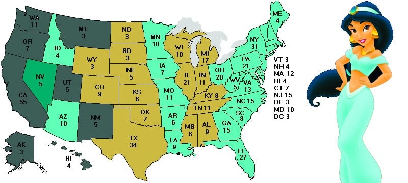
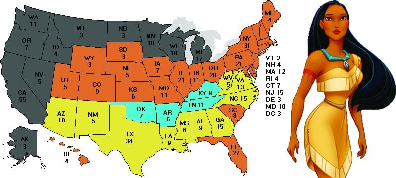
Pretty much what it says on the tin. Not much else to add.


This site is made possible by member support. 💞
Big thanks to Arcustech for hosting the site and offering amazing tech support.
When you buy through links on kottke.org, I may earn an affiliate commission. Thanks for supporting the site!
kottke.org. home of fine hypertext products since 1998.
Beloved by 86.47% of the web.


Pretty much what it says on the tin. Not much else to add.
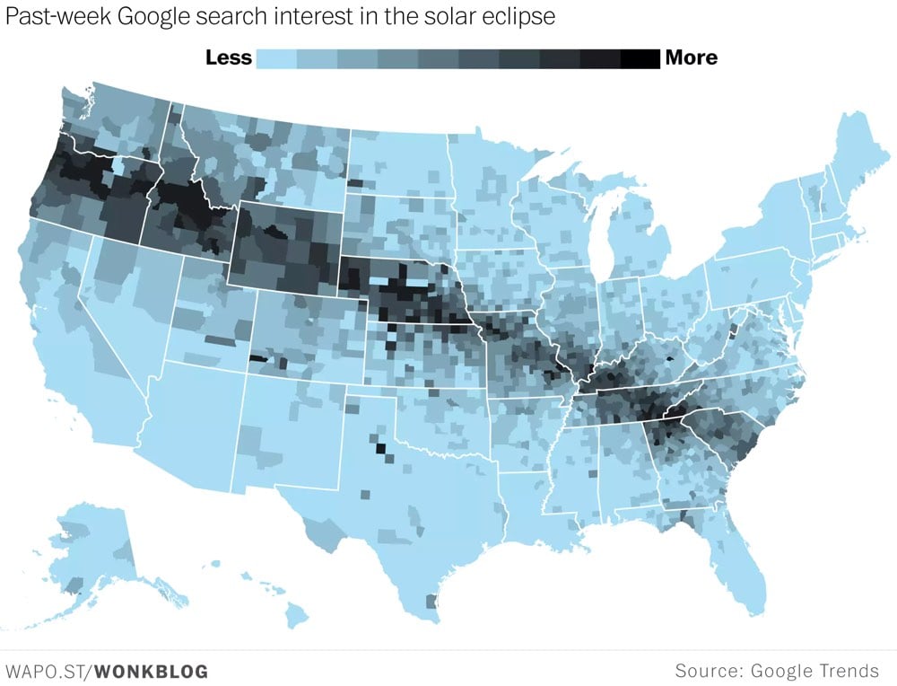
According to Google Trends, search traffic about the upcoming solar eclipse mirrors the path of totality. And according to XKCD, pre-eclipse search traffic for “eclipse” is outpacing pre-election search traffic for “election”.
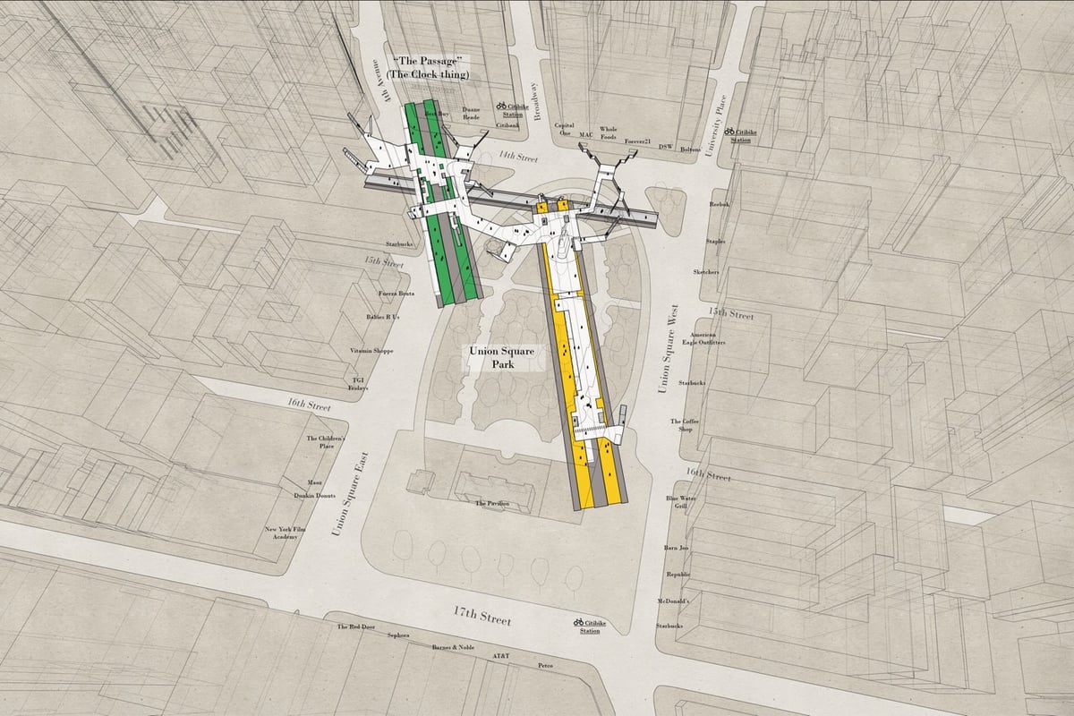
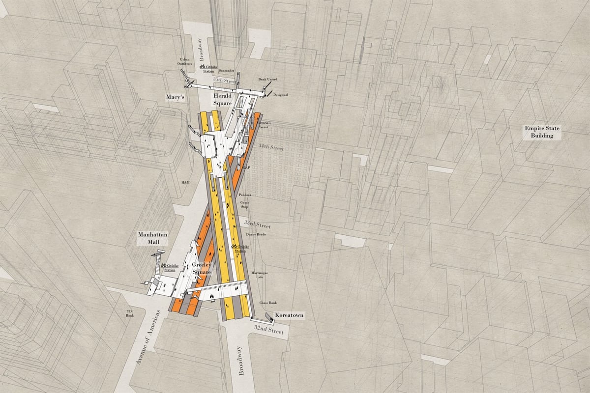
The subway and the street level of NYC are two very different worlds and even long-term residents have a difficult time understanding how they fit together. Architect Candy Chan has drawn a series of x-ray maps of NYC subway stations that show their layouts and orientation compared to the geography of the streets above. (Tip: you can zoom the maps for more detail.)
The series is an extension of her station layouts series. Prints are available in Chan’s shop.
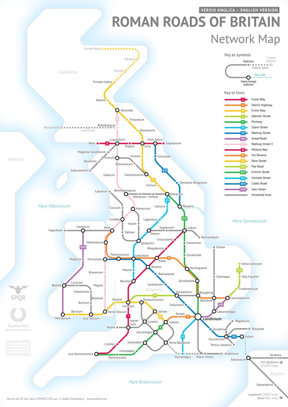
After completing his subway-style map of the roads of the entire Roman Empire, Sasha Trubetskoy began work on a highly requested follow-up: a similar map of the Roman roads in Britain.
This was far more complicated than I had initially anticipated. Not only were there way more Roman Roads in Britain than I initially thought, but also their exact locations and extents are not very clear. In a few places I had to get rather creative with the historical evidence.
As Wikipedia notes, most of the roads were completed by 180 AD and many of them are still in use today.
After the Romans departed, systematic construction of paved highways in the UK did not resume until the early 18th century. The Roman road network remained the only nationally-managed highway system within Britain until the establishment of the Ministry of Transport in the early 20th century.
In just the past 10 years, the number of earthquakes in the central US (and particularly Oklahoma) has risen dramatically. In the 7-year period ending in 2016, there were more than three times the number of magnitude 3.0+ earthquakes than in the previous 36 years. Above is a video timeline of Oklahoma earthquakes from 2004-2016. At around the midpoint of the video, you’ll probably say, “wow, that’s crazy”. Keep watching.
These earthquakes are induced earthquakes, i.e. they are caused by humans. Fracking can cause induced earthquakes but the primary cause is pumping wastewater back into the ground. From the United States Geological Survey’s page on induced earthquake myths & misconceptions (a summarized version of this paper):
Wastewater disposal wells typically operate for longer durations and inject much more fluid than hydraulic fracturing, making them more likely to induce earthquakes. Enhanced oil recovery injects fluid into rock layers where oil and gas have already been extracted, while wastewater injection often occurs in never-before-touched rocks. Therefore, wastewater injection can raise pressure levels more than enhanced oil recovery, and thus increases the likelihood of induced earthquakes.
Of course, this wastewater is a byproduct of any oil & gas production, including fracking. But specifically in Oklahoma’s case, the induced earthquakes have relatively little to do with fracking:
In contrast, in Oklahoma spent hydraulic fracturing fluid represents 10% or less of the fluids disposed of in salt-water disposal wells in Oklahoma (Murray, 2013). The vast majority of the fluid that is disposed of in disposal wells in Oklahoma is produced water. Produced water is the salty brine from ancient oceans that was entrapped in the rocks when the sediments were deposited. This water is trapped in the same pore space as oil and gas, and as oil and gas is extracted, the produced water is extracted with it. Produced water often must be disposed in injection wells because it is frequently laden with dissolved salts, minerals, and occasionally other materials that make it unsuitable for other uses.

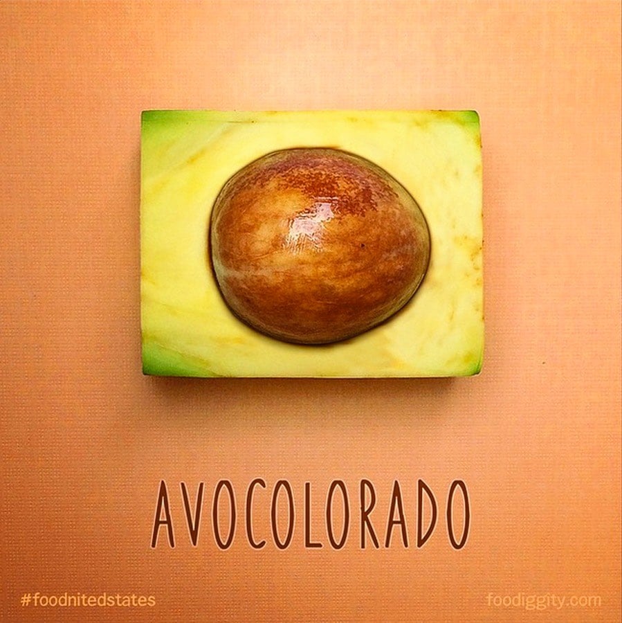
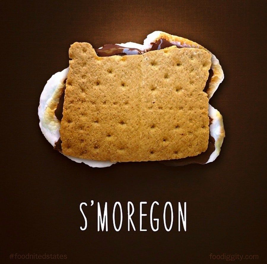
Each of the 50 US states made of food and named accordingly, e.g. Arkanslaw, Pretzelvania, Tunassee, Mississippeas. Maps? Food? Language? How many more of my boxes could this project possibly check? Oh, this was a kid’s idea and his dad went over the top in helping him achieve it? CHECK.
Oh, and to teach the kid about capitalism, of course there are t-shirts and posters available.
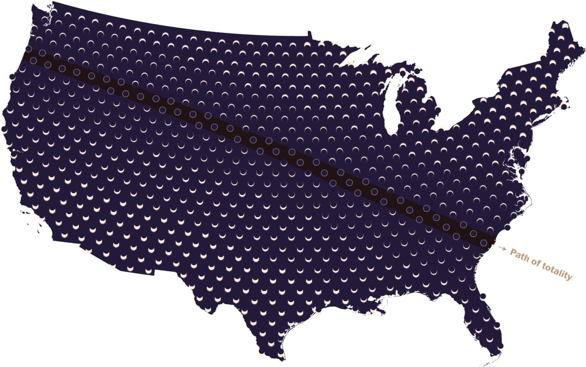
The Washington Post has a cool series of maps related to the total solar eclipse happening in August. The one above is a one-shot view of what the Sun will look like across the US on August 21 and there are other maps with captions like “The last eclipse over these areas occurred before Columbus’s arrival in 1492” and “Total solar eclipse paths over the continental U.S. since 2000 B.C.”
In the last 100 years, some areas have been in the paths of multiple eclipses: New England, for example, saw four. (During its World Series dry spell from 1918 to 2004, the greater Boston area alone saw two.)
Others weren’t so lucky. Just 200 miles away in New York, construction on the Empire State Building had not started yet the last time the city saw a total solar eclipse (1925). San Diego had a population of less than 100,000 the last time it was eclipsed (1923), and Chicago hasn’t seen a total eclipse at all in the last 100 years. An area near Tucson has the longest dry spell in the Lower 48: The last total solar eclipse it saw was in the year 797.
The U.S. mainland has averaged about seven total solar eclipses per century since 2000 B.C. Some areas have seen as many as 25 eclipses, while others, such as spots west of Minneapolis, have seen only four in the last four millennia.
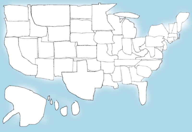
Per Betteridge’s law of headlines and also the map above, my answer is clearly no. You can try it yourself here…you draw them one at a time and it adds them to the map automagically. I’m going to blame my trackpad use a little, but I’m not sure I would have done much better had I drawn with a pencil and looked a map beforehand.
Update: Your periodic reminder that Senator Al Franken can draw all 50 US states from memory with astonishing accuracy.
(thx, eric)
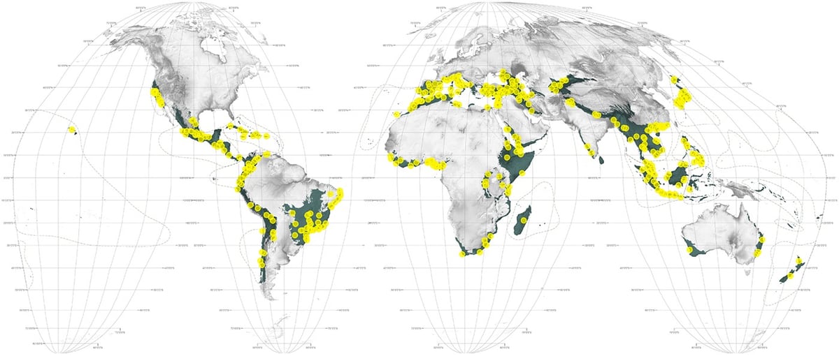
The Atlas for the End of the World is a project started by Penn architect Richard Weller to highlight the effects of human civilization and urbanization on our planet’s biodiversity.
Coming almost 450 years after the world’s first Atlas, this Atlas for the End of the World audits the status of land use and urbanization in the most critically endangered bioregions on Earth. It does so, firstly, by measuring the quantity of protected area across the world’s 36 biodiversity hotspots in comparison to United Nation’s 2020 targets; and secondly, by identifying where future urban growth in these territories is on a collision course with endangered species.
There’s lots to see at the site: world and regional maps, data visualizations, key statistical data, photos of plants and animals that have been modified by humans, as well as several essays on a variety of topics.
And here’s a fun map: countries with national biodiversity strategies and action plans in place. Take a wild guess which country is one of the very few without such a plan in place!
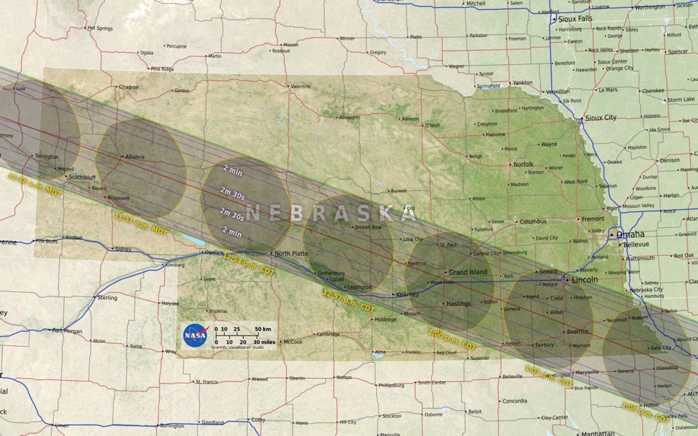
Using data about the Moon’s terrain from the Lunar Reconnaissance Orbiter as well as elevation data on Earth, NASA’s Ernie Wright created a very accurate map of where and when the August 2017 eclipse will occur in the United States.
Standing at the edge of the moon’s shadow, or umbra, the difference between seeing a total eclipse and a partial eclipse comes down to elevation — mountains and valleys both on Earth and on the moon — which affect where the shadow lands. In this visualization, data from NASA’s Lunar Reconnaissance Orbiter account for the moon’s terrain that creates a jagged edge on its shadow. This data is then combined with elevation data on Earth as well as information on the sun angle to create the most accurate map of the eclipse path to date.
You can download maps of your area from NASA’s official eclipse website…I will be studying the Nebraska map closely.
See also Eclipse Megamovie 2017, an eclipse simulator you can use to check what the eclipse will look like in the sky in your area, and what looks like an amazing eclipse watching festival put on by Atlas Obscura.
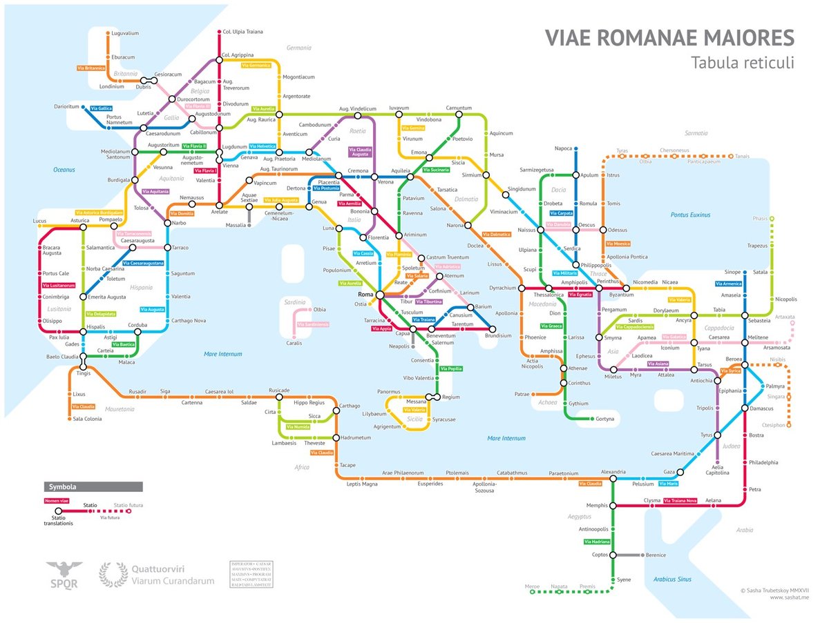
After much research, Sasha Trubetskoy has completed a subway-style map of the road system of the Roman Empire. From about 300 BC, the Romans built or improved over 250,000 miles of roads (50,000 miles were stone paved) that extended into the farthest reaches of the Empire: from Spain to modern-day Iraq to Britain to northern Africa.
Creating this required far more research than I had expected — there is not a single consistent source that was particularly good for this. Huge shoutout to: Stanford’s ORBIS model, The Pelagios Project, and the Antonine Itinerary (found a full PDF online but lost the url).
The lines are a combination of actual, named roads (like the Via Appia or Via Militaris) as well as roads that do not have a known historic name (in which case I creatively invented some names). Skip to the “Creative liberties taken” section for specifics.
(via @zachklein)
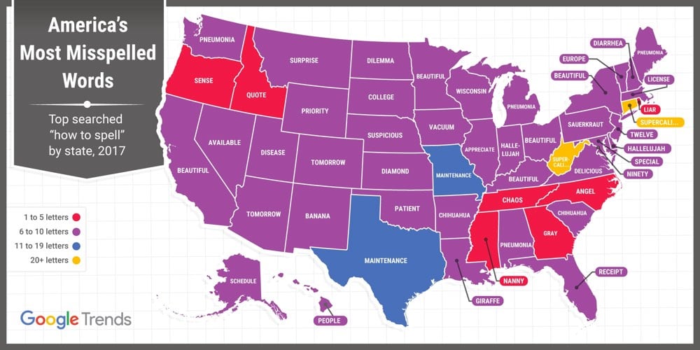
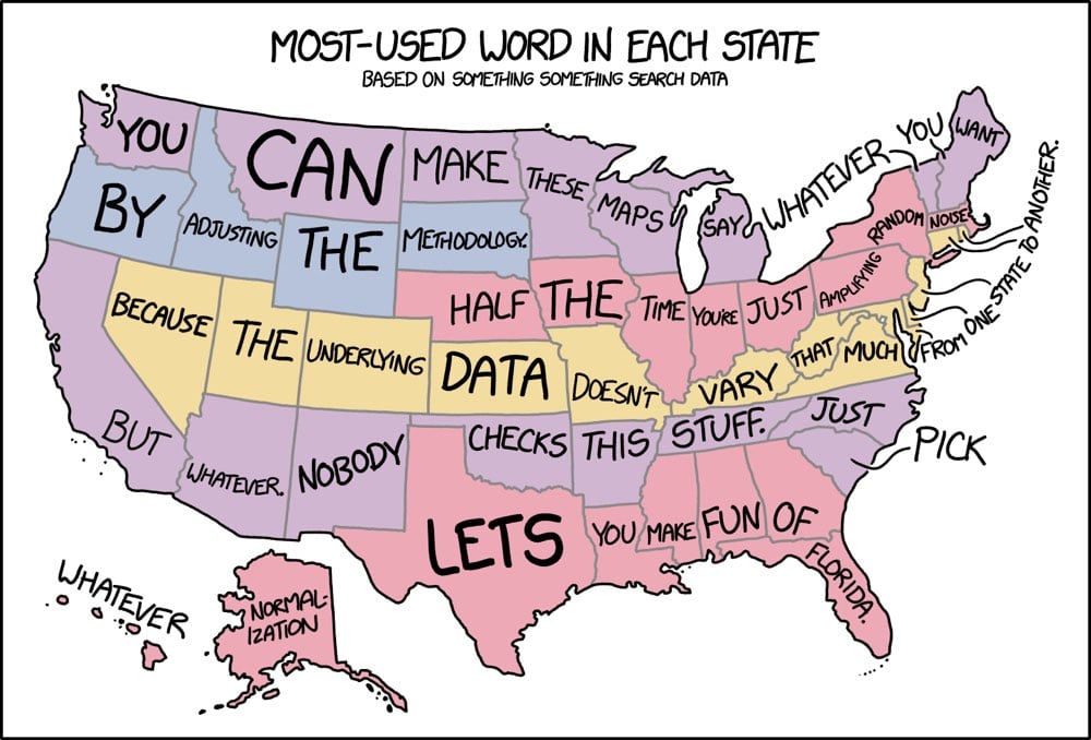
No, not that one. Or this one. Or any of these. This one.
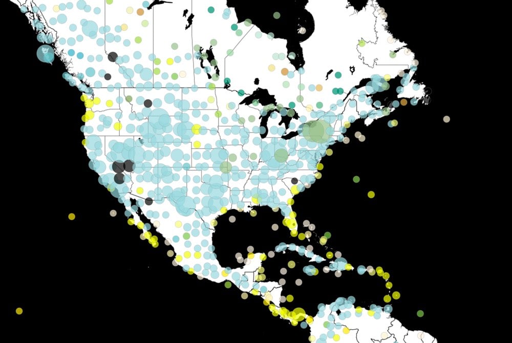
The Paleobiology Database Navigator is a world map that shows where hundreds of thousands of fossils have been found. The data is maintained by an international group of paleontologists and you can filter the map by type of fossil and when it was found. There’s even a toggle to flip back and forth between the current placement of the continents and much earlier Pangea-like configurations. (via @srikardr)
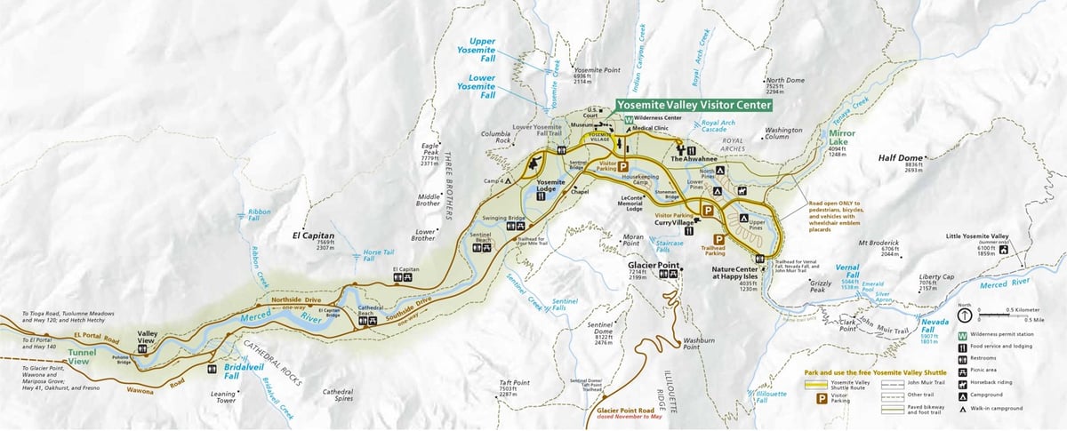
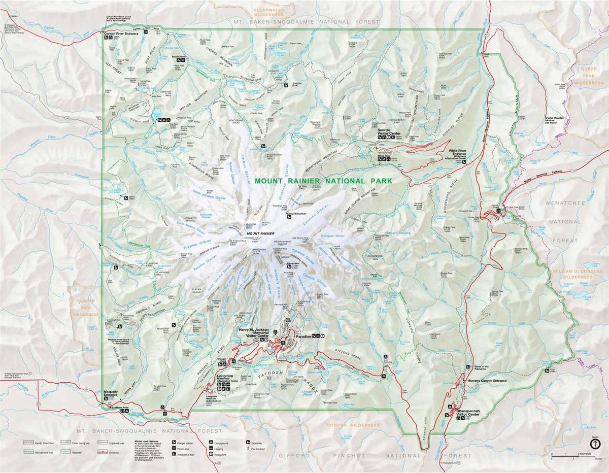
A maps enthusiast who works as a ranger for the National Park Service has amassed an easy-to-access collection of more than 1600 high-resolution maps of US national parks, monuments, recreation areas, and seashores, all available for free download.
His page of favorite maps is a good place to start if you don’t have specific mapping needs.
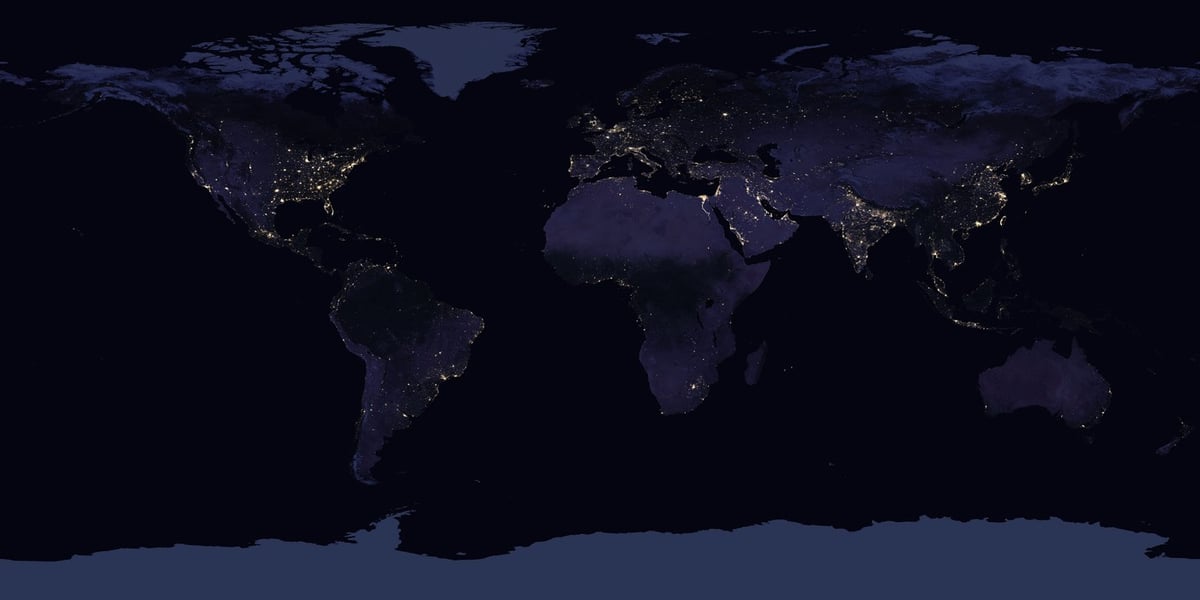
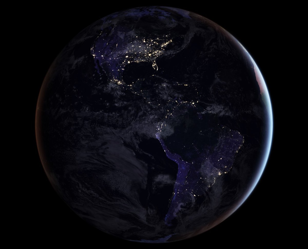
For the first time since 2012, NASA has released a new map of the entire Earth at night. Of course, you don’t see the Earth so much as the activity of humans in well-lit cities.
Today they are releasing a new global composite map of night lights as observed in 2016, as well as a revised version of the 2012 map. The NASA group has examined the different ways that light is radiated, scattered and reflected by land, atmospheric and ocean surfaces. The principal challenge in nighttime satellite imaging is accounting for the phases of the moon, which constantly varies the amount of light shining on Earth, though in predictable ways. Likewise, seasonal vegetation, clouds, aerosols, snow and ice cover, and even faint atmospheric emissions (such as airglow and auroras) change the way light is observed in different parts of the world. The new maps were produced with data from all months of each year. The team wrote code that picked the clearest night views each month, ultimately combining moonlight-free and moonlight-corrected data.
Scientists are planning on providing “daily, high-definition views of Earth at night” starting later this year. It’s worth clicking through to play with the interactive India map…it’s astounding to see how much light the country has added in the past 5 years. And see if you can spot North Korea at night:
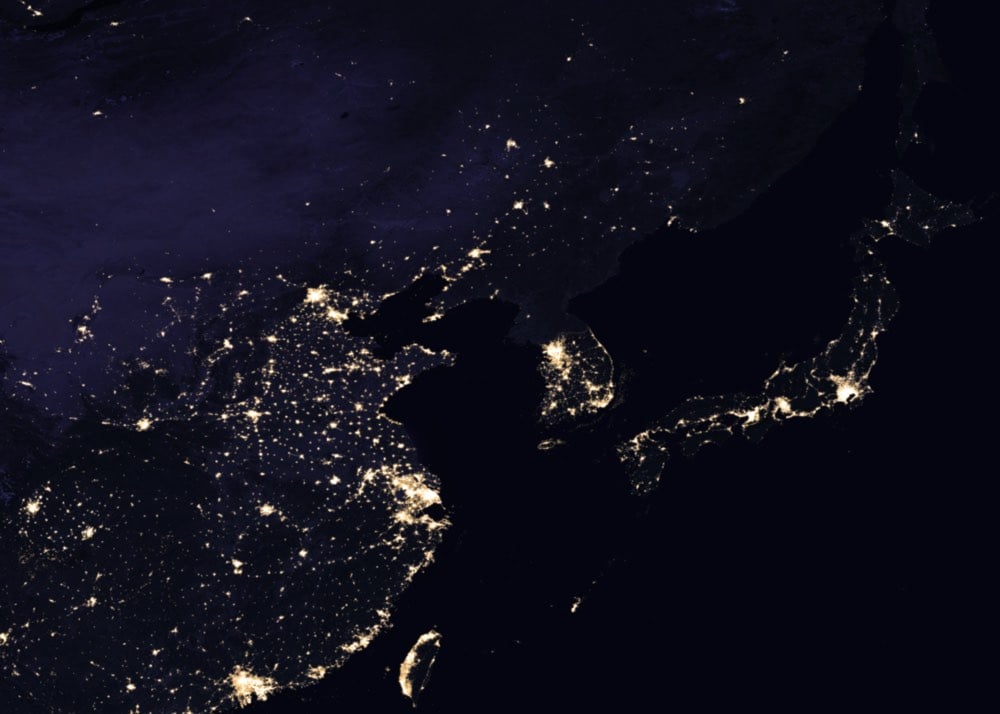
Barely…just a tiny dot for Pyongyang. You can play around with a fully zoomable version of the entire map here. (via @JamesJM)
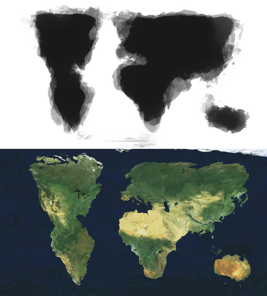
Zak Ziebell asked 30 people to sketch a map of the world and then averaged the results into the map above. I especially love the bottom one with the satellite terrain.
Tasked with creating “a piece of art that would reveal something unseen” as part of a pre-college fine arts program, Ziebell approached 29 strangers on the University of Michigan’s campus, handed them a pen and half a sheet of paper, and asked them, on the spot, to draw a map of the world. Ziebell, who recently posted his findings to Reddit, then completed the task himself and digitally merged the 30 maps into one image, overlaying the composite drawing with satellite data.
Update: This is yet another world map without New Zealand. (via @edmz)
From Aron Strandberg,1 this is a timeline visualization of the age of the world’s population from 1960-2060. The world’s human population has increased rapidly in the last couple centuries, most recently doubling since 1970:
A tremendous change occurred with the industrial revolution: whereas it had taken all of human history until around 1800 for world population to reach one billion, the second billion was achieved in only 130 years (1930), the third billion in less than 30 years (1959), the fourth billion in 15 years (1974), and the fifth billion in only 13 years (1987).
But watching that video, you’ll realize that the world’s population will not reach 20 or 30 billion in 2050 — human civilization is getting old.
Strandberg was also recently in charge of Sweden’s Twitter account, which they hand over to a random Swedish person each week. That’s where I found his chart.↩
This interactive map shows where the 79 million people who have immigrated to the US from 1820 to 2013 came from. In the past, incoming residents from Canada, Italy, Germany, and Ireland were prevalent, but more recently Mexico, China, and the Philippines have led the way.
What I think is particularly interesting about immigration to the U.S. is that each “wave” coming in from a particular country has a story behind it — usually escaping persecution (e.g. Jews escaping Russia after the May Laws were enacted, the Cuban Revolution) or major economic troubles (e.g. the Irish Potato Famine, the collapse of southern Italy after the Italian Unification).
There are plenty of dark spots on United States’ history, but the role it has played as a sanctuary for troubled people across the world is a history I feel very proud to be a part of.
The graph of incoming immigrants as a percentage of the total US population is especially instructive. Though higher than it was in the 60s and 70s, relative immigration rates are still far below what the country saw in the 1920s and before.
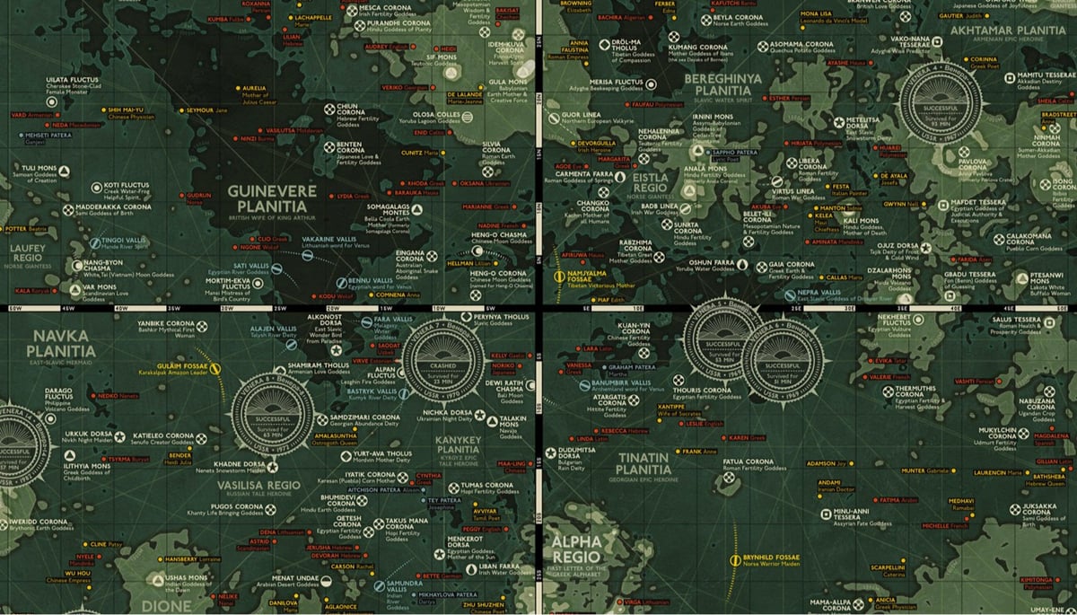
Last year, Eleanor Lutz made a medieval-style map of Mars. As a follow-up, she’s made a topographical map of Venus. The features on Venus are named for female mythological figures & notable women and Lutz provides a small biography for each one on the map. Among those featured on the map are:
Anne Frank
Selu (Cherokee Corn Goddess)
Kali (Hindu Goddess, Mother of Death)
Virginia Woolf
Sedna (Eskimo Whose Fingers Became Seals and Whales)
Ubastet (Egyptian Cat Goddess)
Beatrix Potter
Edith Piaf
Here are the full lists of the craters, mountains, and coronae on Venus.
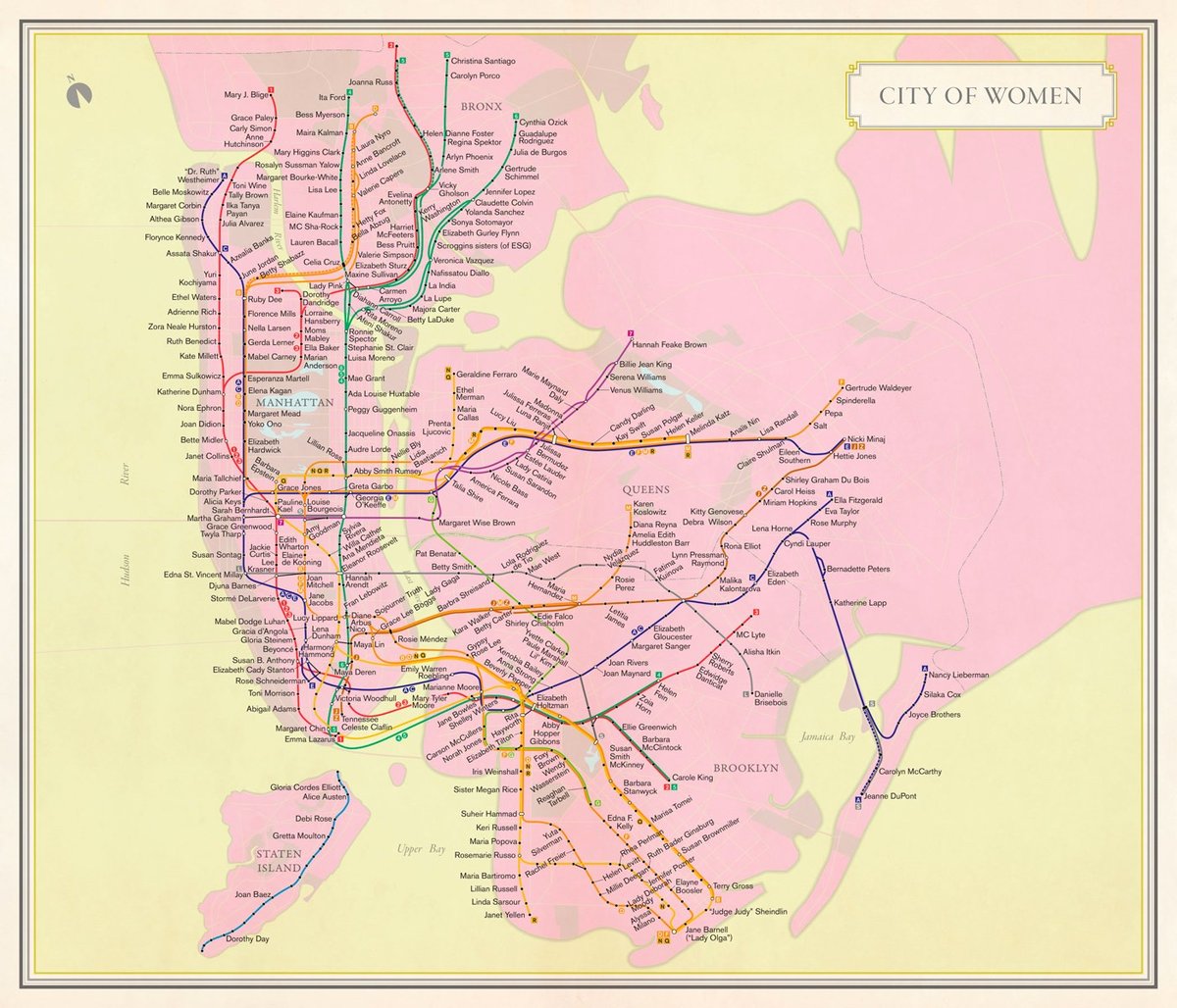
From the New Yorker, Rebecca Solnit on how the world’s places are mostly named after men.
A horde of dead men with live identities haunt New York City and almost every city in the Western world. Their names are on the streets, buildings, parks, squares, colleges, businesses, and banks, and their figures are on the monuments. For example, at Fifty-ninth and Grand Army Plaza, right by the Pulitzer Fountain (for the newspaper magnate Joseph Pulitzer), is a pair of golden figures: General William Tecumseh Sherman on horseback and a woman leading him, who appears to be Victory and also a nameless no one in par-ticular. She is someone else’s victory.
The biggest statue in the city is a woman, who welcomes everyone and is no one: the Statue of Liberty, with that poem by Emma Lazarus at her feet, the one that few remember calls her “Mother of Exiles.” Statues of women are not uncommon, but they’re allegories and nobodies, mothers and muses and props but not Presidents.
For her book Nonstop Metropolis: A New York City Atlas, Solnit and her co-author Joshua Jelly-Schapiro commissioned Molly Roy to make a subway map of NYC that uses only the names of the city’s prominent women for the station names.
It’s a map that reflects the remarkable history of charismatic women who have shaped New York City from the beginning, such as the seventeenth-century Quaker preacher Hannah Feake Bowne, who is routinely written out of history — even the home in Flushing where she held meetings is often called the John Bowne house. Three of the four female Supreme Court justices have come from the city, and quite a bit of the history of American feminism has unfolded here, from Victoria Woodhull to Shirley Chisholm to the Guerrilla Girls.
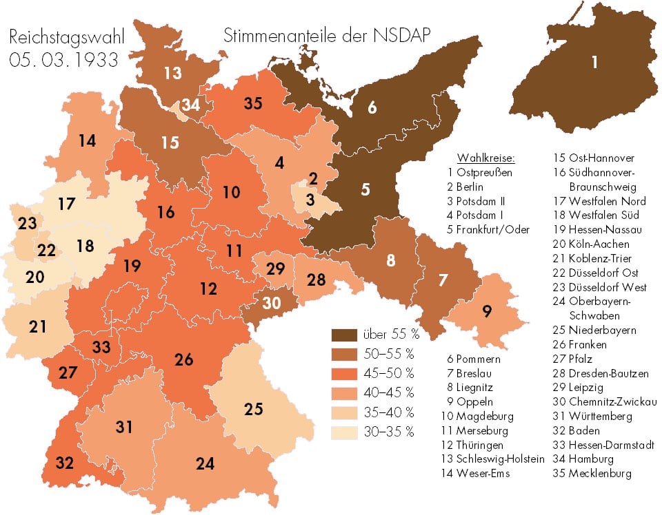
In March 1933, a unified Germany held its last relatively free election before WWII. Hitler had already become Chancellor but he held one last election, seeking a mandate under which to rule. This map shows which areas of Germany supported the Nazi Party most strongly.
However, it’s also important to note that while the Nazis won the most seats in 1933, they did not win a majority of them or the popular vote.
Support varied widely across the country. It was highest in the former Prussian territories in the north-east of Germany (with the exception of Berlin) and much weaker in the west and south of the country, which had, up until 1871, been independent German states.
Across Germany as a whole, the Nazis won 43.91% of the popular vote and got 44.51% of the seats. This made them by far the largest party in the German Reichstag, but still without a clear majority mandate.
I know history doesn’t repeat itself, but this sure is rhyming like Kanye.
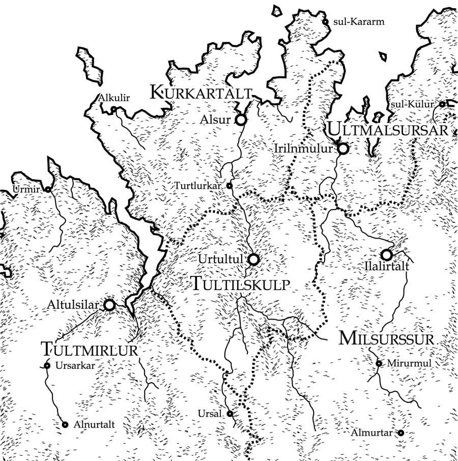
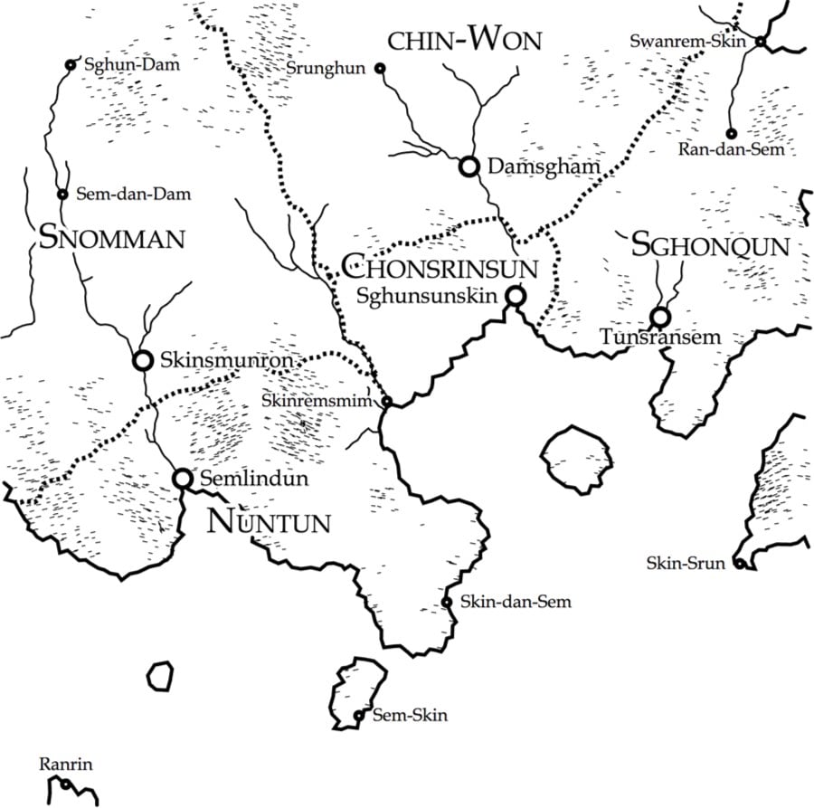
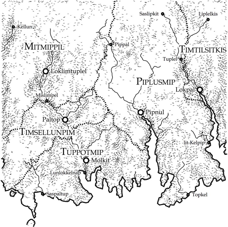
Martin O’Leary is a research scientist who studies glaciers, but in his spare time, he built Uncharted Atlas, a program that auto-generates maps of fantasy lands (like from Game of Thrones or LOTR) and posts them to a Twitter account. The explanation of how the terrain is generated is quite interesting and includes embedded map generators that you can play around with (i.e. prepare to lose about 20 minutes to this).
There are loads of articles on the internet which describe terrain generation, and they almost all use some variation on a fractal noise approach, either directly (by adding layers of noise functions), or indirectly (e.g. through midpoint displacement). These methods produce lots of fine detail, but the large-scale structure always looks a bit off. Features are attached in random ways, with no thought to the processes which form landscapes. I wanted to try something a little bit different.
There are a few different stages to the generator. First we build up a height-map of the terrain, and do things like routing water flow over the surface. Then we can render the ‘physical’ portion of the map. Finally we can place cities and ‘regions’ on the map, and place their labels.
And here’s how the languages for the place names are generated; each map has its own generated language so all of the place names are consistant with each other and different from those regions shown on other maps.
I wanted to produce something which was a step above the usual alphabetic soup of generated placenames, and which was capable of producing recognisably distinct languages. The initial idea was that different regions of each map would have different languages, but I abandoned this because it was too hard to make it clear that this was what was going on, while still having the languages themselves be interesting.
The problem is to generate something like what the constructed languages (conlang) community call a ‘naming language’. This is a light sketch of a language, focusing purely on the parts which are necessary to produce names. So there’s little to no grammar, but a good sense of what the language sounds like, and how it’s written.
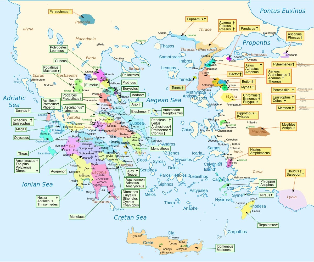
This is a map showing where all of the characters originated in Homer’s epic poem The Iliad. I know Greece is small by today’s standards, but it was surprising to me how geographically widespread the hometowns of the characters were. The Iliad is set sometime in the 11th or 12th century BC, about 400 years before Homer lived. I wonder if that level of mobility was accurate for the time or if Homer simply populated his poem with folks from all over Greece as a way of making listeners from many areas feel connected to the story — sort of the “hello, Cleveland!” of its time. (thx, adriana)
Update: I’ve gotten lots of feedback saying that not every character is represented in this map (particularly the women) and that some of the locations and hometowns are incorrect. Seems like Wikipedia might need to take a second look at it.
Update: The map was made using the Catalogue of Ships, a list of Achaean ships that sailed to Troy, and the Trojan Catalogue, a list of battle contingents that fought for Troy. That’s why it’s incomplete. An excerpt:
Now will I tell the captains of the ships and the ships in their order. Of the Boeotians Peneleos and Leïtus were captains, and Arcesilaus and Prothoënor and Clonius; these were they that dwelt in Hyria and rocky Aulis and Schoenus and Scolus and Eteonus with its many ridges, Thespeia, Graea, and spacious Mycalessus; and that dwelt about Harma and Eilesium and Erythrae; and that held Eleon and Hyle and Peteon, Ocalea and Medeon, the well-built citadel, Copae, Eutresis, and Thisbe, the haunt of doves; that dwelt in Coroneia and grassy Haliartus, and that held Plataea and dwelt in Glisas; that held lower Thebe, the well-built citadel, and holy Onchestus, the bright grove of Poseidon; and that held Arne, rich in vines, and Mideia and sacred Nisa and Anthedon on the seaboard.
(via @po8crg)
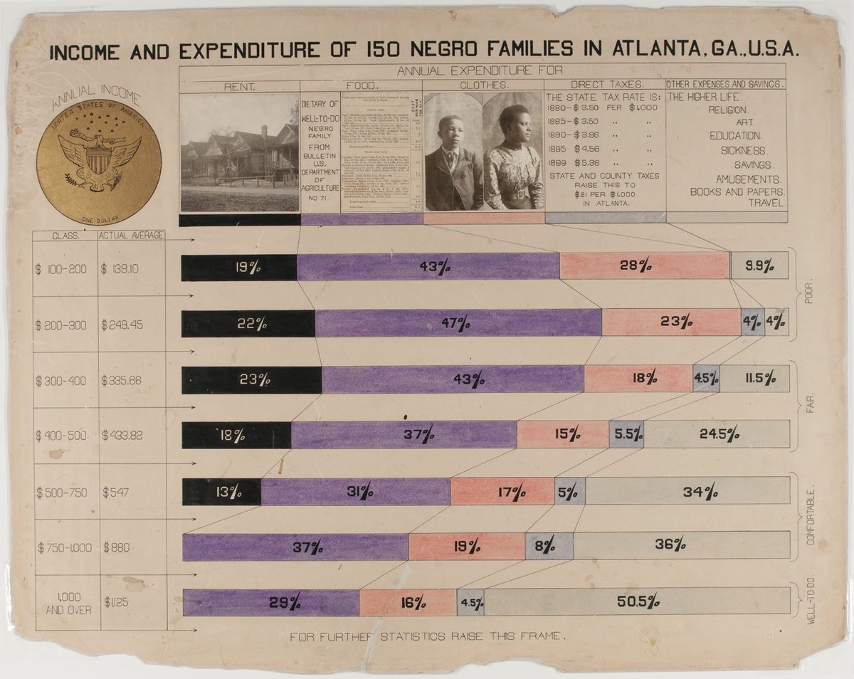
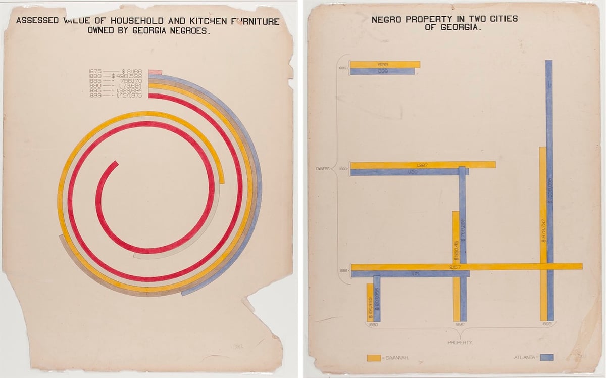
W.E.B. Du Bois was an American author, sociologist, historian, and activist. Apparently Du Bois was also a designer and design director of some talent as these hand-drawn infographics show.
In addition to an extensive collection of photographs, four volumes containing 400 official patents by African Americans, more than 200 books penned by African-American authors, various maps, and a statuette of Frederick Douglass, the exhibition featured a total of fifty-eight stunning hand-drawn charts (a selection of which we present below). Created by Du Bois and his students at Atlanta, the charts, many of which focus on economic life in Georgia, managed to condense an enormous amount of data into a set of aesthetically daring and easily digestible visualisations. As Alison Meier notes in Hyperallergic, “they’re strikingly vibrant and modern, almost anticipating the crossing lines of Piet Mondrian or the intersecting shapes of Wassily Kandinsky”.
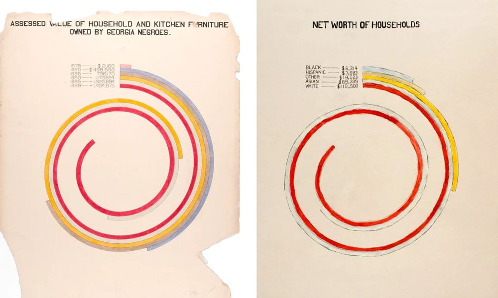
Update: Oh, this is great: Mona Chalabi has updated Du Bois’ charts with current data.
Wealth. If I had stayed close to the original chart, the updated version would have shown that in 2015, African American households in Georgia had a median income of about $36,655, which would fail to capture the story of inflation (net asset numbers aren’t published as cumulative for one race). Instead, I wanted to see how wealth varies by race in America today.
The story is bleak. I hesitated to use the word “worth”, but it’s the language used by the Census Bureau when they’re collecting this data and, since money determines so much of an individual’s life, the word seems relevant. For every dollar a black household in America has in net assets, a white household has 16.5 more.
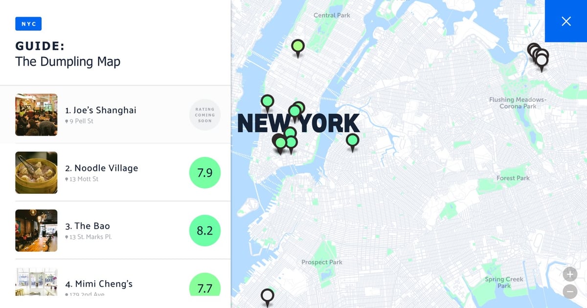
The Infatuation has an interactive map of the best places to get soup dumplings, fried dumplings, wontons, and all that good stuff in NYC, plus ordering recommendations for each place.
You could easily quibble with the list itself — the numbers 1-17 aren’t supposed to be rankings per se, but it starts with lower Manhattan, then gets to Flushing and Sunset Park, and that’s it. Still, the nice thing about a map interface is that you don’t need to worry about who’s number 1 and who’s number 10 quite so much when you’re just trying to find a place in a nearby neighborhood that can deliver the goods. (God, I miss New York.)
Update: I mistook the numbers in the map’s list view for rankings and was all grumpy about all the Chinatown places being ahead of the Queens ones. As it turns out, some of the places have number ratings, some don’t, and the list is more a geographic sequence than anything else.
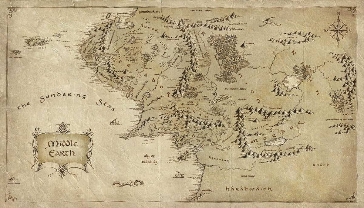
At The Awl, Victoria Johnson fondly remembers the books of her youth that contained extra material. Like maps.
If I ruled the world, or at least a publishing company, all books would contain as much supplementary information as possible. Nonfiction, fiction — doesn’t matter. Every work would have an appendix filled with diagrams, background information, digressions and anecdata. And of course, maps. Lots and lots of maps.
The Hobbit, Winnie the Pooh, and The Wizard of Oz all included great maps that expanded the story in the mind of the reader. Near the end of the piece, Johnson notes that The Hunger Games didn’t include a map of Panem and links to this fan-drawn map (image here):
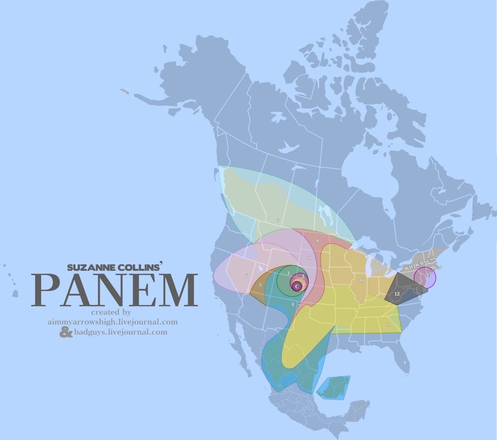
The Capitol is in Denver.
D12 is Appalachia.
D11 shares a border with D12, is one of the largest districts, is South of D12, and is primarily used for growing grain and produce.
D10 is primarily used for raising livestock. They do NOT process the livestock in D10. However, to feed an entire nation, D10 is likely another very large District.
D9 processes food for the Capitol and the tesserae; therefore, it likely shares borders with the food production Districts (D4, D10, D11).
D8 produces and treats textiles and is a factory District. It is POSSIBLE to reach D12 from D8 on foot over a course of weeks/months. Therefore, it does not cross a large body of water.
May the maps be ever in your books.
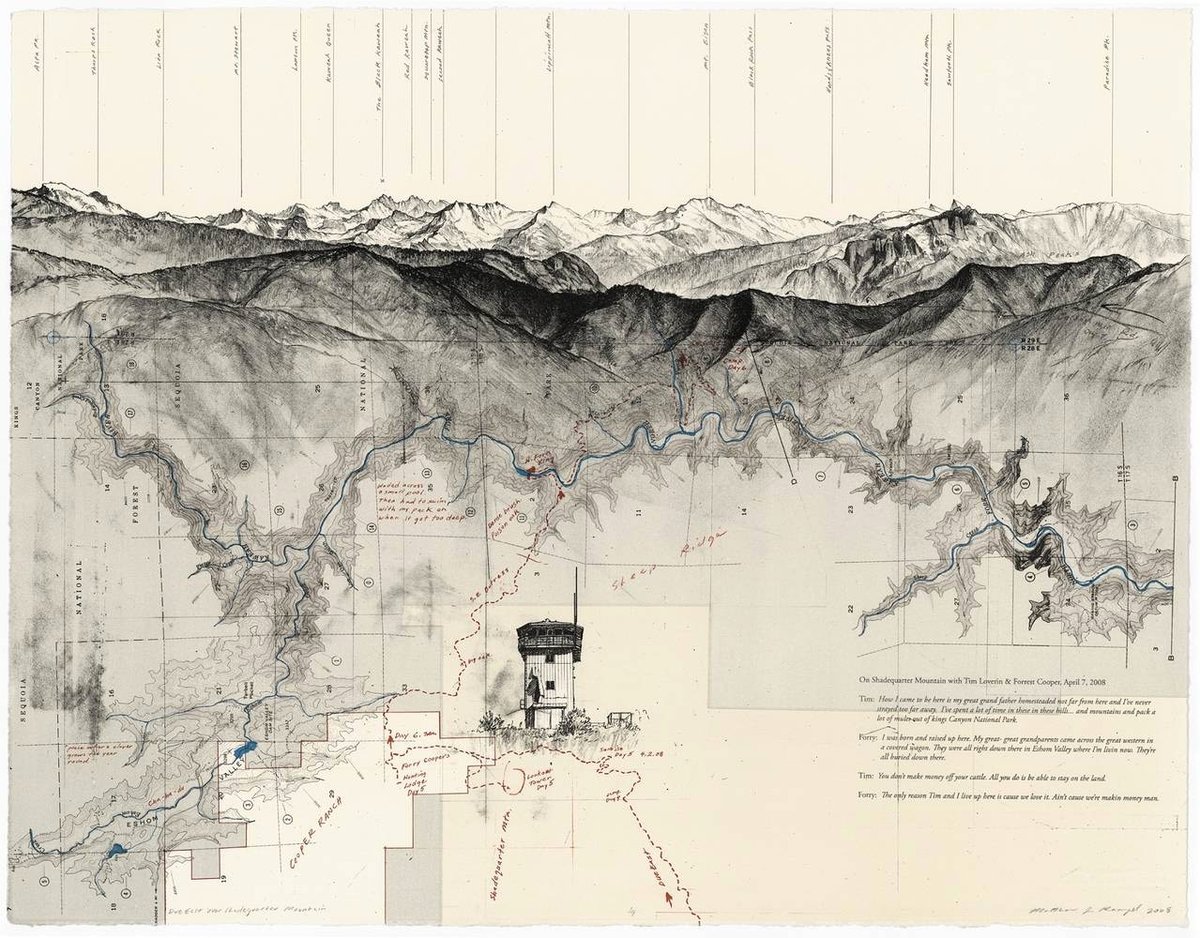
Artist Matthew Rangel hikes through what looks like some of the most beautiful terrain in the world and makes these cartographic drawings based on his experiences. Lovely work. (via @djacobs)
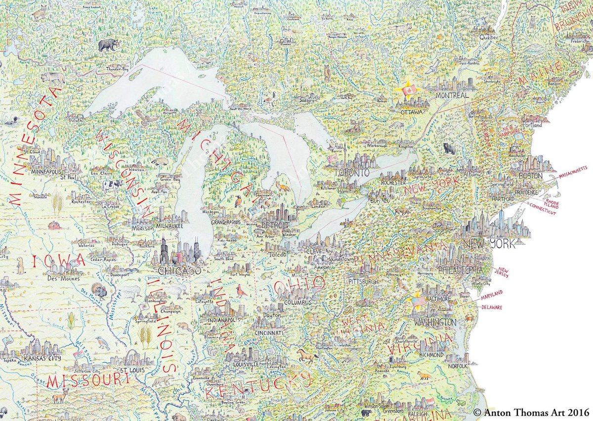
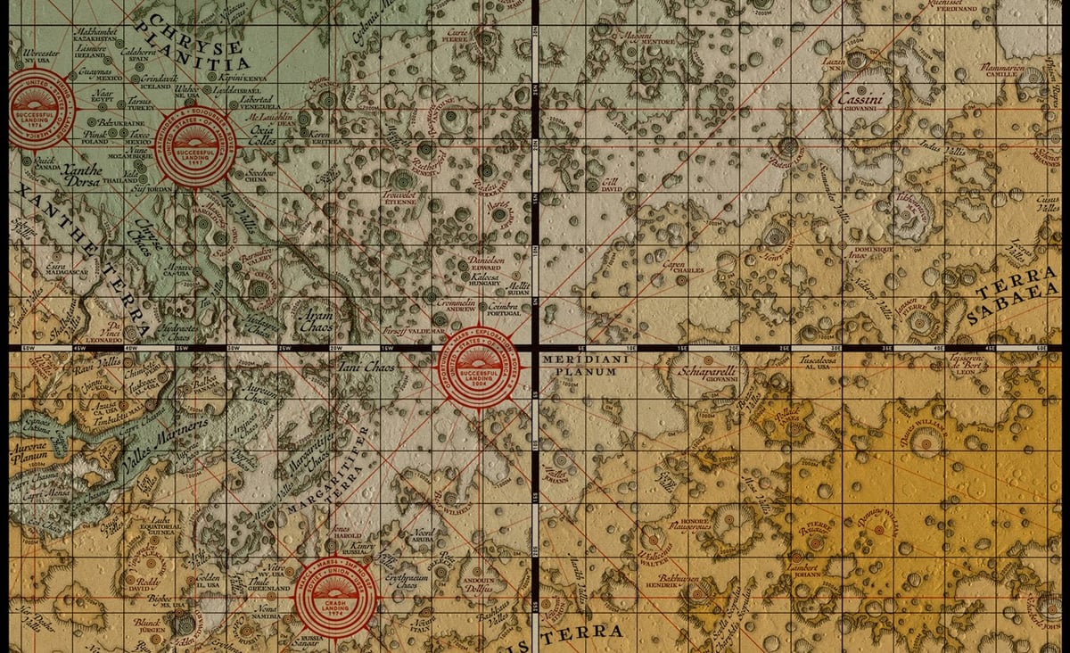
From National Geographic, a list of the best maps produced (or made publicly available) in 2016, including a few I’ve featured on this little site you’re reading.
The two images included above are from a handdrawn map of North America by Anton Thomas and Eleanor Lutz’s Medieval Map of Mars.

It’s that time of year again. No, not Christmas or Hanukkah. As the year winds down, it’s an opportunity for Americans to investigate how differently they use words in different parts of the country. In December 2013, for example, people lost their damn minds over the NY Times’ dialect quiz. This year, you can play around with The Great American Word Mapper which uses Twitter data from 2014 to plot geographic usage patterns.
For instance, you can see where people use “supper” vs. “dinner” (see above). The map indicates mixed usage where I grew up, which checks out…we mostly said “supper” but “dinner” was not uncommon, particularly as I got older. Other results are less useful…the Twitter-based “soda” vs. “coke” vs. “pop” doesn’t tell you as much as directly asking people what they call soft drinks.

The swearing maps are always fun (see also the United States of Swearing)…I wonder why “shit” is so relatively popular in the South?
Some other interesting searches: “moma” (alternate spelling of “momma” in the South with a small pocket of usage around NYC for MoMA), “city” doesn’t give the result you might expect, the distribution of “n***er” vs “n***a” suggests they are two different words with two different meanings, and in trying to find a search that would isolate just urban areas, the best I could come up with was “kanye” (or maybe “cocktails” or “traffic”). And harsh, map! Geez. (via @fromedome)
This is cool and a little mesmerizing: animated US maps showing the most popular baby name in each state from 1910 to 2014 for boys and girls. There are three separate visualizations. The first just shows the most popular baby name in each state. Watch as one dominant name takes over for another in just a couple of years…the Mary to Lisa to Jennifer transition in the 60s and 70s is like watching an epidemic spread. Celebrity names pop up and disappear, like Betty (after Betty Boop and Betty Grable?) and Shirley (after Shirley Temple) in the 30s. The boy’s names change a lot less until you start getting into the Brandons, Austins, and Tylers of the 90s.
The next visualization shows the most particularly popular name for each state, e.g. Brandy was the most Louisianan name for female newborns in 1975. And the third visualization shows each name plotted in the averaged geographical location of births — so you can see, for example, the northward migration of Amanda during the 80s.
P.S. Guess what the most popular boy’s name in the state of my birth was the year I was born? And the most particularly popular boy’s name in the state I moved to just a year later? Jason. I am basic af.
Update: From Flowing Data, some graphs of the most unisex names in US history. (thx, paul)
Socials & More