kottke.org posts about design
This looks like a potentially interesting book from Felice Frankel: Visual Strategies (at Amazon).
Any scientist or engineer who communicates research results will immediately recognize this practical handbook as an indispensable tool. The guide sets out clear strategies and offers abundant examples to assist researchers-even those with no previous design training-with creating effective visual graphics for use in multiple contexts, including journal submissions, grant proposals, conference posters, or presentations.
Visual communicator Felice Frankel and systems biologist Angela DePace, along with experts in various fields, demonstrate how small changes can vastly improve the success of a graphic image. They dissect individual graphics, show why some work while others don’t, and suggest specific improvements. The book includes analyses of graphics that have appeared in such journals as Science, Nature, Annual Reviews, Cell, PNAS, and the New England Journal of Medicine, as well as an insightful personal conversation with designer Stefan Sagmeister and narratives by prominent researchers and animators.
In June 2009, an Air France flight from Rio de Janeiro disappeared without a trace. The disappearance turned crash and the questions started: how did a state-of-the-art plane go down so suddenly and who was to blame? The plane’s black boxes were finally recovered after two years of searching and there’s a case to be made that the design of the cockpit controls may be at least partially responsible for the crash.
The official report by French accident investigators is due in a month and seems likely to echo provisional verdicts suggesting human error. There is no doubt that at least one of AF447’s pilots made a fatal and sustained mistake, and the airline must bear responsibility for the actions of its crew. It will be a grievous blow for Air France, perhaps more damaging than the Concorde disaster of July 2000.
But there is another, worrying implication that the Telegraph can disclose for the first time: that the errors committed by the pilot doing the flying were not corrected by his more experienced colleagues because they did not know he was behaving in a manner bound to induce a stall. And the reason for that fatal lack of awareness lies partly in the design of the control stick - the “side stick” - used in all Airbus cockpits.
chartsandthings is a behind-the-scenes look at how the infographic sausage is made at the NY Times.
From PBS Off Book, a quick look at the thinking behind the opening titles for TV shows and movies, including Zombieland, Mad Men, and Se7en.
See also Art of the Title and A Brief History of Title Design. (via devour)
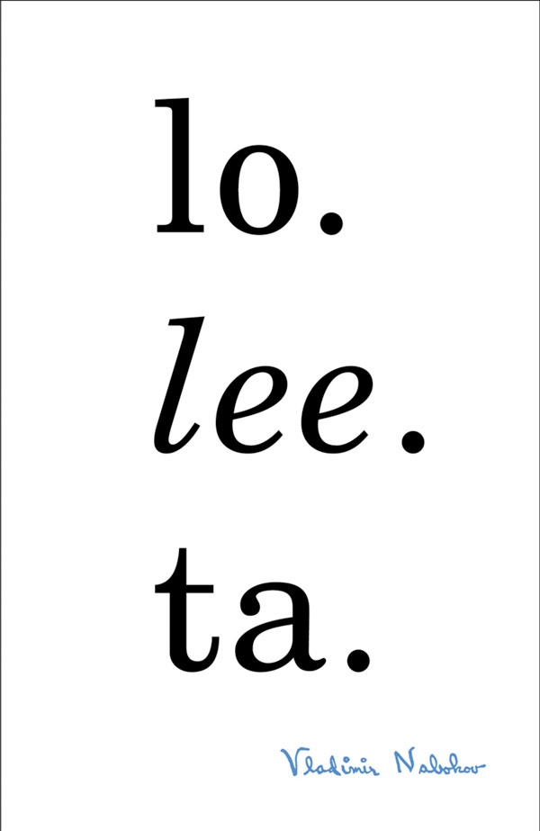
The results of a competition to design a better cover for Nabokov’s Lolita are being packaged into a book due out in June.
Among the problems Nabokov’s Lolita poses for the book designer, probably the thorniest is the popular misconception of the title character. She’s chronically miscast as a teenage sexpot-just witness the dozens of soft-core covers over the years. “We are talking about a novel which has child rape at its core,” says John Bertram, an architect and blogger who, three years ago, sponsored a Lolita cover competition asking designers to do better.
Now the contest is being turned into a book, due out in June and coedited by Yuri Leving, with essays on historical cover treatments along with new versions by 60 well-known designers, two-thirds of them women: Barbara deWilde, Jessica Helfand, Peter Mendelsund, and Jennifer Daniel, to name a few. They don’t shy away from frank sexuality, but they add layers of darkness and complication. And like Jamie Keenan’s cover — a claustrophobic room that morphs into a girl in her underwear — they provoke without asking readers to abdicate their responsibility.
Of the covers shown, Peter Mendelsund’s is a favorite:
Lovely type and illustration on these architectural stationery vignettes collected by BibliOdyssey.
The images in this post all come from Columbia University’s very large assortment of commercial stationery (featuring architectural illustrations): the Biggert Collection.
The vast majority of the images below have been cropped, cleaned and variously doctored for display purposes, with an intent towards highlighting the range of letterform/font and design layouts. The underlying documents are invoices (most), letters, postcards, shipping records and related business and advertising letterhead ephemera from the mid-1800s to the 1930s.
See also the Sanborn fire insurance maps.
Out today: Mike Monteiro’s Design is a Job. The book is an important reminder that how effective you are as a designer depends on many things aside from what you can do in Photoshop or InDesign. You need to build a stable environment for yourself (and your employees) to do your best work: you need to get clients, know how to talk to them, set up a stable and sustainable business, collaborate with others, etc. etc. For a taste of what the book has to offer, A List Apart has an excerpt of the second chapter, Getting Clients.
The biggest lie in this book would be if I told you I don’t worry about where the next client is coming from. I could tell you that once you build up enough of a portfolio, or garner enough experience, or achieve a certain level of notoriety in the industry, this won’t be a concern anymore. I could tell you I sleep soundly, not bolting out of bed at 4 a.m. to run laps around the local high school track. I could tell you that I never worry about enough presents under the tree. I could tell you these things, but I’d be lying. And I don’t want to lie to you. Getting clients is the most petrifying and scary thing I can think of in the world. I’d rather wrestle lady Bengal tigers in heat with meat strapped to my genitals than look for new clients.
If putting in the work to get the kind of work you want to do sounds too daunting, then close this book right now. Walk away. Rethink your life choices and take up a less stressful craft, like cleaning out cobra pits. Do it. No one will think less of you. Cover yourself in sackcloth and pray to your god for penance.
Go!
A month ago, I launched a redesign of kottke.org. While there are still a few issues to iron out1, I am overall very happy with it so far.
If you’re actually reading this on the site and not in RSS (guys, come on in from the cold, don’t be shy), you’ll already have noticed that I changed the “look and feel” of the site. In doing the design, I focused on three things: simplicity, the reading/viewing experience, and sharing.
Aside from those three things, one of my unstated goals with the redesign was to increase the number of people reading kottke.org2 and I had a hunch that the focus on simplicity, sharing, the reading experience would do just that. Using Google Analytics and a couple of other sources, I compared the traffic stats from the past 30 days (I didn’t include the day of launch because that was an outlier day, traffic-wise) to that of the previous 30 days. Here are some of the results. (Except where noted, when I say “traffic”, I mean visits.)
- Overall traffic to kottke.org was up 14%. And February was a pretty good month itself so that’s a nice bump.
- As I hoped, the two areas that saw the most improvement were mobile and referral traffic. Mobile was the lowest-hanging fruit I addressed with the redesign…kottke.org’s previous mobile experience sucked. It’s better now. And the focus on sharing boosted referral traffic.
- Mobile traffic now accounts for 19% of kottke.org’s traffic and increased by 25% over the past 30 days. iPad usage in particular shot up 40% and iPad users are spending longer on the site than they previously were. iPhone and iPod touch traffic both showed double digit percentage increases as well.
- Referral traffic now accounts for 45% of kottke.org’s traffic and increased by 28% over the past 30 days. Most of this increase come from social network sharing. Traffic from Facebook increased by 45%, Facebook mobile was up 43%, Twitter increased by 6% (I already did Twitter sharing pretty well before, so not a huge jump here), and Tumblr referrals went up 125%.
- That big Tumblr increase was due to kottke.org’s new Tumblr blog. Having kottke.org posts be properly rebloggable is paying off. In addition, it’s got over 800 followers that are reading along in the dashboard. I’d like to see that number increase, but I’d probably need to engage a bit more on Tumblr for that to happen.
- For reference, kottke.org’s Twitter account added 1000 followers over the same period, about 20% more than the previous month.
- One of the small changes I made was to stop using post titles for posting to Twitter. I had hoped that using more descriptive text would make the tweets more easily retweetable…look at this tweet for example and compare to the title of the post it links to. This hasn’t really happened, which is surprising and disappointing.
- I also removed the links to the tag pages (like this and this) from the front page. I had a hunch that very few people were using those links compared to the real estate they took up and the traffic numbers bear that out…traffic to tag pages decreased only 3%.
That’s enough for now…I very rarely dig into the traffic stats so it’s difficult to stop when I do. That and it’s rewarding when you redesign something and it actually works out the way you thought it was going to.
[1] Like this weird Safari bug that results in overlapping link text. Many people have reported this but it only happens sporadically (and usually goes away with a refresh) and I can’t reproduce it or find any other sites/designers who are having the same issue. Oh, and it seems like it only happens on OS X Lion. I have no idea if it’s the web fonts or something in my CSS. Anyone have any ideas? ↩
[2] Not for $$$ reasons, although that is certainly a consideration. No, it’s more that I believe there are literally millions of people out there who are not reading kottke.org that would love it. I put a lot of myself into the site, I’m proud of it, and I want people to see it. That’s pretty much it. Oh, and I would also like the unlimited power that comes with millions of readers. evil cackle and cat stroking noises And the money. even more cat stroking noises And the chicks. expensive champagne cork popping noises And my kids’ love and respect. surprisingly loud whining noise that you can’t even believe came from someone less than 40 inches tall oh come on you just watched Wallace and Gromit for the past hour and you want more orange juice jesus come on give it a rest and now there’s a surprisingly loud whining noise coming from a 38-year-old man that should know better… ↩
A beautiful collection of railroad company logos that show the evolution of logo design from 1845 to 2000.

The Art of the Title has an interview with David Fincher, creative director Tim Miller, and designer Neil Kellerhouse about the opening title sequence of The Girl with the Dragon Tattoo.
We were exploring things like, ‘How shiny should the skin be? How visceral and uncomfortable can we make it? How abstract can we get? Is that a flower? Is it a vagina?’ — that sort of thing.
During David’s visits to the studio we would brace for impact, because he has a reputation for being incredibly picky. The first time I met him, I asked one of his friends, ‘How picky is David?’ And he said, ‘You’ve heard of pixel fuckers? Well David breaks each pixel down to its separate RGB components and fucks them one at a time.’ So there was some fear every time we would send something in, but 99% of the time we were just told to keep going.
(via @capndesign)
You’ve seen the now-famous Keep Calm and Carry On poster and its many many variations, but did you know that this British WWII poster was never distributed to the public and was discovered only recently in an English book shop?
(via ★interesting)
If you’re actually reading this on the site and not in RSS (guys, come on in from the cold, don’t be shy), you’ll already have noticed that I changed the “look and feel” of the site. In doing the design, I focused on three things: simplicity, the reading/viewing experience, and sharing.
Simplicity. kottke.org has always been relatively spare, but this time around I left in only what was necessary. Posts have a title, a publish date, text, and some sharing buttons (more on those in a bit). Tags got pushed to the individual archive page and posts are uncredited (just like the Economist!). In the sidebar that appears on every page, there are three navigation links (home, about, and archives), other ways to follow the site (Twitter, Facebook, etc.), and an ad and job board posting, to pay the bills. There isn’t even really a title on the page…that’s what the title tag is for, right? Gone also is the blue border, which I liked but was always a bit of a pain in the ass.
Reading/viewing experience. I made the reading column wider (640px) for bigger photos & video embeds and increased the type size for easier reading. But the biggest and most exciting change is using Whitney ScreenSmart for the display font, provided by Hoefler & Frere-Jones’ long-awaited web font service, which is currently in private beta. Whitney SSm is designed especially for display in web browsers and really pushes the site’s design & readability to a higher level. Many thanks to Jonathan and his web fonts team for letting me kick their tires. I believe that kottke.org is one of only two sites on the entire Internet currently using H&FJ’s web fonts…the other is by some guy who currently lives in a white house near Maryland. Barnaby something…
The reading experience on mobile devices has also been improved. The text was formerly too small to read, the blue border was a pain in the ass (especially since the upgrade to iOS 5 on the iPhone & iPad changed how the border was displayed when zoomed), and the mobile version was poorly advertised. The site now uses the same HTML and CSS to serve appropriate versions to different browsers on different hardware using some very rudimentary responsive design techniques. Whitney ScreenSmart helps out here too…it looks freaking AMAZING on the iPhone 4S’s retina display. Really, you should go look. And then zoom in a bunch on some text. Crazy, right?
Sharing. I’ve always thought of kottke.org as a place where people come to find interesting things to read and look at, and design has always been crafted with that as the priority. A few months ago, I read an interview with Jonah Peretti about what BuzzFeed is up to and he said something that stuck with me: people don’t just come to BuzzFeed to look at things, they come to find stuff to share with their friends. As I thought about it, I realized that’s true of kottke.org as well…and I haven’t been doing a good enough job of making it easy for people to do.
So this new design has a few more sharing options. Accompanying each post is a Twitter tweet button and a Facebook like button. Links to posts are pushed out to Twitter, Facebook, and RSS where they can be easily shared with friends, followers, and spambots. I’ve also created a mirror of kottke.org on Tumblr so you can read and share posts right in your dashboard. I’ve chosen just these few options because I don’t want a pile of sharing crap attached to each post and I know that kottke.org readers actually use and like Twitter, Tumblr, and even Facebook.
So that’s it. I hope you like it. Not every page on the site has the new design yet, but I’m getting there. For reference, here’s what the site has looked like in the past. Comments, questions, criticisms, and bug reports are always welcome.
Nicholas Felton just released his most recent personal annual report: The 2010/2011 Feltron Biennial Report.
Ordered. I believe I have the entire set (aside from the exceedingly rare 2005 edition).
Travis Pitts outlines the six rules of modern movie poster design. Here are three examples:
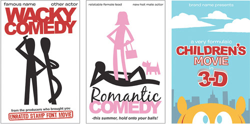
Best viewed large for easy reading of fine print.
Speaking of Apple, here’s a profile of Jerry Manock, who worked for Apple from 1977 to 1984 and designed the case for the Apple II and helped design the Macintosh. Manock was Jobs’ first Jony Ive.
The whole basis of the class I’ve taught at UVM for 21 years is … integrated product development, which means concurrently looking at all of these things: the aesthetics, the engineering, the marketing … which is what we were doing at Apple. Not necessarily purposefully, but everybody was just thrown together… I would walk through the software place and look around and see what people were doing … walk through the marketing area. I had my drawings all on the walls, so anybody could come up. There was a red pencil hanging there. I’d say, “If you see something you don’t like, or is a problem — I don’t care whether it’s a janitor or Steve — write the correction, circle it, put your phone there and I’ll call you and we’ll talk about it.”
(thx, mike)
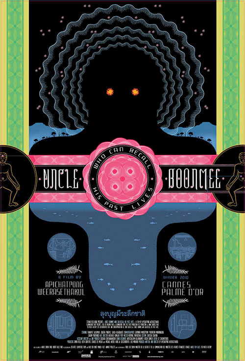
From MUBI notebook, a selection of great movies posters from 2011, including Chris Ware’s lovely one for Uncle Boonmee.
(via dooce)
I love the cover of the most recent Bloomberg Businessweek:
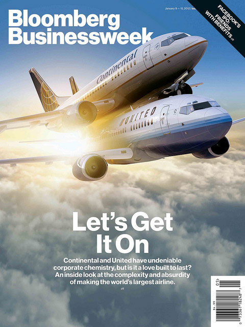
Here’s a peek at how the design process works at the magazine.
Designer Adam Ladd asked his five-year-old daughter for her impressions of several well-known logos. This is great:
(via stellar)
Posters for Oscar nominated movies that maybe tell the truth of each movie a bit more than the conventional posters. For instance, Iron Lady becomes Total Bitch, Tree of Life becomes Wuh?, and The Girl with the Dragon Tattoo becomes All the Rape, No Subtitles.

(via ★vuokko)
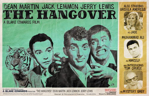
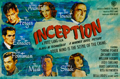
If recent movies like The Hangover, Drive, Inception, and Rushmore had been made in an earlier era, who would have starred in and directed these premakes? How about Dean Martin, Jack Lemmon, and Jerry Lewis in The Hangover?
Or Inception directed by Fritz Lang?
(thx, al)
The Internet Archive is hosting a copy of the American Specimen Book of Type Styles put out by the American Type Founders Company in 1912. It’s a 1300-page book listing hundreds of typefaces and their possible use cases.
There’s also a 1910 copy of what is basically the German version of the ATF book. Look at these swirls! (via @h_fj)
On the Clipart covers blog, you’ll find noted album covers redone with clip art and Comic Sans.

(via @aaroncoleman0)
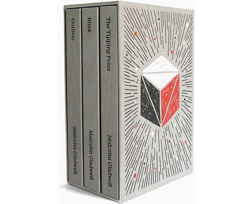
Paul Sahre and Brian Rea designed a 3-book boxed set for Malcolm Gladwell’s “intellectual adventure stories”.
“During our initial meeting with Malcolm, he referred to the three books as ‘intellectual adventure stories,’” Sahre tells Co.Design. “Brian and I really responded to that, as it suggested a specific and interesting way to think about how the books could be designed. We wanted the books to feel like first editions of Moby-Dick or Treasure Island or The Wizard of Oz.”
The tasteful gray cloth binding and foil stamping of the set and its “extremely conventional” design, as Sahre puts it (“maybe ‘comfortable’ would be a better way to describe it,” he adds) makes me think of famous children’s literature collections, like The Chronicles of Narnia. “This ‘traditional/comfortable’ design allowed for the drawings Brian was doing to venture off into the abstract and unconventional place they ended up,” Sahre continues. “More importantly, the quiet design allowed the text and the drawings room to interact and to breathe. I hope the reader doesn’t notice the design of the book at all.”
The set is available on Amazon.

This map of the US was made by David Imus — he worked seven days a week for two years on it — and it won the Best of Show award at the Cartography and Geographic Information Society competition for 2010. Here’s why.
According to independent cartographers I spoke with, the big mapmaking corporations of the world employ type-positioning software, placing their map labels (names of cities, rivers, etc.) according to an algorithm. For example, preferred placement for city labels is generally to the upper right of the dot that indicates location. But if this spot is already occupied — by the label for a river, say, or by a state boundary line — the city label might be shifted over a few millimeters. Sometimes a town might get deleted entirely in favor of a highway shield or a time zone marker. The result is a rough draft of label placement, still in need of human refinement. Post-computer editing decisions are frequently outsourced-sometimes to India, where teams of cheap workers will hunt for obvious errors and messy label overlaps. The overall goal is often a quick and dirty turnaround, with cost and speed trumping excellence and elegance.
By contrast, David Imus worked alone on his map seven days a week for two full years. Nearly 6,000 hours in total. It would be prohibitively expensive just to outsource that much work. But Imus — a 35-year veteran of cartography who’s designed every kind of map for every kind of client — did it all by himself. He used a computer (not a pencil and paper), but absolutely nothing was left to computer-assisted happenstance. Imus spent eons tweaking label positions. Slaving over font types, kerning, letter thicknesses. Scrutinizing levels of blackness. It’s the kind of personal cartographic touch you might only find these days on the hand-illustrated ski-trail maps available at posh mountain resorts.
Update: The map is now in its fourth version of the second edition, updated in Sept 2022. I updated the image above to a snippet of the newest map.
A lovely short film by Ben Proudfoot about a letterpress company and a paper company who are scraping by next door to each other in Los Angeles.
An excellent 26-minute talk by Jonathan Hoefler of the Hoefler & Frere-Jones about how they think about designing typefaces and webfonts in particular.
Today, as webfonts are buoyed by a wave of early-adopter enthusiasm, they’re marred by a similar unevenness in quality, and it’s not just a matter of browsers and rasterizers, or the eternal shortage of good fonts and preponderance of bad ones. There are compelling questions about what it means to be fitted to the technology, how foundries can offer designers an expressive medium (and readers a rich one), and what it means for typography to be visually, mechanically, and culturally appropriate to the web. This is an exploration of this side of web fonts, and a discussion of where the needs of designers meet the needs of readers.
I love Typekit, but I am very much looking forward to switching Stellar over to Whitney or somesuch when H&FJ’s webfonts are released (if the price and performance are right).
Oof…a wine by Roland Tissier has lorem ipsum on the label.

(via stellar)
Steve Silberman has a nice piece on Susan Kare, the woman who designed the original icons for the Macintosh, including a never-before-seen look at her initial sketches for some of them.
Inspired by the collaborative intelligence of her fellow software designers, Kare stayed on at Apple to craft the navigational elements for Mac’s GUI. Because an application for designing icons on screen hadn’t been coded yet, she went to the University Art supply store in Palo Alto and picked up a $2.50 sketchbook so she could begin playing around with forms and ideas. In the pages of this sketchbook, which hardly anyone but Kare has seen before now*, she created the casual prototypes of a new, radically user-friendly face of computing - each square of graph paper representing a pixel on the screen.
A collection of Chevy speedometer designs. My favorite is this one, from the 1970 Nova:
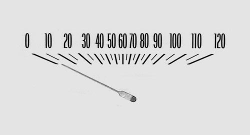
My dad had a bunch of different cars when I was growing up and I remember staring at this particular speedometer for hours…I loved the way the numbers scrunched together in the middle. (via ★vuokko)
Newer posts
Older posts
Socials & More