Type design game
Remember the kerning game? The same folks have built a letter shaping game where you can play at being a type designer. I found this to be a bit more difficult than kerning.
This site is made possible by member support. 💞
Big thanks to Arcustech for hosting the site and offering amazing tech support.
When you buy through links on kottke.org, I may earn an affiliate commission. Thanks for supporting the site!
kottke.org. home of fine hypertext products since 1998.
Beloved by 86.47% of the web.
Remember the kerning game? The same folks have built a letter shaping game where you can play at being a type designer. I found this to be a bit more difficult than kerning.
James Higgs wrote a provocative piece on something that I’ve noticed recently as well: the two sides to Apple’s design aesthetic. On the one hand:
[Apple’s] devices have become increasingly simple and pared down, even as the power contained in them has increased. There is very little, if anything, extraneous on the Magic Trackpad or the MacBook Air. And of course the iPhones 4 and 4S are radically simple, yet well-constructed masterpieces of industrial design.
Yet, when it comes to stuff that isn’t hardware:
But no one laughs when Apple delivers a calendar application for the iPad that tries its hardest to look like a real-word desktop calendar pad, complete with fake leather and “torn” pages.
Still fewer have a chuckle when they see the new Address Book app on Mac OS X Lion, or the even more recent Find My Friends iPhone app.
These apps, and many more besides, all stem from a completely different, and I would say opposite aesthetic sensibility than the plain devices they run on.
They are an expression of purest kitsch, sentimentality, and ornamentation for its own sake. In Milan Kundera’s brilliant definition, kitsch is “the absolute denial of shit”. These are Disney-like apps, sinister in their mendacity.
This isn’t a recent thing either…look at the cheeseball themes and transitions in Keynote (many of them used by Jobs in his keynotes), some of the default system fonts, the emphasis in past keynotes on things like Mail.app themes, etc. Without too much effort, you could pull together many design examples from their currently shipping software that make it appear as though Apple doesn’t have a good aesthetic sense of design at all. But then you look at the general aesthetics of OSX and iOS…I don’t know, it’s really confusing how the same company, especially one that had such strong design leadership, could produce something as beautifully spare as iOS and something as cheesy as the Game Center app. (via ★thefoxisblack)
After years of inactivity, K10k, the venerable design portal, has finally been permanently shuttered. Sad to see it go…K10k was one of a handfull of sites that most influenced my design/online efforts in the 90s.
MoMA is live-streaming the Talk to Me symposium all day today.
This evening and daylong program features presentations, conversations, interviews, and performances on the subjects of design and script writing, cognitive science, gaming, augmented reality, and communication.
Oobject has a collection of Dieter Rams’ distinctive work for Braun.
Dieter Rams’ 40 year stint at Braun until 1995 redefined the world of product design, taking pure modernism to the world of gadgets. He is the direct inspiration for much of Apple’s product design after Steve Jobs returned and in many aspects his work is more rigorous and more coherent than Apple’s.
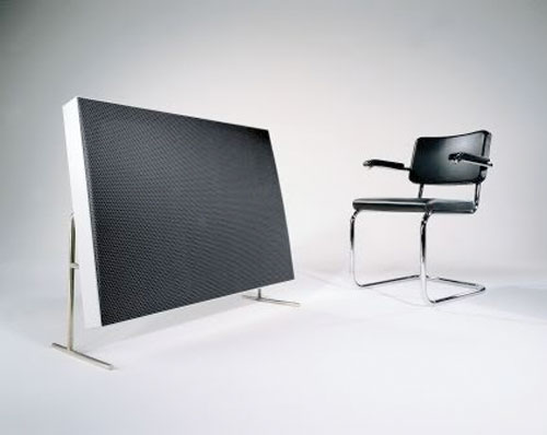
I hadn’t seen this massive speaker before:
A lovely collection of hand-lettered American department store logos from the late 19th and early 20th century.
![]()
Kern Type is a game that compares your kerning efforts to those of professional designers. It’s surprisingly fun. (thx, damien)
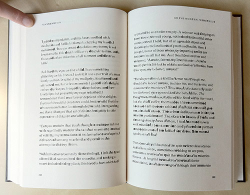
From Fathom, a copy of Mary Shelley’s Frankenstein constructed from found type on the web…as the book goes on, the type gets less legible.
The incomplete fonts found in the PDFs were reassembled into the text of Frankenstein based on their frequency of use. The most common characters are employed at the beginning of the book, and the text devolves into less common, more grotesque shapes and forms toward the end.
Title Scream is a collection of 8-bit video game title screens. Not just static images either…animated GIFs, yo.
A couple years ago, I pointed to a 10-minute clip of a longer documentary called The Social Life of Small Urban Spaces. Some kind soul has put the whole thing up on Vimeo.
This witty and original film is about the open spaces of cities and why some of them work for people while others don’t. Beginning at New York’s Seagram Plaza, one of the most used open areas in the city, the film proceeds to analyze why this space is so popular and how other urban oases, both in New York and elsewhere, measure up. Based on direct observation of what people actually do, the film presents a remarkably engaging and informative tour of the urban landscape and looks at how it can be made more hospitable to those who live in it.
Update: The Vimeo video has been taken down, but you can find it on The Internet Archive.
Inspired in part by my post on the original Twitter homepage, Serge Keller collected a bunch of screenshots of early web sites, including the very first web page, an early Microsoft design, and the White House’s initial site. Some sites haven’t changed all that much…Amazon and Craigslist in particular have retained much of the design DNA over the years.
Moritz Resl took all of the fonts installed on his computer and averaged them together to make a new font: the average font.

The full alphabet is available on Flickr. (via stellar)
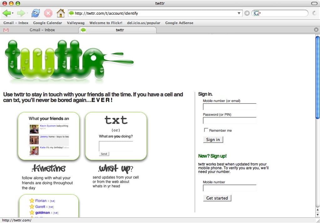
Or at least a very early version. From humble beginnings…
ps. Here’s an early Facebook screenshot, an early Google homepage, and Yahoo’s homepage circa 1994, and an early screencap of Tumblr’s dashboard.
Update: If you look at the screenshot closely, there’s a familiar name at the top of the “What your friends…” box: Instagram co-founder Kevin Systrom (his Twitter user id is 380…meaning that he was one of the first 400 people to sign up for the service).
Absolutely beeeeeyooootiful typography on these Sanborn fire insurance maps.
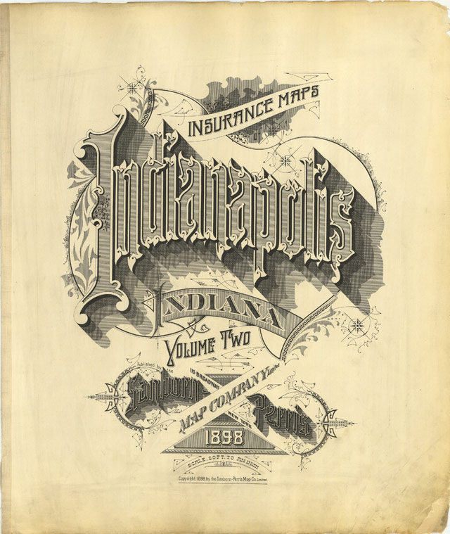
Sanborn’s fire insurance enterprise produced not only excellent and detailed urban maps, but they also maintained an elegant aesthetic in the headings and legends on the maps themselves, and in the title pages of the (larger) city volumes. The ornamental flair is diverse — I don’t think any of the examples above repeat type styles — and lends an air of individuality and refinement to each of the towns surveyed.
Although this sort of artistic embellishment was unlikely to have increased map sales on its own, it’s a charming addition which will have perhaps made the purchasers feel a sense of pride and a little more secure about their own unique town. And it’s certainly in keeping with the cartographic tradition of decorative trimmings.
Chris Ware must have a stack of these babies near his drawing table from which to crib.
There’s been a lot written about Steve Jobs in the past week, a lot of it worthy of reading, but one piece you probably didn’t see is David Galbraith’s piece on Jobs’ similarity to architect Norman Foster. The essay is a bit all over the place, which replicates the experience of talking to David in person, but it’s littered with insight and goodness (ditto).
The answer is what might be called the sand pile model and it operated at Apple and Fosters, the boss sits independently from the structural hierarchy, to some extent, and can descend at random on a specific element at will. The boss maintains control of the overall house style by cleaning up the edges at the same time as having a vision for the whole, like trying to maintain a sand pile by scooping up the bits that fall off as it erodes in the wind. This is the hidden secret of design firms or prolific artists, the ones where journalists or historians agonize whether a change in design means some new direction when it just means that there was a slip up in maintaining the sand pile.
And I love this paragraph, which integrates Foster, Jobs, the Soviet Union, Porsche, Andy Warhol, Lady Gaga, and even an unspoken Coca-Cola into an extended analogy:
Perfecting the model of selling design that is compatible with big business, Foster simultaneously grew one of the largest architecture practices in the world while still winning awards for design excellence. The secret was to design buildings like the limited edition, invite only Porsches that Foster drove and fellow Porsche drivers would commission them. Jobs went further, however, he managed to create products that were designed like Porsches and made them available to everyone, via High Tech that transcended stylistic elements. An Apple product really was high technology and its form followed function, it went beyond the Porsche analogy by being truly fit for purpose in a way that a Porsche couldn’t, being a car designed for a speed that you weren’t allowed to drive. Silicon Valley capitalism had arguably delivered what the Soviets had dreamed of and failed, modernism for the masses. An iPhone really is the best phone you can buy at any price. To paraphrase Andy Warhol: Lady Gaga uses an iPhone, and just think, you can have an iPhone too. An iPhone is an iPhone and no amount of money can get you a better phone. This was what American modernism was about.
Nice profile of BERG in the NY Times by Alice Rawsthorn.
Berg and its peers use design in the traditional way as a tool in the translation process, but they have also developed new means of enabling people to engage with technology, and to feel confident about using it. Mostly Berg does so by making complex technologies seem playful and humorous.
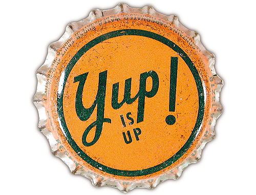
I love this bottlecap collection assembled by Gail Anderson (more here).
Lovely bits of graphic design.
Steven Heller writes about the 40th anniversary of Nike’s iconic swoosh, one of the best logos ever designed.
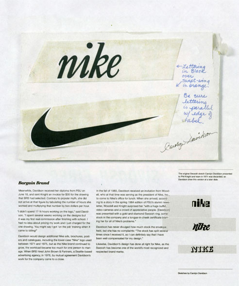
The origin of the mark goes like this: Knight wanted to differentiate BRS’s custom product from the ones they were importing from Onituska in Japan: “…so Knight turned to a graphic design student he met at Portland State University two years earlier.” One day in 1969, the student, Carolyn Davidson, was approached by Knight and offered $2 per hour “to make charts and graphics” for his business. For the next two years Davidson managed the design work on BRS. “Then one day Phil asked me if I wanted to work on a shoe stripe,” Davidson recalled. The only advice she received was to “Make the stripe supportive of the shoe.” Davidson came up with half a dozen options. None of the options “captivated anyone” so it came down to “which was the least awful.”
(via megadeluxe)
Art of the Menu is a new collection of well-designed menus by the folks who bring you Brand New. Two of the most interesting menus I’ve run across are Shopsins’ (the design of which I wrote about several years ago) and Alinea’s (the menu is an infographic).
Allison Arieff argues that companies and their workers should worry less about office design and focus more on how people want to work.
Two other factors often undervalued (and often ignored) in the workplace? Family and time. Architect Iris Regn and artist Rebecca Niederlander have been working to bring these into the conversation by exploring the intersection between creativity and family life in an ongoing collaborative effort they call Broodwork.
Don’t be put off by the awkward name. Broodwork suggests that, far from being the hindrance it’s often presented as, incorporating family into work can have overwhelmingly positive effects. Regn is trained as an architect but is open enough in her thinking to understand that in the scheme of things, the adjustability of her desk isn’t going to have an impact on her creative process nearly as much as what her daughter might say tonight at the dinner table.
“The first impetus [of Broodwork] was to get people to acknowledge interweaving of creative practice and family life,” she told me. “Not to have to hide [your family] when you have to go pick up your kid while at a meeting, for example. That raised eyebrow is going away. Yes, you’re juggling. That’s just part of the deal. When you talk to other parents, everyone knows the deal so why is it that in a professional setting that can’t be brought to the table?
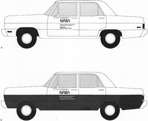
There are only a few images, but even this brief look at a mid-70s NASA graphic standards manual is tantalizing.
(via stellar)
Andy Clymer of H&FJ built a prototype tool that uses facial recognition to design fonts.
(via h&fj)
Tattly is selling “designy, cool, typographic” temporary tattoos from designers including Frank Chimero, Jessica Hische, and Chris Glass.
More about Tattly at Swissmiss:
After applying many bad-clip-art tattoos on my daughter Ella, I decided to stop complaining and take matters into my own hands. I was ready to put designy, cool, typographic tattoos on my daughter, or myself for that matter. The idea for Tattly was born.
Charlie Park takes a look at a type of chart that Edward Tufte developed for his 1983 book, The Visual Display of Quantitative Information. Unlike sparklines, another Tufte invention/coinage, slopegraphs didn’t really take off.
It’s curious that it hasn’t become more popular, as the chart type is quite elegant and aligns with all of Tufte’s best practices for data visualization, and was created by the master of information design. Why haven’t these charts (christened “slopegraphs” by Tufte about a month ago) taken off the way sparklines did? In this post, we’re going to look at slopegraphs — what they are, how they’re made, why they haven’t seen a massive uptake so far, and why I think they’re about to become much more popular in the near future.
Can’t remember who tipped me off to this (Cederholm? Hoefler? Pieratt?), but Colossal is a top-notch visual art/design blog. There are a dozen things on the first two pages that could slide right into kottke.org quite easily. He’s on Stellar too!
View the whole thing at at Core77 and Fueled By Coffee (the rest of which is worth a look). (via mlkshk)
The major types of wine bottle label include Animals Doing Things, Indie Designer, and the Euro-Trash A-hole.
A rare sighting, the A-Hole label is usually more than a label. Often, the whole bottle is some unique shape. Look! I’m a wine bottle in the shape of a shampoo bottle! Deal with it! Whatever. What to Expect: I wouldn’t know, for I do not condone this sort of behavior. And neither should you.
(via @hodgman)
Socials & More