kottke.org posts about design
3-Way Street is a fascinating video by Ron Gabriel that highlights bad interactions between cars, bikes, and pedestrians at a typical NYC street intersection.
There are lots of ways to show these interactions…the overhead view and highlighting are particularly effective design choices. Well done. (thx, janelle)
Chris Ayers is designing posters, logos, and magazine spreads for the fictional people, places, and things in David Foster Wallace’s Infinite Jest, including movie posters for Himself’s films, a magazine layout for an article on Orin, and this poster for the Whataburger Southwest Junior Invitational tennis tournament:

(via @tcarmody)
Olmsted designed NYC’s Central Park and Prospect Park and was the father of American landscape architecture. 37signals recently collected some lessons from Olmsted’s approach to his work.
Olmsted believed the goal wasn’t to make viewers see his work. It was to make them unaware of it. To him, the art was to conceal art. And the way to do this was to remove distractions and demands on the conscious mind. Viewers weren’t supposed to examine or analyze parts of the scene. They were supposed to be unaware of everything that was working.
The recent uploads by your contacts is the most important page on Flickr and it’s broken. Timoni West is a designer at Flickr and she wrote a brief post on that page’s problems.
The page fails on a fundamental level — it’s supposed to be where you find out what’s happened on Flickr while you were away. The current design, unfortunately, encourages random clicking, not informed exploration.
The page isn’t just outdated, it’s actively hurting Flickr, as members’ social graphs on the site become increasingly out of sync with real life. Old users forget to visit the site, new sign ups are never roped in, and Flickr, who increased member sign-ups substantially in 2010, will forego months of solid work when new members don’t come back.
Many of my friends have switched their photo activities to Instagram and, more recently, Mlkshk. And Flickr’s broken “what’s new from your friends” page is to blame. Both of those sites use a plain old one-page reverse-chronological view of your friends’ photos…just scroll back through to see what’s going on. The primary advantage of that view is that it tells a story. Ok, it’s a backwards story like Memento, but that kind of backwards story is one we’re increasingly adept at understanding. The Flickr recent uploads page doesn’t tell any stories.
As long as we’re talking about what’s wrong with Flickr — and the stories thing comes in here too — the site is attempting to occupy this weird middle ground in terms of how people use it. When Flickr first started, it was a social game around publishing photos. You uploaded photos to Flickr specifically to share them with friends and get a reaction out of them. As the service grew, Flickr became less of a place to do that and more of a place to put every single one of your photos, not just the ones you wanted friends to see. Flickr has become a shoebox under the bed instead of the door of the refrigerator or workplace bulletin board. And shoeboxes under beds aren’t so good for telling stories. A straight-up reverse-chron view of your friends’ recent photos probably wouldn’t even work on Flickr at this point…you don’t want all 150 photos from your aunt’s trip to Kansas City clogging up the works. Instagram and Mlkshk don’t have this problem as much, if at all. (via @buzz)
Joshua Yaffa profiles Edward Tufte for The Washington Monthly.
After the publication of Envisioning Information, Tufte decided, he told me, “to be indifferent to culture or history or time.” He became increasingly consumed with what he calls “forever knowledge,” or the idea that design is meant to guide fundamental cognitive tasks and therefore is rooted in principles that apply regardless of the material being displayed and the technology used to produce it. As Tufte explains it, basic human cognitive questions are universal, which means that design questions should be universal too. “I purposely don’t write books with names like How to Design a Web Site or How to Make a Presentation,” he told me.
Sippey posted a brief item on pagination navigation on “river of news” type sites, comparing the opposite approaches of Stellar and Mlkshk. I thought a lot about where to put those buttons and what to label them. There’s no good correct answer. For example, “older” usually points the way to stuff further back in the timeline that you haven’t read, i.e. it’s new to you but old compared to the first page of stuff…are you confused yet? I focused on two things in choosing a nav scheme:
1. The Western left-to-right reading pattern. If you’re in the middle of reading a book, the material to your left is a) chronologically older and b) has already been read and the material to your right is a) chronologically newer and b) unread. From a strict data perspective, a) is the correct way to present information but websites/blogs don’t work like books. b) is how people actually how people use blogs…when a user gets to the bottom of the page, they want to see more unread material and that’s naturally to the right.
2. Consistency. Once you add page numbers into the mix — e.g. “< newer 1 2 3 4 older >” — it’s a no-brainer which label goes where. I don’t think I’ve ever seen the reverse: “< older 4 3 2 1 newer >”.
Also, I do whatever Dan Cederholm does. (But dammit, he does the opposite on his blog! Hair tearing out noise!!) That said, I like Sandy’s suggestion of getting rid of the “newer” button altogether:
We put “Older” on the right, but did away with “Newer” altogether in favor of a link back to page 1. If they want to go back to the previous pages, people can use their back button.
http://mlkshk.com/p/212C
Or maybe put “newer” at the top of the page? Still a waste of screen real estate? Anyway, once I figure out how I want to do infinite scrolling on Stellar, those problematic older/newer buttons will go away. Huzzah!
This wedding invite designed by Kelli Anderson has a 45 RPM record player built right into it.
Here’s more info on how the musical invite was constructed.
The resulting booklet is comprised of a cover, two inner pages, a letterpressed band (with instructions and a tear-off RSVP postcard), and a flexdisc on a screwpost. The recipient bends the second page of the booklet back to create a tented “arm.” With the needle placed, they then carefully spin the flexidisc at 45 RPM (ish) to hear the song. The sewing needle travels the length of the song and produces the sound. Its vibrations are amplified by the thin, snappy paper to which it is adhered. To keep the needle down on the record, we reinforced the back of the “tent” with a spray-mounted half page of heavier cardstock. To reduce friction between the acetate flexidisc and the backing cover, we had the inside of the booklet laminated to be slick and conducive to hand-spinning.
(via stellar)
A dad shares his list of what good toddler iPhone/iPad apps should do and not do.
Move all settings out of the app. For iOS at least, you can move settings out of the app and into the general settings window. Please do this because toddlers are drawn to your little setting icons, and they a) destroy the flow of the app and b) the toddler will change all of them and put the app into an annoying state, e.g. in another language, too hard for them, etc.
(via @tcarmody)
Marie Mundaca designed a few of David Foster Wallace’s books, including The Pale King.
As it turned out, it was too distracting and sad for me to read while I was designing it. Wallace’s tiny, pointy notes were all over the manuscript copy, mostly name changes and corrections and small additions. One character, Elise Prout, used to be a “G3,” and a phrase that said “been squashed like a cartoon character” was changed to “worn the brown helmet.” His notes reminded me of the post-it notes that would come back to me on galley pages of the essay “Host” from Consider the Lobster — notes that said things like “Totally bitchingly great” — and I remembered that I no longer lived in a world where David Foster Wallace was alive.
(thx, mike)
…is a newspaper from Portugal called i.
Designers are clearly thinking about the way two facing pages work together, whether the stories are related or not. This creates a flow that encourages reading without interruption.
i is composed like a beautiful piece of music. It has the discipline to play only the high notes that matter most. For example, it uses its full bleed capability sparingly. It creates strong impact, even with small things. The surprise of occasional whimsy makes the content inviting.
(via good)
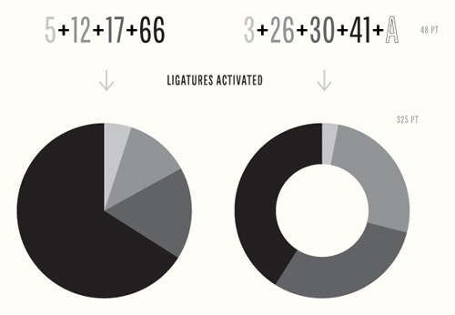
Chartwell is a type family you can use to build all kinds of graphs and charts. Stringing letters and numbers together into ligatures, you can make things like this:
Not quite sure how these are done — it looks like each vertical slice is representative of the colors in a given frame from the film — but these moviebarcodes provide a good sense of a movie’s tone and color. This one is…any guesses?
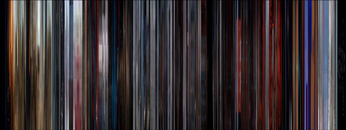
It’s 2001: A Space Odyssey. An unexpectedly colorful film. BTW, prints are available. Oh and see also Brendan Dawes’ Cinema Redux.
Update: Here’s how you can make your own (w/ downloadable source code). (thx, @seoulfully)
The Daily Mail has a profile of Apple’s lead designer, Jony Ive…some bits in there that I hadn’t read before, including this strange anecdote about a bad meeting that may have led to Ive’s departure to Apple:
‘We lost a great talent,’ says Grinyer. ‘We virtually created our own consultancy, Tangerine, just so that we could employ Jony (as Ive prefers to be called). And if I had to put my finger on why and where we lost him it would have to have been one day at Ideal Standard in Hull.
‘Tangerine had a consultancy contract with the bathroom-fittings company to design a toilet. I was there when Jony made an excellent presentation to this guy who was wearing a red nose because it was Comic Relief day. This clown then decided to throw his weight around and pulled apart Jony’s design. It was ridiculous. Britain lost Jony Ive then and there.’
Here’s a collection of video and stills from most of the movie title sequences created by Saul Bass.
“PROJECTIONISTS - PULL CURTAIN BEFORE TITLES”.
This is the text of a note that was stuck on the cans when the reels of film for “The Man With the Golden Arm” arrived at US movie theatres in 1955. Until then the credits were referred to as ‘popcorn time.’ Audiences resented them and projectionists only pulled back the curtains to reveal the screen once they’d finished. Saul Bass’ powerful title sequence for “The Man With the Golden Arm” changed the way directors and designers would treat the opening titles.
Designer Jessica Walsh shares the photo setup she uses to document her work.
I cobbled together this set up out of the desire to properly archive my design work. Next thing I knew I started getting paid for it, and it became an integral part of my work. I am simply listing my equipment and a little bit about what I know to get some designers started in figuring out the best way to shoot their own work.
You can see the gorgeous results in her portfolio.
magCulture has a pre-release look at the new NY Times Magazine.
Redesigns are always interesting, and non more so than when a title as significant and influential as the NYT makes changes. Duplessis has worked with new editor Hugo Lindgren (ex-Bloomberg Business Week and New York magazine) to provide a new vision for the title, researching the magazine’s archive and becoming fascinated by its 60s and 70s incarnations.
For some reason, it reminds me of Monocle, even though it probably shouldn’t? (thx, @nedward)
For the past five years, Michael Bierut has taught a class for aspiring designers where students have to record the results of “a design operation that [they] are capable of repeating every day” for 100 straight days. Here are some of the results.
Zak Klauck: “Over the course of 100 days, I made a poster each day in one minute. The posters were based on one word or short phrase collected from 100 different people. Anyone and everyone was invited to contribute.” The perfect exercise for a graphic designer.
Well worth a listen: Dan Benjamin interviews Mike Monteiro on The Pipeline podcast about his design work and Twitter infamy. The last 10 minutes or so, where Mike calls out designers who don’t talk to clients, is gold. One of the reasons I got out of design is that I was never very good at that part of the job and as Mike says, you have to be able to not only accept but embrace selling your designs to truly succeed.
While we’re being all nostalgic, here’s what Gizmodo looked like when it launched:
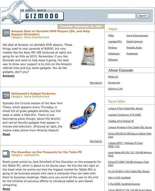
The site, which launched several months before Gawker, was designed & developed by Ben and Mena Trott with the couple’s relatively new blogging software, Movable Type.
With all the buzz around the new Gawker design, I figured I’d dig out the first design I ever showed Nick for the site back in October of 2002:
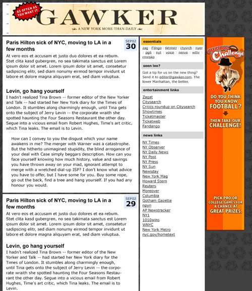
Nick didn’t like it too much. Background too dark, masthead text not logo-y enough. Two weeks later, I sent him this, with a half-assed technicolor logo that I’d dashed off in Photoshop in like 30 minutes:
To my shock, he loved it — so much so that they’re still using the damn thing! — and that design was very close to how the site looked when it launched.
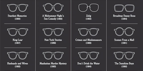
A selection of Woody’s movie eyewear from the full poster.
(thx, ben)
If Mandelbrot and Mondrian had a baby, it might look a little something like this:
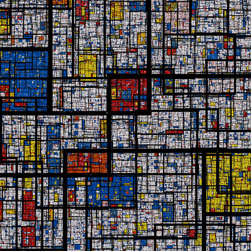
Awesome. There’s also a zoomable version but not a very deep one…would be nice to have an infinitely zoomable version in Processing or something.
Steven Heller had heard rumors of a Nazi graphics standards manual for years and finally tracked one down.
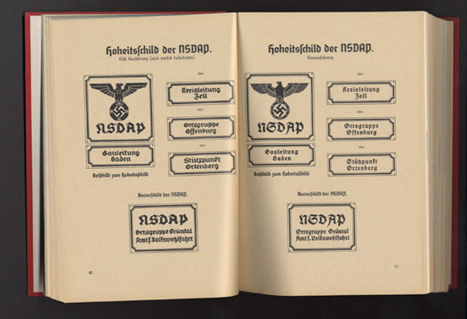
Published in 1936, The Organizationsbuch der NSDAP (with subsequent annual editions), detailed all aspects of party bureaucracy, typeset tightly in German Blackletter. What interested me, however, were the over 70 full-page, full-color plates (on heavy paper) that provide examples of virtually every Nazi flag, insignia, patterns for official Nazi Party office signs, special armbands for the Reichsparteitag (Reichs Party Day), and Honor Badges. The book “over-explains the obvious” and leaves no Nazi Party organization question, regardless of how minute, unanswered.
More photos and a copy for sale here.
Nicholas Felton has been doing personal annual reports since 2005. But for 2010, he did a report of his late father’s life utilizing various documents (birth certificates, notebooks, slides, etc.).
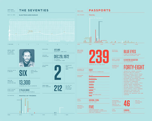
This is a marvelous document. Here’s a photo of some of the source materials.
Some lovely drawings from Dana Tanamachi, a graphic designer and “custom chalk letterer”.
Here’s a timelapse of Tanamachi at work. (via @h_fj)
An infographic that stitches together the 15 films that the Coen brothers have made.
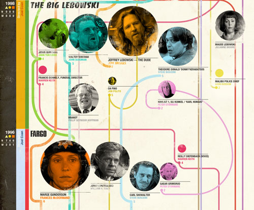
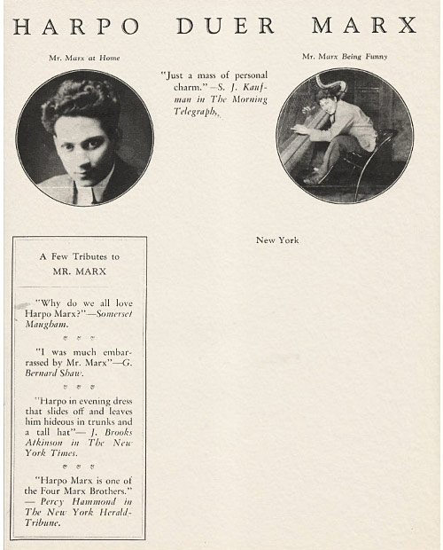
I love the reviews and mentions down the left-hand side…”Harpo Marx is one of the Four Marx Brothers.” (via if charlie parker…)
A long photo essay on the hallways and corridors of science fiction movies and television.
Alien started the kind of corridor-fetishism in screen sci-fi that Kubrick had failed to start with 2001: A Space Oddyssey, since the latter film was so visionary and expensive that practically no-one could even attempt to imitate it.
Instead Roger Christian got inventive with his lower budget and strip-mined an aircraft graveyard, strewing Alien’s Nostromo with sections and detailing from WWII bombers. This usage of full-sized ‘nurnies’ followed the long-established visual effects practice of cannibalising parts from model kits (most especially WWII tanks and destroyers) in order to provide ready-made detailing without resort to custom-crafting and vacuum-forming every last valve and pipe. By the time the 1980s set in, Alien’s strip-mined tech was practically de rigeur for screen sci-fi…
(via @moleitau)
Soap bars are more efficient than liquid soap dispensers but are also a messy pain in the ass. Enter design student Nathalie Stämpfli’s Soap Flakes. It works like a pump dispenser and grates a small amount of soap into your hand when you pump the handle.

Today, most of the soap we use is liquid soap, which contains a lot of water. Block soap instead is more concentrated and therefore has some ecological benefits: You don’t transport unnecessary water around. In place of plastic bottles you can simply use paper for packaging. The solid blocks can easily be piled and allow a greater space efficiency in a truck.
But what about the usage of soap bars? I don’t like the weird slippery feeling when I use them. It gives me goose bumps. And under the shower, it always slides out of your fingers. Hand soap also often gets dirty and accumulates bacteria when more than one person is using it.
Newer posts
Older posts
Socials & More