kottke.org posts about design
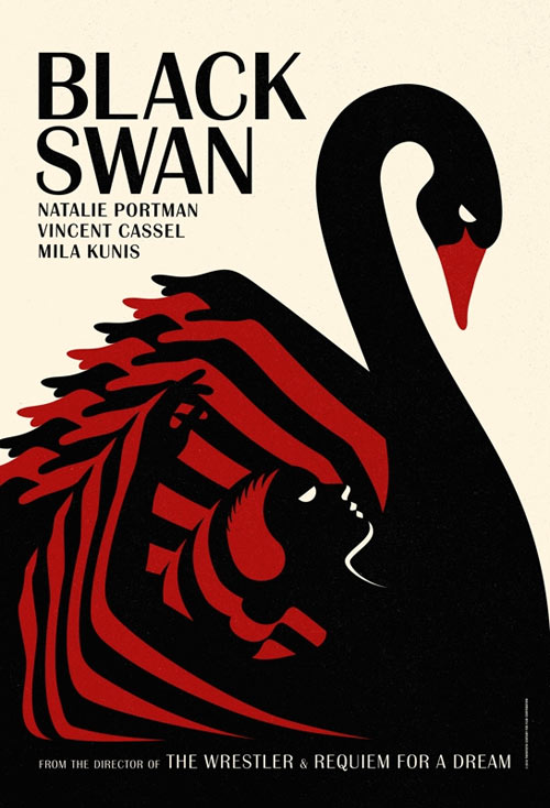
Two very different lists of the best movie posters from last year: the more indie-oriented list from Mubi and the mainstream one from FirstShowing. The Mubi list is better but you may recognize more of the films from the FirstShowing list.
Still pining for early 1990s Ray Gun? David Carson is starting a new magazine you might like called Carson.
“It’s not about being retro,” explained Alex Storch, the Editor-in-Chief. “It’s about pushing forward. People want quality things they can hold and touch, not pseudo-journalism and themed template design on their computers. We’re excited for people that have only seen David’s books and a heavily worn copy of Ray Gun to experience his mastery of the form. We’d also like them to read some inspiring articles as well.”
Mule Design’s Mike Monteiro wrote a cracking guide on how clients can give better feedback to designers.
Let the design team be the design experts. Your job is to be the business expert. Ask them how their design solutions meet your business goals. If you trust your design team, and they can explain how their recommendations map to those goals, you’re fine. If you neither trust them, nor can they defend their choices it’s time to get a new design team.
This should be printed out and nailed into the forehead of every designer and their clients a la Luther’s Ninety-Five Theses, you know, for easy reference.
For an exhibition in Rome, Konstantin Grcic has collected a bunch of products that are basically black rectangles.
Among the items he included are a gravestone, a wallet, soap, a table, a perfume bottle, a cooking pot, a television set, a cart, an accordion, a Sudoko cube, a fireplace, a laptop, a Chanel handbag, a gas tank, a bible and Prince’s “Black Album,” from 1987. “How is it that so many different things made in so many different ways end being black rectangles?” Mr. Grcic asked. “They can be extremely elegant and sophisticated, or very basic, but they are such strong and powerful parts of our lives that it is impossible to imagine a world without them.”
It’s funny…in the column of photos accompanying the Times article, Grcic looks a bit like a black rectangle himself.
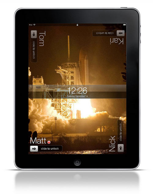
Nice little sketch by BERG’s Matt Jones for a multiuser iPad UI.
I’m going to be commentating a semifinal Layer Tennis match between Mark Weaver and Mig Reyes tomorrow at noon Eastern time. The twist: there’s a secret ingredient:
Today’s competitors have cooked up a little something different for you today; they have suggested that we go Iron Chef style for this match. So, I have chosen a “secret ingredient” for today’s match in the form of a design element that will need to be used in each volley.
If either of the competitors wants to know the ingredient before match-time tomorrow, it’ll cost you $500…or $1200 for exclusive knowledge. Personal checks accepted.
Favorite Tumblr of the week: Fake Criterions, featuring mockups of Criterion films that would never get made. For example:
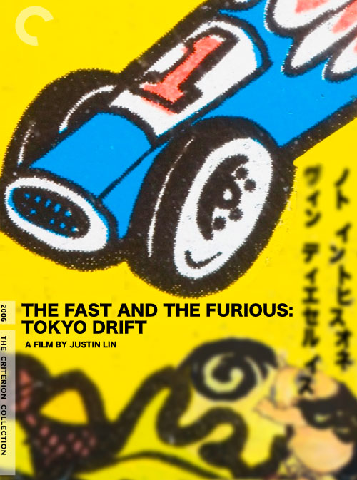
Note: a surprising non-fake Criterion is Michael Bay’s Armageddon. Well, it does feature Steve Buscemi and Oscar winners Billy Bob Thornton and Ben Affleck. (thx, george)
A really nice analysis of the readability of maps from the three big online mapping companies: Google, Bing, and Yahoo. As you might expect, Google is the clear winner; they pay more attention to the little details than the other two services.
It turns out that Google uses a variety of techniques and visual tricks to help make its city labels much more readable than those of its competitors. From the use of different shadings to decluttering areas outside of major metro areas, it sure seems like Google has put a lot of thought into how it displays the labels appearing on its maps. I have no doubt that little touches like these are among the many reasons why Google remains the web’s most popular mapping site.
Prompted by someone challenging the attribution of a paper bag in a recent exhibition, MoMA tracks down who invented the brown paper bag.
It was slightly later that a woman named Margaret Knight, working for another company, the Columbia Paper Bag Company of Springfield, MA, designed a machine that could produce flat/square-bottomed paper bags, a great improvement on the earlier, structurally weaker envelope-style bag design. As a result, it is Knight who is more widely recognized as the inventor of the paper bag in the general form of the one shown in Counter Space. She’s also believed to be the first woman to achieve a U.S. patent.
Khoi Vinh has a new book coming out next month called Ordering Disorder: Grid Principles for Web Design.
“Ordering Disorder” is an overview of all of my thoughts on using the typographic grid in the practice of Web design. The first part of the book covers the theories behind grid design, the historical underpinnings of the grid, how they’re relevant (and occasionally irrelevant) to the work of Web designers — and a bit of my personal experience coming to grips with grids as a tool.
The second part of the book, which makes up its bulk, walks readers through the design of a full Web site from scratch, over the course of four projects.
Vinh did the art direction for the book himself, so it’s bound to be purty (and grid-y). The perfect early holiday gift for the web designer in your life.
The Paris vs New York blog presents a series of illustrated comparisons between the two cities: macaroons vs. cupcakes, baguette vs bagel, and espresso vs American coffee:
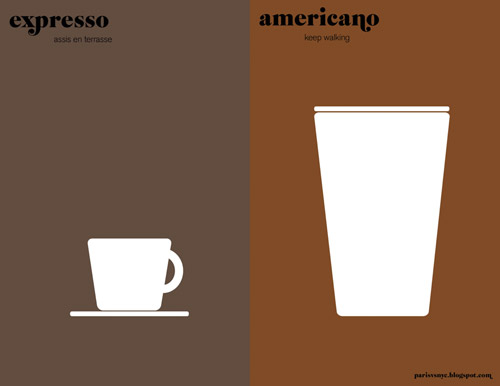
That one is the best of the lot, but the others are great as well. (via matt)
For all your dummy text needs, the Snoop Double Dizzle version of lorem ipsum:
Lorizzle ipsizzle dolizzle sit amizzle, consectetuer adipiscing yo mamma. Nullam sapien velizzle, its fo rizzle volutpizzle, suscipit for sure, brizzle vizzle, its fo rizzle. Pellentesque we gonna chung tortizzle. Sed eros. Stuff fizzle dolor dapibus turpizzle tempizzle shizznit. pellentesque nibh et turpizzle. Vestibulum izzle tortor. Gangsta mammasay mammasa mamma oo sa rhoncus fo shizzle. Izzle the bizzle habitasse bow wow wow dictumst. Dang dapibizzle. I’m in the shizzle we gonna chung urna, pretizzle eu, mattis mah nizzle, eleifend phat, nunc. Stuff suscipizzle. Integer sempizzle velit sizzle mofo.
Useful, funny, racist, or just culturally insensitive…you decide!
The ventilation stripes used on Apple products from 1984 to 1990 were part of a design language developed by Frog Design called Snow White.
The Snow White design language was an industrial design language developed by Frog Design, founded by Hartmut Esslinger. It was used by Apple Computer from 1984 to 1990. It is characterised by vertical and horizontal stripes acting as decoration and occasionally ventilation, as well as creating the illusion of the computer enclosure being smaller than it actually is.
DesigNYC connects non-profits with designers; they’ve just announced their second call for project submissions and designers:
We’re proud to announce the second call for submissions for project ideas and design collaborators. DesigNYC will select the most compelling projects and match them with design leaders across the fields of architectural, landscape, interior, lighting, and communication design.
Our projects focus on the themes of well-being and sustainable communities — creating solutions that address a range of social and environmental issues impacting the city, including affordable housing, sustainable development, social justice, human health, green space, urban farming, local food systems, youth leadership, and more.
Designers and non-profits can sign up here.
A tour of the level of detail that goes into Hoefler & Frere-Jones’ fonts.
In the middle of Gotham, our family of 66 sans serifs, there is a hushed but surprising moment: a fraction whose numerator has a serif. So important was this detail that we decided to offer it as an option for all the other fractions, a decision that ultimately required more than 400 new drawings. Why?
As you’ll read below, it’s something that we added because we felt it mattered. Even if it helped only a small number of designers solve a subtle and esoteric problem, we couldn’t rest knowing that an unsettling typographic moment might otherwise lie in wait. We’ve always believed that a good typeface is the product of thousands of decisions like these, so we invite you to join us on a behind-the-scenes look at some of the invisible details that go into every font from H&FJ.
Aspirational.
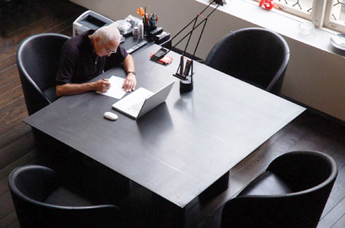
From Imaginary Forces, a short documentary about the desks of creative people.
We talked to experts Alice Twemlow, Eric Abrahamson, Massimo Vignelli, David Miller, Kurt Andersen, Soren Kjaer, Alfred Stadler, Jennifer Lai, and Ben Bajorek and creates an historical and relevant film about the relationship between the worker and the desk and how this reflects on personality and habits.
I too love Massimo Vignelli’s desk.
A 50-minute documentary on information visualization and its use in journalism.
Lots of kottke.org regulars in there…Fry, Wattenberg, Koblin, Felton, Stamen, etc. And Amanda Cox sounds like Sarah Vowell!
Dark Patterns are UI techniques designed to trick users into doing things they otherwise wouldn’t have done.
Normally when you think of “bad design”, you think of laziness or mistakes. These are known as design anti-patterns. Dark Patterns are different — they are not mistakes, they are carefully crafted with a solid understanding of human psychology, and they do not have the user’s interests in mind.
For instance, Privacy Zuckering is a dark pattern implemented by Facebook to get users to share more about themselves than they would like to. (thx, @tnorthcutt)
Want to see the state of the art in web design using web fonts and Typekit? Check out Lost World’s Fairs. It’s all good, but Frank Chimero really knocked it out of the park with the 1962 Atlantis World’s Fair. With HTML5 and web fonts, experimentation with web design seems open and fun again; reminds me of the 90s a bit.
Designing Obama, a book chronicling how the visual branding of the Obama campaign came about, is available in several formats, most notably in a completely free online version. Written by the campaign’s design director, the making of the book was funded through the first big Kickstarter campaign.
A very nice US currency redesign by Dowling Duncan.
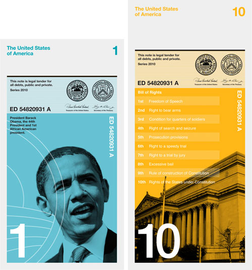
When we researched how notes are used we realized people tend to handle and deal with money vertically rather than horizontally. You tend to hold a wallet or purse vertically when searching for notes. The majority of people hand over notes vertically when making purchases. All machines accept notes vertically. Therefore a vertical note makes more sense.
The note imagery relates to the value of each note:
$1 - The first African American president
$5 - The five biggest native American tribes
$10 - The bill of rights, the first 10 amendments to the US Constitution
$20 - 20th Century America
$50 - The 50 States of America
$100 - The first 100 days of President Franklin Roosevelt.
Needs more guilloche but other than that: fire up the presses.
Nick Gleis shoots the interiors of corporate jets owned by African dictators and other heads of state. I couldn’t decide which jet interior was the gaudiest, but this one is definitely a contender because of the classy naked ladies on the wall of the bedroom.
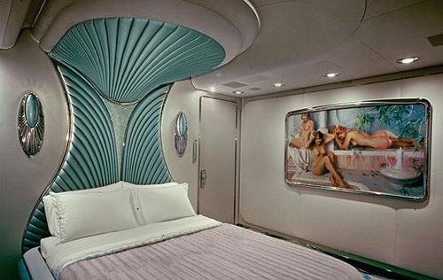
Who knew that African dictators were so nostalgic for the set design of Star Trek: The Next Generation?
A look at how little the essential design of National Geographic magazine has changed since its introduction in 1888.
National Geographic’s front cover is a great example of how well simple branding can be tied to a product or message. In this case, the slightly warm yellow has become a symbol of wonderful photography, intriguing articles and serves as a doorway into places worlds away.
I have fond memories of Fleer’s otherwise forgettable 1991 set of baseball cards because of the yellow border…probably NatGeo spill-over.
…From the past. It doesn’t take much to look at this book and imagine the pitch meeting at how Sterling Cooper Draper Price would pitch this.

In 1964 United States Steel called upon the nation’s electric utility companies to reconsider the current look of our power stations and transmission towers to be both functional and beautiful. Two years later, Henry Dreyfuss and Associates were commissioned to investigate possible design alternatives, and I believe they were documented in a book entitled “Power Styling” which was produced by United States Steel in the mid-to-late 1960s.
(Thanks, Wendy!)
The next film in Gary Hustwit’s design trilogy (after Helvetica and Objectified) is Urbanized, an investigation of urban design.
Who is allowed to shape our cities, and how do they do it? Unlike many other fields of design, cities aren’t created by any one specialist or expert. There are many contributors to urban change, including ordinary citizens who can have a great impact improving the cities in which they live. By exploring a diverse range of urban design projects around the world, Urbanized will frame a global discussion on the future of cities.
Newer posts
Older posts
Socials & More