Typographic mustaches
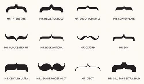
Many more are here; prints are available. (via submitted for your perusal)
This site is made possible by member support. 💞
Big thanks to Arcustech for hosting the site and offering amazing tech support.
When you buy through links on kottke.org, I may earn an affiliate commission. Thanks for supporting the site!
kottke.org. home of fine hypertext products since 1998.
Beloved by 86.47% of the web.
Meant to post about this when it was announced: the Brand New Conference, Nov 5 in NYC.
The Brand New Conference is a one-day event organized by UnderConsideration, focusing on the practice of corporate and brand identity — a direct extension of the popular blog, Brand New. The conference consists of eight sessions offering a broad range of points of view with speakers from around the world practicing in different environments, from global consultancies, to in-house groups, to small firms.
Speakers include boldface names Michael Bierut, Paula Scher, and Erik Spiekermann. Surprisingly, tickets are still available.
The legendary Braun designer talks about his craft.
A design should not dominate people.
And hey, I didn’t know that a book had been published on Rams’ work. I bet Jony Ive has at least three copies. (via monoscope)
I love these minimalist Mad Men posters by Christina Perry.
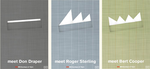
Prints are available. (via footnotes of mad men)
Artist and designer Tobias Wong killed himself last month. Or did he? Sleep can be a dangerous thing.
A really nice collection of prints** of collective nouns. This is a hush of librarians:
I also like the seemingly empty room of ninjas, but more for the term than the illustration. Several other great ones here, like:
a wunch of bankers
a deutschbag of nazis
a fixie of hipsters (coined here, actually)
a knot of string theorists
an array of geeks
**Wait, what’s the collective noun for prints? A charming of prints?
[I would] grab all the modern technology I could find, take it to the late 70’s, superficially redesign it all to blend in, start a consumer electronics company to unleash it upon the world, then sit back as I rake in billions, trillions, or even millions of dollars.
Fantastic. Much more here. (via df)
A lovely visual look at redesigning the map for the Moscow Metro. (thx, matt)
Peter Merholz says there should be a toddler mode for the iPad (and probably iPhone as well).
You know how iPhone and iPad have “airplane mode”, which turns off all connectivity? Right under that, I want “Toddler Mode”. When switched on, you’ll get a dialog letting you know you are entering Toddler Mode, and an explanation of how to get out. Unlike Airplane Mode, you can’t get out of Toddler Mode through settings, because there’s no way Toddler Mode should allow access to the settings panel. I haven’t figured out the best way out of Toddler Mode, but I’m thinking a quick triple-click on the home button, followed by a swipe, should work.
The problem with toddler mode is that the capabilities of kids change very quickly at that age. For instance, the home button is only a problem for a short time. My almost-3-yo son Ollie pretty quickly figured out that if he wanted to keep doing what he was doing, he had to lay off the home button. Now he knows exactly what it does: gets him back to the screen where he can pick a new activity. He also has no problem finding his apps…he knows exactly which of those icons mean fun and which do not.
(BTW, if you’re an interface/interaction designer and you haven’t watched a preschooler using a touchscreen device, you really should. It’s fascinating how quickly they learn some things and just can’t get the hang of other things. It’s a really eye-opening experience.)
If you’ve ever wanted to live in a rolling house that doesn’t take up much space and even has space on the outside for advertising, get thee to the U of Karlsruhe (non-German link here).
This cyclindrical design is a modular protype that provides flexible space within a minimum housing unit. Three different sections are dedicated to different functional needs: there’s a bed and table in section, an exercise cylinder, and a kitchen with a sink.

Yulia Brodskaya makes elaborate typographic creations entirely out of paper. She calls them PAPERgraphics.
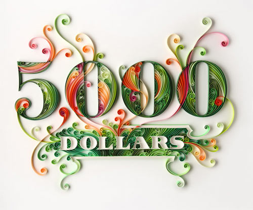
This is like Si Scott in 3-D.
IANAHRSYMMV**, but here are some well-known English language logos redesigned and translated into Hebrew language logos. Nice student work from a class taught by Oded Ezer.
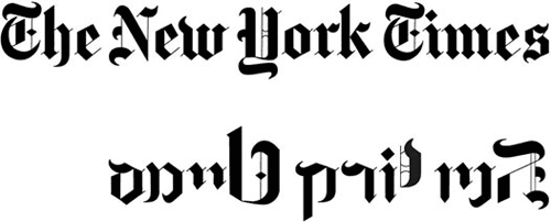
** I am a not a Hebrew reader so your mileage may vary.
Posters of classified ads from local newspapers, gussied up by a group of designers chosen by the Type Directors Club.
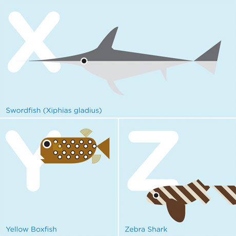
That’s from a lovely poster that James Mattison made for his daughter.
The theme and title of the piece was ‘Learn your A-B-Sea’ and took the format of an alphabet chart illustrated with fish and sea creatures that could be found in the local stretch of water, the Arabian Gulf.
(via @h_fj)
Phil Gyford’s spot-on critique of the number and quality of infographics currently choking the web. As Phil notes, far too many infographics decorate and don’t communicate.
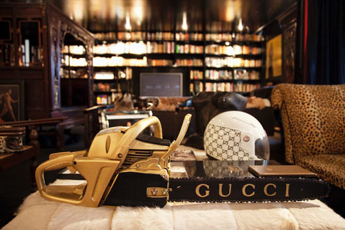
The Selby has some shots of Cindy Gallop’s apartment, which has to be one of most personality-drenched living spaces I’ve seen since Martha Stewart’s house. (Not that I’ve seen Martha Stewart’s house. But I can imagine.) Here is, for example, Gallop’s Gucci chainsaw:
There is also a video tour on Vimeo and a 2006 New York magazine article about how Gallop turned a former YMCA locker room into her “ultimate bachelorette pad”.
She had a specific vision for her new home. “I was looking for something dramatic,” she says. So she told her designer, Stefan Boublil of the Apartment, a creative agency in Soho, “When night falls, I want to feel like I’m in a bar in Shanghai.”
Dribbble (that’s 3 ‘b’s…triple letters are the new omit the vowels) is a show and tell site for designers to display their works-in-progress. The color tags are a fine idea; ex: red. Launched, I believe, just today after a lengthy closed beta.
Based on their great Mag+ concept unveiled late last year, Bonnier and BERG have developed a really nice looking iPad version of Popular Science. No page-turning business…you swipe left/right to page through stories and then scroll to read through single stories.
What amazes me is that you don’t feel like you’re using a website, or even that you’re using an e-reader on a new tablet device — which, technically, is what it is. It feels like you’re reading a magazine.
It’s nice to see the original concept come to life so quickly and completely. Get it in the App Store.
Now this is interesting…Fred Brooks, author of The Mythical Man-Month (which should be subtitled “If You Make Software As Part of a Team You Should Read This Book Immediately Like Now What Are You Waiting For Dummy?”) has a new book out called The Design of Design.
Effective design is at the heart of everything from software development to engineering to architecture. But what do we really know about the design process? What leads to effective, elegant designs? The Design of Design addresses these questions.
These new essays by Fred Brooks contain extraordinary insights for designers in every discipline. Brooks pinpoints constants inherent in all design projects and uncovers processes and patterns likely to lead to excellence. Drawing on conversations with dozens of exceptional designers, as well as his own experiences in several design domains, Brooks observes that bold design decisions lead to better outcomes.
The author tracks the evolution of the design process, treats collaborative and distributed design, and illuminates what makes a truly great designer. He examines the nuts and bolts of design processes, including budget constraints of many kinds, aesthetics, design empiricism, and tools, and grounds this discussion in his own real-world examples-case studies ranging from home costruction to IBM’s Operating System/360. Throughout, Brooks reveals keys to success that every designer, design project manager, and design researcher should know.
For your Lost party tonight: dozens and dozens of Dharma Initiative food labels that you can print out and affix to bottles and jars.
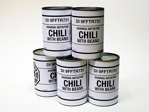
Includes steak sauce, cake mix, tuna, sake, and guacamole dip.
To prove a point about the utility of A/B testing, a marketing blogger helped a homeless man modify his begging approach and increased his earnings by over 100%.
What we did here was quite different than what most homeless people would do. We focused on a different angle. We already have the “I’m homeless, help me” stigma attached to people that are sitting on the side of the street with a cup, so we don’t necessary need to make that a prominent part of our banner. The next big difference is that we changed colors and went from cardboard to white to spark the interest of people walking by instead of automatically having negative associations that they have with cardboard and homeless people.
Writer Gay Talese did something similar last year. (via the browser)
This is stunning. A version of this was presented at SIGGRAPH in August 2009. (via jimray)
For my future reference: Well Placed Pixels, a blog highlighting beautiful software. (via df)
The Department of Architecture and Design at MoMA has made a, er, symbolic acquisition of the @ symbol.
The acquisition of @ takes one more step. It relies on the assumption that physical possession of an object as a requirement for an acquisition is no longer necessary, and therefore it sets curators free to tag the world and acknowledge things that “cannot be had” — because they are too big (buildings, Boeing 747’s, satellites), or because they are in the air and belong to everybody and to no one, like the @ — as art objects befitting MoMA’s collection. The same criteria of quality, relevance, and overall excellence shared by all objects in MoMA’s collection also apply to these entities.
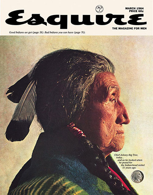
Legendary art director George Lois shares his memories about his twelve favorite Esquire covers.
He tells how the job came about: “I was a well-known advertising agency guy, and the former editor of Esquire, Harold Hayes, he called me up. We met at The Four Seasons, and he said, ‘Could you help me try to do better covers?’ I got this Bronx accent, and he had this southern drawl, and it must have been a funny discussion. ‘You have to go outside and find a designer, a guy who’s talented at graphic design, but understands politics, culture, and movies,’ I told him, and he said, ‘Do me a favor, could you do me just one cover?’ I said, ‘Okay, I’ll do you one.’”
Here’s one I’d never seen before, featuring Chief John Big Tree, the supposed model for the Indian Head nickel.
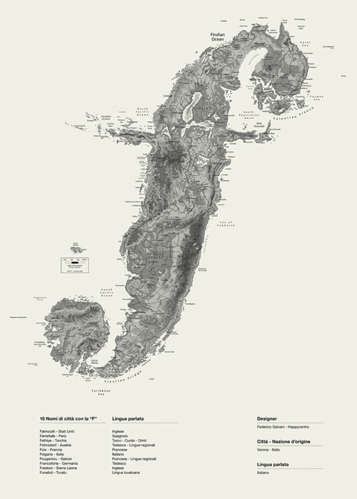
I like these Alphaposters by Happycentro, especially the gorgeous Lowercase F Island:
Socials & More