Slice and chop 2 medium onions into small pieces. Put a medium sized pan on a medium heat with a few glugs of olive oil. Add the onions to the pan, and a pinch of salt and pepper.
Magazine publishers Bonnier and BERG, a London design consultancy, have collaborated on a digital magazine prototype called Mag+. The conceptual device is impressive in its restraint and its truth to form and function.
We find that the graphical page-turning metaphors that you see quite frequently in web-based e-magazine readers are not terribly believable, and they don’t feel very honest to the form of the screen. […] Scrolling systems are more appropriate to what we’re dealing with.
Sing it, brother! Also of note is the way that the video takes the conventional “let me talk over some graphics” screencast and presents it in a much more compelling way.
“We continue to make subtle changes” Ashworth admits, “but we’re very wary about doing too much and are always happy to roll back changes if they end up not feeling ‘right.’
“The most recent major change was to the numbers 1 and 4 earlier this year. Not a lot of people noticed until a poster appeared advertising engineering work on the 14th of February — then I got A LOT of emails.”
Sometimes a book cover is so bad that it keeps you from reading the words within, even if those words are some of the best Twain ever wrote.
The cover of the Signet Classic [version of The Adventures of Huckleberry Finn] was a drawing of a ruddy-cheeked scamp, buck teeth prominent, clutching an apple, with a perky little newsboy tam cocked at a saucy Depression-era angle. Here Huck bore an alarming similarity to both Jerry Mathers of “Leave It to Beaver” and Britney Spears. Revolting. So once again my efforts to polish off this peerless classic were stymied. I could never get more than a few pages into the book before the illustration on the cover made me sick.
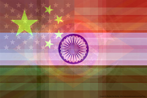
What the world needs is a great flag, a flag of pure bliss. Here’s one of the intermediate steps to the finished product; it’s an average of all the world’s countries’ flags weighted by population.
Greg Allen finally finished his version of Enzo Mari’s 1974 Autoprogettazione dining table made from wood from Ikea’s Ivar shelving system. An example of the Mari’s original table went at auction a few years ago for $14,000; Allen paid $120 for his Ikea raw materials.
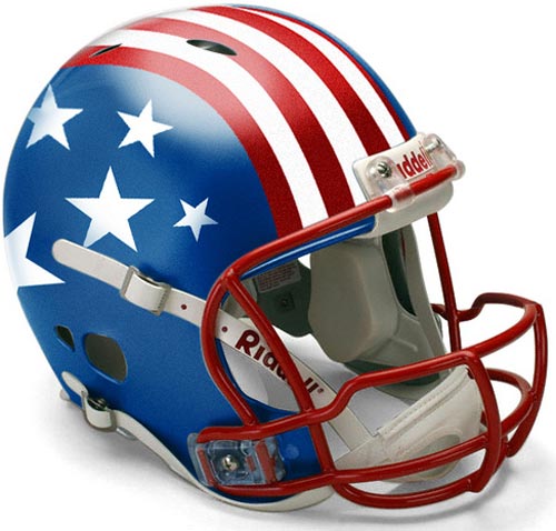
Among the weakest designs are the Washington Redskins and Tampa Bay Buccaneers, whose visually complicated logos become a graphic mess when televised and, I imagine, even if you’re sitting on the fifty-yard line. At the very the bottom of the list are the New England Patriots. The Patriots’ helmet is plastered with their logo, which comes dangerously close to looking like a wind-swept John Kerry dressed up like a Minute Man.
In addition to being a painter of some repute, Peter Paul Rubens was also a diplomat:
In Master of Shadows, Mark Lamster tells the story of Rubens’s life and brilliantly re-creates the culture, religious conflicts, and political intrigues of his time. Commissions to paint military and political leaders drew Rubens from his Antwerp home to London, Madrid, Paris, and Rome. The Spanish crown, recognizing the value of his easy access to figures of power, enlisted him into diplomatic service. His uncommon intelligence, preternatural charm, and ability to navigate through ever-shifting political winds allowed him to negotiate a long-sought peace treaty between England and Spain even as Europe’s shrewdest statesmen plotted against him.
Moretus was Rubens’s most frequent design client. To save his friend money, Rubens generally did his work for Plantin on holidays, so he would not have to charge Moretus his rather exorbitant day rate (Rubens was notorious for his high prices), and even then he agreed to be paid in books.
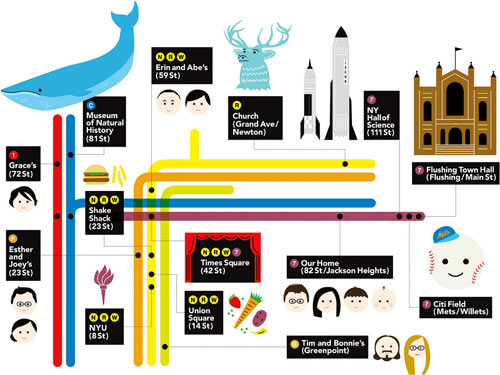
This was my present to my nephew for his 3rd birthday. He loves, loves, loves the subway so my sister asked me if I could make a custom map with all the places that mean something to him on the poster.
Hiding at the very end of the listing is a pasta shape called Marille, which is unusual in that a) it’s a recent shape, b) its designer is known, and c) it is no longer available. Marille’s designer, Giorgetto Giugiaro, previously had designed some of the most distinctive cars in the world and in 1999 was named Car Designer of the Century. (via @nicolatwilley)
Every seven years, designer Stefan Sagmeister closes his New York studio for a yearlong sabbatical to rejuvenate and refresh their creative outlook. He explains the often overlooked value of time off and shows the innovative projects inspired by his time in Bali.
One of the finalists in the Roca’s bathroom-related design contest, Jump the gap, was Spanish design studio Yonoh’s “box.” It’s a self-contained, customizable modular bathroom that features enough room for a toilet, wash-basin, shower, seat, two shelves, a towel rack, and a section for extra space and storage. All of the faucets are electronic, with displays indicating the temperature and the amount of water consumed. This “box” requires hookups for water and electricity, and after water is used by the sink or the shower, it’s stored in a conservation-friendly water tank where it supplies the toilet. It remains to be seen if the eco-friendly “box” will compete with other cubic commodes. Regardless, it’s quite a leap from the Port-a-Potty.
Yu Hun Kim’s reading tray prevents coffee stains and crumb-filled spines. Part of a series called “Aids for Multi-Tasking,” the transparent, acrylic tray covers your magazine or book and features an indentation for your coffee mug. Imagine covering the surface in food and gradually eating your way through an article. But how do you turn a page?
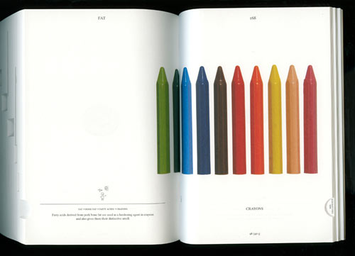
05049 was an actual pig, raised and slaughtered on a commercial farm in the Netherlands. Rotterdam designer Christien Meindertsma was shocked to discover that she could document 185 products contributed to by the animal.
Meindertsma’s design includes the publication of her book, PIG 05049, which charts and pictures each of the products supported by the animal. The surprise is in the fact that elements of production contributed to by pig farming include not only predictable foodstuffs — pork chops and bacon — but far less expected non-food items: ammunition, train brakes, automobile paint, soap and washing powder, bone china, cigarettes.
The caption on the page reads:
Fatty acids derived from pork bone fat are used as a hardening agent in crayons and also gives them their distinctive smell.
Crayons smell like pig bone fat. I don’t think I’ll use crayons ever again without thinking of that little factoid.
See also I, Pencil. Nobody knows how to make a pencil and nobody knows where all the parts of a pig go either. (via design observer)
A gold-plated wind turbine powers an interactively-lit dance floor and speaker system. Michael Jackson’s music plays day and night for the fans that congregate in these remote sand flats.
When the food arrives, does your client salt and pepper the food before he or she tastes it? If so, this is a clear sign that your client is potentially closed-minded, not open to new ideas, or set in his or her ways. If your client first tastes the food, and then adds salt or pepper, tremendous. This suggests your client has opinions, and is not afraid to exercise them-but only after the voice of the “creator” (in this case the chef) has been fairly given a chance first.
Like all con games, this one is based on the illusion that the sucker has the advantage. In this case, it’s the conviction that this kind of client always has that it’s your job to do as they say. Little do they realize that your final allegiance is not to them, but to the quality of the work, something that you cannot in good conscience permit them to jeopardize with their lack of taste.
The lighting-designer version of this is to tell the director that yes, you can make the lights brighter, but you’ll need to turn off the power for a few minutes while you change some of the wiring. Turn everything off, wait fifteen minutes while the director’s eyes adjust to the dark, then turn everything back on. It sure does look brighter now, doesn’t it?
The influential design magazine Emigre stopped publishing issues back in 2005, but now they’re releasing issue No. 70, which is actually a hardcover book celebrating the best of Emigre from the past 25 years.
This book, designed and edited by Emigre co-founder and designer Rudy VanderLans, is a selection of reprints, using original digital files, tracing Emigre’s development from its early bitmap design days in the late 1980s through to the experimental layouts that defined the so called “Legibility Wars” of the late 1990s, to the critical design writing of the early 2000s.
You know that image that’s been going around that shows several revisions to the Pepsi logo while the Coca-Cola logo is the same as it’s been since 1885? It tells a compelling story…Pepsi shifting its brand every few years in an attempt to catch up to steady market leader Coca-Cola. But of course it’s bullshit…Armin Vit constructs a more accurate brand timeline that shows many Coca-Cola logos over the years.
Since the days of radical printer-pamphleteers, design and designers have a long history of fighting for what’s right and working to transform society. The rise of the literary form of the manifesto also parallels the rise of modernity and the spread of letterpress printing.
Note: If you are a member and tried to log in, it didn't work, and now you're stuck in a neverending login loop of death, try disabling any ad blockers or extensions. Or try logging out and then back in. Still having trouble? Email me!
Socials & More