kottke.org posts about design
Using a link to his Twitter account from his blog, Dustin Curtis tested the effect of language on clickthrough rates.
Making the phrase more direct and personal by adding the words “you should” increased the clickthrough rate by 38% to 10.09%.
Curtis started out with “I’m on twitter” and eventually increased the clickthrough rate by more than double by changing the wording to “You should follow me on Twitter here.” (And Jesus, gorgeous site design too.)
The Typography Manual looks like a nice little iPhone app for designers.
The Typography Manual has several useful features and resources for designers, including a visual type anatomy glossary, a font size ruler, an em calculator, and a enough content to fill a 60 page book. It has the all the essentials of a desk reference in a regularly updated pocket resource.
(via quips)
Lettercult has a round-up of some notable “custom letters” from the first half of 2009…hand lettered type, calligraphy, sign painting, graffiti….stuff like that. This is one of my favorites:
(via do)
Flip Flop Fly Ball is a marriage of baseball fandom and an enthusiasm for infographics. While not strictly baseball, this comparison of the sizes and shapes of sports balls is a favorite.
Two recent projects that incorporate the experiences of map users into the subsequent versions of the maps:
1. For the Salone di Mobile event in Milan, The British Council commissioned a map of the event that would be augmented each day with information flowing in from Flickr, Twitter, blogs, and people’s physical scribbles on the maps.
One thing that’s very interesting to us that is using this rapidly-produced thing then becomes a ‘social object’: creating conversations, collecting scribbles, instigating adventures - which then get collected and redistributed.
More information about the project is available on The Incidental site.
2. Walking Maps, produced by Mike Migurski at Stamen, encourages people print out maps from OpenStreetMap, annotate them with missing information, and scan them back in.
In some places, participants are creating the first freely-available maps by GPS survey. In other places, such as the United States, basic roads exist, but lack local detail: locations of traffic signals, ATMs, caf’es, schools, parks, and shops. What such partially-mapped places need is not more GPS traces, but additional knowledge about what exists on and around the street. Walking Papers is made to help you easily create printed maps, mark them with things you know, and then share that knowledge with OpenStreetMap.
Never Use White Type on a Black Background.
Design has many rules that claim to be big truths and full of wisdom. Designers all go by rules that work for them. However, their rules may not work for someone else, or for a particular piece of design work. When a rule is forced upon you, it stops working and becomes a joke, like “Never use a PC,” or “Leave it until the last minute,” or the most famous of them all, “Less is more.” The problem is that every rule related to, or governing, design is ultimately ridiculous. In this book we have collected the most talked-about rules and the viewpoints of designers and thought leaders who live by them or hate them.
(via swissmiss)
This afternoon at 3pm ET, I will offering the commentary in a first round match of the 2009 Layer Tennis playoffs. The match features Aaron Draplin vs. Sam Potts and promises to be awesome. Come by and heckle. BTW, the morning match between Chris Glass and Greg Hubacek with commentary by Rosecrans Baldwin has already begun.
Marie Mundaca designed three of David Foster Wallace’s books (the insides, not the covers). The second one was challenging but rewarding.
Wallace’s idea was to have leaders and labels, like a diagram. He wanted something that looked like hypertext rollovers that were immediate and at hand. I thought this whole thing might be a bit much for me to design. It seemed like it might be a full-time job. I sent it off to one of my favorite designers, who shot me an email back saying something along the lines of “There is not enough money in the world to make me do this.”
The third was just plain tough.
Regarding the design of digital products, form doesn’t follow function anymore.
Thanks to digital technology, designers can squeeze so many functions into such tiny containers that there is more computing power in a basic cellphone (not a fancy model, like a BlackBerry or iPhone, just a cheap one) than at NASA’s headquarters when it began in 1958. That is why the appearance of most digital products bears no relation to what they do.
I’ve heard this idea expressed before, specifically about the iPhone, but I can’t remember where. Maybe it was Rawsthorn herself in Objectified?
Richard Smith is hosting the Dollar Redesign Project, which is starting to attract some interesting redesigns of American paper currency.
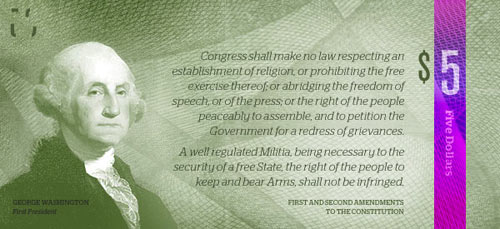
Ministry of Type has some further analysis, including a comparison to European bills.
The deadline for entering the Winterhouse Awards for Design Writing & Criticism is nearing. Get your entries in by June 1.
The Writing Award of $10,000 is open to writers, critics, scholars, historians, journalists and designers and given for a body of work. The Education Award of $1,000 is open to students (high school, undergraduate or graduate) whose use of writing in a single essay demonstrates originality and promise.
A brand timeline portrait shows all the different brands a person uses and interacts with during the course of a typical day.
Originated by Jane Sample, dozens of other people have also created portraits. (via rocketboom)
Update: Make your own at Brand My Day.
Nice black and white covers for science fiction books.
“Sanda created each cover using A4 paper, with all the typography printed and placed on the structure by hand,” Jones continues. “We then photographed each paper structure and, upon seeing the original black and white images, we didn’t feel that any tweaking or further alterations were needed.”
The hole punch one is my favorite. (thx, conor)
The Ministry of Type highlights a small but significant feature on the UI of the Xerox Star, a computer with an early GUI: precise positioning of icons on a dithered background in order to avoid rough edges.
It may be subtle, but it’s the kind of thing that reduces the overall apparent quality of your work, the stuff that marks out your work as being standard (read: mediocre) or exceptional. If you feel you shouldn’t get precious about such things, perhaps graphic design isn’t your thing.
There’s very little information about this online, but here’s what I’ve scraped together. Milton Glaser: To Inform and Delight is a documentary on the legendary designer and it will be released in theaters sometime near the end of May. You know, one of those huge summer blockbusters.
I posted about Glaser’s Ten Things I Have Learned several years ago, mostly for point #5’s rejoinder to “less is more”: “Just enough is more”. Rereading it now, I’m much more interested in some of the other points, particularly 1-3.
And the important thing that I can tell you is that there is a test to determine whether someone is toxic or nourishing in your relationship with them. Here is the test: You have spent some time with this person, either you have a drink or go for dinner or you go to a ball game. It doesn’t matter very much but at the end of that time you observe whether you are more energised or less energised. Whether you are tired or whether you are exhilarated. If you are more tired then you have been poisoned. If you have more energy you have been nourished. The test is almost infallible and I suggest that you use it for the rest of your life.
The Ministry of Type has a look at The St. John’s Bible, a modern-day hand-lettered Bible.
Jackson has brought together an incredible range of styles for the bible, from rich, lush, gold-encrusted illuminations reminiscent of Eastern Orthodoxy to crisp and spare compositions more like the modern style of the Church of England (to my mind at least).
Looks nice. A Heritage Edition is available for $145,000.
Recently a number of efforts have been made at re-imagining the packaging for movies, books, video games, and other media, mostly mashups and in the illustration style of typical of Saul Bass’ movie posters or Penguin Classics book covers. I’ve collected several examples below.
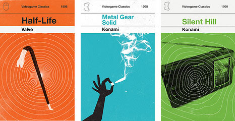
Olly Moss made Penguin-like book covers for video games like Ocarina of Time and Half-Life.
M. S. Corley made Penguin-like versions of the Harry Potter books.
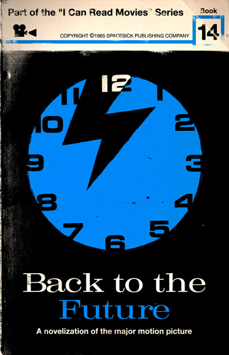
In his I Can Read Movies series, spacesick imagines Penguin-like book covers for movies like Close Encounters of the Third Kind, Sixteen Candles, and Back to the Future.
Forrest Lucero designed Penguin-like book covers for songs from The Postal Service and Daft Punk.
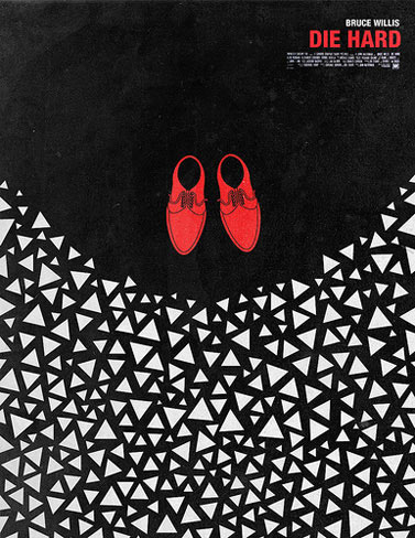
Olly Moss also did simple red/white/black posters for some of his favorite movies, including Die Hard and The Deer Hunter.
A bunch of people on Flickr imagined Nintendo DS tie-in games for movies like Andy Warhol’s Empire, Eyes Wide Shut, and 8 1/2. They also did some for TV shows, magazines, web sites, and all sorts of other media.
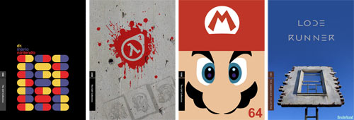
The folks on the NeoGAF message board made Criterion Collection-style box art for video games like Super Mario Galaxy, Black and White, and Super Mario 64.
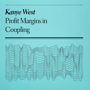
Nikolay Saveliev made simple two-color album covers for the likes of Kanye West, Jessica Simpson, and Franz Ferdinand.
Update: Modernist editions of classic album covers. (thx, zach)
Update: Logan Walters is redoing Wu-Tang Clan album covers.
Update: Classic albums reimagined as Pelican books.
Update: Simple Star Wars posters.
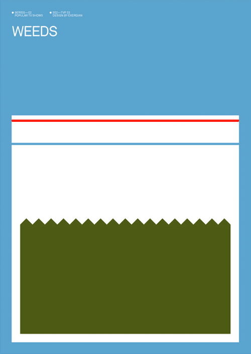
Update: Brandon Schaefer did some simple Blu-ray sleeve for movies, very much in the style of Olly Moss. Exergian did some posters for TV shows; the one for Weeds is particularly nice.
Update: Books as web services.
Update: Panic made some Atari 2600-themed packaging for their software. (thx, daniel)
The spouting bean concept illustrated by Jillian Tamaki for the “Green Chicago” issue of Hemispheres, the inflight magazine for United Airlines, is a little bit of genius.
From an interview by Kicker Studio of London designer Crispin Jones, where he says that the broad definition of design is perhaps not so bad.
On one level design is horribly inarticulate word - it has no real meaning nor way of encompassing all the things that are classed as “design”. This weakness however means that the discipline is kind of without boundaries. I think design allows you to engage with the contemporary world and engage in shaping the world: we’re living in a golden age of products/services as technology matures and people integrate it into their lives.
You may have picked up on this by reading kottke.org over the years, but I think that designers, architects, entrepreneurs, filmmakers, writers, scientists, et al. are all engaged in doing the same kind of thing, more or less, and that working “without boundaries” and borrowing the best aspects of many disciplines is one of the keys to maximizing your creative potential. (thx matt)
Cliff Kuang traces the evolution of office designs from the open factory-like floors of Frederick Taylor to the present era of semi-private pods.
Adrian Shaughnessy shares ten paradoxes about graphic design; by paradox he means “an opinion or statement contrary to commonly accepted wisdom”. I particularly liked these two bits of wisdom:
As part of their training, all designers should be obliged to spend a sum of their own money on graphic design.
And:
If we want to make money as a graphic designer, we must concentrate on the work — not the money.
Long-running design blog Speak Up will cease publication later this week.
Earlier this year, Bryony and I made the decision to close Speak Up. Seeing weeks and weeks go by where we have only two or three posts (and one of them being the Quipsologies round-up) has become too painful for us. It’s also like watching Ozzy Ozbourne today, still holding on to that rock glory but he can’t really rock no more, not like he used to.
If the glass Heinz ketchup bottle were introduced today, it would likely be disparaged because it doesn’t work very well as a ketchup dispenser. But since it’s been around so long, people love it.
Like the Apple iPod, a Rawlings baseball and 3M’s Post-it Notes, Heinz Ketchup is a rare example of a best-selling brand that is also generally considered to be best in class. It would seem silly to splash out on a more expensive alternative, especially as the glass bottle affirms its stellar status.
That is why Heinz Tomato Ketchup is one of the very few branded products you see in its original packaging in expensive restaurants. “Sometimes we have to accept that we can’t better something that already exists,” said Jeremy King, who co-owns The Wolseley in London and is now re-opening The Monkey Bar in New York. “When a customer asks for ketchup they generally want Heinz. The iconic glass bottle reassures them that they are getting it.” Quite a coup for something that does not really do its job properly.
ps. He-ketchup for manly men.
Update: Daniel Eatock Everything Heinz project:
An edition of 57 sealed cans each containing a composite mix of 57 Heinz canned foods.
(thx, andy)
Some interesting moments from the Objectified screening last night.
- Rob Walker, who writes the Consumed column for the NY Times Magazine, was my favorite person in the movie. I particularly liked his idea for a million-dollar marketing campaign for the stuff we already own. Paraphrasing from memory: “You already own all these wonderful things. Enjoy them today.”
- The best comment during the Q&A after the film was from a man who said that the film made him feel physically sick. Not that the movie was bad but that it was powerful. The man was a product designer and the film raised a lot of issues for him with regard to the waste — both physical trash and human energy, if I was catching his drift correctly — produced during the course of making these billions of mass produced items, most of which end up in landfills in pretty short order. He seemed to be asking himself and the audience: how can we, as designers, in good conscience, keep doing this to ourselves?
- The film addressed that question a bit at the end as did the panelists during the Q&A. Dan Formosa of Smart Design, echoing Walker’s marketing idea, said that some designers in the future will shift from designing new products and start to design experiences for people to make better decisions about the objects they introduce into their lives or to better utilize the products they already have. The sales and support process at many many product companies are ripe for a designer’s guiding hand. It’s mind-boggling to me that companies spend billions and billions of dollars designing and building products and then leave the selling of those products to sales people who are largely untrained and unmotivated and the support to a call center in Bangalore. Zappos, Apple, Amazon, and similar companies have realized this with spectacular results.
- What didn’t work for me: 1) The IDEO stuff. They had 12 people brainstorming about how to build a better toothbrush that people won’t throw away and in addition to all of the time they’re spending talking about it, they went through dozens of Post-It notes, and had purchased what looked like hundreds of toothbrushes for research purposes that were likely to get thrown away as well. The whole thing seemed super wasteful (and maybe that was the point of showing it). 2) Karim Rashid. He said a lot of things that sounded good but when you look at his work, I don’t know that he actually believes any of it. 3) Marc Newson. What the hell was he on about?
If you’re interested, check out the trailer. You can also download the groovy song from the trailer and the film’s opening credits…it’s called I Like Van Halen Because My Sister Says They Are Cool by El Ten Eleven.
Tomorrow at 3pm ET: Layer Tennis match between Jennifer Daniel and Jillian Tamaki with commentary by some guy named Jason Kottke. What is Layer Tennis?
Two competitors will swap a file back and forth in real-time, adding to and embellishing the work. Each artist gets fifteen minutes to complete a “volley” and then we post it to the site live. A third participant, a writer, provides play-by-play commentary on the action, as it happens. A match lasts for ten volleys.
Update: Here’s the match preview.
In a 1989 interview for Dutch television, Pixies frontman Frank Black talks about his songwriting process as creating a “poetic structure” with the melody and letting the lyrics flow from there. The Dutch graphic design studio Experimental Jetset took inspiration from Black’s approach.
When we get an assignment (which usually comes in the form of a question, a theme, a problem or a riddle), we feel as if the solution is already enclosed in the assignment itself. The design is already there; it just has to be released. Like the fist from Frank Black’s shirt.
Newer posts
Older posts

Socials & More