Tropicana had certainly sought to create excitement around the Pure Premium rebrand, announcing Jan. 8 a “historic integrated-marketing and advertising campaign … designed to reinforce the brand and product attributes, rejuvenate the category and help consumers rediscover the health benefits they get from drinking America’s iconic orange-juice brand.”
Who knows what the proper conclusions are to draw from all this. Did sales drop because glancing shoppers couldn’t tell Tropicana from a generic store brand? Does this underscore the importance of good design? Or should we beware of what seems like good design but turns out to be a bunch of metaphorical subterfuge? Did PepsiCo do this on purpose, a la the New Coke conspiracy? Are people stupid because they focus more on orange juice packaging than the actual juice when making buying decisions? (via df)
I’m a classy roustabout, but I’m not sure I’d want to accessorize my computer with the pink-accented Swarovski Crystal mouse.
By manipulating the design of an item used everyday into a sensual, feminine form, we have created a personal gesture for the urban lifestyle of the working woman.
Kind of the opposite of the more organic, but equally impractical Mouse Mouse.
The benefits of winning the award appear to be few. According to Philip Stone, The Bookseller’s charts editor:
“What does the future hold for these items?” Mr. Stone asked, speaking of fromage-frais cartons. “Well, given that fromage frais normally comes in 60-gram containers, one would assume that the world outlook for 0.06-gram containers of fromage frais is pretty bleak. But I’m not willing to pay £795 to find out.”
For those of you who are more into designer accessories than dairy almanacs, the Calf & Half pitcher lets you pour with udder abandon.
And if you’re looking for more clandestine cream, bring your own containers. Raw milk, once our only option, then treated as a potential health hazard, now finds itself on the black market.
Brooke Inman’s Everything Color Circle is mesmerizing. As somebody with limited organizational skills, I find it mind-boggling that she was able to put this together. And to think that it could be destroyed in a nanosecond if a sugar-addled kindergartner armed with construction paper wandered into the room. (via design milk)
Remember the gilded age before The Recession? Well, for those of you still untouched by the meltdown, there’s always the $75K rhinestone toilet by designer Jemal Wright.
For the more utilitarian aristocrat suffering from paranoia, or those who have committed investor fraud and fear angry mobs seeking money for better torches, why not build a panic room for your palace? Constructing a basic model in your home should only cost you about $50K, which is chump change compared to the price tag on the aforementioned sparkly loo.
But then a funny thing happened. I kept correcting and correcting, and all of a sudden I had sanitized the font and there was almost no personality left in it. What I was left with might as well have been VAG Rounded. In a very early draft, I had played with the idea of exaggerating the swellings in the strokes from the original sign. Now I resurrected that, and found the true character of the font.
It’s been said that type design is the art of making unequal things appear equal. Noordzij’s theory of the Stroke of the Pen is apparent even in monoweight sans-serifs. Flip Helvetica’s A, V, or W sideways, and you’ll see that the diagonal strokes are slightly unequal. Rotate the O in Futura, which I was always told was a perfect circle, and you’ll see why that’s not true.
How should a company like Google approach design? By the numbers?
A designer, Jamie Divine, had picked out a blue that everyone on his team liked. But a product manager tested a different color with users and found they were more likely to click on the toolbar if it was painted a greener shade.
As trivial as color choices might seem, clicks are a key part of Google’s revenue stream, and anything that enhances clicks means more money. Mr. Divine’s team resisted the greener hue, so Ms. Mayer split the difference by choosing a shade halfway between those of the two camps.
Her decision was diplomatic, but it also amounted to relying on her gut rather than research. Since then, she said, she has asked her team to test the 41 gradations between the competing blues to see which ones consumers might prefer.
Without a person at (or near) the helm who thoroughly understands the principles and elements of Design, a company eventually runs out of reasons for design decisions. With every new design decision, critics cry foul. Without conviction, doubt creeps in. Instincts fail. “Is this the right move?” When a company is filled with engineers, it turns to engineering to solve problems. Reduce each decision to a simple logic problem. Remove all subjectivity and just look at the data. Data in your favor? Ok, launch it. Data shows negative effects? Back to the drawing board. And that data eventually becomes a crutch for every decision, paralyzing the company and preventing it from making any daring design decisions.
In many cases, I’d trust a good designer with 10 years of experience over The Numbers™. That 10 years represents an internalization of thousands of instances of The Numbers across a broad range of experience. At other times, the quantitative approach is useful. Part of being an effective designer (or an auto mechanic or an engineer or programmer etc.) is learning to recognize the right mixture of the two approaches.
The Very Hungry Caterpillar was one of my favorite books when I was a kid and I’ve loved reading it to Ollie over the past few months. So of course, Google’s logo today is aces.
Amazon had reviews from the very first day. It’s always been a feature that customers love. (Many non-customers talk about how they check out the reviews on Amazon first, then buy the product someplace else.) Initially, the review system was purely chronological. The designers didn’t account for users entering hundreds or thousands of reviews.
For small numbers, chronology works just fine. However, it quickly becomes unmanageable. (For example, anyone who discovers an established blog may feel they’ve come in at the middle of a conversation, since only the most recent topics are presented first. It seems as if the writer assumed the readers had read everything from the beginning.)
The reviews of reviews are really helpful when buying. Personally, I always check out four types of reviews on Amazon in roughly this order:
1) most helpful/highest rated, 2) most helpful/lowest rated, 3) least helpful/highest rated, 4) least helpful/lowest rated
Sometimes reading a really negative review which many people think is spectacularly wrong can help make a useful buying decision.
This phenomenon is best illustrated by a single design tweak to the Google search results page in 2000 that Mayer calls “The Billion Dollar HTML Tag.” Google founders Sergey Brin and Larry Page asked Mayer to assess the impact of adding a column of text ads in the right-hand column of the results page. Could this design, which at the time required an HTML table, be implemented without the slower page load time often associated with tables?
Mayer consulted the W3C HTML specs and found a tag (the “align=right” table attribute) that would allow the right-hand table to load before the search results, adding a revenue stream that has been critical to Google’s financial success.
The clip shows an analysis of the plaza of the Seagram Building in NYC and what makes it so effective as a small urban space.
A busy place for some reason seems to be the most congenial kind of place if you want to be alone. […] The number one activity is people looking at other people.
The video was adapted from a book of the same name by William H. Whyte, who is perhaps most well known as the author of The Organization Man. The video is largely out of print — which is a shame because that clip was fascinating — but I found a DVD copy for $95 (which price includes a license for public performance). (via migurski)
The Winterhouse Awards for Design Writing & Criticism seek to increase the understanding and appreciation of design, both within the profession and throughout American life. A program of AIGA, these annual awards have been founded by Jessica Helfand and William Drenttel of the Winterhouse Institute to recognize excellence in writing about design and encourage the development of young voices in design writing, commentary and criticism.
The main award is $10,000 with a student award of $1000.
Take a logo as simple as the Mercedes-Benz star. Just three points framed by a circle, its geometry is easily described in a few lines of Mathematica code, with some obvious parameters controlling the number of points on the star, the sharpness of the star’s points, the thickness of the outer circle, and the orientation of the star.
Good design is innovative. It does not copy existing product forms, nor does it produce any kind of novelty for the sake of it. The essence of innovation must be clearly seen in all functions of a product. The possibilities in this respect are by no means exhausted. Technological development keeps offering new chances for innovative solutions.
Rams was the influential designer behind many Braun products and described his design approach as “less, but better”. (via df)
In a NY Times op-ed piece, Emily Oberman and Bonnie Siegler argue that the Oscars should have a category for the design of title sequences. Hear, hear. Their pick for this year’s hypothetical award:
1. “WALL-E,” Susan Bradley and Jim Capobianco/Pixar. These poignant end titles, which show humans and robots flourishing on a revived Earth, offer a quick history of art, from cave paintings to van Gogh. They then proceed to retell the entire movie, this time in the pixelated style of old video games.
The about-face comes after consumers complained about the makeover in letters, e-mail messages and telephone calls and clamored for a return of the original look. Some of those commenting described the new packaging as “ugly” or “stupid,” and resembling “a generic bargain brand” or a “store brand.”
“Do any of these package-design people actually shop for orange juice?” the writer of one e-mail message asked rhetorically. “Because I do, and the new cartons stink.” Others described the redesign as making it more difficult to distinguish among the varieties of Tropicana or differentiate Tropicana from other orange juices.
David Wertheimer notes that the decoration of the packaging was not the main issue, the design was:
As a loyal Tropicana buyer, I don’t love the straw-punctured fruit or the old logo at all. What I love is Tropicana juice. And the new packaging made it hard for me to buy it. My preference was hidden in small type; the cartons no longer differentiated on the shelves. It took me longer to shop, and twice this winter I went home with the wrong juice.
Have you ever noticed that the rear side window on a BMW has a small design element that hooks back toward the front of the car?
Rather than having the rear side window extend all the way down as might be expected, it angles back toward the front of the car.
Yeah, me either, but apparently all BMWs have it. It’s called the Hofmeister Kink, so named for the Director of Design at BMW who oversaw the style tweak, Wilhelm Hofmeister. Other carmakers have copied the Kink to make certain models appear luxury. (via spronblog)
In Germany in the 1920s, towns, banks, and companies printed their own money called notgeld.
Notgeld was mainly issued in the form of (paper) banknotes. Sometimes other forms were used, as well: coins, leather, silk, linen, stamps, aluminium foil, coal, and porcelain; there are also reports of elemental sulfur being used, as well as all sorts of re-used paper and carton material.
Still, I wonder if we haven’t lost something in the process: the deliberation that comes with a slower pace, the attention to detail required when mistakes can’t be undone with the click of a mouse. Younger designers hearing me talk this way react as if I’m getting sentimental about the days when we all used to churn our own butter.
What could Arnell, the agency that did the deed, have been thinking? It’s one thing to change the logo; it’s another to abandon the mnemonic orange with the straw in it. As package imagery goes, it was pretty smart, and decidedly memorable.
He goes on to call the redesign “a big tactical mistake”. I’m a Tropicana drinker and I think the new packaging sucks. It’s impossible to figure out at a glance which juice is which because all the packages look the same, aside from some thin lines at the very top. Horrible.
As promised, the redesign of this site started last week is still in motion. I’ve just made a bunch of small tweaks that should make the site more readable for some readers.
- Fonts. In response to a number of font issues (many reports of Whitney acting up, the larger type looking like absolute crap on Windows), I’ve changed how the stylesheets work. Sadly, that means no more lovely Whitney. :( Mac users will see Myriad Pro Regular backed up by Helvetica and Arial while PC users will see Arial (at a different font-size). In each case, the type is slightly smaller than it was previously. I’m frustrated that these changes need to be made…the state of typography on the web is still horrible.
- Blue zoom border. Oh, it’s staying, but it’ll work a bit differently. The blue sides will still appear on the screen at all times but the top and bottom bars will scroll with the content. I liked the omnipresent border, but the new scheme will fix the problems with hidden anchor links and hidden in-page search results and allow for more of the screen to be used for reading/scanning. It breaks on short pages (see: the 404 page) and still doesn’t work quite right on the iPhone, but those are problems for another day.
- Icons. Updated the favicon and the icon on the iPhone to match the new look/feel.
- Misc. Rounded off the corners on the red title box. Increased the space between the sidebar and the main content column.
Thanks to everyone who offered their suggestions and critiques of the new design, especially those who took the time to send in screenshots of the problems they were having. Feedback is always appreciated.
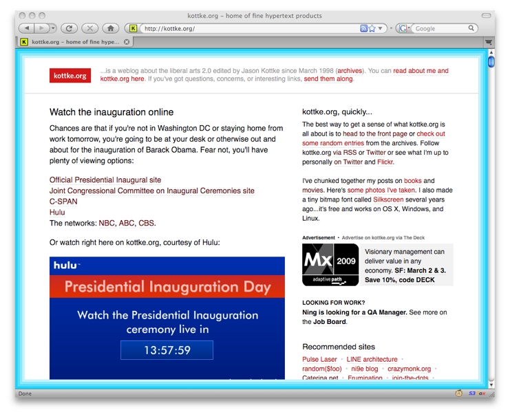
The design of kottke.org has been mostly the same since 2000…a garish yellow/green bar across the top and small black text on a white background everywhere else. (See the progression of designs since 1998.) People absolutely hated that color when I first introduced it1, but it stuck around — mostly out of laziness — and that pukey yellow became the most visible brand element of the site.
Two days ago, I refreshed the design of the site and, as you may have noticed, no more yellow/green. The other big changes are: bigger text set in a new font, a blue “zoom” border around the page, and the addition of titles to the short posts.
(A brief nuts and bolts interlude… For most of you, the site will look like this. If you’ve got Myriad Pro on your machine — it comes free with Acrobat Reader and Adobe CS — it’ll look like this…this is the “intended” look. And if you’re a fancypants designer with Whitney installed, you’ll get this rarified view, which I did mostly for me. On IE6, the site will be legible and usable but somewhat unstyled. If you’re not seeing something that looks like one of the above screenshots — if the text is in all caps, for instance — please drop me a line with a link to a screenshot and your browser information. Thanks!)
The blue “zoom” border is the biggest visual change, and it’s an homage to what is still my favorite kottke.org design, the yellow zoom from 1999. I like that kottke.org is one of the few weblogs out there that can reach back almost ten years for a past design element; the site has history. In a way, that border is saying “kottke.org has been around for ten years and it’s gonna be around for twenty more”. At least that’s how I think about it.
I’ve already gotten lots of feedback from readers, mostly via Twitter and email. There were a few technical issues that I’ve hopefully ironed out — e.g. it should work better on the iPhone now — and a couple which might take a bit longer, like the border messing with the page-at-a-time scrolling method. Some people like the changes, but mostly people don’t like the new design, really dislike the blue, and generally want the old site back. This is exactly the reaction I expected, and it’s heartening to learn that the old design struck such a chord with people. All I’m asking is that you give it a little time.
My suspicion is that as you get used to it, the new text size won’t seem so weird and that blue border will likely disappear into the background of your attention, just as that hideous yellow/green did. A month from now, your conscious mind won’t even see the blue — chalk it up to something akin to banner blindness…brand blindness maybe? — but your subconscious will register it and you’ll just know where you are, safe and sound right here at good ol’ kottke.org. And if that doesn’t work, we’ll tweak and move some things around. Design is a process, not a result, and we’ll get it to a good place eventually, even if it takes twenty years.
[1] I wish I had access to my email from back then…everyone hated it and wanted the old design back. Before landing on the yellow/green color, I tried the golden yellow from the previous design, a blue very much like the blue in the current border, and then red. I think each color was live on the site for a few days and my intention was to just keep switching it around. But then I got bored and just left the yellow/green. Gold star to anyone who remembers that short phase of the site. ↩
Note: If you are a member and tried to log in, it didn't work, and now you're stuck in a neverending login loop of death, try disabling any ad blockers or extensions. Or try logging out and then back in. Still having trouble? Email me!

Socials & More