kottke.org posts about design
A Canadian pig farmer came up with an interesting solution for herding pigs. Instead of using heavy wooden “chase boards” to guide the pigs, she used a length of fabric of the same color, allowing a single person to do a job once done by many.
The trailer for Objectified, a new documentary film about industrial design by Gary Hustwit, who also made Helvetica.
A beautiful heart-shaped map of the NYC subway system is among the several such maps done by a pair of Korean graphic designers calling themselves Zero Per Zero.

A portable map version is available for sale, but the shipping cost from Korea to the US is a bit steep.
Some design heavies — Paula Scher and Gary Hustwit among them — choose their design highlights of 2008.
The best conceived, designed, and expressed total idea, ever: Barack Obama’s entire campaign, each and every part of it, including Barack Obama.
Two designs I found interesting were the Surface Table (made of carbon fiber, it’s only 2mm thick for a 13-foot-long table!) and Boudicca Wode Perfume, which sprays on blue and fades to transparent over time. (via quips)
The NY Times has posted their annual Year in Ideas collection for 2008, packaged this year in an “interactive feature”, which is Esperanto for “no permalinks”. A favorite so far in paging through is Tokujin Yoshioka’s Venus Natural Crystal Chair, a piece of furniture grown in mineral water.
Update: Permalinks are a go. I repeat, permalinks are a go. Here’s the one for the crystal chair. (thx, everyone)
Great two-part video interview with Sol Sender about designing the logo for the Obama campaign. Includes some early design sketches and other designs that made it to the final phase. (via quips)
The challenge: create a fictitious book cover using an image from the Life magazine photo archive. Aside from the first few created in a rush, some of these are pretty good.
In 1960, just before the widespread release of push-button phones, AT&T tested a number of button configurations to see which ones offered the greatest speed and least confusion. The number pattern based on the numbers’ positions on the incumbent rotary dial did well but the company decided to go with the now-familiar 3x3+1 configuration instead.
Eat me daily rounds up a recent AIGA event about food. The most interesting tidbit came from Matteo Bologna’s speech. Bologna designs restaurants, most notably for Keith McNally (Pastis, Balthazar, Morandi, Schillers, etc.).
Really fascinating was what he and McNally did for Pastis — it doesn’t actually have a visual brand. McNally wanted the restaurant to look like it had been in the neighborhood for years, so Bologna constructed this narrative of a family that had maintained the restaurant for a century, and each generation some element gets updated or redesigned, but without going for consistency or even style. The result is completely different-looking signage, awnings, menus, wine lists, checks… everything uses a different palette, type set, but its essential Frenchiness ties everything together. It’s an anti-brand.
The name of the restaurant is thus a play on pastiche in addition to being named after the French aperitif. (via eater)
Designer Peter Saville — you know, iconic Joy Division album cover, Factory Records, etc. — talks about his process a little bit in this video interview.
Learning and filing, learning and filing. Sounds familiar, yeah? (thx, paul)
Chris Pullman was the VP of Design at WGBH in Boston for 35 years.
Viewers of PBS will recognize Pullman’s work in the opening title sequences of “Masterpiece Theatre” and “Antiques Roadshow” and the WGBH animated on-air signature, which is used at the end of every program produced by the public broadcaster.
Pullman recently retired and shared ten lessons he’s learned over the years.
2 Work with people you like and respect.
Birds of a feather flock together. That is a natural thing. Most of the people here at WGBH are here (or certainly stay here) because of our mission. Certainly, my long tenure has been largely because of the people in this room with whom I’ve shared such personal and heart-warming recollections of our time together. Since April, when I first announced my intention to leave WGBH, the private expression of these feelings has been so gratifying, both personally and professionally, that I recently suggested that maybe we should institute the policy of encouraging individuals to make periodic “mock retirement” announcements, with the goal of releasing more regularly the flow of kind remarks for the nourishment of the individual, since we are otherwise so reticent to praise or encourage others in our busy, self-centered daily lives.
The Book Design Review lists their favorite book covers for 2008. Go forth and drool.
Results of the 2008 Muji Award design competition. Winning entries include a drinking straw made from straw, a garbage bag that stands up by itself (no can needed), and a stapler that gets that staple in the corner of the page every time. (thx, dj jacobs)
Steven Heller spoke with the designer Sol Sender about his iconic Obama “O” logo.
Well, the “O” was the identity for the Obama ‘08 campaign and the campaign is over. That doesn’t mean that the mark will be forgotten; I think the memorabilia from this campaign will have a long shelf life and will stand as a visible symbol of pride for people who supported the candidate and for those who see it as a representation of a watershed moment for our country. As far as having another life, I can’t say. Perhaps the 2012 campaign will hark back to it in some way.
Sender’s web site has a bit more info on the development of the Obama brand.
Ecommr is a collection of interface and design elements from ecommerce sites. I wish there were a bit more context around each screenshot (e.g. which interface element is the focus and what’s novel about it) but it’s a good start.
The ballots are being recounted in the Senate race in Minnesota between Norm Coleman and Al Franken because the initial tally was almost too close to call. MPR has a look at some of the ballots that are being challenged…it’s amazing how many weird ways people can mark a ballot that uses a simple fill-in-the-circle design.
Inspired by Emmett Williams, a practitioner of concrete poetry, Rob Giampietro has written three poems: Wastebasket, Snowflakes, and Spraypaint.
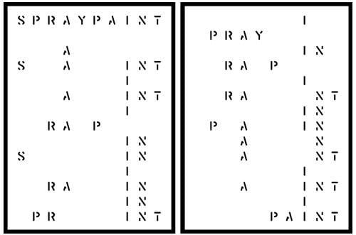
Giampietro has put out a call for someone to develop a Williams Word Generator. Drop him a line if you can help out…shouldn’t be too much different than the many “words within words” generators scattered around the web.
I enjoyed these visual movie reviews, especially There Will Be Blood (“this is just pretentious afterbirth”) and The Darjeeling Limited.
Lovely design for Penguin’s book of Bond short stories, Quantum of Solace.
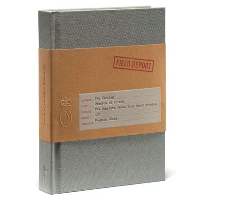
The book collects together all of Ian Fleming’s Bond short stories in a single volume for the first time and includes stories that inspired the Bond film classics From a View to a Kill, For Your Eyes Only, Octopussy, The Living Daylights and of course, Quantum of Solace, the latest in the series.
I love the Penguin logo incorporated into the 007 on the back cover.
Pictures of Numbers is infrequently updated, but the subject matter is timeless and the archives are worth a look.
Pictures of Numbers is a book-project-in-progress, consisting of practical tips and techniques for busy researchers on improving their data presentation.
Matthew Dent’s new coinage for the UK was pretty great, but this Dutch commemorative coin is a fully contemporary chunk of wow.

On the front, the names of famous Dutch architects form an image of the queen while some Dutch architecture books on the back form an outline of The Netherlands. The design was done using free software running on Ubuntu/Debian. (via design observer)
I added 16 new maps to the 2008 Election Maps page in what is probably the final update. Big thanks to everyone who sent in maps.
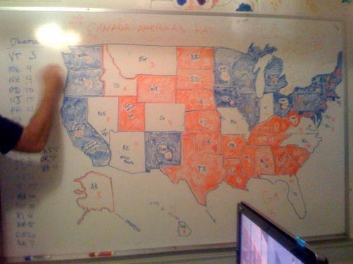
I added ten more maps to the 2008 Election Maps page, including one drawn on a dry erase board.
Both Michael Sippey and Kane Jamison collected screenshots of media sites as they declared Obama’s victory last night. Here are the front pages of all the newspapers today…I particularly enjoyed The Sun’s take on the historic night: One Giant Leap For Mankind. See also: the electoral maps.
Update: Electioneering ‘08 took screencaps of some of the big media sites throughout the evening. (thx, jason)
Update: Jim Ray also collected screencaps of media sites that night.
Update: Kristen Borchardt made an awesome video that takes a number of Nov 5th newspaper front pages and animates through them using each papers’ Obama photo as the focal point…very much like YTMND’s Paris Hilton doesn’t change facial expressions.
Last night as the election results were coming in online, I took screenshots of a bunch of the now-familiar red/blue electoral maps being used by the larger media sites to show election results and posted them all on this page. (There are currently 25 maps…I’m adding more in a few minutes.)
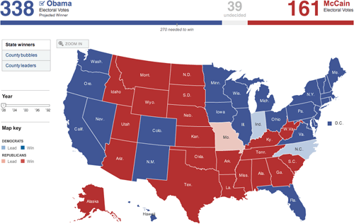
Hit me on my burner if you run across any others. A couple of quick notes:
1. No one strayed from the red and blue. The red/blue combo is overwhelmingly symbolic but there are plenty of other colors in the crayon box; I would like to have seen someone try something different.
2. In the 2000 and 2004 elections, the red/blue map was the focal point of the media coverage. People were fixated by it. This time around, it didn’t matter so much. The maps were interesting for 3-4 hours until the overwhelming nature of Obama’s victory became apparent and then, not so much. By this morning, the maps are already shrinking or disappearing from the home pages of the Times, CNN, and the like.
3. Nate Silver and the rest of the 538 guys nailed it. They got Indiana wrong and there are a couple more states that are still too close to call, but they got the rest of the map right. Their final projection had Obama getting 348.6 electoral votes and they currently have him at 349.
The Virgil O. Stamps Letterpress Laboratory prints business cards on all sorts of papers and surfaces, including children’s coloring book pages, duct tape, old National Geographic pages, antique book pages, and any sort of cardboard scraps. Pretty cool.
Nice look at the evolution of the front page of the LA Times from 1881 to 2003.
I selected a front page from every other decade, starting with the very first edition of the paper in 1881. Note the shifting hierarchy of images (yellow), advertising (orange) and editorial content (blue). The small black arrows are links to related content elsewhere within the paper.
They also look at the front pages of the web site from 1996 - 2006.
Newer posts
Older posts




Socials & More