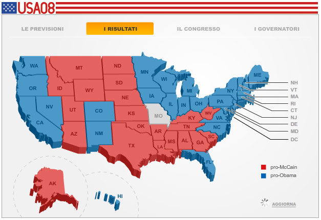
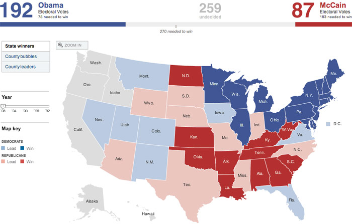
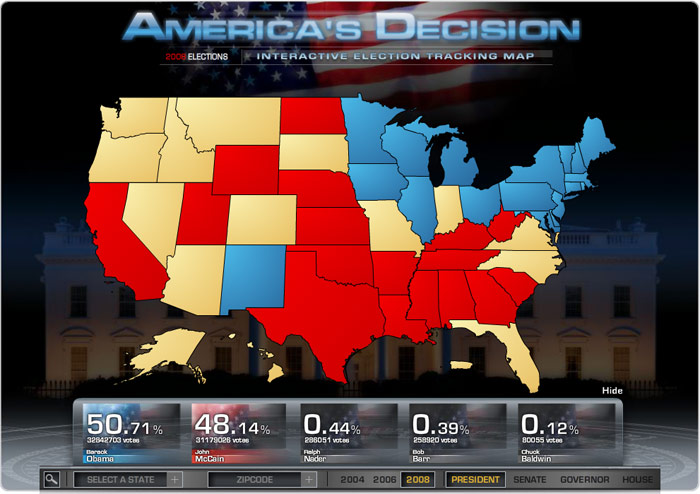
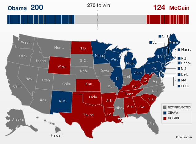
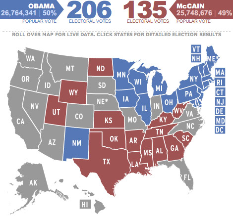
Most media outlets covering the 2008 US Presidential Election used the familar red/blue map to track the progress of the race as results from the polls rolled in Tueday evening. Here are several of those maps, in some ways as similar to each other as they are varied. (Note: Some of these aren't the final maps...I wanted to get screenshots before the sites started moving things around too much.)
New York Times - Nice big clean map, the consensus best map of the 2008 election.

Fox News - Fox is never subtle.

FiveThirtyEight.com - These guys are all about the data. No fancying up the maps.


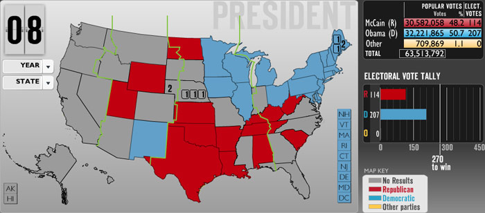
AP - Many sites were using AP's graphics, including C-SPAN.


BBC - The BBC map had an option to toggle to see the area of the states in proportion to their electoral votes.
CBS News - Looks like CBS ran out of room and squashed the US into a narrow column.

Color Your Own Map - A Flickr user made a map you could print out and color in with crayons or colored pencils as the results came in.
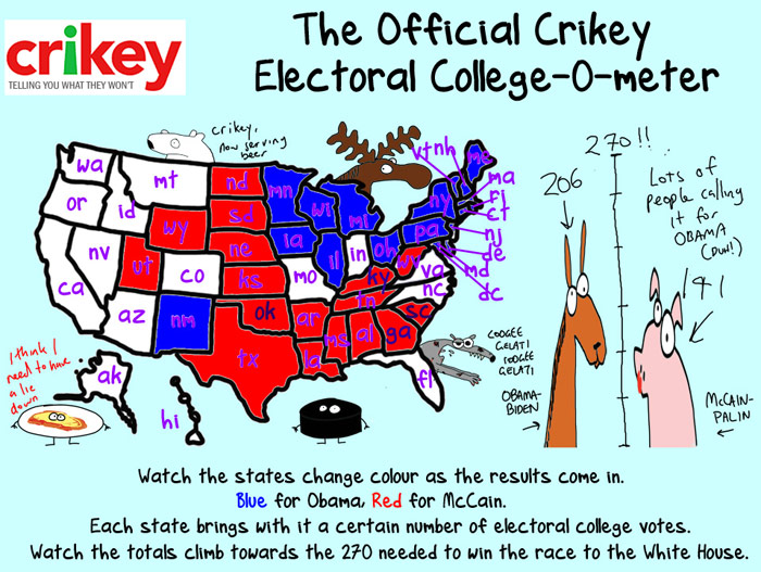
Crikey - A definite outlier and favorite.
Daily Kos - An unpolished effort.

El Mundo - "Obama cambia el color de la Historia".

Google - Functional but not pretty, just like everything else Google does.

Guardian - No electoral totals on the map...they had those pulled out into a separate graphic. Also, "Alaska, Hawaii, not to scale". Helpful!

LA Times - Nice and clean like the NY Times.

MSNBC - Nice lite blue to pink gradient!

NPR / NewsHour with Jim Lehrer

Politico - I do believe that's Silkscreen.

Pollster - Overbearing yellow.

Talking Points Memo - They're using Google's map here, but with slightly different shades of red and blue.

USA Today - This map proudly carries on the USA Today's tradition of cramming it in there.

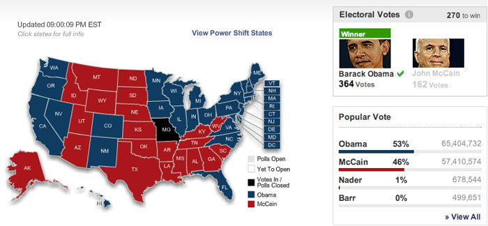
Washington Post - Featuring a very smiley Obama and grumpy McCain. I wonder if those photos varied with the current results...

Wall Street Journal - Nice stipple portraits of the candidates.


Mark Newman - While not a realtime election returns map, Newman's maps provide a more accurate geographical look at how people voted. Also, purple!

Dry erase map - Awesome!

Wikipedia - Check out how the map changed throughout the night. This is the only map on the list that's in the public domain...d/l it and put it up on your site if you'd like.


Frankfurter Allgemeine Zeitung

Neue Zurcher Zeitung - Orange and teal...those are almost different than red and blue.


The Onion - This isn't a realtime results map either but it's The Onion so I had to include it.

Cyberpresse - Lots of whitespace here. Not sure that's a good thing.


Salon - There's a lot more to this map that I couldn't include in the screenshot, including illustrations of the candidates.
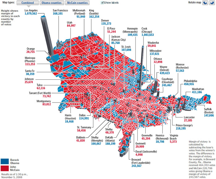
Washington Post - Another one from the Post showing margin of victory by county.

NY TimesA county-by-county map from the Times.

NY Times - A really interesting voting shifts map. Most of the country shifted Democratic, except for Alaska (Palin's home state), Arizona (John McCain's home state), and those parts of the South without a relatively large black population (racism?).