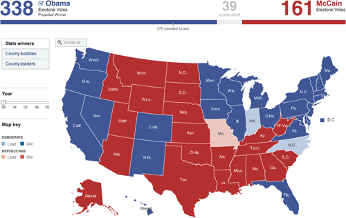
2008 election maps
Last night as the election results were coming in online, I took screenshots of a bunch of the now-familiar red/blue electoral maps being used by the larger media sites to show election results and posted them all on this page. (There are currently 25 maps…I’m adding more in a few minutes.)
Hit me on my burner if you run across any others. A couple of quick notes:
1. No one strayed from the red and blue. The red/blue combo is overwhelmingly symbolic but there are plenty of other colors in the crayon box; I would like to have seen someone try something different.
2. In the 2000 and 2004 elections, the red/blue map was the focal point of the media coverage. People were fixated by it. This time around, it didn’t matter so much. The maps were interesting for 3-4 hours until the overwhelming nature of Obama’s victory became apparent and then, not so much. By this morning, the maps are already shrinking or disappearing from the home pages of the Times, CNN, and the like.
3. Nate Silver and the rest of the 538 guys nailed it. They got Indiana wrong and there are a couple more states that are still too close to call, but they got the rest of the map right. Their final projection had Obama getting 348.6 electoral votes and they currently have him at 349.
Socials & More