kottke.org posts about London Underground
In 2012, Francois De La Taille posted a video of himself racing a Paris Metro train from one station to the next, on foot. He exited the train, dashed out of the station, sprinted down the street (after pausing for a bus crossing the road), ran into the next station (after falling on the stairs), and hopped back onto the same train he’d just gotten off of.
Two years later, James Heptonstall did the same thing on the London Tube and, after a slow start, it went viral. Soon, people from all over the world were racing their hometown subway trains: Taiwan, Stockholm, Hong Kong, etc. If you’re wondering whether such a thing would be possible in NYC, the answer is yes, even if you pick the wrong door to start with:
(via @ftrain)
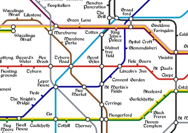
Londonist created a map of the London Underground with station names contemporary to medieval London.
The medieval period spans something like 1,000 years, covering the centuries from the Roman withdrawal around 400 AD to the rise of the Tudors in the late 15th century. Place names, of course, changed greatly over this time and those on the map were not necessarily all in use at the same time. Where applicable, we’ve favoured spellings used in the Domesday survey of 1086. Elsewhere, we’ve taken the earliest recorded version of a place name.
The London Underground recently conducted an experiment on one of the escalators leading out of the busy Holborn station. Instead of letting people walk up the left side of the escalator, they asked them to stand on both sides.
The theory, if counterintuitive, is also pretty compelling. Think about it. It’s all very well keeping one side of the escalator clear for people in a rush, but in stations with long, steep walkways, only a small proportion are likely to be willing to climb. In lots of places, with short escalators or minimal congestion, this doesn’t much matter. But a 2002 study of escalator capacity on the Underground found that on machines such as those at Holborn, with a vertical height of 24 metres, only 40% would even contemplate it. By encouraging their preference, TfL effectively halves the capacity of the escalator in question, and creates significantly more crowding below, slowing everyone down. When you allow for the typical demands for a halo of personal space that persist in even the most disinhibited of commuters — a phenomenon described by crowd control guru Dr John J Fruin as “the human ellipse”, which means that they are largely unwilling to stand with someone directly adjacent to them or on the first step in front or behind — the theoretical capacity of the escalator halves again. Surely it was worth trying to haul back a bit of that wasted space.
Leaving aside “the human ellipse” for now,1 how did the theory work in the real life trial? The stand-only escalator moved more than 25% more people than usual:
But the preliminary evidence is clear: however much some people were annoyed, Lau’s hunch was right. It worked. Through their own observations and the data they gathered, Harrison and her team found strong evidence to back their case. An escalator that carried 12,745 customers between 8.30 and 9.30am in a normal week, for example, carried 16,220 when it was designated standing only. That didn’t match Stoneman’s theoretical numbers: it exceeded them.
But not everyone liked being asked to stand for the common good:
“This is a charter for the lame and lazy!” said one. “I know how to use a bloody escalator!” said another. The pilot was “terrible”, “loopy,” “crap”, “ridiculous”, and a “very bad idea”; in a one-hour session, 18 people called it “stupid”. A customer who was asked to stand still replied by giving the member of staff in question the finger. One man, determined to stride to the top come what may, pushed a child to one side. “Can’t you let us walk if we want to?” asked another. “This isn’t Russia!”
There’s a lesson in income inequality here somewhere…2
Update: The NY Times wades into the not walking on escalators debate: Why You Shouldn’t Walk on Escalators. Standing on the escalator, meet American self-interest.
It would be hard to persuade people that “everybody wins” if they all merely stood on the escalator, Curtis W. Reisinger, a psychologist at Zucker Hillside Hospital in Glen Oaks, N.Y., said.
“Overall I am not too optimistic that people’s sense of altruism can override their sense of urgency and immediacy in a major metro area where the demands for speed and expediency are high,” he wrote in an email.
Sam Schwartz, New York City’s former traffic commissioner and a fellow in transportation at Hunter College, said people’s competitive nature tends to trump logic and science.
“In the U.S., self-interest dominates our behavior on the road, on escalators and anywhere there is a capacity problem,” he wrote in an email. “I don’t believe Americans, any longer (if they ever did), have a rational button.”
There’s nothing more American than a few people gaining a few extra seconds at the expense of many having to wait a lot longer. See also Tom Junod’s piece from Esquire, The Water-Park Scandal and Two Americas in the Raw: Are We a Nation of Line-Cutters, or Are We the Line?
Update: Cheddar did a short video on standing vs walking on escalators:
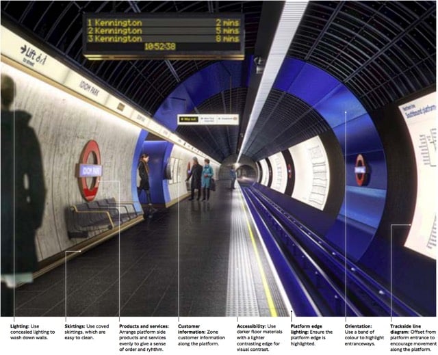
Transport for London recently released a document called the London Underground Station Design Idiom, a guide to the design aesthetic of Tube stations. After an introductory chapter called “A manifesto for good design”, the document offers nine main guidelines for how Underground stations should be designed:
1. Achieve balance across the network. Good design is achieved through balance. For us, this means balance between heritage and the future, between a station’s commercial activity and its customer information, and between the network as a whole and the station as a local place.
2. Look beyond the Bostwick gates. Stations are more than portals to the Underground; they are also places to meet, eat, shop and, most importantly, they are centres of community. Many people’s mental map of London is organised by Underground stations. A neighbourhood’s identity can be enriched by truly ‘embedding’ its station in the local area.
3. Consider wholeness. Good design starts by considering the whole: the whole station (from platform to pavement); the whole of the project from engineering to surface finishing; the whole team. It’s about making sure the right people are engaged from the outset. Considering ‘wholeness’ means creating entire spaces with clear forms, which are clutter-free and legible for all users and requirements.
4. Prioritise comfort for staff and customers. Well-designed stations support staff in their varied roles so they can provide world class customer service. It is this interaction between staff, customers and the built environment that makes London Underground stations so special and distinguishes us from other metros.
5. Delight and surprise. Every Underground station should include at least one moment of delight and surprise, to improve customers’ journeys and the working environment for staff. Such moments help put the network on the map, as a world-class leader of design.
6. Use materials to create atmosphere. The quality of materials has a huge impact on the way a station is perceived by both customers and staff. High quality materials that are robust and easy to maintain make better environments. Use materials to make atmospheric spaces that are dramatic and rich in texture. Make stations more memorable to customers and better places to travel to or through.
7. Create ambience with lighting. Lighting on the Underground is used to make safe and functional environments, with maintenance and costs often dictating the choice and application of fittings with no consideration on how this impacts overall perception of space. Although lighting must be functional to improve safety and increase feelings of comfort, it can also be transformational - improving spaces, drawing attention to heritage or special features and helping customers flow intuitively through a station.
8. Integrate products and services. Good design is not just about choosing the right materials and lighting, it also involves integrating the other products and services which make up the station. All network furniture, fixtures and equipment - such as customer information, safety equipment, ticketing, poster frames, advertising, CCTV and signage - must be fully integrated into the station so there is clarity and coherence from platform to pavement and across the network.
9. Prepare for the future. By embracing new technologies and understanding their benefits we can create better-designed stations that enhance the user experience. This also means considering the life cycle of existing and new materials and products. Designing in flexibility allows our stations to better respond to new challenges, opportunities and change programmes.
Aside from some of the specifics, that’s not a bad list of guidelines on how to think about designing anything. (via mefi)
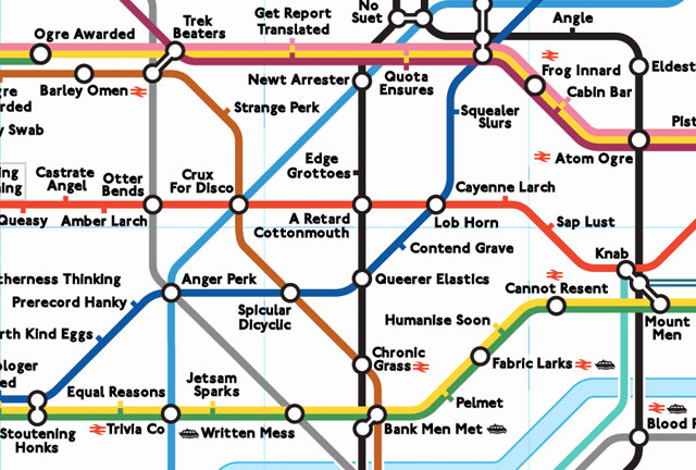
Otter Bends, Queer Spank, Frog Innard, and Lob Horn are some of the stations on the anagram map of the London Underground.
There’s not a whole not more to this radio than what it looks like, but I will forever have a soft spot for things that mimic the London tube map.
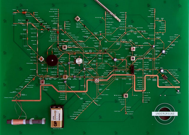
Now, if it contained vacuum tubes or something…
A post featuring 8 different Tube maps since 1908 had me wondering what else was out there on the evolution of the London Underground map. There is quite a bit. This is less a reflection on Harry Beck, etc, and more a collection of what can be found.
A History of the London Tube Maps is pretty thorough until 2002. It’s also attractive as a time capsule for websites from around then.
A more up-to-date designed collection of maps from 1889-2002.
An animated look at how the Thames has been represented over the years. An animated look at the entire system until 2008.
The Guardian’s retrospective slide show.
Among other things, info on non-Harry Beck designed maps from 1939 and 1940. Also the detail that Beck received about 2 weeks wages as a bonus for the original design.
London Tube Map Archive.
A critique of the 2008 map. And the 2009 map. Undated critique (I think for 2008 map).
Geographically accurate Tube map, and the rest of this blog’s coverage of the London Underground, including Edward Tufte’s thoughts:
Harry Beck’s diagram of the 7+ lines of the London Underground, although geographically inaccurate, provides a coherent overview of a complex system. With excellent color printing, classic British railroad typography (by Edward Johnson), and, in the modern style, only horizontal, vertical, and 45 degree lines, the map became a beautiful organizing image of London. For apparently quite a number of people, the map organized London (rather than London organizing the map). Despite 70 years of revision due to extensions of the Underground and bureaucratic tinkering (the marketing department wrecked the map for several years), the map nicely survives to this day.
(First post via Dave M.)
A lengthy discussion of the typeface for the London Underground, both the old version by Edward Johnston as well as the refresh.
“We continue to make subtle changes” Ashworth admits, “but we’re very wary about doing too much and are always happy to roll back changes if they end up not feeling ‘right.’
“The most recent major change was to the numbers 1 and 4 earlier this year. Not a lot of people noticed until a poster appeared advertising engineering work on the 14th of February — then I got A LOT of emails.”
Map of the US Interstate system in the style of the London Tube map.
Go large for detail. (via coudal)
Harry Beck, designer of the iconic London Tube map, once took a crack at a map for the Paris Metro, but his effort was rejected for being too geometric.
So why did the Paris Metro (now operated by the RATP) reject Beck’s clear simplification of their beloved system? One reason is visible at each station entrance; Parisians use the maps here as a free public service to help them find their way round the city - the ubiquitous geographic wall map is more than just a Metro plan.
A map of the Milky Way done in the style of the London tube map.
I was re-reading Carl Sagan’s novel Contact recently, essentially a series of arguments about SETI wrapped into a story, and he alludes to some sort of cosmic Grand Central Station. That, coupled with my longtime interest in transit maps, got me thinking about all of this.
Nice 25-minute documentary on the London Tube map, “the pinnacle of London Transport’s modernist design”.
Another kind of Tube map: which seating/standing positions in the carriage are the best and which are the worst? “Everyone knows the prime seats and standing spots, and people jostle for supremacy when the doors open, especially at the depot, when the train is empty.”
The top 11 underground transit systems in the world. The London Tube is #1, NYC is #7, Hong Kong is #10. (via rob)
Prewalking: walking down the subway platform so that when you board the train, you’ll be close to the exit or transfer point when the train reaches its destination.
Update: Photo of the Way Out -> tube map, which marks which side of the train to exit from and where exits/transfers are for each station. (thx, tom)
Update: Exit maps are available for the Toronto and Toyko subways. (thx, adam)
More explosions in London on the tube and buses. Only detonators were used; minor injuries and damages.
The large number of surveillance cameras in London may help identify the bombing suspects. “In all, there are at least 500,000 cameras in the city, and one study showed that in a single day a person could expect to be filmed 300 times.”
Daniel Gross on why the financial markets reacted to the London bombings as they did. Stocks dropped (but not too much), oil fell sharply, and transportation and insurance stocks took a bigger hit than most.
Despite the flurry of remaindered links yesterday morning about the London transport bombings, yesterday was a pretty slow day on kottke.org. Because of the time difference between New York and London, news about the bombings became more scarce around noon ET when the London workday was ending and I decided not to post about anything else for the remainder of the day. Today, I’m resuming the usual flow of frivolous links and commentary around here, but I’ll be keeping an eye out for news from London as well.
A Letter to the Terrorists, From London. “We’re going to take care of the lives you ruined. And then we’re going to work. And we’re going down the pub.”
Older posts
Socials & More