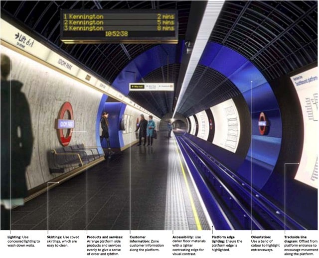
The 9 guidelines for the design of London Tube stations

Transport for London recently released a document called the London Underground Station Design Idiom, a guide to the design aesthetic of Tube stations. After an introductory chapter called “A manifesto for good design”, the document offers nine main guidelines for how Underground stations should be designed:
1. Achieve balance across the network. Good design is achieved through balance. For us, this means balance between heritage and the future, between a station’s commercial activity and its customer information, and between the network as a whole and the station as a local place.
2. Look beyond the Bostwick gates. Stations are more than portals to the Underground; they are also places to meet, eat, shop and, most importantly, they are centres of community. Many people’s mental map of London is organised by Underground stations. A neighbourhood’s identity can be enriched by truly ‘embedding’ its station in the local area.
3. Consider wholeness. Good design starts by considering the whole: the whole station (from platform to pavement); the whole of the project from engineering to surface finishing; the whole team. It’s about making sure the right people are engaged from the outset. Considering ‘wholeness’ means creating entire spaces with clear forms, which are clutter-free and legible for all users and requirements.
4. Prioritise comfort for staff and customers. Well-designed stations support staff in their varied roles so they can provide world class customer service. It is this interaction between staff, customers and the built environment that makes London Underground stations so special and distinguishes us from other metros.
5. Delight and surprise. Every Underground station should include at least one moment of delight and surprise, to improve customers’ journeys and the working environment for staff. Such moments help put the network on the map, as a world-class leader of design.
6. Use materials to create atmosphere. The quality of materials has a huge impact on the way a station is perceived by both customers and staff. High quality materials that are robust and easy to maintain make better environments. Use materials to make atmospheric spaces that are dramatic and rich in texture. Make stations more memorable to customers and better places to travel to or through.
7. Create ambience with lighting. Lighting on the Underground is used to make safe and functional environments, with maintenance and costs often dictating the choice and application of fittings with no consideration on how this impacts overall perception of space. Although lighting must be functional to improve safety and increase feelings of comfort, it can also be transformational - improving spaces, drawing attention to heritage or special features and helping customers flow intuitively through a station.
8. Integrate products and services. Good design is not just about choosing the right materials and lighting, it also involves integrating the other products and services which make up the station. All network furniture, fixtures and equipment - such as customer information, safety equipment, ticketing, poster frames, advertising, CCTV and signage - must be fully integrated into the station so there is clarity and coherence from platform to pavement and across the network.
9. Prepare for the future. By embracing new technologies and understanding their benefits we can create better-designed stations that enhance the user experience. This also means considering the life cycle of existing and new materials and products. Designing in flexibility allows our stations to better respond to new challenges, opportunities and change programmes.
Aside from some of the specifics, that’s not a bad list of guidelines on how to think about designing anything. (via mefi)


Socials & More