kottke.org posts about design
You should design URLs for people because they are important UI elements.
URLs can contain information about the page contents before they are even clicked. This is very advantageous in some communication mediums, such as chats, IMs, tweets, emails and forums.
(via hacker news)
Designer Adam Harvey, who gave the world the anti-paparazzi purse and dazzle camouflage for the face, has developed a hoodie that makes the wearer invisible to the sort of thermal imaging utilized by surveillance drones.
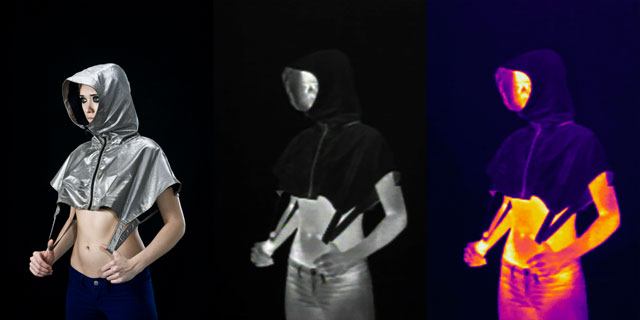
This is the most New Aesthetic thing I have ever seen. The Guardian has more:
“These are primarily fashion items and art items,” Harvey tells me. “I’m not trying to make products for survivalists. I would like to introduce this idea to people: that surveillance is not bulletproof. That there are ways to interact with it and there are ways to aestheticise it.”
I imagine that at some point, anti-drone clothing will eject chaff as a countermeasure against incoming drone-launched missiles. (via @DavidGrann)
Pentagram’s Daniel Weil has designed a new chess set that is currently being used at the World Chess Championship Candidates Tournament in London. The set is beautifully iconic and simple.
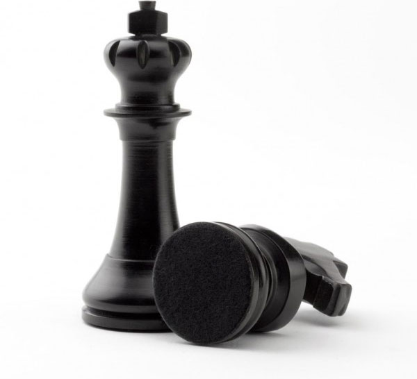
The set is available for sale for £200 or with the board for £300.
There are a zillion definitions of simplicity. Here is Christoph Niemann’s, which he applied in building his new iOS app, Petting Zoo.
Simplicity is not about making something without ornament, but rather about making something very complex, then slicing elements away, until you reveal the very essence.
(via @djacobs)
Designer Ben Pieratt calls Hessian “an invader, an ode, a brand in waiting, a pitch to the market”. It is also a fully developed brand (logos, Twitter handle, web themes, app icons, etc.) for sale.
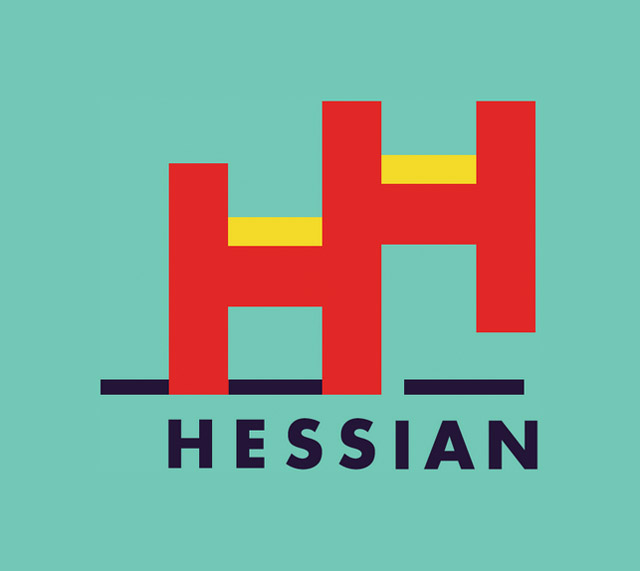
As a newborn idea, Hessian is aggressive and evolving. Its only conduit the working mind of designer Ben Pieratt, it fights for life by building meme-hooks through studies in contrasts, nostalgia, repetition and confusion. The Hessian could be a restaurant, a start-up, a clothing brand or more.
Like any great brand, Hessian is for sale. The current asking price is $18,000.
The forecasted temperature in the interior of Australia is so high for next Monday that the country’s Bureau of Meteorology has had to add an extra color code at the top end of the temperature scale for REALLY FUCKING HOT.
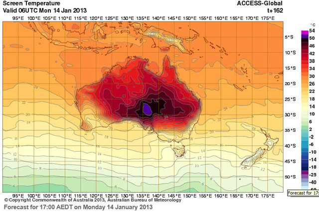
The bureau’s head of climate monitoring and prediction David Jones said the new scale, which also features a pink code for temperatures from 52 to 54 degrees, reflected the potential for old heat records to be smashed.
“The scale has just been increased today and I would anticipate it is because the forecast coming from the bureau’s model is showing temperatures in excess of 50 degrees,” Jones told Fairfax newspapers.
Australia’s all-time record temperature is 50.7 degrees, set in January 1960 at Oodnadatta in the state of South Australia.
The nation as a whole experienced its hottest day on record on Monday with the average maximum temperature across the country hitting 40.33 degrees, surpassing the previous mark of 40.17 degrees set in 1972.
I feel like climate change needs a Steve Jobs to kick everyone’s ass into action on this, iPhone announcement-style. “Unprecedented polar ice cap melt, new colors on Australia’s weather map, massive East Coast hurricanes, are you getting it? These are not three separate incidents. This is one global pattern. And we are calling it anthropogenic climate change. [wild applause]” (via @ftrain)
Chris Ware designed the Newtown-themed cover for the New Yorker last week and describes the process that went into it.
On December 14th, I helped chaperone my daughter’s second-grade-class field trip to a local production of “The Nutcracker,” where I spent most of my time not watching the ballet but marvelling at the calm efforts of the teacher to keep the yelling, excited class quieted down. Teaching was not, I concluded at one point, a profession in which I could survive for even one day. Our buses came back to the school at midafternoon, and I and the other volunteer parents left our children for another hour of wind-down time (for us, not them) before returning for the regular 3-P.M. pickup. I came home, however, not to any wind-down but to the unfolding coverage of the Newtown shooting. Shaken to the core, I returned to the school, where a grim quiet bound myself and the other parents together, the literally unspeakable news sealing our smiles while, at a lower strata, our happy, screaming children ran out of the building into our arms still frothed up by sparkling visions of the Sugar Plum Fairy.
A new series of George Orwell’s books are being published by Penguin and this is the cover for 1984:
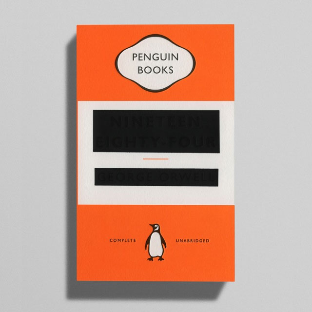
Cover design by David Pearson…more covers from the same series here. (via @torrez)
The NY Times asked a bunch of designers for their favorite book cover designs of 2012. Lots of nice work here.
The Cooper-Hewitt National Design Museum has a relatively new Object of the Day feature. Recent items include an abacus image by Paul Rand, an 18th-century version of bingo, and a Tiffany lamp.
I love these posters featuring six women who changed science and the world. Hard to pick a favorite but I’ll go with the Sally Ride one:
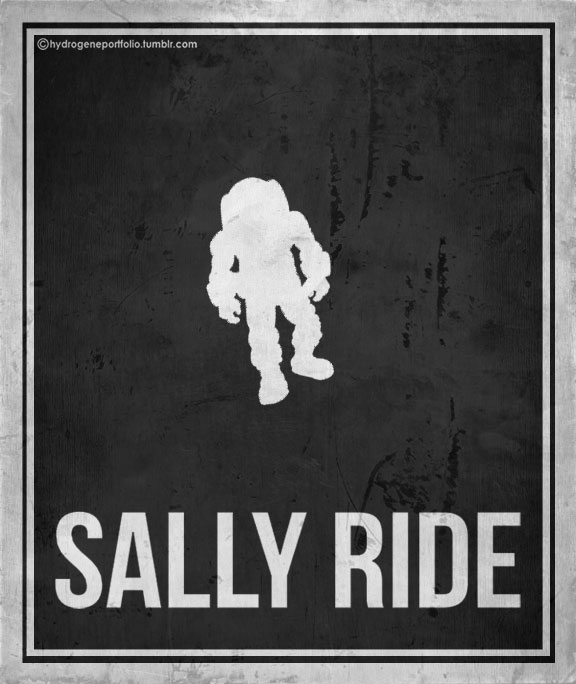
The Rosalind Franklin poster is a close second. The same artist also did this wonderfully minimalist poster for Louis Braille.
ps. Today is Ada Lovelace Day!
Peter Dean is a big Beatles fan. And so he set out to reproduce exactly — from photographic evidence only — an old circus poster owned by John Lennon. In true Sgt. Pepper’s fashion, he had a little help from his friends.
This is a reproduction of the poster that inspired John Lennon to write the song Being for the Benefit of Mr. Kite!, which appeared on The Beatles’ 1967 album Sgt. Pepper’s Lonely Hearts Club Band. It is printed in a limited edition of 1,967.
Lennon bought the poster in an antiques shop and hung it in his music room. While writing for Sgt. Pepper one day, he drew inspiration from the quirky, old-fashioned language and set the words to music.
A limited edition letterpress reproduction of the poster is available for sale.
Leica announced a new version of their M series camera on Monday and the “one more thing” concerned a Jonathan Ive-designed special edition of the Leica M.
This camera will be the mother of all limited editions based on one simple fact: only a single unit of the camera will ever be produced. Aside from announcing this camera, not much else was revealed. It is, however, for more than just a publicity stunt: the camera will be auctioned off, and the proceeds will be donated to charity.
The regular M retails for almost $7000 so I imagine the iLeica will go for about eleventy gajillion. Also, designed? How much leeway will Ive have to really change the camera? He’ll just slap some new colorways on it, yes? (via df)
Some examples of car company logo rip-offs, mostly from China.
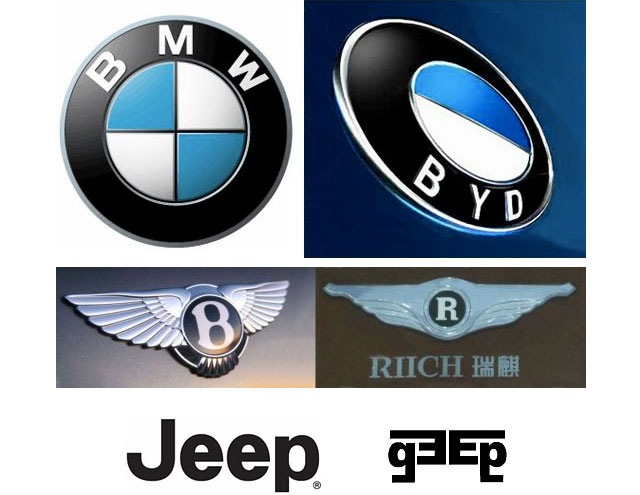
And really, who wouldn’t want a BYD instead of a BMW?
After using the same logo for the past 25 years, Microsoft introduces a new logo that echoes their Windows brand.

The Microsoft brand is about much more than logos or product names. We are lucky to play a role in the lives of more than a billion people every day. The ways people experience our products are our most important “brand impressions”. That’s why the new Microsoft logo takes its inspiration from our product design principles while drawing upon the heritage of our brand values, fonts and colors.
(via df)
For his final project at the Royal College of Art in London, Luc Fusaro outlined a process for building custom-fitting sprinting shoes that weigh just 96 grams.
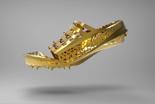
The shoes are fabricated using a selective laser sintering process that uses precise 3-D scans of an athlete’s foot to achieve maximum fit. The really tantalizing (but unfortunately uncited) bit about Fusaro’s design is that by fitting shoes to a sprinter’s feet so precisely, significant performance improvements might result:
Scientific investigations have shown that tuning the mechanical properties of a sprint shoe to the physical abilities of an athlete can improve performance by up to 3.5%.
For 100-meter world record holder Usain Bolt, a performance improvement of 3.5% could lower his world record to 9.24…just by wearing different shoes. That seems insane but Speedo’s LZR Racer suit that was responsible for dozens of world records falling in 2008 were shown to lower racing times by 1.9 to 2.2 percent so that sort of improvement is certainly possible. (via @curiousoctopus)
With the Olympics about two weeks away, consider this a final you-can’t-unsee-it reminder that the 2012 London Olympics logo looks like Lisa Simpson performing oral sex.
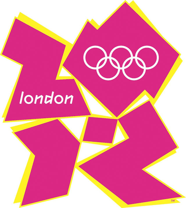
It’s not as bad as some of the others on this list (oh, that Mon-Sat logo), but it’s still exceptionally unforgettable. Enjoy the wall-to-wall Olympic coverage for the next two weeks!
Gawker has rebranded their new commenting system…it’s now called Kinja. The name is recycled from a project that Nick Denton worked on with Meg Hourihan starting in 2003. Kinja 1 was an attempt to build a blog aggregator without relying solely on RSS, which was not then ubiquitous. Here’s a mockup of the site I did for them in late 2003:

Luckily they got some real designers to finish the job…here’s a version that 37signals did that was closer to how it looked at launch.
Where is the team that worked on that Kinja? Nick’s still hammering away at Gawker, Meg is raising two great children (a more difficult and rewarding task than building software), programmer Mark Wilkie is director of technology at Buzzfeed, programmer Matt Hamer still works for Gawker (I think?), intern Gina Trapani is running her own publishing/development empire & is cofounder of ThinkUp, and 37signals (they worked on the design of the site) is flying high.
For the most recent issue of Fast Company, Jeff Chu profiled Tadashi Yanai, the CEO of Uniqlo, one of the hottest retail companies in the world. The piece is full of interesting business & design wisdom throughout.
Yanai, though, cannot resist the American market. Around the corner from his Tokyo office, there’s a large map of Manhattan. There are push pins marking Abercrombie & Fitch, American Eagle, Forever 21, Gap, Hollister, and a half-dozen other brands that could be considered immediate competitors. Significantly, there’s one outlier marked: the Apple Store. When I ask Yanai about this, he replies simply, “People have only one wallet.”
More notably, Apple is perhaps the best example of a company whose products have become ubiquitous without losing cachet. “Specialness is nice to have,” Yanai says, “but what’s more important is being made for all.”
One of my favorite things about shopping at Uniqlo is how they hand you your credit card back:
All associates are trained, for instance, to return your credit card and receipt with both hands, as a sign of respect.

Is it real or is it CSS3? Amazingly, the above image was made entirely in HTML and CSS3 by Dylan Hudson. (via ★interesting)
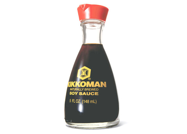
The iconic bottle was designed by Kenji Ekuan and his team at GK Design.
It took three years for Ekuan and his team to arrive at the dispenser’s transparent teardrop shape. More than 100 prototypes were tested in the making of its innovative, dripless spout (based on a teapot’s, but inverted). The design proved to be an ideal ambassador. With its imperial red cap and industrial materials (glass and plastic), it helped timeless Japanese design values — elegance, simplicity and supreme functionality — infiltrate kitchens around the world.
When some unknown ancient civilization invented the Solo cup, they placed several lines on the outside of the cup, seemingly at random intervals. Was it a star chart? A moon calendar? A representation of their water god? Recently internet memiticians have uncovered the startlingly simple pattern behind those lines. Are you ready for this?
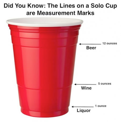
There you have it, the ancients used those marks to measure out appropriate quantities of alcohol, just like today’s college kids do at frat parties. Nevermind that Solo is moving away from that cup design…this is still an amazing discovery. (via stellar)
Update: Getting lots of mail about this…apparently the memiticians were wrong!
The lines on our Party Cups are designed for functional performance and are not measurement lines. If the lines do coincide with certain measurements, it is purely coincidental.
(thx, everyone)
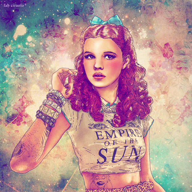
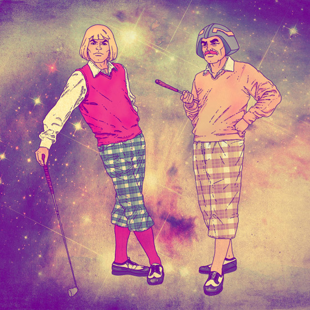
Fabian Ciraolo does illustrations that mash up old and new pop culture. My favorite is Frida Kahlo rocking a Daft Punk t-shirt:
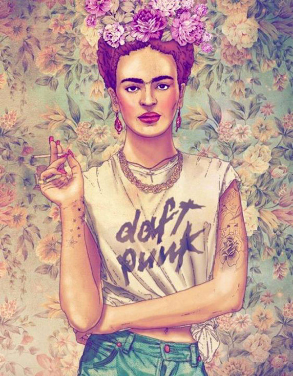
Here are a few others I particularly like:

Dirk van der Kooij is a designer who uses a low-resoution 3D printer of sorts to print out plastic furniture with plastic recovered from recycled refrigerators.
Images of the finished product are available on his web site as are the chairs themselves, for €840. (via @curiousoctopus)
From Steven Heller and Veronique Vienne, a book about 100 Ideas that Changed Graphic Design. Maria Popova has a preview at The Atlantic.
From how rub-on lettering democratized design by fueling the DIY movement and engaging people who knew nothing about typography to how the concept of the “teenager” was invented after World War II as a new market for advertisers, many of the ideas are mother-of-invention parables. Together, they converge into a cohesive meditation on the fundamental mechanism of graphic design — to draw a narrative with a point of view, and then construct that narrative through the design process and experience.
Blown Covers is a new book that details the illustrations that never made it to the front cover of the New Yorker. At Imprint, Michael Silverberg interviews Françoise Mouly, the book’s author and the New Yorker’s art editor since 1993, and shares some of best rejected covers. I like this one by Christoph Niemann showing the attempted return of the Statue of Liberty to France:
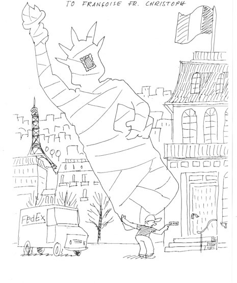
“Think of me as your priest,” she told one of them. Mouly, who cofounded the avant-garde comics anthology RAW with her husband, Art Spiegelman, asks the artists she works with — Barry Blitt, Christoph Niemann, Ana Juan, R. Crumb — not to hold back anything in their cover sketches. If that means the occasional pedophilia gag or Holocaust joke finds its way to her desk, she’s fine with that. Tasteless humor and failed setups are an essential part of the process. “Sometimes something is too provocative or too sexist or too racist,” Mouly says, “but it will inspire a line of thinking that will help develop an image that is publishable.”
This looks like an interesting new book from Taschen, Information Graphics (buy at Amazon).
Our everyday lives are filled with a massive flow of information that we must interpret in order to understand the world we live in. Considering this complex variety of data floating around us, sometimes the best — or even only — way to communicate is visually. This unique book presents a fascinating historical perspective on the subject, highlighting the work of the masters of the profession who have created a number of breakthroughs that have changed the way we communicate. Information Graphics has been conceived and designed not just for designers or graphics professionals, but for anyone interested in the history and practice of communicating visually.
The in-depth introductory section, illustrated with over 60 images (each accompanied by an explanatory caption), features essays by Sandra Rendgen, Paolo Ciuccarelli, Richard Saul Wurman, and Simon Rogers; looking back all the way to primitive cave paintings as a means of communication, this introductory section gives readers an excellent overview of the subject. The second part of the book is entirely dedicated to contemporary works by the current most renowned professionals, presenting 200 graphics projects, with over 400 examples — each with a fact sheet and an explanation of methods and objectives — divided into chapters by the subjects Location, Time, Category, and Hierarchy.
Newer posts
Older posts
Socials & More