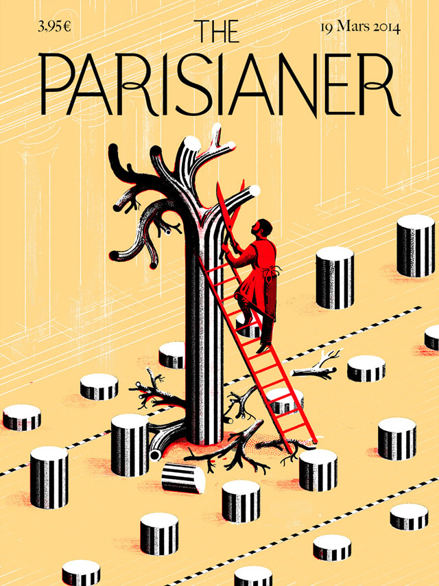
If the New Yorker were set in Paris
Covers for The Parisianer, an imaginary version of the New Yorker set in Paris.
This site is made possible by member support. 💞
Big thanks to Arcustech for hosting the site and offering amazing tech support.
When you buy through links on kottke.org, I may earn an affiliate commission. Thanks for supporting the site!
kottke.org. home of fine hypertext products since 1998.
Beloved by 86.47% of the web.
Covers for The Parisianer, an imaginary version of the New Yorker set in Paris.
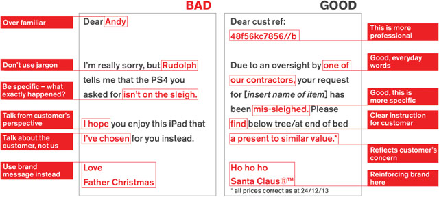
Communications agency Quietroom came up with a tongue-in-cheek set of brand guidelines for Santa Claus outlining a brand refresh for the jolly Pole dweller.
From Pitchfork, a list of the best album covers from 2013. My favorite is this one from Tyler, The Creator, which looks more or less like the opposite of a rap album.

I also liked Michael Cina’s cover for Fort Romeau (which he adapted from his very fetching art) and of course Yeezus, which is this year’s unignorable album in every way. (via @pieratt)
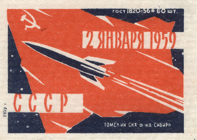
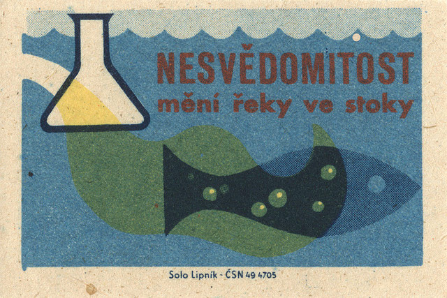
From Flickr, a collection of more than 1600 matchbox labels, most of them from Eastern Europe. (via @themexican)
Football as Football is a collection of American football team logos in the style of European football club badges. Here are badges for the Detroit Lions (in the Italian style) and New England Patriots (in the Spanish style).


Glen Weisgerber is a wizard at the art of hand-lettering. Make sure you watch all the way through for the big flourish-y finish.
(via colossal)
More than 80 photos of marvelous wood type alphabets in this Flickr set.
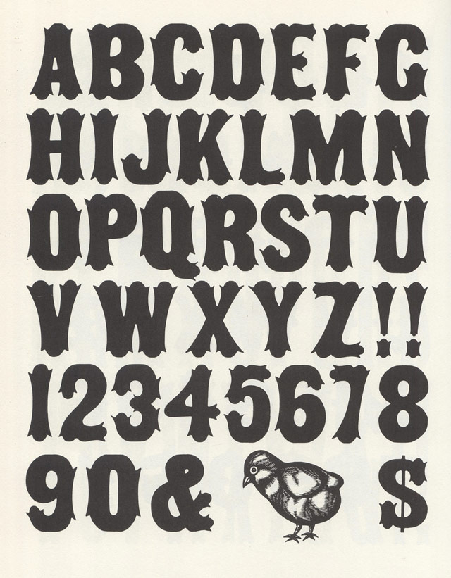
The scans are from Rob Roy Kelly’s 100 Wood Type Alphabets. (via @H_FJ)
Sadly, most infographics these days look like this, functioning as a cheap and easy way to gussy up numbers. But when done properly, infographics are very effective in communicating a lot of information in a short period of time and can help you see data in new ways. In The Best American Infographics 2013, Gareth Cook collects some of the best ones from over the past year. Wired has a look at some of the selections.
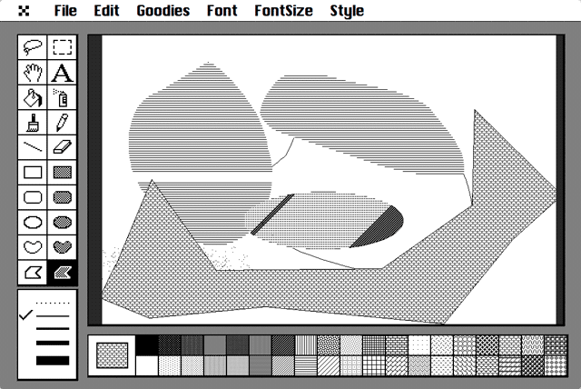
CloudPaint is a fully operational online version of the original MacPaint released with the Macintosh in 1984. The source code for version 1.3 of MacPaint is available from the Computer History Museum.
Steven Hawking came up with a simple and clever way of seeing if time travel is possible. On June 28, 2009, he threw a party for time travellers from the future…but didn’t advertise it until after the party was already over.
In an effort to improve the chances of the party invite being noticed by future generations, Peter Dean, working with approval from Hawking, has made this gorgeous hand-printed poster of the party invitation:
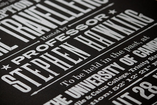
There’s also a smaller less-expensive version of the poster in grey and a fetching yellow/orange.
Vitamins is a design studio in London that made a wall calendar out of Lego. They also built a mechanism to sync an online calendar to the Lego one: you just take a photo of the Lego calendar and send it to a special email address and voilà!
(via ★interesting)
My favorite of Jason’s posts are the ones that are wrong. I love the spirited debate, looking at the @messages directed to him, and I especially love the “Post Updates” feature and its self-documenting “wha?” Kottke.org is not about viral videos or amazing facts (although it has those, too), it’s about Jason saying: “Look at this cool thing,” and starting a conversation around it. Jason has worked for almost fifteen years as programmer, editor, designer and of course blogger of the site with sharing at its core.
I’ve always loved how he thinks and talks about the way the site works:
Stellar is the natural extension of Jason’s work. The site is an enthusiasm engine, allowing you to see the best of the Internet through the eyes of friends and trusted strangers. It’s one of the Top Five pieces of software of all time.1 Jason’s fine hypertext products buy us time by filtering out the crap. If you want something good to read or look at or retweet, Stellar won’t let you down. And it’s made Kottke.org better too.
Last night I swung by Jason’s neighborhood place to raise a glass in Jason’s honor. Meg generously offered me a few glasses more and soon I was telling strangers to buy the Stellar fun pass. Some people are angry drunks, I tell strangers about Stellar. But I do want to take this (sober!) moment to encourage you to buy the stellar fun pass, it helps Jason do what Jason does best - he does it better than anyone else, and it makes all of us better at internet.
Jason was way ahead of his time with his Micropatronage project, which has been a huge influence on how I work and think about the web ever since. I also love How Cranberries are Harvested, NFL maps, God Fave the Queen,
Hilarious bad lip reading of NFL players, Megway, the old domain “yoink.org,” kottke.org/random, and kottke.org posts tagged kottke.org. I love kottke.org.
Happy Birthday, Jason!
1. I am tweaking this list in my head almost weekly, but Stellar is always on it.
The Art of the Title chats with the excellent Jessica Hische about the lettering and type design she did for Wes Anderson’s Moonrise Kingdom.
To me, that was really fun because if you think about New England in the ’60s… it’s not like most places would be staying on top of the most current trends in type, using typefaces that were released that very year. So, using something from the ’40s made sense to me. If you think about a small, conservative New England town, lord knows all the printers and designers in town are probably still using type from years ago. I think when people think about historical type references, they often don’t think about that. You should be reaching from that time period to 15 - 20 years earlier and then you’ll be getting stuff that’s quote-unquote “current.”
And she’s releasing the typeface commercially so everyone can use it! Yay!
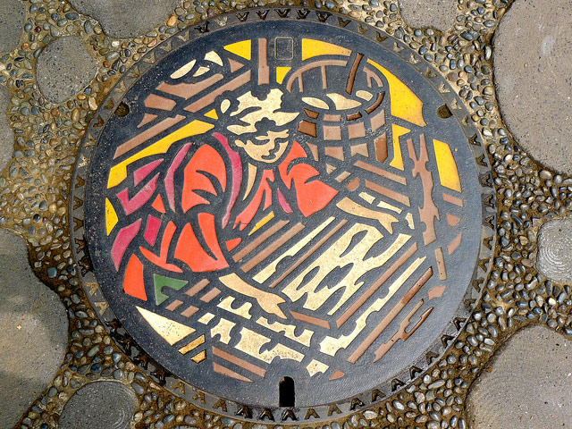
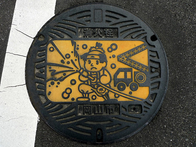
This group on Flickr shows just how fantastically designed Japanese manhole covers are. Here are some of my favorites:


In the parlance of NYC graffiti enthusiasts, going “all city” means getting your stuff known all over the five boroughs. Now a group of designers are challenging each other to go “all RGB”, to make images that contain all of the 16.7 million colors that make up the RGB spectrum once each. This entry is amazing because it still looks like an actual photograph when you zoom out (many others do not):

You can find many more entries on allRGB.com or make your own using this code on GitHub. (via digg)
On the occasion of the latest New Yorker redesign, a worthy re-link to Michael Bierut’s appreciation of the magazine’s practice of slow design.
Publication design is a field addicted to ceaseless reinvention. Sometimes a magazine’s redesign is generated by a change in editorial direction. More often, the motivation is commercial: the publisher needs to get the attention of fickle ad agency media buyers, and a new format — usually characterized as ever more “scannable” and “reader-friendly” — is just the thing. In contrast, one senses that each of the changes in The New Yorker was arrived at almost grudgingly. Designers are used to lecturing timid clients that change requires bravery. But after a certain point — 80 years? — not changing begins to seem like the bravest thing of all.
The New Yorker’s design changes over the years have been so slight that, as Bierut notes, the latest issue looks remarkably like the first issue from 1925.

Mugi Yamamoto’s inkjet printer, designed for his diploma project, eliminates the paper tray and related components by having the printer sit directly on top of the paper, which it “swallows” as it prints.
Apple fan fiction is more popular than ever and usually takes the form of mockups of designs for new products and alternate designs for existing products. There’s been a recent burst of creative energy unleashed on Dribbble around the idea of an iPhone with a screen that wraps completely around the device (or at least down around the sides). Claudio Guglieri seems to have accidentally started it with this mockup of an RSS reader he’s working on:

Fabio Basile dubbed it iPhone 6 Infinity and made a Photoshop template that others could use to make further mockups. More mockups from them and others followed: Side Screen, another Photoshop template, a wrap-around social app, an alternate lock screen, and these subtle side indicators.

Leaving aside for the moment the issue of how a touchscreen device that’s all screen would function while being held, the visual effect is pretty cool.
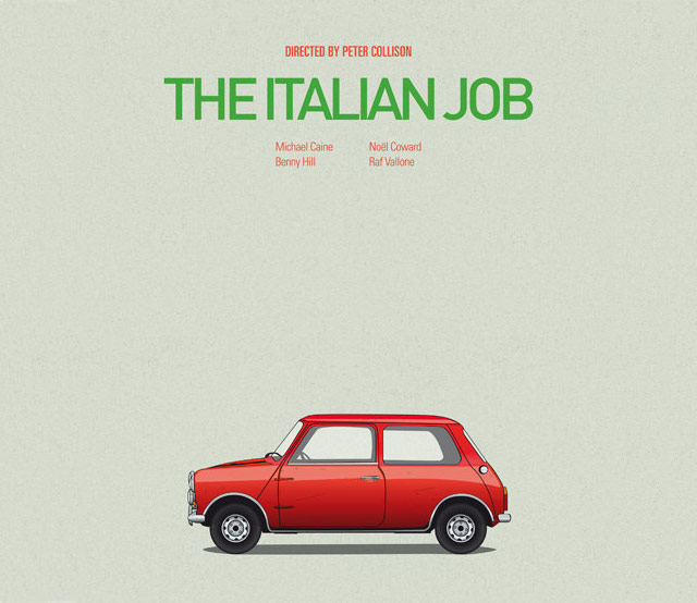
The CarsAndFilms Etsy shop sells posters featuring famous cars from films.
(via cup of jo)
Nice peek into the process of Photoshopping an old photo to make it look new again:
(via @DavidGrann)
Details are scarce and publication is months away, but hotshot book designer Peter Mendelsund is coming out with a book called Cover. I bet it will contain a collection of his covers. Or will be about covers. Or something. But I love book covers so whatever it is, I am covered.
New prints in the Dorothy shop: these really cool Hollywood Star Charts, available in Golden Age and Modern Day editions.
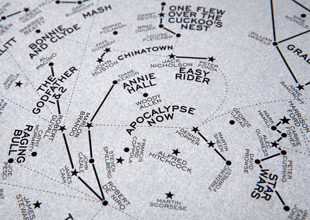
The Modern Day version of our Hollywood Star Chart features constellations named after some of the most culturally significant films to have appeared on the silver screen since 1960 - present day. The stars that make up the clusters are the Hollywood stars that appeared in them.
The chart is based on the night sky over New York on June 16th 1960 — the date of the first showing of Hitchcock’s ‘Psycho’ at the DeMille Theater. With its new approach to storytelling, characterisation and violence it is seen as a key movie in the start of the post-classical era of Hollywood.
The 108 films featured include those chosen for preservation in the US National Film Registry due to their cultural, historical, or aesthetic significance; Academy Award winners; and a few personal favourites. Films include Easy Rider, Bonnie and Clyde, The Exorcist, The Godfather, Chinatown, Star Wars, Pulp Fiction and Avatar.
You may remember Dorothy from their movie name maps.
An extensive examination of the evolution of the Star Wars logo, which went through too many iterations to count.
..Though the poster contained no painted imagery, it did introduce a new logo to the campaign, one that had been designed originally for the cover of a Fox brochure sent to theater owners….Suzy Rice, who had just been hired as an art director, remembers the job well. She recalls that the design directive given by Lucas was that the logo should look “very fascist.”
“I’d been reading a book the night before the meeting with George Lucas,” she says, “a book about German type design and the historical origins of some of the popular typefaces used today — how they developed into what we see and use in the present.” After Lucas described the kind of visual element he was seeking, “I returned to the office and used what I reckoned to be the most ‘fascist’ typeface I could think of: Helvetica Black.”
(via df)
From the AIGA, a lovely short film on type designers Jonathan Hoefler and Tobias Frere-Jones. I love the bit about starting a typeface design with the O, H, and D. Elsewhere, Hoefler recommended other potential starting points:
Work out the B, the ampersand, and the bullet before you get too far: you’ll have to confront decisions about thinning strokes, intersections, and shapes without any counters, which might inform what you do on the other letters.
(via daring fireball)
Before personal brands were something to be seared into the minds of a rabid fanbase, brands were symbols that were literally burned into the flesh of livestock to keep track of ownership. The Texas and Southwestern Cattle Raisers Association has a guide to designing your own cattle brand.
Smithsonian Magazine’s Jimmy Stamp has more info on what cattle brands are all about. For more info on what personal brands are all about, spend more than 30 seconds on Twitter.
Creative Review has named the design department of Bloomberg Businessweek as the 2013 Design Studio of the Year. Well deserved.
But we have chosen to recognise an in-house design team which has had an enormous impact on its industry. Under creative director Richard Turley, (not forgetting editor Josh Tyrangiel) Bloomberg Businessweek has trounced its rivals with a verve and energy that recalls the heyday of the printed magazine.
You can check out BBBW’s design on Flickr and Tumblr.
US currency is already embarrassing and this new design for the $100 bill is not helping.
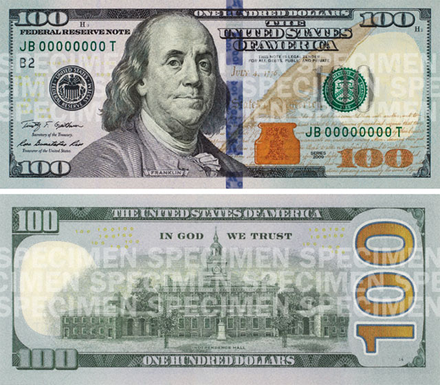
This may be worse than the horrible US passport.
I don’t read music so it’s difficult for me to say how useful this is, but the folks behind Hummingbird claim their new system of music notation is “easier to learn, faster to read, and simpler for even the trickiest music”.
Roll over, Beethoven. (via @veen)
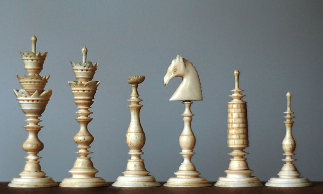
As chess increased in popularity across Europe in the 1800s, the proliferation in the variety of chess sets caused confusion amongst competitors, especially those hailing from different countries. The English typically used Barleycorn sets:
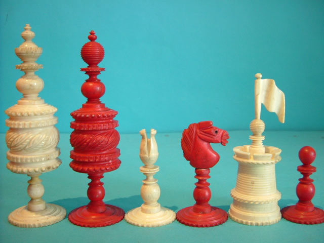
or St. George sets:

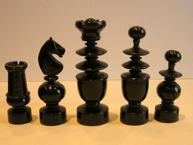
The Germans often used Selenus sets:
Regence sets were popular in France:
Chess set collector Ty Kroll explains the confusion:
English saw a different design for every chess club: St. George sets with their appearance of stacked disks, Dublin sets with more rounded middles, and Northern Uprights with columns instead, as well as elaborate, easily tipped Barleycorn sets. Germany had delicate Selenus sets, beautiful beyond belief, but fragile, tippable, and problematic for play. To tell which piece is which on some of these sets one must count the stacked crown. France saw elegant Regence style sets with some of the most confusing signatures in history. As in the English sets, queen’s were represented by orbs. The king’s floral crown closely resembles the modern Staunton signature for the queen. Knights were always taller than bishops the old French sets. Bishops were represented as fools, not clergymen, and therefore lacked the signature miter. What was worse, the knights in these sets were sometimes simple turned designs, not the recognizable horse’s head. This lead to common confusion as to which minor piece was which. The confusion of antique French knights and bishops is still a common problem today.
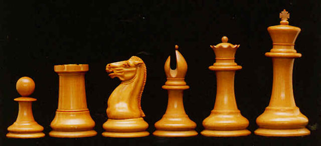
Then in the 1849, Nathaniel Cook designed and John Jaques began to sell a set that eventually came to be called the Staunton chess set:
Howard Staunton was regarded as the top chess player of his era and organized the first international chess tournament in 1851. Staunton endorsed the set and it soon became the standard in chess competitions and, later, the official standard of the World Chess Federation. The most recent iteration of the official Staunton set is Daniel Weil’s design for World Chess:

If you’re interested in learning more, Jimmy Stamp has a nice piece about the design of the original Staunton set and Weil’s update at Smithsonian magazine.
Socials & More