kottke.org posts about photography
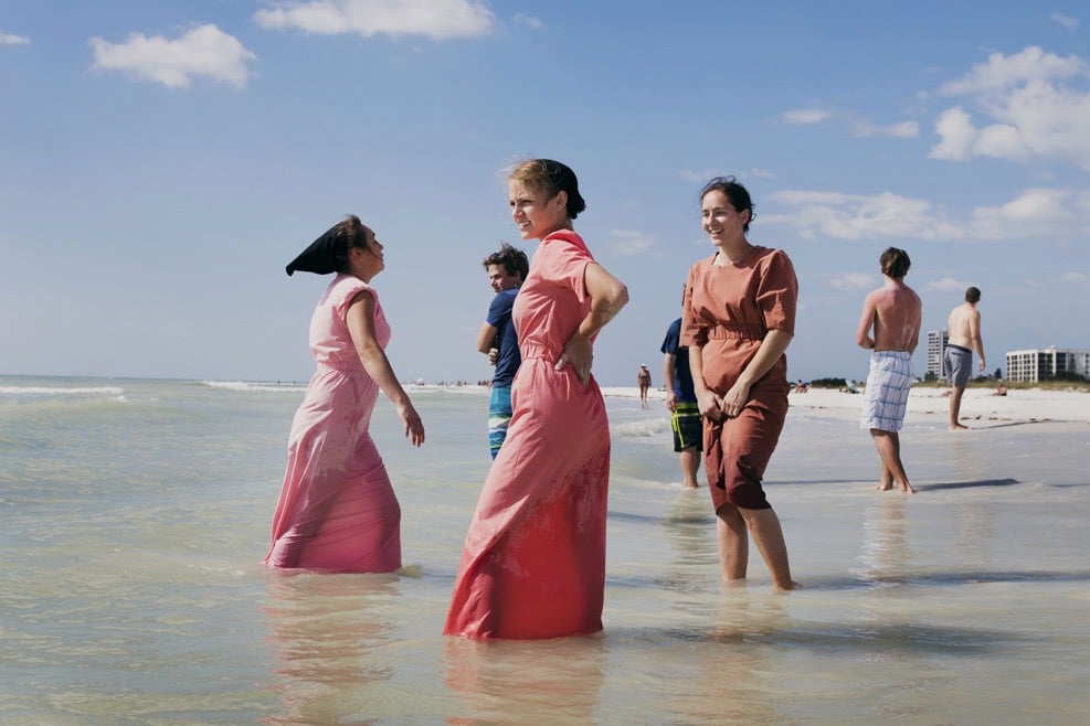
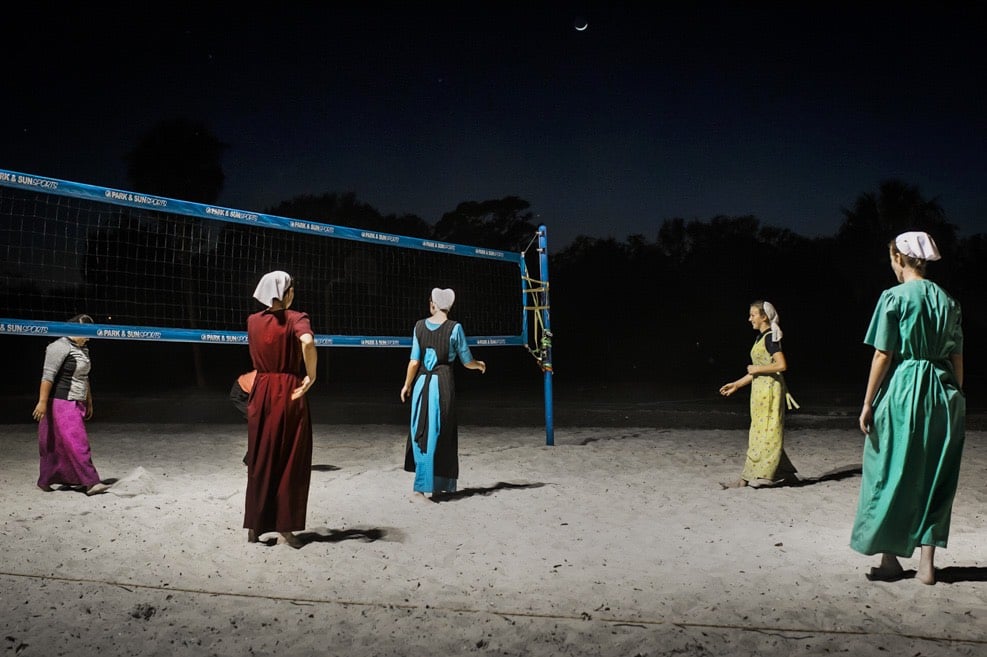
From Dina Litovsky, photos of Amish and Mennonite families on their annual Florida getaway. Her photos were recently featured in The New Yorker. I first read about Amish spring break in 2012 in the NY Times.
Walking around Pinecraft is like entering an idyllic time warp. White bungalows and honeybell orange trees line streets named after Amish families: Kaufman, Schrock, Yoder. The local Laundromat keeps lines outside to hang clothes to dry. (You have to bring your own pins.) And the techiest piece of equipment at the post office is a calculator. The Sarasota county government plans to designate the village, which spreads out over 178 acres, as a cultural heritage district.
Many travelers I spoke to jokingly call it the “Amish Las Vegas,” riffing off the cliché that what happens in Pinecraft stays in Pinecraft. Cellphone and cameras, normally off-limits to Amish, occasionally make appearances, and almost everyone uses electricity in their rental homes. Three-wheeled bicycles, instead of horses and buggies, are ubiquitous.
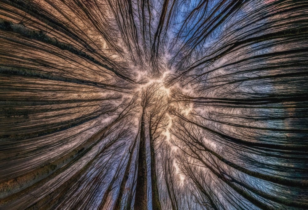

Amongst much fine work on his website and Instagram, Manuelo Bececco’s photos of forest canopies are my favorites. And did you notice the crown shyness in the first photo?
Crown shyness, a phenomenon where the leaves and branches of individual trees don’t touch those of other trees, forming gaps in the canopy.
(via moss and fog)
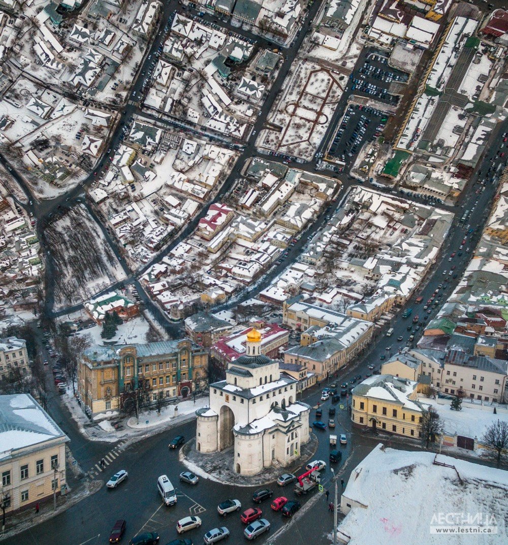
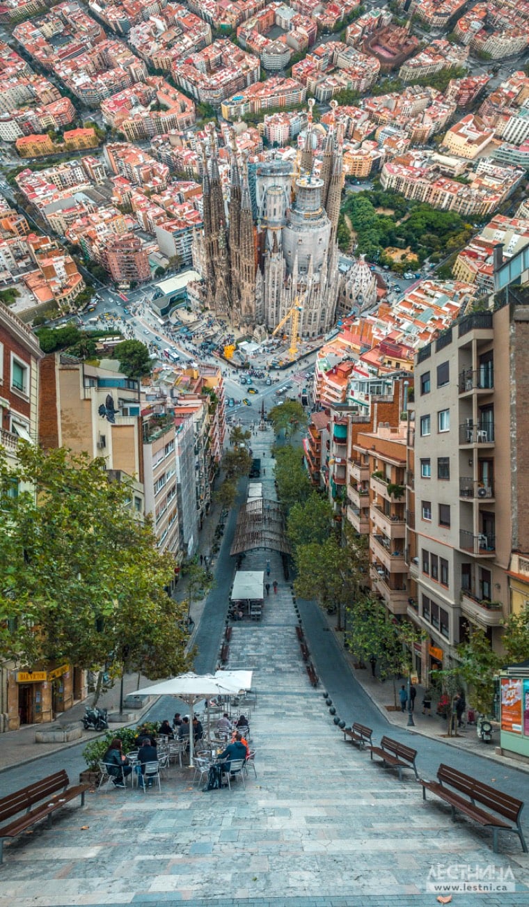
As a long-time fan of BERG’s Here & There projection map of Manhattan (and Inception), these bendy photos of European cityscapes by Lestnica are right up my alley (which is now above my head har har). See also Aydın Büyüktaş’s Flatland photos. (via colossal)
If you didn’t have the opportunity yesterday to watch Jon Stewart’s scathing and powerful opening statement before a House subcommittee about providing health benefits for surviving 9/11 first responders, you really should; it’s quite something:
As I sit here today, I can’t help but think what an incredible metaphor this room is for the entire process that getting healthcare and benefits for 9/11 first responders has come to. Behind me, a filled room of 9/11 first responders and in front of me a nearly empty Congress.
Shameful. It’s an embarrassment to the country and it is a stain on this institution. You should be ashamed of yourselves, for those that aren’t here, but you won’t be. Because accountability doesn’t appear to be something that occurs in this chamber.
On Twitter, archivist Jason Scott shared a cache of over 2300 photos taken by a worker at Ground Zero during the cleanup process in September & October 2001. These photos provide a unique and documentary view of the work being done there, work on behalf of Americans everywhere that this worker, and many others, paid for with his life. Scott:
So, it would probably be useful to interview the worker who took all these photos, who walked around the grounds, who captured these unique images of Ground Zero from all over the space, showing the effort being done to clear the wreckage.
Except we can’t.
He’s dead.
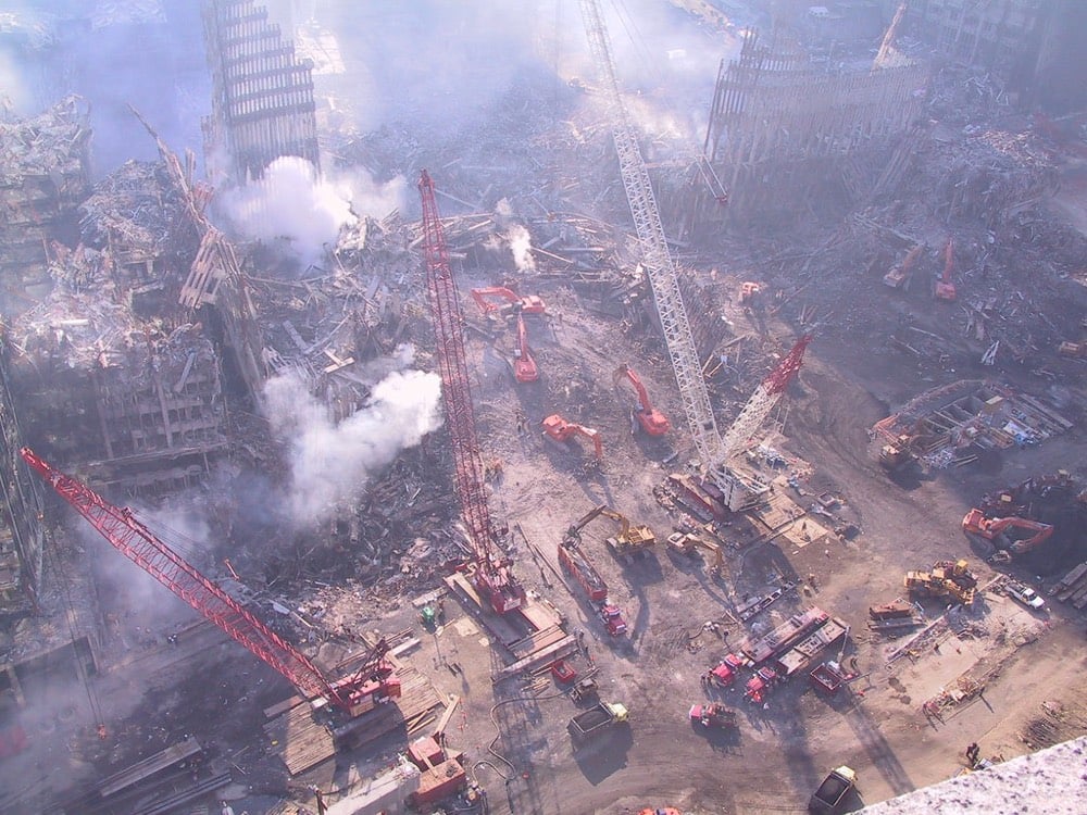

The parallels of all this to HBO’s Chernobyl miniseries is left as an exercise to the reader.
Update: The House subcommittee approved extending the compensation fund for 9/11 first responders until 2090. The bill is expected to pass a full House vote but the Senate is anyone (but Mitch McConnell’s) guess.
Update: For his efforts, one of the first responders gifted Stewart a firefighter’s jacket that belonged to a good friend of his, now deceased:
Tobias Friedrich uses a specialized kit to make these great split shots — half underwater and half over — no need for stitching composites together in a digital darkroom.


Here’s some more info on split photography and the gear you’d need for giving it a shot. (via tmn)
Gothamist recently posted some vintage photos of NYC’s High Line taken by Jake Dobkin back when it was still an abandoned rail line and not an immaculately designed space surrounded by luxury condos. Meg & I snuck up there in Feb 2004 and walked all the way down from 33rd St to the Meatpacking and back again. Here are a few photos I snapped that day:
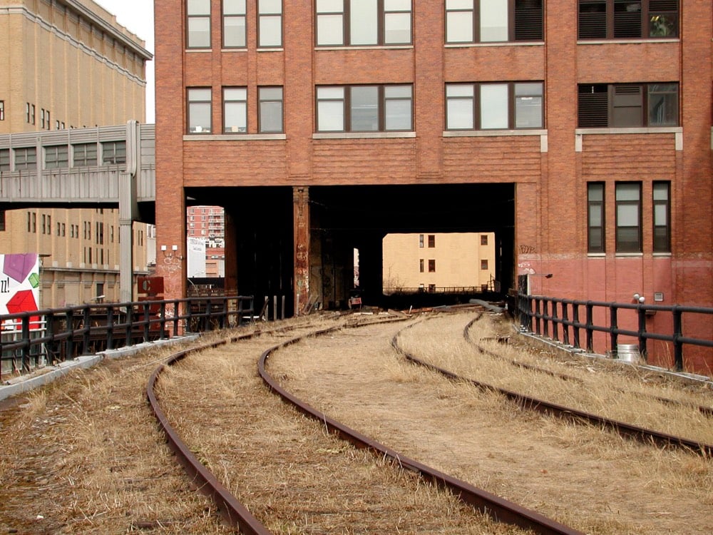
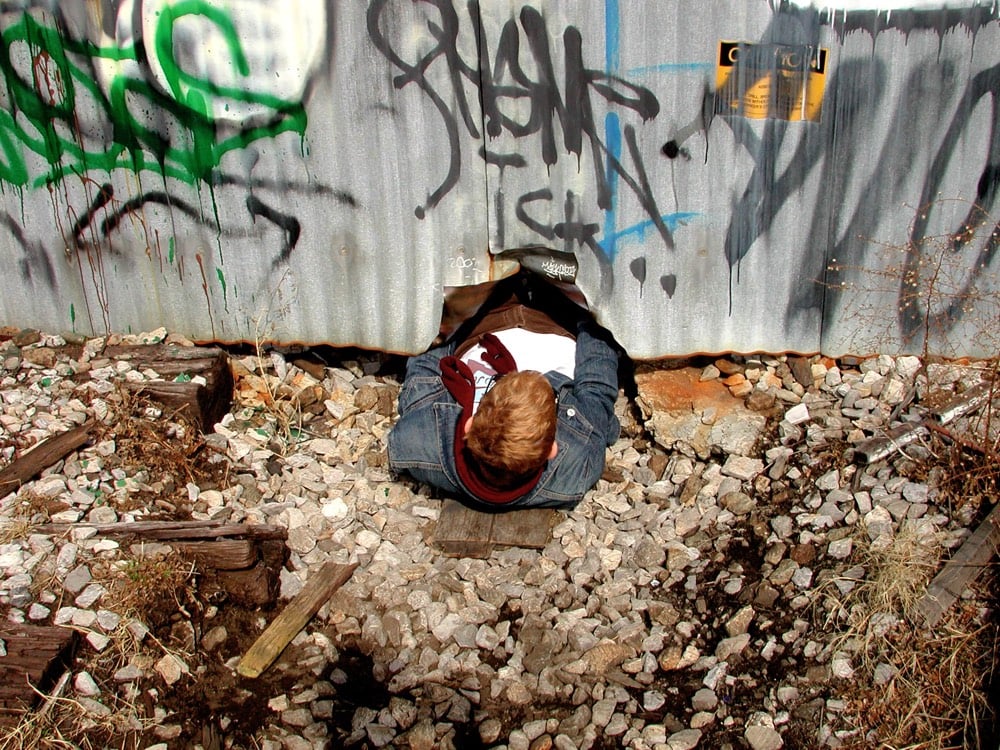
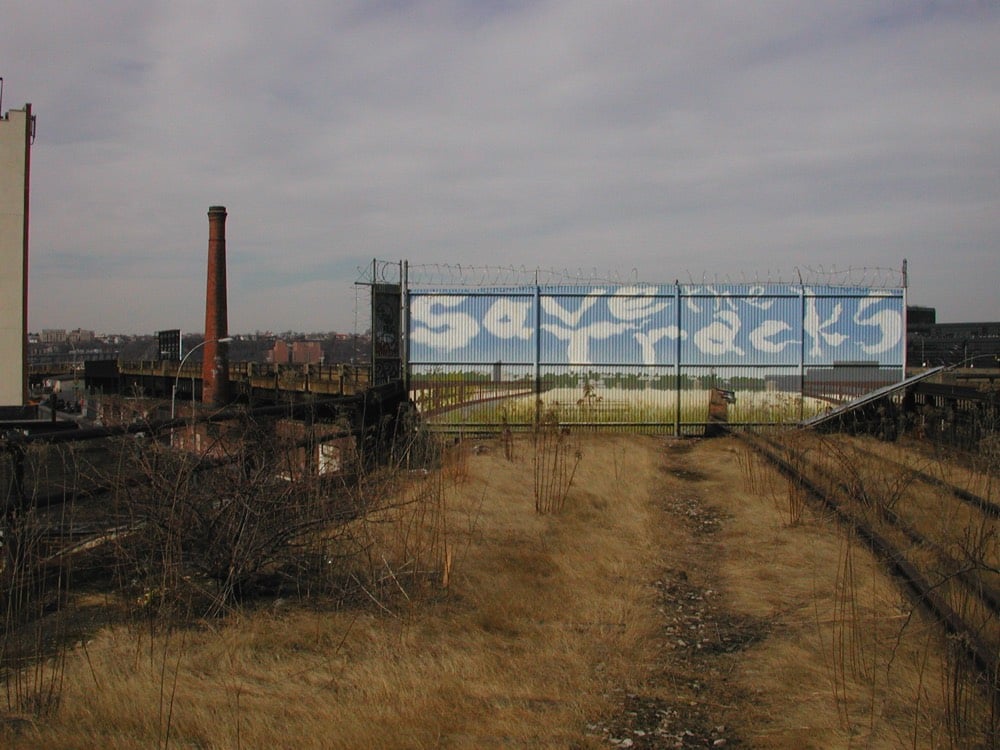
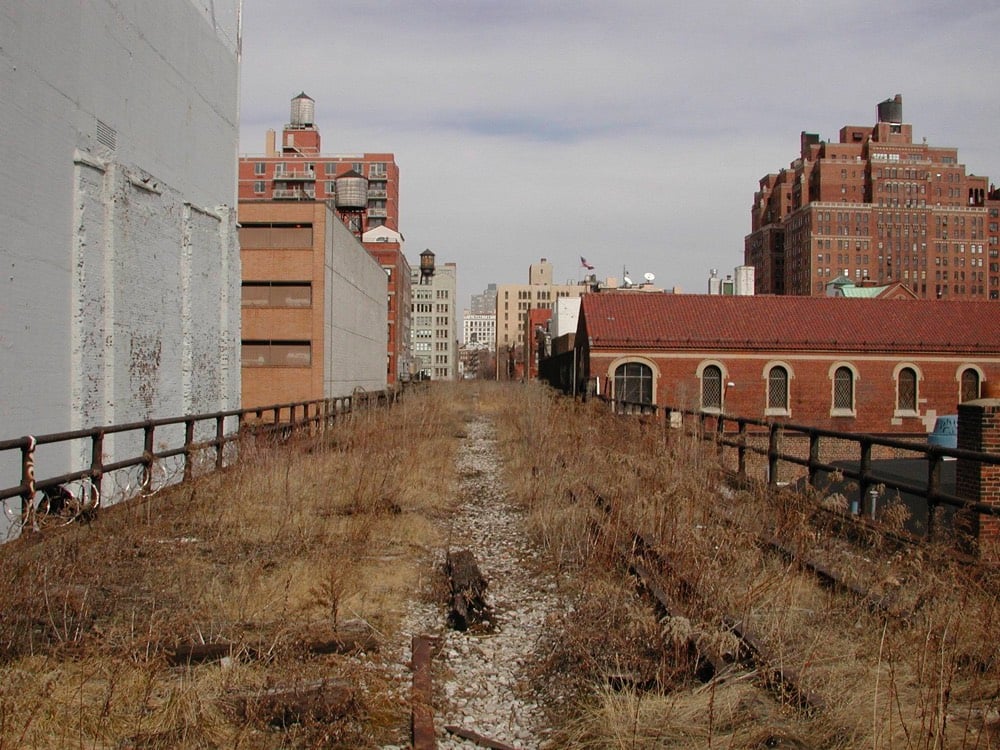
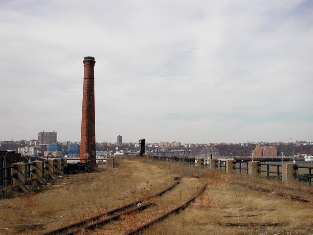
A couple of these were kindly included in Phaidon’s book about the making-of the High Line park.
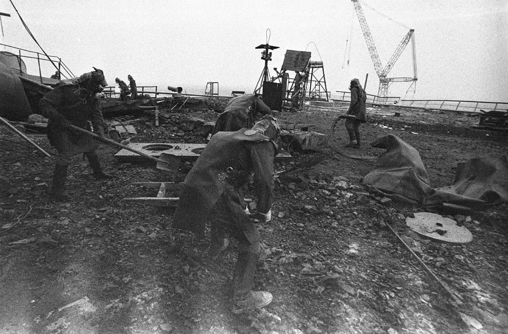
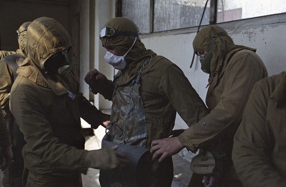
Alan Taylor has put together a selection of photos taken in the aftermath of the Chernobyl disaster in the Soviet Union in 1986. You may have seen some of these scenes recreated in HBO’s Chernobyl miniseries.
Liquidators clean the roof of the No. 3 reactor. At first, workers tried clearing the radioactive debris from the roof using West German, Japanese, and Russian robots, but the machines could not cope with the extreme radiation levels so authorities decided to use humans. In some areas, workers could not stay any longer than 40 seconds before the radiation they received reached the maximum authorized dose a human being should receive in his entire life.
See also more recent photos of Chernobyl and the exclusion zone and Masha Gessen’s take on what HBO’s series got wrong.
Photographer Jun Yamamoto (a.k.a. jungraphy) takes these subdued (but somehow also vibrant) photos of Japanese cities at night. This one in particular caught my eye:
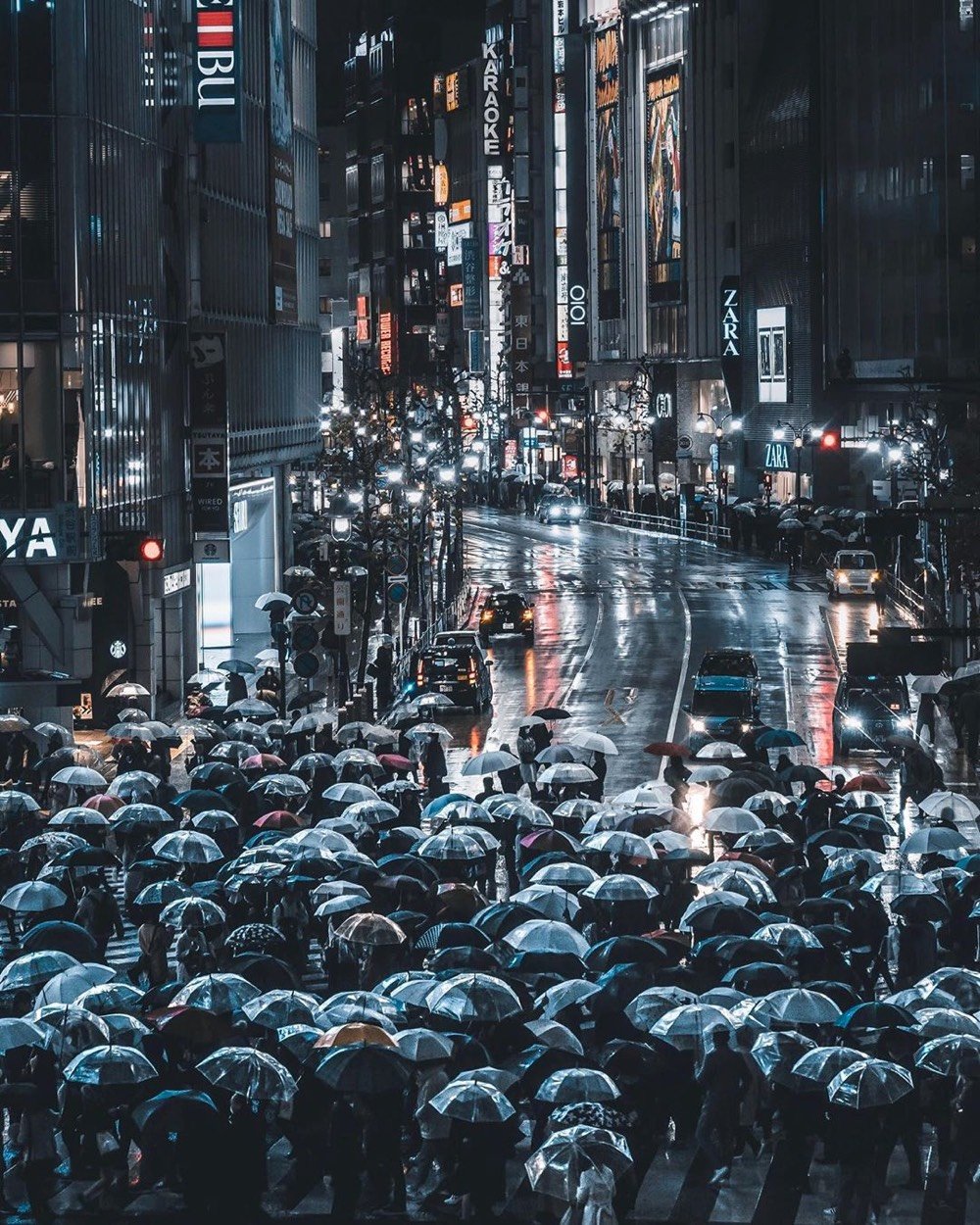
I’m assuming the photos are processed to get that moody red/blue/black color palette.
This video is so far up my alley that I’m now charging it rent. (For parking in the alley. Yeah, I don’t know how metaphors work.) Anyway, this 20-minute film is a collection of photography of street scenes, from the very first photo ever taken of a person in 1838 (by Louis Daguerre) to a crowded market in Glasgow in 1869 to a ghostly Norwegian street scene in 1882 to NYC’s Mulberry St in 1900 to a newsie selling newspapers about the Titanic disaster in 1912 to more modern scenes, presented chronologically one photo per year. Along the way, you see the development of history, fashion, and technology — the people in the photos get crisper and clearer as shutters quicken and film improves.
My only complaint is that many of the photos after 1900 and into the 40s & 50s have been artificially colored…and distractingly so. Why not just feature the original B&W versions? Believe me, I understand the appeal & impact of seeing the past in color, but these colorized versions greatly detract from the historical value of this video. (via aeon)
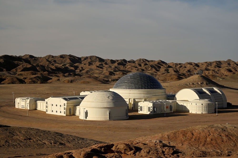
A Chinese company called C-Space has built a simulation of a Mars base in the Gobi desert. Currently used for educational purposes, the company plans to open “Mars Base 1” up for tourism to give visitors a glimpse of what living on Mars would be like.
The facility’s unveiling comes as China is making progress in its efforts to catch up to the United States and become a space power, with ambitions of sending humans to the moon someday.
The white-coloured base has a silver dome and nine modules, including living quarters, a control room, a greenhouse and an airlock.
Alan Taylor featured some photos of Mars Base 1 recently.


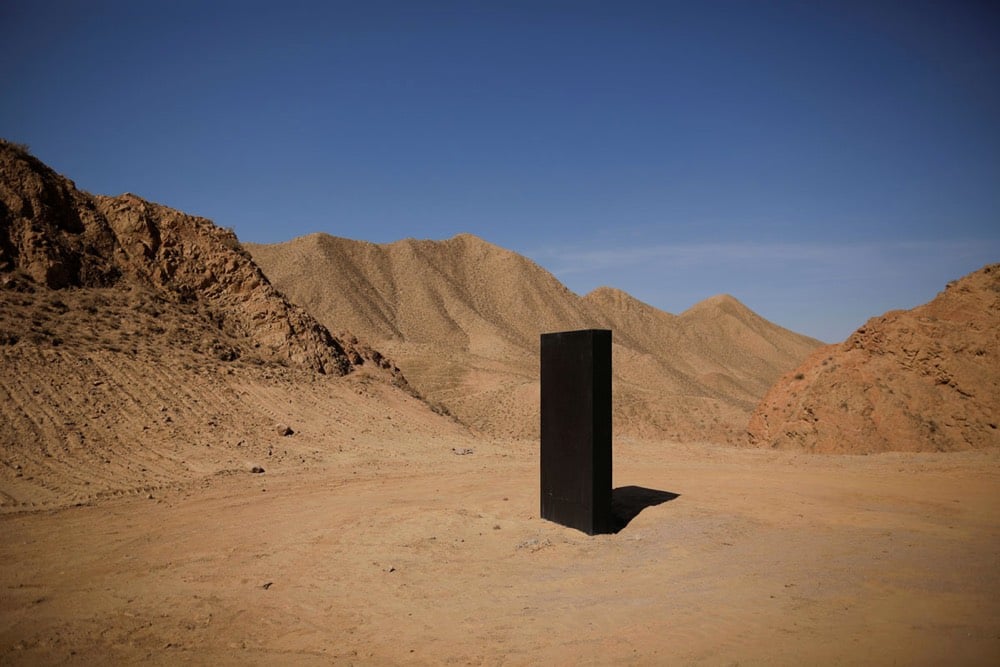
It’s all a little surreal, even before you get to the 2001 monolith:
For his photo series The Pillar (which is also a book), Stephen Gill set up a camera next to a post near his home in Sweden and set the shutter to fire when a motion sensor was triggered. “I decided to try to pull the birds from the sky,” he said.
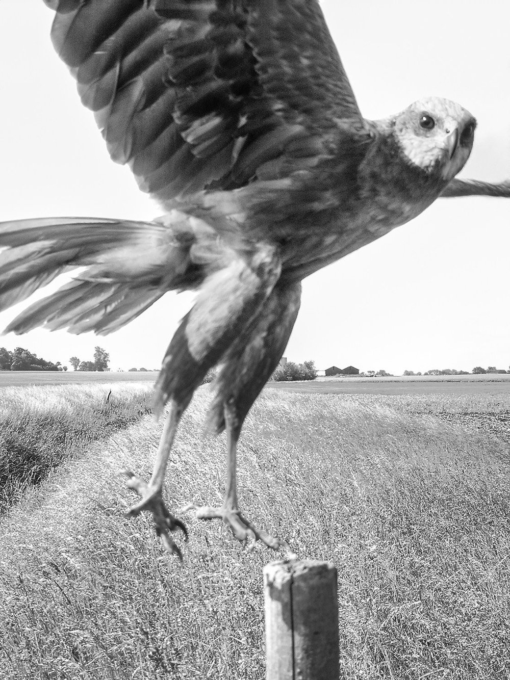
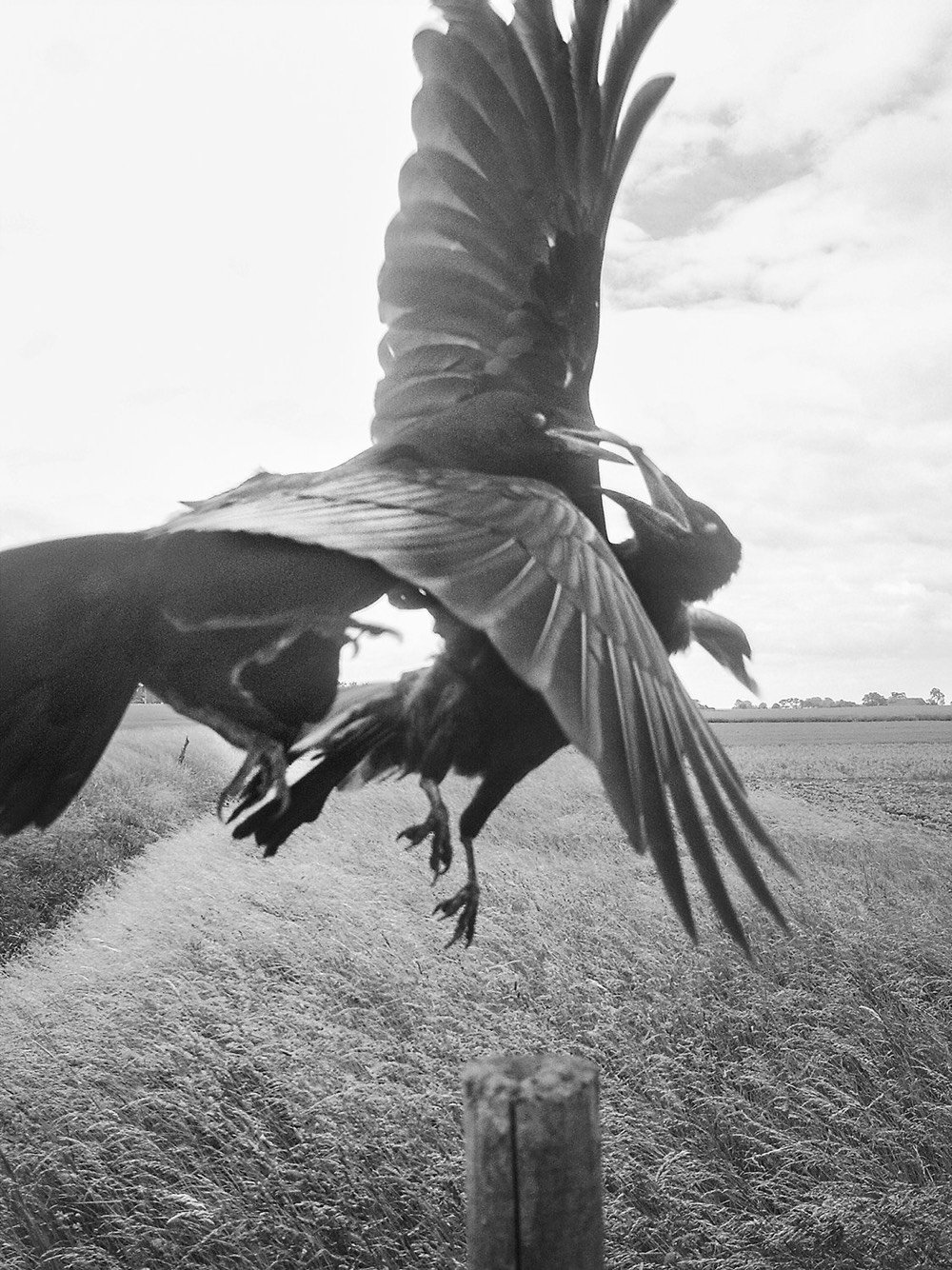
A selection of Gill’s photographs were published by the New Yorker, accompanied by a wonderful short essay by Karl Ove Knausgaard.
A pillar knocked into the ground next to a stream in a flat, open landscape, trees and houses visible in the distance, beneath a vast sky. That is the backdrop to all the photographs in Stephen Gill’s book “The Pillar.” We see the same landscape in spring and summer, in autumn and winter, we see it in sunshine and rain, in snow and wind. Yet there is not the slightest bit of monotony about these pictures, for in almost every one there is a bird, and each of these birds opens up a unique moment in time. We see something that has never happened before and will never happen again. The first time I looked at the photographs, I was shaken. I’d never seen birds in this way before, as if on their own terms, as independent creatures with independent lives.
Kaija Straumanis took a series of portraits of herself being hit in the face with all sorts of different objects, from a dodgeball to a book to an old boot.
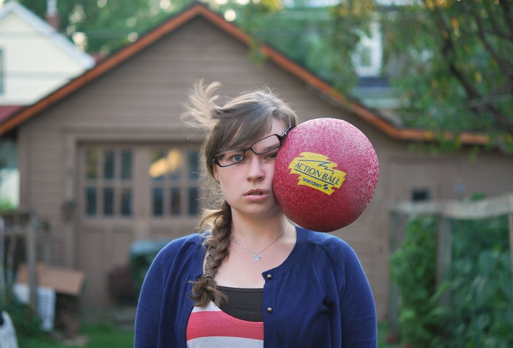
(via moss & fog)
German photographer Michael Wolf, who documented life in our densest cities, has died at the age of 64.
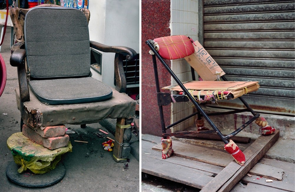
Though seldom commented on by art critics, there was a political undertone to Wolf’s work. In several of his best-known series, even the ones where people were an invisible presence, his striking images point to the human cost and extraordinary resilience of contemporary city dwellers caught up in the Darwinian thrust of global capitalism. For every epic project like Architecture of Density, there were intimately observed series’ created during his various trawls through Hong Kong’s back alleys. There, he caught telling glimpses of the city’s makeshift character: customised chairs, surreal arrangements of kitchen mops and wire coat hangers, twisting gas and water pipes, all the mundane everyday objects that speak of the relentless resourcefulness of its residents, and of Wolf’s eye for accidental sculptural beauty amid the seemingly mundane. A detached gaze, yes, but an expressively tender one all the same. It will be missed.
Wolf’s most well-known project was Architecture of Density, a series of photos taken of the buildings of Hong Kong.

Another Hong Kong project was 100x100, in which he documented 100 apartments of the now-demolished Shek Kip Mei Estate that were each about 100 square feet in size.

Tokyo Compression catches Japanese commuters pressed up against the windows of their train cars.
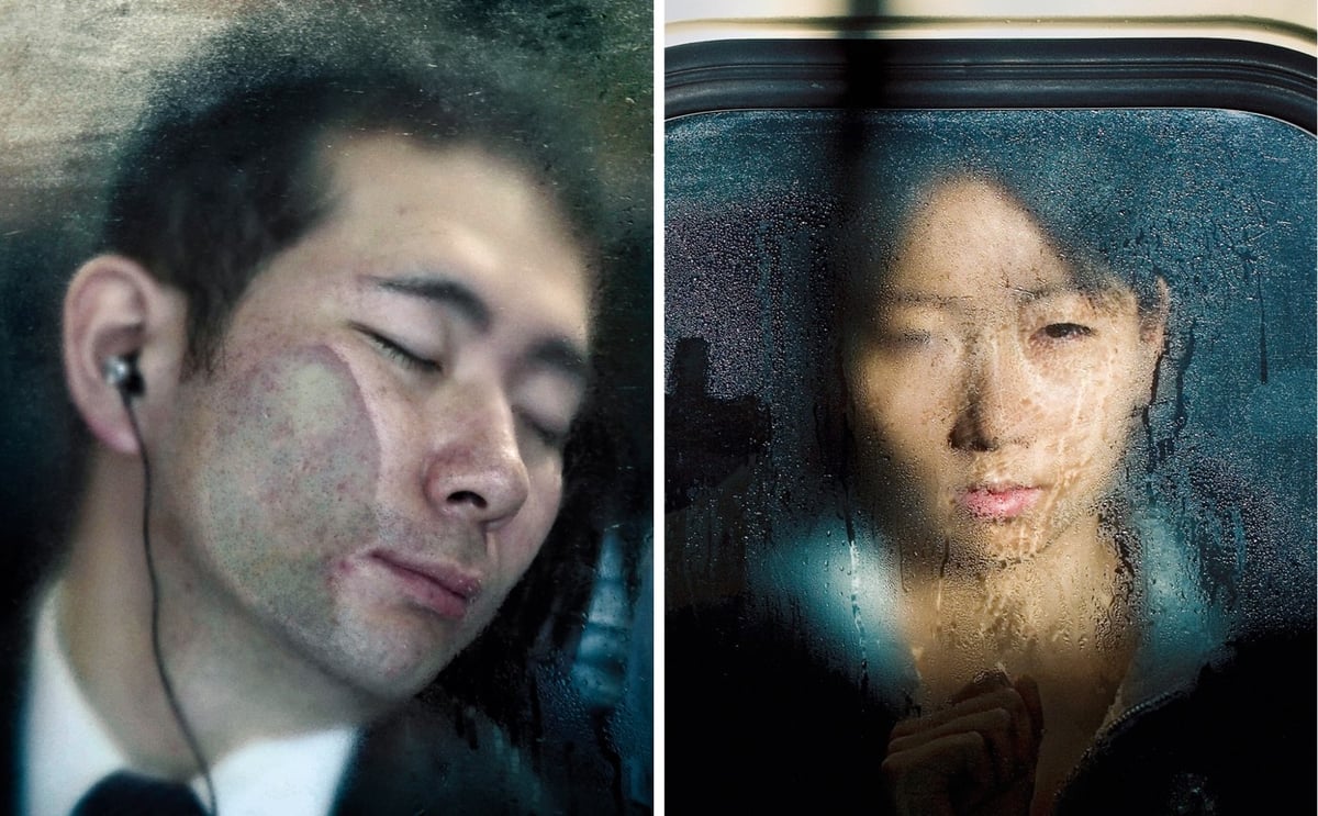
Bastard Chairs catalogues dozens of improvised devices for seating.
Wolf talked about his work in this short video profile:
You can view Wolf’s complete catalog of work on his website.

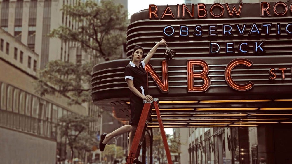
Since 1999, Mary Ellen Matthews has been the official photographer of SNL. For each show, Matthews captures a stylized portrait of the host, which is then used for “bumpers” between commercials and the live program.
“I kind of think of them as billboards. They pop off the screen,” Matthews, a self-described “one-woman circus,” told Vulture in a recent interview. “I like to make it as easy as possible for everyone. I don’t want them overthinking this part of the show. It should be super fun and super easy. It’s an open invitation to get kooky.”
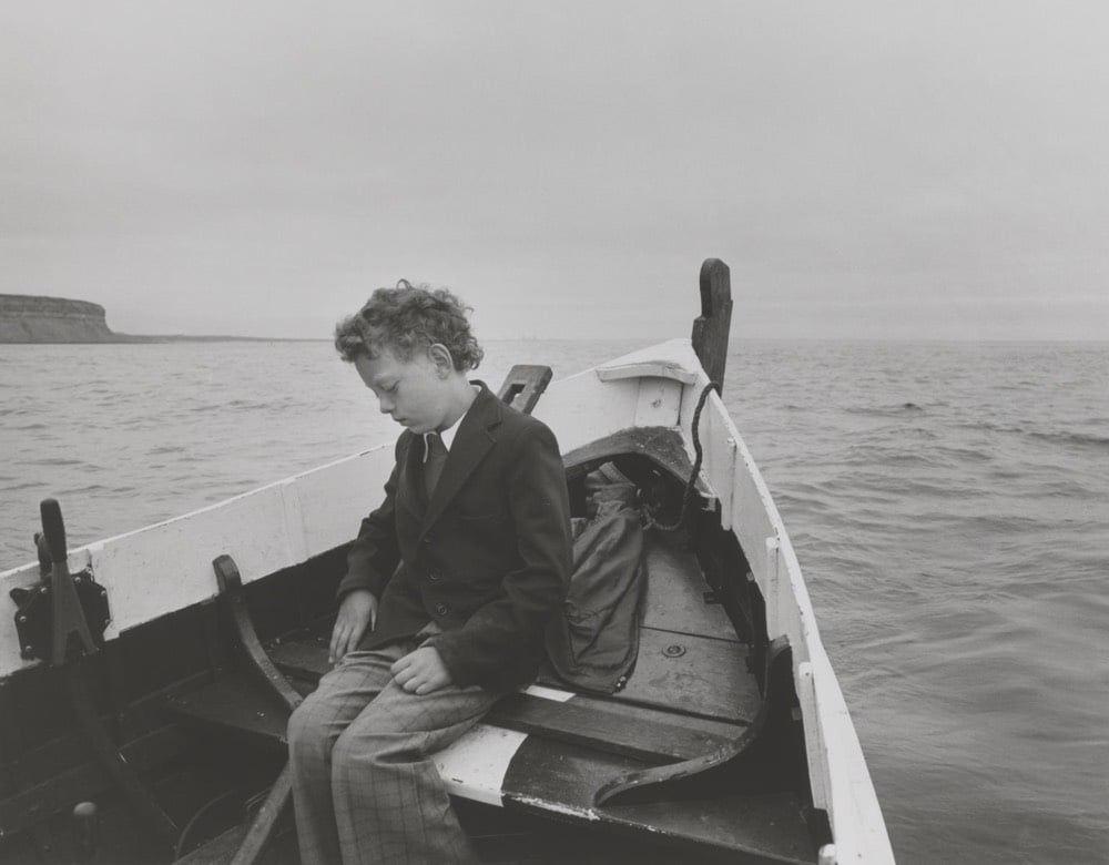
This photograph was taken by Chris Killip in 1983 in the British coastal village of Skinningrove. According to Killip, it shows a difficult but necessary moment in a young man’s life, rebuilding his trust in the life-giving sea.
It was a fishing village and it was very difficult to gain access to photograph there. Simon’s father had drowned in an incident at sea. They had this ritual where they came out and took Simon out to sea so that he wouldn’t become fearful of it. It’s very formal. He’s dressed very formally. I was on the boat and nobody spoke.
What an intimate moment. You can read more about Killip and his process here. In this short film by Michael Almereyda, Killip talks about the time he spent photographing in Skinningrove:
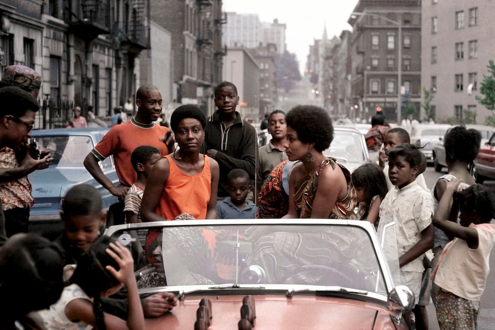
Photographer Kwame Brathwaite is best known for his images of black superstars in the 1970s (Muhammad Ali training for the Rumble in the Jungle, the Jackson 5 on their first tour in Africa, Bob Marley at home in Kingston). A new exhibition highlights earlier work from his archives and positions him as an influential figure in a burgeoning movement. The now 81-year-old has his first book coming out in May after a six decade career: Kwame Brathwaite: Black is Beautiful.
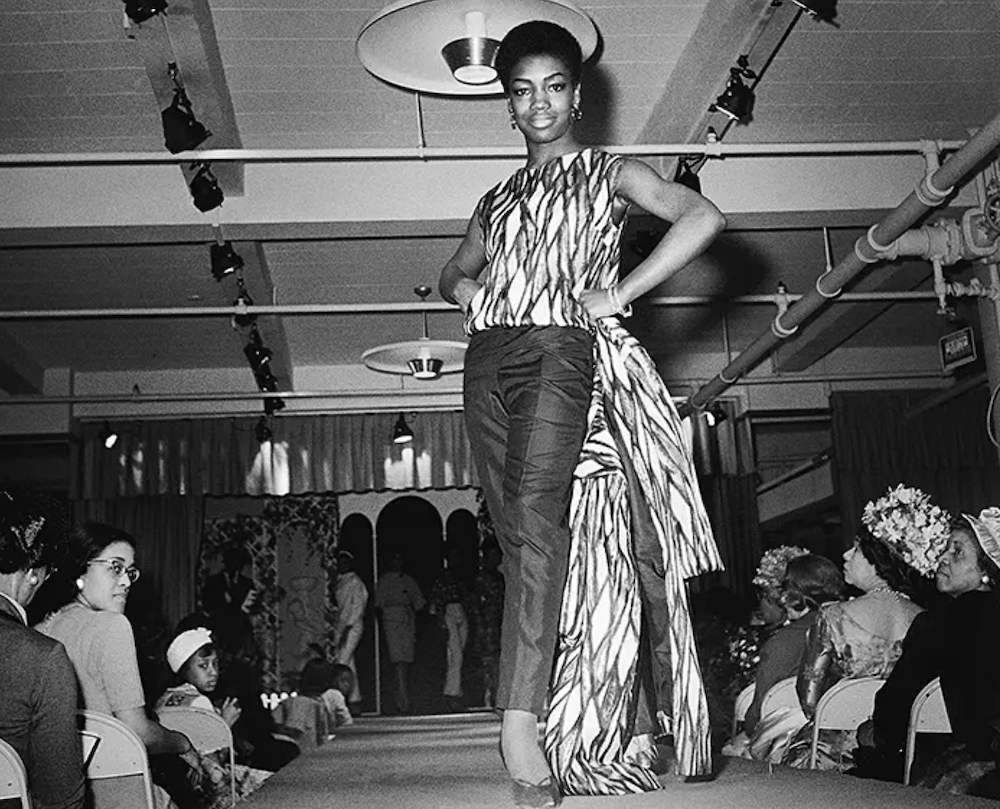
Brathwaite co-organized a fashion show in Harlem that became iconic. Naturally ‘62: The Original African Coiffure and Fashion Extravaganza Designed to Restore Our Racial Pride and Standards used the slogan “Black is Beautiful,” later to be a major part of history. His imagery and ideals elevated the slogan to part of the zeitgeist. Artsy has a beautiful slideshow of the Grandassa models and this:
The participants, known as the Grandassa models, were not professionals in the fashion world, which reinforced Brathwaite’s political and artistic vision. They were dark-skinned and their hair was unprocessed; they wore African-inspired garments full of lush colors, waxed cotton prints, and elaborate patterns.
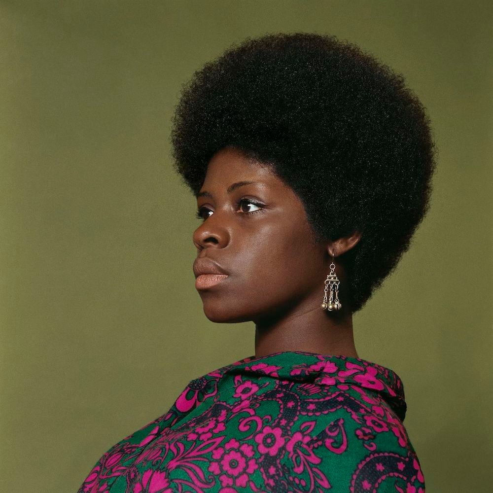
The FT has a great piece with more context on Kwame’s history and work.
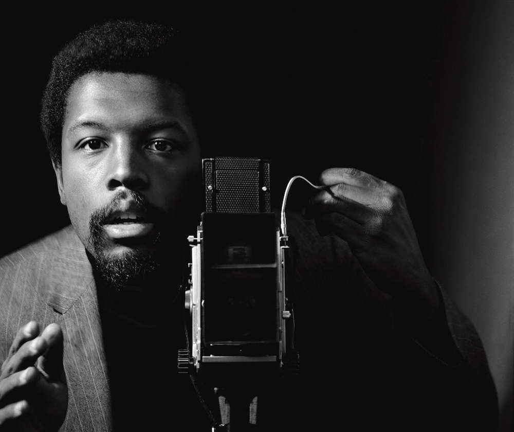
Black is Beautiful: The Photography of Kwame Brathwaite opens April 11 at the Skirball Center in Los Angeles.

Ok, this is pretty cool. We have the first photo of a supermassive black hole, from imagery taken two years ago of the elliptical galaxy M87 (in the constellation Virgo) by the Event Horizon Telescope project. The EHT team is a group of 200 scientist that has been working on this project for two decades. The image was created using data captured from radio telescopes from Hawaii to the South Pole and beyond using very long baseline interferometry.
The image, of a lopsided ring of light surrounding a dark circle deep in the heart of the galaxy known as Messier 87, some 55 million light-years away from here, resembled the Eye of Sauron, a reminder yet again of the power and malevolence of nature. It is a smoke ring framing a one-way portal to eternity.
Now is a good time to (re)read Jonathan Lethem’s early novel, the absurdist physics love story As She Climbed Across the Table.
Update: Vox’s Joss Fong has a good 6-minute video that explains how the photo was taken:
And this video by Veritasium is even more meaty (and this one too):

Photographer Winnie Au spoke with Buzzfeed about her ongoing Cone of Shame project, which looks to dispel the shame of the cones dogs must wear after medical procedures. Partially inspired by her late corgi Tartine, whose medical treatment would have cost tens of thousands of dollars without insurance, Winnie is using the project to fundraise for Animal Haven Shelter in New York. She’s an advocate for adopting pets.
A lot of people I know have bought their dogs verses adopting because they wanted a very specific breed, what most don’t realize there are rescues dedicated to specific breeds. So if you are obsessed with bernedoodles, you can adopt one. Of course, I love mutts too, and you can rescue an adorable mutt also. The most important thing to me is that your dog and its age, energy, and vibe fit your lifestyle.
There are so many great rescues out there who can help you find the best pet for you. In America alone, there are 1.6 million dogs waiting to be rescued every year. If those dogs don’t get rescued, a lot of them end up euthanized. I just want to stress to people to adopt when you get your next pet as there are so many great dogs out there ready for a new home.

Winnie collaborated with costume designer and stylist Marie-Yan Morvan, whose work helped the project coalesce. I can’t wait to see more of this project. If you want to support the work and Animal Haven, you can buy a print or a tote via the Cone of Shame shop.


On her Instagram account, Marin Mushrooms, nature photographer Alison Pollack captures the otherworldly beauty of fungi and slime molds in northern California forests. (via laura olin)


From The Public Domain Review, Ogawa Kazumasa’s Hand-Coloured Photographs of Flowers.
The stunning floral images featured here are the work of Ogawa Kazumasa, a Japanese photographer, printer, and publisher known for his pioneering work in photomechanical printing and photography in the Meiji era.
A reprinted book containing these images by Kazumasa is available as are prints. (via @john_overholt)
This is a photo taken in Germany in 1914 by August Sander:
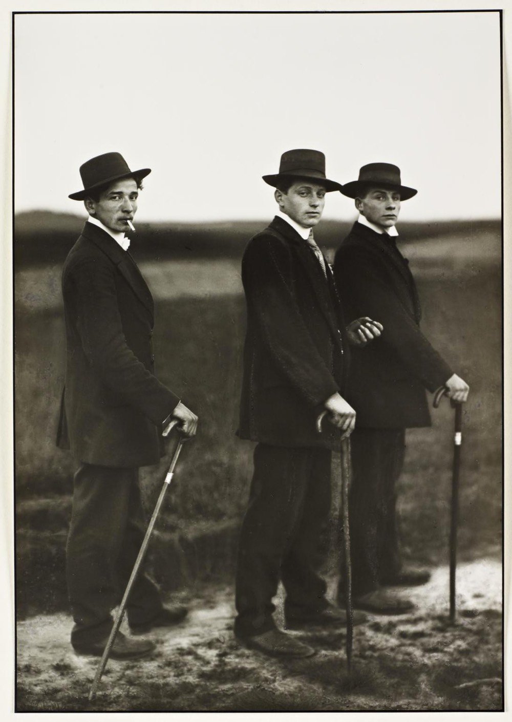
It’s called Young Farmers and it depicts three young men on their way to a dance in rural Germany. But as John Green explains in this video, there is so much more going on with this photo.
From The Tate, which has a print of Young Farmers in its collection:
The Marxist art critic John Berger famously analysed the photograph in his influential essay ‘The Suit and the Photograph’ (1980) writing: ‘The date is 1914. The three young men belong, at the very most, to the second generation who ever wore such suits in the European countryside. Twenty or 30 years earlier, such clothes did not exist at a price which peasants could afford.’ (Berger 1980, p.30.) Berger suggests that these mass market suits, emulating the higher quality attire of the bourgeois urban class, draws attention to, rather than disguises, their ‘social caste’, and not in a particularly flattering sense. In his essay, Berger considers that the three young men are of a social group not beyond the reach of aspirational advertising campaigns and travelling salesmen, and in a state of awkward transition, succumbing to a new ‘cultural hegemony’. The posturing of these three rural ‘lads’, perhaps on their way to a dance, confounds and subverts expectations of the peasant ‘type’, especially in that they smoke cigarettes. Peasants were traditionally depicted smoking a pipe handcrafted from wood, and which like the wooden canes that appear frequently in Sander’s volume of photographs devoted to peasants and farmers, including this one, connoted an organic connection to the native soil as well as a certain time-honoured wisdom. By contrast, the mass-manufactured cigarette was often seen at the time as an urban symbol of social dissolution.
However, Green also cautions that there’s only so much you can infer about people from a photograph (given, for example, that the three men weren’t actually farmers).
This video is from a new-to-me channel called The Art Assignment, which is about art and art history. Subscribed!
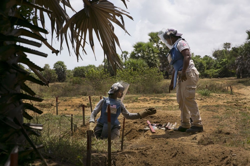
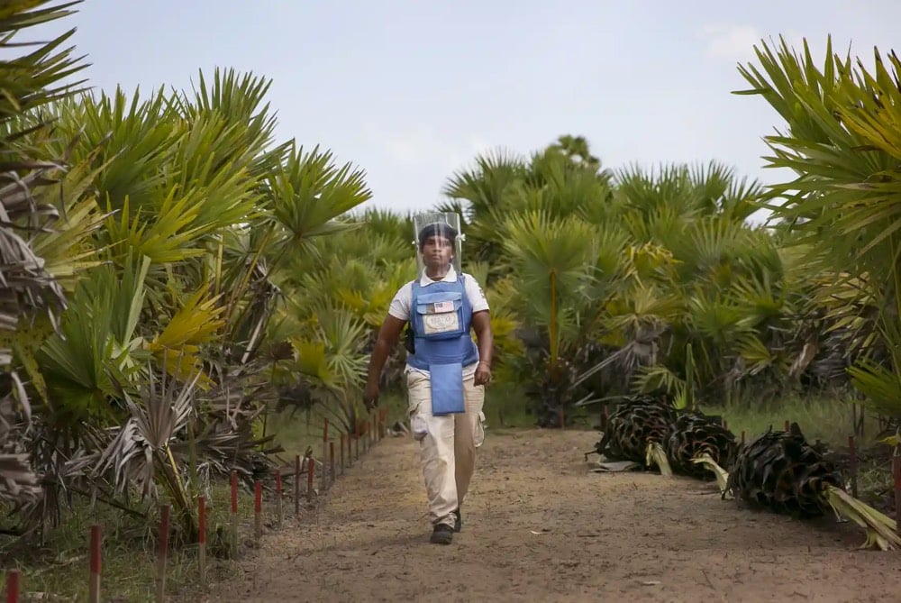
Photographer Allison Joyce has been in Sri Lanka photographing the women clearing one of the biggest minefields in the world. The mines were left over from the Sri Lankan civil war and the women are employed by NGO HALO Trust.
Landmines were used in vast quantities by both sides at different stages of the fighting in the north. From 2010 to 2012, HALO deminers removed over 30,000 mines a year. By 2014 the total had fallen to 16,000 annually, but those remaining threaten the most economically vulnerable people in the country. Mines present an obstacle to the safe return of internally displaced people (IDPs) and prevent access to paddy fields, fishing jetties and grazing land affecting the lives and livelihoods of thousands of people.
HALO remains the largest international mine action operator in the country. Our 830 staff, including a large proportion of former IDPs, work in the Jaffna, Kilinochchi and Mullaitivu districts. Fifty percent of our deminers are women, many of them war widows with children to support.
In Focus and The Guardian have photo essays about the women and their work.
Larry Luckham was a manager at a Bell Labs data center in Oakland in the late 60s and early 70s. One day, he captured daily life at the company with his camera.
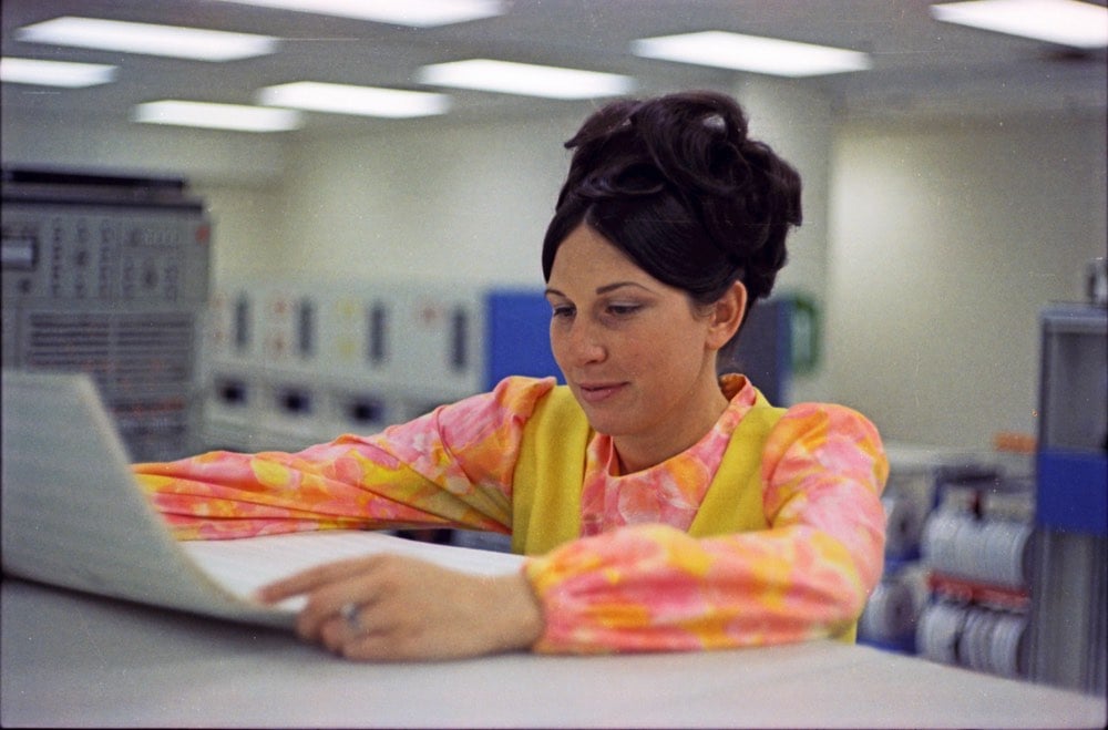
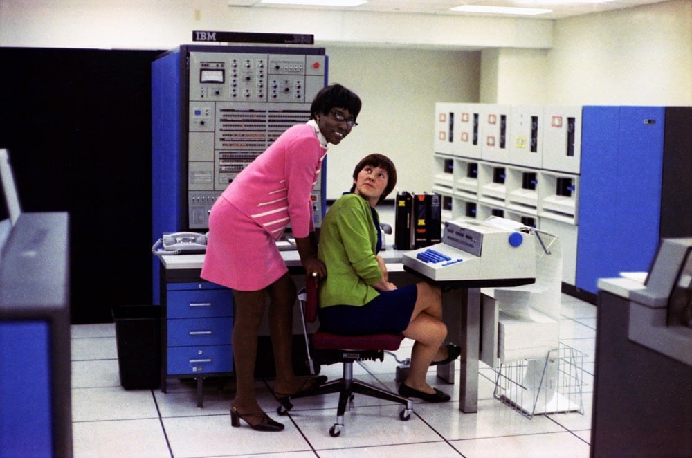
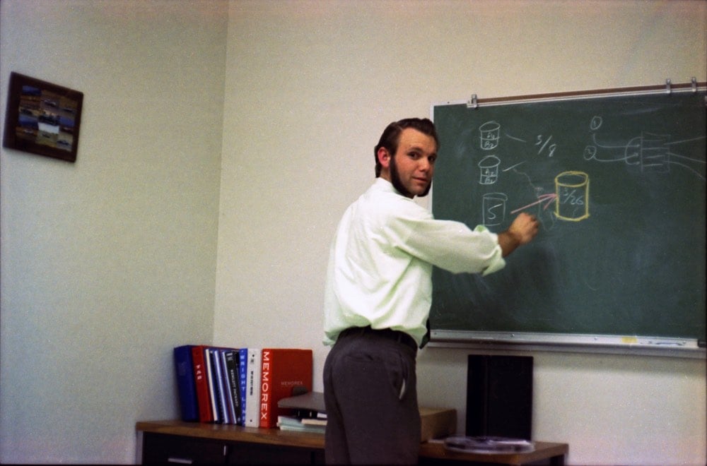
Note how many of his coworkers were women, including women of color. From The Secret History of Women in Coding:
A good programmer was concise and elegant and never wasted a word. They were poets of bits. “It was like working logic puzzles — big, complicated logic puzzles,” Wilkes says. “I still have a very picky, precise mind, to a fault. I notice pictures that are crooked on the wall.”
What sort of person possesses that kind of mentality? Back then, it was assumed to be women. They had already played a foundational role in the prehistory of computing: During World War II, women operated some of the first computational machines used for code-breaking at Bletchley Park in Britain. In the United States, by 1960, according to government statistics, more than one in four programmers were women. At M.I.T.’s Lincoln Labs in the 1960s, where Wilkes worked, she recalls that most of those the government categorized as “career programmers” were female. It wasn’t high-status work — yet.
Mathieu Stern had an idea. He thought that if you could sculpt a piece of ultra-clear ice into the correct shape, it would function as a camera lens. To find that quality of ice, he traveled to Iceland to scavenge a chunk of an iceberg washed ashore on a black sandy beach. After some trial and error, he succeeded in making his iceberg lens and using it to shoot some photos and video. The lens lasted for about a minute before melting.
Here are some of the photos he took:
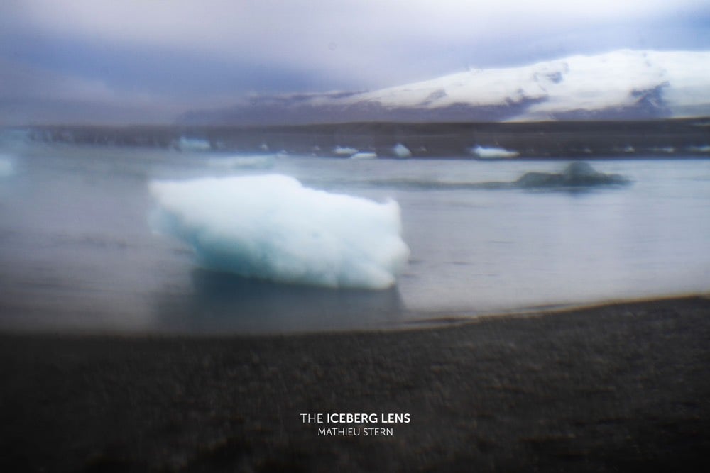
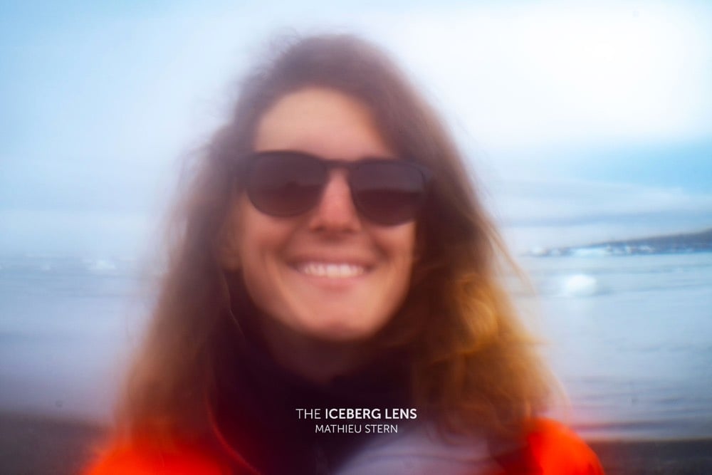
It’s a little impractical to go all the way to Iceland for iceberg ice when you can make your own clear ice at home, but Stern had this to say:
Now if people asks me “Are you happy with the result? it’s a bunch of blurry photos!?”, my response would be: “this project is a scientific, artistic and poetic project, I never imagined the result would look like the photos that comes from an ultra modern lens, but I was amazed by the strange beauty of the images I made with the first ever 10 000 year old lens.”
This is not a project for everyday photography, it was an adventure and a bet that when you have a crazy hypothesis, you should do everything to experiment it in the field.
I also wondered whether iceberg ice was actually more clear or pure than ice you could make at home. I didn’t find anything definitive but I did read this piece by Michelle Iwen about drinking single-malt scotch cooled by iceberg ice.
Our expedition leader, an Irish biologist studying southern birds, fished small chunks of clear-bubbled ice directly from the water as he worked to dislodge a sharp edged growler from beneath the propeller. He encouraged us to taste the ice, licking off the overlying salt water to find the pure, flavorless cold underneath.
“If you hold it in your bare hand long enough to speed the melting, you’ll hear it fizzle,” he told us. The fizzy pop of bergy seltzer is a familiar, yet unexpected sound. It sounds like a freshly opened can of soda, as the bubbles newly freed from the ice travel up toward the surface of the water. Yet the mundane sound of bergy seltzer belies the sinister power of melt against the bottom of the iceberg. Each bubble released scores the surface of the ice, compromising its structural integrity. We held the ice shards in our hands to make it fizz, let our skin burn against the freeze, as our expedition guide hoisted the free-floating remnants of a tiny growler into the zodiac to be chipped apart and consumed in cocktails that evening.
(via @peteashton)
Street photographer Patrick Barr has been out photographing NYC since the 1990s. Barr also goes by the name of Tiger Hood (or Nappy Gilmore) and when he’s out on the street selling prints of his photographs, he passes the time playing a street golf game of his own invention.
It’s a game that requires only three items: a golf club, a newspaper-stuffed milk carton, and a crate. What was initially just a way for Barr to pass time has gained traction from major news outlets and celebrities on a global scale. However, street golf seems to overshadow his true passion… photography. Barr’s archive consists of thousands of mind blowing film photographs of NYC from the 1990’s to 2000’s. His goal was to preserve a time and place that he predicted would dissolve in the coming years. With his archive as evidence, he predicted correctly.
You can find some of Barr’s photos on Flickr and Instagram but if you want to buy a print, you’ll have to catch him on the streets of lower Manhattan.
1969 was quite a year that saw the founding of Sesame Street, PBS, Monty Python, and the Internet as well as Woodstock and my favorite, the crew of Apollo 11 landing on the Moon.
At In Focus, Alan Taylor has collected 50 photos from 1969, a visual record of that iconic year.
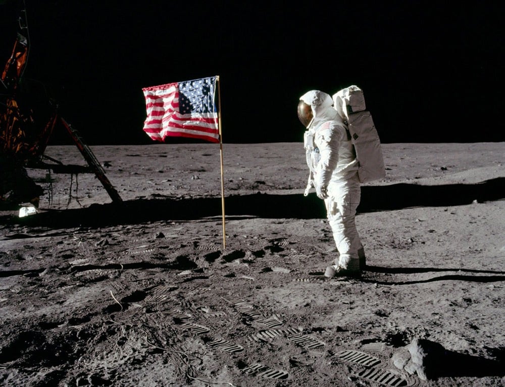


From top to bottom, Buzz Aldrin on the Moon, Queen Elizabeth riding on the Tube in London, and a billboard in Times Square featuring John Lennon & Yoko Ono’s message of peace.
As part of his The World in Faces project, Alexander Khimushin has been making portraits of the indigenous people of Siberia wearing native dress.
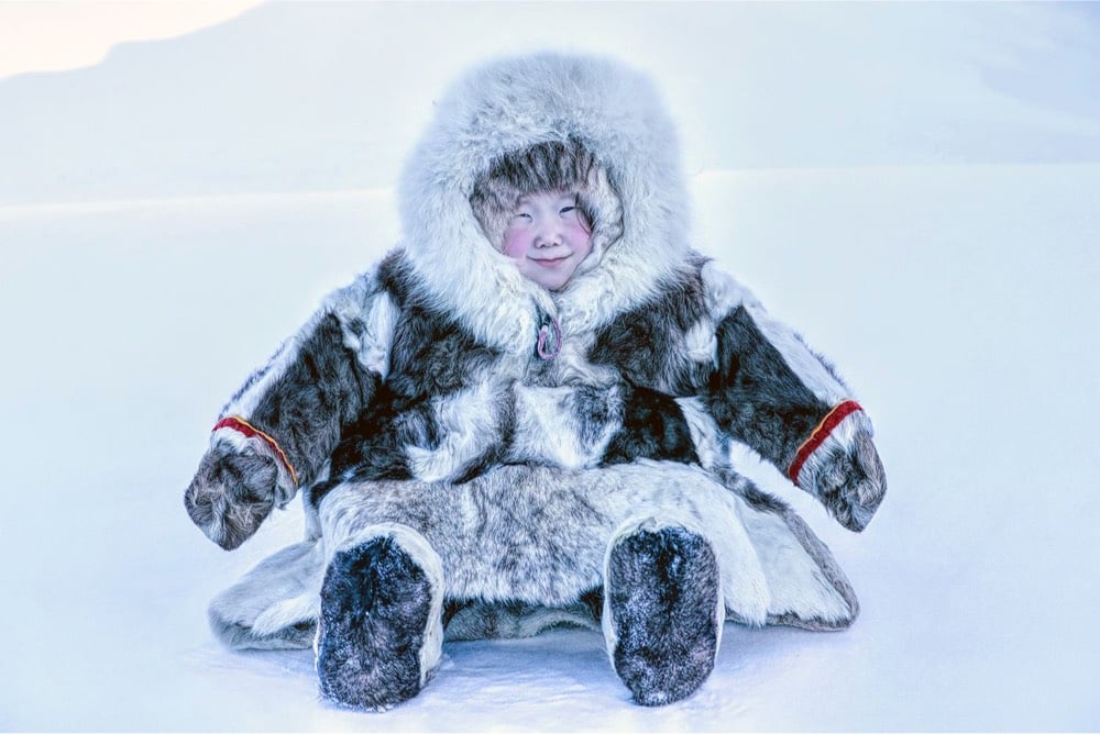

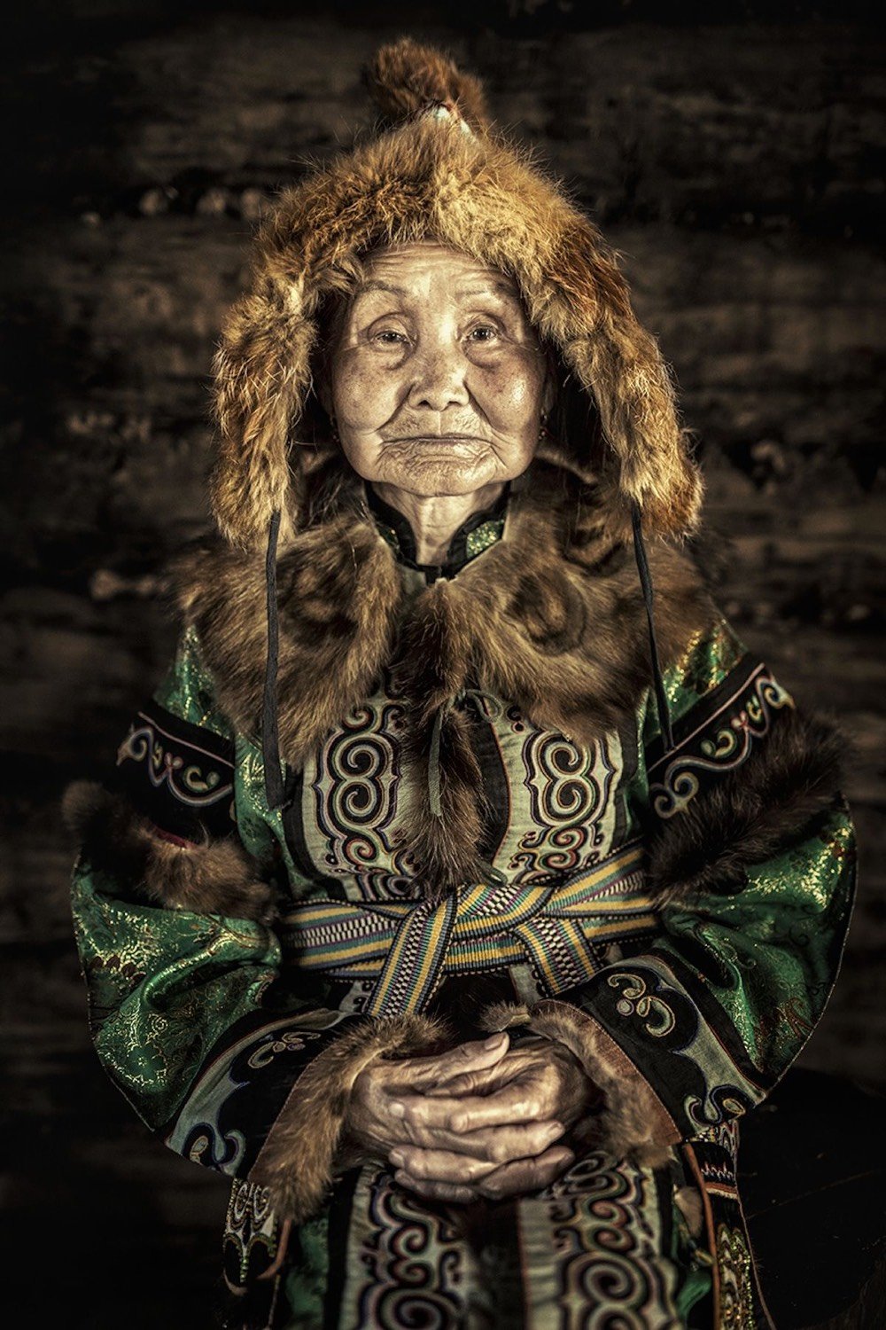
The photo at the top is of three-year-old Gulnara Kayarina wearing her everyday outfit:
She lives in a portable little 2x3 meter house on skis, wrapped in the reindeer skins, at the endless tundra, about 50 km away from the nearest settlement of Tukhard (pronounced Too-Hard) — one the the remotest and coldest places of Krasnoyarsk Krai. Located at the Taymyr Peninsula (Arctic part of Siberia and the Northernmost region of Eurasia) Tukhard is accessible by helicopter only. Gulnara is one of two daughters in the family of reindeer herders Prokopy and Maya Kayarin. Her sister Rimma is a bit older, she is 5. Both girls live nomadic life with their parents and their reindeer in the vast snowy expanse of the tundra, extended as far as the edge on the Arctic Ocean. Nenets People are one of five ethnic group on Indigenous People of Taymyr Peninsula. Most of Nenets People still live traditional lifestyle in this extremely remote and coldest region of the world. Right now the region experiencing a so-called polar night — 45 days long period of total darkness. Winter temperature regularly drops below -40C/-40F. With a combination of strong winds with a speed as high as 35 meters/sec the climate of Taymyr is certainly one of the most extreme ones of the world.
You can follow this project on Facebook and Instagram.
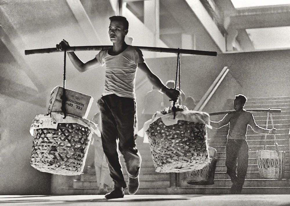
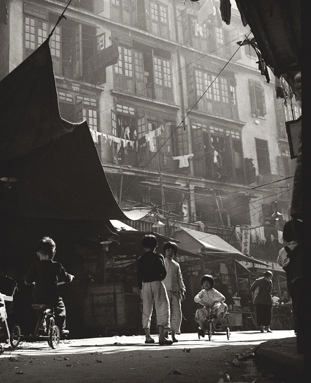
When he was a teenager, Fan Ho grabbed his father’s camera and started documenting street scenes in Hong Kong. From there, he built up a documentary body of work that puts him among the great practitioners of street photography.
Dubbed the “Cartier-Bresson of the East”, Fan Ho patiently waited for ‘the decisive moment’; very often a collision of the unexpected, framed against a very clever composed background of geometrical construction, patterns and texture. He often created drama and atmosphere with backlit effects or through the combination of smoke and light. His favorite locations were the streets, alleys and markets around dusk or life on the sea.
What made his work so intensely human is his love for the common Hong Kong people: Coolies, vendors, hawkers selling fruits and vegetables, kids playing in the street or doing their homework, people crossing the street… He never intended to create a historic record of the city’s buildings and monuments; rather he aimed to capture the soul of Hong Kong, the hardship and resilience of its citizens.
Before his death a few years ago, Ho selected some images from his archives that have become the basis of a new show at the Blue Lotus Gallery.
The photographic selection expressed in this new body of work feels more natural, indeed closer to documentary and pure street photography compared to his previously highly stylised approach. In his own manifesto ‘Thoughts on Street Photography’ which he wrote at the age of 28, and of which carefully selected quotes can be found throughout the book, he explains, “my realistic street photos are rarely selected. Pictorial aesthetics and images with a sense of humour are still the key for salon photos but I expect changes to happen soon. In the meantime, I will just keep trying.”
(via moss & fog)

For the past few years, visual artist Threadstories has been making these amazing masks and posting selfies of her wearing them on Instagram. She starts each mask with a crocheted balaclava:

And ends up at many different endpoints:


You can see the masks in motion in this video and read more about the project in this RedMilk interview.
I don’t have any one line of enquiry or source of inspiration. Everything from traditional basket making to Francis Bacons portraits to the sight of someone with really crooked teeth or an episode of Blue Planet might inspire a mask. Thematically I am questioning how the erosion of personal privacy online effects how we view and portray ourselves. I am constructing facades — masks in response to these questions. We are all so over exposed and to what end? Privacy is precious.
(via swissmiss)
At the end of a long day in March 1936, Dorothea Lange stopped in a migrant workers camp in California for just 10 minutes and took six photos of a woman and her children. The final photo, known as Migrant Mother, became one of the most iconic photographs of the Great Depression.
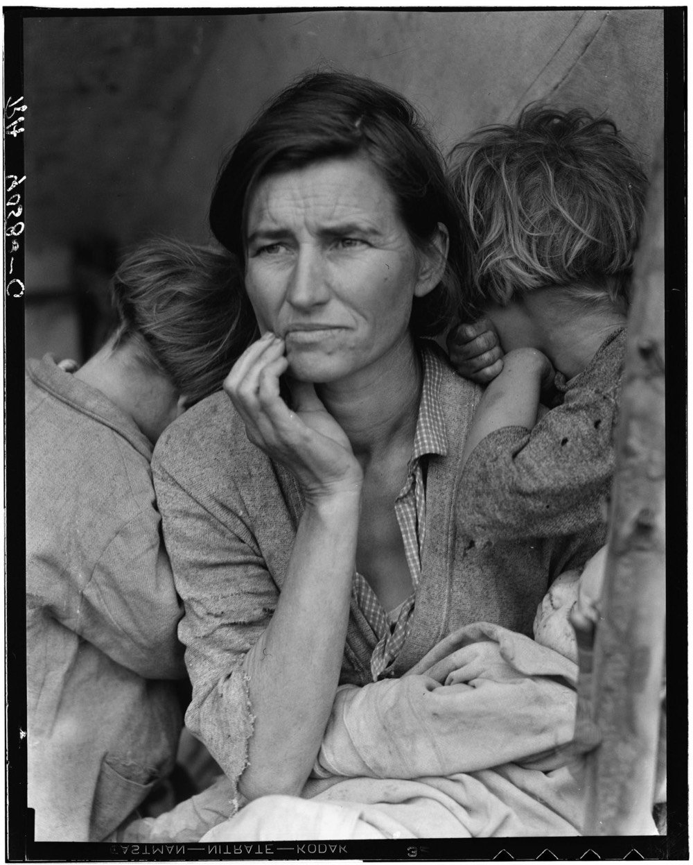
In this video, Evan Puschak details not only the context the photo was created under (FDR’s administration wanted photos that would shift public support towards providing government aid) but also how Lange stage-managed the scene to get the shot she wanted.
As Puschak notes, the photo we are all familiar with was retouched three years after its initial publication to remove what Lange saw as a detriment to the balance of the scene: the thumb of the woman’s hand holding the tent post in the lower right-hand corner.
It is easy to tell whether a print of “Migrant Mother” was made before 1939, because that year Ms. Lange had an assistant retouch the negative and remove Ms. Thompson’s thumb from the bottom right corner, much to the chagrin of Roy Stryker, her boss at the Farm Security Administration. While that was a fairly common practice at the time, Mr. Stryker thought it compromised the authenticity not just of the photo but also of his whole F.S.A. documentary project, Ms. Meister said. But Ms. Lange considered the thumb to be such a glaring defect that she apparently didn’t have a second thought about removing it.
Here’s what it looked like before the alteration:
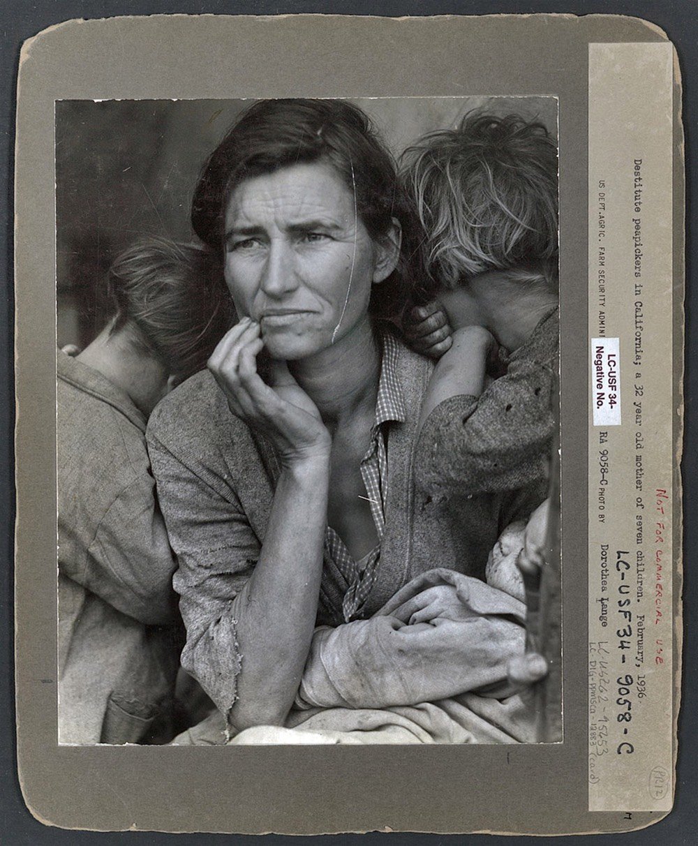
There are some other things about the photo that may prompt us to think about the objectivity of documentary photography. The cultural story of Migrant Mother is that this is a white woman who came west during the Great Depression for migrant work. The real story is more complicated. The woman was identified in the late 1970s as Florence Owens Thompson, and as she told her story, we learned some things that Lange didn’t have time to discover during her fleeting time at the camp:
1. Thompson was a full-blooded Cherokee born in Indian Territory (which later became the state of Oklahoma). As this NY Times review of Sarah Meister’s book on the photograph says, if people had known the woman wasn’t white, the photo may not have had the impact it did.
“We have never been a race-blind country, frankly,” Ms. Meister said. “I wish that I could say that the response would have been the same if everyone had been aware that she was Cherokee, but I don’t think that you can.”
2. The family were not recent migrants to California and had actually moved from Oklahoma in 1926, well before the Depression started. The family briefly moved back to Oklahoma because Thompson was pregnant and afraid the father’s family would take the baby from her, but returned to California in 1934.
3. Thompson’s first husband died in 1931 of tuberculosis while she was pregnant with her sixth child. A seventh child resulted from a brief relationship with the father mentioned above. An eighth child followed by a new husband in 1935. But it was Thompson who provided for the family while taking care of 8 kids:
By all accounts, Jim Hill was a nice guy from a respectable family who never could seem to get his act together. “I loved my dad dearly,” Norma Rydlewski said, “but he had little ambition. He was never was able to hold down a job.” The burden of supporting the family, and of keeping it together, fell on Florence.
4. The ultimate goal of Lange taking Thompson’s photo for the FSA was to stimulate public support for government aid to people who were out of work because of the Depression. But Thompson herself didn’t want any aid:
“Her biggest fear,” recalled son Troy Owens, “was that if she were to ask for help [from the government], then they would have reason to take her children away from her. That was her biggest fear all through her entire life.”
5. Thompson and her family weren’t actually living at the pea pickers camp when Lange photographed them there. They had just stopped temporarily to fix their car and were only there for a day or two.
In the field notes that she filed with her Nipomo photographs, Lange included the following description: “Seven hungry children. Father is native Californian. Destitute in pea pickers’ camp … because of failure of the early pea crop. These people had just sold their tires to buy food.”
Owens scoffed at the description. “There’s no way we sold our tires, because we didn’t have any to sell,” he told this writer. “The only ones we had were on the Hudson and we drove off in them. I don’t believe Dorothea Lange was lying, I just think she had one story mixed up with another. Or she was borrowing to fill in what she didn’t have.”
“Mother always said that Lange never asked her name or any questions, so what she [Lange] wrote she must have got from the older kids or other people in the camp,” speculates daughter Katherine McIntosh, who appears in the Migrant Mother photo with her head turned away behind her mother’s right shoulder. “She also told mother the negatives would never be published — that she was only going to use the photos to help out the people in the camp.”
So what are we to make of what we thought we knew about this photograph and what we know now? In 2009, Errol Morris wrote of the FSA photos:
Rothstein, Lange and Evans have been accused of posing their photographs, in short, of manipulating them to some end. And yet all photographs are posed. There is no such thing as pure documentary photography. The problem is not in what any of them have done, but in our misunderstanding of photography. No crimes were committed by the F.S.A. photographers. They labored as employees of an organization dedicated to providing propaganda for the Roosevelt administration. And they created some of the greatest photographs in American history. Photographs can be works of art, bearers of evidence, and a connection with the past for individuals, families and society as a whole. It should not be lost on any of us that these controversies are still with us. The Photoshop alteration of a photograph “documenting” the launching of Iranian missiles, the cropping of a Christmas get-together at the Cheney ranch. These are just the latest iterations. In 1936, Roosevelt was reelected in a contentious election. Photography played a controversial role, reminding us that wherever there are intense disagreements, particularly political disagreements, there will be disagreements about photography, as well.
The stories we tell about photographs change as we change and as our culture changes. Yes, Migrant Mother is a symbol of the hardship endured by many during the Great Depression. But Migrant Mother is also the portrait of a fiercely independent Native American single mother who fought to provide for her family and keep them together during the most difficult time in our nation. That’s a story worth hearing today.
Both prints above are courtesy of the Library of Congress, Prints & Photographs Division: with thumb and without. You can also explore the rest of the LOC’s FSA collection.
Newer posts
Older posts




Socials & More