kottke.org posts about design
Fritz Kahn’s Man As Industrial Palace.
Kahn’s modernist visualization of the digestive and respiratory system as “industrial palace,” really a chemical plant, was conceived in a period when the German chemical industry was the world’s most advanced.
Be sure to check out the larger version.
Without the associated covers, this list of the AIGA’s 50 Books/50 Covers winners for “outstanding book and book cover design produced in 2006” is pretty useless. (Anyone want to track all of these covers down? I’ll host (or link to) the results on kottke.org.)
Update: Photos of the covers and books are all available on the AIGA Design Archives site. No permalink tho. :( (thx, tbit)
Michael Bierut dug his 1979 design portfolio out of the closet, which portfolio he used only once to get the last job he ever had to look for.
The newly designed US$5 bill is the worst one yet…the phrase “typographic train wreck” comes to mind. The purple 5 in the lower right, while useful, is one of the most amateur design choices I’ve seen on something that’s destined for such a wide market. (thx, tom)
It seems as though the only people who put out manifestos these days are designers and serial killers. 50 manifestos from such designers as Zaha Hadid, Stefan Sagmeister, Rem Koolhaas, and John Maeda.
The Morning News has a gallery of pages from Hand Job (@ Amazon), a collection of hand drawn type, and a short interview with its author, Michael Perry. It looks like a gorgeous book; you can find more images from it on Perry’s web site, which is sure to get an unusual influx of visitors searching for non-typography-oriented happy endings..
Graph of the movie poster colors of the top-grossing movies, from the brightly colored G-rated movies to the dark and fleshy NC-17 films.
Profile of designer Josh Davis on Apple’s web site. “The most complex print I’ve done had 120,000 layers in Illustrator. The printer called and said, ‘How did you do this? How long did it take?’ And I said, ‘Oh, five minutes.’”
Tauba Auerbach: startling starting staring string sting sing sin in i. More of her typographic work here.
Some Infinite Jest fashion notes: an Enfield Tennis Academy tshirt from Neighborhoodies and…
Was the designer of Infinite Jest’s book cover influenced by the color palette of the Nikes that Andre Agassi wore in 1991? Compelling visual evidence is available at lonelysandwich.
Le Pain Quotidien uses stale bread for menu holders on their tables. Clever design.
CEOs must be designers, not just hire them. “Design is no longer just about form anymore but is a method of thinking that can let you to see around corners. And the high tech breakthroughs that do count today are not about speed and performance but about collaboration, conversation and co-creation.”
McSweeney’s is opening a small design shop called Timothy McSweeney’s Design House to “tackle smaller jobs where the personal touch is welcome”. If I wanted a job, this is one of the places I’d apply. (via quipsologies)
Edward Tufte highlights some infographics done by Megan Jaegerman for the NY Times in the 90s. Tufte: “Her work is elegant, smart, finely detailed, inventive, and informative. A fierce researcher and reporter, she writes gracefully and precisely. Her best work is the best work in news graphics.”
John Gruber remarked on the lack of a clipboard on the iPhone and I found myself missing that feature this afternoon. Steven Johnson suggested a double-click of the Home button as a shortcut to the phone favorites screen to shorten initiation times for frequent calls. Both of these observations beg the question: how are new capabilities going to get added to the iPhone? A bunch of you are either interaction/interface designers or otherwise clever folks…how would you add a feature like a clipboard to the iPhone?
Here’s where interaction on the iPhone stands right now. Pressing, holding, flipping physical buttons (home, power, silent, volume). Tapping buttons on the screen to active them. Tapping the screen to zoom in/out. Tap the screen with two fingers to zoom with Google Maps. Pinch and expand on screen to zoom in/out. Swipe screen to scroll up/down and side to side. Swipe screen to flip album covers in iPod mode. Touch and hold screen to bring up magnifying loupe and drag to move cursor. Flip unit to reorient screen from portrait to landscape and vice versa. Swipe message to delete. Swipe screen to unlock. There are probably more that I’m forgetting.
How do you add to that while keeping the interface intuitive, uncluttered (both the physical device and onscreen), and usable? Add a button to the device? Add buttons onscreen…a menu button perhaps? Double and triple pressing of physical buttons? New touchscreen gestures? Physical gestures like shaking the entire phone to left or right? Voice activated features? A combination of some/all of those?
Cute ad for Deutsche Post…two envelopes playing Pong with a heart.
Rebecca Charles, owner of the Pearl Oyster Bar in NYC, a seafood place modeled after hundreds of similar restaurants in New England offering similar menus, is suing a former employee (of six years) for copying too closely her restaurant and menu in opening his new place, Ed’s Lobster Bar.
Many parallels here to the design/art/film world…what is mere inspiration versus outright theft? The key question in these kinds of cases for me is: does the person exercise creativity in the appropriation? Did they add something to it instead of just copying or superficially changing it? Clam shacks are everywhere in New England, but an upscale seafood establishment with a premium lobster roll is a unique creative twist on that concept brought to NYC by Charles. An upscale clam shack blocks away from a nearly identical restaurant at which the owner used to work for six years…that seems a bit lame to me, not the work of a creative restaurateur. Who knows how this stuff is going to play out legally; it’s a complex issue with lots of slippery slope potential.
Meg has more thoughts on the issue and Ed Levine weighs in over at Serious Eats with information not found in the NY Times article. It was Ed who first raised the issue about Ed’s Lobster Bar earlier in the month.
Update: I forgot to link to the menus above. Here’s the menu for Pearl Oyster Bar and here’s the menu for Ed’s Lobster Bar. For comparison, here are the menus for a couple of traditional clam shacks: the Clam Box in Ipswich, MA and Woodman’s in Essex, MA.
Video about how the keyboard software for the iPhone works. As suspected, learning the keyboard requires some techniques not needed for using a regular keyboard but once you get used to them, the two-thumbed typing shown in the final scene seems pretty quick.
Cartype: “A comprehensive collection of reviews and study of typographical applications of emblems, car company logos and car logos with images, comments, links, car company information and general interest.”
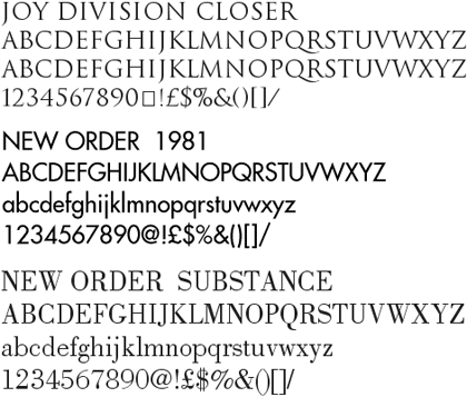
Peter Saville, the British designer closely associated with Factory Records, is offering free downloads of some of the fonts he used in designing record sleeves and other work for New Order, Joy Division, and other Factory Records artists (see update below).

(thx, mark)
Update: Several Peter Saville fans from around the world have written in to say that the above site is not Peter Saville’s official site (this is). It’s also unclear whether those fonts were indeed made by Saville (probably not) or ever offered for download free of charge (probably definitely not). But they’re still neat fonts, so download at your own risk.
Update: Kai has identified some of the fonts offered as shoddy versions of the following:
Joy Division Closer - Trajan (Adobe)
Blue Monday - Engravers Gothic (Bitstream)
New Order 1981 - Futura (Bauer)
New Order 1993 - Handel Gothic (Linotype)
New Order Ceremony - Albertus (Mecanorma)
New Order 316 - BT Incised 901 (Bitstream) = Antique Olive (Linotype)
New Order Regret - Rotis Serif (Agfa)
In this case, you get what you pay for, I guess.
On brand indentities that are flexible (vs. those that are static). Examples: Google’s logo, Target’s bullseye, and Saks’ jumbly identity. “As advertising agencies lose their grip on the communications channels, the logos are starting to come out of the corner. Once pushed as far over to the bottom right as possible, they’re becoming central to communication, no longer content to just be the the full-stop at the end of a piece of branded communication.” (via quipsologies)
Newer posts
Older posts


Socials & More