No One Belongs Here More Than You
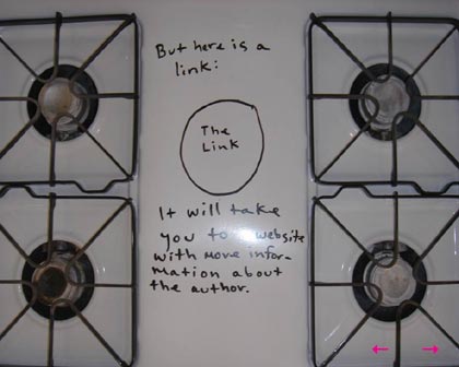
Miranda July, who you might remember from her film Me and You and Everyone We Know, has a book coming out in May, a collection of stories called No One Belongs Here More Than You. The book has a web site that’s one of the most effective and creative I’ve seen in a long time. Here’s a screenshot of one of my favorite pages, just to give you a taste:
The really intriguing thing about the site is that it breaks pretty much every rule that contemporary web designers have for effective site design. The site is a linear progression of images, essentially 30 splash pages one right after another. It doesn’t have any navigation except for forward/back buttons; you can’t just jump to whatever page you want. July barely mentions anything about the book and only then near the end of the 30 pages. There’s no text…it’s all images, which means that the site will be all but invisible to search engines. No web designer worth her salt would ever recommend building a site like this to a client.
Yet it works because the story pulls you along so well; July’s using the site’s narrative to sell a book that is, presumably, chock full of the same sort of narrative. If you think the site sucks and quickly click away, chances are you’re not going to like the book either…it’s the perfect self-selection mechanism. The No One Belongs Here More Than You site is a lesson for web designers: the point is not to make sites that follow all the rules but to make sites that will best accomplish the primary objectives of the site.
Stay Connected