kottke.org posts about design
Rebecca Charles, owner of the Pearl Oyster Bar in NYC, a seafood place modeled after hundreds of similar restaurants in New England offering similar menus, is suing a former employee (of six years) for copying too closely her restaurant and menu in opening his new place, Ed’s Lobster Bar.
Many parallels here to the design/art/film world…what is mere inspiration versus outright theft? The key question in these kinds of cases for me is: does the person exercise creativity in the appropriation? Did they add something to it instead of just copying or superficially changing it? Clam shacks are everywhere in New England, but an upscale seafood establishment with a premium lobster roll is a unique creative twist on that concept brought to NYC by Charles. An upscale clam shack blocks away from a nearly identical restaurant at which the owner used to work for six years…that seems a bit lame to me, not the work of a creative restaurateur. Who knows how this stuff is going to play out legally; it’s a complex issue with lots of slippery slope potential.
Meg has more thoughts on the issue and Ed Levine weighs in over at Serious Eats with information not found in the NY Times article. It was Ed who first raised the issue about Ed’s Lobster Bar earlier in the month.
Update: I forgot to link to the menus above. Here’s the menu for Pearl Oyster Bar and here’s the menu for Ed’s Lobster Bar. For comparison, here are the menus for a couple of traditional clam shacks: the Clam Box in Ipswich, MA and Woodman’s in Essex, MA.
Video about how the keyboard software for the iPhone works. As suspected, learning the keyboard requires some techniques not needed for using a regular keyboard but once you get used to them, the two-thumbed typing shown in the final scene seems pretty quick.
Cartype: “A comprehensive collection of reviews and study of typographical applications of emblems, car company logos and car logos with images, comments, links, car company information and general interest.”
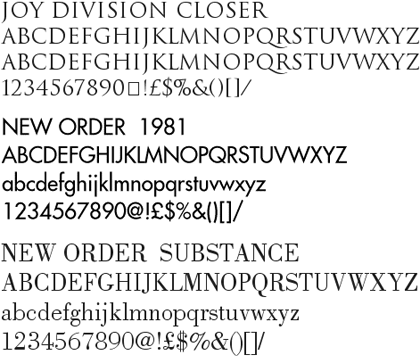
Peter Saville, the British designer closely associated with Factory Records, is offering free downloads of some of the fonts he used in designing record sleeves and other work for New Order, Joy Division, and other Factory Records artists (see update below).
(thx, mark)
Update: Several Peter Saville fans from around the world have written in to say that the above site is not Peter Saville’s official site (this is). It’s also unclear whether those fonts were indeed made by Saville (probably not) or ever offered for download free of charge (probably definitely not). But they’re still neat fonts, so download at your own risk.
Update: Kai has identified some of the fonts offered as shoddy versions of the following:
Joy Division Closer - Trajan (Adobe)
Blue Monday - Engravers Gothic (Bitstream)
New Order 1981 - Futura (Bauer)
New Order 1993 - Handel Gothic (Linotype)
New Order Ceremony - Albertus (Mecanorma)
New Order 316 - BT Incised 901 (Bitstream) = Antique Olive (Linotype)
New Order Regret - Rotis Serif (Agfa)
In this case, you get what you pay for, I guess.
On brand indentities that are flexible (vs. those that are static). Examples: Google’s logo, Target’s bullseye, and Saks’ jumbly identity. “As advertising agencies lose their grip on the communications channels, the logos are starting to come out of the corner. Once pushed as far over to the bottom right as possible, they’re becoming central to communication, no longer content to just be the the full-stop at the end of a piece of branded communication.” (via quipsologies)
Michael Bierut on design lessons learned from The Sopranos. “On The Sopranos, interest in certain things, including but not limited to event planning, fashion design, literature, and certain psychological theories, are considered indications of effeminacy. A not unsimilar macho attitude often obtains in corporate boardrooms when it comes to design.”
After working on this — on again and off again, mostly off — for much too long, I’m pleased to say that a significant chunk of kottke.org now has tags (around 5,100 entries are tagged, out of ~13,000). Right now, the only way to access them is through individual tag pages, but after all the bugs are ironed out, I’ll be putting them in different places around the site (front page, main archive page, etc.).
Each tag page lists all the entries1 on the site that are tagged with that particular word…some good examples to start you off are: photography, economics, lists, infoviz, food, nyc, cities, restaurants, video, timelapse, interviews, language, maps, and fashion. Each page also has a list of tags related to that particular tag and further down in the sidebar, you’ll find lists of recently popular tags, all-time popular tags, a few favorite tags of mine, and some random tags…lots of stuff to explore.
I’ve tweaked the design as well: the main column is a little wider, the post metadata look/feel is consistent among short posts and long posts, faint dotted lines now separate all entries, and per-entry tags were added to the post metadata. I’m testing all that out for eventual site-wide use. Questions, comments, bug reports, etc. are welcome…send them on in.
Update: I almost forgot, the nsfw tag.
[1] Not all the entries exactly. Until I figure out how to do some pagination, I’ve limited the number of entries to 100 for each tag page. The movies page was more than 1 Mb when all the entries were listed. ↩
A rare positive review from Speak Up of the new London 2012 that everyone else in the world seems to hate. “I believe, despite any ensuing boo’s, that this is some of the most innovative and daring identity work we have seen in this new millennium, and the lack of cheesy and imagination-impairing gradients gives me hope that identity work can still be resurrected on a larger scale.”
Update: Coudal loves the logo.
Matt Webb’s presentation slides and transcripts are always worth reading through…this one is no exception: Products Are People Too. I hope to catch one of his talks in person someday.
Decisions, Decisions: a nice looking hand-drawn flowchart poster.
Analysis of Casino Design is one of a number of articles on different aspects of casinos, gambling, and slot machines (see links at the bottom of the page). (via spitting image)
One of the causes of feature creep in products like consumer electronics is that when customers are making purchase decisions, they’ll likely choose the one with the most features. “But, when they were asked to use the digital device, so-called ‘feature fatigue’ set in. They became frustrated with the plethora of options they had created, and ended up happier with a simpler product.”
Food design by Marti Guixe. I love the 7-Step Cookie…it’s got numbered bite-marks that show you how to eat it. Some larger photos of some of his projects here. (via core77)
Winners of the 2007 National Design Awards, including Apple’s Jonathan Ive and Chip Kidd.
Mocketing: making fun of your product or brand in order to sell the product and build the brand. Found out about mocketing from this Book Design Review post on a book called Unmarketable.
Technology Review asked several designers to name their favorite technology products. Worth a look for the photos of pristine Sony Walkmans, Ataris, and Polaroid cameras.
Fresh Dialogue 23 is an upcoming AIGA NY event (May 29) that will focus on the increasingly common phenomenon of the former audience lending a hand in designing their own experiences. Speakers include Stamen’s Eric Rodenbeck and Ze Frank. (thx, khoi)
Michael Bierut’s 13 reasons to choose a particular typeface for a project. “Once I saw a project in a student portfolio that undertook the dubious challenge of redesigning the Tiffany’s identity. I particularly disliked the font that was used, and I politely asked what it was. ‘Oh,’ came the enthusiastic response, ‘that’s the best part! It’s called Tiffany!’”
Why has Apple’s focus on industrial design been so successful? “The most fundamental thing about Apple that’s interesting to me is that they’re just as smart about what they don’t do. Great products can be made more beautiful by omitting things.” (via justin)
Clever technique for pinching the colors from famous paintings using the Match Color tool in Photoshop. “The Old Masters of painting spent years of their lives learning about color. Why let all their effort go to waste on the walls of some museum when it could be used to give you a hand with color correction?”
Colors that have stood for things for a long time, like red for stop, green for money, and white for surrender.
The Cooper Hewitt Design Museum has announced plans for expansion. I was up there this weekend checking out the Design Triennial and found the exhibition a bit small; a similar show at the expansive MoMA might have run to twice the size and would have included larger items. I hope they don’t do too much to the building though…in many rooms, the building is just as much of an attraction as the items on display.
Confession: I collected stickers when I was a kid. Put them in books. I remember most of these scratch ‘n sniffs. Now I collect links and ideas…I wish they scratched ‘n sniffed. (via quipsologies)
Typographic map of London. That is, a map made of type (like Paula Scher’s paintings) not a map of typography in London. (via moon river)
Newer posts
Older posts

Socials & More