I’m not going to lie to you…
I’m not going to lie to you…I didn’t read this whole thing, but I found the sprinkled-in UI redesigns of Amazon’s book listings and other online retail interfaces interesting. (thx, drew)
This site is made possible by member support. 💞
Big thanks to Arcustech for hosting the site and offering amazing tech support.
When you buy through links on kottke.org, I may earn an affiliate commission. Thanks for supporting the site!
kottke.org. home of fine hypertext products since 1998.
Beloved by 86.47% of the web.
I’m not going to lie to you…I didn’t read this whole thing, but I found the sprinkled-in UI redesigns of Amazon’s book listings and other online retail interfaces interesting. (thx, drew)
Pagination and Page-View Juicing are Evil. “The realistic ones at least admit that it’s a cheap way to boost stats. The disingenuous (or naive) ones actually posit that they are improving readability and usability for their audiences by reducing scrolling. Because scrolling is so hard.” See also my pagination tantrum.
A low wattage color palette for web designers. The palette is based on the Energy Star wattage ratings for colors. (via migurski)
Feast your eyes on the new design for the US passport. “They’ll never go for this…it’s too over-the-top.” “Perfect!”
Miranda July, who you might remember from her film Me and You and Everyone We Know, has a book coming out in May, a collection of stories called No One Belongs Here More Than You. The book has a web site that’s one of the most effective and creative I’ve seen in a long time. Here’s a screenshot of one of my favorite pages, just to give you a taste:
The really intriguing thing about the site is that it breaks pretty much every rule that contemporary web designers have for effective site design. The site is a linear progression of images, essentially 30 splash pages one right after another. It doesn’t have any navigation except for forward/back buttons; you can’t just jump to whatever page you want. July barely mentions anything about the book and only then near the end of the 30 pages. There’s no text…it’s all images, which means that the site will be all but invisible to search engines. No web designer worth her salt would ever recommend building a site like this to a client.
Yet it works because the story pulls you along so well; July’s using the site’s narrative to sell a book that is, presumably, chock full of the same sort of narrative. If you think the site sucks and quickly click away, chances are you’re not going to like the book either…it’s the perfect self-selection mechanism. The No One Belongs Here More Than You site is a lesson for web designers: the point is not to make sites that follow all the rules but to make sites that will best accomplish the primary objectives of the site.
On the occasion of Helvetica’s NYC premiere tonight, Michael Bierut remembers a time when no one knew anything about type or fonts except for designers and typesetters. “[Today] we live in a world where any person in any cubicle in the world can pick between Arial and Trebuchet and Chalkboard whenever they want, risk free, copyfitting tables be damned, and where a film about a typeface actually stands a chance of enjoying some small measure of popular success.”
Results of the Type Directors Club type design competition for 2007. I really like Subtil. (via quipsologies)
The mid-2000s may be seen in the future as not such a fantastic time for logo design. One further piece of evidence: the what-were-they-thinking? new design for the Dairy Queen logo. “[The] gold and blue curved swishes [signify] food and treats.” Don’t know about you, but that blue swish make me want to cram ice cream down my treat-hole!
Quentin Tarantino and Robert Rodriguez pick their 10 favorite movie posters.
Profile of Edward Tufte. “Running his own enterprise, Tufte says, allows him to work ‘elegantly, intensely, gracefully and incredibly efficiently.’”
Perhaps the highest praise I can offer for Helvetica comes courtesy of Meg, who was snickering on the way into the theater about going to see a movie about a font and exited saying, “that was great, now I want to be a designer!” The rest of the audience, mostly designers and type folks, loved it as well. But for the non-design folks, what’s compelling about the movie is getting a glimpse of how designers think and work; that it’s not just about making things look pretty. The modern world is awash in signage and symbols and words and for a lot of them, especially the corporate messages, there’s a reason why they look the way they do. The story of Helvetica offers a partial key to decoding these messages.
Check out some clips from the film and the screenings schedule to find out when Helvetica will be showing in your area. Thanks to the fine folks at Veer for inviting me to the screening.
A look at the newly redesigned Time magazine, available at newsstands today. It’s been noted elsewhere that it looks more like The Economist than it did and that the photo on the cover of Reagan crying is actually a photo illustration…the tear was added digitally.
Update: An interview with the guy who added the digital tear to Reagan. Did that Worth1000-grade Photoshopping really warrant an interview?
Universe is another pretty but useless data visualization of the news. See also: just about every other data visualization of the news.
Among the many interesting things in Online Journalism Review’s article about using eyetracking to increase the effectiveness of news article design is this odd result:
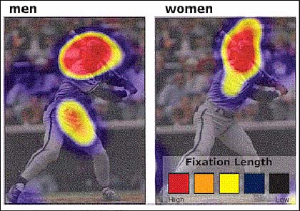
Although both men and women look at the image of George Brett when directed to find out information about his sport and position, men tend to focus on private anatomy as well as the face. For the women, the face is the only place they viewed. Coyne adds that this difference doesn’t just occur with images of people. Men tend to fixate more on areas of private anatomy on animals as well, as evidenced when users were directed to browse the American Kennel Club site.
That is absolutely fascinating. I’d love to hear an evolutionary biologist’s take on why that is.
I’m also heartened by the article’s first featured finding: that tighter writing, more white space, and jettisoning unnecessary imagery helps readers read faster and retain more of what they’ve read.
A nice presentation on web typography from SXSW 2007.
A wonderful collection of 19th century shipping posters on Flickr. (via quipsologies)
Update: That Flickr user also has several other interesting sets of images to look at, including book covers, typography of The Electric Company, Soviet children’s books, and Civil War posters.
Not sure why I’m surprised, but when Apple came up with the idea for their Apple Stores, they appoached the design of the stores like they would any other product: they built a prototype first:
“One of the best pieces of advice Mickey ever gave us was to go rent a warehouse and build a prototype of a store, and not, you know, just design it, go build 20 of them, then discover it didn’t work,” says Jobs. In other words, design it as you would a product. Apple Store Version 0.0 took shape in a warehouse near the Apple campus. “Ron and I had a store all designed,” says Jobs, when they were stopped by an insight: The computer was evolving from a simple productivity tool to a “hub” for video, photography, music, information, and so forth. The sale, then, was less about the machine than what you could do with it. But looking at their store, they winced. The hardware was laid out by product category - in other words, by how the company was organized internally, not by how a customer might actually want to buy things. “We were like, ‘Oh, God, we’re screwed!’” says Jobs.
But they weren’t screwed; they were in a mockup. “So we redesigned it,” he says. “And it cost us, I don’t know, six, nine months. But it was the right decision by a million miles.” When the first store finally opened, in Tysons Corner, Va., only a quarter of it was about product. The rest was arranged around interests: along the right wall, photos, videos, kids; on the left, problems. A third area - the Genius Bar in the back - was Johnson’s brainstorm.
Lots of other great stuff in the article as well. Sounds like the Apple Store is an underrated piece of Apple technology.
The New Yorker redesign just went live. Not sure if I like it yet, but I don’t not like it. Some quick notes after 15 minutes of kicking the tires, starting with the ugly and proceeding from there:
The New Yorker’s archives are not yet fully available online. The full text of all articles published before May, 2006, can be found in “The Complete New Yorker,” which is available for purchase on DVD and hard drive.Not sure if this is the only case or if the all longer articles from before a certain date have been pulled offline. This also is not good.
Thanks to Neil for the heads up on the new site.
Partial shot of a Waffle House grill cook’s cheat sheet. The placement of various condiments on the plate denote what the cook should be making at any given time.
Coming in July: Seventy-nine Short Essays on Design by Michael Bierut. Looks like some of those essays will be drawn from Design Observer.
Lovely designed condom applicator from South Africa…just put it on and pull the applicator away.
A list of well-know logos & brands and their design histories.
Update: I took out the link because several people told me that the site I was linking to has a history of taking other’s content and passing it off as their own.
This is an old one, but this cartoon of the various views of a design/software project is pretty good.
The graphic design of the futuristic world depicted in Mike Judge’s Idiocracy. I love the signage that doesn’t fit on the hospital. (via do)
Every few months, the blogosphere addresses the matter of gender diversity of speakers at conferences about design, technology, and the web. The latest such incidents revolved around the lack of women speakers at the the Future of Web Apps conference in San Francisco last September1 and the Creativity Now conference put on by Tokion in NYC last October. Each time this issue is raised, you see conference organizers publicly declare that they tried, that diversity is a very important issue, and that they are going to address it the next time around.
With that in mind, I collected some information2 about some of the most visible past and upcoming conferences in the tech/design/web space. I’m reasonably sure that the organizers of these conferences were aware of at least one of the above recent complaints about gender diversity at conferences (they were both linked widely in the blogosphere), so it will be interesting to see if those complaints were taken seriously by them.
Future of Web Apps - San Francisco
September 13-14, 2006
0 women, 13 men. 0% women speakers.
Tokion Magazine’s 4th Annual Creativity Now Conference
October 14-15, 2006
6 women, 30 men. 17% women speakers.
PopTech 2006
October 18-21, 2006
8 women, 30 men. 21% women speakers.
Web Directions North
February 7-10, 2007
5 women, 16 men. 24% women speakers.
LIFT
February 7-9, 2007
10 women, 33 men. 23% women speakers.
Future of Web Apps - London
February 20-22, 2007
1 woman, 26 men. 4% women speakers.
TED 2007
March 7-10, 2007
12 women, 41 men. 23% women speakers.
SXSW Interactive 2007
March 9-13, 2007
147 women, 378 men. 28% women speakers.
164 women, 373 men. 31% women speakers. (updated 2/22/2007)
165 women, 379 men. 30% women speakers. (updated 3/31/2007)
BlogHer Business ‘07
March 22-23, 2007
43 women, 0 men. 100% women speakers.
An Event Apart Boston 2007
March 26-27, 2007
1 woman, 8 men. 11% women speakers.
O’Reilly Emerging Technology Conference
March 26-29, 2007
9 women, 44 men. 17% women speakers.
12 women, 79 men. 13% women speakers. (updated 3/31/2007)
Web 2.0 Expo 2007
April 15-18, 2007
17 women, 91 men. 16% women speakers.
Future of Web Design
April 18, 2007
2 women, 12 men. 14% women speakers.
4 women, 16 men. 20% women speakers. (updated 3/31/2007)
GEL 2007
April 19-20, 2007
2 women, 11 men. 15% women speakers.
1 woman, 16 men. 6% women speakers. (updated 3/31/2007)
MIX07
April 30 - May 2, 2007
0 women, 4 men. 0% women speakers.
8 women, 89 men. 8% women speakers. (updated 3/31/2007)
The New Yorker Conference 2007
May 6-7, 2007
3 women, 21 men. 13% women speakers. (updated 2/28/2007)
6 women, 29 men. 17% women speakers. (updated 3/31/2007)
Dx3 Conference 2007
May 15-18, 2007
5 women, 48 men. 9% women speakers. (updated 3/2/2007)
5 women, 70 men. 7% women speakers. (updated 3/31/2007)
An Event Apart Seattle 2007
June 21-22, 2007
0 women, 9 men. 0% women speakers.
1 women, 9 men. 10% women speakers. (updated 3/31/2007)
From this list, it seems to me that either the above concerns are not getting through to conference organizers or that gender diversity doesn’t matter as much to conference organizers as they publicly say it does. The Future of Web Apps folks seem to have a particularly tin ear when it comes to this issue. For their second conference, they doubled the size of the speaker roster and added only one woman to the bill despite the complaints from last time. This List of Women Speakers for Your Conference compiled by Jen Bekman is a little non-web/tech-heavy, but it looks like it didn’t get much use in the months since its publication. Perhaps it’s time for another look. (If you think this issue is important, Digg this post.)
Update: To the above list, I added An Event Apart Boston 2007 and corrected a mistake in the count for GEL 2007 (they had one more woman and one less man than I initially counted.) Ryan Carson from Carson Systems, the producers of The Future of Web Apps conferences, emailed me this morning and said that my “facts just aren’t correct” for the count for their London conference. He stated that the number of speakers they had control over was only 13. Some of the speakers were workshop leaders (the workshops “are very different” in some way) and others were chosen by sponsors of the conference, not by Carson Systems. I’m keeping the current count of 27 total speakers as listed on their speakers page this morning…they’re the people they used to promote the conference and they’re the people at the conference in the front of the room, giving their views and leading discussions for the assembled audience. (thx, erik, mark, and ryan)
Update: I added the Future of Web Design conference to the above list. (thx, jeff)
Update: Hugh Forrest wrote to update me on the latest speaker numbers for SXSW Interactive 2007 (he keeps close watch on them because the issue is an important and sensitive one to the SXSW folks)…the ones on their site were less than current. In cases where counts are updated (and not inaccurate due to my counting errors), I will append them to the conference in question so that we can see trends. I plan to update the above list periodically, adding new conferences and keeping track of the speaker numbers on upcoming ones.
[1] Sadly, when I Googled “future of web apps women” while doing some research for this post, Google asked “Did you mean: ‘future of web apps when’”? ↩
[2] All statistics as of 2/22/2007. Consider the gender counts rough approximations…in some cases, I couldn’t tell if a certain person was a man or a woman from their name or bio. ↩
[3] This conference has released only a very incomplete speaker list. ↩
A friend of mine who works at the University of Nebraska-Lincoln emailed to let me know that they’ve posted both audio and video of a talk that Chris Ware gave at the school last week. If you’re short on time, the real meat of the video starts around 18:30 when Ware starts a slideshow that delves into his process. In addition to his series of Thanksgiving-themed New Yorker covers from last year, he also talks about some of his other work, including Rusty Brown and the strip he did for the NY Times Magazine.
An interview with Ootje Oxenaar, who designed a whole range of Dutch banknotes in the 60s, 70s, and 80s. “On the 1000 guilder note, it became a ‘sport’ for me to put things in the notes that nobody wanted there! I was very proud to have my fingerprint in this note - and it’s my middle finger!”
Socials & More