kottke.org posts about design
The North American Cartographic Information Society has published the third volume of The Atlas of Design, a book consisting of “beautiful and inspiring maps from around the world”.
National Geographic took a look at some of the maps included in the book.
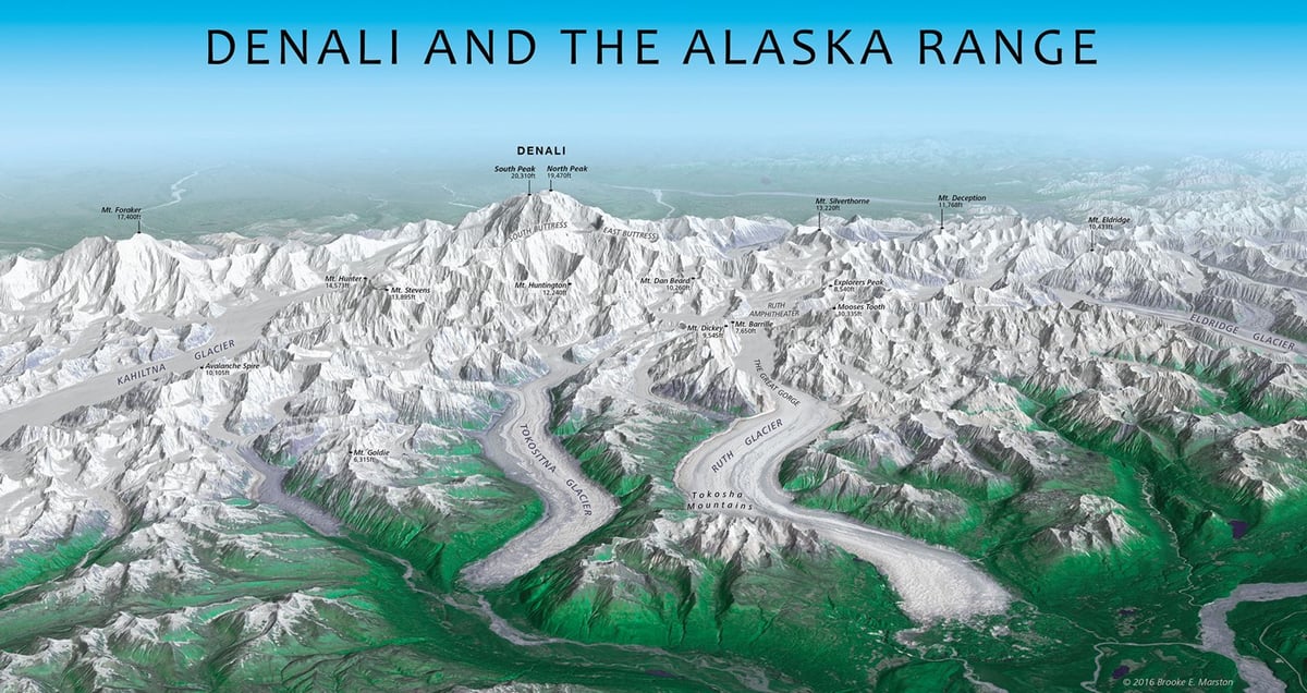
The striking panorama above of Denali and the Alaska Range was created by draping satellite imagery over a three-dimensional model of the terrain. Brooke Marston, a cartographer at the U.S. State Department’s Bureau of Intelligence and Research, was inspired by the Austrian artist Heinrich Berann, who is famed for his beautiful panoramas of mountain ranges.
While Berann took some artistic license with the precise location and positioning of mountains in his panoramas, Marston’s map is true to the geography. The oblique, bird’s-eye view emphasizes the sheer size of the mountains while maintaining a closeness with the viewer. “Good oblique mapping can transport the viewer straight into the landscape,” Elmer says. “This map makes me feel lost among the jagged, cold, majestic mountains just looking at it.”
Andy Baio has redesigned his long-running blog Waxy.
After 14 years of blogging, I switched from MovableType to WordPress. The design is finally responsive, though pretty minimalist for now with lots of rough edges. It took some effort, but I preserved the links to everything I’ve ever written — 472 posts and 15,891 links.
In his post about the redesign, he notes why he still continues to publish on his own site:
Ultimately, it comes down to two things: ownership and control.
Last week, Twitter announced they’re shutting down Vine. Twitter, itself, may be acquired and changed in some terrible way. It’s not hard to imagine a post-Verizon Yahoo selling off Tumblr. Medium keeps pivoting, trying to find a successful revenue model. There’s no guarantee any of these platforms will be around in their current state in a year, let alone ten years from now.
Here, I control my words. Nobody can shut this site down, run annoying ads on it, or sell it to a phone company. Nobody can tell me what I can or can’t say, and I have complete control over the way it’s displayed. Nobody except me can change the URL structure, breaking 14 years of links to content on the web.
I might have said “freedom” instead of “control” but there’s some hard nodding from me right here. I’d also add something about the freedom to pursue revenue in whatever way you want. Publishing on YouTube or Facebook or Medium or Instagram or Twitter limits how you can do that.
But given the state of the open web these days, Andy rightly notes that going it alone is much more difficult now than it used to be:
But the ecosystem for independent publications is fundamentally broken. Getting discovered, building a readership, and profiting from your work as an independent writer are all much, much harder than they used to be.
I also have lots of thoughts about this, and I’m glad Andy has decided to join me in sticking it out and remaining independent. Waxy is one of my favorite sites in the world and I’m happy to see it looking so smart this morning.
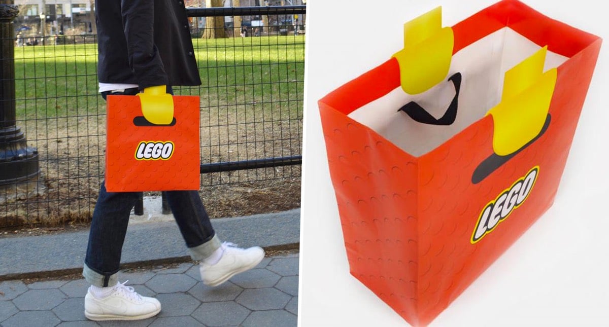
These Lego shopping bags are cleverly designed to make people carrying them look like they have Lego minifig arms. Fantastic design. (via @andrewbloch)
This folding measuring spoon on Kickstarter is clever as hell. Polygons lays flat in a drawer and, depending on how you pick it up, folds into four different volumes.
Premarked areas on both spoon sizes (tablespoon and teaspoon) let you know where to pick up from to measure the volume required for your recipe. Practicality and simplicity at its finest.
The spoons come in two sizes (the smaller measures teaspoons and the larger one tablespoons), they’re marked with US and metric measurements, you can flatten it to easily scrape every last bit of stuff into the bowl, and it doubles as a knife when flat as well. (via colossal)
Update: Hmm, it looks like Polygons needs a little more work to be a fully functional product. (thx, mac)
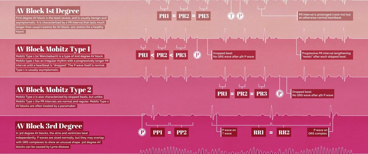
This is a lovely infographic from Eleanor Lutz of a bunch of different heartbeat EKG waves, from a normal heartbeat to a flatline to ventricular fibrillation (“must be treated immediately with CPR and defibrillation”.) Prints are available.
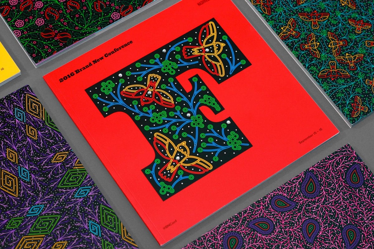
I love this design work from UnderConsideration for their recent conference in Nashville. It’s got a Western rhinestone + woodtype vibe but it also feels digital — the first thing that popped into my head when I saw that gorgeous F was a circuit board. Wonderful. (via @Colossal)
Designing Your Life is one of the most popular courses at Stanford. Taught by Bill Burnett and Dave Evans, the class teaches how you can use design thinking and techniques to shape your life and career. Burnett and Evans just came out with a book based on the class, Designing Your Life: How to Build a Well-Lived, Joyful Life.
In this book, Bill Burnett and Dave Evans show us how design thinking can help us create a life that is both meaningful and fulfilling, regardless of who or where we are, what we do or have done for a living, or how young or old we are. The same design thinking responsible for amazing technology, products, and spaces can be used to design and build your career and your life, a life of fulfillment and joy, constantly creative and productive, one that always holds the possibility of surprise.
The course itself isn’t available online, but there are a couple of lectures from the class available on YouTube: Reframe Your Passion and Prototypes for Personal Success.
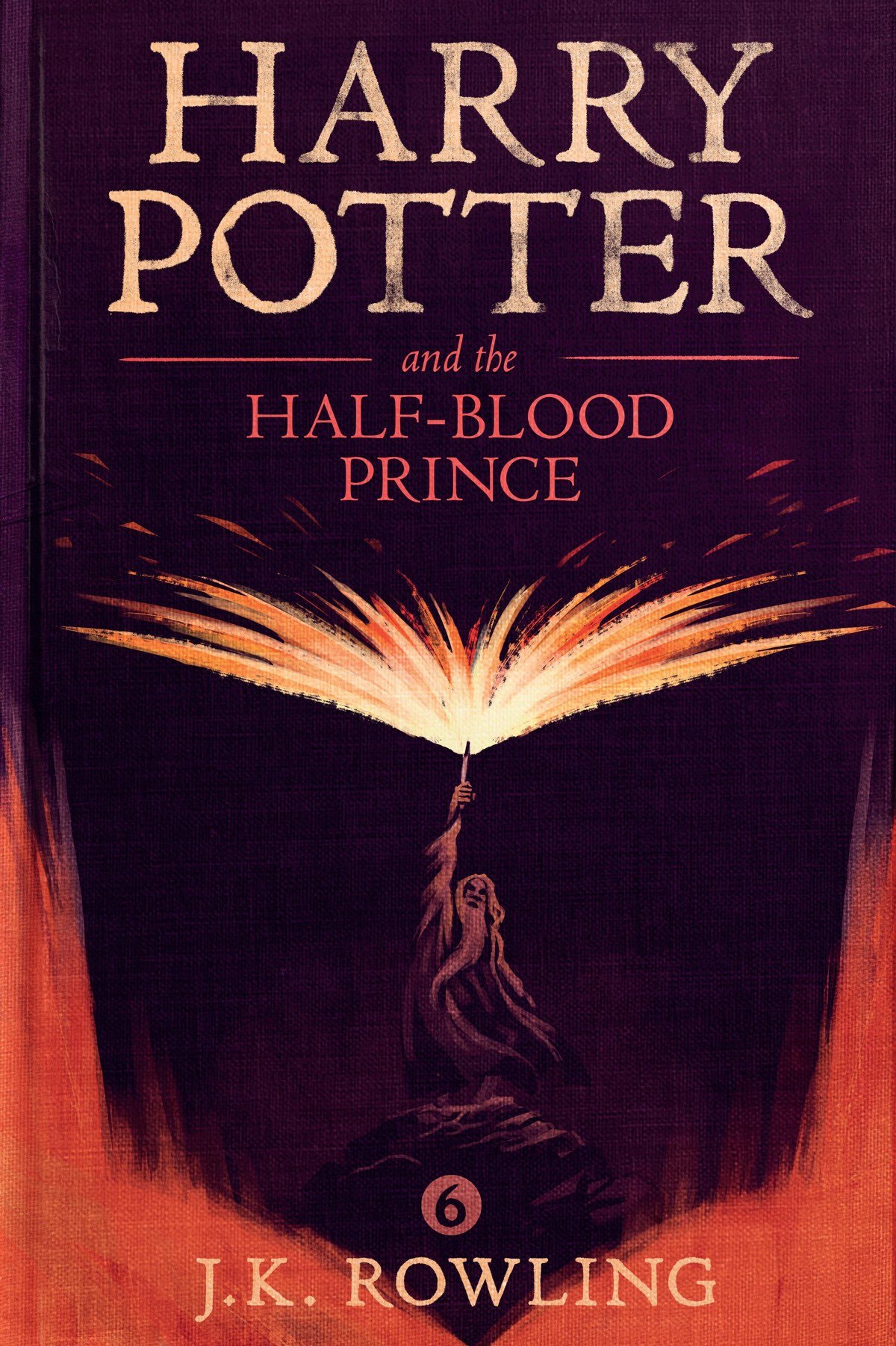
I first ran across the work of designer Olly Moss several years ago, when he designed some super-simple alternate posters for iconic movies. He’s since worked on a whole bunch of great stuff, like Firewatch and posters for Studio Ghibli. Just the other day, while the kids and I were finding out what our Patronuses are,1 I discovered that Moss not only designed the cover of the forthcoming ebook of Fantastic Beasts and Where to Find Them but also did the covers for all seven of the Harry Potter ebooks.
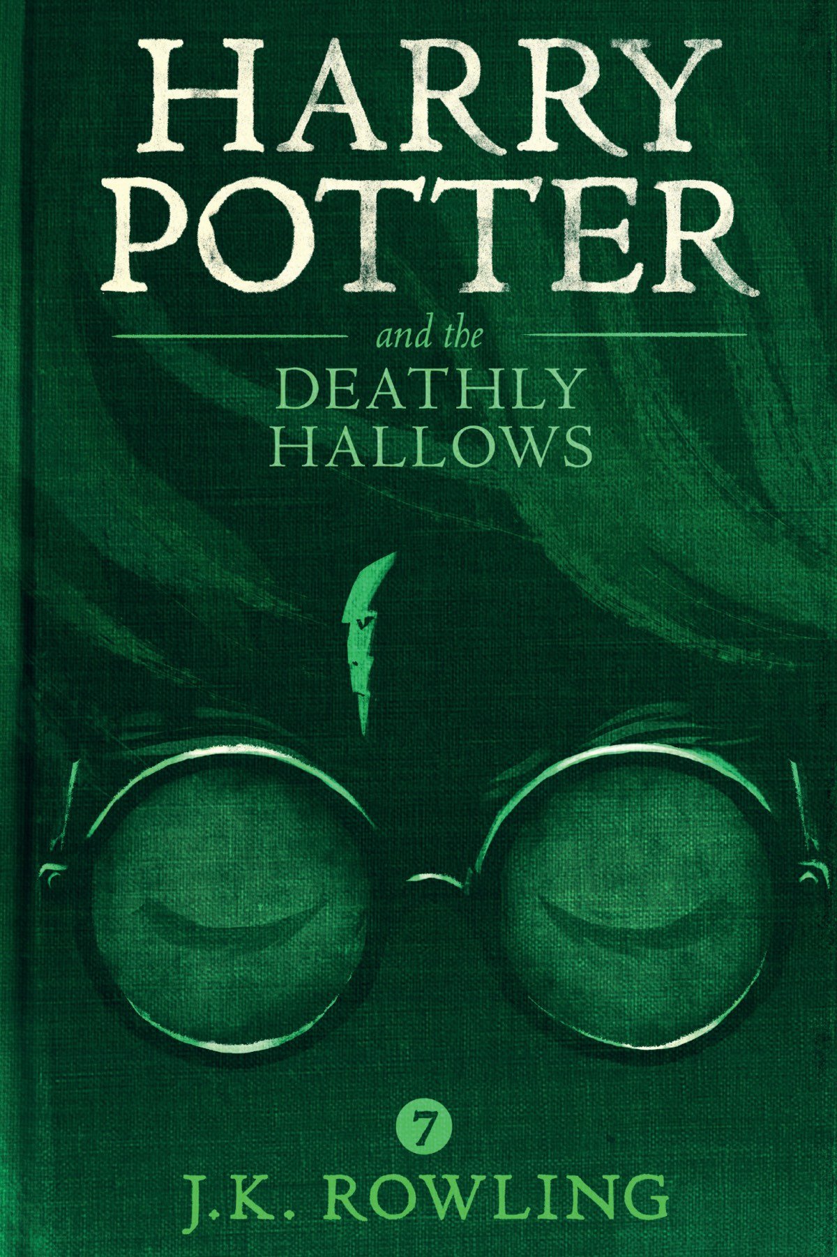
Moss’ main technique, of combining two or more aspects of the story into a single image, is on full display in the Potter covers — the prison on a rock shaped like a dog for Azkaban, Voldemort as Harry’s scar for Hallows, and Dumbledore’s spell casting forming the pages of a textbook for Half-Blood Prince.
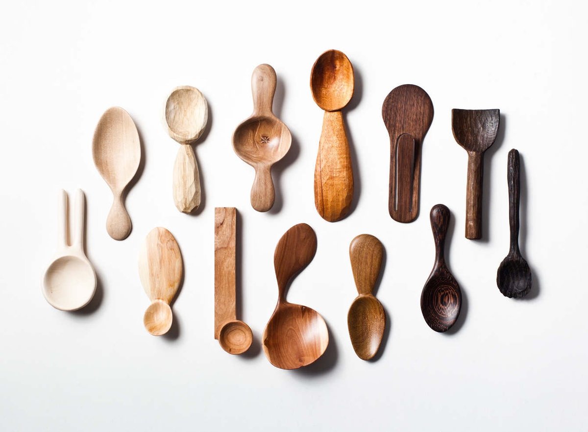
In 2014, Stian Korntved Ruud hand-carved a different wooden spoon every single day for the entire year. Yep, 365 spoons.
The past year Stian spent most of his time exploring the unique organic qualities of wood and how adding of a function can beautifully refine a piece of wood. The project consists of 365 unique hand carved spoons made from various types of wood. One carved everyday through a year.
By repeating the production of a spoon every day for a longer period of time (365 days), the goal is to challenge and explore a spoons aesthetic and functional qualities.
(via @pieratt)

For the first time in more than four years, kottke.org is sporting a new design this morning. Since you should never launch anything completely finished,1 there are probably still some things that need to be ironed out, but I hope most of it works. (Drop me a note if you notice something amiss?) Let’s hop right into what’s new and why. (For reference, here’s what the site looked like until late yesterday, here’s what I said about that design, and here’s what some of the previous designs looked like.)
Design. Gone is the now-beloved blue gradient (which ppl didn’t like when I introduced it), replaced with a colorful rainbow banner thingie. The site title and the old school tagline — “home of fine hypertext products” — are both making a comeback. The march toward simplicity continues…every remaining design element serves a purpose. The type is a bit bigger to offset ever increasing display resolutions (which somewhat paradoxically makes everything smaller). Post titles are quite a bit larger. Media embeds and images are much larger, especially if it’s right at the top of the post. Check out this post and this one for examples of what I’m talking about. Tweaked the footnote style.2 More tweaks to come. (Including moving to some even faster new servers at Arcustech, the fantastic hosts of kottke.org for years now. Big thanks to them for all their support!)
The layout of the site is responsive — not fully so, but if you resize your browser window, it’ll change and flow and do all of the neat things that responsive design does. The type is still my favorite Whitney ScreenSmart by Hoefler & Co (designed by Tobias Frere-Jones), but I finally (FINALLY!!!) turned on smart quotes and such — you know, like “opening and closing quotes around this text” and apostrophes’ apostrophes and the proper m-dash right heeeeeere — so now the designers who read the site can finally stop tutting about it. (And Hoefler and Frere-Jones can stop tearing their hair out about seeing text rendered with their point-perfect typeface littered with dumb quotes. Enjoy your tresses, fellows!)
Mobile. This was the main impetus behind the redesign. Over 40% of you read kottke.org on a mobile device of some kind. The old site worked fine on phones and tablets, but not great. Now, the site looks and works great on mobile. (At least I think it does.)
Tags. Some of my favorite things about kottke.org are the tags and tag pages. Looking at the site through the lens of tags, it becomes apparent that kottke.org is actually a collection of hundreds of small blogs about introversion, Stanley Kubrick, time travel, early color photography, economics, crying at work, and all sorts of other things. For the redesign, I made them more visible on the site and I’m hoping to find more ways to improve their involvement in the site soon. You’ll now find tags at the end of posts no matter where you find them on the site; previously they were only on the individual post pages. Tag pages are now paginated so you can go back through hundreds and even thousands of posts on each topic. I’ve also included a list of related tags at the top of each tag page…which is incredibly addictive for surfing around aimlessly.
Biography. With the help of some friends (aka the kottke.org board of advisors), I rewrote the about page. I liked the brevity of the old version, but in the words of one friend, “the previous version undersold the site so much it was almost inaccurate”. This is the first bio I’ve ever written that takes seriously what the site is and what I’ve done in my career…and as such it makes me really uncomfortable. Taking credit, particularly in public, has never been my thing. But I wanted to have a chance at explaining kottke.org to people who might not know the whole story. Everyone here has an opinion about kottke.org, this is mine.
When I started the site in 1998, people expressing their ideas & beliefs through links and attempting to stitch technology & the liberal arts together were not commonplace pursuits. In many ways, media on the web has come to resemble, in form and function, what kottke.org and other early blogs were doing back then. The largest social media companies in the world are now centered around people collecting and showing each other cool/interesting/funny links in order to say something about what they believe. I’m proud that kottke.org and I have played a role in that (r)evolution.
Future. The past 2.5 years have been the most challenging out of the 18+ years I’ve been doing the site. (Translation: they sucked.) I’ve been working, with many loooong periods of inactivity, on this redesign for more than 2 years. It’s not a cure for cancer or the world’s best design work, but to have it finally be out in the world feels amazing. Like a bad chapter in my life is ending. Like I’m still alive. Vital. A start of something. Like I’m finally investing in myself and my future for the first time in a long while. It feels like hope. And I hope you like it. It’s a genuine pleasure being able to share myself with you like this, and I don’t know what I’d do without it.
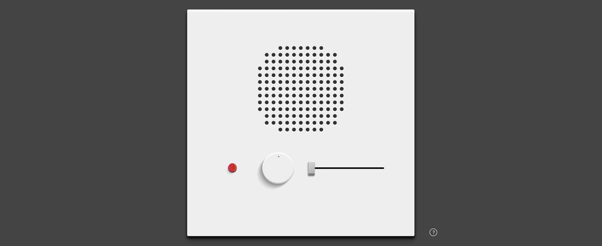
This is fun: the Ramsophone is a music box you can play around with on the web. Push buttons to make it do stuff and refresh for a new box that sounds/works differently. Design inspired by Dieter Rams and music inspired by the Stranger Things theme.
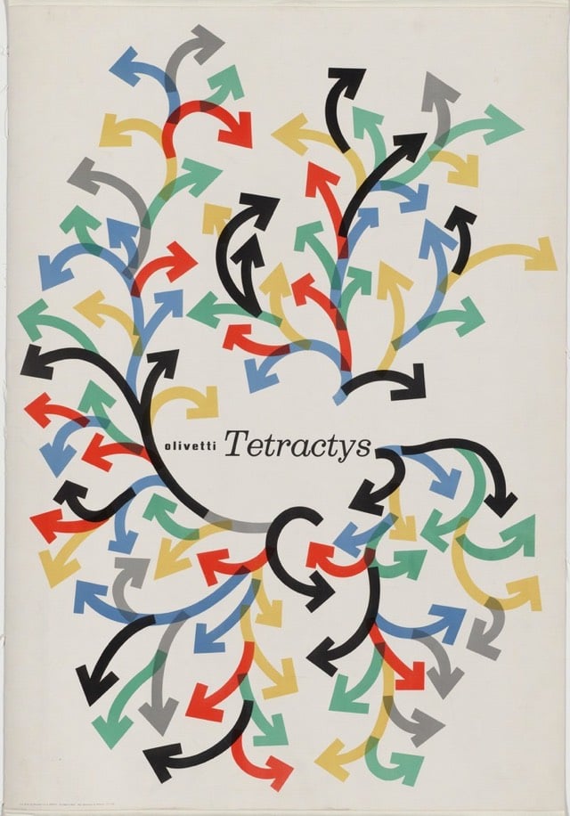
An advertising poster for Italian typewriter company Olivetti by graphic designer Giovanni Pintori.
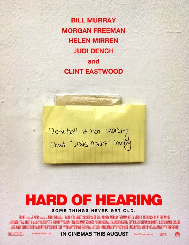
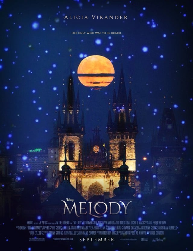
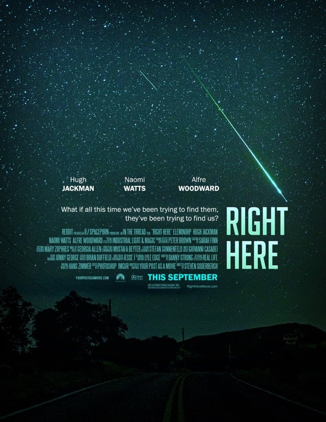
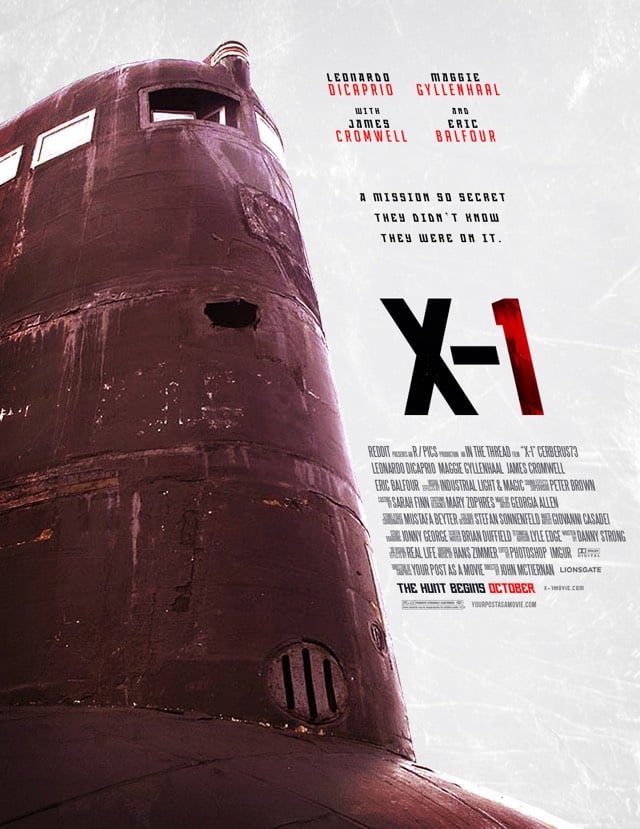
This Reddit user takes photos posted by people and turns them into posters for fictional movies. Some of these should be optioned…has a movie ever started as a poster before? (via one perfect shot)
Update: I previously described this as the effort of a Reddit forum…it actually just one user. (thx, all)
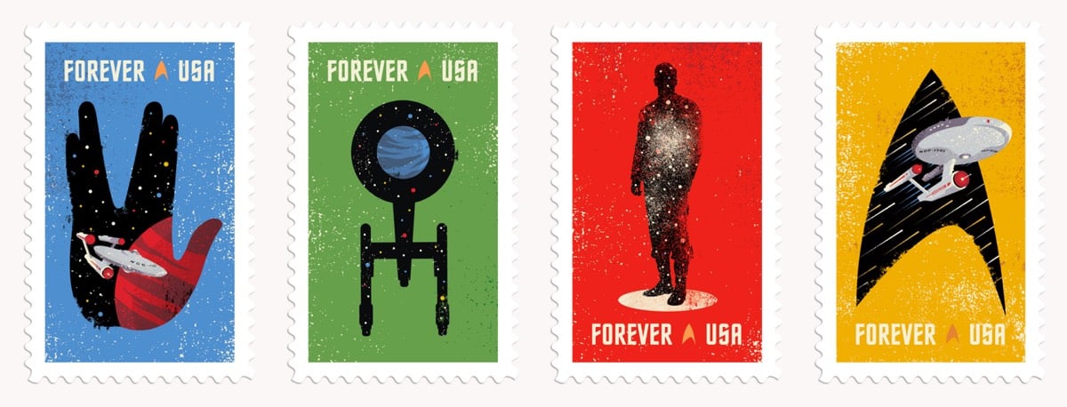
The USPS is releasing a set of four commemorative Star Trek stamps on the 50th anniversary of the original series. The stamps were designed by Heads of State and you can buy there here.
Graphic Means is a documentary film by Briar Levit about the history of graphic design production from the 1950s to the 1990s.
It’s been roughly 30 years since the desktop computer revolutionized the way the graphic design industry works. For decades before that, it was the hands of industrious workers, and various ingenious machines and tools that brought type and image together on meticulously prepared paste-up boards, before they were sent to the printer.
Features interviews with Steven Heller, Ellen Lupton, Tobias Frere-Jones, and more. (via @cleverevans)
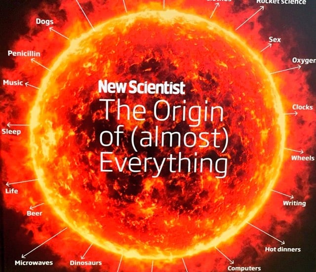
Oh, this new book from Jennifer Daniel and New Scientist looks great: The Origin of (almost) Everything.
Together they take us on a whistle-stop tour from the start of our universe (through the history of stars, galaxies, meteorites, the Moon and dark energy) to our planet (through oceans and weather to oil) and life (through dinosaurs to emotions and sex) to civilization (from cities to alcohol and cooking), knowledge (from alphabets to alchemy) ending up with technology (computers to rocket science). Witty essays explore the concepts alongside enlightening infographics that zoom from how many people have ever lived to showing you how a left-wing brain differs from a right-wing one.
And Stephen Hawking wrote the foreword. You fancy, Jennifer Daniel!
Like many of you, I have been watching Stranger Things on Netflix. My 80s movie fixations tilted towards the War Games/Explorers/Goonies end of the spectrum rather than the supernatural/horror/Steven King end so I’m not obsessed, but I am definitely enjoying it. You can watch the first 8 minutes of the show to judge for yourself.
But I love the opening credits, especially the music. (Both remind me of the opening credits for Halt and Catch Fire.) The title song was composed by Kyle Dixon and Michael Stein, members of Austin synth band Survive. Someone did a 10-minute extended version of the song and put it up on Soundcloud:
Currently on repeat for the last hour with no sign of stopping. You may also be interested in a pair of playlists featuring music from the show:
What else? Here’s a deep dive into the font used for the opening credits (which was also used for the Choose Your Own Adventure books back in the 80s). Alissa Walker wrote about the free-range children on display in ST, something that also grabbed my attention. When I was a kid, I rode my bike everywhere. On summer weekends, I typically ate breakfast at my house and was gone until dinnertime. My parents had no clue where I was or what I was up to…and none of my classmates’ parents did either.
Update: Garrett Shane Bryant made a 50-track playlist of songs that sound like the score of the show. Outstanding. (via @dozens)
Update: From the NY Times, The ‘Stranger Things’ School of Parenting.
Still, “Stranger Things” is a reminder of a kind of unstructured childhood wandering that — because of all the cellphones, the fear of child molesters, a move toward more involved parenting or a combination of all three — seems less possible than it once was.
The show’s references to beloved films of the ’80s have been much remarked upon, but “Stranger Things” also calls to mind all those books and TV shows — from “The Chronicles of Narnia” to “Muppet Babies” — where parents are either absent or pushed into the background.
These stories let children imagine breaking the rules, but they also allow them to picture themselves solving mysteries or hunting down monsters all on their own. Often it’s only when the parents aren’t watching that a child can become a hero.
(via @CognoscoCuro)
Update: The official soundtrack for the show is available on iTunes. It’s the score though, not the classic 80s tunes.
Update: Vox spoke to a creative director at Imaginary Forces about their process for designing the opening titles.
Update: And the score is now available on Spotify. This is my working music for the day.
Update: Dixon and Stein talked about how the music for the show came about.
A lovely short video profile of Thomas Lilley, who is a roadliner in Glasgow. A roadliner is a person who paints the words and marks on roads with molten thermoplastic. Lilley does it quickly, freehand, and beautifully. The design firm who did the video above commissioned Lilley’s crew to make a custom typeface for them and their new logo.
See also The art of street typography. (via @mathowie)
Alex Ronan interviewed legendary designer Susan Kare for Lenny. Cross-stitch prepared her for designing pixel icons and fonts for the Mac:
Also, I did have limited experience designing for grids from working on craft projects such as tiled ashtrays and cross-stitch embroidery kits.
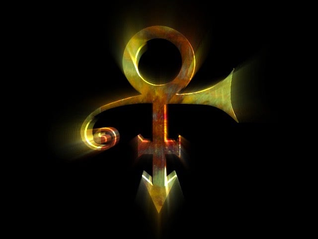
Prince’s iconic symbol was originally designed by Martha Kurtz and Dale Hughes (based on an initial concept by Lizz Frey) for use in a 1992 music video and Hughes shared a bunch of the original files and thinking that went into its design.
The day before Prince was scheduled to view HDMG’s latest edit of the video, Mitch Monson (HDMG partner/video graphics artist) asked Martha and me if we could create an animated 3D logo to use as a close to the video…. by tomorrow.
Umm, okay, and what do you have to work with?
Well, we have these drawings that Lizz has been working on…
(via do I even need to tell you)
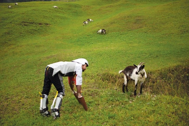
In response to feeling like he was psychologically “stuck in a big, dark hole”, designer Thomas Thwaites decided to become a goat. At least part time.
From this, he builds a goat exoskeleton-artificial legs, helmet, chest protector, raincoat from his mum, and a prosthetic goat stomach to digest grass (with help from a pressure cooker and campfire)-before setting off across the Alps on four legs with a herd of his fellow creatures. Will he make it? Do Thwaites and his readers discover what it truly means to be human?
A book detailing his experience came out earlier this year.
You may remember Thwaites as the guy who built a toaster from scratch (also a book). Like completely from scratch…he smelted his own iron ore.
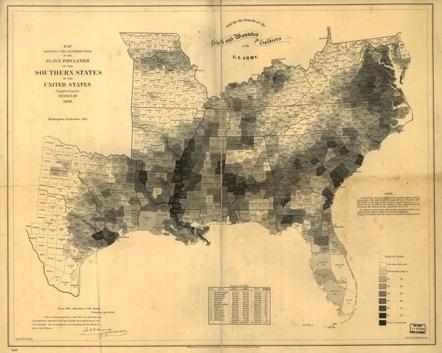
From Clive Thompson, a history of the infographic, which was developed in part to help solve problems with an abundance of data available in the 19th century.
The idea of visualizing data is old: After all, that’s what a map is — a representation of geographic information — and we’ve had maps for about 8,000 years. But it was rare to graph anything other than geography. Only a few examples exist: Around the 11th century, a now-anonymous scribe created a chart of how the planets moved through the sky. By the 18th century, scientists were warming to the idea of arranging knowledge visually. The British polymath Joseph Priestley produced a “Chart of Biography,” plotting the lives of about 2,000 historical figures on a timeline. A picture, he argued, conveyed the information “with more exactness, and in much less time, than it [would take] by reading.”
Still, data visualization was rare because data was rare. That began to change rapidly in the early 19th century, because countries began to collect-and publish-reams of information about their weather, economic activity and population. “For the first time, you could deal with important social issues with hard facts, if you could find a way to analyze it,” says Michael Friendly, a professor of psychology at York University who studies the history of data visualization. “The age of data really began.”
The AIGA and Design Observer have announced the results of the 50 Books/50 Covers competition for books published in 2015. The competition recognizes excellence in design of books and, separately, book covers. Here are a couple of my favorite covers:
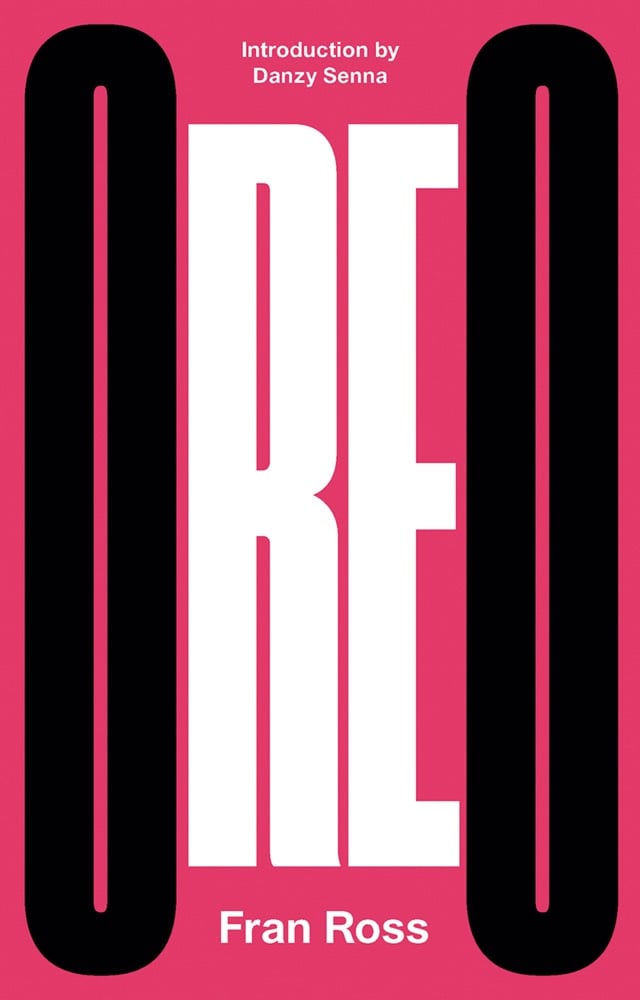
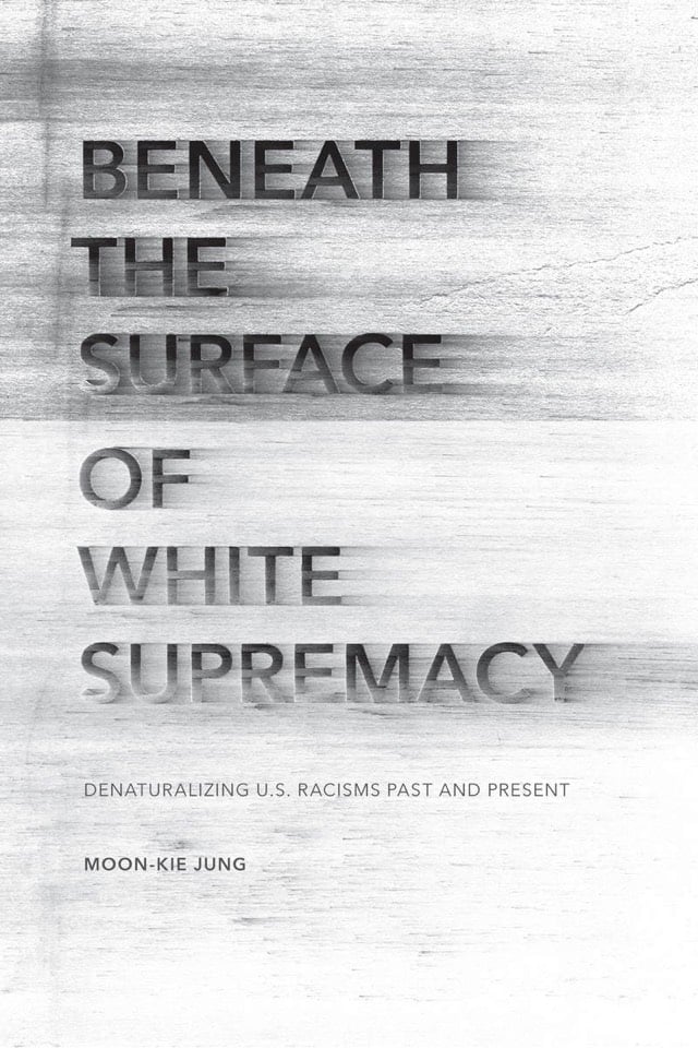
Oreo by Fran Ross was designed by Erik Carter and Moon-Kie Jung’s Beneath the Surface of White Supremacy was designed by Anne Jordan and Mitch Goldstein.
Gary Hustwit, director of Helvetica and Objectified, is directing a movie on legendary product designer Dieter Rams. Here’s the Kickstarter campaign.
This Kickstarter campaign will fund the film and also help to preserve Dieter’s incredible design archive for the future. There’s a trove of drawings, photographs, and other material spanning Dieter’s fifty plus years of work, and it needs to be properly conserved.
To that end, we’re working with the Dieter and Ingeborg Rams Foundation to help them catalog, digitize, and save these documents. The public has never seen most of this material, and we intend to share some of these discoveries with our backers during the process of making the film.
Rams’ designs have influenced an entire generation of designers, including one Jony Ive from a small company called Apple.
Jarrett Fuller examines the video essay, typically used for film criticism (e.g. Every Frame a Painting, F is for Fake), and argues for its use in design criticism. (via @tonyszhou)
Ahhh, this makes me nostalgic for the 90s World Wide Web. Designer Sebastian Serena has built a Rube Goldberg machine out of HTML form elements. Once you start, you’ll watch the whole thing. (via @Colossal)
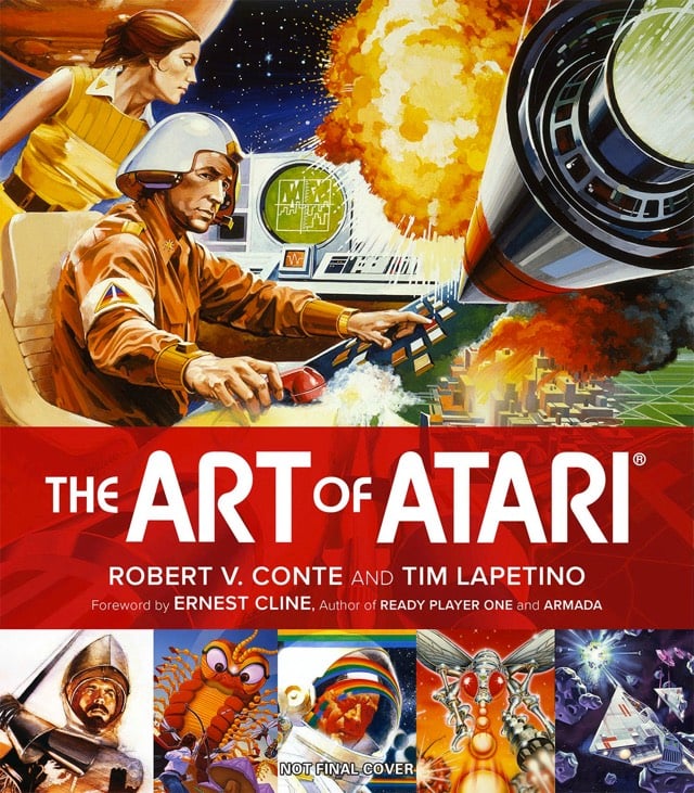
The Art of Atari showcases the design of the iconic company’s video game packaging, advertisements, catalogs, and other stuff. Judging from my reaction to just the cover, I might die of nostalgia if I were to see the inside. Might be worth the risk though.
See also season 3 of Boss Fight Books featuring books on SMB3, Mega Man 3, Katamari Damacy, and more. (via df & @robinsloan)
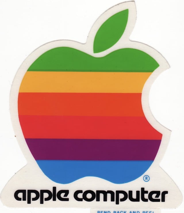
Just learned/realized that the old logos for Reebok, Apple, and Trapper Keeper all use the same typeface, Motter Tektura.
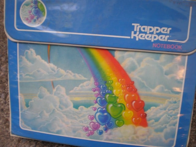
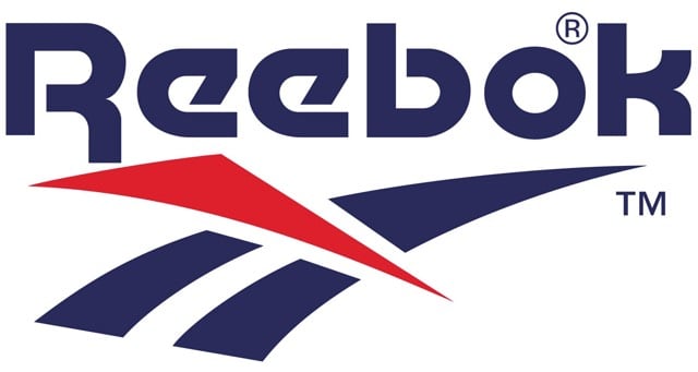
(via @pieratt)
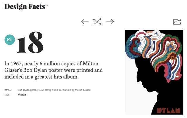
Design Facts is just what it says on the tin.
Design Facts is a platform for sharing the inspiring, shocking, passionate, brilliant, revolutionary, carefully crafted and relatively young history of our craft, all in bite-sized servings.
Warning, once you start reading, you’re probably not going to be able to stop until you’ve seen all 135 facts. (Also, there’s is something charmingly old school about this site. Sure, it’s a slideshow, but in a 1997 sort of way.)
Newer posts
Older posts
Socials & More