Jason Fried wrote a preview of what’s coming in Basecamp 3. Jim Ray noted on Twitter that “Basecamp vs. Slack will be interesting”. And suddenly I remembered that back in 2002, Jason, Slack CEO Stewart Butterfield, and I hosted a “peer meeting” on Simplicity in Web Design at SXSW.1 The meeting’s description:
As the Web continues to increase in complexity, many designers are looking to simplicity as a tool in designing Web sites that are at once powerful and easy for people to use. Join your peers and colleagues in a discussion facilitated by three working designers who are committed to producing work which is simple: obvious, elegant, economical, efficient, powerful and attractive. We’ll be discussing what simplicity in Web design really means, the difference between Minimalism as an aesthetic and simplicity as a design goal, who is and who isn’t simple, how you can use simplicity to your advantage, and plenty more.
It’s fun to see those two going at it more than 13 years later, still focused on harnessing the power of simplicity to help people get their best work done. (I don’t know what the other guy’s deal is. He’s doing…. something, I guess.)

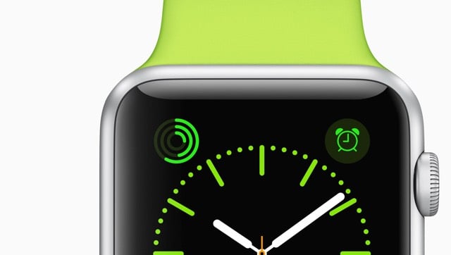
Some sort of embargo seems to have lifted because here come the Apple Watch reviews! As I’m unanointed by Apple, I haven’t experienced Apple Watch in the flesh, but I do have a few random thoughts and guesses.
John Gruber notes that why Apple made a watch is different from why they made the iPhone. People were generally dissatisfied with their mobile phones (I know I was) so Apple made one that was much better. But people who wear current watches like them.
But as Ive points out, this time, the established market — watches — is not despised. They not only don’t suck, they are beloved.
I’m one of the watch non-wearers Gruber discusses elsewhere in his review; I haven’t worn a watch since my Swatch band broke when I was 17. Part of the reason I don’t wear a watch is they look hideous. The more expensive watches get, the uglier they are. Have you seen the watch ads in the New Yorker or Vogue? Garish nasty looking objects. And men’s watches are generally massive, built for lumberjacks, linebackers, and other manly men, not for dainty-wristed gentlemen like myself. I tried on a regular men’s Rolex some years ago and it looked like I’d strapped a gold-plated Discman on my wrist.
I know, I know, not all watches. The point is that for me, Apple Watch looks like something I would consider wearing on a regular basis — imagining myself living in Steve Jobs’ living room has always been more my speed than J.P. Morgan’s library.1
The subtle notifications possible with Apple Watch (taps, drawings, heartbeats) are very interesting. Also from Gruber’s review:
You’re 16. You’re in school. You’re sitting in class. You have a crush on another student — you’ve fallen hard. You can’t stop thinking about them. You suspect the feelings are mutual — but you don’t know. You’re afraid to just come right out and ask, verbally — afraid of the crushing weight of potential rejection. But you both wear an Apple Watch. So you take a flyer and send a few taps. And you wait. Nothing in response. Dammit. Why are you so stupid? Whoa — a few taps are sent in return, along with a hand-drawn smiley face. You send more taps. You receive more taps back. This is it. You send your heartbeat. It is racing, thumping. Your crush sends their heartbeat back.
In 2005, I wrote about a feature I called sweethearting:
Pings would be perfect for situations when texting or a phone call is too time consuming, distracting, or takes you out of the flow of your present experience. If you call your husband on the way home from work every night and say the same thing each time, perhaps a ping would be better…you wouldn’t have to call and your husband wouldn’t have to stop what he was doing to answer the phone. You could even call it the “sweetheart ping” or “sweethearting”…in the absence of a prearranged “ping me when you’re leaving”, you could ping someone to let them know you’re thinking about them.
Like I said elsewhere in that post, this stuff always makes me think about Matt Webb’s Glancing project:
Glancing: An application to allow ultra-simple, non-verbal communication amongst groups of friends online.
It’s a desktop application that you use with a group of other people. It lets you “glance” at them in idle moments, and it gives all of you an indication of the activity of glancing going on.
A group is intended to be less than a dozen people. A person may belong to several groups simultaneously by running separate instances of Glancing. Groups are started deliberately, probably by using a www interface, and people are told the group secret so they can join (a “secret” is just a shared password).
But the thing that has struck me the most since the announcement of Apple Watch is the idea that if you’re wearing one, you’re going to be checking your devices a lot less. From TechCrunch last month:2
People that have worn the Watch say that they take their phones out of their pockets far, far less than they used to. A simple tap to reply or glance on the wrist or dictation is a massively different interaction model than pulling out an iPhone, unlocking it and being pulled into its merciless vortex of attention suck.
One user told me that they nearly “stopped” using their phone during the day; they used to have it out and now they don’t, period. That’s insane when you think about how much the blue glow of smartphone screens has dominated our social interactions over the past decade.
From Joshua Topolsky’s review at Bloomberg:
I’m in a meeting with 14 people, in mid-sentence, when I feel a tap-tap-tap on my wrist. I stop talking, tilt my head, and whip my arm aggressively into view to see the source of the agitation. A second later, the small screen on my new Apple Watch beams to life with a very important message for me: Twitter has suggestions for people I should follow. A version of this happens dozens of times throughout the day-for messages, e-mails, activity achievements, tweets, and so much more. Wait a second. Isn’t the promise of the Apple Watch to help me stay in the moment, focused on the people around me and undisturbed by the mesmerizing void of my iPhone? So why do I suddenly feel so distracted?
The promise of the Apple Watch is to make it more convenient to send & receive notifications and quick messages, although many of the reviews make it clear that Apple hasn’t entirely succeeded in this. In the entire history of the world, if you make it easier for people to do something compelling, people don’t do that thing less: they’ll do it more. If you give people more food, they eat it. If you make it easier to get credit, people will use it. If you add another two lanes to a traffic-clogged highway, you get a larger traffic-clogged highway. And if you put a device on their wrist that makes it easier to communicate with friends, guess what? They’re going to use the shit out of it, potentially way more than they ever used their phones.
Now, it’s possible that Apple Watch doesn’t make receiving notifications easier…instead, it may make controlling notifications easier. Like congestion pricing for your digital interactions. But that is generally not where technology has been taking us. Every new communications device and service — the telegraph, telephone, internet, email, personal computer, SMS, smartphones, Facebook, Whatsapp, Slack,3 etc. etc. etc. — makes it easier to 1) connect with more and more people in more and more ways, and 2) to connect with a few people more deeply. And I don’t expect Apple Watch will break that streak. The software will get faster & better, the hardware will get cheaper & longer-lasting, and people will buy & love them & use them constantly.
P.S. While I didn’t quote from it, The Verge review is great. But mainly I’m wondering…where are the reviews from the fashion world? I assume Vogue and other such magazines and media outlets received Apple Watches for review and their embargoes lifted as well, but after searching for a bit, I couldn’t find any actual reviews. And only a single major review by a woman, Lauren Goode’s at Re/code. If you run across any, let me know?
Update: Joanna Stern wrote a review for the WSJ with an emphasis on the fashion aspect. (via @trickartt)
Update: Executive editor Nicole Phelps wrote a review for style.com. (thx, louis-olivier)
When Stewart Butterfield’s first game company wasn’t going all that well, he and his team decided to focus on one of the game’s features that enabled players to share images. Before long, Flickr had taken over the web, and in some ways, launched a new era of social media. So Stewart went back to his original passion. And his next game flopped. So he focused on an internal communication tool his team had built to better work on the game. That became a new product called Slack. And Slack could be huge. In Wired, Mat Honan does an excellent job tracing the career of Stewart Butterfield, and in doing so, paints a very accurate portrait of the evolution of the start-up world: The most fascinating profile you’ll ever read about a guy and his boring startup.


Socials & More