kottke.org posts about design
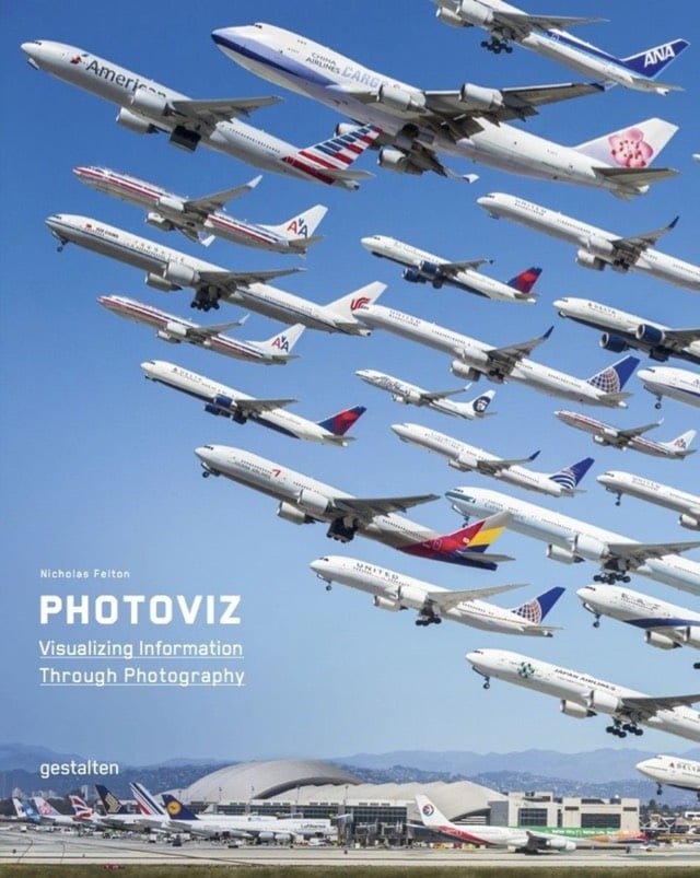
Nicholas Felton is out with a new book on information visualization and photography called Photoviz.
The stories told with graphics and infographics are now being visualized through photography. Fotoviz shows how these powerful images are depicting correlations, making the invisible visible, and revealing more detail than classic photojournalism.
Ahhhhh, this looks amazing. And is right up my alley as well…I quickly looked through some of the images featured in the book and I’ve posted many of them here before (see time merge media for instance). Can’t wait for this one to arrive.
Curated by Zach Davenport, this Pinterest board features all sorts of different letterforms, from A to Z.
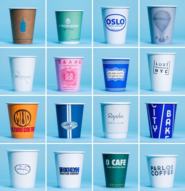
Gear Patrol collected a number of coffee cups from coffee shops around NYC. Prices for a small cup ranged from $1 to $4.50. I’m guessing the latter was not 4.5 times tastier than the former. (via @mccanner)
If you’ve ever pulled a door that you should have pushed, you’re not alone. Vox and 99% Invisible collaborated on this video about bad door design. I read Don Norman’s The Design of Everyday Things just as I was starting my design career and it probably had more influence than anything in how I approached designing for the web. (via @ophelea23)
IZ is an online clothing retailer catering to people in wheelchairs. The clothes are designed to be worn while seated and for ease of getting on and off. For instance this blazer is arch-cut in the back:
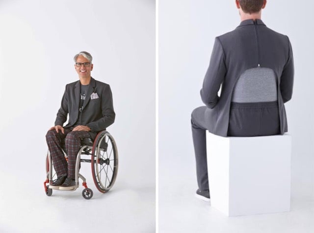
Pants are cut higher in the back to cut down on bunching in the front and riding down in the back and shirts are cut so that they drape right at the waist and hips.
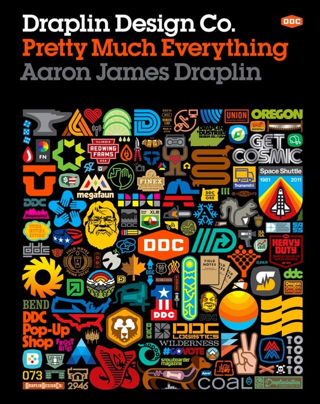
You’re probably familiar with Aaron James Draplin through his work on Field Notes. Well, as his upcoming book shows, Draplin is an uncommonly prolific designer who has done a ton of amazing work.
Pretty Much Everything is a mid-career survey of work, case studies, inspiration, road stories, lists, maps, how-tos, and advice. It includes examples of his work — posters, record covers, logos — and presents the process behind his design with projects like Field Notes and the “Things We Love” State Posters. Draplin also offers valuable advice and hilarious commentary that illustrates how much more goes into design than just what appears on the page. With Draplin’s humor and pointed observations on the contemporary design scene, Draplin Design Co. is the complete package for the new generation of designers.
I’ve been a fan of his for a long time…this is an easy purchase.
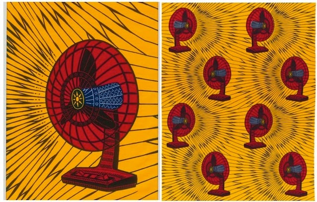
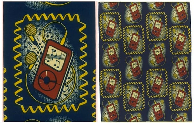
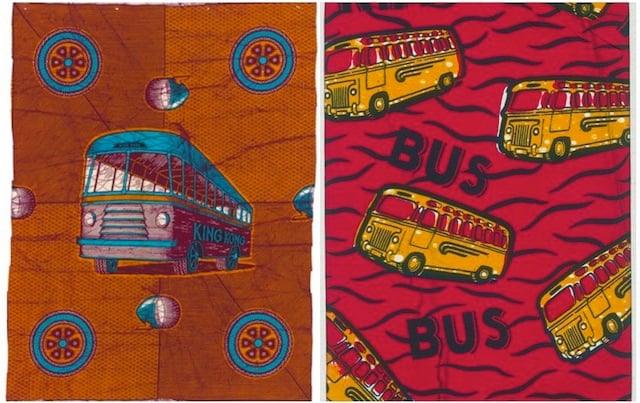
Love these. African textiles. Studio 360: “But I had no idea that some of the trendiest of these prints are actually designed and produced in the Netherlands by a company called Vlisco.”
Khrista Rypl writes:
Inge Oosterhoff wrote a wonderful deep dive into the history behind the Vlisco textile house, and explained how their designs have remained hugely popular in Africa since the late 1800s. But Vlisco doesn’t just make fabric; they’re known for their printed designs. And unlike many fashion companies, Vlisco doesn’t name their patterns: each is given a number and then distributed to different areas in Africa. Some patterns are designed with different countries in mind, while others are distributed widely around the continent. As the patterns catch on among shopkeepers and consumers, many of them get colorful names like “Love Bomb,” “Tree of Obama,” and “Mirror in the Sun.” But the names aren’t even the best part: many popular patterns have developed specific cultural meanings and subtexts.
(via yellowdoorhouse)
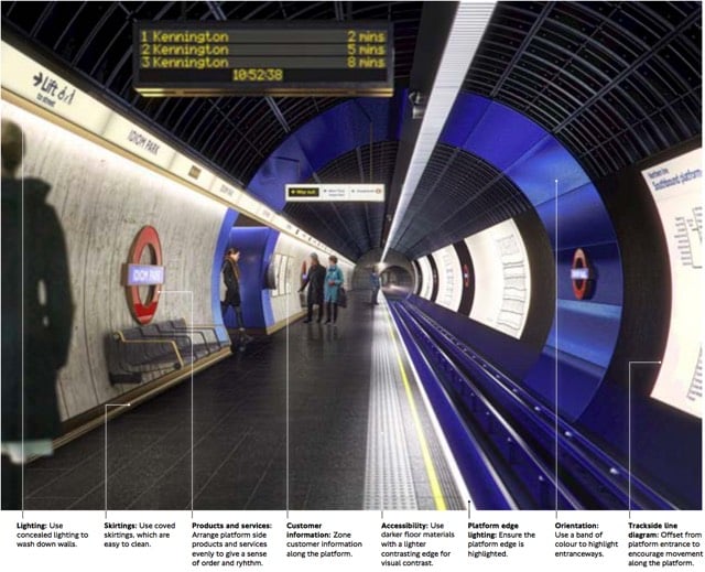
Transport for London recently released a document called the London Underground Station Design Idiom, a guide to the design aesthetic of Tube stations. After an introductory chapter called “A manifesto for good design”, the document offers nine main guidelines for how Underground stations should be designed:
1. Achieve balance across the network. Good design is achieved through balance. For us, this means balance between heritage and the future, between a station’s commercial activity and its customer information, and between the network as a whole and the station as a local place.
2. Look beyond the Bostwick gates. Stations are more than portals to the Underground; they are also places to meet, eat, shop and, most importantly, they are centres of community. Many people’s mental map of London is organised by Underground stations. A neighbourhood’s identity can be enriched by truly ‘embedding’ its station in the local area.
3. Consider wholeness. Good design starts by considering the whole: the whole station (from platform to pavement); the whole of the project from engineering to surface finishing; the whole team. It’s about making sure the right people are engaged from the outset. Considering ‘wholeness’ means creating entire spaces with clear forms, which are clutter-free and legible for all users and requirements.
4. Prioritise comfort for staff and customers. Well-designed stations support staff in their varied roles so they can provide world class customer service. It is this interaction between staff, customers and the built environment that makes London Underground stations so special and distinguishes us from other metros.
5. Delight and surprise. Every Underground station should include at least one moment of delight and surprise, to improve customers’ journeys and the working environment for staff. Such moments help put the network on the map, as a world-class leader of design.
6. Use materials to create atmosphere. The quality of materials has a huge impact on the way a station is perceived by both customers and staff. High quality materials that are robust and easy to maintain make better environments. Use materials to make atmospheric spaces that are dramatic and rich in texture. Make stations more memorable to customers and better places to travel to or through.
7. Create ambience with lighting. Lighting on the Underground is used to make safe and functional environments, with maintenance and costs often dictating the choice and application of fittings with no consideration on how this impacts overall perception of space. Although lighting must be functional to improve safety and increase feelings of comfort, it can also be transformational - improving spaces, drawing attention to heritage or special features and helping customers flow intuitively through a station.
8. Integrate products and services. Good design is not just about choosing the right materials and lighting, it also involves integrating the other products and services which make up the station. All network furniture, fixtures and equipment - such as customer information, safety equipment, ticketing, poster frames, advertising, CCTV and signage - must be fully integrated into the station so there is clarity and coherence from platform to pavement and across the network.
9. Prepare for the future. By embracing new technologies and understanding their benefits we can create better-designed stations that enhance the user experience. This also means considering the life cycle of existing and new materials and products. Designing in flexibility allows our stations to better respond to new challenges, opportunities and change programmes.
Aside from some of the specifics, that’s not a bad list of guidelines on how to think about designing anything. (via mefi)
Pablo Eyre took a number of movie posters featuring photography from their respective movies and replaced the photos with the actual scenes. I imagine this is what movie posters look like in Harry Potter.
(Something must be in the air lately. This video is similar to two other videos I’ve linked to recently: book covers in motion?and a comparison of movie posters and the scenes that inspired them.)
From Henning Lederer, a series of 55 vintage book covers gently animated. Lederer previously did an animation of Fritz Kahn’s famous poster, Der Mensch als Industriepalast.
In 1977, Herbert Yager interviewed designer and title sequence designer Saul Bass about his approach to designing opening title sequences for films such as North by Northwest, Vertigo, and Psycho.
I began as a graphic designer. As part of my work, I created film symbols for ad campaigns. I happened to be working on the symbols for Otto Preminger’s Carmen Jones and The Man With The Golden Arm and at some point, Otto and I just looked at each other and said, “Why not make it move?”
It was as simple as that.
I had felt for some time that audience involvement with a film should begin with its first frame.
Until then, titles had tended to be lists of dull credits, mostly ignored, endured, or used as popcorn time.
There seemed to be a real opportunity to use titles in a new way — to actually create a climate for the story that was about to unfold.
No where in that excerpt did Bass or the interviewer reference Bass’ wife and collaborator Elaine Bass, who worked closely with him on almost all of their film projects. In recent years, there’s been a push to recontextualize their working relationship as a partnership. Elaine did start off working as his employee but clearly they worked as true collaborators for much of their careers.
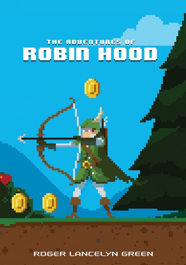
Perhaps attempting to capitalize on the popularity of Minecraft with young boys, Random Penguin1 has released the Puffin Pixels Series of books. The covers of The Swiss Family Robinson, Treasure Island, and four more titles are done in the style of 8-bit video games. The cover illustrations were done by Michael Myers. (via @gavinpurcell)
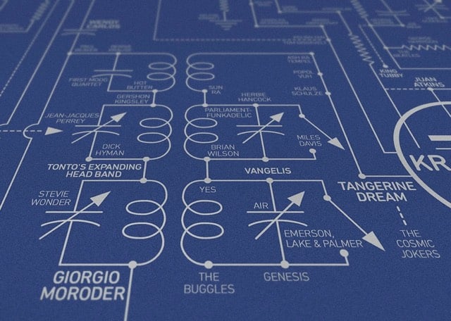
From Dorothy, a beautiful print of the history of electronic music mapped onto the circuit board of a theremin, one of the first electronic instruments.
Our Electric Love Blueprint celebrates over 200 inventors, innovators, composers and musicians who (in our opinion) have been pivotal to the evolution of electronic music from the invention of the earliest known sound recording device in 1857 to the present day. Key pioneers featured include Léon Theremin, Bob Moog, Karlheinz Stockhausen, Brian Eno, Kraftwerk, John Cage, New Order and Aphex Twin.
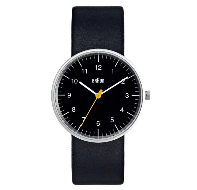
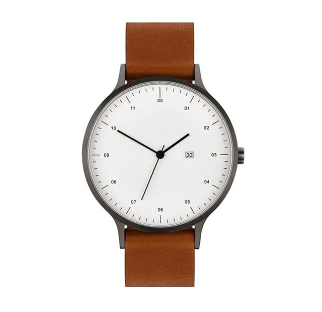
I am not a watch person. Haven’t worn one since high school, no interest in getting an Apple Watch, etc. But this post on We Made This about watches that appeal to graphic designers lists a few watches I would consider wearing. The Braun is a classic, of course:
But this one from Instrmnt is also quite nice, although I would prefer slightly larger numbers:
And for kottke.org superfans only, I would recommend the Timex Weekender.
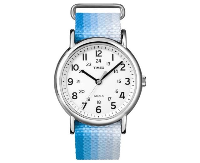
PS to the superfans: if you don’t like watches, may I interest you in a Vancouver bridge or a warehouse in Milton Keynes?
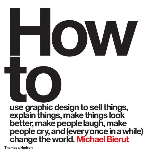
Michael Bierut is popping off right now. The School of Visual Arts recently honored him with their Masters Series Award, which includes an exhibition of his work that runs until early November. And he’s also out with a new book with a large title, How to Use Graphic Design to Sell Things, Explain Things, Make Things Look Better, Make People Laugh, Make People Cry, and (Every Once in a While) Change the World.
Update: Bierut’s brief interview in the WSJ is worth a read. I enjoyed his Jack Donaghy-esque take on NYC work fashion:
I always wear a necktie to work. I didn’t claw my way all the way from Ohio just to dress like a farmer.
And his love for Wile E. Coyote:
He had this endless faith and brand loyalty and never thought to try the competition even though Acme products failed him time and time again.
Although in fairness, the deck was stacked against the Coyote (see rule #7). (via @PaulAntonson)
From Kevin Slavin and Bunnie Huang on location in Shenzhen, China, a look at what changes when you stop designing phones for companies and start designing them for people. You end up with a variety of phones satisfying different desires, from tiny phones that double as Bluetooth earpieces to phones that look like a race car or a pack of cigarettes or a soda can to phones with built-in lamps.

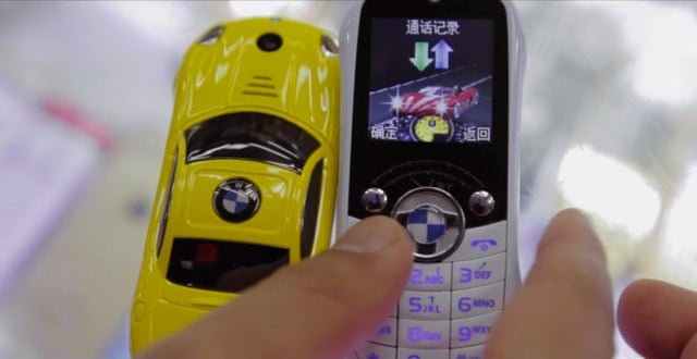
A spin around the internet reveals many more examples of these kinds of phones: flashlight phones, lighter phones, phones with up to 4 SIM slots, super-rugged phones w/ walkie talkie capability, credit card-sized phones, watch phones, and USB key phones. (via @triciawang)
Jason Fried wrote a preview of what’s coming in Basecamp 3. Jim Ray noted on Twitter that “Basecamp vs. Slack will be interesting”. And suddenly I remembered that back in 2002, Jason, Slack CEO Stewart Butterfield, and I hosted a “peer meeting” on Simplicity in Web Design at SXSW.1 The meeting’s description:
As the Web continues to increase in complexity, many designers are looking to simplicity as a tool in designing Web sites that are at once powerful and easy for people to use. Join your peers and colleagues in a discussion facilitated by three working designers who are committed to producing work which is simple: obvious, elegant, economical, efficient, powerful and attractive. We’ll be discussing what simplicity in Web design really means, the difference between Minimalism as an aesthetic and simplicity as a design goal, who is and who isn’t simple, how you can use simplicity to your advantage, and plenty more.
It’s fun to see those two going at it more than 13 years later, still focused on harnessing the power of simplicity to help people get their best work done. (I don’t know what the other guy’s deal is. He’s doing…. something, I guess.)
I love this poster by Korean designer Chae Byung-rok. His web site is currently down, but you can see more of his work on It’s Nice That. (via @djacobs)
From 1969, this is the video that Saul Bass made to pitch AT&T on a new corporate identity. What a time capsule. Here’s the logo, which remained in use until 1983, when Bass designed the “Death Star” logo to replace it.
Rain-Bros by Daniel Savage is a fun visualization of the different wavelengths of light in the visible spectrum, from the loping walk of red to blue’s energetic bounce.
….and it still looks like a middlebrow kids clothing brand logo.
So why are we doing this now? Once upon a time, Google was one destination that you reached from one device: a desktop PC. These days, people interact with Google products across many different platforms, apps and devices-sometimes all in a single day. You expect Google to help you whenever and wherever you need it, whether it’s on your mobile phone, TV, watch, the dashboard in your car, and yes, even a desktop!
Today we’re introducing a new logo and identity family that reflects this reality and shows you when the Google magic is working for you, even on the tiniest screens. As you’ll see, we’ve taken the Google logo and branding, which were originally built for a single desktop browser page, and updated them for a world of seamless computing across an endless number of devices and different kinds of inputs (such as tap, type and talk).
Update: The design team shares how they came up with the new logo.
Update: When I said that Google’s new logo “still looks like a middlebrow kids clothing brand logo”, this is pretty much what I meant.
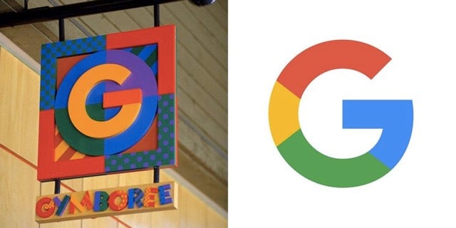
Gymboree’s identity (1993-2000) vs. Google’s new identity (Sep 01, 2015)
(via @buzz)
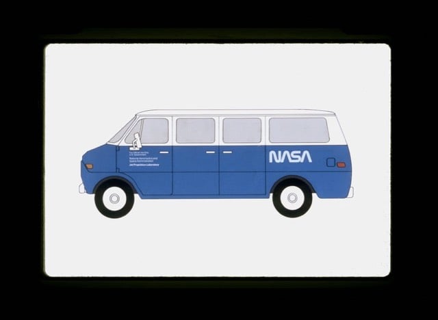
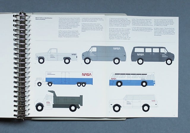
When I posted about NASA’s logo battle, I included a link to some photographs of the NASA Graphics Standards Manual. At the time, I mused to myself that someone should reprint the manual…hey, maybe the guys who did the standards manual for the NYC subway. Well, lo and behold, that is exactly what’s happening. Jesse Reed & Hamish Smyth just launched a Kickstarter campaign to reissue the 1975 NASA Graphics Standards Manual.
Our Kickstarter will support the printing of a reissue of the manual. It will be printed and bound as a hardcover book, using high quality scans of [the original designer’s] personal copy, who is in full support of the campaign.
Instant order.
Update: It’s not a printed copy, but possibly (?) in response to the Kickstarter, or other renewed attention, NASA has released the standards manual as a free downloadable PDF.
From Pop Chart Lab, a beautiful poster showing 121 architectural styles of American houses.
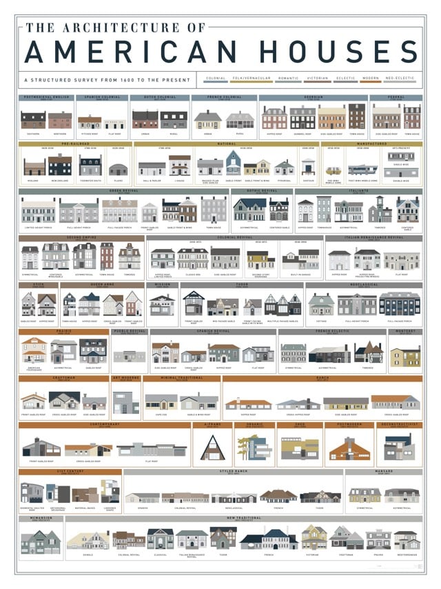
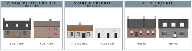
Useful if you don’t know your Victorian from your Tudor from your Greek revival.
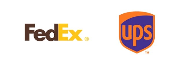
Paula Rúpolo took some famous brands’ iconic logos (McDonald’s, Starbucks, eBay) and swapped the colors with logos of their competitors (Subway, Dunkin Donuts, Amazon). Here’s FedEx and UPS:
Bellerby & Co. Globemakers are one of the world’s last remaining makers of globes by hand. Their Instagram account is chock full of their handiwork.
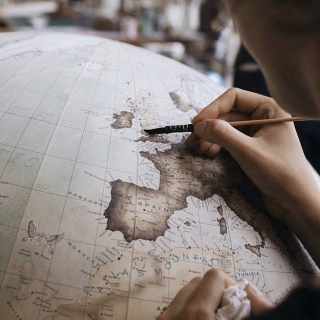
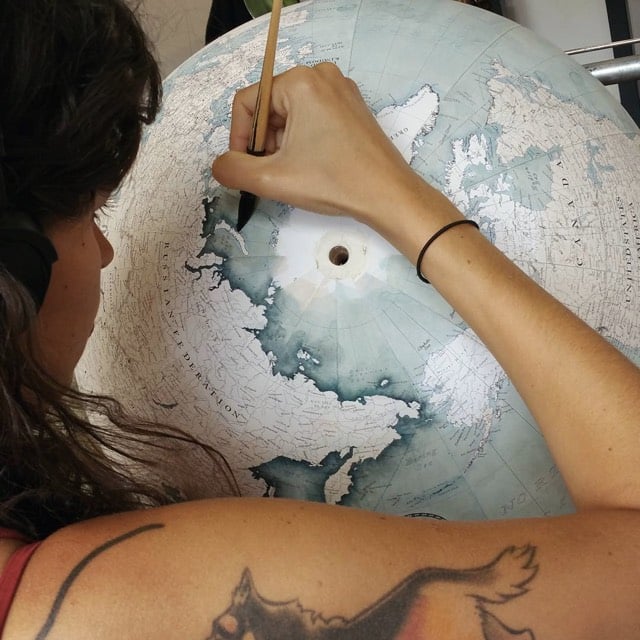
If I could afford it (£2000!), I’d get The Livingstone globe in Prussian blue. Beautiful and wonderful craftsmanship.
NASA’s original logo looked something like this:
It was referred to, colloquially, as the meatball. In the 1970s, the meatball was switched out for the worm, a more Modernist take:
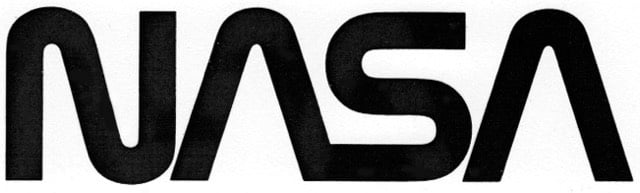
This logo was done by Richard Danne and Bruce Blackburn, and Danne wrote an essay about the experience.
And here is one of the most interesting exchanges I’ve ever witnessed in a design presentation:
Fletcher: “I’m simply not comfortable with those letters, something is missing.”
Low: “Well yes, the cross stroke is gone from the letter A.”
Fletcher: “Yes, and that bothers me.”
Low: “Why?”
Fletcher: (long pause) “I just don’t feel we are getting our money’s worth!”
Others, not just the designers were stunned by this last comment. Then the discussion moved back to the strong red/rust color we were proposing. We had tried many other colors of course, including the more predictable blue range, but settled on red because it suggested action and animation. It seemed in spirit with the Can Do nature of the Space Agency.
Fletcher: And this color, red, it doesn’t make much sense to me.”
Low: “What would be better?”
Fletcher: “Blue makes more sense… Space is blue.”
Low: “No Dr. Fletcher, Space is black!”
NASA’s Graphics Standards Menu utilizing the worm logo can be seen here.
The space agency switched back to the original logo in 1992. Michael Bierut compared the two:
The worm is a great-looking word mark and looked fantastic on the spacecraft. By any objective measure, the worm was and is absolutely appropriate, and the meatball was and is an amateurish mess.
(thx, jarrett)
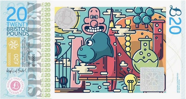
Cities, businesses, and artists are producing small batches of paper currency designed to be spent locally. I love the £20 note from Bristol, England (above)…it’s got Wallace’s head on it!
The local currency, though, is intended not as collectible but to encourage trade at the community businesses where they are accepted, rather than chain stores, where money taken in tends to flow out of town and into the coffers of multinational corporations. (Compare it to the farmers’ market: Homegrown lettuce now has a whole new meaning.)
“If you use a local currency, you keep the money local, and that has a ‘lifts all boats’ vibe to it,” said David Wolman, the author of “The End of Money.”
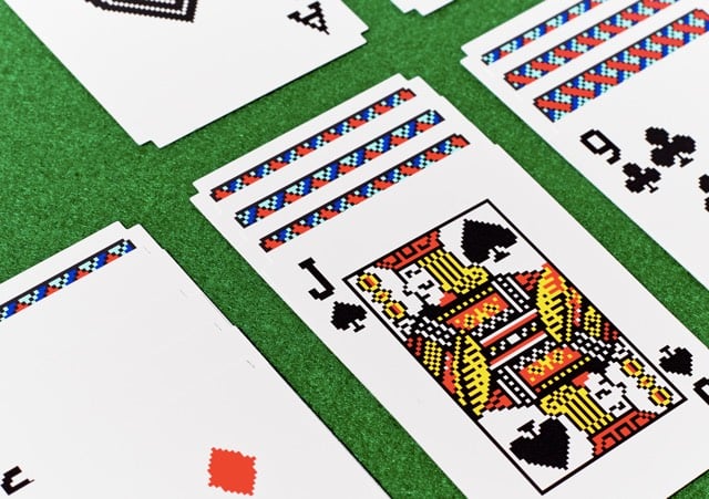
Susan Kare, who famously designed the original icons for the Apple Macintosh, has teamed up with Areaware to offer real decks of cards with her artwork from Windows 3.0’s version of Solitaire. Nice example of defictionalization. They’re currently sold out but I’m hoping they restock so I can order a deck. (via subtraction)
Update: Areaware tells me that the cards aren’t out of stock, they are just not in stock yet. So don’t worry…they haven’t sold out or anything.
The Fibonacci Shelf by designer Peng Wang might not be the most functional piece of furniture, but I still want one.
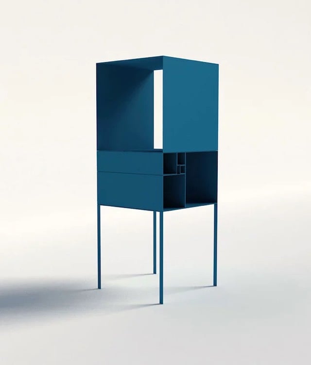
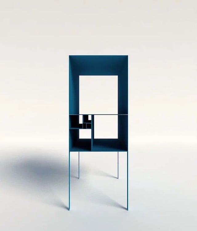
The design of the shelf is based on the Fibonacci sequence of numbers (0, 1, 1, 2, 3, 5, 8, 13, 21, …), which is related to the Golden Rectangle. When assembled, the Fibonacci Shelf resembles a series of Golden Rectangles partitioned into squares. (via ignant)
Newer posts
Older posts

.svg)
Socials & More