kottke.org posts about design
Pixar: The Design of Story is an upcoming exhibition at the Cooper Hewitt National Design Museum here in NYC.
Through concept art from films such as Toy Story, Wall-E, Up, Brave, The Incredibles and Cars, among others, the exhibition will focus on Pixar’s process of iteration, collaboration and research, and is organized into three key design principles: story, believability and appeal. The exhibition will be on view in the museum’s immersive Process Lab — an interactive space that was launched with the transformed Cooper Hewitt in December 2014 — whose rotating exhibitions engage visitors with activities that focus on the design process, emphasizing the role of experimentation in design thinking and making.
More details are available in the press release. Definitely going to check this out and take the kids.
I think I’m a little bit in love with Muji’s white toaster, designed — along with a few other new items — by Naoto Fukasawa.
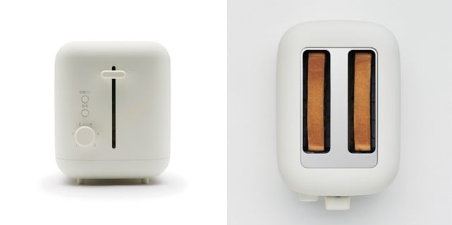
Fukasawa also designed Muji’s wall-mounted CD player. The toaster is only available at select stores in the US for now, but can be found in the UK and Europe in a few months. Or buy it now on eBay. (via @daveg)
Wired asked a bunch of noted designers — Paola Antonelli, John Maeda, Jessica Walsh, Milton Glaser, etc. — for their summer reading picks. Among their selections were Flow by Mihaly Csikszentmihalyi, An Engineer Imagines by Peter Rice, The Success and Failure of Picasso by John Berger, and Just Enough Research by Erika Hall.
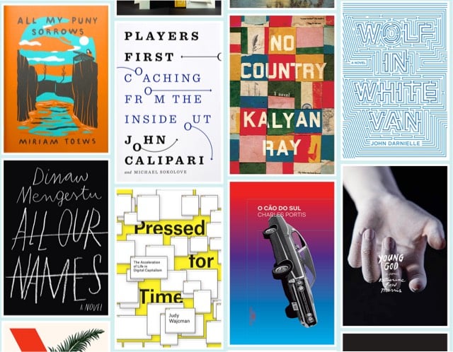
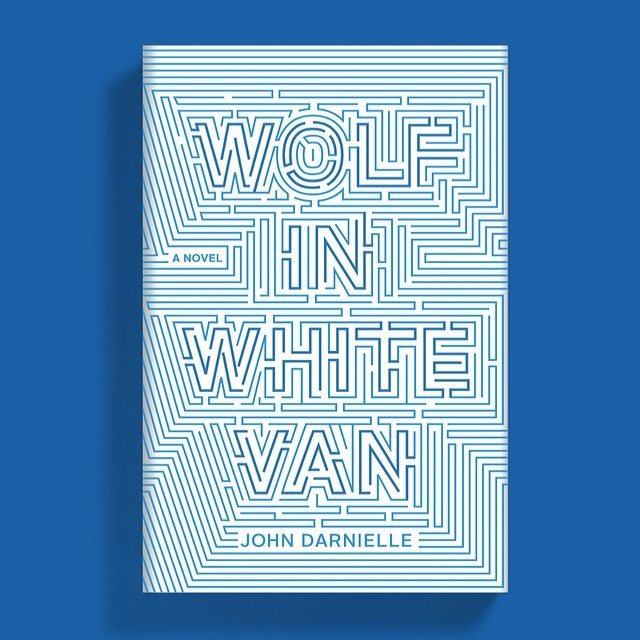
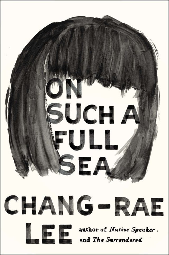
Design Observer and the AIGA have announced the winners of their 50 Books | 50 Covers competition to find the best designed books and book covers published last year. The books are here and the covers are here.
They’re publishing a book and putting on an exhibition in New Orleans of the winners and need your help on Kickstarter to make it happen.
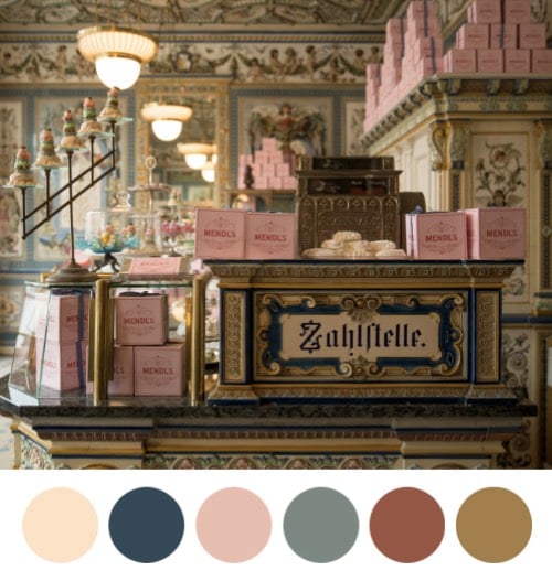
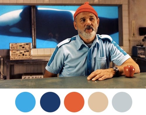
Color palettes derived from Wes Anderson movies.
Saul Bass designed the opening sequences for dozens of films, including North by Northwest, Psycho, West Side Story, and Goodfellas. Here’s a look at some of his best work:
(via art of the title)
From designer Karl Sluis, a list of nine great book about information visualization not written by Edward Tufte. Gonna keep my eye out for Stephen Few’s Now You See It and David McCandless’ The Visual Miscellaneum, but Herbert Bayer’s World Geographic Atlas is a little too rich for my blood.
I love this piece from Jennifer Daniel about self-congratulatory “design can change the world” rhetoric.
Design can change the world. Are you kidding me? Are we having a debate or a therapy session?
Designers will do anything to convince themselves we are not in a service industry. Why are we so desperate to make ourselves feel better? Because we feel GUILTY and we have to reconcile what we do professionally with the world we live in. We WANT to save the world so we repeat our daily affirmations on our way to work…
“Design can change the world.”
…on our way to yoga…
“Design can change the world.”
This debate as is an attempt to assuage the guilt we already have and know we have because we’re here doing THIS instead of something truly meaningful.
(via @jimray)
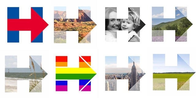
Soon after the logo for Hillary Clinton’s campaign was revealed, I wrote “I am not a big fan of the arrowed H”. Well, the campaign’s clever use of the logo has won me over. Quartz’s Annalisa Merelli explains.
It is through all these iterations that Clinton’s logo fully displays its iconic value: It is highly recognizable despite the changes, and the much-criticized right-facing red arrow is now appears as it was likely meant to: pointing the way forward. The different backgrounds aren’t just an innovative graphic solution-they are the visual embodiment of the values Clinton is building her campaign around. It vehicles a leadership based on collectivity and inclusiveness rather than the elitist individualism Clinton is often accused of.
This is smart: a startup design service called BentoBox just for designing restaurant websites. Entrepreneur magazine recently profiled the service.
The site conveys important information — location, hours and a phone number are featured prominently, as are frequently asked questions — in a visually appealing way that expresses the restaurant’s high-end yet relaxed atmosphere while also making you hungry.
This is what a restaurant website should do — namely, serve as an extension of its brick-and-mortar presence — and yet so many miss the mark, says Krystle Mobayeni. For years, Mobayeni ran her own web design agency. Clients included Rent the Runway, Sailor Jerry, the School of the Visual Arts, plus a few restaurants, such as David Chang’s Momofuku. While companies in other industries usually had a good handle on their web presence, Mobayeni noticed that the restaurants were struggling. There wasn’t a good platform that anticipated their needs and gave them an easy way to present themselves on the web, and so often, their sites suffered for it.
The number has been steadily dwindling the last few years, but it’s surprising how many restaurant sites are still Flash, don’t work on mobile, and make you work to find the location and opening hours. Some examples of Bento’s work: Parm, Fedora, and The Meatball Shop. Damn, now I’m hungry. (via @adamkuban)
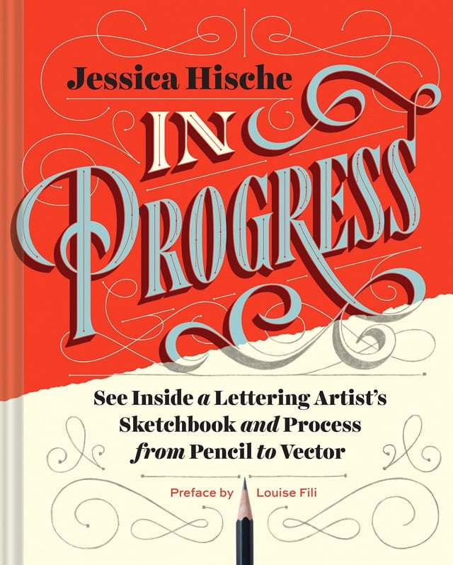
One of my favorite designers, Jessica Hische (she did the film titles for Moonrise Kingdom), is coming out with a new book in September called In Progress: See Inside a Lettering Artist’s Sketchbook and Process, from Pencil to Vector.
This show-all romp through design-world darling Jessica Hische’s sketchbook reveals the creative and technical process behind making award-winning hand lettering. See everything, from Hische’s rough sketches to her polished finals for major clients such as Wes Anderson, NPR, and Starbucks. The result is a well of inspiration and brass tacks information for designers who want to sketch distinctive letterforms and hone their skills.
Hische made a video offering a quick tour of the book:
Looks great!
Nick Barnes is a football commentator for BBC Radio Newcastle. For each match he does, Barnes dedicates two pages in his notebook for pre-match notes, lineups, player stats, match stats, and dozens of other little tidbits.
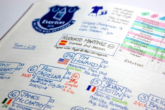
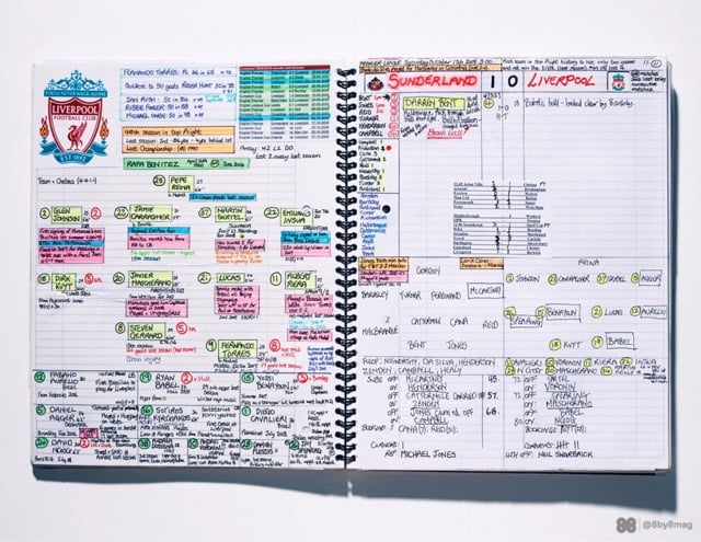
Wonderful folk infographics. NBC commentator Arlo White also shared his pre-match notes. Both men say they barely use the notes during the match…by the time the notes are done, they know the stuff. (via @dens)
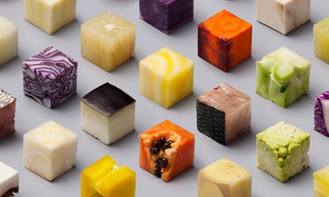
From the design shop of Lernert & Sander, a poster of almost a hundred different foods cut into perfect little cubes. No CGI involved, it’s actually food. No idea how they got some of those foods to hang together…particularly the onion, cabbage, and leek. (via colossal)
Seb Lester can somehow freehand draw the logos for the NY Times, Honda, Ferrari, Coca-Cola, and many more.
Watching the video, I didn’t even notice any tracing…it’s all freehand. Keep up with Lester’s drawings on his Instagram account.
Kevin Fox recently unearthed a screenshot he took of Apple’s homepage in the early 90s:
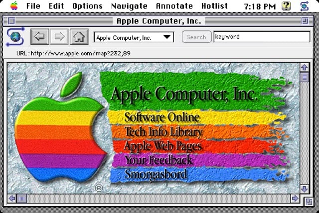
I don’t remember this version, but it looks like it was contemporary with this Microsoft homepage (which I do remember). I bet there’s footage of this page in Triumph of the Nerds or Nerds 2.0.1 or on an episode of Computer Chronicles. Anyone?
Inspired by the logo for Hillary Clinton’s 2016 Presidential run, designer Rick Wolff created an entire uppercase alphabet for a typeface he’s calling Hillvetica.
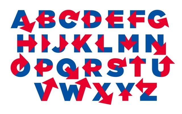
From his Twitter stream, it appears that Wolff is attempting to make an actual Hillvetica font so stay tuned. FYI, Pentagram partner Michael Bierut designed the logo. The simplicity is appealing, but overall I am not a big fan of the arrowed H.
Update: The Washington Post made a little text editor so you can write whatever you want in Hillvetica. The Clinton campaign has already put it to use:
The aluminum soda can is a humble testament to the power and scope of human ingenuity. If that sounds like hyperbole, you should watch this video, which features eleven solid minutes of engineering explanation and is not boring for even a second.
More science/engineering programming like this please…I feel like if this would have been on PBS or Discovery, it would have lasted twice as long and communicated half the information. For a chaser, you can watch a detailed making-of from an aluminum can manufacturing company:
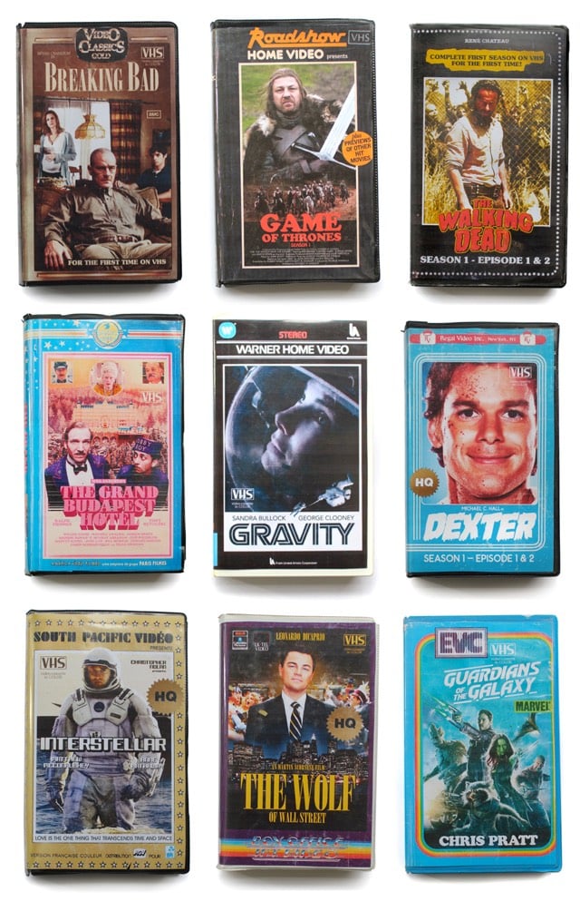
Someone pretending to be a Parisian hipster who only watches VHS versions of modern shows & movies like Game of Thrones and Interstellar created these VHS covers as an April Fools joke. These are actually pretty great. (via subtraction)
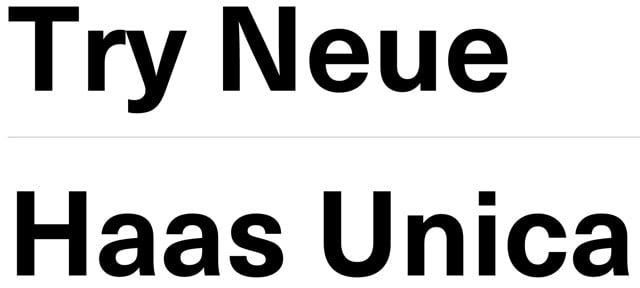
Conceived in the late 1970s as a hybrid of three of the most popular (and some would say, overused) sans-serif typefaces in the world, Haas Unica didn’t make the digital jump to personal computers in the 1980s. It was nearly forgotten, but has been revived by Monotype, which released Neue Haas Unica as a webfont today.
Unica® was an attempt to create the ultimate sans-serif - a hybrid of Helvetica, Univers and Akzidenz Grotesk. Designed by Team ‘77 and released to great acclaim in 1980, Unica went missing under a heap of legal disputes and has never been available as a full, digital typeface. Until now.
Unica’s story starts in the 1970s. Electronic, on-screen phototypesetting was gaining popularity, but most sans-serif typefaces on the market had been designed earlier, in the era of metal type. The revered Haas Type Foundry in Münchenstein, Switzerland, saw the chance to develop a new sans-serif face that was optimized for the new technology and filled the gap in the market. To develop their new product, they turned to Swiss type design trio, Team ‘77 (André Gürtler, Christian Mengelt and Erich Gschwind).
Team ‘77 set out to design a font based on Helvetica but drawing on other sans-serif typefaces, principally Univers. The name they gave it would also be a hybrid of the two.
The original name for Helvetica was Neue Haas Grotesk. Haas + Univers + Helvetica = Haas Unica.
Update: Several digital versions of Haas Unica have been available prior to this one.
For many years a digital version of Unica was available from Scangraphic (and Elsner+Flake) but it was pulled from the market due to a complaint by Linotype who claims the Haas rights. In 2008, Cornel Windlin did a Semibold for the the Schauspielhaus Zürich identity, used in 2009-10. Later, Louise Paradis created a revival named Unica Intermediate while doing research for the TM retrospective.
(via @typographica)
Although I am slowly coming around1 to Massimo Vignelli’s assertion that designers should only use a handful of typefaces, I enjoyed seeing Typographica’s list of their favorite typefaces of 2014.
Typeface design and distribution is in a state of rapid change. Last year we noted its diffusion around the globe, and that trend persists. The majority of font production is no longer concentrated in a few regional epicenters.
That goes for corporate epicenters as well. The independence of type designers themselves is increasingly evident. Small foundries have existed since the dawn of digital fonts, but now they are the norm. Only a handful of the selections in this year’s list were published by companies with more than ten employees.
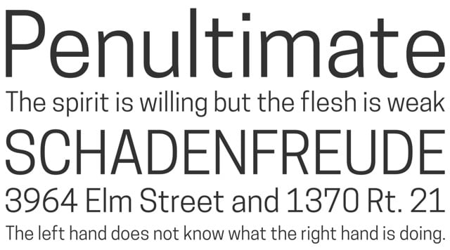
I discovered that one of the selections, a beautiful custom typeface made for the reopening/rebranding of the Cooper Hewitt Design Museum (sample shown above), has been made available by the museum for free download (including a web fonts version).
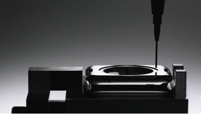
From product designer Greg Koenig, a fantastic display of Kremlinology on how he thinks Apple makes the Apple Watch, based on the available evidence (production videos, patents, product specs).
In the above shot, blanks are placed in an immersion ultrasonic tester. What Apple is looking for is the presence of voids or density variances within the structure of the blank that, under stress, could lead to part failure or surface defects as material is removed in further machining processes. This level of inspection is, to put it mildly, fastidious beyond where most other companies would go (save Rolex). Immersion ultrasonic inspection is typically reserved for highly stressed medical implants and rotating components inside of aircraft engines; not only does this step take time, it also is typically performed by custom built machines of tremendous expense.
If you don’t have the time or energy to read through the whole thing, at least skip to the final two paragraphs about manufacturing as ritual.
Also, Koenig’s Twitter stream is full of interesting nuggets about Apple. Here are a few that caught my attention:
From the cool devices in our hands, to the software on our screens, to the smooth stylings of Jony Ive’s Apple product video voiceovers, it’s clear this is the era of design. Since design has touched and changed so many parts of our lives, isn’t it time that we redesigned death? The chief creative officer at one of the top design firms in the world thinks it is:
With just a little attention, it seemed — a few metaphorical mirrors affixed to our gurneys at just the right angle — he might be able to refract some of the horror and hopelessness of death into more transcendent feelings of awe and wonder and beauty.
From Jon Mooallem in California Sunday Magazine: Death, Redesigned. (I like where you’re going with the embalming and the eternal darkness, I just think it could pop a little more.)
Motherboard has an interesting story about how women who lose limbs are finding prosthetic devices are made for men: “Man Hands.”
When Jen Lacey gets her toes done, she does both feet, even though one of them is made of rubber. “I always paint my toenails,” she says, “because it’s cute, and I want to be as regular as possible.” But for a long time, even with the painted toes, her prosthetic foot looked ridiculous. The rubber foot shell she had was wide, big and ugly. “I called it a sasquatch foot,” she jokes. “It’s an ugly man foot.”
Part of the problem is that most prosthetic devices are designed by men and most prosthetists are men.
There are a few reasons for all this male-centric design. The history of prosthetics is, in large part, a history of war. One of the earliest written records of a prosthetic device comes from the Rigveda, an ancient sacred text from India. Ironically, that amputee is a woman—the warrior queen Vishpala loses her leg in battle and is fitted with a replacement so she can return and fight again. But after that, the history of prosthetics is nearly entirely a history of men—Roman generals, knights, soldiers, dukes.
Every year, 30 percent of those undergoing an amputation are women. In other words, it’s the 70 percent that’s male that drives the market.
These Shylights are amazing. Kinetic ceiling lights that resemble blooming flowers, unfurling parachutes, descending ghosts.
The concept is based on nyctinasty, the process by which flowers open and close due to light or temperature changes.
“We wanted to find this exact moment, where the difference is in an object, when it is dead or when it starts to become alive.”
(via This Isn’t Happiness)
If you’ve seen “American Psycho,” you’ll likely remember the scene where Patrick Bateman and his peers pull out their business cards like Old West gunfighters pulled out their firearms. Now you can have Bateman’s card — “That’s bone. And the lettering is something called Silian Rail.” — in the form of an iPhone case.
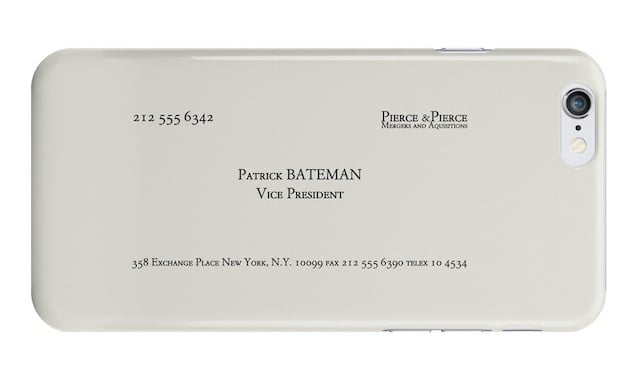
As for Silian Rail, according to IMDb:
This is not a real font, the name was invented by Bret Easton Ellis for the novel. In the film, the actual font seen on the business card is Garamond Classico SC.
You can watch the full scene here. (via The Cut)
This Garden of Eden-themed serpent rug by Fornasetti belongs in a bedroom.
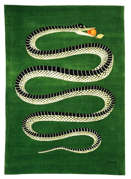
The Wall Street Journal explores “The Cult of Fornasetti.”
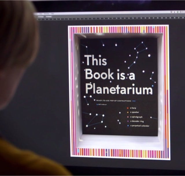
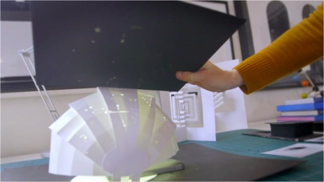
One of my design heroes, Kelli Anderson, is coming out with a pop-up book called This Book Is a Planetarium. What’s unique about this book is that the pop-up elements are functional contraptions, in the vein of her record player wedding invitation. There’s a tiny planetarium:
and a speaker for your smartphone:
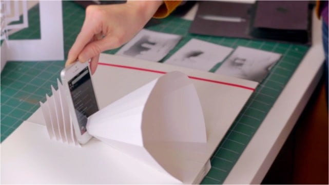
The news comes via a video profile of Anderson’s work by Adobe. So cool.
Vice did a nice little feature on George Lois, the kind of 1960s big-egoed ad man on which Mad Men’s Don Draper was based.
Lois created a number of iconic ad campaigns as well as dozens of fantastic Esquire covers. Or at least he says he did. ;) (via devour)
Update: Here’s the transcript for the episode of This American Life in which Sarah Koenig interviews her father Julian Koenig about George Lois taking credit for some of his best ideas.
In my instance, the greatest predator of my work was my one-time partner George Lois, who is a most heralded and talented art director/designer, and his talent is only exceeded by his omnivorous ego. So where it once would’ve been accepted that the word would be “we” did it, regardless of who originated the work, the word “we” evaporated from George’s vocabulary and it became “my.”
Of course, Koenig also claims to have invented thumb wrestling and to have popularized shrimp in America, so… (via @kevinmeyers)
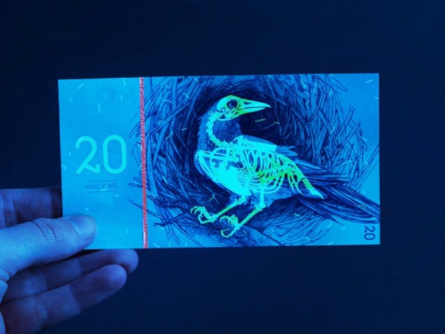
For her master’s project, Barbara Bernát designed a set of fictional banknotes: the Hungarian Euro.
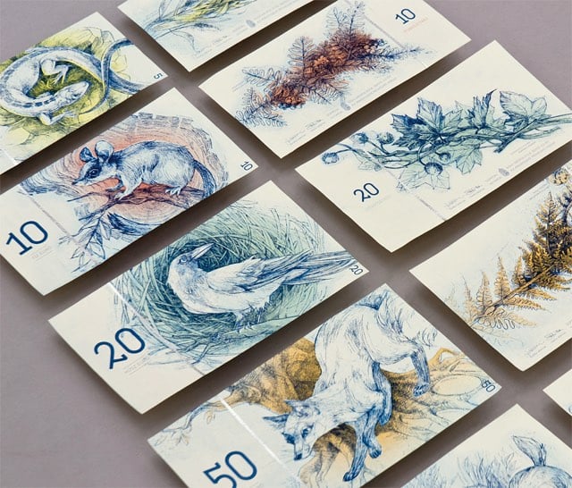
I am a total sucker for banknote mockups and aside from the simplicity, what caught my eye about Bernát’s project is the one security feature: if you look at the notes under a UV light, you see the skeletons of the animals depicted on the notes:
(via @shaylamaddox)
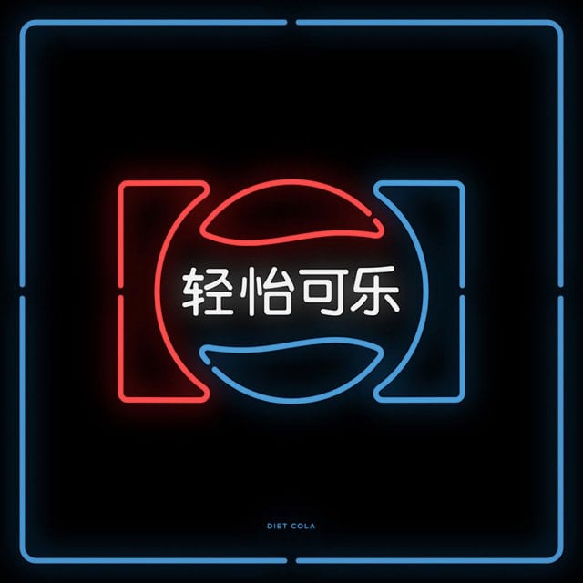
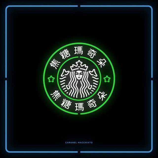
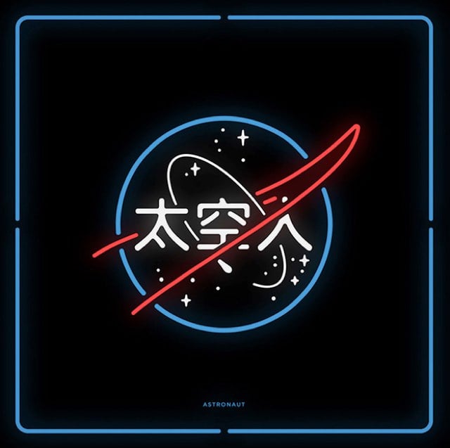
A project called Chinatown takes familiar logos like Pepsi, Starbucks, UPS, and Lego and translates them, imprecisely, into their Chinese equivalents.
It uses basic words for translation, such as “Caramel Macchiato” for “Starbucks” in order to maintain the visual continuity. By arranging the words this way, ‘Chinatown’ pushes viewers to ask themselves what it means to see, hear, and become fully aware. ‘Chinatown’ also demonstrates our strangeness to 1.35 billion people in the world, when you can’t read Chinese.
(via @pieratt)
Newer posts
Older posts
Socials & More