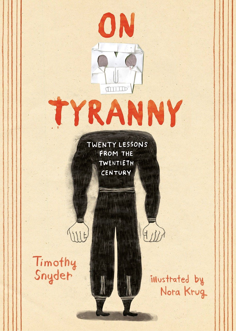
Krug’s goal for this project was to use her medium to echo Snyder’s call for action. “While it was important to me to create images that would highlight the contemporary relevance of Snyder’s message,” she writes, “the use of historic images was clearly essential. At moments in the book that refer to a particular event in time — such as this one about Hitler’s annexation of Austria, when Austrian Nazis captured Jews and forced them to scrub the streets clean — I felt that rather than showing my own visual representation of that event, it was more powerful to feature a historic photograph because of the immediacy of the medium that would make that moment in history come to life.”
Combining Krug’s drawings with historic materials gave her the license to contrast the documentary with the imagined, the factual with the poetic, and to create a narrative tension that emphasizes historical relationships. “More importantly,” she explains, “this combination of mediums allows me to admit to the fact that we don’t exist in a vacuum, that we can only exist in relationship to the past, that everything we think and feel is thought and felt in reference to it, that our future is deeply rooted in our history, and that we will always be active contributors to shaping how the past is viewed and what our future will look like.”
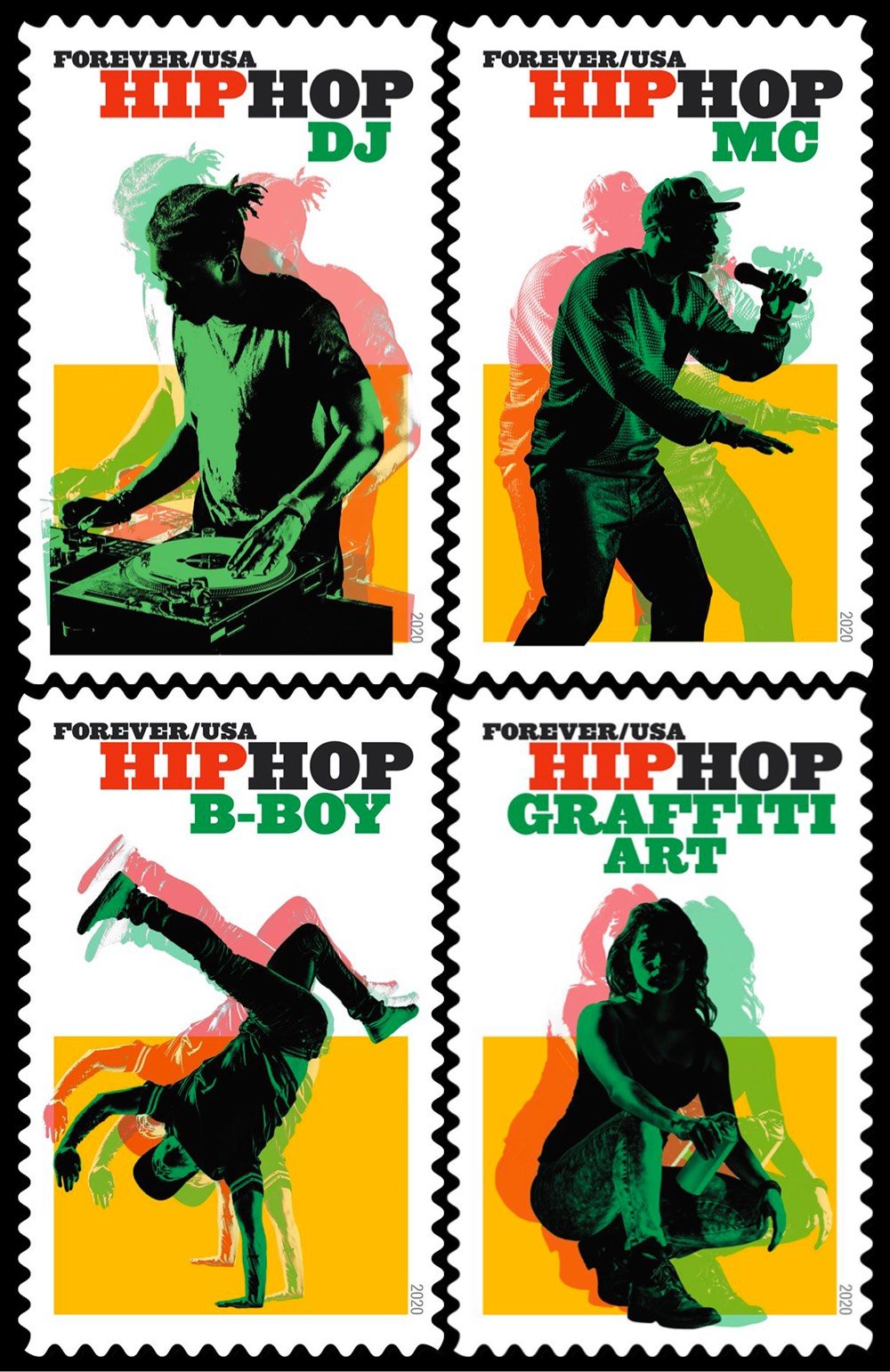
Hip Hop has a long and rich history, and from the start, I knew I wouldn’t be able to represent its totality in one set of stamps. But because it is such an important part of our nation’s art, and one of our most significant cultural contributions to the world, I knew we needed to at least begin representing it somehow. Hip Hop has four widely recognized key elements, or “pillars”: Rap, DJs, Graffiti, and B-boying (known more broadly as break-dancing). Using contemporary images that quickly and accurately depict the genres eased the burden of having to represent the many histories within the subject.
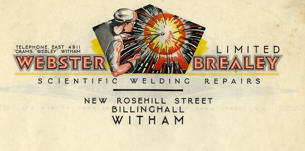
There’s a typeface that has made a resurgence in the last couple of years. It’s appeared on hip hop album covers, food packaging, and advertising. Perhaps you know it from the Garfield comics, Tootsie Roll logo, or the Pet Sounds album cover by the Beach Boys. It’s called Cooper Black, and its popularity and ubiquity has never waned in the hundred years since it was first designed.
Cooper Black tends to get a bad rap from type aficionados (too popular, too cartoony) but this video — and Heck’s comments in particular — have given me a new appreciation for it.
From how rub-on lettering democratized design by fueling the DIY movement and engaging people who knew nothing about typography to how the concept of the “teenager” was invented after World War II as a new market for advertisers, many of the ideas are mother-of-invention parables. Together, they converge into a cohesive meditation on the fundamental mechanism of graphic design — to draw a narrative with a point of view, and then construct that narrative through the design process and experience.
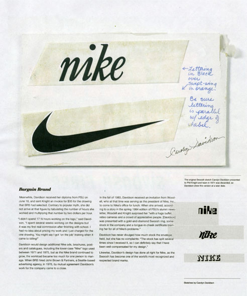
The origin of the mark goes like this: Knight wanted to differentiate BRS’s custom product from the ones they were importing from Onituska in Japan: “…so Knight turned to a graphic design student he met at Portland State University two years earlier.” One day in 1969, the student, Carolyn Davidson, was approached by Knight and offered $2 per hour “to make charts and graphics” for his business. For the next two years Davidson managed the design work on BRS. “Then one day Phil asked me if I wanted to work on a shoe stripe,” Davidson recalled. The only advice she received was to “Make the stripe supportive of the shoe.” Davidson came up with half a dozen options. None of the options “captivated anyone” so it came down to “which was the least awful.”
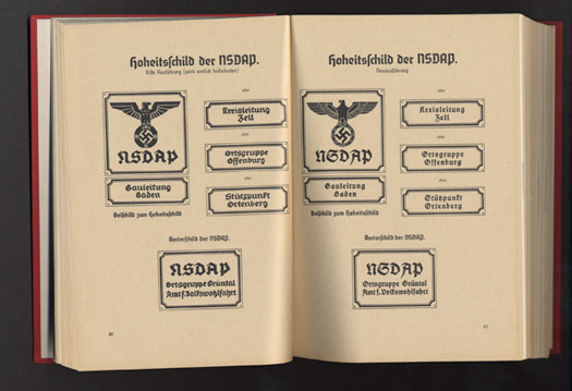
Steven Heller had heard rumors of a Nazi graphics standards manual for years and finally tracked one down.
Published in 1936, The Organizationsbuch der NSDAP (with subsequent annual editions), detailed all aspects of party bureaucracy, typeset tightly in German Blackletter. What interested me, however, were the over 70 full-page, full-color plates (on heavy paper) that provide examples of virtually every Nazi flag, insignia, patterns for official Nazi Party office signs, special armbands for the Reichsparteitag (Reichs Party Day), and Honor Badges. The book “over-explains the obvious” and leaves no Nazi Party organization question, regardless of how minute, unanswered.
What could Arnell, the agency that did the deed, have been thinking? It’s one thing to change the logo; it’s another to abandon the mnemonic orange with the straw in it. As package imagery goes, it was pretty smart, and decidedly memorable.
He goes on to call the redesign “a big tactical mistake”. I’m a Tropicana drinker and I think the new packaging sucks. It’s impossible to figure out at a glance which juice is which because all the packages look the same, aside from some thin lines at the very top. Horrible.
Since Mr. Obama promotes himself as the candidate of change, maybe he should start wearing a different kind of lapel pin that signals his patriotism as well as other values he wants to communicate.
One fellow suggests ripping his lapels off and thereby skirting the whole pin issue. (via design observer)
How do designers employ wit, irony — even subversion — in the service of making a connection with their audience, and how can they replicate these connections across a body of work? Are there limits to commercializing this kind of design, or are we seeing new opportunities for the provocateur in an ever-commoditized world? What is the role of the brand in this context, and to what degree does a sly exchange between designer and user create a new kind of brand experience?
Featuring Ze Frank, Steven Heller, and others…Nov 9 in NYC.
If you happen to be in NYC on November 3rd, stop by Eyebeam in the evening and check out a panel that I’m on about criticism called “Everybody’s A Critic, Or Are They?” Here’s a description:
With 9 million blogs, umpteen online message boards, thousands of shows on hundreds of cable channels, and an increased number of magazines on the newsstand, the number of outlets for expressing criticism has never been higher and the barriers to would-be critics have never been lower. Is this devaluing evaluation or does the shotgun approach result in better criticism? YOU be the Judge!
Joining me on the panel are Emily Gordon, Village Voice film critic Michael Atkinson, and Columbia professor & author Duncan Watts. The wonderful Steven Heller will moderate and no doubt bring the conversation to a higher level. Details:
November 3, 2005
7:00 PM - 9:00 PM
Eyebeam (map)
540 W. 21st St.
New York, NY 10011
Interview with Steven Heller, art director of the NY Times Book Review, among many other things. On the question of how he decides that design is good, he says, “if I like it, it’s good.”
Stay Connected