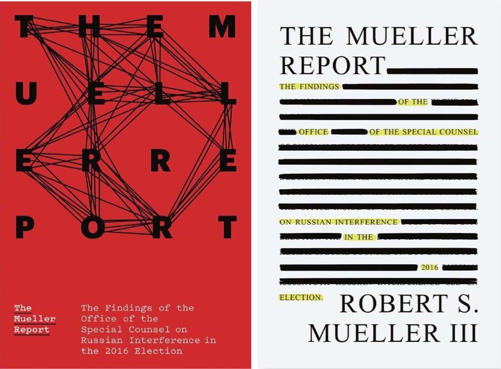
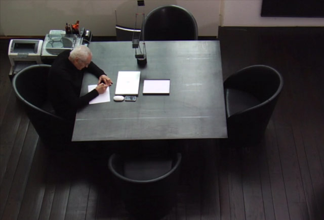
Book Covers for the Mueller Report
The New Yorker asked five designers to design book covers for the Mueller Report in the event that it’s eventually published. Here are my two favorites, by Michael Bierut and Na Kim:
This site is made possible by member support. ❤️
Big thanks to Arcustech for hosting the site and offering amazing tech support.
When you buy through links on kottke.org, I may earn an affiliate commission. Thanks for supporting the site!
kottke.org. home of fine hypertext products since 1998.
The New Yorker asked five designers to design book covers for the Mueller Report in the event that it’s eventually published. Here are my two favorites, by Michael Bierut and Na Kim:
![]()
Pentagram’s Michael Bierut and his team designed the identity for Hillary Clinton’s 2016 Presidential campaign (of which I was not initially a fan but came around later). Here’s how it happened.
I put together a three-person team: me, designer Jesse Reed, and project manager Julia Lemle. We would work in secret for the next two months. Our first meeting with the Clinton team began with a simple statement: “Our candidate has 100 percent name recognition.” There is a well-known marketing principle that is often credited to midcentury design legend Raymond Loewy. He felt that people were governed by two competing impulses: an attraction to the excitement of new things and a yearning for the comfort provided by what we already know. In response, Loewy had developed a reliable formula. If something was familiar, make it surprising. If something was surprising, make it familiar.
That same principle applies to political campaigns. In 2008 Sol Sender, Amanda Gentry and Andy Keene were faced with the challenge of branding a candidate who had anything but name recognition. Barack Obama’s design team responded with a quintessentially professional identity program, introducing — for the first time — the language of corporate branding to political marketing. Obama’s persona — unfamiliar, untested, and potentially alarming to much of the voting public — was given a polished logo and a perfectly executed, utterly consistent typographic system. In short, they made a surprising candidate seem familiar.
We faced the opposite problem. Our candidate was universally known. How could we make her image seem fresh and compelling?
This is a great look at how a designer at the top of his game approaches a problem…and reckons with failure. Even this little bit:
It wasn’t clever or artful. I didn’t care about that. I wanted something that you didn’t need a software tutorial to create, something as simple as a peace sign or a smiley face. I wanted a logo that a five-year-old could make with construction paper and kindergarten scissors.
Leading up to the election, how many photos did you see of Hillary logos hand-drawn by kids on signs and t-shirts? Lots and lots…my kids even got into the act.
Anyway, a huge contrast to the process and impact of the Trump campaign’s identity.
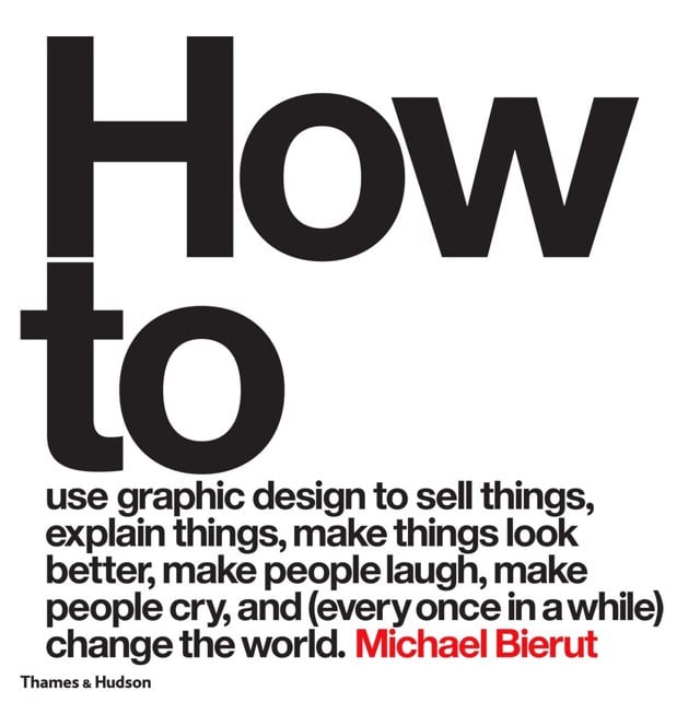
Michael Bierut is popping off right now. The School of Visual Arts recently honored him with their Masters Series Award, which includes an exhibition of his work that runs until early November. And he’s also out with a new book with a large title, How to Use Graphic Design to Sell Things, Explain Things, Make Things Look Better, Make People Laugh, Make People Cry, and (Every Once in a While) Change the World.
Update: Bierut’s brief interview in the WSJ is worth a read. I enjoyed his Jack Donaghy-esque take on NYC work fashion:
I always wear a necktie to work. I didn’t claw my way all the way from Ohio just to dress like a farmer.
And his love for Wile E. Coyote:
He had this endless faith and brand loyalty and never thought to try the competition even though Acme products failed him time and time again.
Although in fairness, the deck was stacked against the Coyote (see rule #7). (via @PaulAntonson)
NASA’s original logo looked something like this:
![]()
It was referred to, colloquially, as the meatball. In the 1970s, the meatball was switched out for the worm, a more Modernist take:
![]()
This logo was done by Richard Danne and Bruce Blackburn, and Danne wrote an essay about the experience.
And here is one of the most interesting exchanges I’ve ever witnessed in a design presentation:
Fletcher: “I’m simply not comfortable with those letters, something is missing.”
Low: “Well yes, the cross stroke is gone from the letter A.”
Fletcher: “Yes, and that bothers me.”
Low: “Why?”
Fletcher: (long pause) “I just don’t feel we are getting our money’s worth!”Others, not just the designers were stunned by this last comment. Then the discussion moved back to the strong red/rust color we were proposing. We had tried many other colors of course, including the more predictable blue range, but settled on red because it suggested action and animation. It seemed in spirit with the Can Do nature of the Space Agency.
Fletcher: And this color, red, it doesn’t make much sense to me.”
Low: “What would be better?”
Fletcher: “Blue makes more sense… Space is blue.”
Low: “No Dr. Fletcher, Space is black!”
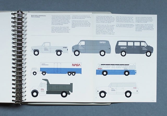
NASA’s Graphics Standards Menu utilizing the worm logo can be seen here.
The space agency switched back to the original logo in 1992. Michael Bierut compared the two:
The worm is a great-looking word mark and looked fantastic on the spacecraft. By any objective measure, the worm was and is absolutely appropriate, and the meatball was and is an amateurish mess.
(thx, jarrett)
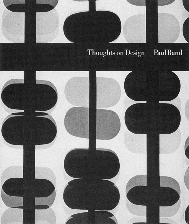
Legendary designer Paul Rand’s Thoughts on Design is back in print for the first time since the 1970s. The new version, which will be out on Aug 19, is available for preorder and comes with a foreword by Michael Bierut.
One of the seminal texts of graphic design, Paul Rand’s Thoughts on Design is now available for the first time since the 1970s. Writing at the height of his career, Rand articulated in his slender volume the pioneering vision that all design should seamlessly integrate form and function. This facsimile edition preserves Rand’s original 1947 essay with the adjustments he made to its text and imagery for a revised printing in 1970, and adds only an informative and inspiring new foreword by design luminary Michael Bierut. As relevant today as it was when first published, this classic treatise is an indispensable addition to the library of every designer.
A giant in the world of design, Massimo Vignelli, passed away this morning at the age of 83. Michael Bierut, who worked for Vignelli, has a nice remembrance of him.
Today there is an entire building in Rochester, New York, dedicated to preserving the Vignelli legacy. But in those days, it seemed to me that the whole city of New York was a permanent Vignelli exhibition. To get to the office, I rode in a subway with Vignelli-designed signage, shared the sidewalk with people holding Vignelli-designed Bloomingdale’s shopping bags, walked by St. Peter’s Church with its Vignelli-designed pipe organ visible through the window. At Vignelli Associates, at 23 years old, I felt I was at the center of the universe.
On the occasion of the latest New Yorker redesign, a worthy re-link to Michael Bierut’s appreciation of the magazine’s practice of slow design.
Publication design is a field addicted to ceaseless reinvention. Sometimes a magazine’s redesign is generated by a change in editorial direction. More often, the motivation is commercial: the publisher needs to get the attention of fickle ad agency media buyers, and a new format — usually characterized as ever more “scannable” and “reader-friendly” — is just the thing. In contrast, one senses that each of the changes in The New Yorker was arrived at almost grudgingly. Designers are used to lecturing timid clients that change requires bravery. But after a certain point — 80 years? — not changing begins to seem like the bravest thing of all.
The New Yorker’s design changes over the years have been so slight that, as Bierut notes, the latest issue looks remarkably like the first issue from 1925.
You may remember a short piece by Errol Morris in the Times a few weeks ago that was more of a quiz than a essay. Well, the quiz turned out to be a smokescreen for how people’s opinions change when the text is set in different typefaces.
Each Times participant read the passage in one of six randomly assigned fonts - Baskerville, Computer Modern, Georgia, Helvetica, Comic Sans and Trebuchet. The questions, ostensibly about optimism or pessimism, provided data about the influence of fonts on our beliefs.
The test consisted of comparing the responses and determining whether font choice influenced our perception of the truth of the passage.
The results pointed to a small but noticeable effect in the authority of each font.
DAVID DUNNING: Baskerville seems to be the king of fonts. What I did is I pushed and pulled at the data and threw nasty criteria at it. But it is clear in the data that Baskerville is different from the other fonts in terms of the response it is soliciting. Now, it may seem small but it is impressive.
ERROL MORRIS: I am completely surprised by this. If you asked me in advance, I would have guessed Georgia or Computer Modern, something that has the imprimatur of, I don’t know, truth - truthiness.
DAVID DUNNING: The word that comes to my mind is gravitas. There are some fonts that are informal - Comic Sans, obviously - and other fonts that are a little bit more tuxedo. It seems to me that Georgia is slightly tuxedo. Computer Modern is a little bit more tuxedo and Baskerville has just a tad more starchiness. I would have expected that if you are going to have a winner in Baskerville, you are also going to have a winner in Computer Modern. But we did not. And there can be a number of explanations for that. Maybe there is a slight difference in how they are rendered in PCs or laptops that causes the starch in Computer Modern to be a little softer than the starch in Baskerville.
ERROL MORRIS: Starchiness?
DAVID DUNNING: Fonts have different personalities. It seems to me that one thing you can say about Baskerville is that it feels more formal or looks more formal. So that may give it a push in terms of its level of authority. This is, of course, speculation. I don’t really know. What one would do with, when you get surprising results is you now have to think about, O.K., what do we do to take that back-ended speculation and support it with data?
Update: Pentagram’s Michael Bierut weighs in on Morris’ article.
Whether or not a typeface can do any or all of those things, I do agree the landscape has changed. Once upon a time, regular people didn’t even know the names of typefaces. Then, with the invention of the personal computer, people started learning. They had their opinions and they had their favorites. But until now, type was a still matter of taste. Going forward, if someone wants to tell the truth, he or she will know exactly what typeface to use. Of course, the truth is the truth no matter what typeface it’s in. How long before people realize that Baskerville is even more useful if you want to lie?
For the past five years, Michael Bierut has taught a class for aspiring designers where students have to record the results of “a design operation that [they] are capable of repeating every day” for 100 straight days. Here are some of the results.
Zak Klauck: “Over the course of 100 days, I made a poster each day in one minute. The posters were based on one word or short phrase collected from 100 different people. Anyone and everyone was invited to contribute.” The perfect exercise for a graphic designer.
Hack 2 Work is a series of tips and tricks for designers from Core77. Looks good so far. Check out Liz Danzico’s How to Learn About Your Clients From Their Table Manners (to be taken with a grain of salt, I’m sure):
When the food arrives, does your client salt and pepper the food before he or she tastes it? If so, this is a clear sign that your client is potentially closed-minded, not open to new ideas, or set in his or her ways. If your client first tastes the food, and then adds salt or pepper, tremendous. This suggests your client has opinions, and is not afraid to exercise them-but only after the voice of the “creator” (in this case the chef) has been fairly given a chance first.
and How to Make Your Client’s Logo Bigger Without Making Their Logo Bigger from Michael Bierut:
Like all con games, this one is based on the illusion that the sucker has the advantage. In this case, it’s the conviction that this kind of client always has that it’s your job to do as they say. Little do they realize that your final allegiance is not to them, but to the quality of the work, something that you cannot in good conscience permit them to jeopardize with their lack of taste.
Update: James Grimmelmann shares his similar tip for lighting designers:
The lighting-designer version of this is to tell the director that yes, you can make the lights brighter, but you’ll need to turn off the power for a few minutes while you change some of the wiring. Turn everything off, wait fifteen minutes while the director’s eyes adjust to the dark, then turn everything back on. It sure does look brighter now, doesn’t it?
In the NY Times, Michael Bierut talks about the differences in graphic design when he started work in the early 80s and now. In a word: computers.
Still, I wonder if we haven’t lost something in the process: the deliberation that comes with a slower pace, the attention to detail required when mistakes can’t be undone with the click of a mouse. Younger designers hearing me talk this way react as if I’m getting sentimental about the days when we all used to churn our own butter.
Uber-designer Michael Bierut talks about the 85 notebooks that he’s carried around over the last 26 years (not all at once, of course).
The notebooks function like a security blanket for me. I can’t go into a meeting unless I have my current notebook in my hand, even if I never open it. Because I carry one everywhere, I tend to misplace them a lot. Losing one makes me frantic. Everyone who works with me gets used to me asking, “Have you seen my notebook anywhere?” which I assume gets irritating after a while: sorry. I’ve left them behind in clients’ offices. On one occasion, I left one on the roof of a cab on the upper west side. I ended up walking ten blocks, retracing the taxi’s route, until I found it on Broadway at 63rd Street, intact except for some tire marks.
I’ve tried using notebooks several times over the years, but the habit has never stuck.
The Atlantic is getting a redesign. Changes are already afoot over at the web site and Pentagram’s blog has an extensive look at the magazine’s new look, designed by Michael Bierut, Luke Hayman, and their team. I love the proposed Helvetica cover. The inspiration for the throw-back logo came in part from an appearance of an old issue of the magazine on Mad Men (Bierut is a fan).
BTW, the new cover tells of an article on blogs — Will Blogs Kill Writing? — that you will likely be hearing about from all corners of the web when the issue is released next week.
An appreciation of Mad Men by designer Michael Bierut.
Jesus God in heaven! Not until I know I’m not wasting my time! From the minute Don launched his this-meeting-is-over bluff, I was on the edge of my seat, and my lovely wife Dorothy will tell you that I literally clapped my hands at that line. For me, this sequence is as close to pornography as I ever get to see on basic cable.
Alright, uncle, I give, I give. I will try and find some time in my schedule to watch this show.
Michael Bierut celebrates the elegantly simple design of the Brannock Foot-Measuring Device.
Charles F. Brannock only invented one thing in his life, and this was it. The son of a Syracuse, New York, shoe magnate, Brannock became interested in improving the primitive wooden measuring sticks that he saw around his father’s store. He patented his first prototype in 1926, based on models he had made from Erector Set parts. As the Park-Brannock Shoe Store became legendary for fitting feet with absolute accuracy, the demand for the device grew, and in 1927 Brannock opened a factory to mass produce it. The Brannock Device Co., Inc., is still in business today. Refreshingly, it still only makes this one thing. They have sold over a million, a remarkable number when one considers that each of them lasts up to 15 years, when the numbers wear off.
Bierut also notes that Tibor Kalman was a big fan of the Brannock Device, once saying:
It showed incredible ingenuity and no one has ever been able to beat it. I doubt if anyone ever will, even if we ever get to the stars, or find out everything there is to find out about black holes.
The humble shoe horn is another well designed shoe-related device that may never be bettered.
The 92nd St Y has put the video of a talk called The Art of the Book up on their site. The talk was held in Dec 2006 and featured Milton Glaser, Chip Kidd, and Dave Eggers with Michael Bierut moderating. You may recall that Glaser got into a bit of hot water for some comments he made about the career paths of women in graphic design.
Michael Bierut on the concept of bershon, defined by Sarah Brown thusly:
The spirit of bershon is pretty much how you feel when you’re 13 and your parents make you wear a Christmas sweatshirt and then pose for a family picture, and you could not possibly summon one more ounce of disgust, but you’re also way too cool to really even DEAL with it, so you just make this face like you smelled something bad and sort of roll your eyes and seethe in a put-out manner. Kelly Taylor from Beverly Hills, 90210 is the patron saint of bershon, as her face, like most other teenagers’, was permanently frozen in this expression.
Bierut notes that Jennifer Grey’s performance in Ferris Bueller embodies the spirit of bershon, but Molly Ringwald does bershon pretty well in Sixteen Candles and The Breakfast Club.
Which actors would play the designers in Graphic Design: The Movie? Maybe Phillip Seymour Hoffman as Michael Bierut, Massimo Vignelli played by Sean Connery (Connery won’t do the Italian accent though), and Julie Christie as Paula Scher.
Video interview with Michael Bierut about typography and design. (via typographica)
Michael Bierut dug his 1979 design portfolio out of the closet, which portfolio he used only once to get the last job he ever had to look for.
Michael Bierut on design lessons learned from The Sopranos. “On The Sopranos, interest in certain things, including but not limited to event planning, fashion design, literature, and certain psychological theories, are considered indications of effeminacy. A not unsimilar macho attitude often obtains in corporate boardrooms when it comes to design.”
Michael Bierut’s 13 reasons to choose a particular typeface for a project. “Once I saw a project in a student portfolio that undertook the dubious challenge of redesigning the Tiffany’s identity. I particularly disliked the font that was used, and I politely asked what it was. ‘Oh,’ came the enthusiastic response, ‘that’s the best part! It’s called Tiffany!’”
On the occasion of Helvetica’s NYC premiere tonight, Michael Bierut remembers a time when no one knew anything about type or fonts except for designers and typesetters. “[Today] we live in a world where any person in any cubicle in the world can pick between Arial and Trebuchet and Chalkboard whenever they want, risk free, copyfitting tables be damned, and where a film about a typeface actually stands a chance of enjoying some small measure of popular success.”
Coming in July: Seventy-nine Short Essays on Design by Michael Bierut. Looks like some of those essays will be drawn from Design Observer.
Pentagram has redesigned the Doomsday Clock, which depicts the world’s proximity to nuclear annihilation. The funny thing is that they designed the 12 o’clock face, which will never actually be needed because we’ll all be dead before the Bulletin of the Atomic Scientists has a change to move it forward.
At The Art of the Book event last week, the panel was asked why there were so few female superstar designers. Milton Glaser took a shot at answering the question (many women choose family over work during the crucial superstar career development years) but judging by the reaction afterwards online, his comments were not appreciated by some. To be fair, Glaser’s comments were taken out of context, I think, and what he said is a part of the overall answer to the question. On Design Observer, Michael Beirut, who was the moderator for that evening’s event, takes a closer look at the issue. “The real question was the unspoken one: ‘Why is it that you guys up there are always…guys?’” Oh, and here’s a list of women speakers for your conference.
Took in The Art of the Book lecture at the 92nd Street Y last night. Milton Glaser, Chip Kidd (“a modern day Truman Capote” I heard him described as afterward), Dave Eggers, with Michael Beirut moderating. One of the most interesting comments came late in the proceedings from Dave Eggers, who described one of the main goals of the McSweeney’s design staff as attempting to design the books as well and as beautifully as they could as objects so that people would be compelled to save them. That way, even if people didn’t have time to read them soon after purchase, they couldn’t bear to throw/give the book away and would instead put it on their shelf in the hopes — McSweeney’s hopes, that is — that the buyer would at some point pull it down off the shelf and give it another try.
This design goal runs counter to the design process behind most contemporary book jackets, which are engineered almost entirely for the purpose of eliciting in the potential buyer a “buy me” reaction within two seconds of spotting them. McSweeney’s, as a champion of authors, wants the writing to be read while most major publishing companies, as champions of their shareholders, want books to be purchased. People buying books is important to the goal of getting the writing within them read, but McSweeney’s emphasis on designing books to last in people’s homes is a clever way to pursue that goal after the sale.
Michael Bierut on his design process, written in plain language that the client never gets to hear (but maybe they should):
When I do a design project, I begin by listening carefully to you as you talk about your problem and read whatever background material I can find that relates to the issues you face. If you’re lucky, I have also accidentally acquired some firsthand experience with your situation. Somewhere along the way an idea for the design pops into my head from out of the blue. I can’t really explain that part; it’s like magic. Sometimes it even happens before you have a chance to tell me that much about your problem! Now, if it’s a good idea, I try to figure out some strategic justification for the solution so I can explain it to you without relying on good taste you may or may not have. Along the way, I may add some other ideas, either because you made me agree to do so at the outset, or because I’m not sure of the first idea. At any rate, in the earlier phases hopefully I will have gained your trust so that by this point you’re inclined to take my advice. I don’t have any clue how you’d go about proving that my advice is any good except that other people - at least the ones I’ve told you about - have taken my advice in the past and prospered. In other words, could you just sort of, you know…trust me?
It is like magic. Reminds me of something Jeff Veen wrote last year on his process:
And I sort of realized that I do design that way. I build up a tremendous amount of background data, let it synthesize, then “blink” it out as a fully-formed solution. It typically works like this:
- Talk to everybody I possibly can about the problem.
- Read everything that would even be remotely related to what I’m doing. Hang charts, graphs, diagrams, and screenshots all over my office.
- Observe user research; recall past research.
- Stew in it all, panic as deadline approaches, stop sleeping, stop eating.
- Be struck with an epiphany. Instantly see the solution. Curse my tools for being too slow as I frantically get it all down in a document.
- Sleep for three days.
Like I said when I first read Jeff’s piece, in my experience, a designer gets the job done in any way she can and then figures out how to sell it to the client, typically by coming up with an effective (and hopefully at least partially truthful) backstory that’s crammed into a 5-step iterative process, charts of which are ubiquitous in design firm pitches.
Second part of a two-part interview with designer Michael Bierut. “I’ve found that any reluctance I’ve had to doing more of this ‘political design’ has to do with my own fear that things like T-shirts and posters are usually feeble tools to address the enormous problems we face as a society today.” Read part one.
Michael Bierut recalls a phone conversation with photographer Arnold Newman. “Er…yes, I do portraits.”
Stay Connected