kottke.org posts about Helvetica
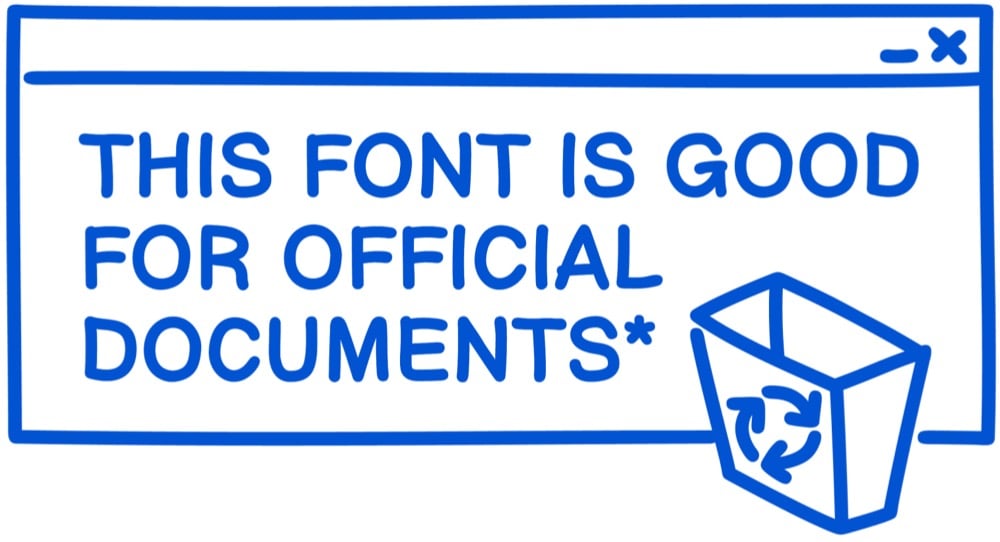
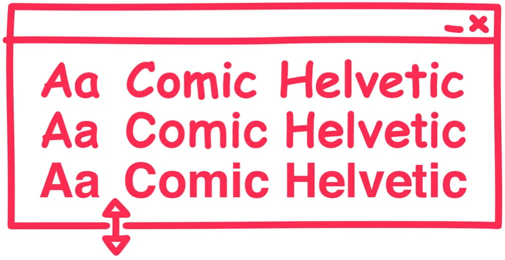
In some workplaces, people use Helvetica to conduct business because it conveys a sense of order and authority. In other workplaces, people use Comic Sans, which conveys a sense of casual chaos. Designer Alexander Pravdin decided to combine the two typefaces into one diabolical font: Comic Helvetic. You can download it here.
If you need me for the rest of the day, I’ll be over in the corner trying to decide where these three typefaces fit on the alignment chart. (via print)
Update: See also Comic Neue. (via @DirkOlbrich)
Thinking that some people might need high quality entertainment while shut inside due to the COVID-19 pandemic, filmmaker Gary Hustwit is streaming his films online for free, one film per week. First up (from Mar 17-24) is Helvetica, his documentary on typography and graphic design. Here’s the trailer:
Click through to watch the whole film. (via daring fireball)
I just upgraded to OS X Yosemite yesterday1 and the Helvetica as the system font is as jarring as everyone says it is. But that new Apple Watch font, San Francisco, seems really nice. So of course someone has worked out a way to use the Watch font as the system font on Yosemite. Here’s what you do…just type the following in Terminal.app:
ruby -e “$(curl -fsSL https://raw.github.com/wellsriley/YosemiteSanFranciscoFont/master/install)”
Then restart your computer. Full instructions are on GitHub. Here’s what it looks like:
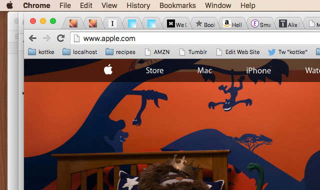
Pretty nice. But it’s not perfect. For instance, look at the text in the Chrome tabs…it’s not aligned correctly. And if you have the fast user switching menu enabled in the menu bar, that’s weirdly misaligned too. If you’d like, you can also switch back to using the previous font, Lucida Grande.
Back in July, Ben Terrett wrote a post about how many instances of the word “helvetica” set in unkerned 100 pt Helvetica it would take to go from the Earth to the Moon:
The distance to the moon is 385,000,000,000 mm. The size of an unkerned piece of normal cut Helvetica at 100pt is 136.23 mm. Therefore it would take 2,826,206,643.42 helveticas to get to the moon.
But let’s say you wanted to stretch one “helvetica” over the same distance…at what point size would you need to set it? The answer is 282.6 billion points. At that size, the “h” would be 44,600 miles tall, roughly 5.6 times as tall as the Earth. Here’s what that would look like:
The Earth is on the left and that little speck on the right side is the Moon. Here’s a close-up of the Earth and the “h”:
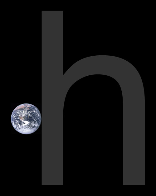
And if you wanted to put it yet another way, the Earth is set in 50.2 billion point type — Helvetically speaking — while the Moon is set in 13.7 billion point type. (thx, @brainpicker)
The trailer for Objectified, a new documentary film about industrial design by Gary Hustwit, who also made Helvetica.
The (Mostly) True Story of Helvetica and the New York City Subway details the use of type in signage, maps, and manuals for the NYC subway. A must-read for type and subway fans.
As if this plethora of signs were not enough, the subway system also had a bewildering variety of other porcelain enamel and hand-painted signs. The porcelain enamel signs, either hung from the ceiling or posted on the walls, were directional as well as informational. The directional signs included those on the outside of the station entrances as well as those intended for the corridors and platforms underground. Many of the informational signs warned against criminal, dangerous or unhealthy behavior: no peddling wares, no leaning over the tracks, no crossing the tracks, no smoking, no spitting. The directional and informational ones were made by Nelke Veribrite Signs and the Baltimore Enamel Company, while the behavioral ones were the product of the Manhattan Dial Company. Most were lettered in some form of sans serif capitals-regular, condensed, square-countered, chamfered, outlined-though some were in bracketed or slab serif roman capitals. They were usually white letters on a colored background (often dark green for the IND and dark blue for the IRT and BMT), yet many were also black on a white background. There was no house style.
What is to modern eyes a beautiful disorder of tiled text and hand-painted enamel became an embarrassing shambles in the 70s and 80s. It was only in late 1989 that Helvetica became the official typeface for New York City subway system signage…about 20 years too late to prevent the current signage from looking dated.
The Atlantic is getting a redesign. Changes are already afoot over at the web site and Pentagram’s blog has an extensive look at the magazine’s new look, designed by Michael Bierut, Luke Hayman, and their team. I love the proposed Helvetica cover. The inspiration for the throw-back logo came in part from an appearance of an old issue of the magazine on Mad Men (Bierut is a fan).
BTW, the new cover tells of an article on blogs — Will Blogs Kill Writing? — that you will likely be hearing about from all corners of the web when the issue is released next week.
Mad Men gets a C- for using Arial in the closing credits instead of original-and-still-champion Helvetica. Time for Sterling to have a chat with the art department.
Objectified is an upcoming film about industrial design by Gary Hustwit, director of Helvetica.
Objectified is a documentary about industrial design; it’s about the manufactured objects we surround ourselves with, and the people who make them. On an average day, each of us uses hundreds of objects. (Don’t believe it? Start counting: alarm clock, light switch, faucet, shampoo bottle, toothbrush, razor…) Who makes all these things, and why do they look and feel the way they do? All of these objects are “designed,” but how can good design make them, and our lives, better?
The film is due out in early 2009. (via design observer)
In the past few weeks, I’ve seen several people mention the 50 Years of Helvetica exhibit at the MoMA along with some variation of “Woo! I might need to take a trip to New York to go see this!” You should know that this exhibit takes up just a small corner of the Architecture and Design Gallery on the 3rd floor…it’s essentially a case and a handful of posters and other specimens. If you’re in the museum already, definitely check it out, but you’ll be disappointed if you make a special expensive trip just to see the Helvetica stuff.
Exhibit on Helvetica (the font, not the film) opens tomorow at the MoMA and will be available for a good long time (until March 31, 2008). “Widely considered the official typeface of the twentieth century, Helvetica communicates with simple, well-proportioned letterforms that convey an aesthetic clarity that is at once universal, neutral, and undeniably modern.”
Winners of the Helvetica haiku contest I pointed to a couple of weeks ago. My favorite of all the ones listed: “i shot the serif / left him there full of leading / yearning for kerning”. Close second: “She misunderstood / When I said she was ‘Grotesque’ / Akzidenz happen”. I am a sucker for puns.
Quick quiz: Is this text set in Arial or Helvetica? If you’re struggling with that, check out How to Spot Arial. (thx, hubs)
Perhaps the highest praise I can offer for Helvetica comes courtesy of Meg, who was snickering on the way into the theater about going to see a movie about a font and exited saying, “that was great, now I want to be a designer!” The rest of the audience, mostly designers and type folks, loved it as well. But for the non-design folks, what’s compelling about the movie is getting a glimpse of how designers think and work; that it’s not just about making things look pretty. The modern world is awash in signage and symbols and words and for a lot of them, especially the corporate messages, there’s a reason why they look the way they do. The story of Helvetica offers a partial key to decoding these messages.
Check out some clips from the film and the screenings schedule to find out when Helvetica will be showing in your area. Thanks to the fine folks at Veer for inviting me to the screening.
Helvetica, The Movie! “The film is studded with the stars of typography: Erik Spiekermann, Matthew Carter, Massimo Vignelli, Michael Bierut, Wim Crouwel, Hermann Zapf, Stefan Sagmeister, Jonathan Hoefler, Tobias Frere-Jones, Experimental Jetset.”
Helvetica vs. Arial. Two of the world’s most popular typefaces battle it out for supremacy.
Stay Connected