kottke.org posts about fonts
I don’t know the author or typographer behind The Temporary State. There’s a contact address that reads “B. Tulskaya ul. 2-571, Moscow, Russia, 115191.” But Mx. Tulskaya (if that’s indeed the author) has made an outstanding pocket history of the use of italics in type, partly to defend against the fact that The Temporary State’s fonts do not use an italic typeface.
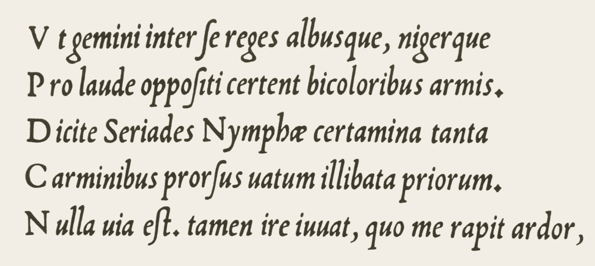
I knew, for instance, that Venetian printer Aldus Manutius is generally credited with introducing italics into European print (partly, the histories say, to imitate Latin handwriting, and partly as a space-saving device). I did not know that after other printers began to copy Manutius’s use of italics, the Venetian Senate granted Aldus exclusive right to use them.
I knew that Italian futurist poet and manifesto-writer Filippo Marinetti championed a wide range of typographic innovations; I did not know (or had forgotten) that he wished to reserve italic type for “a series of similar and swift sensations,” while bold would be used for the imitation of heavy tones, and so on. A kind of emotional functionalism in type.
It is strange, how Marinetti in his call for revolution against “the Poetry Book” doesn’t see any problem with italics. Somehow, Roman numerals are an issue, but the use of highly decorative imitation of a 16th century pretty handwriting is a futuristic expression, not part of the “typographic harmony” ensemble. It is even stranger, that he doesn’t address the application of italic itself, as his idea of highlighting the page with «3-4 colors and 20 different typefaces» is very close to how the use of italic is regulated in the Chicago Manual. The only difference is: where Marinetti suggests «20 different typefaces», Chicago suggests only one — italic. So, seemingly to achieve Marinetti’s idea all that is needed is to diversify the means of text highlighting. And it’s not like there are no alternative typographic traditions, which could be used to substitute the italic.
Much of the article is devoted to this; how you can achieve the typographic effect of italics (emphasis, foreign words, titles, etc.) without using italic type. Here the examples are legion. In German blackletter, foreign words (especially in Roman languages) would be put in Roman type, while emphasized words or phrases would be in boldface. In Cyrillic printing, especially in the Soviet period, you see “sperrsatz,” or wide spacing, to denote emphasis.
Bauhaus, following the German blackletter tradition, forsook italic typesetting altogether, opting for a combination of boldface, sperrsatz, and fonts of different sizes, all of which achieve the effect of italics without the pretense of adopting an old Latin handwriting style.
Since few social media networks support bold and italic typesetting, it’s interesting to think about the range of ways users still suggest italics or the effect of italics.
There’s pseudo-Markdown, in the form of
*italics*
or
_italics_
Of course, there’s
ALL CAPS
There are also memes and GIFs, which are a way of both drawing emphasis to text and giving it an emotional characterization that go far beyond what Marinetti could dream of with his really quite limited notion of “3 or 4 different colours and 20 different typefaces on the same page. That text itself would and could be animated, that it could be superimposed on a miniature movie that would explode into mostly-text networks, is a future Marinetti might have embraced, but one he couldn’t quite fully see.
(Via Robin Sloan)
For August, the writers at HiLobrow will have a month of appreciations of fonts and typefaces, lovingly titled “Kern Your Enthusiasm.” Matthew Battles kicks things off with the legendary Aldine Italic developed for Venetian publisher Aldus Manutius, a new set of metal letters that helped jumpstart a little thing we call the Renaissance.
When Aldus put the first version of a typeface we call italic to use in 1501, the printing press had been proliferating in Europe for half a century. In other words, it was about as old as the computer is now. It was a time of immense invention and swiftly spun variety in the printed book, and a time of new mobility and independence of thought and activity among certain classes of people as well — and the combination of new ways and new tools meant new kinds of books. Crucially, the book was getting smaller, small enough to act not only as a desktop, but as a mobile device.
Previous HiLobrow series include “Kirb Your Enthusiasm” (on Jack Kirby), “Kirk Your Enthusiasm” (on Star Trek’s Captain Kirk) and “Herc Your Enthusiasm” (on old school hip-hop, where I contributed a short thing on Afrika Bambaataa.)
After a thorough review, Typographica has chosen their favorite typefaces of 2008.
Sensationalism aside, it’s significant that the ever-increasing quality in type design these days — dubbed by some as the new “golden age” of type — has caused this year’s list to supersede previous lists in many ways.
Check out these “flair” typefaces from the 70s.
They were very big around 1970 or so. Bookman set the example, even though it’s from much earlier. By the mid-seventies, they were adding Bookman-style swashes to everything. They were usually called Whateverthefontwascalled Flair.
Scroll down the page for samples of Univers Flair, Franklin Gothic Flair, etc.
The goal of Oded Ezer’s Typosperma Project “was to create some sort of new transgenic creatures, half (human) sperm, half letter”. (via buzzfeed)
The Goodie Bag podcast has an entertaining little video on Trajan, the font used ubiquitously in movie credits and posters:
Like indoor plumbing and toga parties, Trajan hails from Rome. Matter of fact, you can find almost 2,000-year-old inscriptions on Trajan’s column, where they have totally off-the-leash keggers on Saturdays… Russell Crowe has co-starred with Trajan three times now.
This reminds me of Red is Not Funny, J. Tyler Helms’ illustration of the wide use of bold red letters in distinctly unfunny comedies. (via cameron hunt)
Erik Spiekermann on FE-Mittelschrift, the typeface used for German license plates.
The official typeface for our license plates is now called FE-Mittelschrift, with FE meaning it is Fälschungs-Erschwert, i.e. difficult to forge. Apparently car thieves, terrorists and notorious law-breakers had been exploiting DIN’s geometric construction principle and turning E into F or 3 into 8 etc by simply using a bit of black tape or white paint.
Here are all the alphanumeric characters:
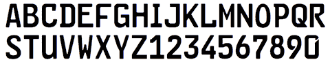
Note the tamper-resistant differences between the 6 (no notch) and 9 (notched), the E & F, the I & 1, the O & zero, the P & R, and so on.
Subtil, a display typeface by Hanno Bennert and Alexander Gialouris that was a winning entry in the Type Directors Club 2007 competition. Love those subtly rounded ends.
New web site for Hoefler & Frere-Jones, the noted and celebrated typeface designers, including a weblog. Subscribed. Oh, and the browser fonts of choice for the meticulous duo? “Lucida Grande, Lucida Sans, Verdana, Georgia, Helvetica, Arial” (thx, jonathan)
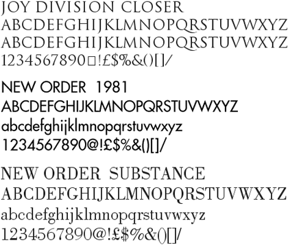
Peter Saville, the British designer closely associated with Factory Records, is offering free downloads of some of the fonts he used in designing record sleeves and other work for New Order, Joy Division, and other Factory Records artists (see update below).
(thx, mark)
Update: Several Peter Saville fans from around the world have written in to say that the above site is not Peter Saville’s official site (this is). It’s also unclear whether those fonts were indeed made by Saville (probably not) or ever offered for download free of charge (probably definitely not). But they’re still neat fonts, so download at your own risk.
Update: Kai has identified some of the fonts offered as shoddy versions of the following:
Joy Division Closer - Trajan (Adobe)
Blue Monday - Engravers Gothic (Bitstream)
New Order 1981 - Futura (Bauer)
New Order 1993 - Handel Gothic (Linotype)
New Order Ceremony - Albertus (Mecanorma)
New Order 316 - BT Incised 901 (Bitstream) = Antique Olive (Linotype)
New Order Regret - Rotis Serif (Agfa)
In this case, you get what you pay for, I guess.
Michael Bierut’s 13 reasons to choose a particular typeface for a project. “Once I saw a project in a student portfolio that undertook the dubious challenge of redesigning the Tiffany’s identity. I particularly disliked the font that was used, and I politely asked what it was. ‘Oh,’ came the enthusiastic response, ‘that’s the best part! It’s called Tiffany!’”
Exhibit on Helvetica (the font, not the film) opens tomorow at the MoMA and will be available for a good long time (until March 31, 2008). “Widely considered the official typeface of the twentieth century, Helvetica communicates with simple, well-proportioned letterforms that convey an aesthetic clarity that is at once universal, neutral, and undeniably modern.”
Winners of the Helvetica haiku contest I pointed to a couple of weeks ago. My favorite of all the ones listed: “i shot the serif / left him there full of leading / yearning for kerning”. Close second: “She misunderstood / When I said she was ‘Grotesque’ / Akzidenz happen”. I am a sucker for puns.
Quick quiz: Is this text set in Arial or Helvetica? If you’re struggling with that, check out How to Spot Arial. (thx, hubs)
The top 100 fonts as determined by a panel of designers and type experts. Top 10: Helvetica, Garamond, Frutiger, Bodoni, Futura, Times, Akzidenz Grotesk, Officina, Gill Sans, and Univers. A PDF of the results (with photos, in German) is also available. (via type for you)
List of the 7 worst fonts. What, no Hobo or Brush Script? Comic Sans is, of course, #1 with a bullet. (via wider angle)
Typography language pedantry: font vs. typeface. “‘Fonts’ and ‘typefaces’ are different things. Graphic designers choose typefaces for their projects but use fonts to create the finished art.”
Helvetica, The Movie! “The film is studded with the stars of typography: Erik Spiekermann, Matthew Carter, Massimo Vignelli, Michael Bierut, Wim Crouwel, Hermann Zapf, Stefan Sagmeister, Jonathan Hoefler, Tobias Frere-Jones, Experimental Jetset.”
Older posts
Stay Connected