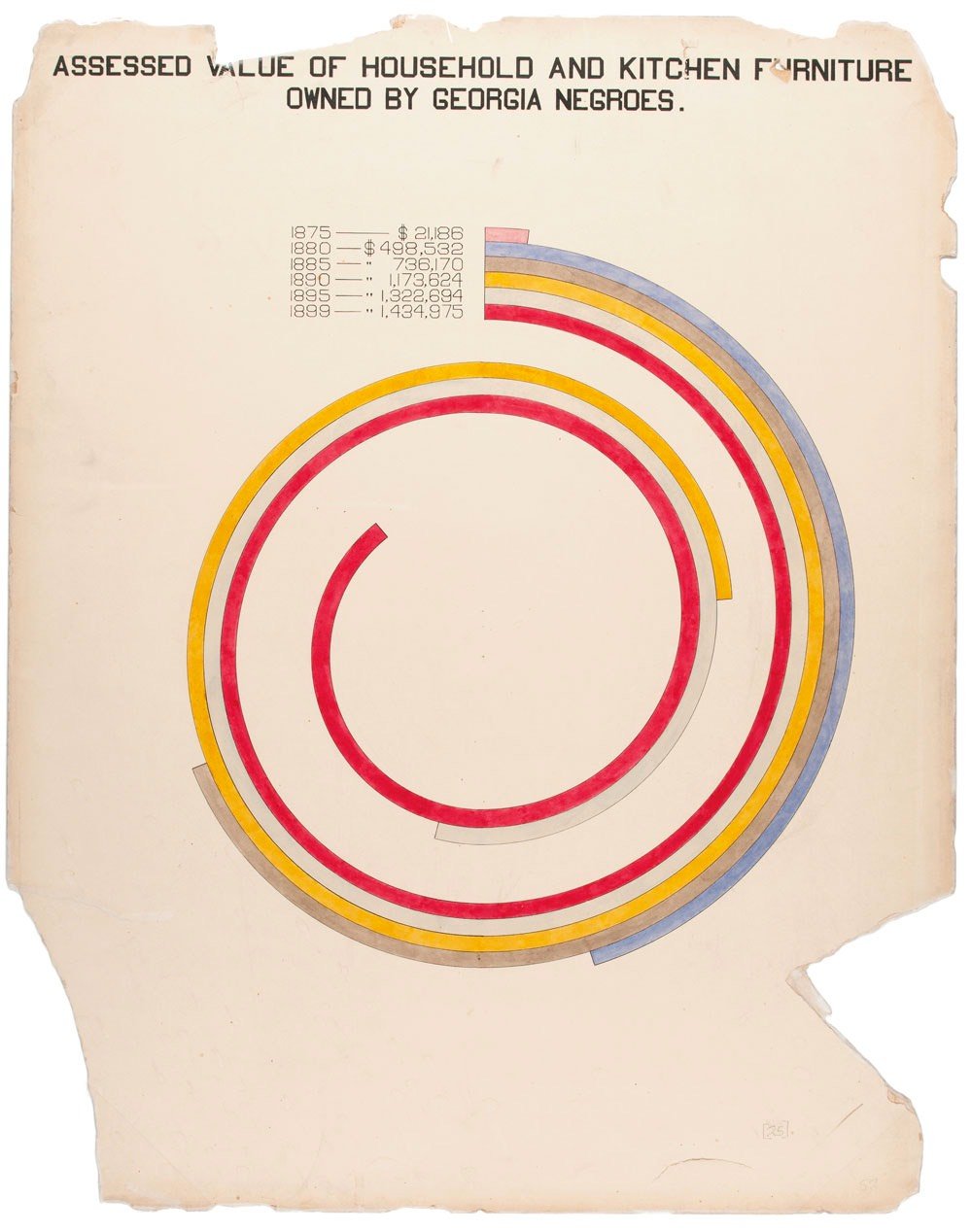
This exhibition will be the first time museum visitors have the opportunity to delve into the art of his complete filmography, examining his inspirations, homages, and the meticulous craftsmanship that define his work.
Through a curated collection of original props, costumes, and behind-the-scenes insights, including from his personal collection, this exhibition offers an unprecedented look into the world of Wes Anderson, celebrating his enduring influence on contemporary cinema.
The Great Wave has not been on view in the Art Institute galleries for five years because, like all prints, it is susceptible to light damage and must rest a minimum of five years between showings to preserve its colors and vibrance.
Here’s a video of the print being removed from storage as well as a brief comparison of their three prints:
For other places you can see The Great Wave on display, check out Great Wave Today.
Jason’s only got one rule for guest editors and it’s, “If you’re going to post about Utrecht once, you have to post about Utrecht three times,” which is a bad rule imo and problematic for me because I don’t know anything about Utrecht except they got bones full of drugs there and a doorbell for fish.
Luckily, I am American and did the American thing of texting the only Dutch person I know when I saw the fish doorbell was opening up for the year, because obviously everyone from the Netherlands will already know about the fish doorbell. He didn’t know about the fish doorbell, but he did used to be an intern at the Musical Clock Museum in Utrecht, which is a museum focusing on self-playing instruments and musical clocks. The Museum Speelklok appears to contain the second largest such collection in the world behind the Musical Museum in Brentford, which has them beat on self-playing instruments, though it’s not clear how many musical clocks they’ve got at MM. Regardless, the Utrecht Musical Clock Museum appears delightful and you should visit after visiting the fish doorbell.
Update:
Thanks to Logan and Marc in the comments for pointing me to Wintergatan. The marble machine in the video below is exhibited at Museum Speelklok.
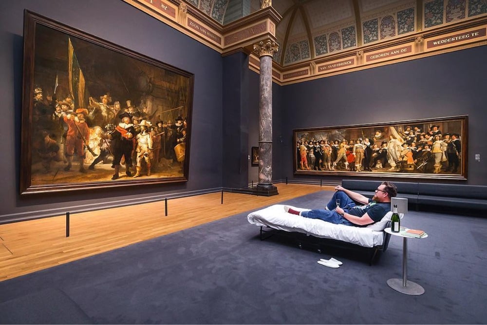
This story is a few years old but it charmed me too much this morning to let it slide. In 2017, four years after its grand reopening, Amsterdam’s Rijksmuseum welcomed its 10-millionth visitor, a man named Stefan Kasper. His lucky timing resulted in getting to spend the night in the museum, where he dined and slept underneath Rembrandt’s the Night Watch.
Here’s a short video of Kasper’s time in the museum:
I still can’t believe it. I discovered characters that I have never seen before. They came to life in front of me. It’s an experience that is forever etched in my memory.
Not the same, but I got to go to a press preview when the MoMA reopened a few years ago after renovations and it was quite an experience to wander those familiar galleries pretty much by myself. I stood in front of Starry Night and One: Number 31, 1950 for a really long time that morning.
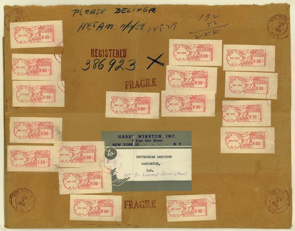
That last image is the mailing wrapper from when jeweler Harry Winston sent the Hope Diamond (currently valued at $200-350 million) to the Smithsonian through the regular US Mail.
Mailed on the morning of November 8 from New York City, the item was sent by registered (first class) mail — considered the safest means of transport for valuables at that time. The total fee was $145.29 (see the meter machine tapes). Postage only amounted to $2.44 for the package which weighed 61 ounces. The remainder of the fee ($142.85) paid for an indemnity of about $1 million.
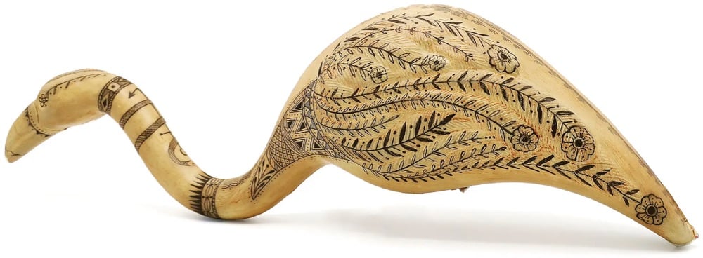
For an exhibition entitled DEATH TO THE LIVING, Long Live Trash now on view at the Brooklyn Museum, artist Duke Riley takes trash that he’s collected on the beach and turns it into art — think mosaics made from bottle caps, bread bag clips, and tampon applicators. But his plastic scrimshaw creations are absolute genius:
Scrimshaw art was made by whalers in the 19th century by carving designs into the teeth, bones, and baleen of whales. Riley has cleverly adopted the practice using aesthetically similar white plastics, producing a series he calls the Poly S. Tyrene Maritime Museum. The NY Times:
As whalers often depicted the leaders and profiteers of their day, Riley portrays the C.E.O.s of chemical companies, plastic industry lobbyists and others he deems responsible for producing the devastating tonnages of single-use plastics that are engulfing our oceans and threatening our ecosystems. It’s a downer, but if you look closely there’s often a Riley twist of humor, like the seagull shown relieving itself on the head of a water bottle magnate.
In the wake of his 27-year-old brother Tom’s death from cancer in 2008, Bringley, two years his junior, gave up a prestigious “high-flying desk job” at The New Yorker, where “they told me I was ‘going places,’” for a job in which “I was happy to be going nowhere.” He explains, “I had lost someone. I did not wish to move on from that. In a sense I didn’t wish to move at all.”
Drawn to “the most straightforward job I could think of in the most beautiful place I knew” — a job that promised room to grieve and reflect in the wake of his loss — Bringley arrived at the Met in the fall of 2008. He explains his state of mind when he pivoted toward this union position for which he donned a cheap, blue, polyester uniform and received an allowance of $80 a year for socks: “My heart is full, my heart is breaking, and I badly want to stand still a while,” he writes.
He answered an ad in the Times and went to an open house. “They tell you the hours” — for beginners, twelve hours on Fridays and Saturdays and eight hours on Sundays — “and half the people leave,” he recalled. After a week of training (“Protect life and property, in that order,” he was told), he joined the Met’s largest department: some five hundred guards, who work in rotating “platoons.” Bringley spent the next decade at the museum, and has now written a guard’s-eye memoir, “All the Beauty in the World,” detailing a job that is equal parts dreamy, dull, and pragmatic. “You can spend an hour deciding to learn about ancient Egypt, or look around at people and write a short story about one in your head,” he explained.
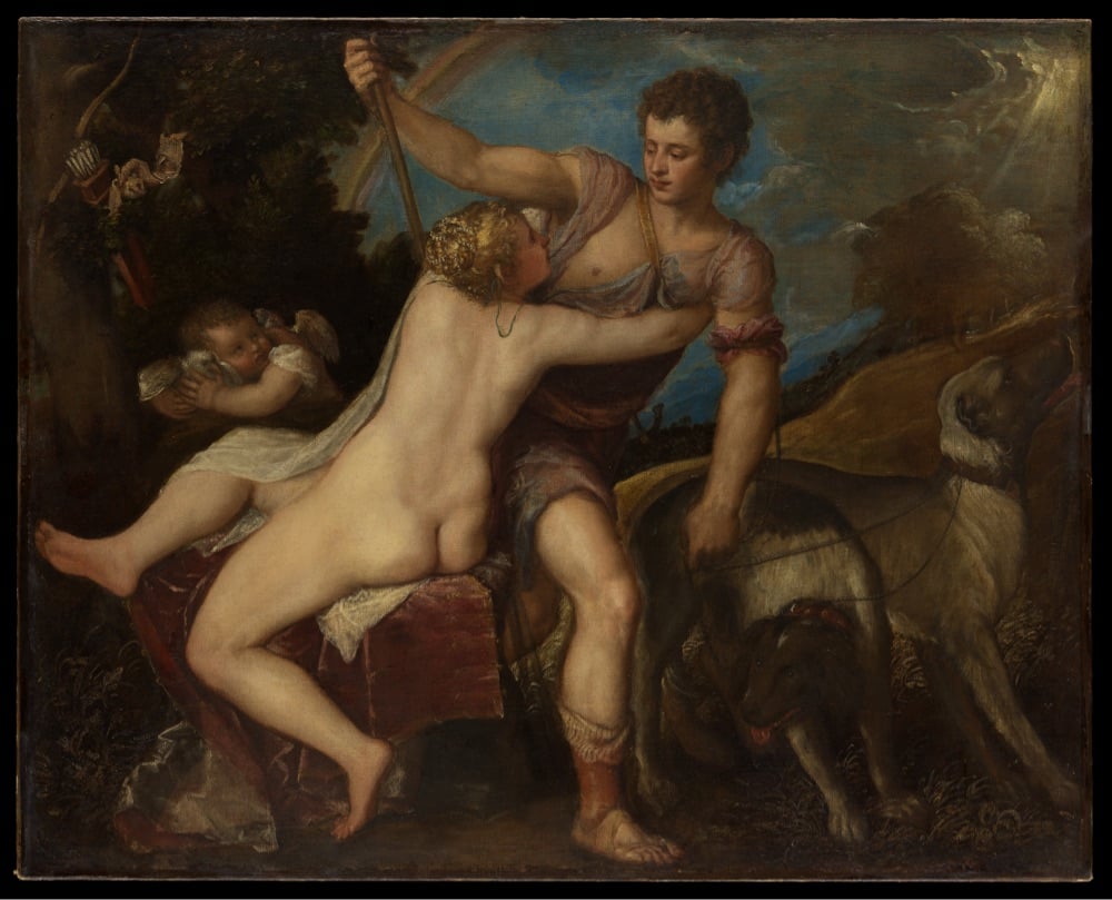
Bringley’s website has a page that lists all the art he mentions in the book, with links to each artwork on the Met’s website. I love this sort of thing from authors — it’s where I found the image at the top of the page: Titian’s Venus and Adonis. You can also book a tour of the museum with Bringley.
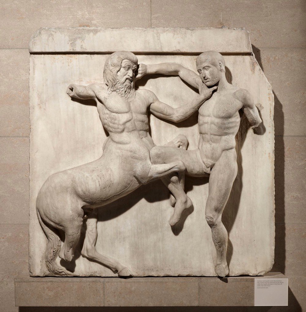
The Greek government and activists have long been calling for the return of the Parthenon Marbles from the British Museum to Greece. But how did the marbles get to Britain in the first place?
In the early 19th century, a British lord named Elgin removed a significant portion of the remaining marble decoration and statuary from The Parthenon in Athens and brought it back to Britain. To cover his debts, he sold the marbles to the British government and they eventually made their way into the British Museum. In the video above, Evan Puschak provides more detail about how it all went down.
For its part, the British Museum isn’t budging, although their official stance on the matter seems defensive, almost like they know they’re on thin ice, morally speaking. It’s long past time the marbles were repatriated and they should just get it over with already.
Update: This is interesting from David Allen Green: the return of the Parthenon Marbles isn’t up to the British Museum.
The fourth point is that the current legislation does make it difficult-to-impossible for the museum to dispose (to use the legal word) of the marbles as it wishes, either by returning them to Greece or otherwise.
An elaborate legal basis could, perhaps be provided, but — on balance — one suspects an English court would rule such a disposal as unlawful.
This means this is not a matter solely for the trustees of the museum (as I explain here).
For the marbles to be returned properly to Greece would require a change in primary legislation, which in turn means it has to have government support (or at least no government opposition).
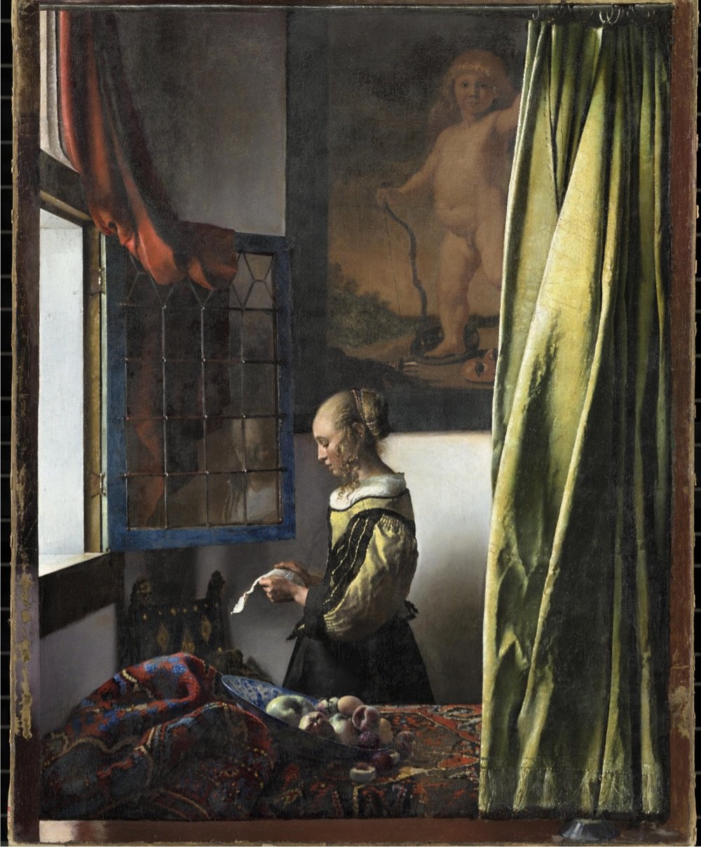
Wow! A forthcoming exhibition at Amsterdam’s Rijksmuseum will bring together 28 of the 37 known paintings by Dutch master Johannes Vermeer, including The Girl with a Pearl Earring. As the museum’s website says: “Never before have so many Vermeers been brought together”.
The exhibition will include masterpieces such as The Girl with a Pearl Earring (Mauritshuis, The Hague), The Geographer (Städel Museum, Frankfurt am Main), Lady Writing a Letter with her Maid (The National Gallery of Ireland, Dublin) and Woman Holding a Balance (The National Gallery of Art, Washington DC).
Works never before shown to the public in the Netherlands will include the newly restored Girl Reading a Letter at the Open Window from the Gemäldegalerie Alte Meister in Dresden.
This is one of the best virtual exhibitions I have ever seen, and I have seen a lot of them. It is written in a personable, light-hearted style that still manages to be incredibly information-rich. The way they zoom into the detail of the paintings to illustrate the commentary is flawlessly paced and takes full advantage of the ultra-high resolution photographs. Fry explains changes Vermeer made based on the most recent imaging and research into his process. There are also annotated areas of each painting which you can click on for a shot of additional information. The notes open in windows that have click-through images, so every note is really multiple notes. Then when you’re done exploring the nooks and crannies, you click back to the main tour and the narration picks up where you left off. Whoever designed this is a content management genius, seriously.
The exhibition runs at the Rijksmuseum from February 10 to June 4, 2023 — but note that The Girl with a Pearl Earring will only be available for viewing until March 30, at which point the painting will return to Mauritshuis in The Hague. I….think I might have to get to Amsterdam to go see this?
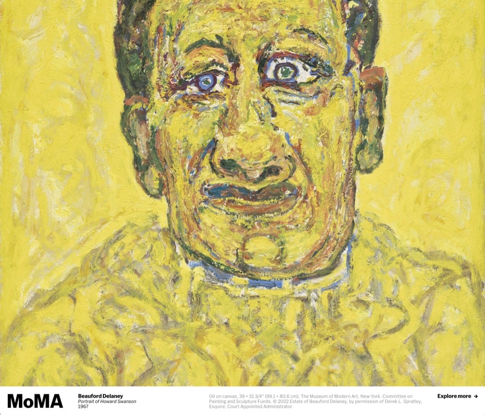
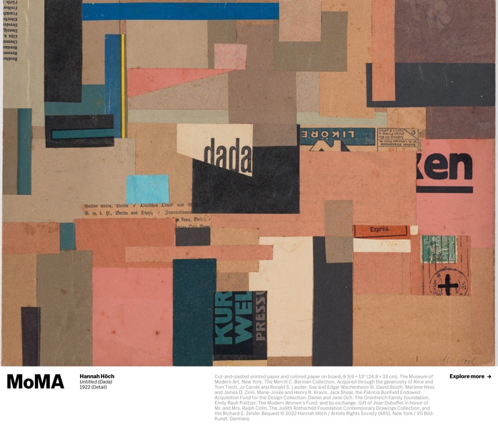
I just switched my web browser to use the New Tab with MoMA extension. Each new browser tab I open contains another piece of art from MoMA’s collection. Here are a few things that have popped up so far:
I’m really enjoying this so far…it feels like being in a slow-moving art history class all day long.
Every few months for the past couple of years, I’ve shared the movies, books, music, TV, and podcasts I’ve enjoyed (or not) recently. Here’s everything I’ve “consumed” since early February, accompanied by a mini review.
How To with John Wilson. What happens near the end of the risotto episode got all the attention, but I’m all about the bag of chips saga. (B+)
Black Art: In the Absence of Light. I can listen to artists and critics talk about art all day long. Also? Everyone in this has impeccable eyewear. (A)
Casino Royale. The best of the Daniel Craig Bonds IMO. (B+)
The Lying Life of Adults by Elena Ferrante. Another marvelously constructed world with vibrant characters by Ferrante. (A)
Wandavision. A love letter to television. Watched this with the kids and we all loved it. (A)
Looper. This is perhaps my favorite type of movie: clever sci-fi with a creative director and good actors that give a shit. (A-)
Sonic the Hedgehog. Jim Carrey is the highlight here and not much else. (C+)
The Remains of the Day. One of my favorite movies. I’ve watched this every few years since 1993 and what I get out of it changes every time. Great book too. (A+)
Zack Snyder’s Justice League. Way too long and nearly pointless. This is what happens when you start treating the director of Legend of the Guardians: The Owls of Ga’Hoole like an auteur. (B-)
A Promised Land by Barack Obama. I recommend the audiobook version of this. You can really tell the bits of the book he cares about and the stuff he phones in a little bit more. The tone of his voice when he talks about Michelle — that love is real. (B+)
Making Sense — The Boundaries of Self. I listened to this conversation with the poet David Whyte at the beginning of March and it was exactly what I needed to hear at that time. I must have listened to his short essay on Friendship about 5 times. (A)
Thunderstruck by Erik Larson. About the invention of the wireless telegraph and the beginning of our abundantly connected world. (B+)
Still Processing - The N Word. The way that Morris and, particularly, Wortham use inclusive language is fascinating. They invite people into the conversation without any loss of insight or critical capability. A bracing rebuttal to the idea that using so-called “woke” language is hamstringing discourse in America. (A-)
Matilda by Roald Dahl. Read this aloud to the kids and was told my rendition was not nearly as good as Kate Winslet’s. (B+)
The Falcon and the Winter Soldier. Less popular with me and the kids than Wandavision. Occasionally fun but also kind of a mess, especially when it comes to the “moral of the story”. (B)
The Talk Show with Craig Mod. Every single second of this 2.5-hour-long conversation between Craig Mod and John Gruber felt like it was created specifically for me. (A-)
Unstoppable. The perfect movie. I wouldn’t change a thing. (A)
Pac-Man 99. A nice update to this venerable game. The kids dismissed it as “too hectic”. (B+)
Fortnite. The perfect game for introverts — you can actually win by cleverly avoiding crowds and then dealing with a much more manageable 1-on-1 situation. But also I am old and there are too many buttons on this controller. (B+)
HazeOver. Recommended to me by Mike Davidson, this macOS app dims background windows to help you focus on your work. (B+)
Titanic. Had to rewatch after Evan Puschak’s video about it. Still an amazingly effective blockbuster movie. (A)
For All Mankind (Season One). So many people have recommended this to me over the past year and I finally got around to watching it. I was hooked within the first 5 minutes. (A)
NYC. So much to say about this city and the resilience of the people who call it home. Still undefeated. (A)
Throughline — The Real Black Panthers. Great podcast on the political agenda and strategy of the Black Panther Party. A natural companion to Judas and The Black Messiah. (A)
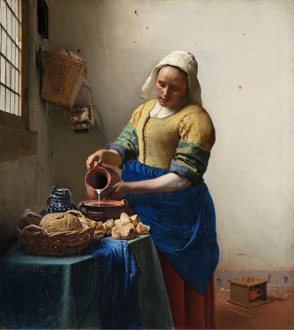
Frick Madison. They have like 10% of the world’s Vermeers in just one room! (B+)
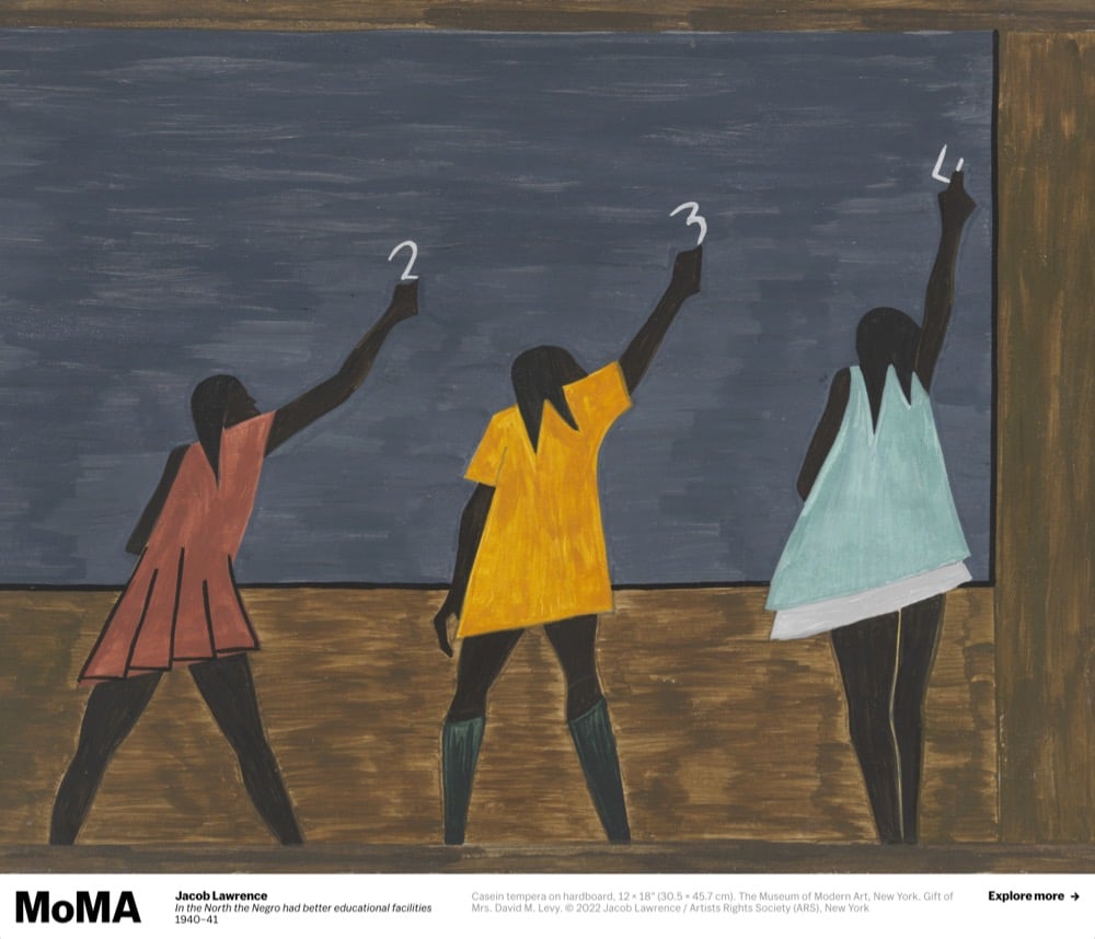
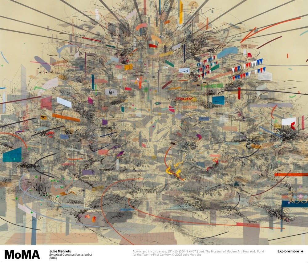
The Whitney. Great to be back here to see the work of Dawoud Bey and Julie Mehretu. (A)
The outdoor dining situation in NYC. The city has to keep this and the pandemic pedestrian areas reclaimed from cars. More room for people, less room for cars. (A)
Fairfax. This is the sister restaurant to my two favorite places in NYC, both of which closed permanently because of the pandemic, and the first restaurant I’ve been to since March 2020. We ate outside, I had too many cocktails, and it was perfect. (A+)
After months of lockdown and closure due to the pandemic, Desus Nice & The Kid Mero go to the Met Museum in NYC to take in some art. Would 100% take a tour of any art museum with these two astute cultural commentators.
Designed for both researchers and curious art lovers, the collections.louvre.fr database already contains more than 482,000 entries, including works from the Louvre and the Musée National Eugène-Delacroix, sculptures from the Tuileries and Carrousel gardens, and ‘MNR’ works (Musées Nationaux Récupération, or National Museums Recovery) recovered after WWII and entrusted to the Louvre until they can be returned to their legitimate owners. For the first time ever, the entire Louvre collection is available online, whether works are on display in the museum, on long-term loan in other French institutions, or in storage.
For the past few years, I’ve been keeping track of everything I read, watch, listen to, and experience in my media diet posts. As a media diet wrap-up, here’s the most compelling content & experiences from 2020, stuff that helped stimulate and sustain me in a year of isolation and pandemic.
Portrait of a Lady on Fire. This was the final movie I saw in a theater before the pandemic hit; I chose well. Not a week has gone by this year that I didn’t think about some aspect or another of this film.
You’re Wrong About. By far my favorite episodic podcast. The joy with which the hosts delight each other with insights and humorous asides is the engine that drives the show. Literally my only complaint: I wish they hadn’t changed the theme music.
The Queen’s Gambit. Seems like everyone watched this miniseries this fall and I loved it just as much as anyone.
The Rain Vortex at Singapore’s Changi Airport. An enchanting oasis in the middle of an airport indicative of Singapore’s incorporation of natural elements into urban spaces.
MASS MoCA. For my birthday, I treated myself with a road trip to this superb museum. The Sol LeWitt, James Turrell, and Jenny Holzer exhibitions alone were worth the trip. I sorely miss museums.
Ted Lasso. Mister Rogers’ Neighborhood + Major League. Who knew you could make radical empathy funny? Everyone I’ve recommended this show to has loved it.
The Land That Never Has Been Yet from Scene on Radio. An essential series on American democracy. Like, do we even have one? It’s hard to choose, but the episode on how the libertarianism of the contemporary Republican Party was the result of a deliberate campaign by just a few people that increasingly came to dominate American politics is my favorite.
Carol. I remember liking this back when it came out, but my rewatch a couple of months ago was a revelation. A remarkable, sparkling film.
Caste by Isabel Wilkerson. Wilkerson has a gift for finding new ways for her readers to think about entrenched systems and behaviors.
Devs. This show got neglected a little in the end-of-year lists because of an early-in-the-pandemic release, but it was one of my top 2-3 shows this year.
The Great. I really enjoyed this Hulu show as I watched it and it’s grown in my esteem in the months since. It’s one of the first shows I recommend when friends ask what I’ve been watching lately. Huzzah!
Nintendo Switch. To distract themselves from the pandemic, did America spend more hours playing video games or watching TV? I did both. Mario Kart 8, Super Mario 35, Rocket League, Fortnite, Minecraft, Among Us, and all the old NES games were popular in our household this year.
Conversations with Friends by Sally Rooney. I found reading difficult for most of the year — I only finished three books in the past 10 months. But this one I couldn’t put down; finished it in two days.
Exhalation by Ted Chiang. Perfect little stories expertly told. Don’t miss the endnotes, where Chiang reveals where the ideas for each of his stories came from.
AirPods Pro. The best augmented reality device yet devised — the music feels like it’s actually in your head more seamlessly than ever before.
Little Women. Fantastic casting, performances, and direction. Waiting patiently for whatever Gerwig does next.
The Splendid and the Vile by Erik Larson. Everything from Larson is great and this book about the Battle of Britain and the triumph of leadership resonated throughout this pandemic year.
Future Nostalgia. I listened to this more than anything else in 2020. Also notable because IMO there are no skippable songs on this album.
Tomidaya shoyu ramen. This tiny ramen shop in the Little Tokyo section of Saigon is supposed to closely resemble Japan shops. One of the best bowls I’ve ever had.
The Mandalorian. I was lukewarm on season one but loved season two. Of all the recent Star Wars things, this show best channels the sometimes goofy/campy magic that made the original movie so compelling.
Forgive me reader, for I have been lazy. It’s been 7 months since I’ve shared a list of the movies, books, music, TV, and podcasts that I’ve been watching/reading/listening to, uh, recently. But I’ve been diligently keeping track1 and so here’s everything I’ve consumed since early May. Warning: soooo much TV and soooo many movies (and bad ones at that) and very few books. At the end of most days — after work, parenting, cooking yet another meal I’m not actually in the mood for, and constantly refreshing Instagram — I just don’t have enough left in the tank for books. (Oh, and as usual, don’t pay too much attention to the letter grades!)
Winds of Change. A fun ride but ultimately kind of empty? (B)
How to Be an Antiracist by Ibram X. Kendi. Perhaps not what you’d expect going in — thought-provoking on almost every page. (A)
The Mirror & the Light by Hilary Mantel. I knew it was coming, Thomas Cromwell’s downfall; it’s historical fact after all. But somehow the actual moment shocked me, despite Mantel’s careful foreshadowing over hundreds of pages. (A)
Normal People. No way in hell was this going to be as good as the book, but they somehow did it. Stellar casting. (A-)
Fleabag Live. I wanted to love this like I loved the TV show but could not get into it. (C+)
Harry Potter at Home. My kids and I listened to this in the car and loved it. (A-)
Watchmen. After admitting I’d stopped watching after a few episodes, several of you urged me to keep going. I finished it but still was not as dazzled as everyone else seemed to be. Maybe if I’d read the graphic novel? (B+)
The Last Dance. I grew up watching and rooting for Jordan and the Bulls, so this was the perfect nostalgic entertainment. Jordan comes off as both more and less of a dick than I remember. (A-)
Beyond Meat. I snuck some of their ground “beef” into a casserole to try it out and see if the kids would notice. They didn’t at first, but once I told them, the three of us agreed that it was not that tasty — and definitely didn’t taste like beef. Plus I had an upset stomach until noon the next day. (C-)
Knives Out. I enjoyed this much more the second time. (A-)
Honeyland. A maddening microcosm of modernity. (A)
The Great. Super fun show from the screenwriter of The Favourite. (A-)
Hamilton. Obviously better in person (and 4 years ago), but the performances and music are so great it doesn’t matter. (A)
Slate Money — Modern Monetary Theory. Really interesting alternate way of thinking about the economy, federal debt, inflation, and taxes. They kinda jumped right into the middle of it though, leaving this interested MMT beginner a little baffled. (B)
12 Monkeys. So very 90s. Brad Pitt is great in this though. (B+)
The Old Guard. Engaging and built for a sequel. But what isn’t these days? (B+)
Cars 2. I’d only ever seen the first 2/3s of this because my then-4-year-old son was so upset that the onscreen baddies were going to kill Lightning McQueen that we had to leave the theater. (B-)
Nintendo Switch. Such a fun little console that doesn’t take itself too seriously. (A-)
Pluto TV. Am I the last person on Earth to find out about this app? Dozens of channels of reruns that you can’t pause and are interrupted by ads, just like old school TV. I’ve been watching far too much old Doctor Who on here. (B+)
Folklore. I don’t really get Taylor Swift and that’s ok. (C)
This Land. Excellent and infuriating — this had me yelling at my car radio. (A)
MASS MoCA. Took a day trip down here back in October. My first museum since Feb. Sol LeWitt, James Turrell, Jenny Holzer, great building, virtually no one here on a weekday — very much worth the 6-hour RT car ride. (A+)
Palm Springs. Groundhog Day + 50 First Dates. (A-)
Kona Honzo. After getting a taste of mountain biking on a borrowed bike, I upgraded to this hardtail. Had some really great rides on it but also stupidly crashed, landed on my face, had to go to the ER, and got 9 stitches on my chin. Would not recommend crashing (stupidly or otherwise, but especially stupidly), but I liked mountain biking enough to get back on the bike a couple of weeks later. (A-)
My Octopus Teacher. As I said previously: “It’s such a simple movie but it packs a surprising emotional wallop and is philosophically rich. Even (or perhaps especially) the bits that seem problematic are thought-provoking.” (A)
His Dark Materials. I like the show but the main character is so irritating that I don’t know if I can keep watching… (B+)
Zama. Maybe surrealist film is not my cup of tea. (B)
AlphaGo. I’d read a lot about the events in this film, but seeing it play out was still gripping and surprising. This and My Octopus Teacher would make a great double feature about the shifting definition of what makes humans human. (A)
The Way I See It. Pete Souza reflects on his proximity to power. (B+)
The Queen. Had to watch this after the Princess Di You’re Wrong About series. (B+)
Tenet. Primer + James Bond. Maybe the pandemic has made me dumber, but this totally confused me. In a bad way — it could/should have been simpler. (B)
Caste by Isabel Wilkerson. A masterful examination of the skin color-based caste system of the United States, compared and contrasted with the caste systems of India and Nazi Germany. (A)
The British Museum contains hundreds of contested items, the spoils of the British Empire’s reach (and smash n’ grab) across the globe. Some of the museum’s most popular and prized items are included: the Parthenon Marbles, the Rosetta Stone, and the Benin Bronzes. The countries from which these artifacts were taken are increasingly asking for their return.
Some of the world’s greatest cultural and historical treasures are housed in London’s British Museum, and a significant number of them were taken during Britain’s centuries-long imperial rule. In recent years, many of the countries missing their cultural heritage have been asking for some of these items back.
Benin City in Nigeria is one of those places. They’ve been calling for the return of the Benin Bronzes, hundreds of artifacts looted in 1897 when British soldiers embarked a punitive expedition to Benin. Many are now housed in the British Museum.
And it’s just the beginning. As the world reckons with the damage inflicted during Europe’s colonial global takeover, the calls for these items to be returned are getting louder and louder.
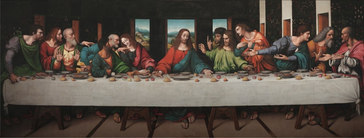
The Royal Academy of Arts and Google teamed up on a high-resolution scan of a copy of Leonardo da Vinci’s The Last Supper painted by his students. Even though the top part of the original is not depicted, this copy is said to be “the most accurate record of the original” and since the actual mural by Leonardo is in poor shape, this copy is perhaps the best way to see what Leonardo intended.
This version was made around the same time as Leonardo made his original. It’s oil paint on canvas, whereas Leonardo’s was painted in tempera and oil on a dry wall — an unusual use of materials — so his has flaked and deteriorated badly. It probably didn’t help that Napoleon used the room where the original hung as a stable during his invasion of Milan.
A zoomable version is available here. The resolution on this scan is incredible. The painting is more than 26 feet wide and this is the detail you can see on Jesus’ downcast right eye:
The genius of Leonardo’s composition is much clearer in the RA copy. The apostles are arranged into four groups of three and there are many subtle interactions between the figures. Leonardo believed that gestures were very important in telling the story. He explained that the power of his compositions were such that “your tongue will be paralysed with thirst and your body with sleep and hunger before you depict with words what the painter shows in a moment”.
There are many elements in the copy which are more distinct that the original, such as the figure of Judas clutching his money bag and knocking over the salt. The landscape beyond the windows with its valleys, lakes and paths is well preserved in the copy, but has almost disappeared in the original. Leonardo’s use of colour was was greatly admired, but in the original the colours are very faded — Saint Simon on the extreme right clearly wears a pink cloak, but this is not visible in the original.
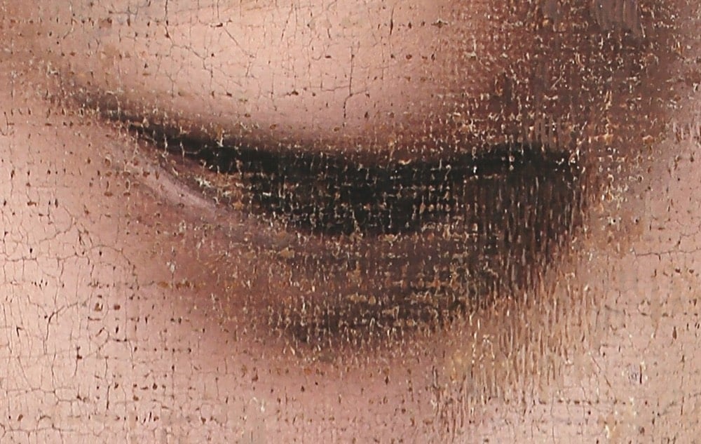
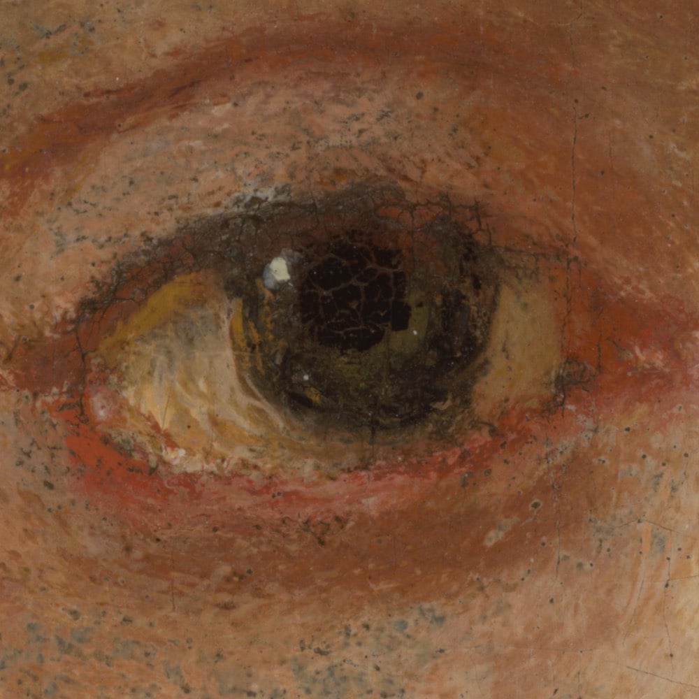
One of Rembrandt van Rijn’s most iconic paintings The Night Watch is currently undergoing restoration at the Rijksmuseum in Amsterdam. As part of the effort, the team took hundreds of photographs of the Dutch master’s painting and stitched them together into a massive 44.8 gigapixel image, which they have released online in a zoomable interface. The level of detail available here is incredible. Here’s the max zoom level on the right eye of the gentleman in the middle, the captain of the company that paid Rembrandt to do the painting:
Crazy right? You can see the brushstrokes better than if you were standing in front of the actual painting in the museum.
The Rijksmuseum’s imaging team led by datascientist Robert Erdmann made this photograph of The Night Watch from a total of 528 exposures. The 24 rows of 22 pictures were stitched together digitally with the aid of neural networks. The final image is made up of 44.8 gigapixels (44,804,687,500 pixels), and the distance between each pixel is 20 micrometres (0.02 mm). This enables the scientists to study the painting in detail remotely. The image will also be used to accurately track any future ageing processes taking place in the painting.
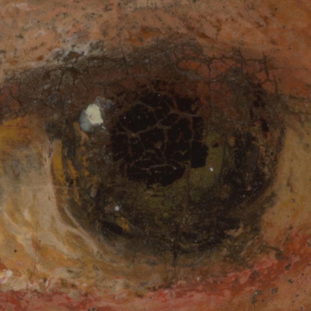
Ok, I told you a little fib just now. Actually, this is his eye at the true maximum zoom level:
Each pixel is 0.02mm across — and keep in mind that this painting is almost 12 feet high and more than 14 feet across. An astounding level of detail and a gigantic image.
As part of a website refresh, The British Museum has made over 1.9 million photos of its collections freely available to the public. Visitors to their online collections website can download images, and share & adapt them for non-commercial purposes under a Creative Commons CC BY-NC-SA 4.0 license. Museum director Hartwig Fischer said of the refresh:
The British Museum Collection Online makes millions of objects accessible to the citizens of the world, wherever they might be. Whether you are a student, an artist, a scholar or are a lover of history and culture, this is an unparalleled resource to explore the richness, diversity and complexity of human history contained in the British Museum’s collection. It is also a platform where we can share the latest knowledge and research. We are delighted to be able to unveil this major revamp early, and hope that these important objects can provide inspiration, reflection or even just quiet moments of distraction during this difficult time.
However useful the new online collection is, it must be noted that the ownership of several of the items in the British Museum’s collection — including the Parthenon Marbles & Rosetta Stone — is disputed.
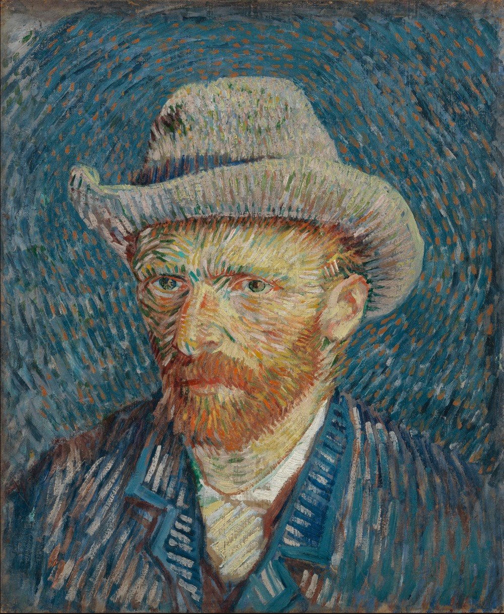
One of my favorite museums I’ve visited in the past few years is the Van Gogh Museum in Amsterdam. Van Gogh’s art career lasted for only 10 years, and the museum provides a fascinating account (through his work, letters, and other material) of how a talented but unremarkable painter made the conceptual breakthrough for which he is now known the world over.
The museum is closed due to the pandemic, but anyone with an internet connection can experience the collection at home thanks to the museum’s dedication to accessibility. This 15-minute tour of the museum filmed in 4K resolution should get you started — here are the first two parts:
For the first time in its 174-year history, the Smithsonian has released 2.8 million high-resolution two- and three-dimensional images from across its collections onto an open access online platform for patrons to peruse and download free of charge. Featuring data and material from all 19 Smithsonian museums, nine research centers, libraries, archives and the National Zoo, the new digital depot encourages the public to not just view its contents, but use, reuse and transform them into just about anything they choose — be it a postcard, a beer koozie or a pair of bootie shorts.
And this gargantuan data dump is just the beginning. Throughout the rest of 2020, the Smithsonian will be rolling out another 200,000 or so images, with more to come as the Institution continues to digitize its collection of 155 million items and counting.
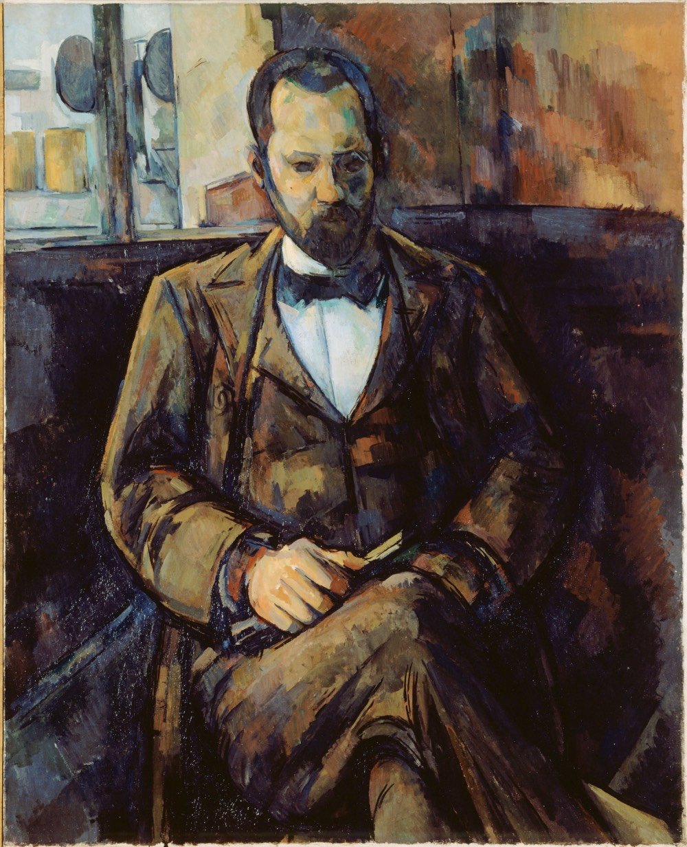
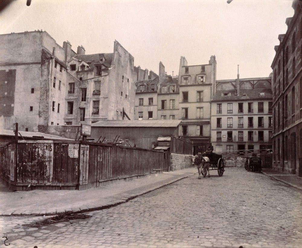
Paris Musées, a collection of 14 museums in Paris have recently made high-res digital copies of 100,000 artworks freely available to the public on their collections website. Artists with works in the archive include Rembrandt, Monet, Picasso, Cézanne, and thousands of others. From Hyperallergic:
Paris Musées is a public entity that oversees the 14 municipal museums of Paris, including the Musée d’Art Moderne de la Ville de Paris, Petit Palais, and the Catacombs. Users can download a file that contains a high definition (300 DPI) image, a document with details about the selected work, and a guide of best practices for using and citing the sources of the image.
“Making this data available guarantees that our digital files can be freely accessed and reused by anyone or everyone, without any technical, legal or financial restraints, whether for commercial use or not,” reads a press release shared by Paris Musées.
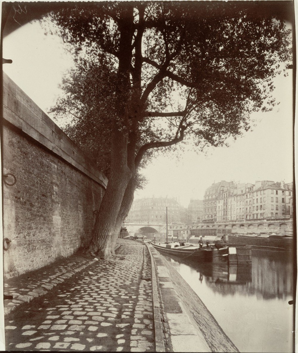
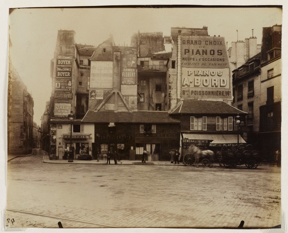
What a treasure trove this is. I was particularly happy to see a bunch of work in here from Eugène Atget, chronicler of Parisian streets, architecture, and residents and one of my favorite photographers.
Like Andy Warhol famously said,1 someday in the far future you might end up in an exhibit in someone else’s natural history museum. That what happens in this short film by Kirsten Lepore, who you may remember from the weirdo Hi Stranger video. (via waxy)
For more than a decade, museums around the world have been making high-quality 3D scans of important sculptures and ancient artifacts. Some institutions, such as the Smithsonian and the National Gallery of Denmark, have forward-thinking programs that freely share their 3D scans with the public, allowing us to view, copy, adapt, and experiment with the underlying works in ways that have never before been possible. But many institutions keep their scans out of public view.
The Louvre, for example, has 3D-scanned the Nike of Samothrace and the Venus de Milo. The Galleria dell’Accademia in Florence 3D-scanned Michelangelo’s David. The Bargello has a scan of Donatello’s David. Numerous works by Auguste Rodin, including the Gates of Hell, have been scanned by the Musée Rodin in Paris. The Baltimore Museum of Art got in on the Rodin action when it scanned The Thinker. The Metropolitan Museum of Art has scans of works by Bernini, Michelangelo, and many others. But instead of allowing them to be studied, copied, and adapted by scholars, artists, and digitally savvy art lovers, these museums have kept these scans, and countless more, under lock and key.
In Berlin, the state-funded Egyptian Museum and Papyrus Collection has a high-quality, full-color 3D scan of the most iconic portrait sculpture ever produced, the 3,364-year-old Bust of Nefertiti. It has held this artifact since 1920, just a few years after its discovery in Amarna, Egypt; Egypt has been demanding its repatriation ever since it first went on display. The bust is one of the most copied works of ancient Egyptian art, and has become a cultural symbol of Berlin. For reasons the museum has difficulty explaining, this scan too is off-limits to the public.
Rather, it was off-limits. I was able to obtain it after a 3-year-long freedom of information effort directed at the organization that oversees the museum.
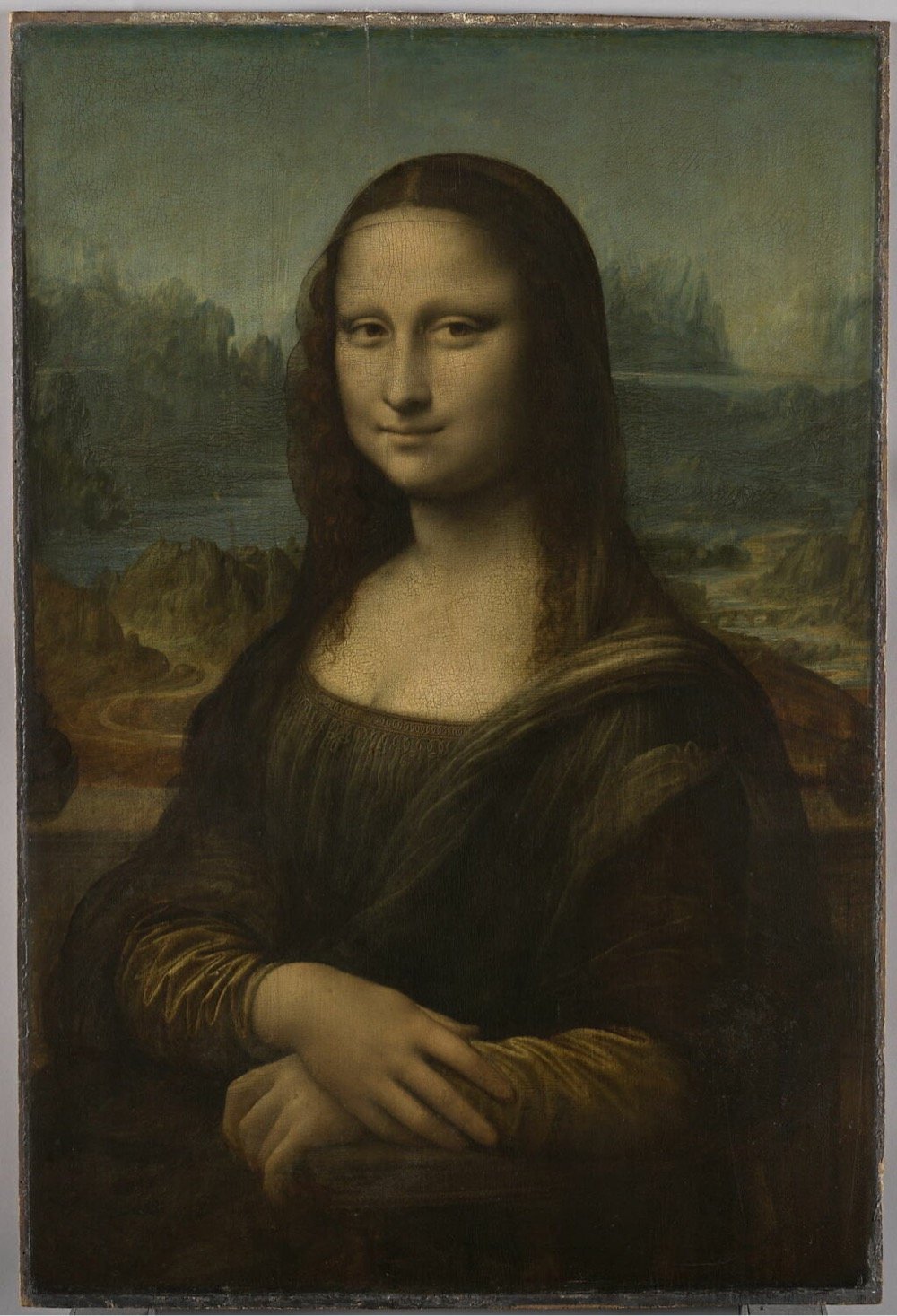
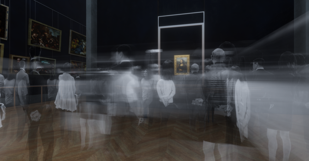
Ok, this post doesn’t have anything to do with boy detective Encyclopedia Brown…I just needed him for the title. In the NY Times, art critic Jason Farago argues that in order to improve the visitor experience at the Louvre, the Mona Lisa and her smile have got to go.
Yet the Louvre is being held hostage by the Kim Kardashian of 16th-century Italian portraiture: the handsome but only moderately interesting Lisa Gherardini, better known (after her husband) as La Gioconda, whose renown so eclipses her importance that no one can even remember how she got famous in the first place.
Some 80 percent of visitors, according to the Louvre’s research, are here for the Mona Lisa — and most of them leave unhappy. Content in the 20th century to be merely famous, she has become, in this age of mass tourism and digital narcissism, a black hole of anti-art who has turned the museum inside out.
Enough!
I visited the Louvre back in 2017 and the Mona-driven crowds were very distracting. I wrote a short review for my media diet:
The best-known works are underwhelming and the rest of this massive museum is overwhelming. The massive crowds, constant photo-taking, and selfies make it difficult to actually look at the art. Should have skipped it.
The Louvre is actually not a good place to look at art and if moving the Mona Lisa to a dedicated gallery elsewhere can help solve that problem, they should do it. (via @fimoculous)
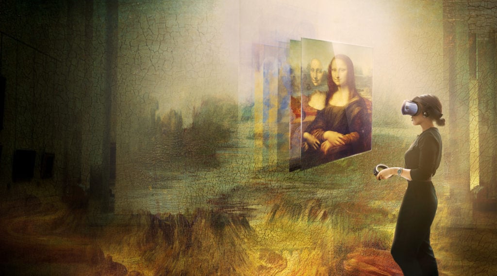
An incredible 80 percent of the Louvre’s 10 million yearly visitors find their way to the Salle des États to catch a glimpse of the Mona Lisa. It’s so popular that it wasn’t included in the ongoing Leonardo da Vinci exhibition, for fear that the bustle to the painting would make it “practically unvisitable.” The curators used the opportunity to put together the museum’s first-ever virtual reality project, offering visitors a seven-minute experience of a work titled Mona Lisa: Beyond the Glass.
Visitors can strap themselves into the state-of-the-art headsets and learn snippets of information about Leonardo’s famous sitter, Lisa del Giocondo, as well as his artistic method and the history of the painting. It will immerse them in what could be the surroundings beyond the frame of what is depicted in Leonardo’s masterpiece, and, at the end, invite them to climb aboard an imagined version of Leonardo’s visionary flying machine—a sketch of which is also included in the exhibition—and soar across the landscape surrounding Mona Lisa’s luxuriant loggia.
An interesting detail to this initiative is that although digital experiences like this are usually meant to broaden a museum’s public and draw more visitors, the Louvre definitely doesn’t need to be better known. They put this project together because “The museum still wants to amplify whatever it does beyond those who can actually set foot in the museum.”
The initiative is part of a broader plan to make culture accessible to a wider public. Efforts have been underway in France to redistribute some of its cultural resources around the country. The French culture minister Franck Riester plans to introduce a number of small-scale digital museums around France that will showcase high-resolution digital copies of works from the country’s 12 national public collections, including the Louvre, with people in remote regions. With more than $3 million invested in the plan, the small digital museums—dubbed “micro-folies”—are expected to number 1,000 within three years.


Stay Connected