Update: From the reaction I’m hearing so far, it’s difficult to tell what was more disappointing to people: Jobs’ keynote or The Sopronos finale. Also, a Keynote bingo was possible (diagonally, bottom left to top right)…no report yet as to whether anyone yelled out during the show.
Update:TUAW is reporting that someone in the crowd yelled “bingo” 35 minutes into the keynote, but if you look at the card, a bingo was only possible when the iPhone widgets were announced towards the end. Disqualified for early non-bingo! (thx, alex)
After working on this — on again and off again, mostly off — for much too long, I’m pleased to say that a significant chunk of kottke.org now has tags (around 5,100 entries are tagged, out of ~13,000). Right now, the only way to access them is through individual tag pages, but after all the bugs are ironed out, I’ll be putting them in different places around the site (front page, main archive page, etc.).
Each tag page lists all the entries1 on the site that are tagged with that particular word…some good examples to start you off are: photography, economics, lists, infoviz, food, nyc, cities, restaurants, video, timelapse, interviews, language, maps, and fashion. Each page also has a list of tags related to that particular tag and further down in the sidebar, you’ll find lists of recently popular tags, all-time popular tags, a few favorite tags of mine, and some random tags…lots of stuff to explore.
I’ve tweaked the design as well: the main column is a little wider, the post metadata look/feel is consistent among short posts and long posts, faint dotted lines now separate all entries, and per-entry tags were added to the post metadata. I’m testing all that out for eventual site-wide use. Questions, comments, bug reports, etc. are welcome…send them on in.
[1] Not all the entries exactly. Until I figure out how to do some pagination, I’ve limited the number of entries to 100 for each tag page. The movies page was more than 1 Mb when all the entries were listed. ↩
Made some long overdue changes to the sidebar on the front page, including an even longer overdue update of the “sites I’ve enjoyed recently”. I used to use that list for my daily browse but it fell into decay when I started reading sites in RSS. Now the list is a random sampling of sites from the current reading list in my newsreader. If things look a little weird, you may need to refresh the stylesheet (do a Shift-reload on the home page).
Panic has released Coda, a new web development app for OS X. Panic co-founder Cabel Sasser describes it thusly:
We build websites by hand, with code, and we’ve long since dreamed of streamlining the experience, bringing together all of the tools that we needed into a single, elegant window. While you can certainly pair up your favorite text editor with Transmit today, and then maybe have Safari open for previews, and maybe use Terminal for running queries directly or a CSS editor for editing your style sheets, we dreamed of a place where all of that can happen in one place.
Ever since I switched to a Mac, I’ve been seeking a suitable replacement/upgrade for Homesite. I limped along unsatisfied with BBEdit and am finally getting into the groove with TextMate, but the inter-app switching — especially between the editor, FTP client, and the terminal — was really getting me down. John Gruber has a nice preview/review of Coda:
Each of Coda’s components offers decidedly fewer features than the leading standalone apps dedicated to those tasks. (With the possible exception of the terminal - I mean, come on, it’s a terminal.) This isn’t a dirty secret, or the unfortunate downside of Coda only being a 1.0. Surely Coda will sprout many new features in the future, but it’s never going to pursue any of these individual apps in terms of feature parity.
The appeal of Coda cannot be expressed solely by any comparison of features. The point is not what it does, but it how it feels to use it. The essential aspects of Coda aren’t features in its components, but rather the connections between components.
Panic’s implicit argument with Coda is that there are limits to the experience of using a collection of separate apps; that they can offer a better experience - at least in certain regards - by writing a meta app comprising separate components than they could even by writing their own entire suite of standalone web apps. Ignore, for the moment, the time and resource limitations of a small company such as Panic, and imagine a Panic text editor app, a Panic CSS editor app, a Panic web browser, a Panic file transfer/file browser app - add them all together and you’d wind up with more features, but you’d miss the entire point.
Panic co-founders Steven Frank and Cabel Sasser both weigh in on the launch. Has anyone given Coda a shot yet? How do you find it? I’m hoping to find some time later today to check it out and will attempt to report back.
I’m not going to lie to you…I didn’t read this whole thing, but I found the sprinkled-in UI redesigns of Amazon’s book listings and other online retail interfaces interesting. (thx, drew)
Following up on my post about gender diversity at web conferences, Jeffrey Zeldman of An Event Apart commissioned a study by hiring “researchers at The New York Public Library to find out everything that is actually known about the percentage of women in our field, and their positions relative to their male colleagues”. “There is no data on web design and web designers. Web design is twelve years old, employs hundreds of thousands (if not millions), and generates billions, so you’d think there would be some basic research data available on it, but there ain’t.” I found the same thing when poking around for a bit back in February. They do have stats for IT workers in general…men outnumber women by over 3-to-1 and that gap is growing.
Update:NY Times: “Yet even as [undergraduate women] approach or exceed enrollment parity in mathematics, biology and other fields, there is one area in which their presence relative to men is static or even shrinking: computer science.” (thx, meg)
Pagination and Page-View Juicing are Evil. “The realistic ones at least admit that it’s a cheap way to boost stats. The disingenuous (or naive) ones actually posit that they are improving readability and usability for their audiences by reducing scrolling. Because scrolling is so hard.” See also my pagination tantrum.
Miranda July, who you might remember from her film Me and You and Everyone We Know, has a book coming out in May, a collection of stories called No One Belongs Here More Than You. The book has a web site that’s one of the most effective and creative I’ve seen in a long time. Here’s a screenshot of one of my favorite pages, just to give you a taste:
The really intriguing thing about the site is that it breaks pretty much every rule that contemporary web designers have for effective site design. The site is a linear progression of images, essentially 30 splash pages one right after another. It doesn’t have any navigation except for forward/back buttons; you can’t just jump to whatever page you want. July barely mentions anything about the book and only then near the end of the 30 pages. There’s no text…it’s all images, which means that the site will be all but invisible to search engines. No web designer worth her salt would ever recommend building a site like this to a client.
Yet it works because the story pulls you along so well; July’s using the site’s narrative to sell a book that is, presumably, chock full of the same sort of narrative. If you think the site sucks and quickly click away, chances are you’re not going to like the book either…it’s the perfect self-selection mechanism. The No One Belongs Here More Than You site is a lesson for web designers: the point is not to make sites that follow all the rules but to make sites that will best accomplish the primary objectives of the site.
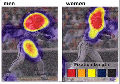
Although both men and women look at the image of George Brett when directed to find out information about his sport and position, men tend to focus on private anatomy as well as the face. For the women, the face is the only place they viewed. Coyne adds that this difference doesn’t just occur with images of people. Men tend to fixate more on areas of private anatomy on animals as well, as evidenced when users were directed to browse the American Kennel Club site.
That is absolutely fascinating. I’d love to hear an evolutionary biologist’s take on why that is.
I’m also heartened by the article’s first featured finding: that tighter writing, more white space, and jettisoning unnecessary imagery helps readers read faster and retain more of what they’ve read.
The New Yorker redesign just went live. Not sure if I like it yet, but I don’t not like it. Some quick notes after 15 minutes of kicking the tires, starting with the ugly and proceeding from there:
Only some of the old article URLs seem to work, which majorly sucks. This one from 2002 doesn’t work and neither does this one from late 2005. This David Sedaris piece from 9/2006 does. kottke.org has links to the New Yorker going back to mid-2001…I’d be more than happy to supply them so some proper rewrite rules can be constructed. I’d say that more than 70% of the 200+ links from kottke.org to the New Yorker site are dead…to say nothing of all the links in Google, Yahoo, and 5 million other blogs. Not good.
The full text of at least one article (Stacy Schiff’s article on Wikipedia) has been pulled from the site and has been replaced by an abstract of the article and the following notice:
The New Yorker’s archives are not yet fully available online. The full text of all articles published before May, 2006, can be found in “The Complete New Yorker,” which is available for purchase on DVD and hard drive.
Not sure if this is the only case or if the all longer articles from before a certain date have been pulled offline. This also is not good.
They still default to splitting up their article into multiple pages, but luckily you can hack the URL by appending “?currentPage=all” to get the whole article on one page, like so. Would be nice if that functionality was exposed.
The first thing I looked for was the table of contents for the most recent issue because that’s, by far, the page I most use on the site (it’s the defacto “what’s new” page). Took me about a minute to find the link…it’s hidden in small text on the right-hand side of the site.
There are several RSS options, but there’s no RSS autodiscovery going on. That’s an easy fix. The main feed validates but with a few warnings. The bigger problem is that the feed only shows the last 10 items, which isn’t even enough to cover an entire new issue’s worth of stories and online-only extras.
Some odd spacing issues and other tiny bugs here and there. The default font size and line spacing make the articles a little hard to read…just a bit more line spacing would be great. And maybe default to the medium size font instead of the small. A little rough around the edges is all.
The front page doesn’t validate as XHTML 1.0 Transitional. But the errors are pretty minor… instead of , not using the proper entity for the ampersand, uppercase anchor tags and the like.
All articles include the stardard suite of article tools: change the font size, print, email to a friend, and links to Digg, del.icio.us, & Reddit. Each article is also accompanied by a list of keywords which function more or less like tags.
Overall, the look of the site is nice and clean with ample white space where you need it. The site seems well thought out, all in all. A definite improvement over the old site.
Every few months, the blogosphere addresses the matter of gender diversity of speakers at conferences about design, technology, and the web. The latest such incidents revolved around the lack of women speakers at the the Future of Web Apps conference in San Francisco last September1 and the Creativity Now conference put on by Tokion in NYC last October. Each time this issue is raised, you see conference organizers publicly declare that they tried, that diversity is a very important issue, and that they are going to address it the next time around.
With that in mind, I collected some information2 about some of the most visible past and upcoming conferences in the tech/design/web space. I’m reasonably sure that the organizers of these conferences were aware of at least one of the above recent complaints about gender diversity at conferences (they were both linked widely in the blogosphere), so it will be interesting to see if those complaints were taken seriously by them.
Web 2.0 Expo 2007
April 15-18, 2007
17 women, 91 men. 16% women speakers.
Future of Web Design
April 18, 2007
2 women, 12 men. 14% women speakers.
4 women, 16 men. 20% women speakers. (updated 3/31/2007)
GEL 2007
April 19-20, 2007
2 women, 11 men. 15% women speakers.
1 woman, 16 men. 6% women speakers. (updated 3/31/2007)
MIX07
April 30 - May 2, 2007
0 women, 4 men. 0% women speakers.
8 women, 89 men. 8% women speakers. (updated 3/31/2007)
The New Yorker Conference 2007
May 6-7, 2007
3 women, 21 men. 13% women speakers. (updated 2/28/2007)
6 women, 29 men. 17% women speakers. (updated 3/31/2007)
Dx3 Conference 2007
May 15-18, 2007
5 women, 48 men. 9% women speakers. (updated 3/2/2007)
5 women, 70 men. 7% women speakers. (updated 3/31/2007)
An Event Apart Seattle 2007
June 21-22, 2007
0 women, 9 men. 0% women speakers.
1 women, 9 men. 10% women speakers. (updated 3/31/2007)
From this list, it seems to me that either the above concerns are not getting through to conference organizers or that gender diversity doesn’t matter as much to conference organizers as they publicly say it does. The Future of Web Apps folks seem to have a particularly tin ear when it comes to this issue. For their second conference, they doubled the size of the speaker roster and added only one woman to the bill despite the complaints from last time. This List of Women Speakers for Your Conference compiled by Jen Bekman is a little non-web/tech-heavy, but it looks like it didn’t get much use in the months since its publication. Perhaps it’s time for another look. (If you think this issue is important, Digg this post.)
Update: To the above list, I added An Event Apart Boston 2007 and corrected a mistake in the count for GEL 2007 (they had one more woman and one less man than I initially counted.) Ryan Carson from Carson Systems, the producers of The Future of Web Apps conferences, emailed me this morning and said that my “facts just aren’t correct” for the count for their London conference. He stated that the number of speakers they had control over was only 13. Some of the speakers were workshop leaders (the workshops “are very different” in some way) and others were chosen by sponsors of the conference, not by Carson Systems. I’m keeping the current count of 27 total speakers as listed on their speakers page this morning…they’re the people they used to promote the conference and they’re the people at the conference in the front of the room, giving their views and leading discussions for the assembled audience. (thx, erik, mark, and ryan)
Update: I added the Future of Web Design conference to the above list. (thx, jeff)
Update: Hugh Forrest wrote to update me on the latest speaker numbers for SXSW Interactive 2007 (he keeps close watch on them because the issue is an important and sensitive one to the SXSW folks)…the ones on their site were less than current. In cases where counts are updated (and not inaccurate due to my counting errors), I will append them to the conference in question so that we can see trends. I plan to update the above list periodically, adding new conferences and keeping track of the speaker numbers on upcoming ones.
[1] Sadly, when I Googled “future of web apps women” while doing some research for this post, Google asked “Did you mean: ‘future of web apps when’”? ↩
[2] All statistics as of 2/22/2007. Consider the gender counts rough approximations…in some cases, I couldn’t tell if a certain person was a man or a woman from their name or bio. ↩
[3] This conference has released only a very incomplete speaker list. ↩
Serious Eats is looking for a web designer who’s familiar with blogs, isn’t afraid of a little PHP code, and is located in (or is planning on relocating to) NYC. Serious Eats is a start-up that is focused on sharing food enthusiasm through blogs and online community. You’ll be working with a fine group of folks. SE is headed up by Ed Levine, who Gourmet editor-in-chief Ruth Reichl calls the “missionary of the delicious” and Meg Hourihan, who co-founded blogger.com and happens also to be married to me. Alaina Browne, formerly of A Full Belly and Mule Design, and Adam Kuban, pizza and burger expert, round out SE’s crew of passionate food people.
Fringe benefits: you can’t imagine all the culinary goodies that make their way into that office everyday. Meg comes home and casually says things like, “oh, we had a private tasting of the new Haagen-Dazs flavors in the office today” all the freaking time. If you’re a web designer with an interest in food, this is your place.
Fuck, this pisses me off: the New Yorker is splitting up their longer pieces into multiple pages (for example: Ben McGrath’s article on YouTube). I know, everyone else does it and it’s some sort of “best practice” that we readers let them get away with so they can boost pageviews and advertising revenue at the expense of user experience, but The New Yorker was the last bastion of good behavior on this issue and I loved them for it. This is a perfect example of an architecture of control in design and uninnovation. I want the New Yorker’s web site to get better, not worse. Blech and BOOOOOOOOOOOOO!!!!
Google launched a new code search feature today. At least two sites already offer this functionality, but a great deal of attention follows Google wherever they go.
Code search is a great resource for web developers and programmers, but like the making available of all previously unsearched bodies of information, it’s given lots of flashlights to people interested in exploring dark corners. Here are some things that people have uncovered already:
Wordpress usernames and passwords. Looks like a lot of these are the result of people zipping/tarring up their Wordpress files and putting the zip/tar file in a publicly accessible directory. I imagine other such applications are just as susceptible to this issue. (via airbag)
Like Movable Type. This only turns up one username/password, but it’s for Gawker. Which in turn reveals this open directory with all sorts of code and u/p goodies…but they restricted access to it after being notified of the problem.
Programmers who want to get a new job. (thx, brian) In the office just now, we were talking about turning Google Code Search into a job posting board by inserting “Like our code? Come work for us!” text ads in the comments of source code which is then distributed and crawled by Google.
Programmers coding while drunk. Also: “I am drunk and coding like I am the greatest coder of all time.” (thx, tom)
Customer databases with names, addresses, zip codes, phone numbers, and weakly encrypted passwords. Ouch. (No link to this one because I don’t really want to get anyone’s data out there.) (thx, jon)
Expression of which programming language sucks more. For instance, Python sucks. (thx, paolo)
When I do a design project, I begin by listening carefully to you as you talk about your problem and read whatever background material I can find that relates to the issues you face. If you’re lucky, I have also accidentally acquired some firsthand experience with your situation. Somewhere along the way an idea for the design pops into my head from out of the blue. I can’t really explain that part; it’s like magic. Sometimes it even happens before you have a chance to tell me that much about your problem! Now, if it’s a good idea, I try to figure out some strategic justification for the solution so I can explain it to you without relying on good taste you may or may not have. Along the way, I may add some other ideas, either because you made me agree to do so at the outset, or because I’m not sure of the first idea. At any rate, in the earlier phases hopefully I will have gained your trust so that by this point you’re inclined to take my advice. I don’t have any clue how you’d go about proving that my advice is any good except that other people - at least the ones I’ve told you about - have taken my advice in the past and prospered. In other words, could you just sort of, you know…trust me?
And I sort of realized that I do design that way. I build up a tremendous amount of background data, let it synthesize, then “blink” it out as a fully-formed solution. It typically works like this:
- Talk to everybody I possibly can about the problem. - Read everything that would even be remotely related to what I’m doing. Hang charts, graphs, diagrams, and screenshots all over my office. - Observe user research; recall past research. - Stew in it all, panic as deadline approaches, stop sleeping, stop eating. - Be struck with an epiphany. Instantly see the solution. Curse my tools for being too slow as I frantically get it all down in a document. - Sleep for three days.
Like I said when I first read Jeff’s piece, in my experience, a designer gets the job done in any way she can and then figures out how to sell it to the client, typically by coming up with an effective (and hopefully at least partially truthful) backstory that’s crammed into a 5-step iterative process, charts of which are ubiquitous in design firm pitches.
TechCrunch reports on FlySpy, a site that will help people buy the lowest priced airplane ticket for a given destination:
The way it works is that I give it a departure city and a destination city and optionally a departure date and length of stay. The search result, which returns very quickly, will present me with a graph of flight prices over the next 30 days so that I can quickly look at which days are the cheapest to fly. To book a flight I just click on the point in the graph. Simple.
That’s a pretty useful UI innovation (especially if you’re able to drill down into individual days to find the lowest fare on that day), but it doesn’t help you much if your travel dates are inflexible. The killer airline reservation app that I’ve been wanting for several years would tell you when to buy your ticket for a particular flight. Airlines update their fares several times a day and hundreds of times over the course of a month. Depending on when you buy, it might cost you $250 or $620 for the same exact ticket.
What this hypothetical app would do is track fare histories and then release forecasts based on those histories. If you want a RT to SFO from JFK on 4/12/06 returning 4/17/06, the site would tell you to buy your ticket three weeks out or when the price hits $298, whichever comes first, but to never wait until the week before, when similar flights begin to sell out.
A thornier problem than the one FlySpy addresses, but it could save people a lot of money. (This would work for hotels and rental cars as well probably, although I don’t think their prices fluctuate as much.)
Note: If you are a member and tried to log in, it didn't work, and now you're stuck in a neverending login loop of death, try disabling any ad blockers or extensions. Or try logging out and then back in. Still having trouble? Email me!
Socials & More