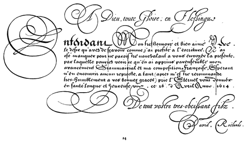
So you think you can kern?
Kern Type is a game that compares your kerning efforts to those of professional designers. It’s surprisingly fun. (thx, damien)
This site is made possible by member support. 💞
Big thanks to Arcustech for hosting the site and offering amazing tech support.
When you buy through links on kottke.org, I may earn an affiliate commission. Thanks for supporting the site!
kottke.org. home of fine hypertext products since 1998.
Beloved by 86.47% of the web.
Kern Type is a game that compares your kerning efforts to those of professional designers. It’s surprisingly fun. (thx, damien)
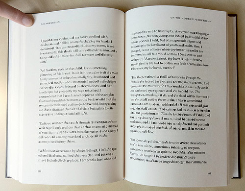
From Fathom, a copy of Mary Shelley’s Frankenstein constructed from found type on the web…as the book goes on, the type gets less legible.
The incomplete fonts found in the PDFs were reassembled into the text of Frankenstein based on their frequency of use. The most common characters are employed at the beginning of the book, and the text devolves into less common, more grotesque shapes and forms toward the end.
When I heard the news, my immediate reaction was not positive. There may have been an expletive uttered. I am happy for the crew at Typekit, several of whom are my friends, but Adobe products do not fill me with joy when I use them. No one I know is filled with joy when using Adobe products…mostly the opposite. Typekit is a great service; I hope Adobe keeps it that way.
Moritz Resl took all of the fonts installed on his computer and averaged them together to make a new font: the average font.
The full alphabet is available on Flickr. (via stellar)
Absolutely beeeeeyooootiful typography on these Sanborn fire insurance maps.
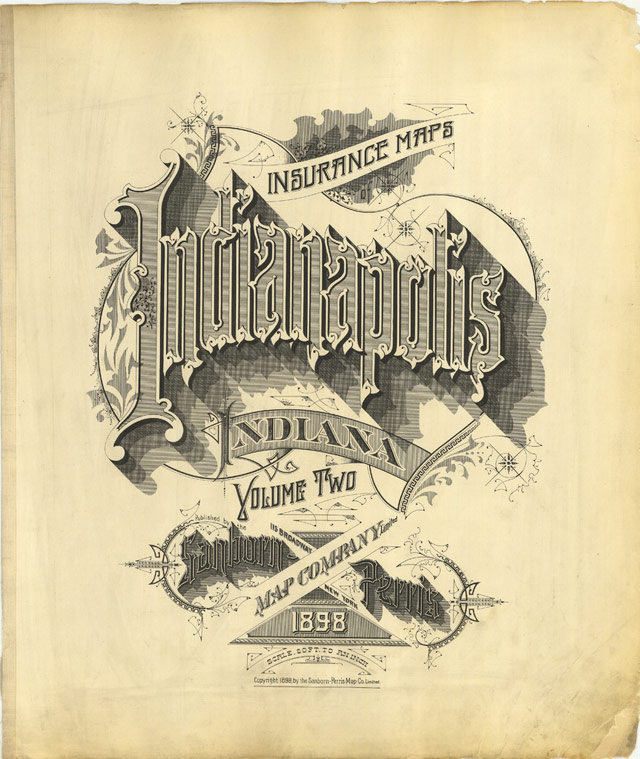
Sanborn’s fire insurance enterprise produced not only excellent and detailed urban maps, but they also maintained an elegant aesthetic in the headings and legends on the maps themselves, and in the title pages of the (larger) city volumes. The ornamental flair is diverse — I don’t think any of the examples above repeat type styles — and lends an air of individuality and refinement to each of the towns surveyed.
Although this sort of artistic embellishment was unlikely to have increased map sales on its own, it’s a charming addition which will have perhaps made the purchasers feel a sense of pride and a little more secure about their own unique town. And it’s certainly in keeping with the cartographic tradition of decorative trimmings.
Chris Ware must have a stack of these babies near his drawing table from which to crib.
Christian Boer designed a typeface especially for dyslexics called dyslexie.
Research by the University of Twente indicates that the typeface decreases reading errors by dyslexics.
Andy Clymer of H&FJ built a prototype tool that uses facial recognition to design fonts.
(via h&fj)
I love these two related typefaces by Klim Type Foundry: Metric and Calibre.
Metric & Calibre are a pair of typefaces that share a fundamental geometry yet differ in the finish of key letterforms. Metric is a geometric humanist, sired by West Berlin street signs. Calibre is a geometric neo-grotesque, inspired by the rationality of Aldo Novarese’s seldom seen Recta. They were conceived as a pair but function independently of each other.
The development of Metric & Calibre is based upon two ideas-1: “engineered geometry” and it’s application to street signage, 2: alternate letterforms in typefaces.
(via df)
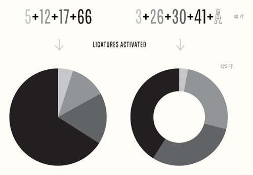
Chartwell is a type family you can use to build all kinds of graphs and charts. Stringing letters and numbers together into ligatures, you can make things like this:
As you might have heard, MoMA recently acquired 23 typefaces for its Architecture and Design collection. I was curious about how such an acquisition works, so I sent a quick email to Jonathan Hoefler, one of the principals at Hoefler & Frere-Jones, a New York City type foundry that contributed four typefaces to the MoMA.
Kottke: Three of the four H&FJ typefaces acquired by MoMA are available for purchase on your web site. Did they just put in their credit card info and voila? Or was there a little more to it?
Hoefler: MoMA’s adopting the fonts for their collection was much more complex than buying a copy online (and not only because Retina, one of our four, isn’t available online.) I should start by stating that you can never actually “buy fonts” online: what one can buy are licenses, and the End-User License that surrounds a typeface does not extend the kinds of rights that are necessary to enshrine a typeface in a museum’s permanent collection. The good news is that H&FJ has become as good at crafting licenses as we have at creating typefaces, an unavoidable reality in a world where fonts can be deployed in unimaginable ways. This was a fun project for our legal department.
It was actually a fascinating conversation with MoMA, as we each worked to imagine how this bequest could be useful to the museum for eternity. What might it mean when the last computer capable of recognizing OpenType is gone? What will it mean when computers as we know them are gone? How does one establish the insurance value of a typeface: not its price, but the cost of maintaining it in working order? Digital artworks are prone to different kinds of damage than physical ones, but obsolescence is no less damaging to a typeface than earthquakes and floods to a painting. On the business side there are presumably insurance underwriters who can bring complex actuarial tables to bear on the issue, but I think it’s an even more provocative issue for conservators. 472 years after its completion, the frescoes of the Sistine Chapel underwent a restoration that scholars still find controversial. What might it mean for someone to freshen up our typefaces in AD 2483?
—
Thanks, Jonathan.
Researchers at Princeton have found evidence that making something more difficult to learn improves long-term learning and information retention. More specifically, changing the typeface from something legible (like Helvetica) to something more difficult to read (like Monotype Corsiva or Comic Sans) increased retention in actual classroom settings.
This study demonstrated that student retention of material across a wide range of subjects (science and humanities classes) and difficulty levels (regular, Honors and Advanced Placement) can be significantly improved in naturalistic settings by presenting reading material in a format that is slightly harder to read…. The potential for improving educational practices through cognitive interventions is immense. If a simple change of font can significantly increase student performance, one can only imagine the number of beneficial cognitive interventions waiting to be discovered. Fluency demonstrates how we have the potential to make big improvements in the performance of our students and education system as a whole.
I agree with Lehrer…get David Carson on the horn. (thx, lara)
Matt Jacobs has made a bookmarklet that you can use to find out which Typekit fonts a given site uses. Useful!
Here’s a teaser trailer:
From the film’s website:
Linotype: The Film is a feature-length documentary film centered around the Linotype typecasting machine invented by Ottmar Mergenthaler. Called the “Eighth Wonder of the World” by Thomas Edison, the Linotype revolutionized printing and society, but very few people know about the inventor or his fascinating machine.
The Linotype completely transformed the communication of information similarly to how the internet is now changing it all again. Although these machines were revolutionary, technology began to supersede the Linotype and they were scrapped and melted-down by the thousands. Today, very few machines are still in existence.
(via df)
A tour of the level of detail that goes into Hoefler & Frere-Jones’ fonts.
In the middle of Gotham, our family of 66 sans serifs, there is a hushed but surprising moment: a fraction whose numerator has a serif. So important was this detail that we decided to offer it as an option for all the other fractions, a decision that ultimately required more than 400 new drawings. Why?
As you’ll read below, it’s something that we added because we felt it mattered. Even if it helped only a small number of designers solve a subtle and esoteric problem, we couldn’t rest knowing that an unsettling typographic moment might otherwise lie in wait. We’ve always believed that a good typeface is the product of thousands of decisions like these, so we invite you to join us on a behind-the-scenes look at some of the invisible details that go into every font from H&FJ.
Aspirational.
Want to see the state of the art in web design using web fonts and Typekit? Check out Lost World’s Fairs. It’s all good, but Frank Chimero really knocked it out of the park with the 1962 Atlantis World’s Fair. With HTML5 and web fonts, experimentation with web design seems open and fun again; reminds me of the 90s a bit.
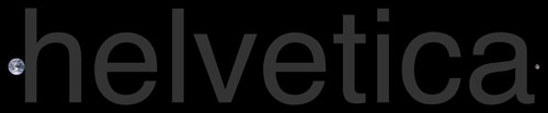
Back in July, Ben Terrett wrote a post about how many instances of the word “helvetica” set in unkerned 100 pt Helvetica it would take to go from the Earth to the Moon:
The distance to the moon is 385,000,000,000 mm. The size of an unkerned piece of normal cut Helvetica at 100pt is 136.23 mm. Therefore it would take 2,826,206,643.42 helveticas to get to the moon.
But let’s say you wanted to stretch one “helvetica” over the same distance…at what point size would you need to set it? The answer is 282.6 billion points. At that size, the “h” would be 44,600 miles tall, roughly 5.6 times as tall as the Earth. Here’s what that would look like:
The Earth is on the left and that little speck on the right side is the Moon. Here’s a close-up of the Earth and the “h”:
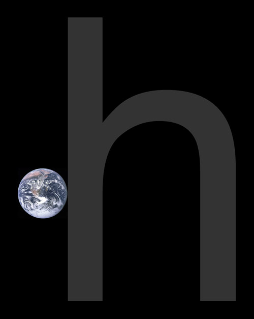
And if you wanted to put it yet another way, the Earth is set in 50.2 billion point type — Helvetically speaking — while the Moon is set in 13.7 billion point type. (thx, @brainpicker)
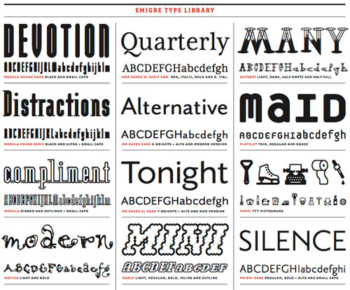
A list of the most important typefaces of the last decade.
It is not a list of my favorite typefaces, nor is it a list of the most popular typefaces. Instead, it is a list of typefaces that have been “important” for one reason or another. However, I am not going to provide my reasons. Instead, I am going to let the readers of this blog see if they can figure out the contribution that each of these ten faces makes.
Great song by Cee-Lo, who you may know as one half of Gnarls Barkley.
NSFW in both the visual and audio departments for extensive use of the phrase “fuck you”.
I love Anil’s comment that the video is “a little bit Tobias, and a little bit Sasha”. And indeed the typeface in the video is Champion Gothic, designed by Tobias Frere-Jones’ partner, Jonathan Hoefler.
This is the origami alphabet:
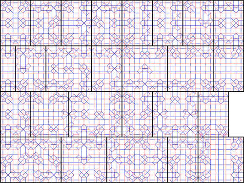
When a piece of paper is folded according to these directions, a 3-D extrusion of the alphabet will result. The alphabet’s creators have also devised an alphabet made by the hinged dissection of a square.
From Google Books. Here’s a sample page:
(via ministry of type)
Yulia Brodskaya makes elaborate typographic creations entirely out of paper. She calls them PAPERgraphics.
This is like Si Scott in 3-D.
The Department of Architecture and Design at MoMA has made a, er, symbolic acquisition of the @ symbol.
The acquisition of @ takes one more step. It relies on the assumption that physical possession of an object as a requirement for an acquisition is no longer necessary, and therefore it sets curators free to tag the world and acknowledge things that “cannot be had” — because they are too big (buildings, Boeing 747’s, satellites), or because they are in the air and belong to everybody and to no one, like the @ — as art objects befitting MoMA’s collection. The same criteria of quality, relevance, and overall excellence shared by all objects in MoMA’s collection also apply to these entities.
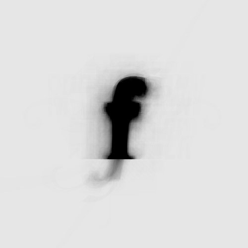
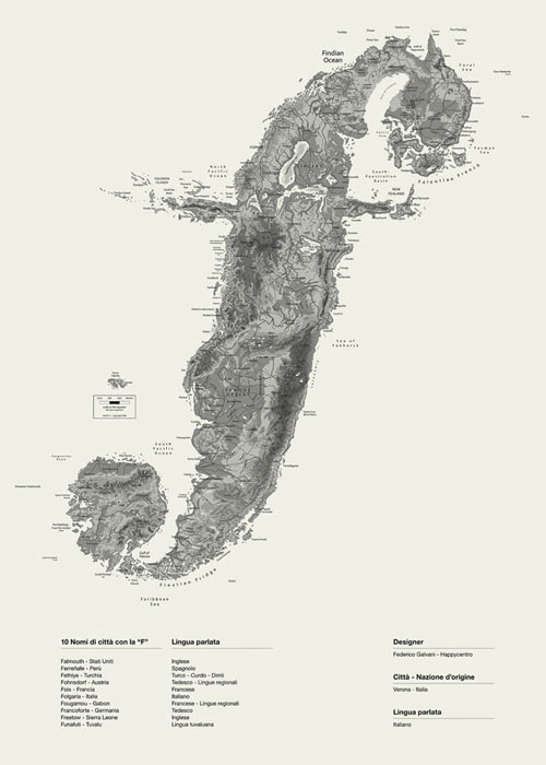
I like these Alphaposters by Happycentro, especially the gorgeous Lowercase F Island:
Clever idea: you can measure the amount of ink required to print different typefaces simply by writing them out with ballpoint pens. The pens themselves become the usage graph:
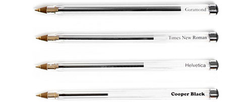
Update: You can also use this technique to represent which colors you draw with most often.
Over at Bygone Bureau, Nick Martens puts on his palaeotypography hat and plunges into the Oxford English Dictionary to learn about the history of typography.
To beat fat, 1683, “If a Press-man Takes too much Inck with his Balls, he Beats Fat.”
A lengthy discussion of the typeface for the London Underground, both the old version by Edward Johnston as well as the refresh.
“We continue to make subtle changes” Ashworth admits, “but we’re very wary about doing too much and are always happy to roll back changes if they end up not feeling ‘right.’
“The most recent major change was to the numbers 1 and 4 earlier this year. Not a lot of people noticed until a poster appeared advertising engineering work on the 14th of February — then I got A LOT of emails.”
Socials & More