kottke.org posts about remix
Last week, I linked to a video mashup by Bill McClintock of several metal songs, saying “although the video was posted a day or two before Ozzy Osbourne died, it feels like a fitting tribute to one of metal’s true pioneers”. This morning, YouTube helpfully informed me that McClintock had since done a proper tribute in the form of a compilation of every Ozzy/Sabbath-related video mashup he’d ever done.
Rest in darkness, Ozzy. 🤘
This is a great 5-minute mashup of several metal and metal-adjacent songs from artists like NIN, Metallica, Rage Against the Machine, KISS, Dio, Black Sabbath, and Soundgarden. Even if you don’t care for metal, I feel confident that you’ll enjoy this anyway — it’s a bop. Here’s the track list:
Nine Inch Nails - Terrible Lie
Rage Against the Machine - Killing in the Name
Dio - Holy Diver
Soundgarden - Outshined
Judas Priest - Hot Rockin’
KISS - All Hell’s Breakin’ Loose
Pantera - 5 Minutes Alone
Black Sabbath - Into the Void
Billy Squier - The Stroke
Judas Priest - You’ve Got Another Thing Comin’
Alice in Chains - Them Bones
Metallica - Sad But True
Although the video was posted a day or two before Ozzy Osbourne died, it feels like a fitting tribute to one of metal’s true pioneers. (via neatorama)
This video feels like a throwback to a simpler time on YouTube: 331 film clips edited together to recreate Eminem’s Lose Yourself. A particularly well-done example of a time-worn genre. I lol’d at “let it go!!”
I love me some Wallace & Gromit and so I was delighted to see that this guy made a real life version of Wallace & Gromit’s breakfast machine, complete with a spoonful of jam flying through the air perfectly meeting a piece of toast popping out of a toaster.
It starts with this crazy part here, where he falls out of bed into a pair of trousers, landing in a chair, and then his sleeves go on, and the vest. And then, probably the hardest part of all, is throwing jam — through the air — and hitting toast — in the air — perfectly. Some of these stunts are going to be the most challenging things I’ve ever attempted.
Cracking toast, Gromit! (via the kid should see this)
Do yourself a favor and watch this: Erin Morton is a junior in the BFA Musical Theatre program at the University of Cincinnati College-Conservatory of Music and she absolutely blisters the paint off of the walls with her performance of Radiohead’s Creep. Wow. I actually got some goosebumps watching this.
BTW, other contenders for best Creep cover include Prince and a 1600-person pub choir.
While not nearly as popular as his amazing rendition of NIN’s Hurt, Johnny Cash’s stripped-down cover of Depeche Mode’s Personal Jesus is fantastic. Both songs are from Cash’s sixty-seventh studio album, American IV: The Man Comes Around (Spotify, Apple Music), which was the last one to be released before his death.
In case you want to listen to Johnny Cash all morning, here’s that version of Hurt and Bridge over Troubled Water (with Fiona Apple):
Oh, and his cover of The Beatles’ In My Life:
This is a lovely cover of Bush’s Glycerine by Allison Lorenzen and Midwife, set to a poignant series of very short videos of everyday life. Give this 20 seconds of your complete attention and you’ll watch the whole thing, I promise. (via @mariabustillos.com)
In a recent episode of The Simpsons, Bart becomes a DJ and KDO favorites The Hood Internet wrote the music and did all of Bart’s mixes. They also made a ending credits remix of some of the most memorable Simpsons songs, including See My Vest, Mr. Plow, Do the Bartman, We Do (the Stonecutters song), Dr. Zaius, and The Monorail Song:
(via @unlikelywords.bsky.social)
A couple of weeks ago, I posted a YouTube video of Doechii singing and rapping about anxiety over Gotye’s Somebody That I Used To Know from 2019 that was going viral on Insta and TikTok. Well yesterday, Doechii officially released Anxiety as a single, so you can find it on YouTube (though I prefer the original video), Spotify, Apple Music, and anywhere else you stream or buy music.
P.S. Here’s Doechii doing a CATFISH / DENIAL IS A RIVER medley at the Grammys last month:
And of course, you can check out her Tiny Desk Concert too.
Apple TV+ is streaming an 8-hour remix of the Severance theme by ODESZA that is perfect music for your innie to refine macrodata to. The workday-long video is a 23-minute mix that’s looped and set to footage from the show. Legit adding this to the work music rotation. (via @margarita.bsky.social)
I can already tell this is going to be my favorite thing of the day: Doechii singing and rapping about anxiety over Gotye’s Somebody That I Used To Know from 2019. If you didn’t know she could sing, well you do now.
If my math is right, Doechii was 21 in this video, living in NYC, vlogging about going to thrift stores (on her old YouTube channel that only has a little over 9,000 subscribers), and working hard on her music. I think it paid off?
P.S. This video from 2015 of Doechii in high school singing Do You Want to Build a Snowman? with her friends is super sweet.
Oh this is just delightful: for the opening of his documentary film on the history of music on SNL he co-directed with Oz Rodriguez, Questlove produced what the NY Times calls “a high-speed, six-minute DJ mix of SNL music highlights”. So. Good.
From the same piece in the Times, Questlove explains how it came about:
It’s impossible for me to phone anything in, even if I wanted to. I just wanted to throw the ultimate D.J. gig and hook you in from the gate. It started off small, and it couldn’t stop.
In the beginning, I was just going in five-year intervals — what’s the three strongest moments between ‘75 and ‘80? — and do it that way. But I’m so programmed as a D.J. it’s physically impossible for me to gather a group of songs together and not start — that’s my version of improvisation. And once you put, like, 17 songs together, you have a conversation with yourself: “OK, are we really doing this?”
My producers said: “It’ll never happen! The clearance, the clearance!” This is the first time that I realized my diplomatic position in music. People say, “Ahmir, you might be the next Quincy Jones, because your whole thing is more social than creative, knowing the right people, knowing who’s who.” There were at least 19 situations in which I had to come hat in hand to said person, and mind you, this is for two seconds — Michael Bolton singing “Love Is a Wonderful Thing” just once.
He got every clearance except for Luciano Pavarotti:
The only outright no that I couldn’t fix was that Luciano Pavarotti was going to be part of the Bobby McFerrin-Busta Rhymes mash-up. But it was too much to explain to his estate, and I couldn’t go to Italy and whatever. It could have been brilliant, Bobby McFerrin and Pavarotti going toe to toe.
The film premieres tonight on NBC and will be available on Peacock starting tomorrow.
Update: According to Questlove’s Instagram post, the musical montage was edited by John MacDonald, Coordinating Producer of The Tonight Show. (via @solace.bsky.social)
Update: The YouTube video is now barely watchable — 2/3s of the screen is blurred. You’ll have to watch the film on Peacock to get the full experience.
Following on from last year’s successful trial, the Australian Open is once again broadcasting all their matches, nearly live and in their entirety, on YouTube — but with animated avatars in place of the players. Here’s how it looks in practice, kind of Wii Tennis; this is a match between Coco Gauff and Jodie Burrage from a few days ago (the animation starts just before the 35-minute mark:
The matches are only delayed by two minutes (the system needs some rendering time) and viewers get to hear the the audio & commentary from the actual match. From The Guardian:
The technology made its debut at the grand slam last year and audiences peaked for the men’s final, the recording of which has attracted almost 800,000 views on YouTube. Interest appears to be trending up this year and the matches are attracting roughly four times as many viewers than the equivalent time in 2024.
The director of innovation at Tennis Australia, Machar Reid, said although the technology was far from polished it was developing quickly. “Limb tracking is complex, you’ve got 12 cameras trying to process the silhouette of the human in real time, and stitch that together across 29 points in the skeleton,” he said. “It’s not as seamless as it could be – we don’t have fingers – but in time you can begin to imagine a world where that comes.”
Re: not seamless, here’s a recent blooper reel:
Back in 2023, the NFL and Disney collaborated on a Toy Story version of an NFL game, the NHL broadcast an animated hockey game in 2024, and last month the NFL did another animated broadcast with characters from The Simpsons playing key roles.
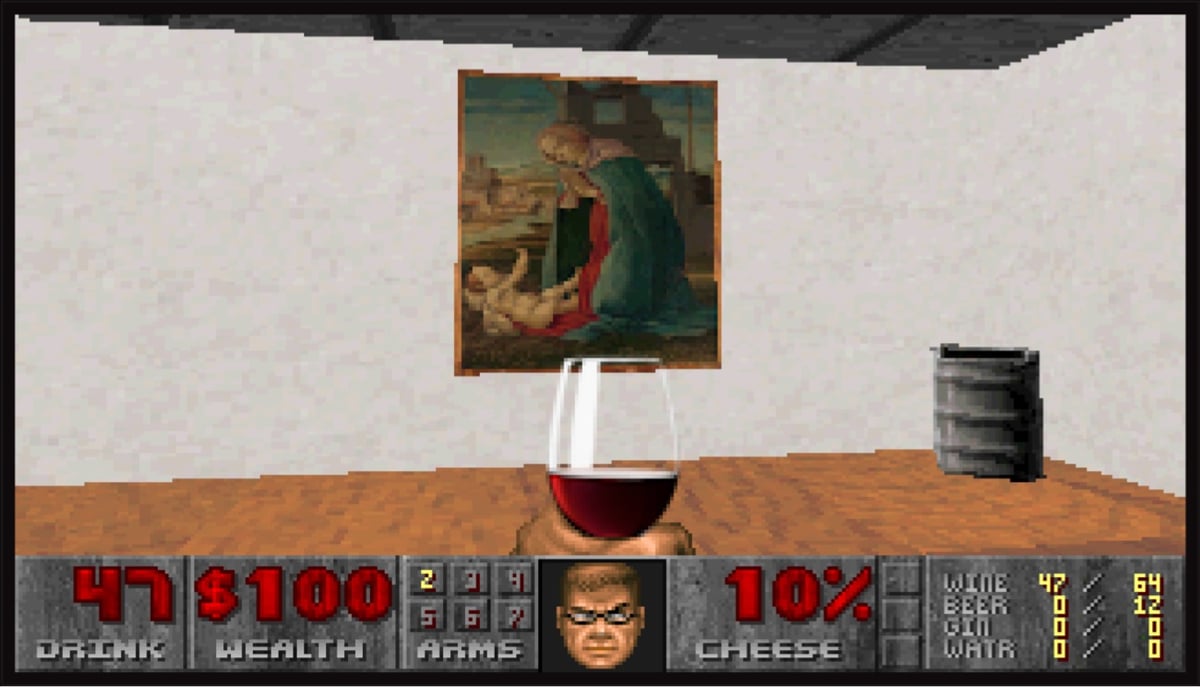
Have you ever wanted to browse art from the Metropolitan Museum in a first-person shooter interface? You are in luck because DOOM: The Gallery Experience exists.
DOOM: The Gallery Experience was created as an art piece designed to parody the wonderfully pretentious world of gallery openings.
In this experience, you will be able to walk around and appreciate some fine art while sipping some wine and enjoying the complimentary hors d’oeuvres in the beautifully renovated and re-imagined E1M1 of id Software’s DOOM (1993).
They sourced the art from the Met’s Open Access collection and in the game you can click through to see each piece on the Met’s website. Here’s a video of the gameplay:
And of course people are speedrunning it. (via waxy.org)
I’ve shared animator Nick Murray Willis’ videos before — he takes snippets of sound & dialogue from sports commentary & movies and creates context-shifted animations from them. For instance, in the two videos above with football (soccer) commentary, a commentator’s chant of “Messi, Messi, Messi” becomes a French street performer thanking the crowd (“merci, merci, merci”).
(Ok, I’ve caught myself attempting to explain humor, so I’m gonna wrap this up by urging you to watch the videos if you want.)
Sleepy Skunk’s end-of-the-year movie trailer mashups are always worth a look. This year’s installment got me wondering how many of these movies I’ve actually seen — not that many, I don’t think. (via @rands)
A Japanese group called Electronicos Fantasticos! figured out that by connecting a supermarket barcode scanner to a powered speaker and rhythmically scanning barcode-like patterns with it, you can make music. This is so fun!
Oh man this is so great: electronic music sample breakdowns from 1990 until the present day. The visualizations on these are fantastic — just watch a bit of the first one (Groove Is In The Heart) and you’ll see what I mean. They’re not all that great (some of these producers are out here working harder than others, is what I’m saying), but these are some of my favorites:
- Groove Is In The Heart by Dee-Lite (Eva Gabor Green Acres sample!)
- Firestarter by The Prodigy (sample from The Breeders?)
- Praise You by Fatboy Slim (It’s a Small World from Mickey Mouse Disco? Fat Albert Theme?!)
- One More Time by Daft Punk
- Robot Rock by Daft Punk
- Archangel by Burial
- First of the Year by Skrillex
- Girl by Jamie xx
- Pick Up by DJ Koze
- leavemealone by Fred again
Is DJ Shadow electronic? I would have liked to have seen something from Endtroducing… but maybe they couldn’t even locate the samples. 😂
I could have also gone for more Daft Punk, but I guess you need to let others have a shot. Luckily the same channel has breakdowns of a few more Daft Punk tunes from Discovery and an extended breakdown of One More Time.
Also from the same channel (and even better IMO): The Most Iconic Hip-Hop Sample of Every Year (1973-2023).
See also The Making of Burial’s Untrue.
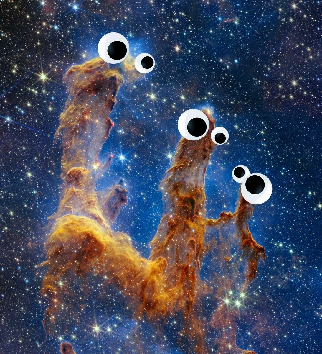
I know astronomical imagery is on the verge of being over-processed these days (those colors don’t exist out there!), but this image from the JWST is shocking. Clear evidence of Sesame Street’s Yip Yip Martians from billions of years ago. What did Jim Henson know and when did he know it?
In this video from Pianote, the multi-talented Jon Batiste hears Green Day’s Holiday for the first time (drum & vocals only) and is challenged to come up with a piano accompaniment for it — and he really really gets into it. (How do you find a song that a musical encyclopedia like Batiste has never heard before though?)
These are always so fun to watch — see also Drummer Plays Metallica’s Enter Sandman After Hearing It Only Once. Oh and Green Day’s demastering of Dookie. (via @unlikelywords.bsky.social)




Kostya Petrenko makes 80s versions of tech/media company logos as if they’ve been screencapped from CRT displays. I think my favorite of his might be the retro OpenAI logo, which you can see in this reel.
See also Medieval Versions of Contemporary Corporate Logos.
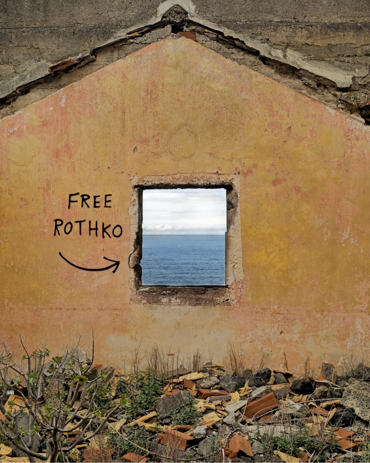
From French street artist OakOak, a reminder that art is everywhere and that art comes from everywhere. From their website and Instagram, here are a few more pieces that caught my eye:
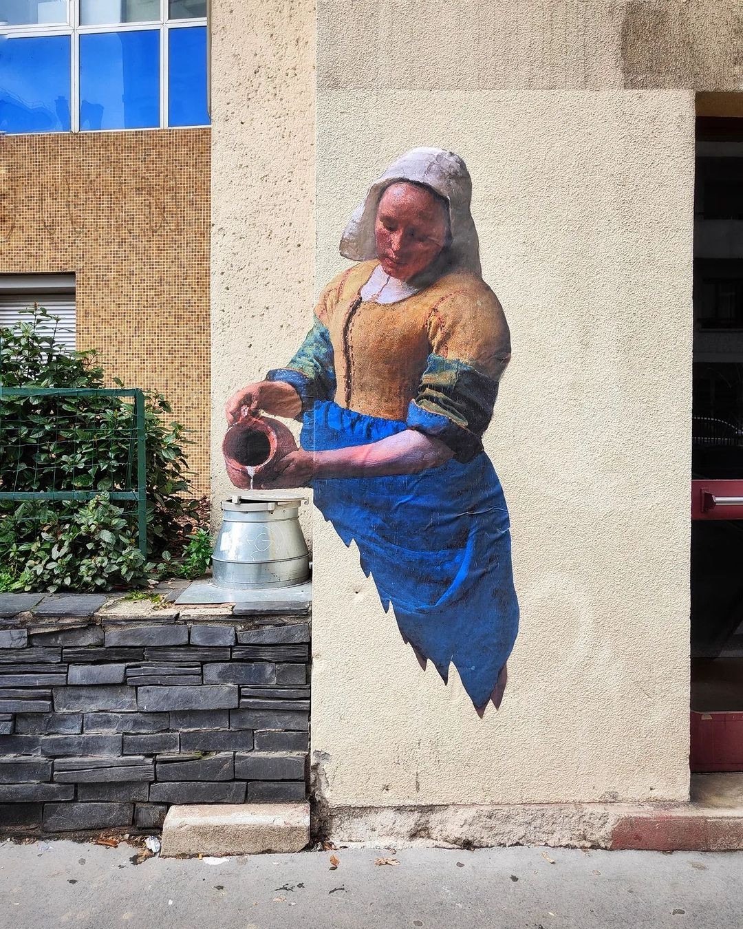
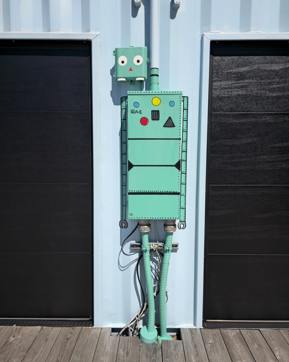

And ha, I just noticed this one, a riff on Hokusai’s The Great Wave.

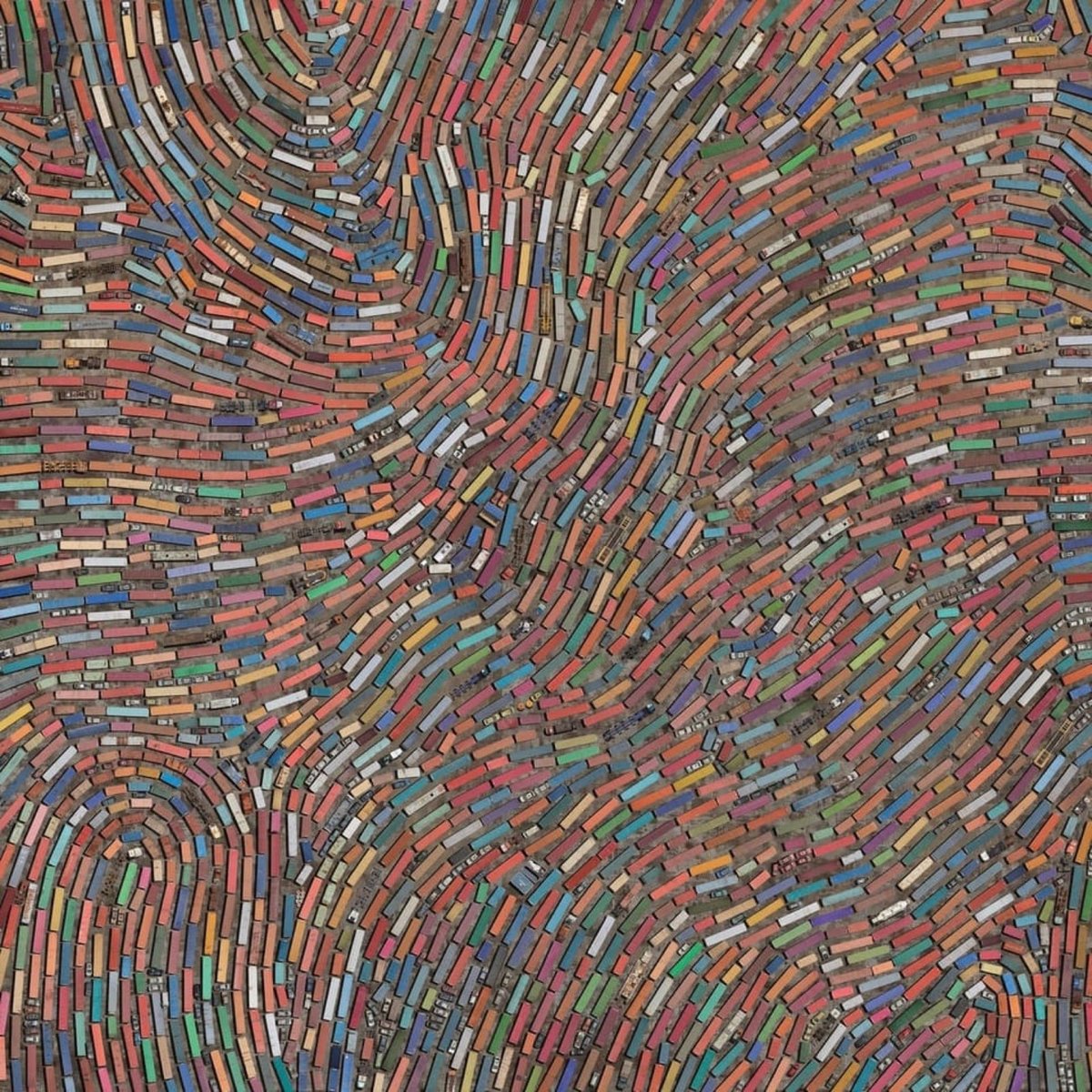


In a continuation and tweak of his Coletivos project (which I posted about previously), Cássio Vasconcellos took aerial photos of scrapyards and arranged the junked cars, planes, trains, and other objects into dense photographic collages.
OVER presents a scenario that seems to point to a dystopian future, but which, in fact, brings together fragments of the present. The exaggerated agglomeration denounces the misleading idea of “disposal”, given that objects do not cease to exist in the world when we throw them away. Rather, they inhabit other places.
This video shows the artist’s process, from hanging out the side of a helicopter to arranging all the items in Photoshop.
So first of all, this mashup of LCD Soundsystem’s New York, I Love You But You’re Bringing Me Down and a recording of Miles David from his Elevator to the Gallows score is just great to listen to musically. But the, let’s call it choreography, is brilliantly spare: a pair of YouTube videos pulled up side-by-side in a now-ancient Safari browser and pressing play to sync them by hand — jazz-like, improvisational.
If you’d like to try this yourself, here’s the LCD Soundsystem and Miles Davis videos; just press play on the David video at 32 seconds into the LCD video.
See also New Yorker film critic Richard Brody on Louis Malle’s “Elevator to the Gallows,” and Its Historic Miles Davis Soundtrack. (via James Risley in the Kottke comments)
Songs played back at much slower speeds were a thing several years ago — the effect can turn even the harshest rock song or bounciest pop tune into something that sounds like Enya or an ethereal Gregorian chant. I listen to these while I work sometimes and I’ve got a new one for the rotation: Radiohead’s Everything in Its Right Place, but played 800% slower.
See also the Seinfeld Theme Slowed Down, Justin Bieber slowed down 800%, a whole playlist of 800% slower songs, and, perhaps best of all, 80s Pop Hits sung by Alvin & the Chipmunks played at 16 RPM on a record player (“secretly the most important postpunk/goth album ever recorded”).
Oh, and some artists are releasing their own slowed-down versions of songs. LXNGVX’s Yum Yum comes in regular, slowed (my fave), super slowed, and sped up. Thom Yorke released a slower version of Creep in 2021. And Underworld released Slow Slippy, a slowed-down remix of Born Slippy, in 2017. (via @jameskelleher.pilcrow.ie)
For some reason, this is a full-length version of Radiohead’s OK Computer by @shonkywonkydonkey that uses his voice for everything (vocals, drums, guitar, etc.) I don’t exactly know if I like this, but it is interesting. (via sippey)

In 1994, a Navajo/Diné weaver named Marilou Schultz made a weaving of the microscopic pattern of an Intel Pentium processor. (In the image above, the weaving is on the left and the chip is on the right.)
The Pentium die photo below shows the patterns and structures on the surface of the fingernail-sized silicon die, over three million tiny transistors. The weaving is a remarkably accurate representation of the die, reproducing the processor’s complex designs. However, I noticed that the weaving was a mirror image of the physical Pentium die; I had to flip the rug image below to make them match. I asked Ms. Schultz if this was an artistic decision and she explained that she wove the rug to match the photograph. There is no specific front or back to a Navajo weaving because the design is similar on both sides,3 so the gallery picked an arbitrary side to display. Unfortunately, they picked the wrong side, resulting in a backward die image.
Schultz is working on a weaving of another chip, the Fairchild 9040, which was “built by Navajo workers at a plant on Navajo land”.
In December 1972, National Geographic highlighted the Shiprock plant as “weaving for the Space Age”, stating that the Fairchild plant was the tribe’s most successful economic project with Shiprock booming due to the 4.5-million-dollar annual payroll. The article states: “Though the plant runs happily today, it was at first a battleground of warring cultures.” A new manager, Paul Driscoll, realized that strict “white man’s rules” were counterproductive. For instance, many employees couldn’t phone in if they would be absent, as they didn’t have telephones. Another issue was the language barrier since many workers spoke only Navajo, not English. So when technical words didn’t exist in Navajo, substitutes were found: “aluminum” became “shiny metal”. Driscoll also realized that Fairchild needed to adapt to traditional nine-day religious ceremonies. Soon the monthly turnover rate dropped from 12% to under 1%, better than Fairchild’s other plants.
The whole piece is really interesting and demonstrates the deep rabbit hole awaiting the curious art viewer. (via waxy)
Here’s a newly released remix of The Postal Service’s The District Sleeps Alone Tonight by Sylvan Esso. In addition to YouTube, it’s also available on several other sites. (via sippey)
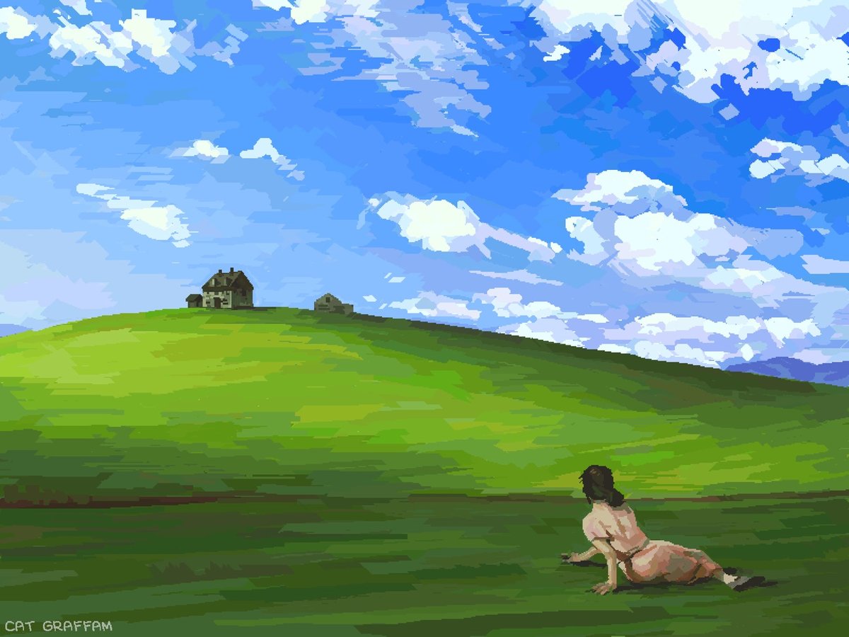
Cat Graffam combined their love of art and old technology to create a mashup of Andrew Wyeth’s Christina’s World and the Windows XP wallpaper, using MS Paint and a mouse. You can watch how they did it in this video:
Prints of the finished product are available. (via waxy)
Newer posts
Older posts





Socials & More