There and back again
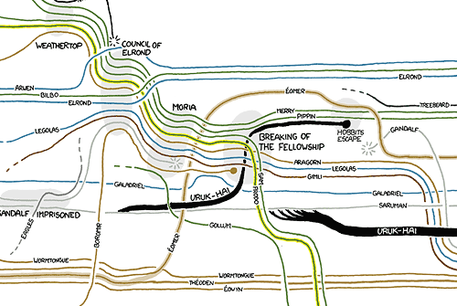
A wonderful character interaction map of the Lord of the Rings trilogy drawn by Randall Munroe. Here’s just a little part of it:
This site is made possible by member support. 💞
Big thanks to Arcustech for hosting the site and offering amazing tech support.
When you buy through links on kottke.org, I may earn an affiliate commission. Thanks for supporting the site!
kottke.org. home of fine hypertext products since 1998.
Beloved by 86.47% of the web.
A wonderful character interaction map of the Lord of the Rings trilogy drawn by Randall Munroe. Here’s just a little part of it:
The Strange Maps book is out today. The book is based on the awesome Strange Maps blog, one the very few sites I have to exercise restraint in not linking to every single item posted there. The content of the book is adapted from the site, so of course it’s top shelf.
My only reservation in recommending the book is the design. When I cracked it open, I was expecting full-bleed reproductions of the maps, large enough to really get a detailed look at them. The maps *are* the book, after all. But that’s not the case…only a few of the maps get an entire non-full-bleed page and some of the maps are stuck in the corner of a page of text, like small afterthoughts. The rest of the design is not much better, cheesy at best and distracting at worst. I wasn’t expecting Taschen-grade production values, but something more appropriate to the subject matter would have been nice.
Beautiful map by National Geographic of human exploration of the solar system.
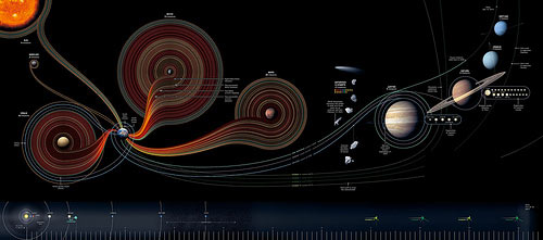
See also Race to the Moon at HistoryShots and Bryan Christie’s Mission(s) to Mars. (thx, byrne)
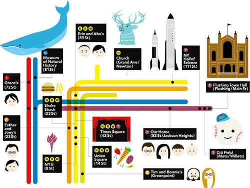
This was my present to my nephew for his 3rd birthday. He loves, loves, loves the subway so my sister asked me if I could make a custom map with all the places that mean something to him on the poster.
Best viewed a bit large.
Update: There’s been a bit of confusion…this is not something that I made. I don’t even have a nephew.
Update: The subway map was made by Erin Jang.
To get to a McDonald’s in the lower 48 United States, it’s never more than 145 miles by car. And the McFarthest Spot in the US is in South Dakota.
For maximum McSparseness, we look westward, towards the deepest, darkest holes in our map: the barren deserts of central Nevada, the arid hills of southeastern Oregon, the rugged wilderness of Idaho’s Salmon River Mountains, and the conspicuous well of blackness on the high plains of northwestern South Dakota.
See also maximum Starbucks density and Starbucks center of gravity of Manhattan.
Update: The distribution of McDonald’s in Australia is a bit more uneven. (thx, kit)
Update: As of December 2018, the point the farthest away from any McDonald’s in the lower 48 US states is in Nevada, 120 miles away from the nearest McDonald’s.
Foliage map for New York and New England. You can register as a “Foliage Ambassador” on the site to report on the progress in your area.
If you want to know what football games are going to be on TV in your part of the country on Sunday, check out these maps every week.
Among this list of 20 fascinating ancient maps, you’ll find the island of California, a would-be beautification of Paris circa-1789, and the Modern and Completely Correct Map of the Entire World, which turned out to be nothing of the sort. (thx, john)
An assessment: what sort of photographer is the Google Street View car?
Initially, I was attracted to the noisy amateur aesthetic of the raw images. Street Views evoked an urgency I felt was present in earlier street photography. With its supposedly neutral gaze, the Street View photography had a spontaneous quality unspoiled by the sensitivities or agendas of a human photographer. It was tempting to see the images as a neutral and privileged representation of reality — as though the Street Views, wrenched from any social context other than geospatial contiguity, were able to perform true docu-photography, capturing fragments of reality stripped of all cultural intentions.
Strange Maps has a map of What’s On Earth Tonight, basically a TV Guide for the Milky Way. The map is not that big yet because TV signals have only been sent out from Earth since the late 1920s.
The first tv images of World War II are about to hit Aldebaran star system, 65 light years [ly] away. If there’s anybody out there alive and with eyes to see it, the barrage of actual and dramatised footage of WW2 will keep them shocked and/or entertained for decades to come. Which is just as well, for they’ll have to wait quite a few years to catch the first episodes of such seminal series as The Twilight Zone and Bonanza (both 1959), just about now hitting the (putative) extraterrestrial biological entities of the Mu Arae area (appr. 50 ly). The Cosby Show, Miami Vice and Night Court (all 1984) should be all the rage on Fomalhaut (25 ly). Meanwhile, the sentient, tv-watching creatures near Alpha Centauri (4.4 ly), our closest extrasolar star, are just recovering from the infamous “wardrobe malfunction” during Janet Jackson and Justin Timberlake’s halftime show during the 2004 Superbowl.
See also the opening scene from Contact.
Two recent projects that incorporate the experiences of map users into the subsequent versions of the maps:
1. For the Salone di Mobile event in Milan, The British Council commissioned a map of the event that would be augmented each day with information flowing in from Flickr, Twitter, blogs, and people’s physical scribbles on the maps.
One thing that’s very interesting to us that is using this rapidly-produced thing then becomes a ‘social object’: creating conversations, collecting scribbles, instigating adventures - which then get collected and redistributed.
More information about the project is available on The Incidental site.
2. Walking Maps, produced by Mike Migurski at Stamen, encourages people print out maps from OpenStreetMap, annotate them with missing information, and scan them back in.
In some places, participants are creating the first freely-available maps by GPS survey. In other places, such as the United States, basic roads exist, but lack local detail: locations of traffic signals, ATMs, caf’es, schools, parks, and shops. What such partially-mapped places need is not more GPS traces, but additional knowledge about what exists on and around the street. Walking Papers is made to help you easily create printed maps, mark them with things you know, and then share that knowledge with OpenStreetMap.
This large map of Sable Island shows its many shipwrecks.
Only sealers, shipwrecked sailors and salvagers made their homes on Sable Island, impermanent ones at best. The salvagers must have had some pretty good times — over the last few centuries, more than 350 vessels were shipwrecked on what became known as the “Graveyard of the Atlantic”. Located in shallow, often stormy and foggy waters, the elongated Sable Island (44 km long but never more than 2 km wide) might have been predestined as a catchment area for ships treading these Atlantic latitudes — a self-fulfilling curse for captains igorant or oblivious of this huge, constantly shifting sandbar.
Update: Dueling Graveyards of the Atlantic.
The waters off North Carolina’s Outer Banks entomb thousands of vessels and countless mariners who lost a desperate struggle against the forces of war, piracy and nature. The Graveyard of the Atlantic, with one of the highest densities of shipwrecks in the world, holds some of America’s most important maritime history.
(thx, dan)
Rice School of Architecture produced a poster showing the relative sizes of ring roads from cities around the globe. Houston’s is the largest, followed by Beijing. (via strange maps)
North Korea is in the news. Not much is known about the secretive country, but a group of interested citizens has been mapping North Korea on Google Earth using snippets of news reports here and there.
More than 35,000 people have downloaded Mr. Melvin’s file, North Korea Uncovered. It has grown to include thousands of tags in categories such as “nuclear issues” (alleged reactors, missile storage), dams (more than 1,200 countrywide) and restaurants (47). Its Wikipedia approach to spying shows how Soviet-style secrecy is facing a new challenge from the Internet’s power to unite a disparate community of busybodies.
“Here is one of the most closed countries in the world and yet, through this effort on the Internet by a bunch of strangers, the country’s visible secrets are being published,” says Martyn Williams, a Tokyo-based technology journalist who recently sent Mr. Melvin the locations of about 30 North Korean lighthouses.
Update: The map itself is available here. (thx, brian)
I really like the subway travel time heatmaps on Triptrop NYC.
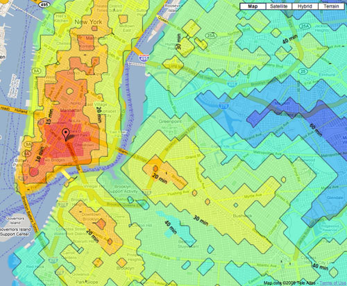
Put in an address and you get a map of how far away everything is using the subway. 15 minutes, forty minutes, two hours — all set up with nice little colors. That’s pretty easy, I think. Triptrop can help you find a convenient place to live. It’s also a nice way to tell your friend to stop inviting you to the purple part of the Bronx, or to prove that the G isn’t actually that bad.
(via fake is the new real)
Mike Frumin took the NYC subway ridership data from all the way back to 1905 (!!) and graphed it on a map, with a sparkline of the ridership data for each stop. Frumin explains the project a little more here.
The result, after much whacking, is, I think, compelling, but you’ll have to see for yourself. The general idea it that the history of subway ridership tells a story about the history of a neighborhood that is much richer than the overall trend. An example, below, shows the wild comeback of inner Williamsburg, and how the growth decays at each successive stop away from Manhattan on the L train.
Update: Here’s another representation of the same data. In this one, the ridership numbers are represented by the thickness of the subway line.
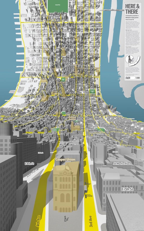
This is a little bit brilliant. Here and There are a pair of maps of Manhattan that start from an on-the-street viewpoint and curl up as you gaze uptown or downtown until you see the rest of the island from a traditional “flat map” view.
As the model bends from sideways to top-down in a smooth join, more distant parts of the city are revealed in plan view. The projection connects the viewer’s local environment to remote destinations normally out of sight.
Prints are available. This is like a 3-D version of the spider maps for London buses, in which a local street grid relays information about the immediate vicinity while the surrounding schematic shows connections to the rest of the system.
Update: Jack Schulze explains the influences behind the maps. (via waxy)
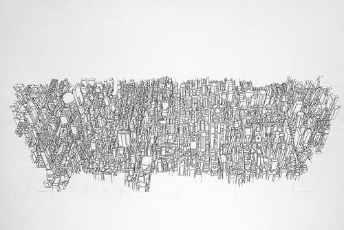
Update: Ooh, these science illustrations from NISE use a similar technique to simultaneously show the internal and external structure of their subjects.
These illustrations show familiar objects across ten orders of magnitude-from familiar aspects down to the level of their constituent atoms. Vast scale differences are usually shown through separate images (e.g., the Eames’ Powers of Ten). This illustration employs the artistic convention of perspective-typically used by landscape painters-to show multiple scales in one frame.
(thx, matt)
If you don’t like this re-imagined NYC subway map, I’ll kick you in the Brooklyn. Somewhat NSFW. (via illustration art)
A sampling of art by Lucas Monaco, whose work deals with maps, flows, and overlaps.

I really love that last one. (via moon river)
In 1879, Brooklyn papermaker Robert Gair developed a process for mass producing foldable cardboard boxes. One of the paper-folding machines in his factory malfunctioned and sliced through the paper, leading Gair to the realization that cutting, creasing, and folding in the same series of steps could transform a flat piece of cardboard into a box.
Gair’s invention made him a wealthy man and turned his company into an epicenter of manufacturing in Brooklyn. From Evan Osnos’ New Yorker article about Chinese paper tycoon Cheung Yan:
Gair’s box, a cheap, light alternative to wood, became “the swaddling clothes of our metropolitan civilization,” Lewis Mumford wrote. Eventually, the National Biscuit Compnay introduced its first crackers that stayed crispy in a sealed paper box, and an avalanche of manufacturers followed. Gair expanded to ten buildings on the Brooklyn waterfront. Massive migration from Europe to the United States created a manufacturing workforce in Brooklyn, to curn out ale, coffee, soap, and Brillo pads — and Gair made boxes right beside them.
Gair’s concentrated collection of buildings eventually led the area between the Brooklyn and Manhattan Bridges to be called Gairville. That area is now known as Dumbo and, in addition to tons of residential space, the neighborhood is home not to manufacturing but to architecture firms, web companies, and other creative industries.
The Gair Company’s most iconic building was also its last: the Clocktower Building, also known as Gair Building No. 7. I tracked down several of the other Gair buildings and put them on this Google Map.
Can you help fill in the holes? Email me with additions/corrections and I’ll fill them in on the map. Thanks!
Update: I found a photo of some of the buildings that comprised Gairville on Google Books. The map has a couple of additions as well.
The architect Robert Stern once remarked, “Can you imagine an elevated expressway at 30th Street just so Long Island guys could get to New Jersey?” Robert Moses could. A pair of Google Maps of Manhattan were redrawn to include the Lower Manhattan Expressway and Mid Manhattan Expressway, two highways masterminded by Moses that would have cut across Manhattan through Soho and at 30th St., respectively.
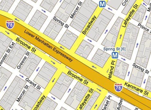
This was true for me, at least, while I was making these; Hand erasing buildings through SoHo, TriBeCa, and the LES was an eery experience as I tried to imagine what these places would really look like if my brush was a bulldozer.
More information on the Mid-Manhattan Expressway and the Lower Manhattan Expressway on NYCroads. (via migurski)
The Millions has created a map for a walking tour of NYC’s independent book stores. The good news is the walk won’t take you too long. (This is also the bad news.)
Pew Research Center’s interactive maps of migration flows in the US are pretty interesting. The region map makes it seem as though the Northeast is rapidly losing population to the South but the states map clarifies the picture…the flow looks to be hundreds of thousands of retirees moving to Florida and Georgia.
Harry Beck, designer of the iconic London Tube map, once took a crack at a map for the Paris Metro, but his effort was rejected for being too geometric.
So why did the Paris Metro (now operated by the RATP) reject Beck’s clear simplification of their beloved system? One reason is visible at each station entrance; Parisians use the maps here as a free public service to help them find their way round the city - the ubiquitous geographic wall map is more than just a Metro plan.
There’s a fascinating tidbit in this Google blog post about the non-discovery of Atlantis in Google Earth. It concerns how the depth of the ocean floor is measured.
Now you’re probably wondering where the rest of the depth data comes from if there are such big gaps from echosounding. We do our best to predict what the sea floor looks like based on what we can measure much more easily: the water surface. Above large underwater mountains (seamounts), the surface of the ocean is actually higher than in surrounding areas. These seamounts actually increase gravity in the area, which attracts more water and causes sea level to be slightly higher. The changes in water height are measurable using radar on satellites.
Wow! (via ben fry)
Applying techniques usually used to track endangered animal species, geography professor Thomas Gillespie thinks he has pinpointed the location of the world’s most hunted animal, Osama bin Laden.
More specifically, he found a 90 percent chance that bin Laden is in Kurram province in Pakistan’s Federally Administered Tribal Areas, most likely in the town of Parachinar which gave shelter to a larger number of Mujahedin during the 1980s. […] Gillespie even identified three buildings in Parachinar that would make the most likely shelters for Bin Laden and his entourage.
The full report is here in PDF format.
The NY Times has a timeline map showing what people from around the country said on Twitter during the Super Bowl broadcast. I like the emoticons tab but they also should have included a profanity tab.
Socials & More