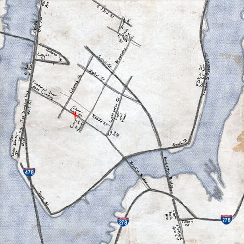
While I felt that it was important to show certain shapes aboveground, I also felt that it was important to leave out certain pieces of belowground information. There are several places where the subway tunnels cross and overlap each other beneath the surface. This may be important information for city workers or utility companies trying to make repairs, but for the average commuter, showing these interactions just creates visual noise. I tried to reduce that noise by cleanly separating the lines on the map so they don’t overlap. Consider the different depictions of the 4 line and the 5 line in the Bronx; sure, the MTA’s paths may be accurate, but they’re also confusing, and riders don’t really need to see those particular details to understand where they’re going.
I’m hoping this will be a new option on Google Maps alongside “satellite” soon: thermographic view. It’s basically a heat map of all the buildings on a map…pop in your address and see how energy efficient your roof is. Belgium only. Unfortunately…unless you live in Belgium. (via infosthetics)
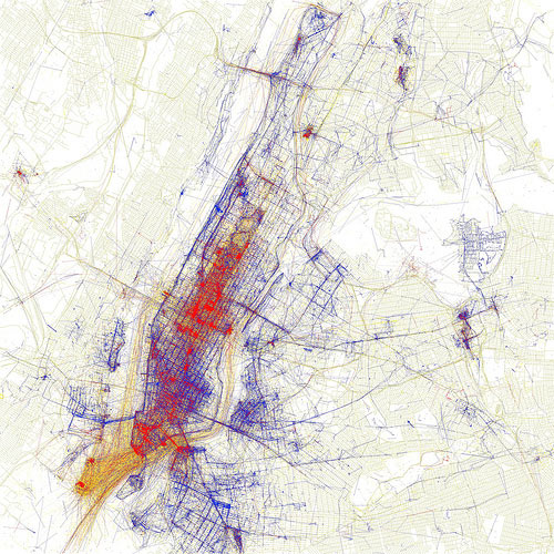
Locals and Tourists is a set of maps showing where people take photos in various cities around the world. The results are broken down into tourist photos and photos taken by locals. Here’s NYC:
Blue points on the map are pictures taken by locals (people who have taken pictures in this city dated over a range of a month or more). Red points are pictures taken by tourists (people who seem to be a local of a different city and who took pictures in this city for less than a month).
If you’re travelling abroad with the iPhone and understandably wish to avoid AT&T’s ridiculously high data roaming charges when trying to find the train station in a new city, I would highly recommend OffMaps.
OffMaps lets you take your maps offline. It is the ideal companion for any iPhone and iPod Touch user, who wants to access maps when travelling abroad (and avoid data roaming charges) and who wants to have fast access to maps at all times. This app (and the icon) just has to be on the right hand side of Apple’s built-in maps app.
OffMaps uses OpenStreetMap that include a lot more information than simple road maps: from ATMs and train stations to restaurants and pubs! You choose which areas to download instead of buying a new app for every city you want to visit.
I used it for a week in Paris and it worked great; the GPS and compass both still work when data is off so locating yourself isn’t a problem. Just download the proper maps before you leave for your trip and you’re good to go.
The new subway map makes Manhattan even bigger, reduces Staten Island and continues to buck the trend of the angular maps once used here and still preferred in many other major cities. Detailed information on bus connections that was added in 1998 has been considerably shortened.
Manhattan will be shown on the map as nearly twice as wide as in real life. Cut back on the chili-cheese fries, my friend!
5. Google Earth. Google Earth presents a world in which the area of most concern to you (in this instance, Avebury in Wiltshire) can be at the centre, and which - with mapped content overlaid - can contain whatever you think is important. Almost for the first time, the ability to create an accurate map has been placed in the hands of everyone, and it has transformed the way we view the world.
Until we see that the iPhone is as thoroughly entangled into a network of landscapes as any more obviously geological infrastructure (the highway, both imposing carefully limited slopes across every topography it encounters and grinding/crushing/re-laying igneous material onto those slopes) or industrial product (the car, fueled by condensed and liquefied geology), we will consistently misunderstand it.
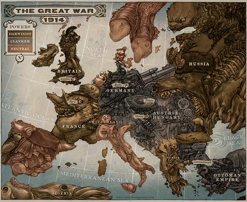
In Britain’s place should come Poland, which has suffered quite enough in its location between Russia and Germany and deserves a chance to enjoy the bracing winds of the North Atlantic and the security of sea water between it and any potential invaders.
The Beauty of Maps is a BBC series that “[looks] at maps in incredible detail to highlight their artistic attributions and reveal the stories that they tell”. The site also links to another maps blog: Amazing Maps. (via junk_deluxe)
Stretching from New York to Minnesota, [Stayathomia’s] defining feature is how near most people are to their friends, implying they don’t move far. In most cases outside the largest cities, the most common connections are with immediately neighboring cities, and even New York only has one really long-range link in its top 10. Apart from Los Angeles, all of its strong ties are comparatively local.
The interactive map on the NYC govt site has hi-resolution aerial photos from 1924 (click the camera and move the slider to 1924). Check out all the piers, the Brooklyn Navy Yard, the old baseball stadiums, the LES (and everywhere else they built housing projects), Penn Station, and the skyscraperless Midtown. This is hours of fun.
Update:The NYC Oasis map features a satellite view from 1996 and an imagined sat view from 1609. (thx, steve)
Fascinating map of Netflix rental patterns for NYC, Atlanta, Miami, and nine other US cities. I wonder if you could predict voting patterns according to where people rent Paul Blart: Mall Cop or Frost/Nixon. I wonder what the map for Napoleon Dynamite looks like?
Most of the interesting trends occurred on a local scale — stark differences between the South Bronx and Lower Manhattan, for example, or the east and west sides of D.C. — and weren’t particularly telling at a national scale. (We actually generated U.S. maps in PDF form that showed all 35,000 or so ZIPs, but when we flipped through them, with a few exceptions, we found the nationwide patterns weren’t nearly as interesting as the close-in views.)
The Known Universe zooms out from Tibet to the limits of the observable universe. Dim the lights, full-screen it in HD, and you’re in for a treat.
Like Powers of Ten, except astronomically accurate. It’s not a dramatization, it’s a map; the positioning data was pulled from Hayden Planetarium’s Digital Universe Atlas, which is available for free download.
Since 1998, the American Museum of Natural History and the Hayden Planetarium have engaged in the three-dimensional mapping of the Universe. This cosmic cartography brings a new perspective to our place in the Universe and will redefine your sense of home. The Digital Universe Atlas is distributed to you via packages that contain our data products, like the Milky Way Atlas and the Extragalactic Atlas, and requires free software allowing you to explore the atlas by flying through it on your computer.
Note: If you are a member and tried to log in, it didn't work, and now you're stuck in a neverending login loop of death, try disabling any ad blockers or extensions. Or try logging out and then back in. Still having trouble? Email me!
Socials & More