First the videos. Someone visiting the Bronx Zoo caught the plane on video, flying low in the sky just after the bird strike. A Coast Guard video monitoring station got a shot of the plane just after it splashed down…you can see the spray from the impact flying in from the left of the video just after the 2:00 mark.
Soon after the plane hits, the camera zooms in and you can see just how quickly people get out and onto the wings. And then this video shows it most clearly:
Look how low and level and steady Sully guided that thing in! Amazing!
The life raft attached to the plane was upside down in the river, just out of reach. Mr. Wentzell turned and found another passenger, Carl Bazarian, an investment banker from Florida who, at 62, was twice his age. Mr. Wentzell grabbed the wrist of Mr. Bazarian, who grabbed a third man who held onto the plane. Mr. Wentzell then leaned out to flip the raft. “Carl was Iron Man that day,” Mr. Wentzell said. “We got the raft stabilized and we got on.” A man went into the water, and the door salesman and the banker hauled him aboard. He curled in a fetal position, freezing.
The Times also comes through with the 3-D flight graphic I asked for the other day but they upped the ante with a seating chart of the plane where you can click on certain passengers’ seats to read their thoughts. Mark Hood in seat 2A described the landing:
When we touched down, it was like a log ride at Six Flags. It was that smooth.
I was re-reading Carl Sagan’s novel Contact recently, essentially a series of arguments about SETI wrapped into a story, and he alludes to some sort of cosmic Grand Central Station. That, coupled with my longtime interest in transit maps, got me thinking about all of this.
[I removed the map temporarily because it wasn’t loading.]
To construct the map, outside.in scrapes kottke.org’s RSS feed, looks for names of specific places, and plots the related blog entries on a map. There’s not a lot of local content on kottke.org but the results are still pretty good; it works a lot better on a local site like Gothamist. [Disclosure: I am an advisor to outside.in.]
Our Dumb World is an atlas of the World presented by The Onion. It manages to inform (poorly) and entertain at the same time. For instance, here’s their description of Israel:
Home to one-third of the world’s Jews and two-thirds of the world’s anti-Semites, the nation of Israel is a place so holy that merely walking in it can gain you a place in the World to Come, nowadays often within minutes.
And about the US, “The Land Of Opportunism”:
The United States was founded in 1776 on the principles of life, liberty, and the reckless pursuit of happiness at any cost — even life and liberty.
With Google Map Maker, you can become a citizen cartographer and help improve the quality of maps and local information in your region. You are invited to map the world with us!
Update: Several people wrote in to recommend OpenStreetMap instead because Google doesn’t make the data available in a raw form whereas the OSM data is under a CC license available for derivative works like OpenCycleMap. (thx, mike and everyone)
Called the “Atlas of True Names,” the new map traces the etymological roots of European and global place names and then translates them into English. The “City of Boatmen” is also known as Paris. Should you travel to the Land of the Fire Keepers, you’d find yourself in Azerbaijan. And Italy comes from the Latin word vitulus, which means “calf.”
New York is “Wild Boar Village”, Chicago is “Stink Onion”, Great Britain is “Great Land of the Tattooed”, and Grozny is “The Awesome”. However, Language Log notes that some of the translations should be taken with a grain of salt. (thx, andreas)
This is not a political blog. However, this is a story I couldn’t pass up: the story of how voting patterns in the 2008 election were essentially determined 85 million years ago, in the Cretaceous Period. It’s also a story about how soil science relates to political science, by way of historical chance.
Headline I’d like to see in 96 pt. type in the NY Times: Obama Elected By Rich Loamy Soils of Cretaceous Seas.
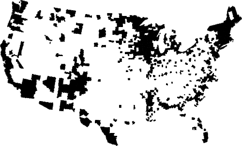
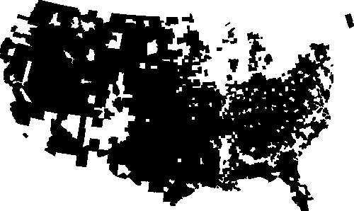
The western Great Plains are emptying of people. Some 322 of the 443 Plains counties have lost population since 1930 and a majority have lost population since 1990. Now is the time for the Federal government to sell high-priced land in the West, use some of the proceeds to deal with current problems and use some of the proceeds to buy low-priced land in the Plains creating the world’s largest nature park, The Buffalo Commons.
According to this map, the US government owns more than 50% of the land in some western states (Nevada 84.5%, Utah 57.4%, Oregon 53.1%, Arizona 48.1%, California 45.3%).
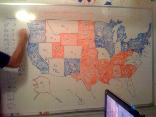
Hopefully I’ll have some time this afternoon to update the 2008 Election Maps page; I’ve got lots of good submissions waiting in my inbox. Thanks to everyone who sent in links and screenshots.
Idea for the Obama administration: fireside chats. On the radio, on satellite radio, as a podcast, transcripts available online soon after airing. Done live if possible, a genuine lightly scripted chat. Maybe Obama could have special guests on to talk about different aspects of policy and government. Bush does weekly radio addresses but they’re short, boring, and scripted.
And I gotta tell you, if change.gov is indicative of how the Obama administration is going to use the web to engage with Americans, this is going to be an interesting four years.
Ok, that’s probably the last Obama post for a bit. Back to your irregularly unscheduled programming.
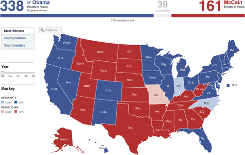
Last night as the election results were coming in online, I took screenshots of a bunch of the now-familiar red/blue electoral maps being used by the larger media sites to show election results and posted them all on this page. (There are currently 25 maps…I’m adding more in a few minutes.)
1. No one strayed from the red and blue. The red/blue combo is overwhelmingly symbolic but there are plenty of other colors in the crayon box; I would like to have seen someone try something different.
2. In the 2000 and 2004 elections, the red/blue map was the focal point of the media coverage. People were fixated by it. This time around, it didn’t matter so much. The maps were interesting for 3-4 hours until the overwhelming nature of Obama’s victory became apparent and then, not so much. By this morning, the maps are already shrinking or disappearing from the home pages of the Times, CNN, and the like.
3. Nate Silver and the rest of the 538 guys nailed it. They got Indiana wrong and there are a couple more states that are still too close to call, but they got the rest of the map right. Their final projection had Obama getting 348.6 electoral votes and they currently have him at 349.
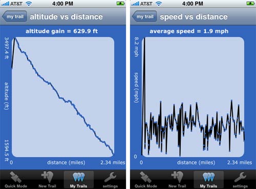
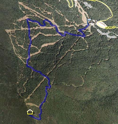
When we were up in Vermont earlier this month, we rode the single chair to the top of the mountain at Mad River Glen and then hiked down. Before we left, we installed iTrail on Meg’s phone. iTrail uses the iPhone’s GPS capability to track your progress along a trail, jogging path, etc. The reviews at the iTunes Store aren’t glowing but we found that it worked pretty well for us. Here are a couple of graphs generated by iTrail of our hike:
iTrail also allows data export to a Google Docs speadsheet. From there, you can import that data into Google Maps, like so:
It’s not perfect (we weren’t doing 8.2 mph at the beginning of the hike) and GPS mapping apps are hardly new, but I’ve never done this before and it feels like living in the future.
Philip Kromer took the newspaper endorsement data from the Editor and Publisher page I linked to this morning and mapped the results. The states are colored according to FiveThirtyEight’s current projections and those newspapers with larger circulations have larger circles. From Kromer’s blog post:
This seems to speak of why so many on the right feel there’s a MSM bias - 50% of the country is urban, 50% rural, but newspapers are located exclusively in urban areas. So, surprisingly, the major right-leaning papers are all located in parts of the country we consider highly leftish. The urban areas that are the largest are thus both the most liberal and the most likely to have a sizeable conservative target audience.
Whenever I rode the subway with my two older boys, I tried to hold on to their hands at all times. In the process, I developed a special move. I think anyone who saw it must have been impressed.
I would hold the boys’ hands as we briskly made our way out of the station, then, just as we reached the turnstiles, I would let go. We would pass through the turnstiles simultaneously, and so smoothly that the boys’ hands would still be up in the air when we got to the other side, where I would grab their little fingers again in one fluid motion. (Requires practice.)
Note: If you are a member and tried to log in, it didn't work, and now you're stuck in a neverending login loop of death, try disabling any ad blockers or extensions. Or try logging out and then back in. Still having trouble? Email me!

Socials & More