kottke.org posts about infoviz
When I linked to a recent NY Times article about rewilding golf courses, I pulled out this startling fact: “The United States has more golf courses than McDonald’s locations.” Nathan Yau of FlowingData found that that is indeed true but wondered where all of the golf courses were actually located. (A: typically not in cities where the McDonald’s are concentrated).

This makes more sense now. You can have a golf course in an area where there aren’t that many people, because people will travel to play golf. Few people are going to travel specifically for McDonald’s.
If we compare the two, you see the McDonald’s city concentrations, and golf fills the in-between spaces.


On Beautiful Public Data, Jon Keegan highlights the extremely information-rich flight maps produced by the Federal Aviation Administration that pilots use to find their way around the skies.
Among all of the visual information published by the U.S. government, there may be no product with a higher information density than the Federal Aviation Administration’s (FAA) aviation maps. Intended for pilots, the FAA publishes free detailed maps of the entire U.S. airspace, and detailed maps of airports and their surroundings and updates them frequently. The density of the critical information layered on these maps is staggering, and it is a miracle that pilots can easily decipher these maps’ at a glance.
Oh wow, this takes me back. My dad was a pilot when I was a kid and he had a bunch of FAA maps in the house, in his planes, and even on the walls of his office. I remember finding these maps both oddly beautiful and almost completely inscrutable. What a treat to be able to finally figure out how to read them, at least a little bit. And the waypoint names are fun too:
Orlando, FL has many Disney themed waypoints such as JAFAR, PIGLT, JAZMN, TTIGR, MINEE, HKUNA and MTATA. Flying into Orlando, your plane might use the SNFLD arrival path, taking you past NOOMN, FORYU, SNFLD, JRRYY and GTOUT.
Based on the waypoints near Atlanta’s Hartsfield-Jackson International, this airport must be home to some of the nerdiest air traffic controllers. There’s a crazy number of Lord of the Rings waypoints: HOBTT, SHYRE, FRDDO, BLLBO, BGGNS, NZGUL, RAETH, ORRKK, GOLLM, ROHUN, GONDR, GIMLY, STRDR, SMAWG and GNDLF.

I loved playing around with the National Audubon Society’s Bird Migration Explorer, which is a beautifully designed interactive map of the Western hemisphere that shows the seasonal migration patterns of more than 450 species of birds. What a resource…so much information to explore here. (via marco c. in the comments)
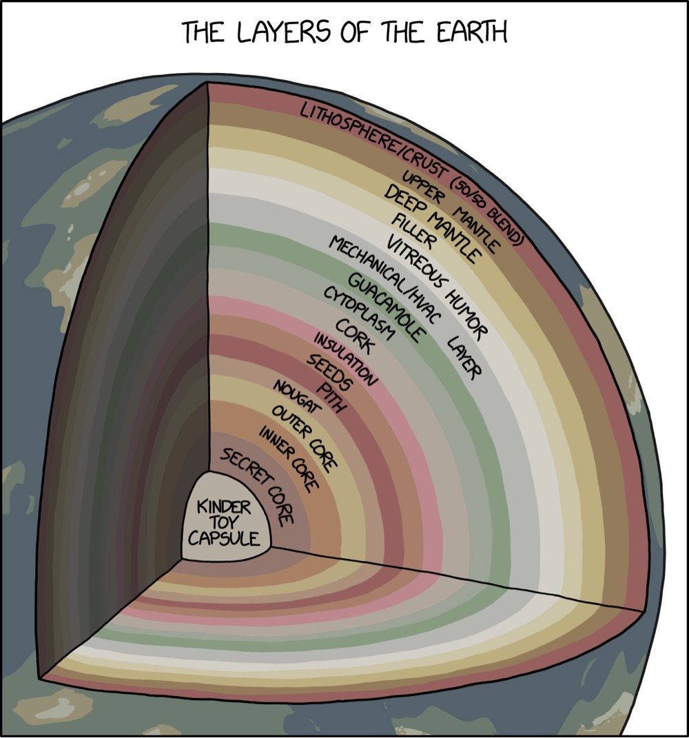
From XKCD, a 3D cutaway map of the many layers of the Earth, from the familiar crust around the outside to the more mysterious layers like nougat, vitreous humor, guacamole, and cork.
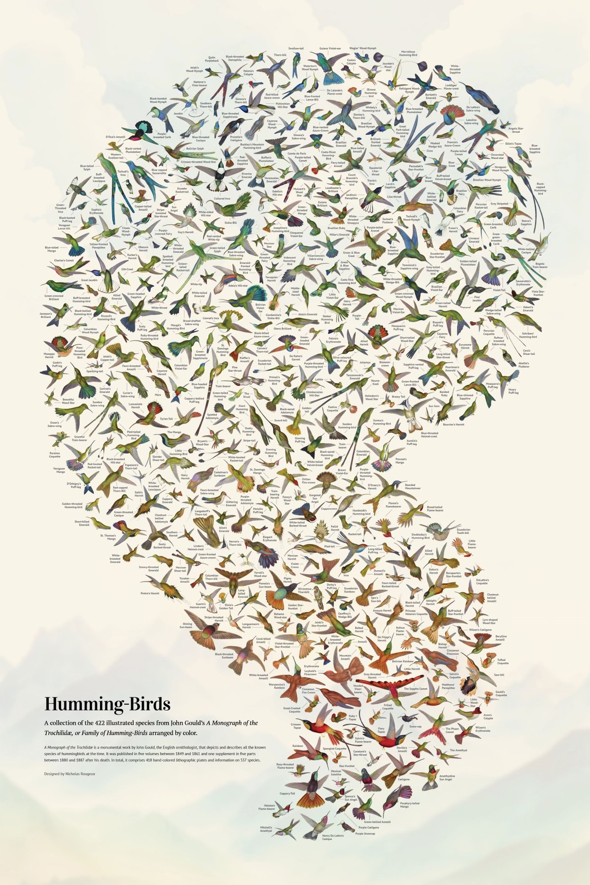
Wow, Nicholas Rougeux has restored John Gould’s A Monograph of the Trochilidæ, or Family of Humming-Birds, which was published between 1848 & 1887 and contains hand-colored lithographic depictions of almost every single hummingbird species known to exist at the time.


From Rougeux’s page about the project:
The monograph is considered one of the finest examples of ornithological illustration ever produced, as well as a scientific masterpiece. Gould’s passion for hummingbirds led him to travel to various parts of the world, such as North America, Brazil, Colombia, Ecuador, and Peru, to observe and collect specimens. He also received many specimens from other naturalists and collectors.
The image at the top of the post is the gorgeous poster that Rougeux created from the drawings in Gould’s monograph…you can order some for your walls and read a making-of.
See also other projects by Rougeux that I’ve posted about.
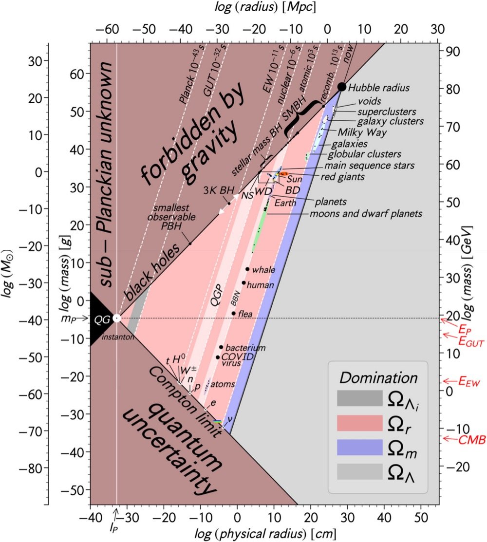
You just have to admire a chart that casually purports to show every single thing in the Universe in one simple 2D plot. The chart in question is from a piece in the most recent issue of the American Journal of Physics with the understated title of “All objects and some questions”.
In Fig. 2, we plot all the composite objects in the Universe: protons, atoms, life forms, asteroids, moons, planets, stars, galaxies, galaxy clusters, giant voids, and the Universe itself. Humans are represented by a mass of 70 kg and a radius of 50 cm (we assume sphericity), while whales are represented by a mass of 10^5 kg and a radius of 7 m.
The “sub-Planckian unknown” and “forbidden by gravity” sections of the chart makes the “quantum uncertainty” section seem downright normal — the paper collectively calls these “unphysical regions”. Lovely turns of phrase all.
But what does it all mean? My physics is too rusty to say, but I thought one of the authors’ conjectures was particularly intriguing: “Our plot of all objects also seems to suggest that the Universe is a black hole.” Huh, cool.
Well, it is that time of year again when the leaves in the northern hemisphere change colors. As usual, SmokyMountains.com has published their best guess as to when the leaves will be changing in various parts of the country. At the end of September and beginning of October here in Vermont, it’ll start looking like this.
The length of a human life is around 80 years. You might get 100 if you’re lucky. The universe is about 13.7 billion years old. The vast difference between a human lifespan and the age of the universe can be difficult to grasp — even the words we use in attempting to describe it (like “vast”) are comically insufficient.
To help us visualize what a difference of eight orders of magnitude might look like, Wylie Overstreet and Alex Gorosh have created a scale model of time in the Mojave Desert, from the Big Bang to the present day. This is really worth watching and likely to make you think some big think thoughts about your place in the universe and in your life.
This is a followup of the scale model of the solar system they built and a video they made about people seeing the Moon through a telescope for the first time.
See also a behind-the-scenes: How We Built a Scale Model of Time. (via colossal)
Based on data from a 2021 survey, FlowingData made these cool infographics of all of the different types of households in the United States. Here are the ten most common:
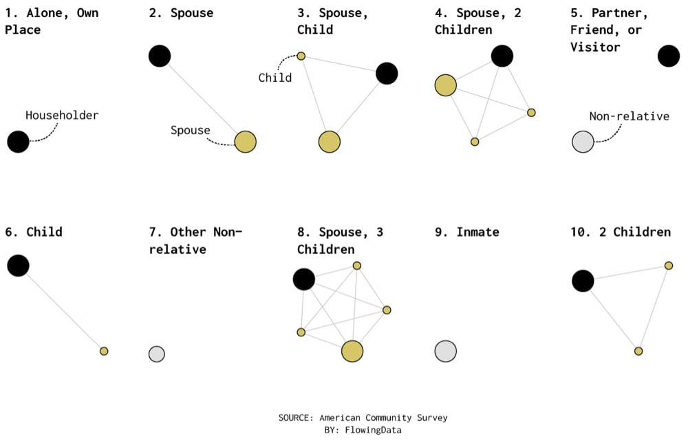
Single homeowners are the most common but look at #9: inmate. Shameful.
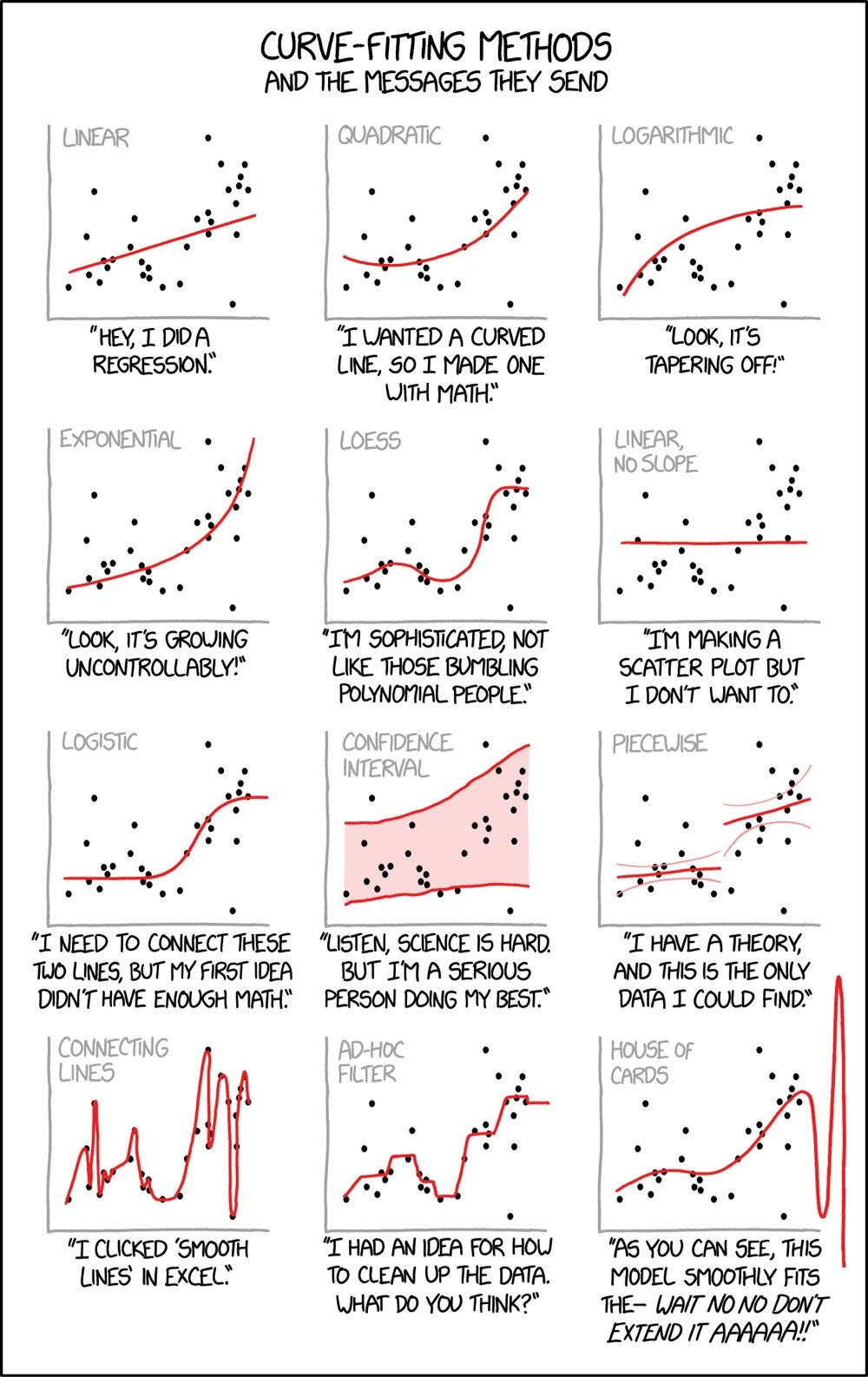
From XKCD, Curve-Fitting Methods and the Messages They Send. Ahhhh, this takes me back to my research days in college, tinkering with best fits and R-squared values…
I’ve written before about the data visualizations created by W.E.B. Du Bois for the 1900 World’s Fair in Paris. Apparently a selection of these infographics are on display at the Cooper Hewitt Design Museum in NYC until May 29.
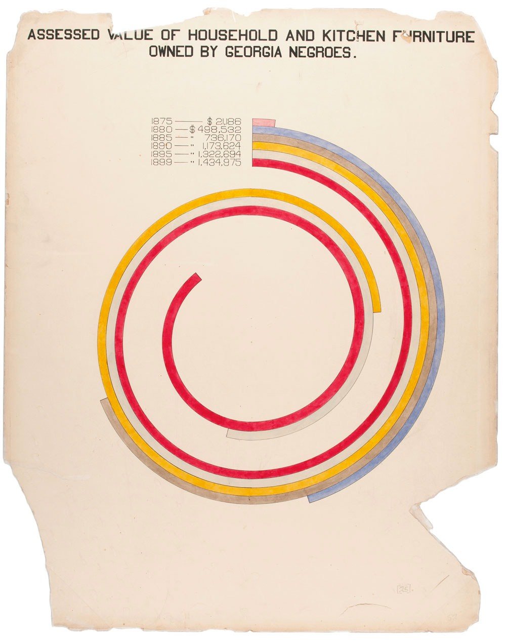
Wish I could get down there to see these…
There are few sounds that can transport me back to a specific time and place like the handshake of a dialup modem. I heard that arrangement of noises thousands of times sitting at my desk in rural Wisconsin, trying to soak up the entire internet. That sound meant freedom, connection, knowledge.
Oona Räisänen created this great visualization and explanation of what’s going on when a modem is making those noises.

If you ever connected to the Internet before the 2000s, you probably remember that it made a peculiar sound. But despite becoming so familiar, it remained a mystery for most of us. What do these sounds mean?
As many already know, what you’re hearing is often called a handshake, the start of a telephone conversation between two modems. The modems are trying to find a common language and determine the weaknesses of the telephone channel originally meant for human speech.
See also this other visualization of dialup sounds, opera singers dubbed with dialup modems, and a vocal arrangement of the modem handshake.
Genetics determines most of how tall children will grow as adults, but environmental factors affect it too. As the wealth of many countries around the world has increased over the past 100 years, living conditions and access to nutrition have improved and people have gotten taller.
A century ago, humans were quite short. For example, the average South Korean woman was about 4-foot-7, or 142 centimeters, while the average American woman was about 5-foot-2, or 159 centimeters. Humans were fairly short by today’s standards, and that was true throughout nearly all of human history.
But in the past century, human heights have skyrocketed. Globally, humans grew about 3 inches on average, but in South Korea, women grew an astounding 8 inches and men grew 6 inches.
South Korea is almost unique in how quickly their population has gotten taller because they went from a relatively low-income country in the 1950s to well on their way to being a rich, industrialized country by the 90s. And the difference is particularly stark when you compare the heights of South Koreans with those of North Koreans, where the living standard is much lower and access to nutrition is restricted.
I really like the show-your-work vibe of this video, along with this recent one on the greatest unexpected performances in the NBA. These videos are not only relating something interesting to the audience, they’re showing us how the data analysis works: where the data is from, how it’s analyzed, and what it all means, which builds data and statistical literacy in a society that desperately needs it.
Ok this video from The Pudding is cool for two different reasons. First, you learn about which NBA player had the most unexpectedly great performance since 1985 (e.g. when a guy who is usually good for 6-8 pts inexplicably drops 50). But, you also get a fun little tutorial in how statistical analysis works and the importance of paying attention to the right data in order to get an answer that’s actually meaningful and relevant. How to interpret data in this way is an under-appreciated aspect in the bombardment of data and statistics we see in the media these days and teaching more people about it doesn’t have to be boring or stuffy.
The Pudding also sets an example here by working in the open: the data they used for their analysis is available on Github.
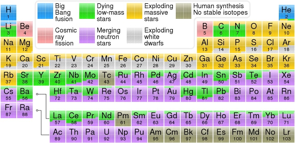
From Wikipedia contributor Cmglee and Astronomy Picture of the Day, a color-coded periodic table that displays which cosmic events — the Big Bang, exploding stars, merging neutron stars, etc. — was responsible for creating each element, according to our present understanding of the universe.
The hydrogen in your body, present in every molecule of water, came from the Big Bang. There are no other appreciable sources of hydrogen in the universe. The carbon in your body was made by nuclear fusion in the interior of stars, as was the oxygen. Much of the iron in your body was made during supernovas of stars that occurred long ago and far away. The gold in your jewelry was likely made from neutron stars during collisions that may have been visible as short-duration gamma-ray bursts or gravitational wave events.
The data for the table came from OSU’s Jennifer Johnson, who quotes Carl Sagan:
The nitrogen in our DNA, the calcium in our teeth, the iron in our blood, the carbon in our apple pies were made in the interiors of collapsing stars. We are made of starstuff.
(thx, caroline)
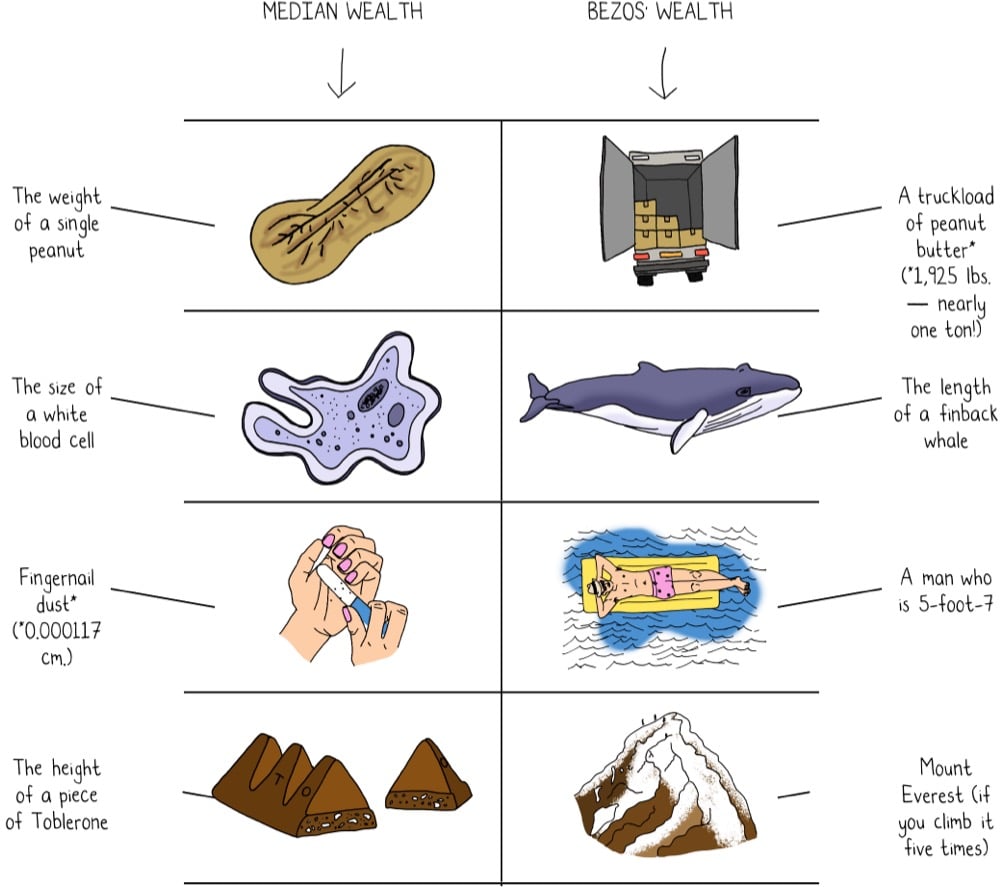
In 9 Ways to Imagine Jeff Bezos’ Wealth, Mona Chalabi provides us with some data visualizations that can help us wrap our heads around just how much money Amazon founder Jeff Bezos has. For instance, if the width of an Oreo cookie represents the median net worth of a US household, Bezos’ wealth is twice the width of the Grand Canyon.
See also 1 pixel wealth, Printing Money, and Spend Bill Gates’ Money.
For the past few years, David McCandless at Beautiful News Daily has been sharing infographics about positive developments in the world, the “stuff we can’t always see because we’re fixated on the negativity of the news”. Now all that good news has been bundled into a new book, Beautiful News: Positive Trends, Uplifting Stats, Creative Solutions. Here are a couple of sample pages from the book:


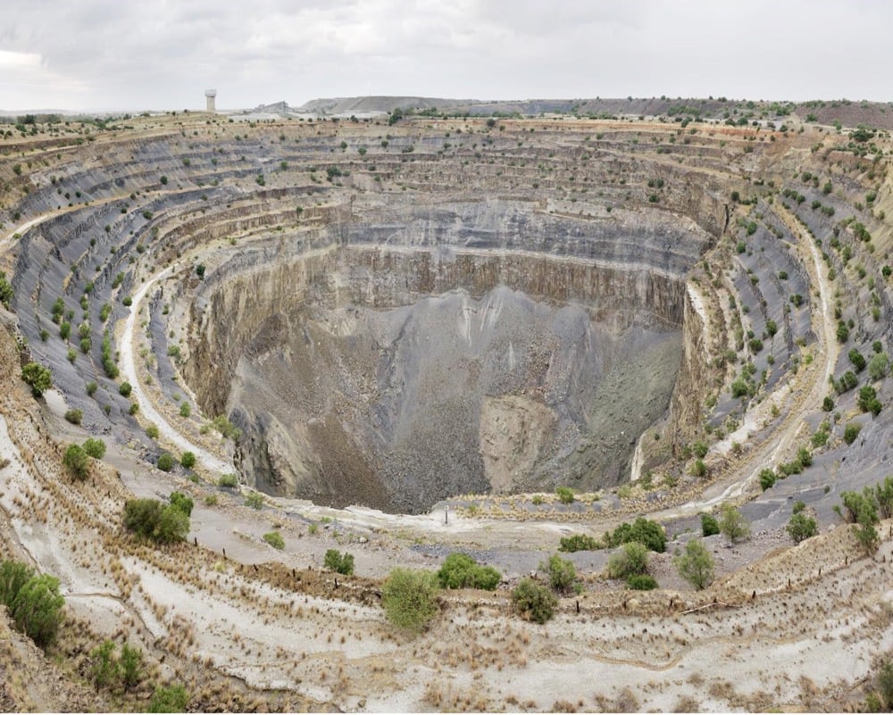
For his project For What It’s Worth, Dillon Marsh created 1:1 scale visualizations of the minerals extracted from South African mines and placed them in photos of the mines themselves. From top to bottom above, a sphere of the 284,000 metric tonnes of copper extracted from the O’Kiep mine, a sphere of the 9500 metric tonnes of gold from the Free State Gold Field, a sphere of 3850 metric tonnes of platinum extracted in total in South Africa since 1924, and a gemstone of the 7.6 million carats of diamonds extracted from the Koffiefontein Mine.
The diamond in particular, which you might not be able to see in that photo (it’s on a vertical stand right in front of the massive hole), underscores just how tiny the amount of material pulled out of these massive mines is, especially when you factor in all the manpower, machinery, injuries, fatalities, and environmental damage related to mining. All that for a bit of shine. (via clive thompson)
Throughout the relatively short recording career of The Beatles, and as late as 1967’s Magical Mystery Tour, the band’s albums released in the United States were, in some cases, quite different than those released in the UK. Jared Pike explains the differences in this comprehensive video:
Pike also made a chart of all the releases and which albums they appeared on, which you can download here. The image is too tall to include here, but here’s an excerpt that shows some of the reorganization that was done for American audiences:
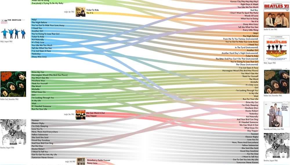
I just looked on Spotify here in America and they’re using the UK versions of the albums (at least for Rubber Soul and Revolver). I wonder how long that’s been the case? According to Wikipedia, it looks like when the band’s albums were reissued on CD in 1987, the track listings were standardized to the UK/international release.

This is neat: Clive Thompson built a little app that converts tabular data into a bar chart using houses from the video game Townscaper. Says Thompson:
A few days ago I was placing houses in a long row, with varying heights. And when I looked at the jagged result I thought:
Hey, that looks like a bar chart!
That made me wonder, hmmm, could I use Townscaper as a dataviz tool? Could I write code that takes data and turns it into a row of buildings?
See also Dan Malec’s algorithmic Townscaper towns.

Well, I’m not sure this book could be any further up my alley; I mean:
The life and legend of New York City, from the size of its skyscrapers to the ways of its inhabitants, is vividly captured in this lively collection of more than 250 maps, cross sections, flowcharts, tables, board games, cartoons and infographics, and other unique diagrams spanning 150 years. Superstars such as Saul Steinberg, Maira Kalman, Christoph Niemann, Roz Chast, and Milton Glaser butt up against the unsung heroes of the popular press in a book that is made not only for lovers of New York but also for anyone who enjoys or works with information design.
The CDC recently released their report on Mortality in the United States, 2020 and this graph of US life expectancy at birth since 1950 by Christopher Ingraham dramatically summarizes the report’s main finding:
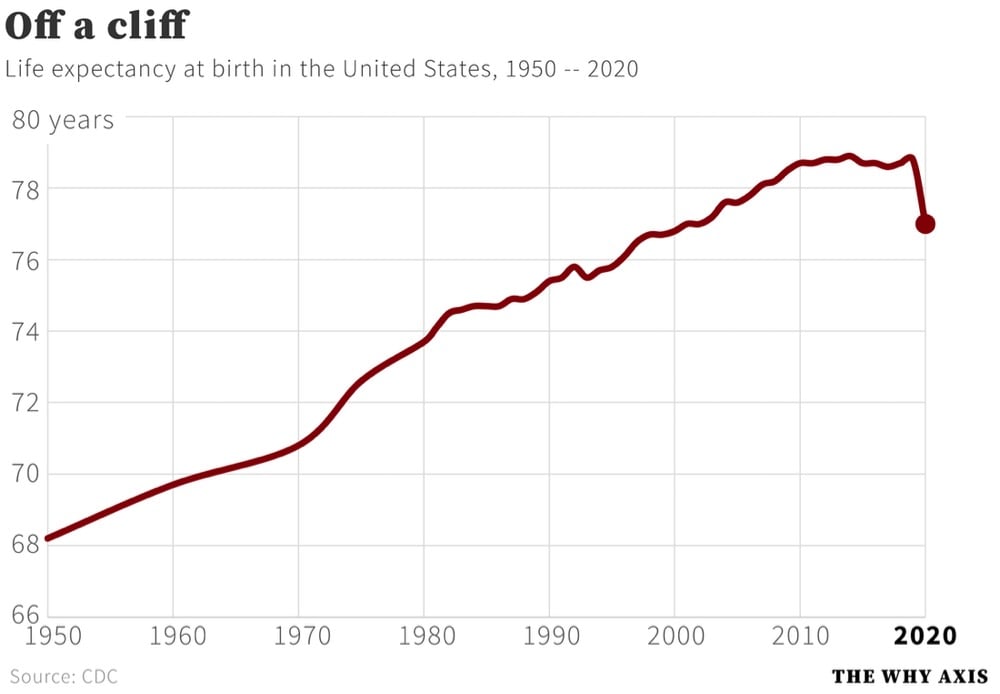
That’s a decrease in life expectancy of 1.8 years from 2019. Here are some more of the report’s significant findings:
In 2020, life expectancy at birth was 77.0 years for the total U.S. population — a decrease of 1.8 years from 78.8 years in 2019. For males, life expectancy decreased 2.1 years from 76.3 in 2019 to 74.2 in 2020. For females, life expectancy decreased 1.5 years from 81.4 in 2019 to 79.9 in 2020.
In 2020, the difference in life expectancy between females and males was 5.7 years, an increase of 0.6 year from 2019.
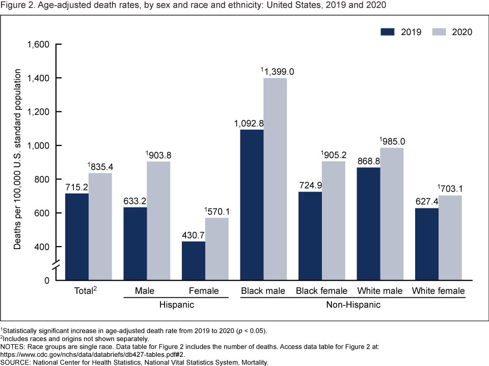
The age-adjusted death rate for the total population increased 16.8% from 715.2 per 100,000 standard population in 2019 to 835.4 in 2020. Age-adjusted death rates increased in 2020 from 2019 for all race-ethnicity-sex groups, increasing 42.7% for Hispanic males, 32.4% for Hispanic females, 28.0% for non-Hispanic Black males, 24.9% for non-Hispanic Black females, 13.4% for non-Hispanic White males, and 12.1% for non-Hispanic White females.
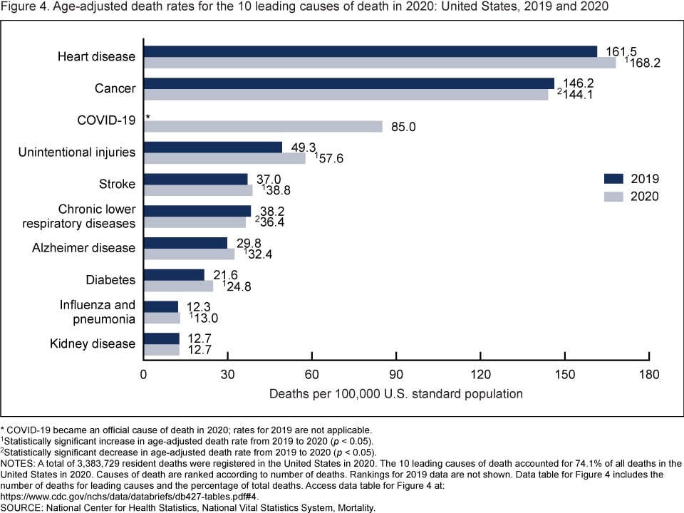
In 2020, 9 of the 10 leading causes of death remained the same as in 2019. The top leading cause was heart disease, followed by cancer. COVID-19, newly added as a cause of death in 2020, became the 3rd leading cause of death. Of the remaining leading causes in 2020 (unintentional injuries, stroke, chronic lower respiratory diseases, Alzheimer disease, diabetes, influenza and pneumonia, and kidney disease), 5 causes changed ranks from 2019. Unintentional injuries, the 3rd leading cause in 2019, became the 4th leading cause in 2020. Chronic lower respiratory diseases, the 4th leading cause in 2019, became the 6th. Alzheimer disease, the 6th leading cause in 2019, became the 7th. Diabetes, the 7th leading cause in 2019, became the 8th. Kidney disease, the 8th leading cause in 2019, became the 10th leading cause in 2020. Stroke, and influenza and pneumonia, remained the 5th and 9th leading causes, respectively. Suicide dropped from the list of 10 leading causes in 2020.
And from the report’s summary:
From 2019 to 2020, the age-adjusted death rate for the total population increased 16.8%. This single-year increase is the largest since the first year that annual mortality data for the entire United States became available. The decrease in life expectancy for the total population of 1.8 years from 2019 to 2020 is the largest single-year decrease in more than 75 years.
Since more people in the US died of Covid in 2021 than in 2020, I’d expect the decline life expectancy and the rise in death rate to continue.
From Max Roser at Our World in Data: Our history is a battle against the microbes: we lost terribly before science, public health, and vaccines allowed us to protect ourselves.
Science is the foundation for our success. 150 years ago nobody knew where diseases came from. Or more precisely, people thought they knew, but they were wrong. The widely accepted idea at the time was the ‘Miasma’ theory of disease. Miasma, the theory held, was a form of “bad air” that causes disease. The word malaria is testament to the idea that ‘mal aria’ — ‘bad air’ in medieval Italian — is the cause of the disease.
Thanks to the work of a number of doctors and chemists in the second half of the 19th century humanity learned that not noxious air, but specific germs cause infectious diseases. The germ theory of disease was the breakthrough in the fight against the microbe. Scientists identified the pathogens that cause the different diseases and thereby laid the foundation for perhaps the most important technical innovation in our fight against them: vaccines.
Here’s what vaccines did for us, in three charts:
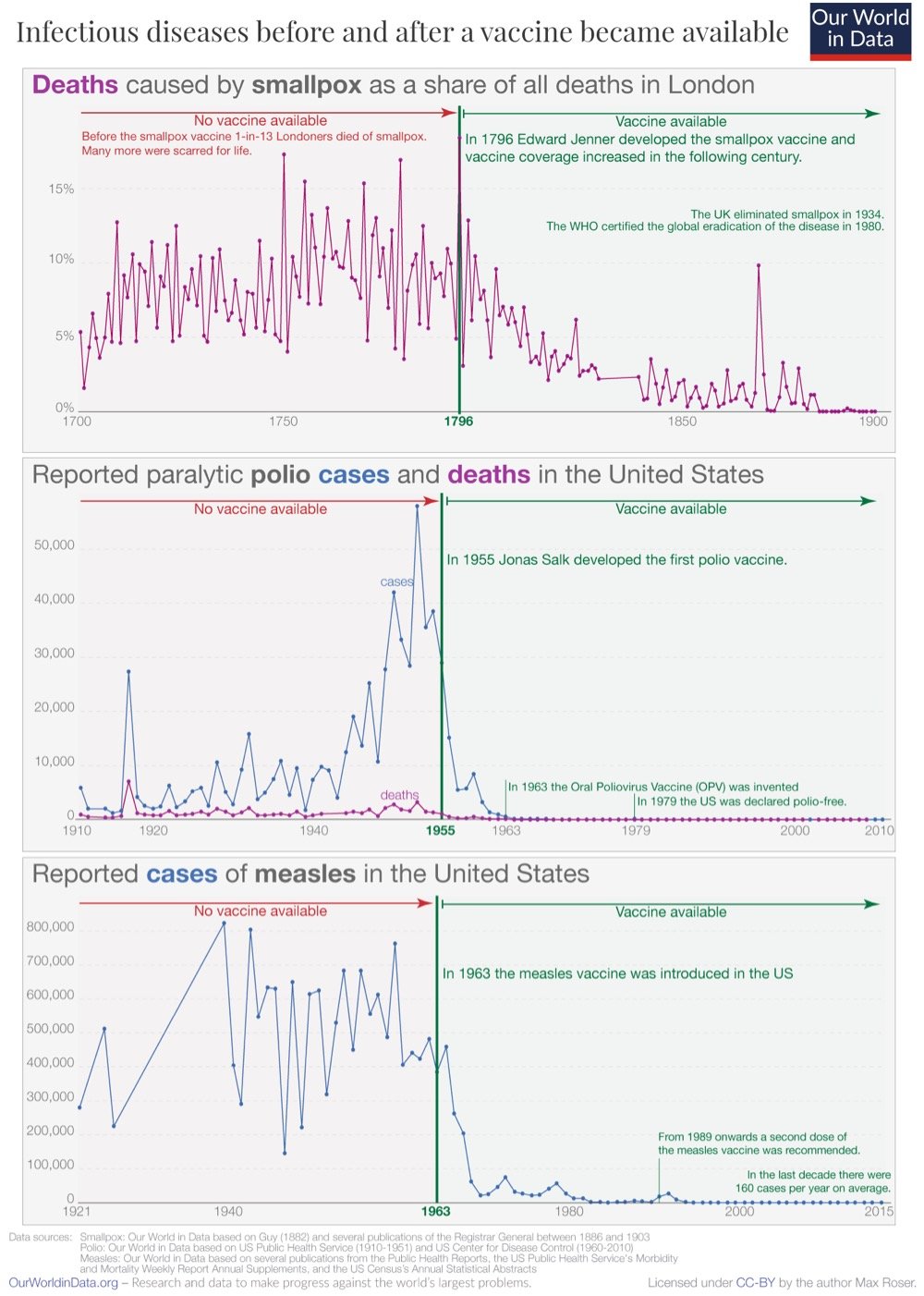
Even among those who accept and understand how good vaccines are at stopping disease, it’s difficult to truly appreciate just how incredible and transformative they have been. By one estimate, vaccines saved between 150 & 200 million lives from 1980 & 2018…and that’s just for smallpox. Covid-19 vaccines have saved hundreds of thousands of lives in Europe and the US in the first year of their availability. Truly a miraculous invention.
Using data from Johns Hopkins, this time lapse video shows the spread of Covid-19 across the US from Feb 2020 to Sept 2021. This looks so much like small fires exploding into raging infernos and then dying down before flaring up all over again. Indeed, forest fire metaphors seem to be particularly useful in describing pandemics like this.
Think of COVID-19 as a fire burning in a forest. All of us are trees. The R0 is the wind speed. The higher it is, the faster the fire tears through the forest. But just like a forest fire, COVID-19 needs fuel to keep going. We’re the fuel.
In other forest fire metaphorical scenarios, people are ‘kindling’, ‘sparks being thrown off’ (when infecting others) and ‘fuel’ (when becoming infected). In these cases, fire metaphors convey the dangers posed by people being in close proximity to one another, but without directly attributing blame: people are described as inanimate entities (trees, kindling, fuel) that are consumed by the fire they contribute to spread.
See also A Time Lapse World Map of Every Covid-19 Death (from July 2020).


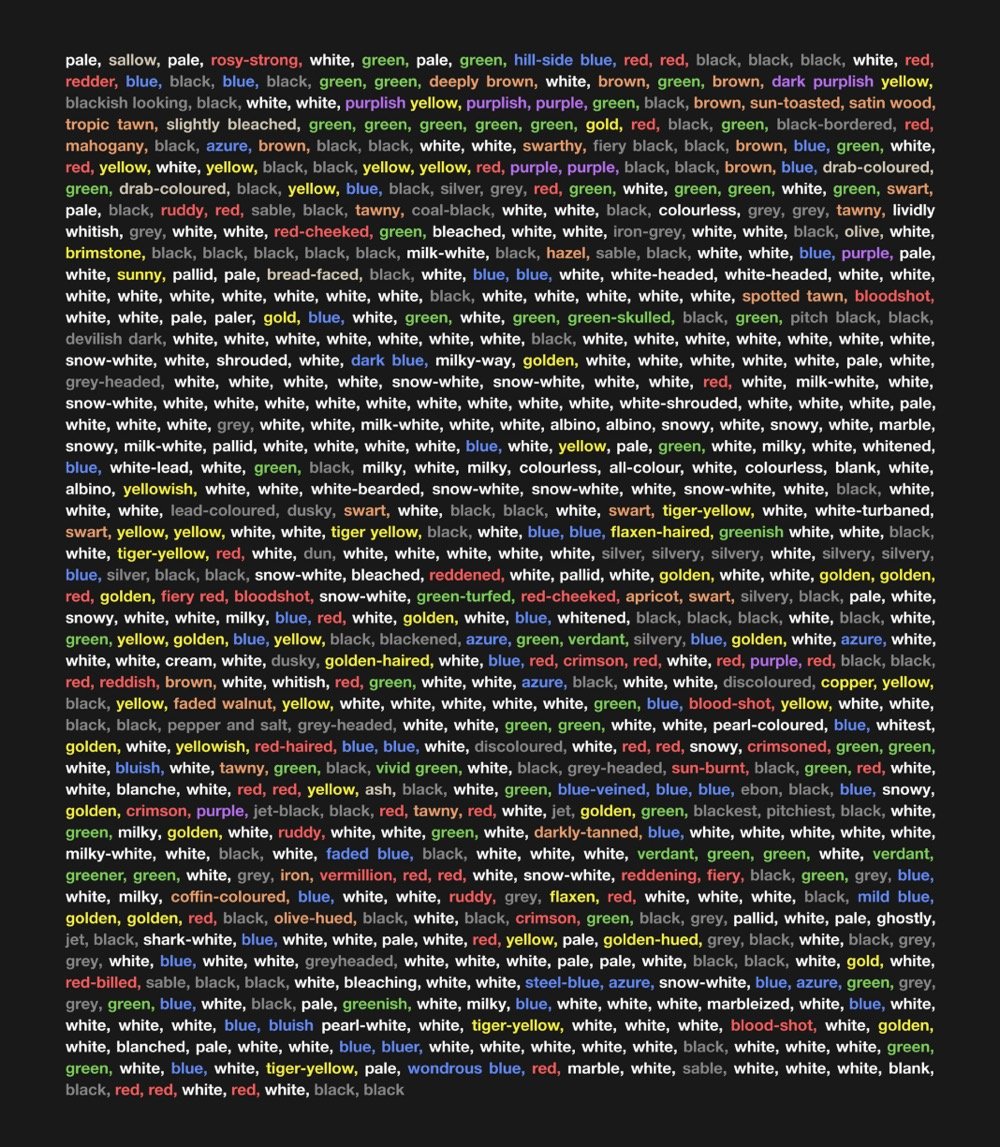
Peter Gorman of Barely Maps has published a wonderful little book called Kaleidoscope Brain that contains 100 visualizations of Moby-Dick. Gorman read Herman Melville’s masterpiece last year and made these maps & graphics to help him make sense of it.
I read Moby-Dick in April 2020. For weeks afterward, I couldn’t stop thinking about it. I started making maps and diagrams as a way to figure it out.
Moby-Dick is infamous for its digressions. Throughout the book, the narrator disrupts the plot with contemplations, calculations, and categorizations. He ruminates on the White Whale, and the ocean, and human psychology, and the night sky, and how it all relates back to the mystery of the unknown. His narration feels like a twisting-turning struggle to explain everything.
Reading Moby-Dick actually made me feel like that-like I’d mentally absorbed its spin-cycle style. I developed a case of “Kaleidoscope Brain.” The maps I was making were obsessive and encyclopedic. They were newer and weirder and they digressed beyond straightforward geography.
The book is available as a free download on Gorman’s Patreon — support his efforts if you find them valuable!
Above, from top to bottom: the letters of the alphabet in order of their appearance in the book, the constellation Cetus (aka “The Whale”), every color in the book.
It may seem like sometimes that with the pandemic, we’re back to square one. With the much more contagious Delta variant in play and an increasing number of breakthrough infections, the efficacy of these vaccines that we thought were amazing maybe aren’t? (Or maybe we just need to readjust our expectations?) But in terms of what these vaccines were specifically developed for — reducing & preventing severe disease and death — they are still very much doing their job. Just take a look at this graph from a White House Covid-19 press briefing yesterday:
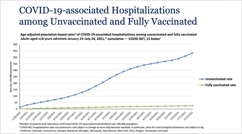
Even with Delta endemic in the country, the vaccines are providing extraordinary protection against infections severe enough to land folks in the hospital. In a recent CDC study of infections and hospitalizations in Los Angeles County, they report that on July 25, the hospitalization rate of unvaccinated people was 29.2 times that of fully vaccinated persons. 29 times the protection is astounding for a medical intervention. These vaccines work, we’re lucky to have them, and we need to get as many people worldwide as we can vaccinated as quickly as we can. Period.
Charles Gaba has been graphing the Covid-19 vaccination rates of the 50 states (and DC) against the percentage of people who voted for Donald Trump in 2020 and there is unsurprisingly a clear correlation between the two:
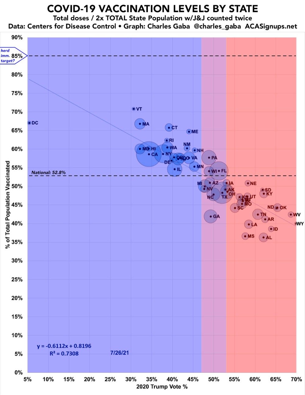
As one commenter noted, all of the solidly “blue” states are above the vaxxed national average and all the solidly “red” states are below it. The picture is a little more muddy when you look at the rates at the county level:
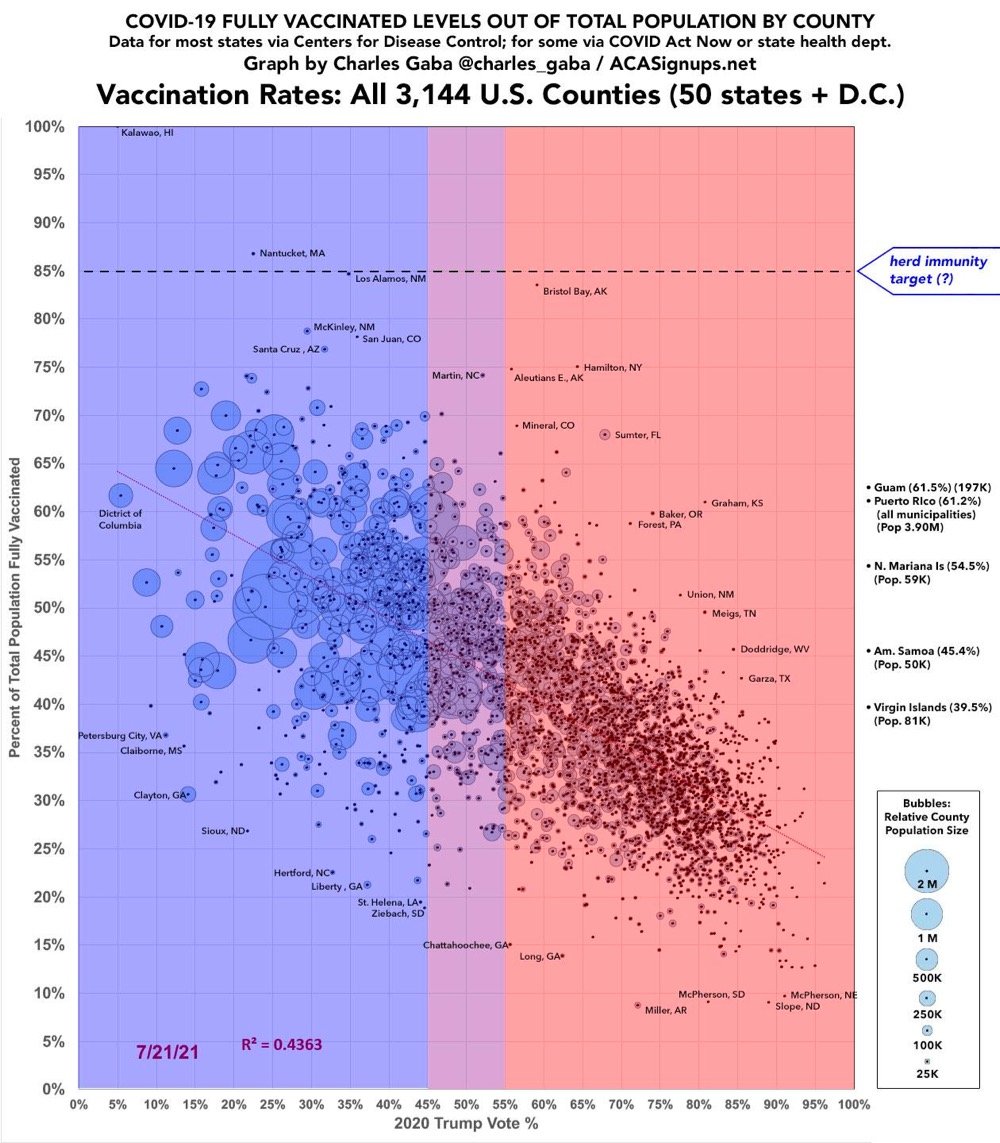
The “conservatives are unvaxxed” trend is still there, but a lack of access and education around the vaccines in counties with large Black and Latino populations also plays a large role in whether people are vaccinated or not.
This is an animation of how quickly an object falls 1 km to the surfaces of solar system objects like the Earth, Sun, Ceres, Jupiter, the Moon, and Pluto. For instance, it takes 14.3 seconds to cover that distance on Earth and 13.8 seconds on Saturn.
It might be surprising to see large planets have a pull comparable to smaller ones at the surface, for example Uranus pulls the ball down slower than at Earth! Why? Because the low average density of Uranus puts the surface far away from the majority of the mass. Similarly, Mars is nearly twice the mass of Mercury, but you can see the surface gravity is actually the same… this indicates that Mercury is much denser than Mars.
(via @thekidshouldsee)
Newer posts
Older posts
Socials & More