kottke.org posts about infoviz
For the New Yorker, Hannah Fry wrote a brief history of information visualization, a quiet innovation that has changed the world:
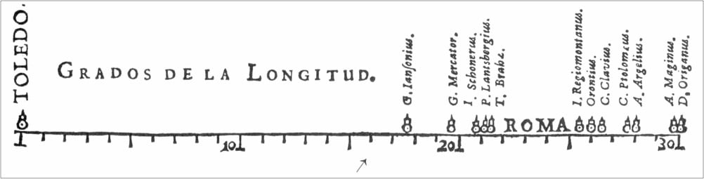
Van Langren could have put these values in a table, as would have been typical for the time, but, as Friendly and Wainer observe, “only a graph speaks directly to the eyes.” Once the numbers were visualized, the enormous differences among them — and the stakes dependent on those differences — became impossible to ignore. Van Langren wrote, “If the Longitude between Toledo and Rome is not known with certainty, consider, Your Highness, what it will be for the Western and Oriental Indies, that in comparison the former distance is almost nothing.”
Van Langren’s image marked an extraordinary conceptual leap. He was a skilled cartographer from a long line of cartographers, so he would have been familiar with depicting distances on a page. But, as Tufte puts it, in his classic study “Visual Explanations” (1997), “Maps resemble miniature pictorial representations of the physical world.” Here was something entirely new: encoding the estimate of a distance by its position along a line. Scientists were well versed in handling a range of values for a single property, but until then science had only ever been concerned with how to get rid of error — how to take a collection of wrong answers and reduce its dimension to give a single, best answer. Van Langren was the first person to realize that a story lay in that dimension, one that could be physically seen on a page by abstracting it along a thin inked line.
Van Langren’s graph, which Fry says “might be the first statistical graph in history”, is pictured at the top of this post.
This chart caught my eye yesterday:
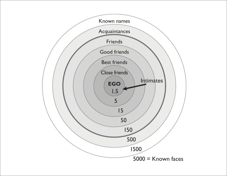
It’s from Robin Dunbar’s recent book, Friends: Understanding the Power of Our Most Important Relationships. You might recall the author’s name from his concept of Dunbar’s number:1 that on average people can maintain about 150 friendships with others, a limit that is determined by human brain size and function. The chart is a more detailed version of the concept: it shows, roughly, the number of people we can have meaningful relationships with at various levels of intimacy. Dunbar explains in this Atlantic interview:
The innermost layer of 1.5 is [the most intimate]; clearly that has to do with your romantic relationships. The next layer of five is your shoulders-to-cry-on friendships. They are the ones who will drop everything to support us when our world falls apart. The 15 layer includes the previous five, and your core social partners. They are our main social companions, so they provide the context for having fun times. They also provide the main circle for exchange of child care. We trust them enough to leave our children with them. The next layer up, at 50, is your big-weekend-barbecue people. And the 150 layer is your weddings and funerals group who would come to your once-in-a-lifetime event.
The layers come about primarily because the time we have for social interaction is not infinite. You have to decide how to invest that time, bearing in mind that the strength of relationships is directly correlated with how much time and effort we give them.
The interview is interesting throughout — there’s evidence that introverts have fewer connections in each layer than extroverts, your numbers go down as you get older when relationship become harder to replace, “falling in love will cost you two friendships”, and how much time is necessary to form a friendship:
It takes about 200 hours of investment in the space of a few months to move a stranger into being a good friend. This fits with our data, which suggests that close friends are very expensive in terms of time investment to maintain. I think the figures are a guideline rather than precise. It just means friendships require work.
I’ve been thinking a lot about friendship over the many months of the pandemic — about how my friend circles changed during that time and what friendship actually means to me. It is not much of an exaggeration to say that my close friends saved my life during the past year — there were 3 or 4 people that I leaned heavily on (and they on me) for advice, sanity checks, shoulder-crying, going on long walks, emotional support, grieving, getting unfunked, relationship advice, and generally feeling like a normal & whole person in the midst of an unprecedentedly awful situation. We talked and cried and raged about anything and everything. We went deep and got intimate. If there’s a silver lining to the pandemic for me, it’s the development and deepening of these incredible friendships. ♥
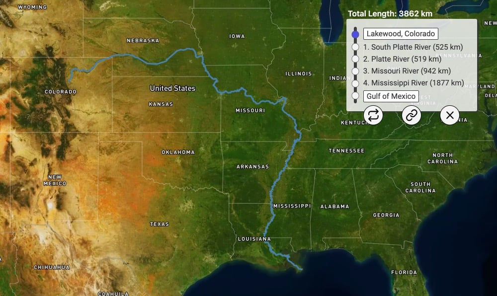
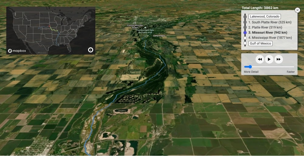
Using data from the United States Geological Survey, River Runner visualizes the path taken by a raindrop from its landing spot to its eventual endpoint. Just click on any spot in the US and it maps out the path the drop would take, complete with a satellite fly-through of the route. I spent many happy minutes playing with this, although the endpoint of “Canada” for a raindrop that lands in my Vermont yard was somewhat unsatisfying.
See also The Marvelous Mississippi River Meander Maps and a map of all of the rivers in the US. (via waxy)
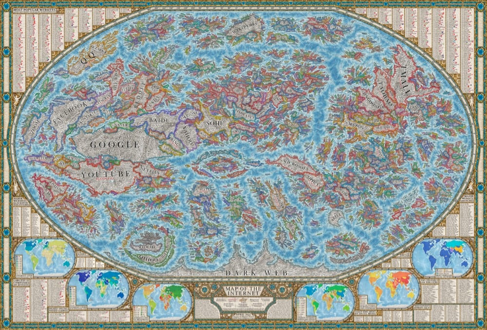
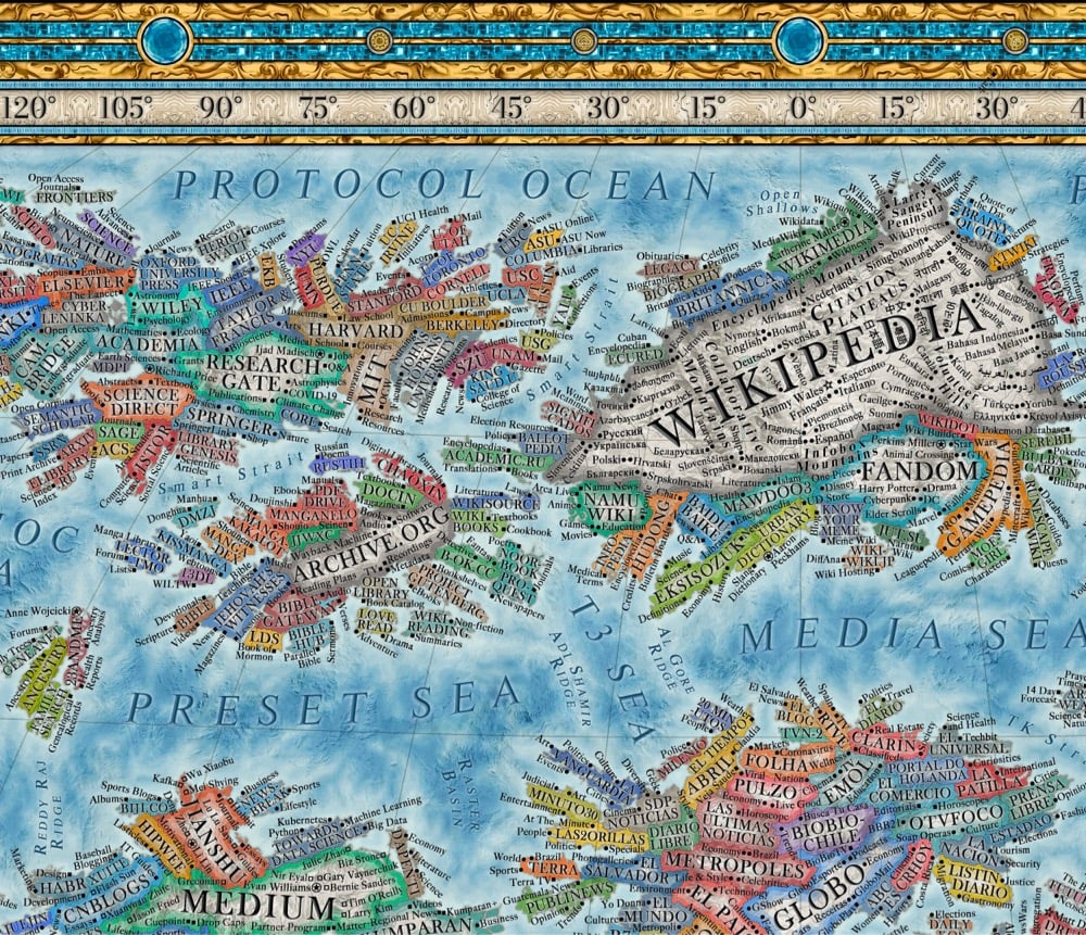
Translating sites, search engines, social networks, browsers, ISPs, and other internet entities into geographic features, Martin Vargic has created a map of the internet circa 2021.
It includes several thousand of some of the most popular websites, represented as distinct “countries”, which are grouped together with others of similar type or category, forming dozens of distinct clusters, regions and continents that stretch throughout the map, such as “news sites”, “search engines”, “social networks”, “e-commerce”, “adult entertainment”, “file sharing”, “software companies” and so much more. In the center of it all can be found ISPs and web browsers, which form the core and backbone of the internet as we know it, while the far south is the domain of the mysterious “dark web”.
See also an actual map of the known internet from May 1973.
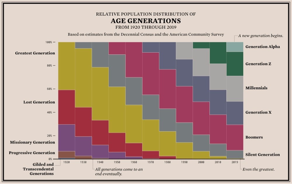
From Flowing Data, a stacked bar chart showing the relative population distribution of age generations from 1920 to the present. The thing that’s really apparent to me in this graph is how the size, increased life expectancy, and better quality of life of the Silent and (especially) Baby Boomer generations really shifted the social order in America. It’s a triple whammy: this large group of very healthy people stuck around so much longer than the previous generations that they were able to keep their wealth and political/corporate power instead of handing it off to the next generations. It’s a generational firewall — they didn’t leave any room for their children or grandchildren. Instead, Gen X and Millennials got branded as lazy/apathetic and financially careless. (via @mikey_two)
Courtesy of Geodienst, this is a map of the world’s lighthouses. Where the data is available (and you can see it’s quite sparse for some areas of the world), the map shows the location, color, range, and flashing frequency/pattern of each lighthouse. The color and flashing pattern of a lighthouse is called the characteristic. Each lighthouse has a different characteristic so that mariners can tell them apart and to indicate different water areas. (via strange maps)
In his latest impeccably produced video, Neil Halloran looks at the science of climate change and uncertainty both in science and in the public’s trust of science.
Degrees of Uncertainty is an animated documentary about climate science, uncertainty, and knowing when to trust the experts. Using cinematic visualizations, the film travels through 20,000 years of natural temperature changes before highlighting the rapid warming of the last half century.
The vast majority of climate scientists seem pretty sure that human use of fossil fuels has warmed the Earth and that warming is increasingly having an impact on both nature and society. But how do we, as members of the public with a relatively poor understanding of science, evaluate how certain we should be?
FYI: This video includes some interactive elements that only work if you watch it on Halloran’s website.
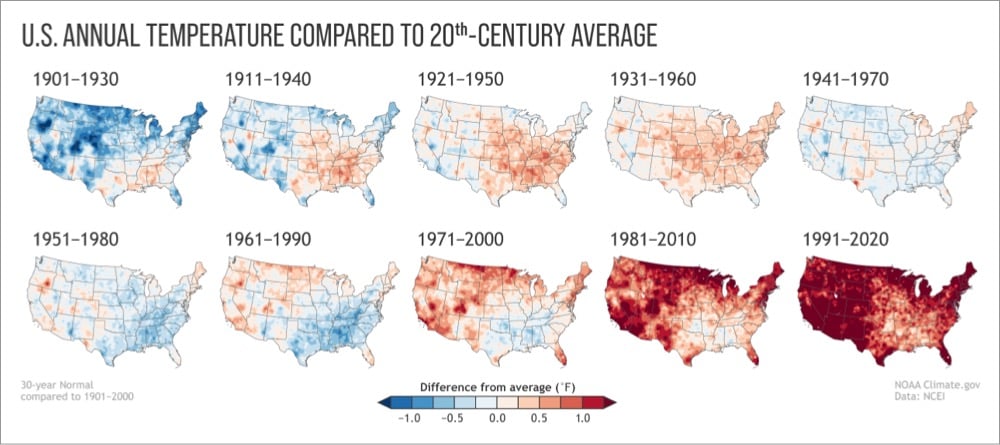
Every 10 years, the National Oceanic and Atmospheric Administration (NOAA) updates its definition of what it defines as “normal” weather.
As soon as the 2021 New Year’s celebrations were over, the calls and questions started coming in from weather watchers: When will NOAA release the new U.S. Climate Normals? The Normals are 30-year averages of key climate observations made at weather stations and corrected for bad or missing values and station changes over time. From the daily weather report to seasonal forecasts, the Normals are the basis for judging how temperature, rainfall, and other climate conditions compare to what’s normal for a given location in today’s climate.
They’re set to release the updated 1991-2020 Normals in early May and, crucially, these new normal climate conditions are not adjusted for climate change.
The last update of the Normals took place in 2011, when the baseline shifted from 1971-2000 to 1981-2010. Among the highlights of the rollout was the creation of a map showing how climate-related planting zones across the contiguous United States had shifted northward in latitude and upward in elevation. It was a clear signal that normal overnight low temperatures across the country were warmer than they used to be.
The planting zone maps emphasized a key point about the Normals and climate change: the once-per-decade update means these products gradually come to reflect the “new normal” of climate change caused by global warming. What’s normal today is often very different than what was normal 50 or 100 years ago. This gradual adjustment is the point: the purpose of the Normals is to provide context on what climate is like today, not how it’s changing over time.
This is literally shifting baselines in action.
So what are shifting baselines? Consider a species of fish that is fished to extinction in a region over, say, 100 years. A given generation of fishers becomes conscious of the fish at a particular level of abundance. When those fishers retire, the level is lower. To the generation that enters after them, that diminished level is the new normal, the new baseline. They rarely know the baseline used by the previous generation; it holds little emotional salience relative to their personal experience.
And so it goes, each new generation shifting the baseline downward. By the end, the fishers are operating in a radically degraded ecosystem, but it does not seem that way to them, because their baselines were set at an already low level.
Over time, the fish goes extinct — an enormous, tragic loss — but no fisher experiences the full transition from abundance to desolation. No generation experiences the totality of the loss. It is doled out in portions, over time, no portion quite large enough to spur preventative action. By the time the fish go extinct, the fishers barely notice, because they no longer valued the fish anyway.
I’ve been thinking a lot about shifting baselines recently — specifically in terms of how quickly people in the US got used to thousands of people dying from Covid every day and became unwilling to take precautions or change behaviors that were deemed essential just months earlier when many fewer people were dying. See also mass shootings.
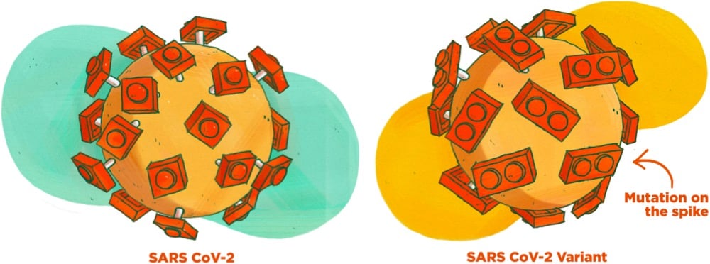
This guide to Covid-19 variants (SARS-CoV-2 viruses that have evolved changes to meaningfully alter their behavior) by Michaeleen Doucleff and Meredith Rizzo at NPR cleverly visualizes how mutations of the virus’s spike proteins help bind it more easily to ACE2 receptors on human cells. The key to the visualization is Meredith Miotke’s illustrations of the viruses using Lego pieces to represent the virus spikes and cell receptors. The usual SARS-CoV-2 has 1x1 Lego pieces that can bind with 1x2 pieces, like so:
But, as everyone who has ever worked with a Lego set knows, a 1x1 piece stuck to a 1x2 piece is not super stable. So when a version of the virus with a 1x2 piece shows up, it’s able to form a better connection to the 1x2 receptor:
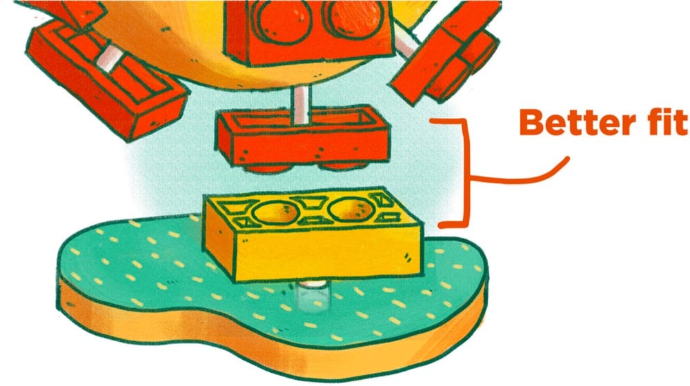
The analogy breaks down if you look too hard at it1 but for many people, it can be a quick way to get the gist of the mechanism at work here. (via @EricTopol)
For Design Ah by Daihei Shibata, Unendurable Line is a short film about sudden changes due to “thresholds hidden in everyday life”. The choral accompaniment to this is delightful.
See also Shibata’s Unexpected Outcome. If you’re in the US, you can watch 60 full episodes of Design Ah on THIRTEEN.
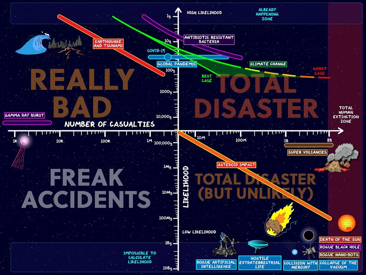
Spurred by the pandemic — what he calls “the first experience we’ve had of a global disaster affecting every single person on Earth”1 — Domain of Science’s Dominic Walliman takes stock of many of the possible catastrophes that might befall humanity, ranking possible threats based on their likelihood and the number of potential casualties.
This year was the first experience we’ve had of a global disaster affecting every single person on Earth. And also how unprepared society was to deal with it, despite plenty of people giving warnings that this was going to happen at some stage.
But in the midst of all the doom I started to wonder, what other things could threaten humanity, that we are not thinking about? So I made the Map of Doom to list all the threats to humanity in one place.
The result is the quadrant chart and the video above as well as the Map of Doom.
One could imagine a third dimension of this chart: what, if anything, humans can do about each of these threats. Earthquakes can be detected, buildings can be designed to withstand them, and evacuation procedures enacted and prioritized. Many effects of climate change can be mitigated. Asteroids can be detected, but doing something about them might prove difficult. We’ve lowered the threat of nuclear war — for now. Supervolcanoes? Yikes.
You can find a list of references used in the video’s description. (via open culture)
Check out this graph from Our World in Data of the price of electricity from new power plants. In 2009, solar was the most expensive energy source and in 2019 it’s the cheapest.
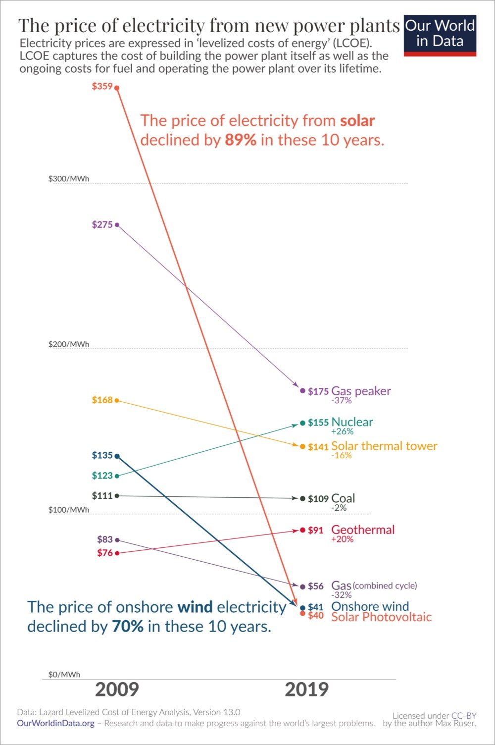
Electricity from utility-scale solar photovoltaics cost $359 per MWh in 2009. Within just one decade the price declined by 89% and the relative price flipped: the electricity price that you need to charge to break even with the new average coal plant is now much higher than what you can offer your customers when you build a wind or solar plant.
It’s hard to overstate what a rare achievement these rapid price changes represent. Imagine if some other good had fallen in price as rapidly as renewable electricity: Imagine you’d found a great place to live back in 2009 and at the time you thought it’d be worth paying $3590 in rent for it. If housing had then seen the price decline that we’ve seen for solar it would have meant that by 2019 you’d pay just $400 for the same place.
The rest of the page is worth a read as well. One reason why the cost of solar is falling so quickly is that the technology is following a similar exponential curve to computer chips, which provide more speed and power every year for less money, an observation called Wright’s Law:
If you want to know what the future looks like one of the most useful questions to ask is which technologies follow Wright’s Law and which do not.
Most technologies obviously do not follow Wright’s Law — the prices of bicycles, fridges, or coal power plants do not decline exponentially as we produce more of them. But those which do follow Wright’s Law — like computers, solar PV, and batteries — are the ones to look out for. They might initially only be found in very niche applications, but a few decades later they are everywhere.
If you are unaware that technology follows Wright’s Law you can get your predictions very wrong. At the dawn of the computer age in 1943 IBM president Thomas Watson famously said “I think there is a world market for maybe five computers.” At the price point of computers at the time that was perhaps perfectly true, but what he didn’t foresee was how rapidly the price of computers would fall. From its initial niche when there was perhaps truly only demand for five computers they expanded to more and more applications and the virtuous cycle meant that the price of computers declined further and further. The exponential progress of computers expanded their use from a tiny niche to the defining technology of our time.
Solar modules are on the same trajectory, as we’ve seen before. At the price of solar modules in the 1950s it would have sounded quite reasonable to say, “I think there is a world market for maybe five solar modules.” But as a prediction for the future this statement too would have been ridiculously wrong.
After Terri Nelson noticed people complaining online about a lack of scent from newly purchased scented candles, Kate Petrova analyzed Amazon reviews for candles from the past three years and found a drop in ratings for scented candles beginning in January 2020 (compared to a smaller ratings decline for unscented candles).
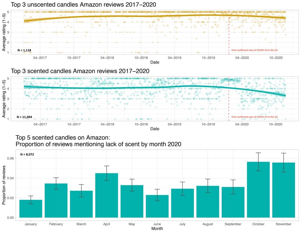
The hypothesis is that some of these buyers have lost their sense of smell due to Covid-19 infections and that’s showing up in the ratings.
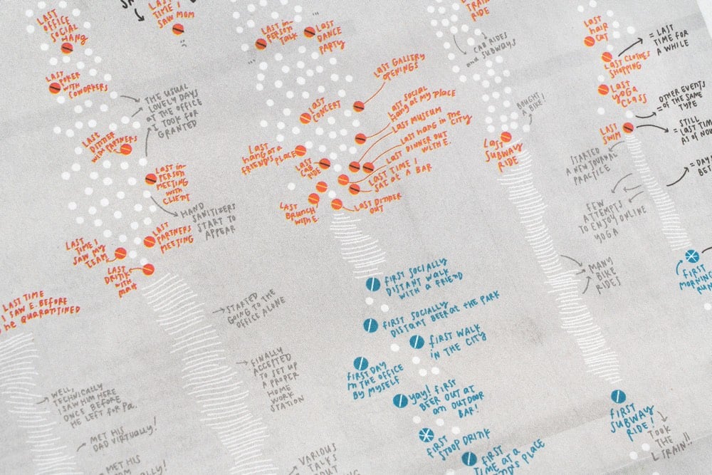
For the print version of the NY Times from this past Sunday, information designer Giorgia Lupi created a hand-drawn visualization that “tracks the last time [she] did something before the pandemic hit, and the first time she did something new with social distancing”.
Our lives have been transformed during the Covid-19 pandemic as the activities we used to do every day have been put on hold and new, socially distanced routines have taken their place. Pentagram partner Giorgia Lupi documents these changes in her own life in a data visualization commissioned by The New York Times for the cover of its “At Home” section, which runs as part of the newspaper’s Sunday edition. The hand-drawn visualization is a personal timeline that tracks the “last” time Giorgia did something before the pandemic hit, and the “first” time she did something new as she started to emerge from lockdown.
Not hand-drawn, but I remember pretty clearly what my lasts were:
- Last movie (w/ kids): Onward in mid-March
- Last movie (solo): Portrait of a Lady on Fire in mid-March
- Last visit to NYC: late October 2019
- Last trip: Vietnam/Singapore/Qatar in Jan/Feb 2020
- Last restaurant (solo): a forgettable ramen place in Burlington in mid-March
- Last restaurant (w/ a friend): better local ramen place in early March
- Last cocktail bar: Bar Stories in Singapore in early February
- Last museum: Museum of Islamic Art in Doha, Qatar in early February
I don’t remember my firsts as well, although one that sticks out is eating french fries (take-out) in July. On a normal day, french fries are delicious but when you haven’t had them in months, they are otherworldly.
From Stamen’s lead cartographer Alan McConchie, an excellent review of the charts and maps that best communicated vital information about the 2020 election.
After the first night of election results was over, and most of the state races had been called, we settled in for several more days of vote counting in a few key states. Dynamic “choose your own adventure” maps and scenario modeling tools became much less useful, and the landscape of the remaining Electoral College outcomes could be explained better without a map or a chart at all. Simple infographics like this one from the BBC did an excellent job of telling the reader all they needed to know.
You should dig into the article for the commentary and analysis, but I did want to share a couple of my favorite maps/charts:

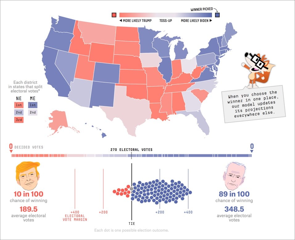
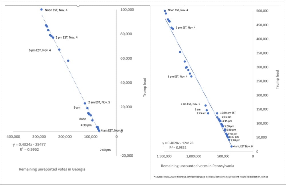
The graphs by John Harurum in that last image were especially useful for me in seeing how the counting trends were going.
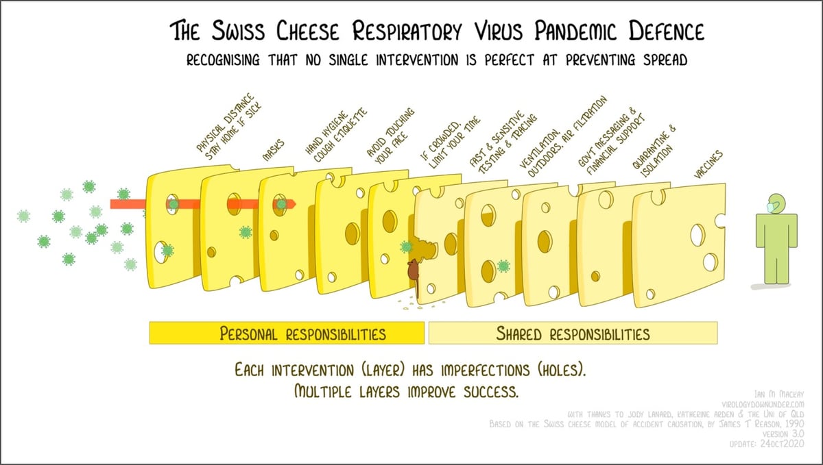
The Swiss cheese model of accident causation is a framework for thinking about how to layer security measures to minimize risk and prevent failure. The idea is that when several layers of interventions, despite their weaknesses, are properly stacked up between a hazard and a potentially bad outcome, they are able to cumulatively prevent that outcome because there’s no single point of failure. During the pandemic, health care workers and public health officials have been using the Swiss cheese model to visualize how various measures can work together to help keep people safe.
Virologist Dr. Ian Mackay has visualized the Swiss cheese Covid-19 defense in a wonderful way (pictured above). Each layer of cheese represents a personal or shared intervention — like mask wearing, limiting your time indoors w/ crowds, proper ventilation, quarantine, vaccines — and the holes are imperfections. Applied together, these imperfect measures work like a filter and can vastly improve chances of success.1 He even added a “misinformation mouse” chewing through one of the cheese slices to represent how deceptive information can weaken these defenses.
Mackay has released this graphic under a Creative Commons license (free to share and adapt w/ attribution) and is available in English, German, French, Spanish, Korean, and several other languages. (via @EricTopol)
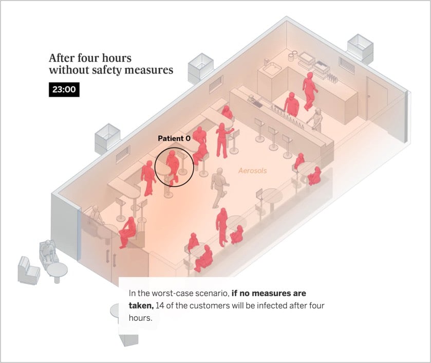
From El Pais, this is an excellent visualization of how Covid-19 spreads indoors via aerosols and what can be done to limit that spread. They go through simulations of three different indoor scenarios that are based on actual events — in a home with friends, in a bar at 50% capacity, and in a classroom — and see what happens when differing levels of precautions are applied: masks, ventilation, and limiting exposure time.
Six people get together in a private home, one of whom is infected. Some 31% of coronavirus outbreaks recorded in Spain are caused by this kind of gathering, mainly between family and friends.
Irrespective of whether safe distances are maintained, if the six people spend four hours together talking loudly, without wearing a face mask in a room with no ventilation, five will become infected, according to the scientific model explained in the methodology.
If face masks are worn, four people are at risk of infection. Masks alone will not prevent infection if the exposure is prolonged.
The risk of infection drops to below one when the group uses face masks, shortens the length of the gathering by half and ventilates the space used.
In all three scenarios, note that distancing is largely irrelevant when people gather indoors for longer periods in poorly ventilated areas. From the school example:
In real outbreaks, it has been noted that any of the students could become infected irrespective of their proximity to the teacher as the aerosols are distributed randomly around the unventilated room.
The only thing that’s disappointing about this piece is that it does not stress enough that finding alternatives to indoor activities with lots of people is the much safer course of action than just cracking a window or masking up. Safety step #1 is still being smart about non-essential activities — masks and ventilation are not magically going to protect you during risky activities. Educating our children is important and difficult (though not impossible) to do outside in many places, so yeah, let’s mask up and ventilate those classrooms. But your indoor birthday party with 10 friends or Thanksgiving dinner with the cousins and grandparents? Or dining out in a room full of strangers at a restaurant? Even with masks and ventilation, it’s not a great idea. Scale it down, move it to Zoom/FT, hold it outdoors (distanced, masked), or just skip it.
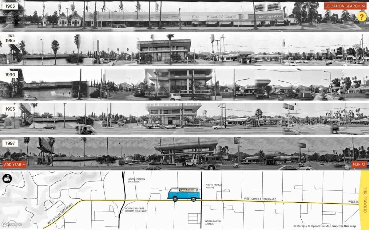
Since 1965, American artist Ed Ruscha has been taking photos all along the length of Sunset Boulevard in LA. The Getty has made those photos available on the Getty Research Institute website and Stamen Design built this fantastic interface called 12 Sunsets for virtually cruising up and down the street.
This is so much fun to play with! You can use the mouse or arrow keys to drive, the spacebar to flip to the other side of the street, and you can change or add years to the display. It’s really interesting to add a bunch of different years to the display and then motor up and down the street to see what’s changed over the decades. It’s the perfect interface for this art.
Data visualization pioneer Edward Tufte has published four books on the art and science of displaying information, including the seminal The Visual Display of Quantitative Information in 1983. To that set, he now adds a fifth book: Seeing with Fresh Eyes: Meaning, Space, Data, Truth. I couldn’t find a description of the book, but the website lists the table of contents and shows a few of the page layouts.
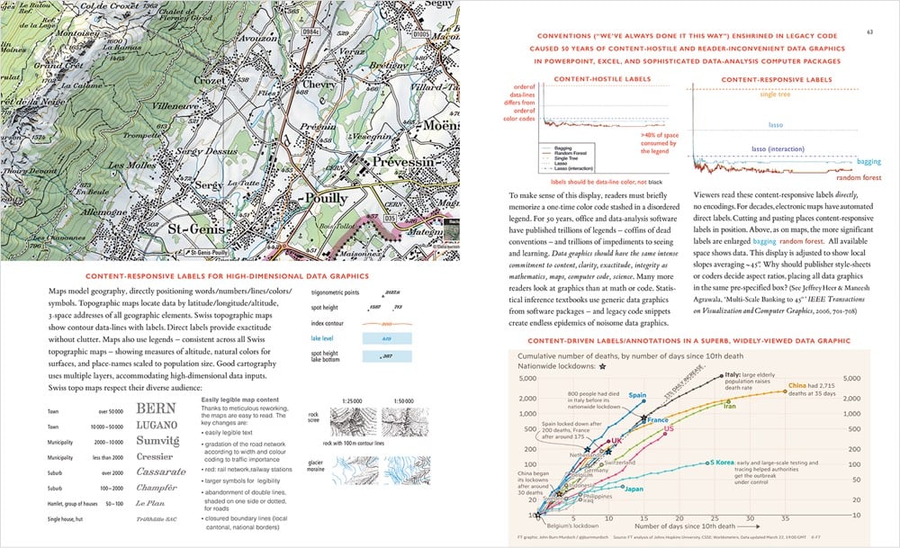
His previous four books are some of my favorites about design. You can only order Seeing with Fresh Eyes direct from his site, which says the book is shipping in mid-October. (thx, dewayne)

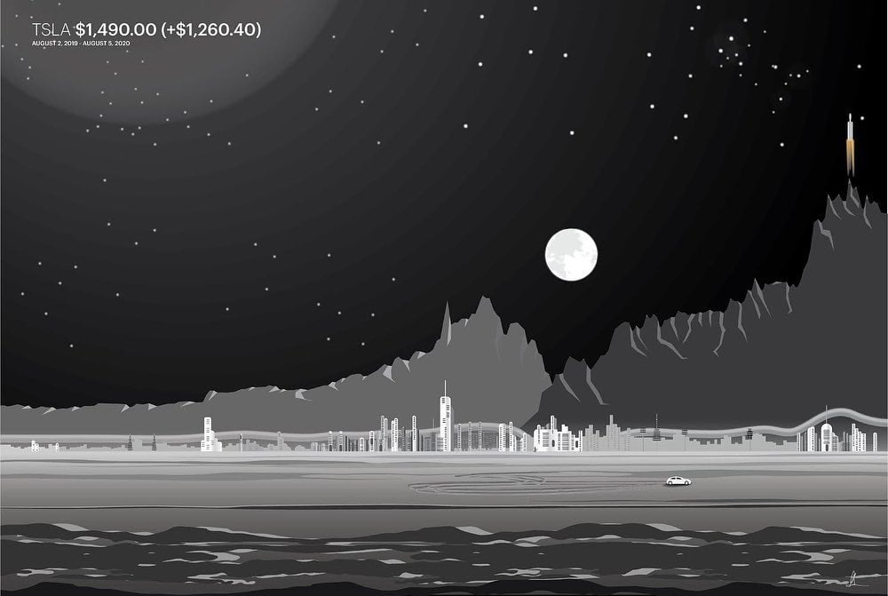
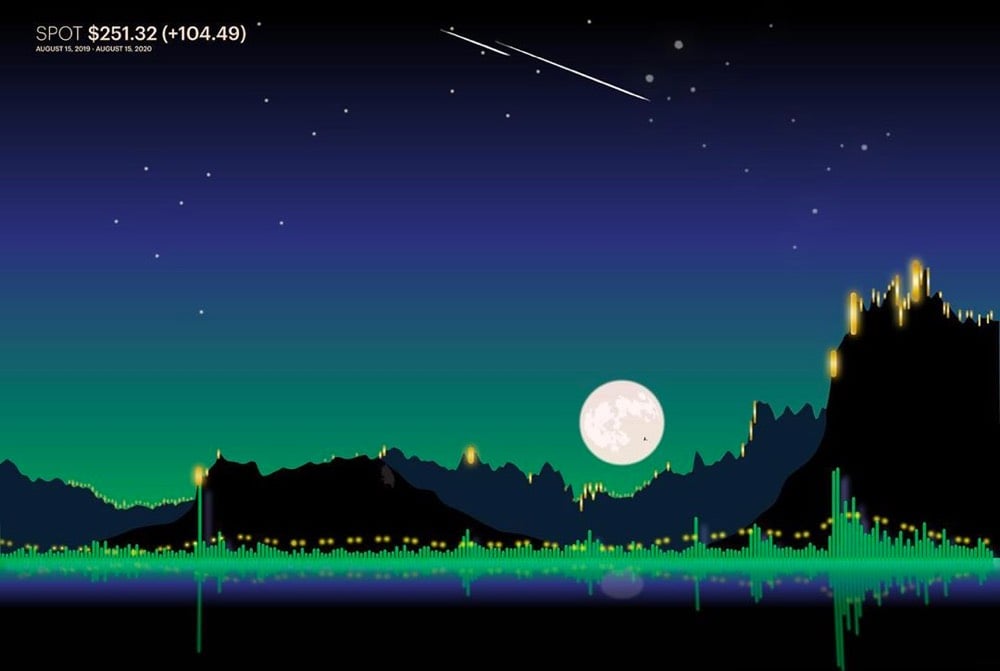
Inspired by the charts on Robinhood and Yahoo Finance, Gladys Orteza is turning the charts of notable stocks into landscape artworks, inserting references to the company into the art. The Ford chart at the top has a truck, the Tesla chart features a rocket (a reference to SpaceX), and the Disney one includes the twin suns of Tatooine & a Jawa Sandcrawler.
Reminds me of Michael Najjar’s High Altitude series (stock market charts represented by jagged Andean mountain peaks) and Jill Pelto turning climate change graphs into art. (via waxy)
Malofiej have announced their 28th International Infographics Awards for 2020, which they refer to as “the Pulitzers for infographics”. You can check out some of the top infographics here, culled from newspapers, magazines, and online media from around the world. The full list is available here, complete with links to the online winners.
From January to the end of June, over 500,000 people died of confirmed cases of Covid-19. In order to demonstrate the magnitude of the pandemic, James Beckwith made a time lapse map of each Covid-19 death.
Each country is represented by a tone and an expanding blip on the map when a death from Covid-19 is recorded. Each day is 4 seconds long, and at the top of the screen is the date and a counter showing the total numbers of deaths. Every country that has had a fatality is included.
As was the case with the pandemic, the video starts slow but soon enough the individual sounds and blips build to a crescendo, a cacophony of death. The only way this could be made more ominous & upsetting is by including the first song off of Cliff Martinez’s Contagion soundtrack as a backing track. As Beckwith notes in the description: “It is likely a sequel will need to be made.” (via open culture)

A pair of aquariums in Japan have published flowcharts that track the relationships of their penguins.
Penguins, the way they waddle around and protect their eggs, are often thought of as cute, cuddly and romantic. But those who observe them for extended periods know they have a dark side. Two aquariums in Japan, Kyoto Aquarium and Sumida Aquarium, keep obsessive tabs on their penguins and maintain an updated flowchart that visualizes all their penguin drama.
As Kyoto-based researcher Oliver Jia points out, penguin drama can include serious crushes and heartbreaks but also adultery and egg-stealing. And these Japanese aquariums have it all charted in a flowchart that can be studied for hours.
(via @pomeranian99)
In 1854, Dr. John Snow produced a map of a London cholera outbreak which showed deaths from the disease concentrated around a water pump on Broad Street. The prevailing view at the time was that cholera spread through dirty air, but Snow hypothesized that it was actually spread through water and constructed this early medical data visualization to help prove it.

Through a mix of personal interviews, clever detective work, and data analysis that included tables and a famous map, Snow managed to stop the outbreak and convince local public health officials, eventually, that cholera could be transmitted through water, not a miasma. Since his breakthrough study, the map has become an iconic piece of epidemiological history, as an illustration of keen detective work, analysis, and visual representation with a map that, even today, tells a story.
Aside from the cluster of deaths around the pump (which could be argued were the result of a miasma cloud and not contaminated water), stories of nearby people who didn’t get sick (brewers who drank the beer they produced rather than well water, people in buildings with their own wells) and far away people who died because they had drunk water from the well were also essential in proving his theory:
I was informed by this lady’s son that she had not been in the neighbourhood of Broad Street for many months. A cart went from broad Street to West End every day and it was the custom to take out a large bottle of the water from the pump in Broad Street, as she preferred it. The water was taken on Thursday 31st August., and she drank of it in the evening, and also on Friday. She was seized with cholera on the evening of the latter day, and died on Saturday
You can read more about John Snow and how his map changed science and medicine in Steven Johnson’s excellent Ghost Map.
For Slate’s 2015 podcast series The History of American Slavery, Andrew Kahn created an interactive visualization of the 20,000+ voyages that made up the Atlantic slave trade that lasted 315 years. A video of the interactive map is embedded above.
As we discussed in Episode 2 of Slate’s History of American Slavery Academy, relative to the entire slave trade, North America was a bit player. From the trade’s beginning in the 16th century to its conclusion in the 19th, slave merchants brought the vast majority of enslaved Africans to two places: the Caribbean and Brazil. Of the more than 10 million enslaved Africans to eventually reach the Western Hemisphere, just 388,747 — less than 4 percent of the total — came to North America. This was dwarfed by the 1.3 million brought to Spanish Central America, the 4 million brought to British, French, Dutch, and Danish holdings in the Caribbean, and the 4.8 million brought to Brazil.
Roughly 400,000 enslaved Africans were brought to the United States before the practice was banned in 1808. The ban was mostly (but not entirely) enforced and yet in 1860, the population of enslaved persons was almost 4 million in the South. That’s because the 1808 ban, according to Ned & Constance Sublette’s book The American Slave Coast: A History of the Slave-Breeding Industry, was a form of trade protectionism that protected the forced breeding of enslaved peoples by American slaveowners. From a review of the book:
In fact, most American slaves were not kidnapped on another continent. Though over 12.7 million Africans were forced onto ships to the Western hemisphere, estimates only have 400,000-500,000 landing in present-day America. How then to account for the four million black slaves who were tilling fields in 1860? “The South,” the Sublettes write, “did not only produce tobacco, rice, sugar, and cotton as commodities for sale; it produced people.” Slavers called slave-breeding “natural increase,” but there was nothing natural about producing slaves; it took scientific management. Thomas Jefferson bragged to George Washington that the birth of black children was increasing Virginia’s capital stock by four percent annually.
Here is how the American slave-breeding industry worked, according to the Sublettes: Some states (most importantly Virginia) produced slaves as their main domestic crop. The price of slaves was anchored by industry in other states that consumed slaves in the production of rice and sugar, and constant territorial expansion. As long as the slave power continued to grow, breeders could literally bank on future demand and increasing prices. That made slaves not just a commodity, but the closest thing to money that white breeders had. It’s hard to quantify just how valuable people were as commodities, but the Sublettes try to convey it: By a conservative estimate, in 1860 the total value of American slaves was $4 billion, far more than the gold and silver then circulating nationally ($228.3 million, “most of it in the North,” the authors add), total currency ($435.4 million), and even the value of the South’s total farmland ($1.92 billion). Slaves were, to slavers, worth more than everything else they could imagine combined.
You can read more about the economics of slavery in this post from 2016, including how American banks sold bonds that used enslaved persons as collateral to international investors. (via open culture)
Using census data (which she acknowledges can be imperfect in capturing the full range of people’s identities), data scientist/artist Mona Chalabi created a drawing of 100 people who are representative of NYC’s population for a NY Times opinion piece on inequality and coronavirus.
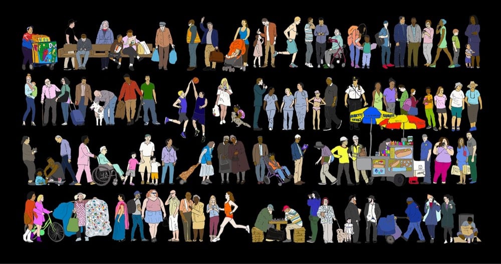
Chalabi writes on Instagram:
When you think about who is most affected by Covid-19, you need to consider inequalities in housing, in access to healthcare, in wealth. And so much of that ends up consistently affecting people of color. You could think of it as overlapping circles in a Venn diagram. Or, you could look at these 100 people.
She’s selling prints of this on her website (pink background, black background), with all profits going towards a Covid-19 rent relief fund for families organized by The Conscious Kid.
See also If Only 100 People Lived on Earth…
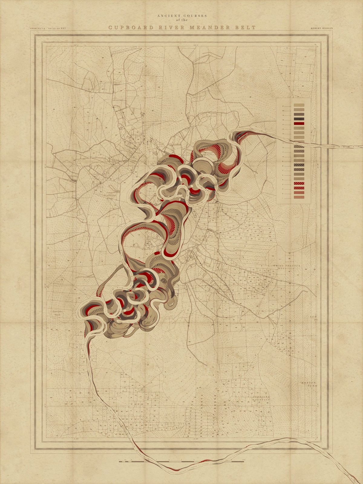
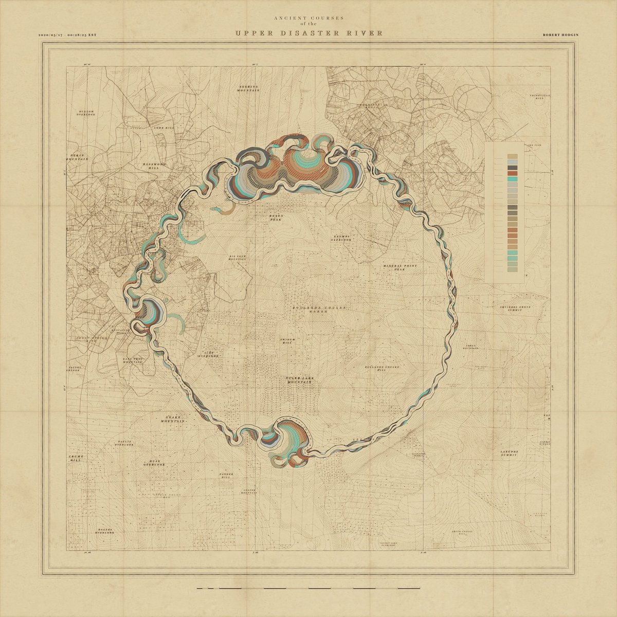
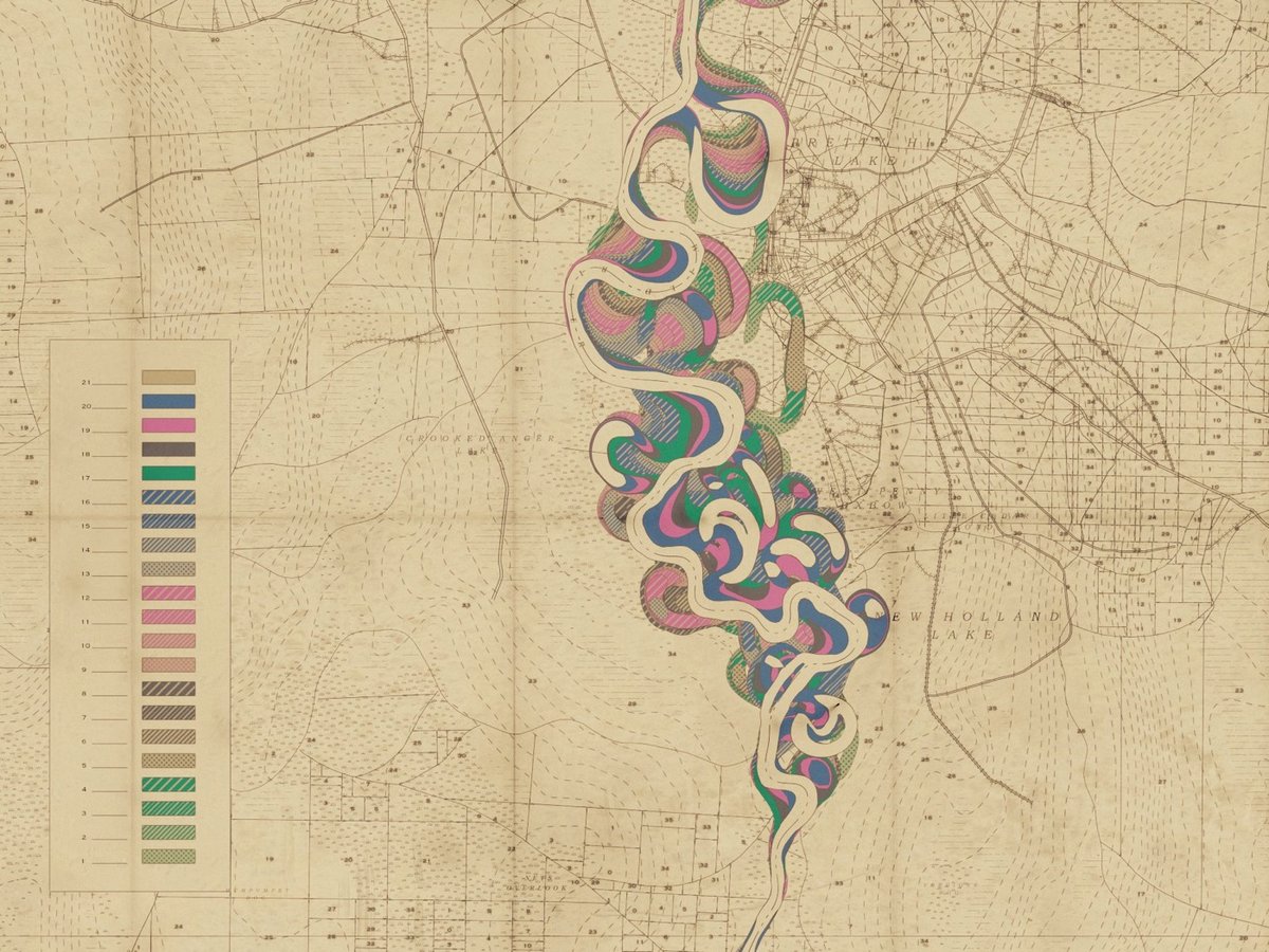
I have written previously about cartographer Harold Fisk’s wonderful meander maps of the Mississippi River produced for the Army Corps of Engineers. Borrowing the aesthetic of these maps, interactive artist & engineer Robert Hodgin wrote some software called Meander to generate meander maps for fictional rivers.
From an input curve, the terrain, land plots, side roads, highways, marsh land and mountain peaks are generated and prominent features are named. The map is then weathered and rendered in the style of old US Army Corp of Engineers maps from the 1930s and 40s.
You can check some of the generated maps out on Twitter or on Instagram, including some prototypes and animations (this one is my favorite). Hodgin has promised a full write-up of the project; I’ll link to it when he publishes it.
Coincidentally, while I was writing this post I got an email from a reader about an audiovisual installation called Meandering River that displayed “real-time visuals generated by an algorithm and music composed by an A.I.”
Synchronicity!
Update: Hodgin wrote about the Meander project on his website and included several more gorgeous examples of his output.
Using data from the Correlates of War Project and the Stockholm International Peace Research Institute, this bar chart race shows the annual military spending of the world’s top spending countries from the start of WWI in 1914 to 2018. See also military spending info from Our World in Data.
This week, Covid-19 passed heart disease and cancer as the leading cause of death per day in the United States. In this graph made by Dr. Maria Danilychev using data from Worldometer and the CDC, you can see that Covid-19 overtook heart disease sometime on Monday or Tuesday.
If the data in NYC is any indication, the number of nationwide Covid-19 deaths may be undercounted, so this transition probably happened sooner.1 Hopefully through the social distancing and other measures put in place to flatten the curve, the number of daily Covid-19 deaths won’t start beating out all other causes combined before it starts declining.
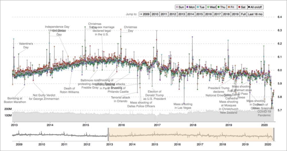
Since 2008, the Hedonometer has been tracking the language we use on Twitter to assign a daily score that measures how collectively happy we are (English tweets only). From the data, you can see that happiness spikes on holidays & after notable news events (same-sex marriage legalization) and unhappiness follows mass shootings, terrorist events, and Trump’s election. But the Covid-19 pandemic has brought Twitter’s collective happiness rating to an overall new low and its first sustained period of unhappiness.
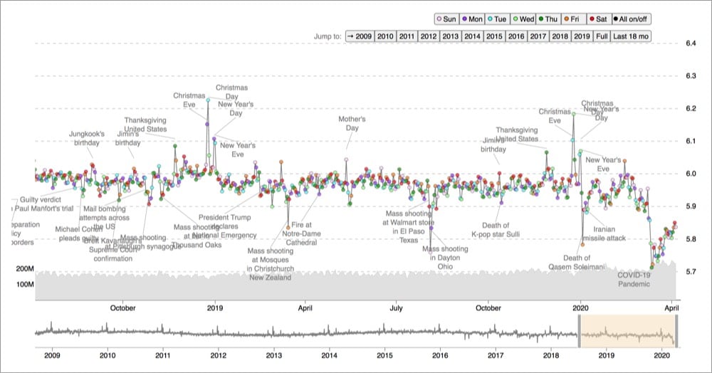
The day they identify as the unhappiest is March 12, 2020, which is the day after Americans finally took Covid-19 seriously. Within the space of a few hours on March 11, the NBA announced it was suspending its season, Tom Hanks revealed that he and his wife Rita Wilson had Covid-19, the WHO declared Covid-19 a pandemic, Donald Trump went on primetime TV to address the nation, and the DJIA closed down 1400 points (it would drop another 2350 points on Mar 12).
See also the previous low point after the Las Vegas shootings and my initial post on the Hedonometer from July 2016. In that initial post, I shared a hunch that Twitter’s happiness seemed to have reached a peak in early 2016. With four years of additional data, it’s obvious that the happiness peaked in late 2015 or early 2016 (at least according to their methodology).
Newer posts
Older posts
Socials & More