The Best Maps & Charts from the 2020 Election
From Stamen’s lead cartographer Alan McConchie, an excellent review of the charts and maps that best communicated vital information about the 2020 election.
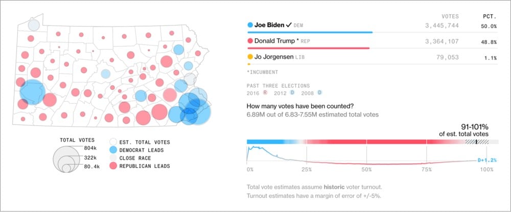
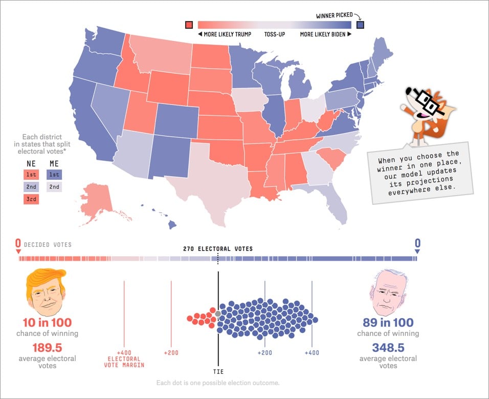
After the first night of election results was over, and most of the state races had been called, we settled in for several more days of vote counting in a few key states. Dynamic “choose your own adventure” maps and scenario modeling tools became much less useful, and the landscape of the remaining Electoral College outcomes could be explained better without a map or a chart at all. Simple infographics like this one from the BBC did an excellent job of telling the reader all they needed to know.
You should dig into the article for the commentary and analysis, but I did want to share a couple of my favorite maps/charts:
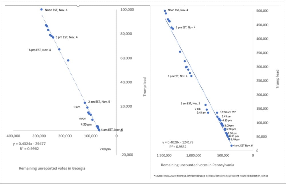
The graphs by John Harurum in that last image were especially useful for me in seeing how the counting trends were going.
Socials & More