The Gluten Free Museum
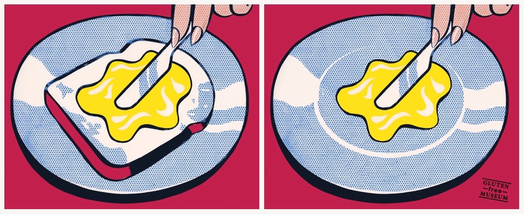
Gluten Free Museum takes works of art (high and low) and removes all of the gluten from them. A one-trick pony, but a particularly entertaining one. (via tmn)
This site is made possible by member support. 💞
Big thanks to Arcustech for hosting the site and offering amazing tech support.
When you buy through links on kottke.org, I may earn an affiliate commission. Thanks for supporting the site!
kottke.org. home of fine hypertext products since 1998.
Beloved by 86.47% of the web.
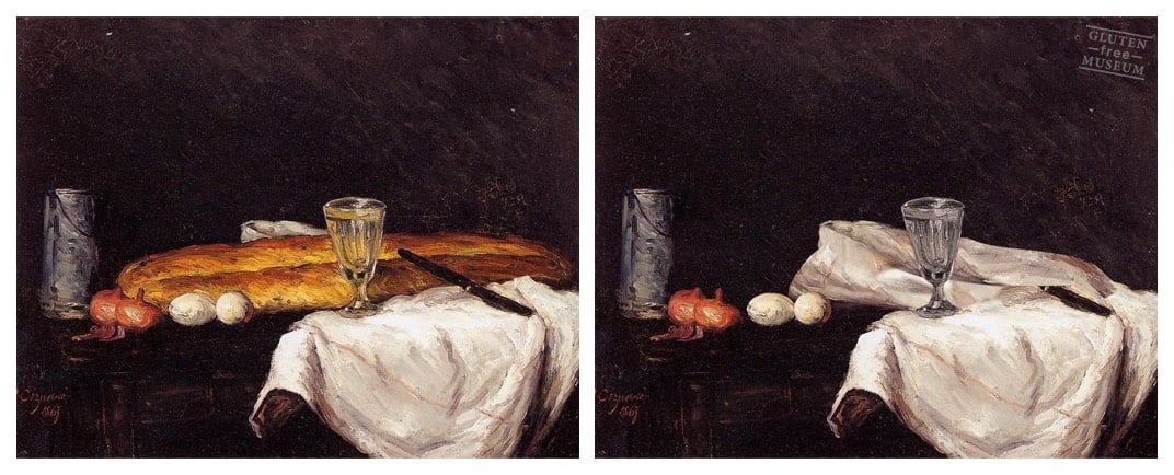
Gluten Free Museum takes works of art (high and low) and removes all of the gluten from them. A one-trick pony, but a particularly entertaining one. (via tmn)
How the Sugar Industry Shifted Blame to Fat. This stuff makes me ANGRY. Fucking shady scientists.
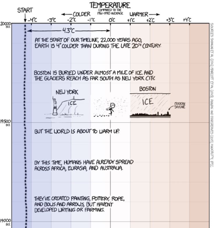
From XKCD, a typically fine illustration of climate change since the last ice age ~20,000 years ago.
When people say “the climate has changed before”, these are the kinds of changes they’re talking about.
And then in the alt text on the image:
[After setting your car on fire] Listen, your car’s temperature has changed before.
The chart is a perfect use of scale to illustrate a point about what the data actually shows. Tufte would be proud.
Update: Tufte is proud. (via @pixelcult)
The series of Marvel movies — X-Men, Avengers, Spider-Man, etc. — is the highest grossing film series of all time but the films’ music is largely forgettable and bland in a way that it isn’t in Star Wars, James Bond, or Harry Potter. In this video, the Every Frame a Painting gang explores why that is: partially a trend toward movie music not designed to be noticed and also the use by directors of temporary music that unduly influences the final score. All the Marvel movies run together for me (aside from Guardians of the Galaxy, which had distinctive music in it, I can’t recall a single scene from any one of the more recent films) and perhaps the music is one reason.
There’s a follow-up video to the one above composed of clips of movies played with their temp music followed by the same clips with the final music, which is nearly identical.
They’ve also started a Twitter account highlighting the influence of temp music on final scores.
These videos have me wondering…was Carter Burwell’s score for Carol influenced by temp music, specifically Philip Glass’ score for The Hours? This interview in Rolling Stone and the FAQ on his site suggest not:
It’s his ability to make music that compliments a scene rather than eclipse it that has made him an invaluable creative partner to filmmakers who work in such intense melodramatic registers, and Burwell is emphatic that his scores aren’t responsible for all of the emotional heavy-lifting. “As a listener, I do not like being instructed,” he says, emphatically. “It riles me when the music tells me something before I can figure it out for myself. In fact, I enjoy the discomfort of not being sure how to take something.” It’s the reason why he loathes listening to the temp music that directors often attach to rough cuts in order to point composers in the right direction.
But the similarities are there, so who knows?
Update: I forgot to mention that Stanley Kubrick ended up ditching the original score written for 2001 and sticking with the temp music, which were the classical compositions by Strauss et al. that we’re so familiar with today.
Update: In a video response, Dan Golding shows how temp music is not a recent Hollywood obsession…even the famous Star Wars theme was greatly influenced by temp music:
He questions that the pull of temp music by contemporary directors and composers is sufficient to explain why movie music is now so uninspiring:
Film music is an embrace of rampant unoriginality, and to think about how film music works, we need to think of new ways to talk about these questions, rather than just saying, “it’s a copy”.
Golding pins the blame primarily on technology but also on composers and filmmakers drawing from fewer and less diverse sources. Interestingly, this latter point was also made by Every Frame a Painting’s Tony Zhou in a recent chat with Anil Dash, albeit about originality in video essays. A lightly edited excerpt:
My advice to people has always been: copy old shit. For instance, the style of Every Frame a Painting is NOT original at all. I am blatantly ripping off two sources: the editing style of F for Fake, and the critical work of David Bordwell/Kristin Thompson, who wrote the introductory text on filmmaking called Film Art. I’ve run into quite a few video essays that are trying to be “like Every Frame a Painting” and I always tell people, please don’t do that because I’m ripping of someone else. You should go to the source. When any art form or medium becomes primarily about people imitating the dominant form, we get stifling art.
If you look at all of the great filmmakers, they’re all ripping someone off but it was someone 50 years ago. It rejuvenated the field to be reminded of the history of our medium. And I sincerely wish more video essayists would rip off the other great film essayists: Chris Marker, Godard, Agnès Varda, Thom Andersen. Or even rip off non-video essayists. I would kill to see someone make video essays the way Pauline Kael wrote criticism. That would be my jam!
ps. Also! Hans Zimmer — composer of film scores for Gladiator, Interstellar, Inception, The Dark Knight, etc. — was the keyboard player in the Buggles’ Video Killed the Radio Star music video. WHAT?!
How’s your day? Tough going? Check out these photos of Paralympic athletes doing their thing and get back to me
A parking lot for airline employees has become a small community of people who live in motor homes and are rarely around.
Taking a back-road shortcut to catch a flight from Los Angeles two years ago, I passed an obscure airline employee parking lot — and was surprised to see over 70 motor homes. It looked like there was an entire community planted right there in the parking lot of the airport. I wondered, who lived there — and why?
I learned that this community was an employee parking lot turned motor-home park made up of pilots, flight attendants and mechanics. And I became fascinated by why and how the residents — people who may have flown us across the country, or walked us through emergency landing procedures — came to inhabit such an unusual place.
What a lovely little film. (via @JossFong)
Nice relaunch/redesign over at The Morning News today. More linky/bloggy.

For the first time in more than four years, kottke.org is sporting a new design this morning. Since you should never launch anything completely finished,1 there are probably still some things that need to be ironed out, but I hope most of it works. (Drop me a note if you notice something amiss?) Let’s hop right into what’s new and why. (For reference, here’s what the site looked like until late yesterday, here’s what I said about that design, and here’s what some of the previous designs looked like.)
Design. Gone is the now-beloved blue gradient (which ppl didn’t like when I introduced it), replaced with a colorful rainbow banner thingie. The site title and the old school tagline — “home of fine hypertext products” — are both making a comeback. The march toward simplicity continues…every remaining design element serves a purpose. The type is a bit bigger to offset ever increasing display resolutions (which somewhat paradoxically makes everything smaller). Post titles are quite a bit larger. Media embeds and images are much larger, especially if it’s right at the top of the post. Check out this post and this one for examples of what I’m talking about. Tweaked the footnote style.2 More tweaks to come. (Including moving to some even faster new servers at Arcustech, the fantastic hosts of kottke.org for years now. Big thanks to them for all their support!)
The layout of the site is responsive — not fully so, but if you resize your browser window, it’ll change and flow and do all of the neat things that responsive design does. The type is still my favorite Whitney ScreenSmart by Hoefler & Co (designed by Tobias Frere-Jones), but I finally (FINALLY!!!) turned on smart quotes and such — you know, like “opening and closing quotes around this text” and apostrophes’ apostrophes and the proper m-dash right heeeeeere — so now the designers who read the site can finally stop tutting about it. (And Hoefler and Frere-Jones can stop tearing their hair out about seeing text rendered with their point-perfect typeface littered with dumb quotes. Enjoy your tresses, fellows!)
Mobile. This was the main impetus behind the redesign. Over 40% of you read kottke.org on a mobile device of some kind. The old site worked fine on phones and tablets, but not great. Now, the site looks and works great on mobile. (At least I think it does.)
Tags. Some of my favorite things about kottke.org are the tags and tag pages. Looking at the site through the lens of tags, it becomes apparent that kottke.org is actually a collection of hundreds of small blogs about introversion, Stanley Kubrick, time travel, early color photography, economics, crying at work, and all sorts of other things. For the redesign, I made them more visible on the site and I’m hoping to find more ways to improve their involvement in the site soon. You’ll now find tags at the end of posts no matter where you find them on the site; previously they were only on the individual post pages. Tag pages are now paginated so you can go back through hundreds and even thousands of posts on each topic. I’ve also included a list of related tags at the top of each tag page…which is incredibly addictive for surfing around aimlessly.
Biography. With the help of some friends (aka the kottke.org board of advisors), I rewrote the about page. I liked the brevity of the old version, but in the words of one friend, “the previous version undersold the site so much it was almost inaccurate”. This is the first bio I’ve ever written that takes seriously what the site is and what I’ve done in my career…and as such it makes me really uncomfortable. Taking credit, particularly in public, has never been my thing. But I wanted to have a chance at explaining kottke.org to people who might not know the whole story. Everyone here has an opinion about kottke.org, this is mine.
When I started the site in 1998, people expressing their ideas & beliefs through links and attempting to stitch technology & the liberal arts together were not commonplace pursuits. In many ways, media on the web has come to resemble, in form and function, what kottke.org and other early blogs were doing back then. The largest social media companies in the world are now centered around people collecting and showing each other cool/interesting/funny links in order to say something about what they believe. I’m proud that kottke.org and I have played a role in that (r)evolution.
Future. The past 2.5 years have been the most challenging out of the 18+ years I’ve been doing the site. (Translation: they sucked.) I’ve been working, with many loooong periods of inactivity, on this redesign for more than 2 years. It’s not a cure for cancer or the world’s best design work, but to have it finally be out in the world feels amazing. Like a bad chapter in my life is ending. Like I’m still alive. Vital. A start of something. Like I’m finally investing in myself and my future for the first time in a long while. It feels like hope. And I hope you like it. It’s a genuine pleasure being able to share myself with you like this, and I don’t know what I’d do without it.
On the first anniversary of 9/11 in 2002, just a few months before he died, Fred Rogers recorded this very short message to the parents of young children.
We’ve seen what some people do when they don’t know anything else to do with their anger. I’m convinced that when we help our children find healthy ways of dealing with their feelings, ways that don’t hurt them or anyone else, we’re helping to make our world a safer, better place.
Mr. Rogers was, without question, my number one hero and influence growing up. I liked Sesame Street and the Electric Company and Captain Kangaroo and 3-2-1 Contact and all the rest, but I loved Mr. Rogers. So, I don’t know about you, but whenever Mr. Rogers looks right into the camera like that and tells me how proud he is of me, I start to tear up a little and vow to do better. See also always look for the helpers.
In an episode of Doctor Who from 2010, the Doctor and his companion Amy take Vincent van Gogh, who was not a commercially successful artist in his own lifetime, to the Musée d’Orsay to see an entire room filled with his paintings. The resulting scene is unexpectedly touching.
What causes traffic? Mostly the poor reaction times of humans driving cars. Even a simple lane change can cause traffic to back up for hours. What’s the solution? (Hint: it rhymes with “health diving stars”.)

Humans of New York recently caught up with Hillary Clinton and she talked about how her public persona came to be.
I know that I can be perceived as aloof or cold or unemotional. But I had to learn as a young woman to control my emotions. And that’s a hard path to walk. Because you need to protect yourself, you need to keep steady, but at the same time you don’t want to seem ‘walled off.’ And sometimes I think I come across more in the ‘walled off’ arena. And if I create that perception, then I take responsibility. I don’t view myself as cold or unemotional. And neither do my friends. And neither does my family. But if that sometimes is the perception I create, then I can’t blame people for thinking that.
Clinton is just a different type of politician than her husband or Obama, for good reason.
Women are seen through a different lens. It’s not bad. It’s just a fact. It’s really quite funny. I’ll go to these events and there will be men speaking before me, and they’ll be pounding the message, and screaming about how we need to win the election. And people will love it. And I want to do the same thing. Because I care about this stuff. But I’ve learned that I can’t be quite so passionate in my presentation. I love to wave my arms, but apparently that’s a little bit scary to people. And I can’t yell too much. It comes across as ‘too loud’ or ‘too shrill’ or ‘too this’ or ‘too that.’ Which is funny, because I’m always convinced that the people in the front row are loving it.
When she says “it’s not bad,” that’s a perfect illustration of not being able to say exactly what you want how you want. A woman gets excited and she seems deranged or unhinged but a man gets excited and he’s seen as passionate? That seems bad to me.
P.S. Clinton is reading Elena Ferrante’s Neapolitan novels!
“You know what I have started reading and it’s just hypnotic is the Neapolitan novels by Elena Ferrante,” she tells Linsky, commenting on Ferrante’s intoxicating novels about female relationships in Naples, Italy that have an intense cult following. “I had to stop myself so I read the first one. I could not stop reading it or thinking about it.”
They’re the best fiction I’ve read in ages…so sad I’ve finished them all.
Researchers at Harvard have come up with a novel way of studying how bacteria evolve to become drug resistant. They set up a large petri dish about the same shape as a football field with no antibiotics in the end zones and increasingly higher doses of antibiotics toward the center. They placed some bacteria in both end zones and filmed the results as the bacteria worked its way toward the center of the field, evolving drug resistance as it went. Ed Yong explains:
What you’re seeing in the movie is a vivid depiction of a very real problem. Disease-causing bacteria and other microbes are increasingly evolving to resist our drugs; by 2050, these impervious infections could potentially kill ten million people a year. The problem of drug-resistant infections is terrifying but also abstract; by their nature, microbes are invisible to the naked eye, and the process by which they defy our drugs is even harder to visualise.
But now you can: just watch that video again. You’re seeing evolution in action. You’re watching living things facing down new challenges, dying, competing, thriving, invading, and adapting — all in a two-minute movie.
Watch the video…it’s wild. What’s most interesting — or scary as hell — is that once the drug resistance gets going, it builds up a pretty good momentum. There’s a pause at the first boundary as the evolutionary process blindly hammers away at the problem, but after the bacteria “learn” drug resistance, the further barriers are breached much more quickly, even before the previous zones are fully populated.

Suddenly, there are four species of giraffe now. Previously there was only one. Scientists have analyzed the genetic code of hundreds of giraffes in Africa and found much variation in their DNA, enough to split one species into four.
Some of the differences were as large or larger than the differences between brown bears and polar bears.
Despite their similar appearances, members of the different species don’t appear to mate with each other. It’s amazing that scientists didn’t know this until now.
Shel Kaphan was the first person Jeff Bezos hired to work on Amazon. In an interview with Craig Cannon, he talked about how he met Bezos, the early days of the site, and how he feels about the experience now.
At the time I thought, “Okay, I’m going to be building this website to run a bookstore and I haven’t done that before but it doesn’t sound so hard. When I’m done with that I’m not sure what I’ll do.” At that point there was no idea of doing anything but a bookstore. I thought maybe I would be able to go back to Santa Cruz and monitor it from there. I was pretty wrong about how the business would develop and how ambitious Jeff was. I didn’t know him at the time. We had just met.
I had forgotten that Amazon’s IPO happened less than two years after the site went live…can’t imagine something like that happening today.
Alright, there’s Bullitt and The French Connection and Ronin and The Bourne Identity. But for my money, the best movie chase scene ever is from Aardman Animations’ The Wrong Trousers. The chase comes right at the end of the 30-minute short and features Wallace and Gromit trying to apprehend a jewel thief. It’s hilarious, exciting, and meticulously crafted. Pay special attention to the editing and sound, particularly in the last 20 seconds. Masterful.
BTW, if you haven’t seen the entire short, it’s free on Amazon Prime right now…it’s probably my favorite short film ever. (Ok, Powers of Ten. But then The Wrong Trousers!)
Christopher Guest (Waiting for Guffman, Best in Show) is coming out with a new mockumentary for Netflix about a competition to determine the best sports mascot.

Craig Mod and Dan Rubin recently walked the Kumano Kodo pilgrimage path in Japan, taking thousands of photos along the way. They made a book of the photographs and have launched a Kickstarter project to make more copies of the book and do some other fun stuff.
The book, of course, is beautiful — Rubin and Mod are great photographers and designers - but direct your attention to the economy of their project description:
In March of this year, Dan Rubin and I went on a walk. The walk was along Japan’s 1,000+ year old Kumano Kodo pilgrimage path.
From that walk, we made one copy of a book of photographs called Koya Bound.
Together, with your help, we’d like to make/do a whole lot more…
This is what we did, here’s what we made, and we’d like your help to do more. That’s how you do Kickstarter, folks.
Update: The website Rubin and Mod made for the project is live. It’s super simple but extensive…I especially like how the journey progresses as you scroll down and the photos “spotlight” out from the path. Strong web design work.
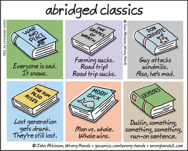
From cartoonist John Atkinson, the plots of some classic books distilled down to just a few words. Like The Grapes of Wrath:
Farming sucks. Road trip! Road trip sucks.
Atkinson followed this up with two additional cartoons: (more) abridged classics and (even more) abridged classics. (via @mkonnikova)
Update: From back near the web’s Big Bang comes Book-A-Minute, which contains ultra-condensed versions of classic books. Here’s the summary of War and Peace:
History controls everything we do, so there is no point in observing individual actions. Let’s examine the individual actions of over 500 characters at great length.
(via @philgyford)

The Architectural Record recently chose the 125 “most significant works that defined architecture” built in the past 125 years. Included are the Morgan Library, the old Penn Station, Frank Lloyd Wright’s Robie House, the Eames House, the Seagram Building (a particular favorite of mine), the Salk Institute, the Memorial to the Murdered Jews of Europe, and the High Line.
Ian Parker wrote about the NY Times’ restaurant critic Pete Wells for the New Yorker this week.
Wells is generally a well-mannered critic, if not an overly respectful one. In his first years on the job, he was sometimes faulted in the food press for being too generous in his appraisals; he had made a point of publishing fewer one-star reviews than his immediate predecessors. “No one likes one-star reviews,” Wells told me, in a conversation at his apartment, which is in a Clinton Hill brownstone. “The restaurants don’t like them, and the readers don’t like them. It’s very tricky to explain why this place is good enough to deserve a review but not quite good enough to get up to the next level.” He added, “I’m looking for places that I can be enthusiastic about. Like a golden retriever, I would like to drop a ball at the feet of the reader every week and say, ‘Here!’”
Parker covers Wells’ most notable reviews — Per Se, Fieri, Senor Frog’s, Momofuku Nishi — as well as the reactions of the restaurants to the reviews.
“I can’t ever read that review again — I’ll get so fucking angry I’ll die,” Chang said. “I made a lot of that food! I tasted it! It was delicious. And… fuck! I believe in the fucking food we make in that restaurant, I believe it to be really delicious, I believe it to be innovative, in a non-masturbatory way.”
I love David Chang. Never change. But back to Wells, I had a conversation last night with a friend who worked in a restaurant that Wells reviewed and he said that Wells is perhaps not physically suited for undercover restaurant dining — “he’s an odd looking dude” was the quote. And I have another friend in the restaurant industry who, after living in Clinton Hill for a few months, told me, “I think Pete Wells is my backyard neighbor.” Several months later: “Yeah, Pete Wells definitely lives behind me.” We joked about Wells talking over the fence in the style of Wilson, the neighbor in Home Improvement whose face is always partially hidden.
This Valley Girl contest that aired on Real People1 in 1982 is quite the time capsule of Reagan-era America. BAG YOUR FACE!!!! I had totally (LIKE, TOTALLY!!) forgotten about that super-80s insult. Is the Valley Girl thing the reason we, like, all say “like” and uptalk all the time now?
Along with the Dukes of Hazzard, Real People and That’s Incredible were my favorite shows in the early 80s. I probably watched this episode on TV when it first aired.↩
Opened in 1995 on St. Marks in the East Village, the @ Cafe was one of the first (and coolest) internet cafes in the US.1 They had a bunch of computers, a T1 line (at $9000/mo!), a hip menu including alcoholic beverages, and no idea what they were doing. They didn’t plan for ventilation for all the hardware, so they cooled the server room with a garbage can full of ice!
And I was glad to hear the CU-SeeMe shout out at the very end of the video. I think about that app every time I hear about something “new” like Facebook Live, Periscope, or Snapchat. Talk about being ahead of its time…CU-SeeMe was video chat that predated the popularity of the web.
At the time, very few people even knew what the “@” symbol was. One article featured in the video described it like so: “that @ is pronounced ‘at’ in case you were curious, and it’s often used in e-mails, the way most hackers and computer freaks communicate with one another”. LOL.↩
When Ashley was a kid, she was legally blind. Her friends and family described colors to her in a wonderful way.
Yellow. I didn’t touch anything for this, they just told me that whenever you laugh so hard you can’t stop, that that happiness is what yellow looks like.
Green. I held soft leaves and wet grass. They told me green felt like life. To this day it is still very much my favorite color.
I love this list. (thx, nicholas)
From Mark Forsyth’s The Elements of Eloquence, a reminder of the rules of adjective order that fluent English speakers follow without quite knowing why.
…adjectives in English absolutely have to be in this order: opinion-size-age-shape-colour-origin-material-purpose Noun. So you can have a lovely little old rectangular green French silver whittling knife. But if you mess with that word order in the slightest you’ll sound like a maniac. It’s an odd thing that every English speaker uses that list, but almost none of us could write it out.
The Cambridge Dictionary lists a slightly different order: opinion, size, physical quality, shape, age, colour, origin, material, type, purpose. A poem by Alexandra Teague explores the topic in a creative way:
That summer, she had a student who was obsessed
with the order of adjectives. A soldier in the South
Vietnamese army, he had been taken prisoner whenSaigon fell. He wanted to know why the order
could not be altered. The sweltering city streets shook
with rockets and helicopters. The city swelteringstreets.
Did anyone learn this in school? I sure didn’t. How do we all know then? My daughter’s kindergarten teacher had a great phrase she used when things got a bit tricky as her students learned to read: “the English language is a rascal”. (via @MattAndersonBBC)
Update: Language Log’s post on adjective order is worth reading. (thx, stephen & margaret)
Raging Cinema pays tribute to the late Gene Wilder and his use of the comedic pause. On Twitter, Edgar Wright, who knows a thing or two about funny, called for a moment of silence for Wilder:
A moment of silence for the master of the comedic pause.
Gene Wilder: funny doing something & funny doing nothing.
Crispin Glover in Back to the Future, Jeff Goldblum in Jurassic Park, and Madeline Kahn in Young Frankenstein are just a few of the interesting and eccentric performances worthy of a Best Supporting Weirdo Oscar.
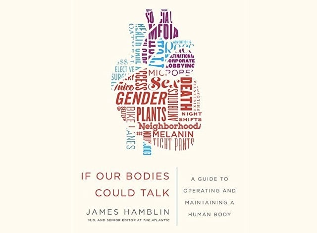
James Hamblin, the dishy brainiac doctor who does those entertaining and informative videos for The Atlantic, is coming out with a book in December called If Our Bodies Could Talk. He calls it “a FAQ about human bodies”.
Now, in this original and entertaining book, Hamblin explores the stories behind health questions that never seem to go away — and which tend to be mischaracterized and oversimplified by marketing and news media. He covers topics such as sleep, aging, diet, and much more:
Can I “boost” my immune system?
Does caffeine make me live longer?
Do we still not know if cell phones cause cancer?
How much sleep do I actually need?
Is there any harm in taking a multivitamin?
Is life long enough?
In SE Asia, particularly in Laos and Thailand at the start of the rainy season, residents hold rocket festivals at which homemade rocket competitions are held. The device shown in this particular video is lit by a small group of people, who then flee as a massive amount of smoke goes up. And then, well, just watch…I don’t want to ruin what happens for you, it’s wonderful.
Some of these homemade rockets work better than others. (via @sampotts)
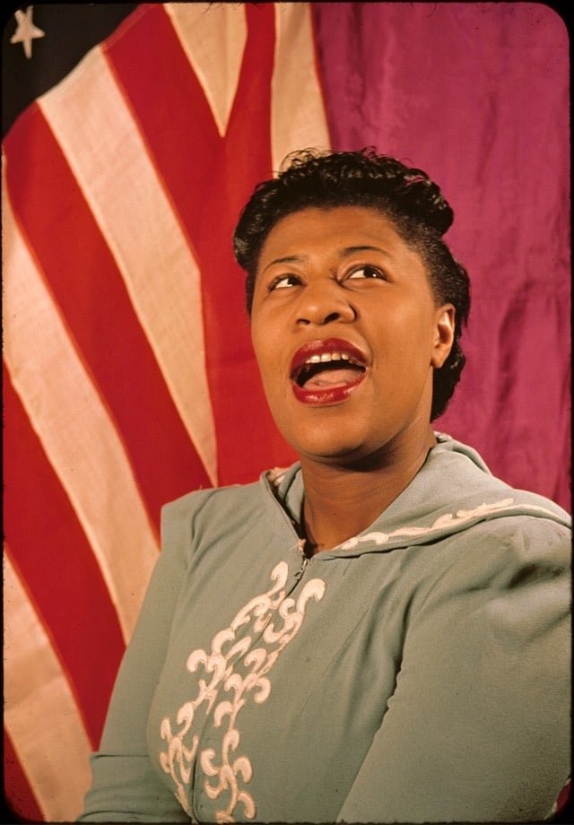
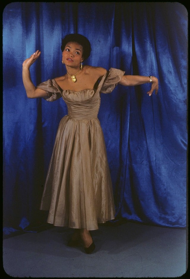

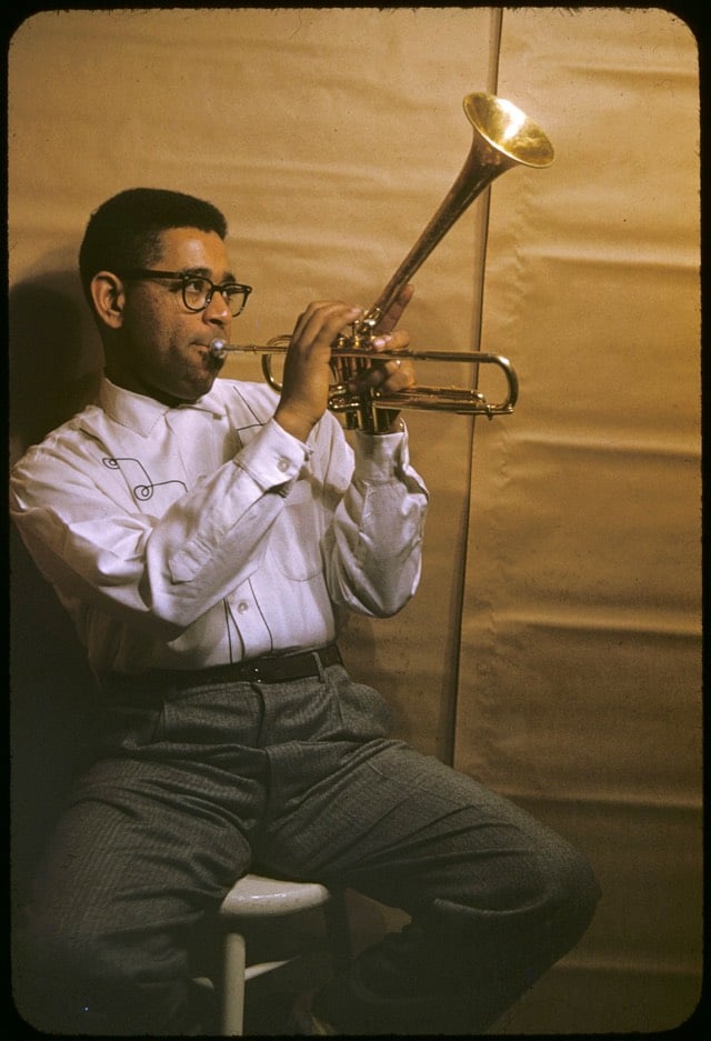
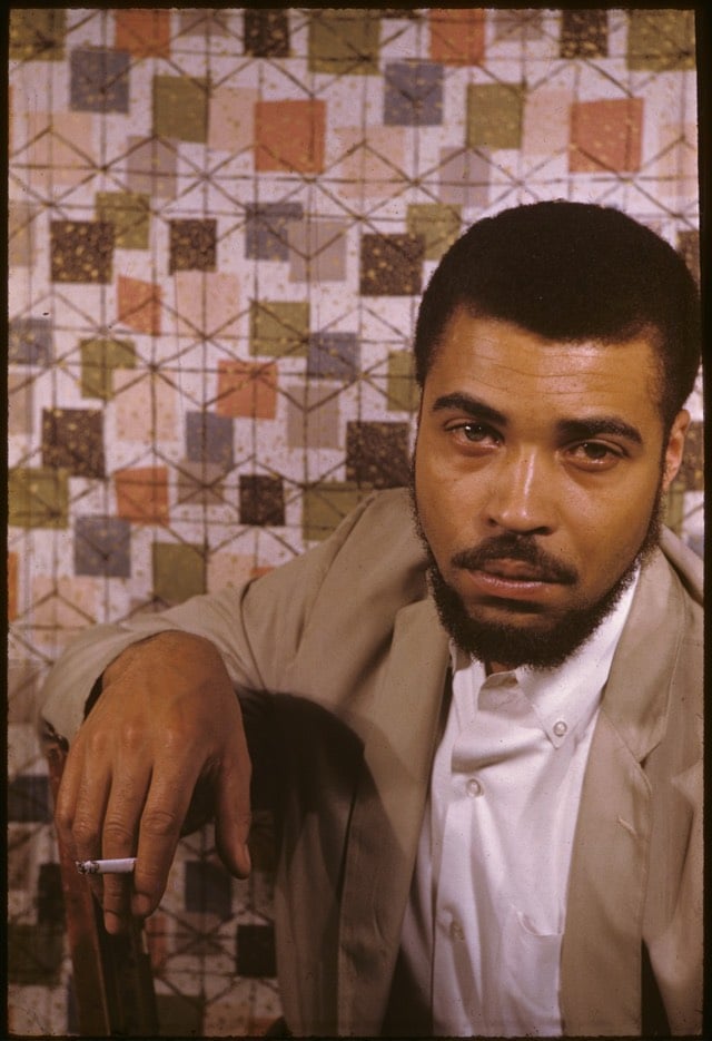
Carl Van Vechten moved to New York in the early 20th century and became “violently interested in Negroes”. As part of that interest, Van Vechten got to know many of the leading black figures in the city and photographed them, first in black & white but later in vibrant Kodachrome. Almost 2000 of his color photos are available at Yale’s Beinecke Library (direct search). Pictured above are Van Vechten’s photos of Ella Fitzgerald, Eartha Kitt, W.E.B. DuBois, Dizzy Gillespie, and a young James Earl Jones. (via the new yorker)

This is fun: the Ramsophone is a music box you can play around with on the web. Push buttons to make it do stuff and refresh for a new box that sounds/works differently. Design inspired by Dieter Rams and music inspired by the Stranger Things theme.
Kanye West is not a great singer. But he packs his songs and albums full of the human voice. Estelle Caswell explains how Kanye uses the human voice as the central instrument in his music.
Jump scares are the easiest way for hack moviemakers to get the audience’s blood flowing: a quick cut accompanied by a loud noise. But it’s a cheap trick, more or less the same one employed by tweens to scare hiccups out of each other.1 But as this video shows, jump scares can be employed to serve the plot, heighten tension, and to “make the calm moments of the movie scary”.
P.S. Why are trailers for horror/action/sci-fi/drama movies so terrible? Because they’re all jump scares.
Speaking of quick cuts, a slight hiccups interlude. I’ve never placed much stock in hiccup cures — breathing into a paper bag, a sudden scare, drinking from the opposite side of a glass — but my son had the hiccups a few months ago and after 25 minutes, they just weren’t going away. After combing through various cures online, we settled on trying a spoonful of honey. One swallow and the hiccups instantly vanished. Like *snap*.↩
Socials & More