kottke.org posts about statistics
Jerry and Marge Selbee were a semi-retired couple in rural Michigan who ran a convenience store. Among their biggest sellers were lottery tickets. One day, Jerry realized that if you only played on certain “roll-down” days (when a four-out-of-six winner would get part of a five-out-of-six prize, and so on), the odds weren’t just better for players; they were positive. You just had to buy a lot of tickets.
Lottery terminals in convenience stores could print only 10 slips of paper at a time, with up to 10 lines of numbers on each slip (at $1 per line), which meant that if you wanted to bet $100,000 on Winfall, you had to stand at a machine for hours upon hours, waiting for the machine to print 10,000 tickets. Code in the purchase. Push the “Print” button. Wait at least a full minute for the 10 slips to emerge. Code in the next purchase. Hit “Print.” Wait again. Jerry and Marge knew all the convenience store owners in town, so no one gave them a hard time when they showed up in the morning to print tickets literally all day. If customers wondered why the unassuming couple had suddenly developed an obsession with gambling, they didn’t ask. Sometimes the tickets jammed, or the cartridges ran out of ink. “You just have to set there,” Jerry said.
The Selbees stacked their tickets in piles of $5,000, rubber-banded them into bundles and then, after a drawing, convened in their living room in front of the TV, sorting through tens or even hundreds of thousands of tickets, separating them into piles according to their value (zero correct numbers, two, three, four, five). Once they counted all the tickets, they counted them again, just to make sure they hadn’t missed anything. If Jerry had the remote, they’d watch golf or the History Channel, and if Marge had it, “House Hunters” on HGTV. “It looked extremely tedious and boring, but they didn’t view it that way,” recalled their daughter Dawn. “They trained their minds. Literally, they’d pick one up, look at it, put it down. Pick one up, put it down.” Dawn tried to help but couldn’t keep pace; for each ticket she completed, Jerry or Marge did 10.
Naturally, of course, the couple hits trouble when they shift their game to Massachusetts and bumps up against a group of MIT students who have the same idea. Hijinks ensue.
A couple nights ago against the Oklahoma City Thunder, Dirk Nowitzki scored 48 points and only missed three shots, prompting Bill Simmons to wonder if that was some sort of record. Jerod from Midwest Sports Fans dug into how useful a stat like points per miss would be as a measure of efficiency.
What is interesting about the table above is that Dirk comes in ahead of Bird, Jordan, and so many others. Does this mean Dirk is a better player than Jordan or Bird? Of course not. But it does mean that he is as efficient a scorer as those two were, if not better. Scoring efficiency only tells one part of the story on one side of the floor, which is why PPM can only be considered a small piece of the puzzle when comparing players, but it is a good way to give one of the most unique scoring talents in NBA history his due.
Bill Simmons has finally accepted the gospel of sabermetrics as scripture and in a recent column, preaches the benefits of all these newfangled statistics to his followers. The list explaining his seven favorite statistics in down-to-earth language is really helpful to the stats newbie.
Measure BABIP to determine whether a pitcher or hitter had good luck or bad luck. In 2009, the major league BABIP average was .299. If a pitcher’s BABIP dipped well below that number, he might have had good luck. If it rose well above that number, he likely had terrible luck. The reverse goes for hitters.
(via djacobs, who has an extremely high VORF)
How accurate are all those preseason predictions about how the coming NFL season will unfold?
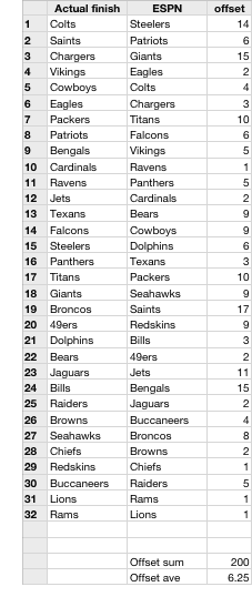 In an effort to find out, I collected a number of preseason “team power rankings” two days before the 2009 NFL regular season started in September. These ranking lists are compiled by columnists and pundits from media outlets like Sports Illustrated, Fox Sports, The Sporting News, and ESPN. In addition, I collected a fan-voted ranking from Yahoo Sports and the preseason Vegas odds to win the Super Bowl. As a baseline of sorts, I’ve also included the ranking for how the teams finished in the 2008 season.
Each team ranking from each list was compared to the final 2009 regular season standings (taken from this tentative 2010 draft order) by calculating the offset between the estimated rank to the team’s actual finish. For instance, ESPN put the Steelers in the #1 slot but they actually finished 15th in the league…so ESPN’s offset for the Steelers is 14. For each list, the offsets for all 32 teams were added up and divided by 32 to get the average number of places that the list was off by. See ESPN’s list at right for example; you can see that each team ranking in the list was off by an average of about 6.3 places.
Here are the offset averages for each list (from best to worst):
| Media outlet | Offset ave. (# of places) |
| CBS Sports | 5.6 |
| The Sporting News | 5.6 |
| USA Today | 5.6 |
| Vegas odds | 5.8 |
| Yahoo Sports | 5.9 |
| Sports Illustrated | 5.9 |
| ESPN | 6.3 |
| Fox Sports | 6.4 |
| 2008 finish | 7.3 |
The good news is that all of the pundits beat the baseline ranking of last season’s final standings. But they didn’t beat it by that much…only 1.7 places in the best case. A few other observations:
- All the lists were pretty much the same. Last place Fox Sports and first place CBS Sports differ by less than one place in their rankings. The Steelers and Patriots were one and two on every list and the bottom five were pretty consistent as well. All the pundits said basically the same thing; no one had an edge or angle the others didn’t.
- Nearly everyone was very wrong about the Steelers, Giants, Titans, Jets, Bengals, and Saints…and to a lesser extent, the Redskins, Bears, Vikings, and Packers. CBS Sports made the fewest big mistakes; their offset for the Bengals was only 4 places. The biggest mistakes were Fox Sports’ choice and the Vegas ranking of the Bengals to finish 28th (offset: 19).
- Among the top teams, the Colts, Eagles, and Patriots more or less fulfilled the hopes of the pundits; only Fox Sports and Sports Illustrated missed the mark on one of these teams (the Colts by 9 places).
- The two “wisdom of the crowds” lists, Yahoo Sports and the Vegas list, ended up in the middle, better than some but not as good as some others. I suspect that there was not enough independent information out there for the crowd to make a good collective choice; those two lists looked pretty much like the pundits’ lists.
- The teams who turned out to be bad were easier to pick than the good teams. The bottom five picks on each list were typically off by 3-5 places while the top five were off by more like 8-12 places (esp the Steelers and the Giants). Not sure why this is. Perhaps badness is easier to see than goodness. Or it’s easier for a good-looking team to go bad than it is for bad-looking team to do better.
For the curious, here’s the full Google Docs spreadsheet of numbers for all of the lists.
Methodology and notes: 1) I made an assumption about all these power ranking lists: that what the pundits were really picking is the final regular season ranking. That isn’t precisely true but close enough for our purposes. 2) I have no idea what the statistical error is here. 3) The 2010 draft order list isn’t a perfect ranking of how the teams finished, but it is close enough. 4) Using the final regular season records as the determining factor of rank is problematic because of the playoffs. By the end of the season, some teams aren’t trying to win every game because they’ve either made the playoffs or haven’t. So some teams might be a little bit better or worse than their records indicate. 5) The Vegas odds list was a rankng of the odds of each team making the Super Bowl, not the odds for the teams’ final records. But close enough. 6) The Sports Illustrated list was from before the 2009 pre-season started; I couldn’t find an SI list from right before the regular season. Still, it looked a lot like the other lists and did middlingly well.
I was kinda waiting for FiveThirtyEight to weigh in on this: using Benford’s Law to check for fraud in the Iranian election results (here as well).
Benford’s law is sometimes useful in these cases, because human beings intuitively tend to distribute the first digits about evenly when they’re making up “random” strings of numbers, when in fact many real-world distributions will be skewed toward the smaller digits.
Both 538 pieces are skeptical that Benford’s Law is applicable in this case. (thx, nick)
Update: Voting fraud expert Walter Mebane has produced a paper on the Iranian election that uses Benford’s Law to check the results. He’s updated the paper several times since it was first published and now writes that “the results give moderately strong support for a diagnosis that the 2009 election was affected by significant fraud”. (thx,scott)
Update: Done just after the election, this analysis shows that the returns released by Iran’s Interior Ministry during the course of the day of the election shows an unnaturally high steadiness of voting percentages. (thx, cliff)
Update: Regarding the previous link, Nate Silver doesn’t think much of that analysis. (thx, cliff)
The distribution of point differentials at the end of NBA basketball games shows that a tie is more than twice as likely as either team winning by one point. A possible simple explanation from the comments:
1. Teams down by 2 late are most likely to take a 2 point shot, while teams down by 3 will most often take a 3 point shot. The team’s choices make ties a likely outcome.
2. A Tie is a stable equilibrium, while other scores aren’t. If a team leads with the ball, they will be fouled, preventing the game from ending on that score. IF a team has the ball with a tie, they’ll usually be allowed to wait and take the last shot, either winning the game or leaving it as a tie.
Update: This study about golf putting seems to have something in common with the overtime finding.
Even the world’s best pros are so consumed with avoiding bogeys that they make putts for birdie discernibly less often than identical-length putts for par, according to a coming paper by two professors at the University of Pennsylvania’s Wharton School. After analyzing laser-precise data on more than 1.6 million Tour putts, they estimated that this preference for avoiding a negative (bogey) more than gaining an equal positive (birdie) — known in economics as loss aversion — costs the average pro about one stroke per 72-hole tournament, and the top 20 golfers about $1.2 million in prize money a year.
The “safety in numbers” effect is proving true in NYC: the number of bicycles on the streets has more than doubled since 2001 while casualties have fallen. The increased prevalence of bike lanes in the city has to be helping too. (thx, david)
Nate Silver, who used polling statistics to predict a clear Obama win in the Presidential election in November, turns his analytical tools loose on the Oscars.
For example, is someone more likely to win Best Actress if her film has also been nominated for Best Picture? (Yes!) But the greatest predictor (80 percent of what you need to know) is other awards earned that year, particularly from peers (the Directors Guild Awards, for instance, reliably foretells Best Picture). Genre matters a lot (the Academy has an aversion to comedy); MPAA and release date don’t at all. A film’s average user rating on IMDb (the Internet Movie Database) is sometimes a predictor of success; box grosses rarely are.
Silver’s “Gamble-Tron 2000 Lock of the Oscars” is that Danny Boyle wins Best Director for Slumdog Millionaire with a whopping 99.7% certainty. I suspect that the Oscars will prove more difficult to predict than the election and that Silver will be wrong in at least two categories. I will report back on Oscar night. (via fimoculous)
StateStats is hours of fun. It tracks the popularity of Google searches per state and then correlates the results to a variety of metrics. For instance:
Mittens - big in Vermont, Maine, and Minnesota, moderate positive correlation with life expectancy, and moderate negative correlation with violent crime. (Difficult to commit crimes while wearing mittens?)
Nascar - popular in North and South Carolinas, strong positive correlation with obesity, and and moderate negative correlation with same sex couples and income.
Sushi - big in NY and CA, moderate positive correlation with votes for Obama, and moderate negative correlation with votes for Bush.
Gun - moderate positive correlation with suicide and moderate negative correlation with votes for Obama. (Obama is gonna take away your guns but, hey, you’ll live.)
Calender (misspelled) - moderate positive correlation with illiteracy and rainfall and moderate negative correlation with suicide.
Diet - moderate positive correlation with obesity and infant mortality and moderate negative correlation with high school graduation rates.
Kottke - popular in WI and MN, moderate positive correlation with votes for Obama, and moderate negative correlation with votes for Bush.
Cuisine - This was my best attempt at a word with strong correlations but wasn’t overly clustered in an obvious way (e.g. blue/red states, urban/rural, etc.). Strong positive correlation with same sex couples and votes for Obama and strong negative correlation with energy consumption and votes for Bush.
I could do this all day. A note on the site about correlation vs. causality:
Be careful drawing conclusions from this data. For example, the fact that walmart shows a moderate correlation with “Obesity” does not imply that people who search for “walmart” are obese! It only means that states with a high obesity rate tend to have a high rate of users searching for walmart, and vice versa. You should not infer causality from this tool: In the walmart example, the high correlation is driven partly by the fact that both obesity and Walmart stores are prevalent in the southeastern U.S., and these two facts may have independent explanations.
Can you find any searches that show some interesting results? Strong correlations are not that easy to find (although foie gras is a good one). (thx, ben)
Clive Thompson writes up the Netflix Prize — which offers $1 million to the first team to improve upon Netflix’s default recommendation algorithm by 10% — and the vexing Napoleon Dynamite problem that is thwarting all comers.
Bertoni says it’s partly because of “Napoleon Dynamite,” an indie comedy from 2004 that achieved cult status and went on to become extremely popular on Netflix. It is, Bertoni and others have discovered, maddeningly hard to determine how much people will like it. When Bertoni runs his algorithms on regular hits like “Lethal Weapon” or “Miss Congeniality” and tries to predict how any given Netflix user will rate them, he’s usually within eight-tenths of a star. But with films like “Napoleon Dynamite,” he’s off by an average of 1.2 stars.
The reason, Bertoni says, is that “Napoleon Dynamite” is very weird and very polarizing. It contains a lot of arch, ironic humor, including a famously kooky dance performed by the titular teenage character to help his hapless friend win a student-council election. It’s the type of quirky entertainment that tends to be either loved or despised. The movie has been rated more than two million times in the Netflix database, and the ratings are disproportionately one or five stars.
This behavior was flagged as an issue by denizens of the Netflix Prize message board soon after the contest was announced two years ago.
Those are the movies you either loved loved loved or hated hated hated. These are the movies you can argue with your friends about. And good old ‘Miss Congeniality’ is right up there in the #4 spot. Also not surprising to see up here are: ‘Napoleon Dynamite’ (I hated it), ‘Fahrenheit 9/11’ (I loved it), and ‘The Passion of the Christ’ (didn’t see it, but odds are, I’d hate it).
After finding that post, I wrote a little bit about why these movies are so contentious.
The thing that all those kinds of movies have in common is that if you’re outside of the intended audience for a particular movie, you probably won’t get it. That means that if you hear about a movie that’s highly recommended within a certain group and you’re not in that group, you’re likely to hate it. In some ways, these are movies intended for a narrow audience, were highly regarded within that audience, tried to cross over into wider appeal, and really didn’t make it.
Earlier this evening, I needed to take some coins that had been piling up to the Coinstar machine. Before I left, I uploaded a photo of the coin bags to Flickr and queried the masses: how much money in the bags?
How did the crowd do? Certainly not as well as the villagers at the 1906 livestock fair visited by Francis Galton.
In 1906 Galton visited a livestock fair and stumbled upon an intriguing contest. An ox was on display, and the villagers were invited to guess the animal’s weight after it was slaughtered and dressed. Nearly 800 gave it a go and, not surprisingly, not one hit the exact mark: 1,198 pounds. Astonishingly, however, the median of those 800 guesses came close — very close indeed. It was 1,208 pounds.
Nate Silver I am not, but after some rudimentary statistical analysis on the coin guesses, it was clear that the mean ($193.88) and median ($171.73) were both way off from the actual value ($426.55). That scatterplot is brutal…there are only a handful of guesses in the right area. But the best guess by a single individual was just 76 cents off.
To be fair, the crowd was likely misinformed. It’s difficult to tell from that photo how fat those bags were — they were bulging — and how many quarters there were.
As part of the Japanese census, people were asked to keep a record of what they were doing in 15 minute intervals. The data was publicly released and Jonathan Soma took it and graphed the results so that you can see what many Japanese are up to during the course of a normal day.
Sports: Women like swimming, but men eschew the water for productive sports, which is the most important Japanese invention.
Early to bed and early to rise… and early to bed: People start waking up at 5 AM, but are taking naps by 7:30 AM.
Fascinating.
New book from O’Reilly: Statistics in a Nutshell.
Need to learn statistics as part of your job, or want some help passing a statistics course? Statistics in a Nutshell is a clear and concise introduction and reference that’s perfect for anyone with no previous background in the subject. This book gives you a solid understanding of statistics without being too simple, yet without the numbing complexity of most college texts.
The folks behind the excellent Baseball Reference have launched a statistics site for the Olympics. Every athlete that’s ever competed in the Games has his/her own page. Announcement here.
Ben Fry has updated his salary vs. performance chart for the 2008 MLB season that compares team payrolls with winning percentage. The entire payroll of the Florida Marlins appears to be less than what Jason Giambi and A-Rod *each* made last year.
Star Trek statistics: just how likely are you to die if you beam down to the planet’s surface wearing a red shirt?
You don’t know about the Red Shirt Phenomenon? Well, as any die-hard Trekkie knows, if you are wearing a red shirt and beam to the planet with Captain Kirk, you’re gonna die. That’s the common thinking, but I decided to put this to the test. After all, I hadn’t seen any definitive proof; it’s just what people said.
According to a simple statistical analysis using computer simulations, a hitting streak as long as Joe DiMaggio’s 1941 56-game streak is not the freakish occurrence that most people think it is.
More than half the time, or in 5,295 baseball universes, the record for the longest hitting streak exceeded 53 games. Two-thirds of the time, the best streak was between 50 and 64 games.
In other words, streaks of 56 games or longer are not at all an unusual occurrence. Forty-two percent of the simulated baseball histories have a streak of DiMaggio’s length or longer. You shouldn’t be too surprised that someone, at some time in the history of the game, accomplished what DiMaggio did.
I think there are probably some cumulative effects that are being ignored here though, like increasing media pressure/distraction, opponents trying particularly hard for an out as the streak continues, pitchers more likely to pitch around them, or even the streaking player getting super-confident. The first game in a streak and the 50th game in a streak are, as they say, completely different ball games.
Gelf Magazine enlisted the help of ZEUS, a football game analyzing computer, to see which NFL coaches called the worst plays at critical times during the 2007 season.
On average, suboptimal play-calling decisions cost each team .85 wins over the course of the season.
In particular, the world champion Giants should have won another game had they called the right plays at the right times. ZEUS also analyzed play calling in “hyper-critical” situations (those fourth-down decisions with five or fewer yards needed for the first down) and found that on average, teams made the wrong calls more than 50% of the time. Here’s an interview on the results with the guys behind ZEUS.
Stats (wins, losses, probability of making the playoffs, etc.) from the rest of the MLB baseball season, played a million times. “The post-season odds report was compiled by running a Monte Carlo simulation of the rest of the season one million times.” (thx, david)
Crime in the three biggest American cities (NY, Chicago, LA) is down…and up almost everywhere else. In part, this is due to the aging of the population in those cities. “Together they lost more than 200,000 15-to 24-year-olds between 2000 and 2005. That bodes ill for their creativity and future competitiveness, but it is good news for the police. Young people are not just more likely to commit crimes. Thanks to their habit of walking around at night and their taste for portable electronic gizmos, they are also more likely to become its targets.” Young people, your gizmos are hurting America!
While bumping around on the internet last night, I stumbled upon Alex Reisner’s site. Worth checking out are his US roadtrip photos and NYC adventures, which include an account and photographs of a man jumping from the Williamsburg Bridge.
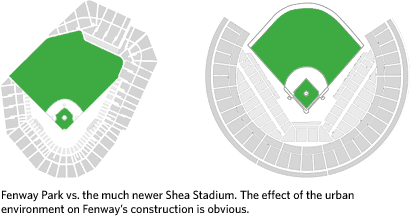
But the real gold here is Reisner’s research on baseball…a must-see for baseball and infographics nerds alike. Regarding the home run discussion on the post about Ken Griffey Jr. a few weeks ago, Reisner offers this graph of career home runs by age for a number of big-time sluggers. You can see the trajectory that Griffey was on before he turned 32/33 and how A-Rod, if he stays healthy, is poised to break any record set by Bonds. His article on Baseball Geography and Transportation details how low-cost cross-country travel made it possible for the Brooklyn Dodgers and New York Giants to move to California. The same article also riffs on how stadiums have changed from those that fit into urban environments (like Fenway Park) to more symmetric ballfields built in suburbs and other open areas accessible by car.
And then there’s the pennant race graphs for each year since 1900…you can compare the dominance of the 1927 Yankees with the 1998 Yankees. And if you’ve gotten through all that, prepare to spend several hours sifting through all sorts of MLB statistics, represented in a way you may not have seen before:
The goal here is not to duplicate excellent resources like Total Baseball or The Baseball Encyclopedia, but to take the same data and present it in a way that shows different relationships, yields new insights, and raises new questions. The focus is on putting single season stats in a historical context and identifying the truly outstanding player seasons, not just those with big raw numbers.
Reisner’s primary method of comparing players over different eras is the z-score, a measure of how a player compares to their contemporaries, (e.g. the fantastic seasons of Babe Ruth in 1920 and Barry Bonds in 2001):
In short, z-score is a measure of a player’s dominance in a given league and season. It allows us to compare players in different eras by quantifying how good they were compared to their competition. It it a useful measure but a relative one, and does not allow us to draw any absolute conclusions like “Babe Ruth was a better home run hitter than Barry Bonds.” All we can say is that Ruth was more dominant in his time.
I’m more of a basketball fan than of baseball, so I immediately thought of applying the same technique to NBA players, to shed some light on the perennial Jordan vs. Chamberlain vs. Oscar Robertson vs. whoever arguments. Until recently, the NBA hasn’t collected statistics as tenaciously as MLB has so the z-score technique is not as useful, but some work has been done in that area.
Anyway, great stuff all the way around.
Update: Reisner’s site seems to have gone offline since I wrote this. I hope the two aren’t related and that it appears again soon.
Update: It’s back up!
Ben Fry has updated his salary vs. performance graph for the 2007 MLB season…it plots team payrolls vs. winning percentage. The Mets and Red Sox should be winning and are…the Yankees, not so much. Cleveland and the Brewers are making good use of their relatively low payrolls.
Regarding the Twitter vs. Blogger thing from earlier in the week, I took another stab at the faulty Twitter data. Using some educated guesses and fitting some curves, I’m 80-90% sure that this is what the Twitter message growth looks like:
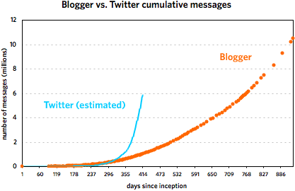
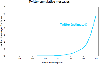
These graphs cover the following time periods: 8/23/1999 - 3/7/2002 for Blogger and 3/21/2006 - 5/7/2007 for Twitter. It’s important to note that the Twitter trend is not comprised of actual data points but is rather a best-guess line, an estimate based on the data. Take it as fact at your own risk. (More specifically, I’m more sure of the general shape of the curve than with the steepness. My gut tells me that the curve is probably a little flatter than depicted rather than steeper.)
That said, most of what I wrote in the original post still holds, as do the comments in subsequent thread. Twitter did not grow as fast as the faulty data indicated, but it did get to ~6,000,000 messages in about half the time of Blogger. Here are the reasons I offered for the difference in growth:
1. Twitter is easier to use than Blogger was and had a lower barrier to entry.
2. Twitter has more ways to update (web, phone, IM, Twitterific) than did Blogger.
3. Blogger’s growth was limited by a lack of funding.
4. Twitter had a larger pool of potential users to draw on.
5. Twitter has a built-in social aspect that Blogger did not.
And commenters in the thread noted that:
6. Twitter’s 140-character limit encourages more messages.
7. More people are using Twitter for conversations than was the case with Blogger.
What’s interesting is that these seeming advantages (in terms of message growth potential) for Twitter didn’t result in higher message growth than Blogger over the first 9-10 months. But then the social and network effects (#5 and #7 above) kicked in and Twitter took off.
Important update: I’ve re-evaluated the Twitter data and came up with what I think is a much more accurate representation of what’s going on.
Further update: The Twitter data is bad, bad, bad, rendering Andy’s post and most of this here post useless. Both jumps in Twitter activity in Nov 2006 and March 2007 are artificial in nature. See here for an update.
Update: A commenter noted that sometime in mid-March, Twitter stopped using sequential IDs. So that big upswing that the below graphs currently show is partially artificial. I’m attempting to correct now. This is the danger of doing this type of analysis with “data” instead of data.
—
In mid-March, Andy Baio noted that Twitter uses publicly available sequential message IDs and employed Twitter co-founder Evan Williams’ messages to graph the growth of the service over the first year of its existence. Williams co-founded Blogger back in 1999, a service that, as it happens, also exposed its sequential post IDs to the public. Itching to compare the growth of the two services from their inception, I emailed Matt Webb about a script he’d written a few years ago that tracked the daily growth of Blogger. His stats didn’t go back far enough so I borrowed Andy’s idea and used Williams’ own blog to get his Blogger post IDs and corresponding dates. Here are the resulting graphs of that data.1
The first one covers the first 253 days of each service. The second graph shows the Twitter data through May 7, 2007 and the Blogger data through March 7, 2002. [Some notes about the data are contained in this footnote.]
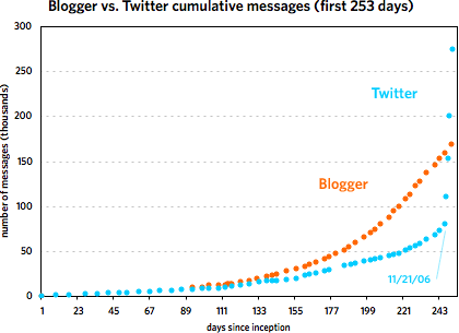
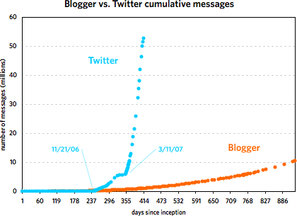
As you can see, the two services grew at a similar pace until around 240 days in, with Blogger posts increasing faster than Twitter messages. Then around November 21, 2006, Twitter took off and never looked back. At last count, Twitter has amassed five times the number of messages than Blogger did in just under half the time period. But Blogger was not the slouch that the graph makes it out to be. Plotting the service by itself reveals a healthy growth curve:
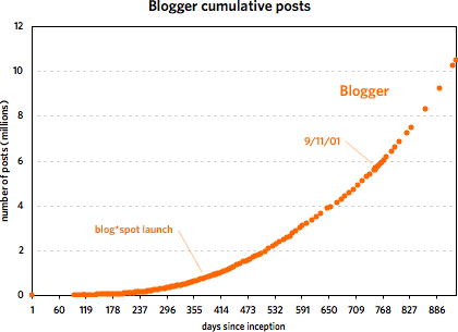
From late 2001 to early 2002, Blogger doubled the number of messages in its database from 5M to 10M in under 200 days. Of course, it took Twitter just over 40 days to do the same and under 20 days to double again to 20M. The curious thing about Blogger’s message growth is that large events like 9/11, SXSW 2000 & 2001, new versions of Blogger, and the launch of blog*spot didn’t affect the growth at all. I expected to see a huge message spike on 9/11/01 but there was barely a blip.
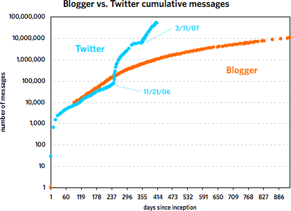
The second graph also shows that Twitter’s post-SXSW 2007 growth is real and not just a temporary bump…a bunch of people came to check it out, stayed on, and everyone messaged like crazy. However, it does look like growth is slowing just a bit if you look at the data on a logarithmic scale:
Actually, as the graph shows, the biggest rate of growth for Twitter didn’t occur following SXSW 2007 but after November 21.
As for why Twitter took off so much faster than Blogger, I came up with five possible reasons (there are likely more):
1. Twitter is easier to use than Blogger was. All you need is a web browser or mobile phone. Before blog*spot came along in August 2000, you needed web space with FTP access to set up a Blogger blog, not something that everyone had.
2. Twitter has more ways to create a new message than Blogger did at that point. With Blogger, you needed to use the form on the web site to create a post. To post to Twitter, you can use the web, your phone, an IM client, Twitterrific, etc. It’s also far easier to send data to Twitter programatically…the NY Times account alone sends a couple dozen new messages into the Twitter database every day without anyone having to sit there and type them in.
3. Blogger was more strapped for cash and resources than Twitter is. The company that built Blogger ran out of money in early 2001 and nearly out of employees shortly after that. Hard to say how Blogger might have grown if the dot com crash and other factors hadn’t led to the severe limitation of its resources for several key months.
4. Twitter has a much larger pool of available users than Blogger did. Blogger launched in August 1999 and Twitter almost 7 years later in March 2006. In the intervening time, hundreds of millions of people, the media, and technology & media companies have become familiar and comfortable with services like YouTube, Friendster, MySpace, Typepad, Blogger, Facebook, and GMail. Hundreds of millions more now have internet access and mobile phones. The potential user base for the two probably differed by an order of magnitude or two, if not more.
5. But the biggest factor is that the social aspect of Twitter is built in and that’s where the super-fast growth comes from. With Blogger, reading, writing, and creating social ties were decoupled from each other but they’re all integrated into Twitter. Essentially, the top graph shows the difference between a site with social networking and one largely without. Those steep parts of the Twitter trend on Nov 21 and mid-March? That’s crazy insane viral growth2, very contagious, users attracting more users, messages resulting in more messages, multiplying rapidly. With the way Blogger worked, it just didn’t have the capability for that kind of growth.
A few miscellaneous thoughts:
It’s important to keep in mind that these graphs depict the growth in messages, not users or web traffic. It would be great to have user growth data, but that’s not publicly available in either case (I don’t think). It’s tempting to look at the growth and think of it in terms of new users because the two are obviously related. More users = more messages. But that’s not a static relationship…perhaps Twitter’s userbase is not increasing all that much and the message growth is due to the existing users increasing their messaging output. So, grain of salt and all that.
What impact does Twitter’s API have on its message growth? As I said above, the NY Times is pumping dozens of messages into Twitter daily and hundreds of other sites do the same. This is where it would be nice to have data for the number of active users and/or readers. The usual caveats apply, but if you look at the Alexa trends for Twitter, pageviews and traffic seem to leveling out. Compete, which only offers data as recently as March 2007, still shows traffic growing quickly for Twitter.
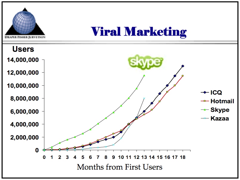
Just for comparison, here’s a graph showing the adoption of various technologies ranging from the automobile to the internet. Here’s another graph showing the adoption of four internet-based applications: Skype, Hotmail, ICQ, and Kazaa (source: a Tim Draper presentation from April 2006).
[Thanks to Andy, Matt, Anil, Meg, and Jonah for their data and thoughts.]
[1] Some notes and caveats about the data. The Blogger post IDs were taken from archived versions of Evhead and Anil Dash’s site stored at the Internet Archive and from a short-lived early collaborative blog called Mezzazine. For posts prior to the introduction of the permalink in March 2000, most pages output by Blogger didn’t publish the post IDs. Luckily, both Ev and Anil republished their old archives with permalinks at a later time, which allowed me to record the IDs.
The earliest Blogger post ID I could find was 9871 on November 23, 1999. Posts from before that date had higher post IDs because they were re-imported into the database at a later time so an accurate trend from before 11/23/99 is impossible. According to an archived version of the Blogger site, Blogger was released to the public on August 23, 1999, so for the purposes of the graph, I assumed that post #1 happened on that day. (As you can see, Anil was one of the first 2-3 users of Blogger who didn’t work at Pyra. That’s some old school flavor right there.)
Regarding the re-importing of the early posts, that happened right around mid-December 1999…the post ID numbers jumped from ~13,000 to ~25,000 in one day. In addition to the early posts, I imagine some other posts were imported from various Pyra weblogs that weren’t published with Blogger at the time. I adjusted the numbers subsequent to this discontinuity and the resulting numbers are not precise but are within 100-200 of the actual values, an error of less than 1% at that point and becoming significantly smaller as the number of posts grows large. The last usable Blogger post ID is from March 7, 2002. After that, the database numbering scheme changed and I was unable to correct for it. A few months later, Blogger switched to a post numbering system that wasn’t strictly sequential.
The data for Twitter from March 21, 2006 to March 15, 2007 is from Andy Baio. Twitter data subsequent to 3/15/07 was collected by me. ↩
[2] “Crazy insane viral growth” is a very technical epidemiological term. I don’t expect you to understand its precise meaning. ↩
Bread is dangerous. Here are some frightening stats: “More than 90 percent of violent crimes are committed within 24 hours of eating bread” and “Bread is made from a substance called ‘dough.’ It has been proven that as little as one pound of dough can be used to suffocate a mouse. The average American eats more bread than that in one month!”
Last night, Ken Griffey Jr. hit the 564th home run of his career to move into 10th place on the all-time list. Reading about his accomplishment, I was surprised he was so far up on the list, given the number of injuries he’s had since coming into the league in 1989. That got me wondering about what might have been had Griffey stayed healthy throughout his career…if he would have lived up to the promise of his youth when he was predicted to become one of the game’s all-time greats.
Looking at his stats, I assumed a full season to be 155 games and extrapolated what his home run total would have been for each season after his rookie year in which he played under 155 games. Given that methodology, Griffey would have hit about 687 home runs up to this point. In two of those seasons, 1995 and 2002, his adjusted home run numbers were far below the usual because of injuries limiting his at-bats and effectiveness at the plate. Further adjusting those numbers brings the total up to 717 home runs, good for 3rd place on the all-time list and a race to the top with Barry Bonds.
Of course, if you’re going to play what-if, Babe Ruth had a couple of seasons in which he missed a lot of games and also played in the era of the 154-game season. Willie Mays played a big chunk of his career in the 154-game season era as well. Ted Williams, while known more for hitting for average, missed a lot of games for WWII & the Korean War (almost 5 full seasons) and played in the 154-game season era…and still hit 521 home runs.
A paper on the tradeoff in baseball between home runs and hitting for average that I don’t fully understand but seems interesting. “Both models find a significant and negative relationship between home runs per at-bat and contact rate.” (thx, aaron)
I don’t typically write about many new Web 2.0 products, but Do The Right Thing is doing something interesting. The site works on a modified Digg model. If you see a story you like, you click a button to declare your interest in it. But then you also rate the social impact of the subject of the story, either positive or negative. Over time and given enough users, you can look at all the stories about a company like Starbucks and see how they’re doing. This is something that people do when reading the news anyway — e.g. “I feel worse about Exxon Mobil because they outsourced 20,000 jobs to India” — and having them explicitly rate stories like this is a quick way of taking the temperature of the social climate around issues & companies and recording the results for all to see.
It would be interesting to see if people would be willing to specify some demographic information (provided that it’s not sold to a third party) like sex, age, race, religion, political party affiliation, and income bracket…that would allow the social impact data to be sliced and diced in interesting ways. Even without that data, the opportunities for data analysis are intriguing…like graphs of a company’s social impact over time.
Running the Numbers, a great new series of photography from Chris Jordan, is kind of a combination of Chuck Close and Edward Burtynsky, with a bit of Stamen thrown in for good measure. (via conscientious)
Older posts
Stay Connected