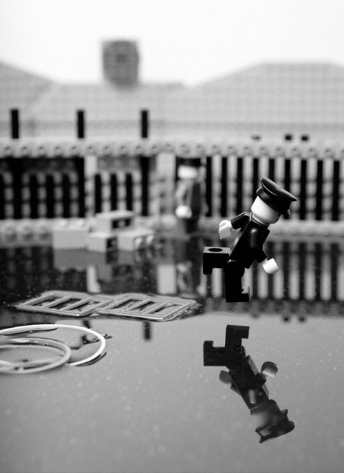
The Dallas Observer has collected a few clips from movies where the music has been replaced by Cee-Lo’s Fuck You. The Dirty Dancing one is probably the best:
I wonder how the slow-dance scene at the end of Rushmore would work. Or the Enchantment Under the Sea Dance in Back to the Future. Audio NSFW. (via @erikmal)
Polar-to-cartesian unwrapping of flower photographs is the new flattening flowers between the pages of books. The Processing source code is available. NotCot applied the effect to chandeliers. I dorked around in Photoshop a little and you can get similar results using the “Polar Coordinates” filter…you just have to stretch out the image first. (via today and tomorrow)
Stieg Larsson is back with a previously unreleased Lisbeth Salander short story from his rumored extensive back catalog: The Girl Who Fixed the Umlaut.
She tried to remember whether she was speaking to him or not. Probably not. She tried to remember why. No one knew why. It was undoubtedly because she’d been in a bad mood at some point. Lisbeth Salander was entitled to her bad moods on account of her miserable childhood and her tiny breasts, but it was starting to become confusing just how much irritability could be blamed on your slight figure and an abusive father you had once deliberately set on fire and then years later split open the head of with an axe.
Considering the New Yorker’s umlaut policy, this is an unusual stone throw.
Warning: this video contains spoilers, violence, and cinematic greatness.
Many friends after seeing my video “Tarantino vs Coen Brothers” requested me to do a new video duel of directors, so I decided to do now a tribute to my two favorite directors, Stanley Kubrick and Martin Scorsese, were 25 days re-watching 34 films, selected more than 500 scenes, and a hard work editing.
In Britain’s place should come Poland, which has suffered quite enough in its location between Russia and Germany and deserves a chance to enjoy the bracing winds of the North Atlantic and the security of sea water between it and any potential invaders.
Love it. Robin Sloan has previously discussed this type of “production as performance” video on Snarkmarket but Pomplamoose has started using the term “VideoSong”:
This cover is a VideoSong, a new medium with 2 rules: 1. What you see is what you hear (no lip-syncing for instruments or voice). 2. If you hear it, at some point you see it (no hidden sounds).
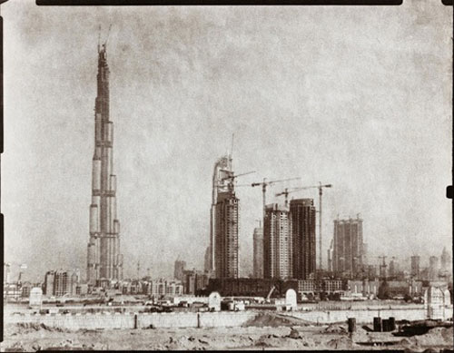
Martin Becka and Cedric Delsaux are a pair of photographers who feature Burj Dubai in their work. Becka’s Burj comes from his Dubai, Transmutations project in which he uses the photogravure processing technique to make images of brand-new Dubai that look as though they were taken in 1880.
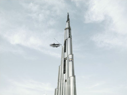
Delsaux’s Burj image comes from a project called The Dark Lens, which features images of Star Wars characters populating the circa-2008 Earth. I believe that’s the Millennium Falcon docking at the Burj:
It was of consequence, I should think; verily, it tied the room together, gather’d its qualities as the sweet lovers’ spring grass doth the morning dew or the rough scythe the first of autumn harvests. It sat between the four sides of the room, making substance of a square, respecting each wall in equal harmony, in geometer’s cap; a great reckoning in a little room. Verily, it transform’d the room from the space between four walls presented, to the harbour of a man’s monarchy.
Yep, it’s the entire screenplay. The Knave abideth, indeed. (thx, conor)
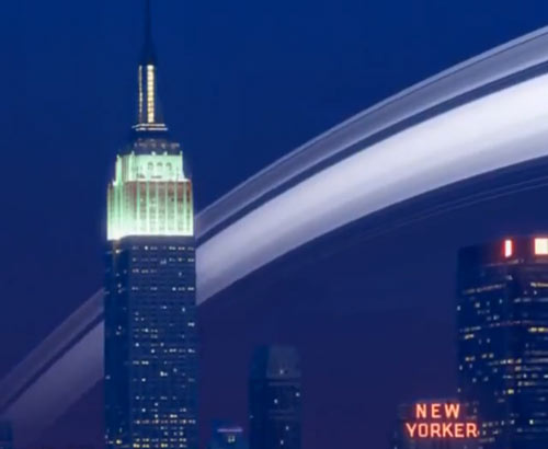
This video of what Earth would look like with Saturnine rings is pretty ho-hum, yeah, there’s a shot from orbit of the Earth with Saturn’s rings around it, and then BAM! here’s what it would look like at night in NYC:
With the combination of GPS and orientation data that’s baked in to so many digital photographs, it should be possible to create a filter — I hear the kids call them apps now — that automatically inserts properly positioned Saturn rings into any sky you want.
What the world needs is a great flag, a flag of pure bliss. Here’s one of the intermediate steps to the finished product; it’s an average of all the world’s countries’ flags weighted by population.
Scenes from several movies that depict New York being destroyed (Day After Tomorrow, Ghostbusters, Independence Day, etc.) accompanied by George Gershwin’s Rhapsody in Blue, which famously accompanies a similar but less violent montage at the beginning of Woody Allen’s Manhattan.


Socials & More