kottke.org posts about infoviz
Ben Fry just updated his interactive salary vs performance graph that compares the payrolls of major league teams to their records. Look at those overachieving Rays and Marlins! And those underachieving Indians, Mets, and Cubs!
Flip Flop Fly Ball is a marriage of baseball fandom and an enthusiasm for infographics. While not strictly baseball, this comparison of the sizes and shapes of sports balls is a favorite.
A very interesting infographic of the ideological history of the Supreme Court from 1937 to the present. The color coding on the map is weirdly inaccurate but you can still be general trends pretty well…like how many of the justices changed greatly during their terms. William O. Douglas became slightly more moderate mid-term and then got really liberal while Rehnquist went from very conservative to more moderate as his term went on, especially after he became Chief Justice.
OT: I knew there was a Burger on the bench but was unaware of Justice Frankfurter (1938-1961).
Update: Alex Lundry designed the visualization and got in touch to explain the color coding.
The colors are chosen based upon the Min, Max, and Median of the area we are comparing. So, in the first view, the “overall” view, the darkest Red is anchored to the maximum ideology number across all justices and all terms, the darkest Blue is anchored to the minimum score, and the purest white is anchored to the actual median number (The Location of the Median Justice is NOT necessarily the actual median, as it is calculated via a Bayesian statistical estimate).
The second “compare” option, “within each seat, row” calculates separate color anchors for each row.
Similarly, the third compare option, “within each year, column” calculates separate color anchors for each column.
The Location of Median Justice and Court Average are not included in these calculations and their color values are set to what they would be in the overall comparison.
Update: Burger, Frankfurter, Salmon. (via @kurtw)
Infographics News collects some lovely infographics from a new Portuguese newspaper called i.
The style of infographics follow the general design created by Javier Errea: no fireworks, modern, compact, with cromatic impact but smart. And the Innovation spirit: “newspapers must be daily magazines”, as Juan Antonio Giner says.
(via max gadney)
Bud Caddell summarizes how to be happy with your work in the form of a Venn diagram consisting of three main overlapping areas: What We Do Well, What We Want to Do, and What We Can Be Paid to Do. (via today and tomorrow)
The Indianapolis Star did a really nice car tracker for the Indianapolis 500. Just push play and watch the race unfold. I was struck by how few changes in position there were…you’d think people would be passing each other all the time but that’s just not the case. (thx, nathan)
By Meg Pickard, a graph of the lifespan of Twitter trending topics compares “people talking about #topic” and “people talking about talking about #topic”. Outside of Twitter, this applies to pretty much any popular newsworthy topic…the news quickly moves from “we’re telling you about Topic X” to media coverage of the media coverage of Topic X. See: Twitter’s own coverage in the media currently. (thx, @ davidfg )
Mike Frumin took the NYC subway ridership data from all the way back to 1905 (!!) and graphed it on a map, with a sparkline of the ridership data for each stop. Frumin explains the project a little more here.
The result, after much whacking, is, I think, compelling, but you’ll have to see for yourself. The general idea it that the history of subway ridership tells a story about the history of a neighborhood that is much richer than the overall trend. An example, below, shows the wild comeback of inner Williamsburg, and how the growth decays at each successive stop away from Manhattan on the L train.
Update: Here’s another representation of the same data. In this one, the ridership numbers are represented by the thickness of the subway line.
Good magazine has a nice chart with advice on reducing your water footprint. Meat = really really not good.
Here’s a handy flowchart to figure out which new media blowhard you are. I am “Try Again”.
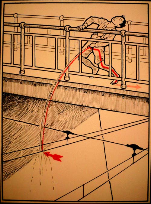
I believe these are the first infographic bloopers I’ve ever seen.
A collection of accidents that happened while working on maps and other graphics.
From the NY Times.
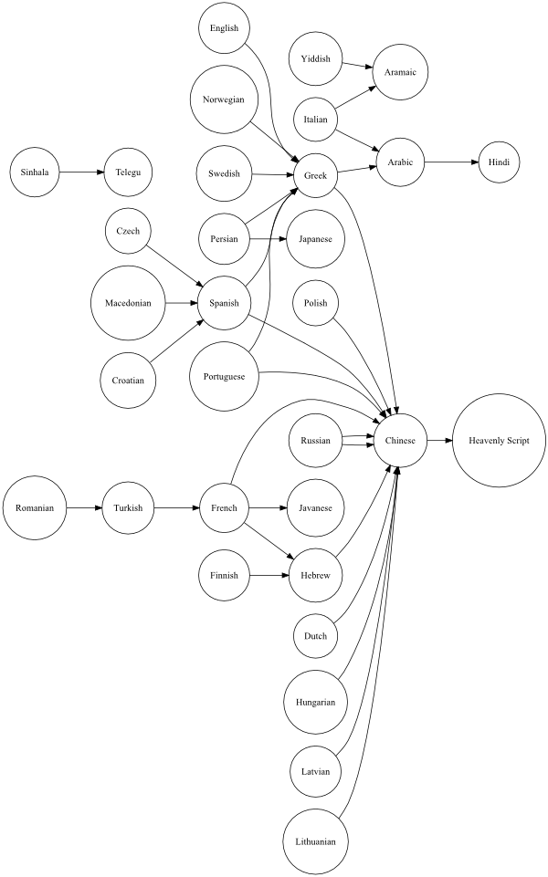
When confronted with an incomprehensible language, an English speaker might say “it’s all Greek to me” while a French or Finnish speaker might say that it sounds like Hebrew. Here’s a flowchart that illustrates the different incomprehensibility relationships (discussion here). The most stereotypical incomprehensible language appears to be Chinese. (via strange maps)
You may remember reading the New Yorker article on Garrett Lisi, a surfer, physicist, and snowboarder who came out of nowhere in 2007 to present a plausible Theory of Everything, “a unifying idea that aims to incorporate all the universe’s forces in a single mathematical framework”. I do but I missed this visualization of Lisi’s theory posted by New Scientist in late 2007. You may want to break out the bong for this one. (thx, matt)
You may remember the Google Motion Chart from Hans Rosling’s TED talk about Gapminder. Now 26 Variable has used the chart to graph the movement of the stocks in the S&P 100 in 2008. The strange thing is that with the default settings, you’re left with the impression that those stocks were more up than down over the year…if you ignore all the dots sliding to the left towards zero market cap.
A visualization of the top 10 Hollywood stars from 1936 to 1945.
For three years, from ‘36 to ‘38, Shirley Temple was the country’s top box-office star, and then Mickey Rooney had the title from ‘39 to ‘41. (And then it was Abbott & Costello.) Imagine. Temple and Rooney knew how to entertain, for sure, but the last thing you could call moviegoers back then, to judge by their six-year reign, was urbane or sophisticated.
The NY Times has a timeline map showing what people from around the country said on Twitter during the Super Bowl broadcast. I like the emoticons tab but they also should have included a profanity tab.
Johannes Kreidler took the data from recent stock charts, fed it to Microsoft Songsmith, and produced melancholy tunes. It’s like the Visualizer in iTunes, only backwards. Ben Fry says of the project:
My opinion of Songsmith is shifting — while it’s generally presented as a laughingstock, catastrophic failure, or if nothing else, a complete embarrassment (especially for its developers slash infomercial actors), it’s really caught the imagination of a lot of people who are creating new things, even if all of them subvert the original intent of the project. (Where the original intent was to… create a tool that would help write a jingle for glow in the dark towels?)
Dopplr is doing 2008 personal annual reports for all their users that shows “data, visualisations and factoids” about their 2008 travel. They’ve also done one for Barack Obama on his behalf that you can download for free. Obama took a whopping 234 trips in 2008 and traveled 92% of the distance to the moon!
Pictures of Numbers is infrequently updated, but the subject matter is timeless and the archives are worth a look.
Pictures of Numbers is a book-project-in-progress, consisting of practical tips and techniques for busy researchers on improving their data presentation.
I added 16 new maps to the 2008 Election Maps page in what is probably the final update. Big thanks to everyone who sent in maps.
Since the 1980 presidential election, more people voted for the Democratic candidate in each successive election than in the previous one…that is, Mondale got more votes than Carter, Dukakis more than Mondale, Clinton more than Dukakis, etc. The vote for Republicans has been a bit more erratic.
The goal of the creators of The Big Chart, The Counter-Intuitive Comparison Institute of North America (CICINA), is to find the single best thing in the world through an NCAA basketball tournament-style bracketing system. This video explains their plans.
Is the Bilbao Guggenheim better than McDonald’s french fries?Are penguins better than Miracle Grow? Can anything beat heated seats on a cold November day?
(via design observer)
Earlier this evening, I needed to take some coins that had been piling up to the Coinstar machine. Before I left, I uploaded a photo of the coin bags to Flickr and queried the masses: how much money in the bags?
How did the crowd do? Certainly not as well as the villagers at the 1906 livestock fair visited by Francis Galton.
In 1906 Galton visited a livestock fair and stumbled upon an intriguing contest. An ox was on display, and the villagers were invited to guess the animal’s weight after it was slaughtered and dressed. Nearly 800 gave it a go and, not surprisingly, not one hit the exact mark: 1,198 pounds. Astonishingly, however, the median of those 800 guesses came close — very close indeed. It was 1,208 pounds.
Nate Silver I am not, but after some rudimentary statistical analysis on the coin guesses, it was clear that the mean ($193.88) and median ($171.73) were both way off from the actual value ($426.55). That scatterplot is brutal…there are only a handful of guesses in the right area. But the best guess by a single individual was just 76 cents off.
To be fair, the crowd was likely misinformed. It’s difficult to tell from that photo how fat those bags were — they were bulging — and how many quarters there were.
SNL’s Fred Armisen shows off his interactive touchscreen skills on some political maps of the US.
Check out Michigan…I can make it bounce.
Nice commentary on TV news anchor busywork. See also Anderson Cooper’s magic pie chart. (And sorry, Hulu = US viewers only.)
Update: For non-US viewers, here’s an alternative link that includes the clip in question and a bunch of other stuff. And please don’t yell at me for using Hulu…it’s often the only alternative and it’s relatively easy to watch outside of the US. (thx, nebel)
Philip Kromer took the newspaper endorsement data from the Editor and Publisher page I linked to this morning and mapped the results. The states are colored according to FiveThirtyEight’s current projections and those newspapers with larger circulations have larger circles. From Kromer’s blog post:
This seems to speak of why so many on the right feel there’s a MSM bias - 50% of the country is urban, 50% rural, but newspapers are located exclusively in urban areas. So, surprisingly, the major right-leaning papers are all located in parts of the country we consider highly leftish. The urban areas that are the largest are thus both the most liberal and the most likely to have a sizeable conservative target audience.
Newer posts
Older posts
Socials & More