kottke.org posts about illustration
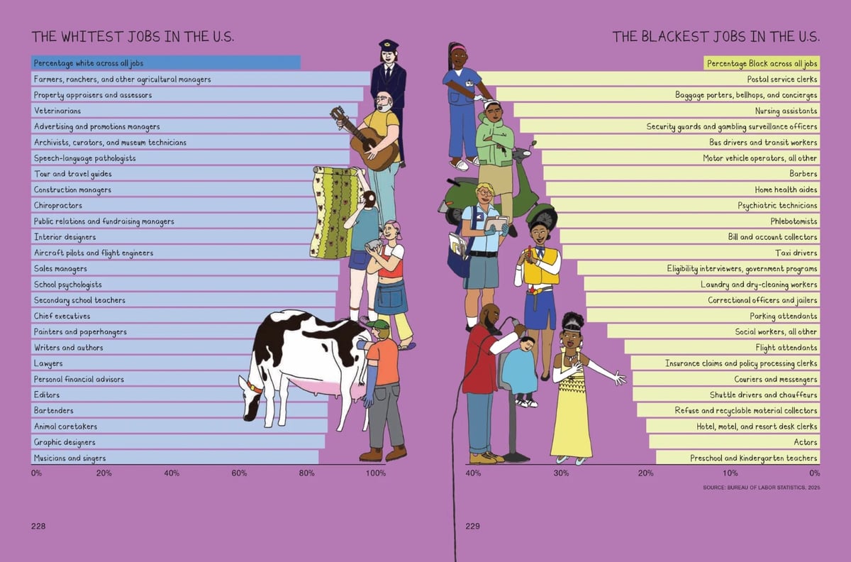
Pulitzer Prize winning journalist and illustrator Mona Chalabi’s new book is about wealth inequality in America. Ten Lives: How What We Have Shapes Who We Are (Amazon) follows ten people with ten different incomes, from the bottom 10% to the top 10% and everything in-between:
For five years, data journalist Mona Chalabi followed them all, documenting how wealth shaped their feelings, their choices, their identities, and their insecurities. She researched the data behind their taxes, groceries, inheritances, and so much more to understand the systems that keep people stuck. But then, she too found herself facing the same fears, when her mother’s sudden illness and subsequent medical bills threatened her own financial safety and made the questions she had been writing about all too real. How much money is enough? To live a “good” life? To protect the people you love in an emergency?
This looks great — Chalabi’s work is always worth a look. Shades of Studs Terkel and What Do People Do All Day crossed with Barbara Ehrenreich. Chalabi did a recent interview with It’s Nice That about the book.
Part of the message of the book is that class doesn’t show up enough in our intersectional identities, and that that’s fundamentally dishonest. I would hope that people read the book and then get much more fluent and comfortable with describing their current wealth and income, as well as the one that they grew up in. I think that’s kind of ambitious, but you never know.
Ten Lives is out today in the US.
For more than a year, marshalled by animator Andy Bailey, more than 1000 artists collaborated to create a hand-drawn, shot-for-shot, animated, flipbook version of Peter Jackson’s The Lord of the Rings: The Fellowship of the Ring. The entire three hours. 120,000 individually drawn pages. A couple of months ago, they released the first 11 minutes:
It’s pretty amazing. It doesn’t include the audio or music from the movie, but I bet you could mute the sound on this and simultaneously play the actual movie for the sound. Here’s an earlier sneak peek at some of the scenes:
This artist wrote about their participation in the project; they contributed 108 drawings that amounted to roughly 10 seconds of animation (and took 30-40 hours to do):
The first clip I claimed was a pretty iconic scene from the beginning of the movie. I chose to render it in pencil as it’s night time and I felt black and white would be more dramatic. As I worked through the frames, I did worry that the subtle variances in shading would make the clip look disjointed, but I think it adds a cool movement to the scene. There is that rough, quirky imperfection to hand drawing. You can see the final result with comparison below (digitized and compiled by Andy).
Here’s a clip of that scene:
I can’t wait to see the finished product — I hope they’re able to release it online.
Over on Flickr, Jane McDevitt maintains a huge collection of 20th century matchbox label art from Eastern Europe, over 4000 photos in all. Some of the labels are available as prints. They did a book too, but it’s sold out. It was really difficult to narrow these down to some of my favorites, but I managed.
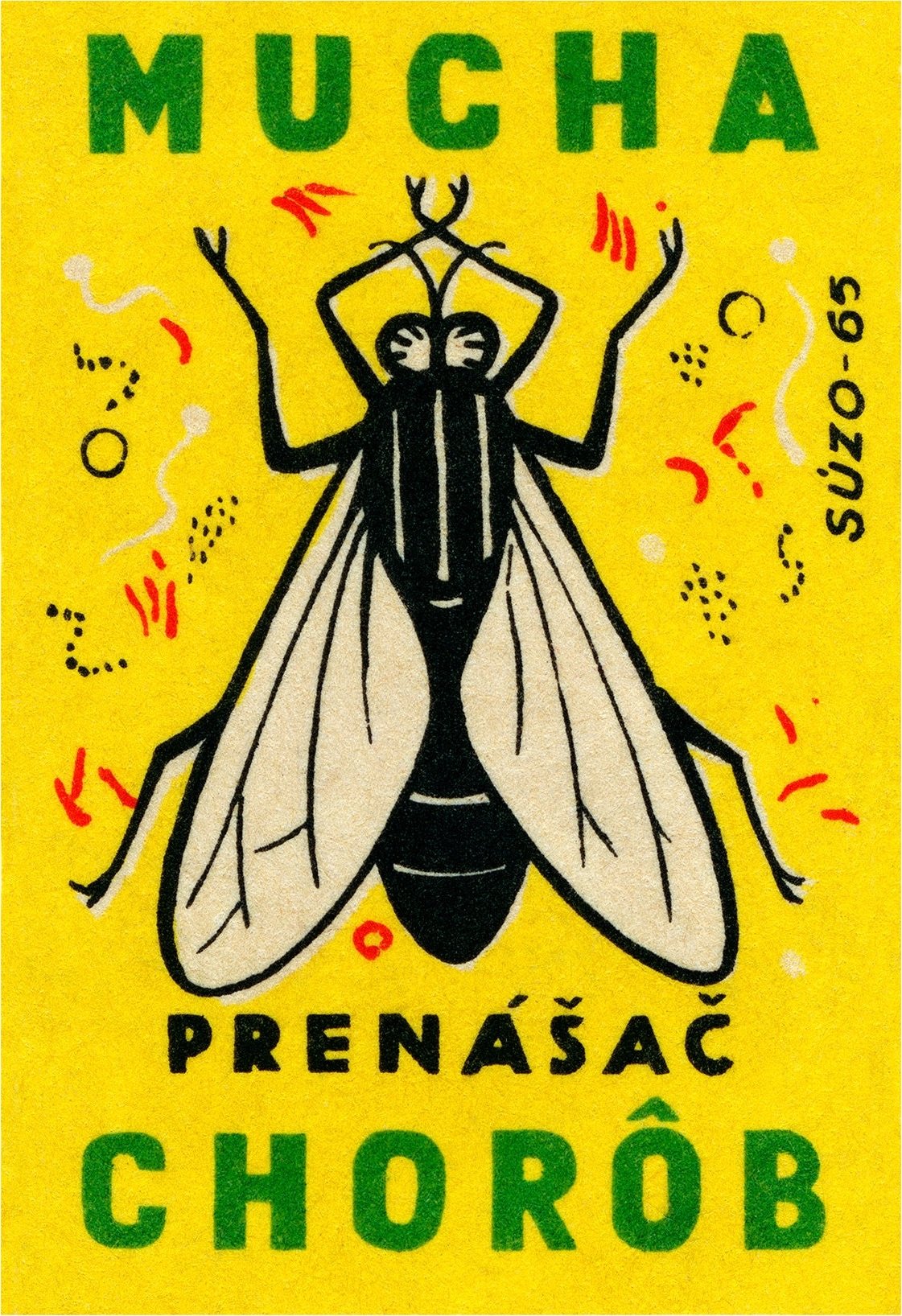
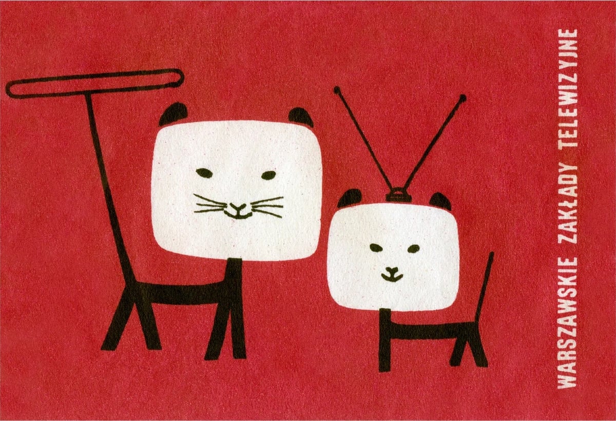
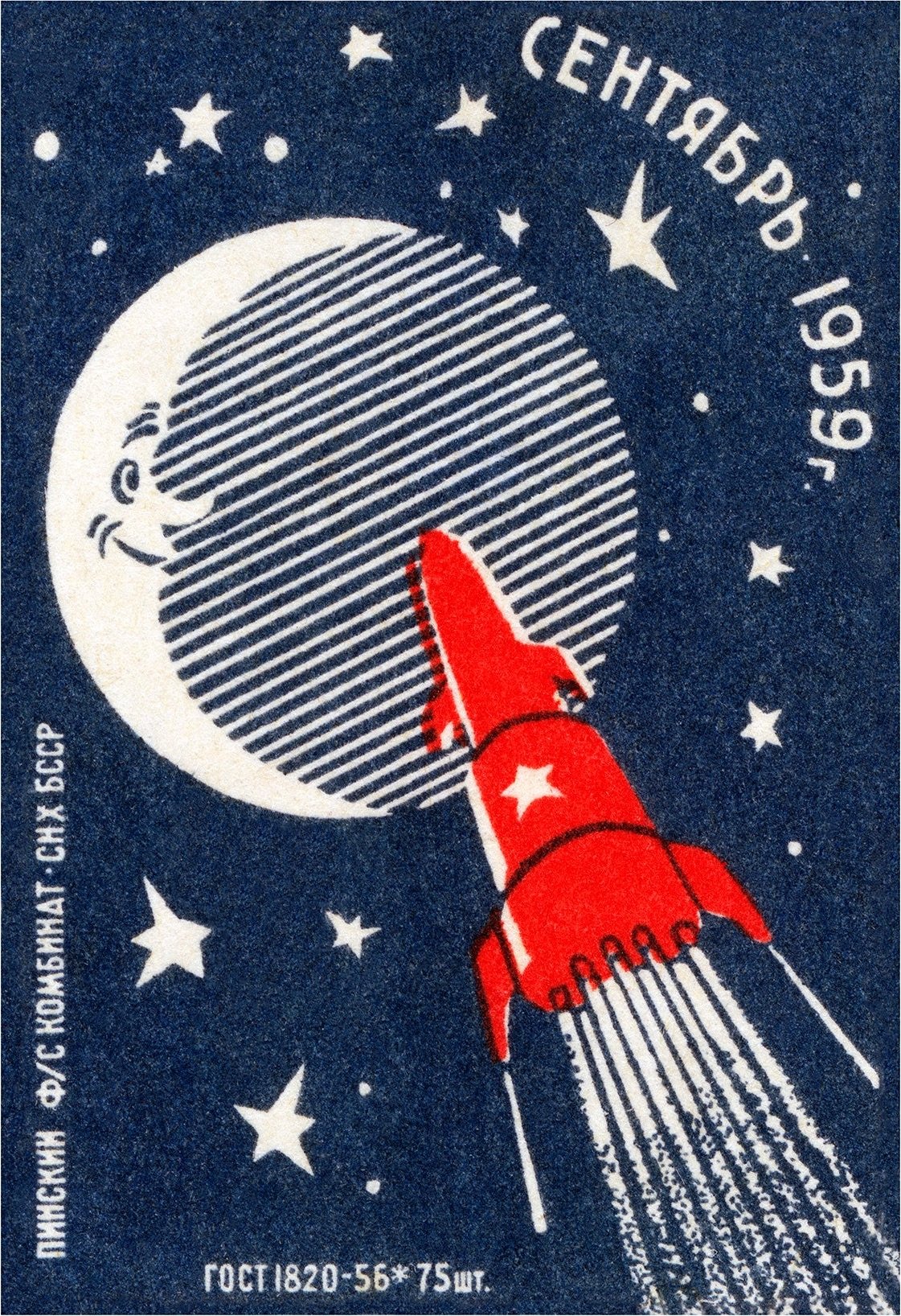
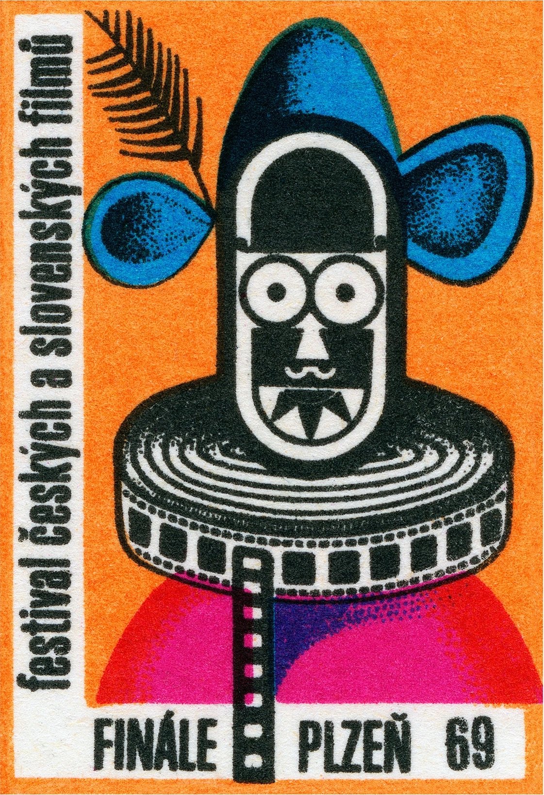
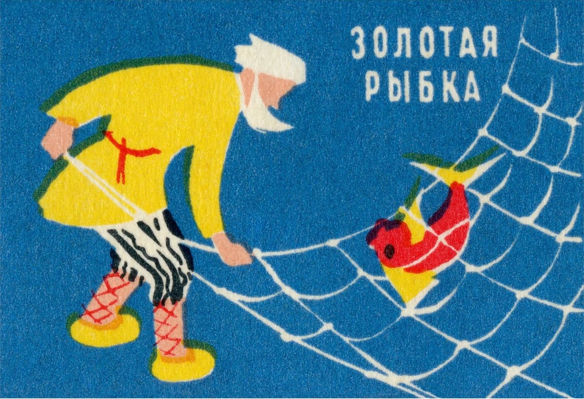
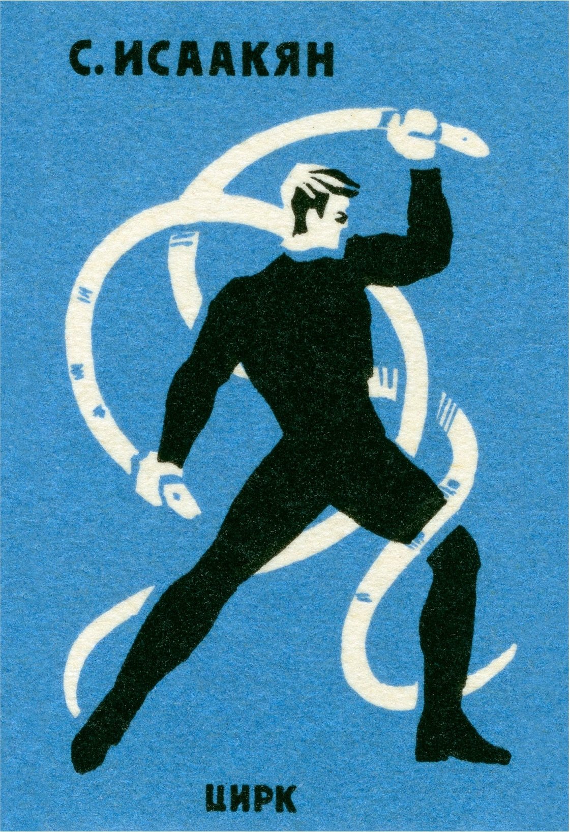
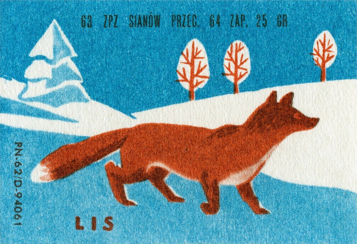
P.S. I wrote this whole post and then discovered that I’d written about this collection before. But I picked different labels so it’s all good.
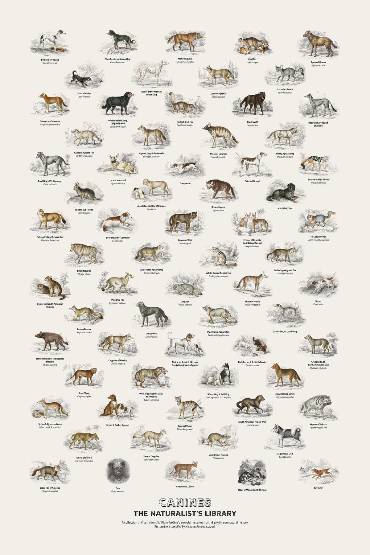
Nicholas Rougeux, whose work I have featured here before, has published a complete digital edition of William Jardine’s 40-volume book series on natural history published in the early-to-mid 19th-century. As part of the project, Rougeux restored each of the more than 1300 illustrations in the library, and the results are fantastic.
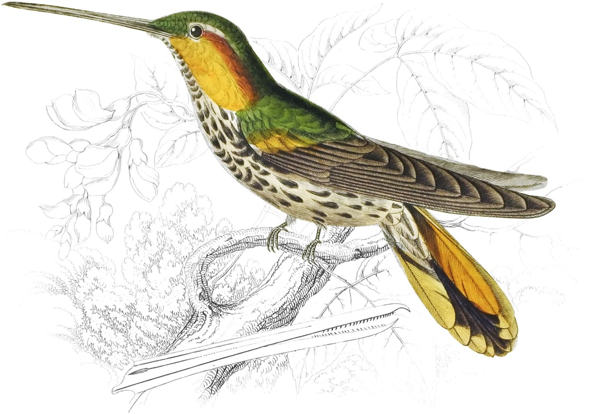
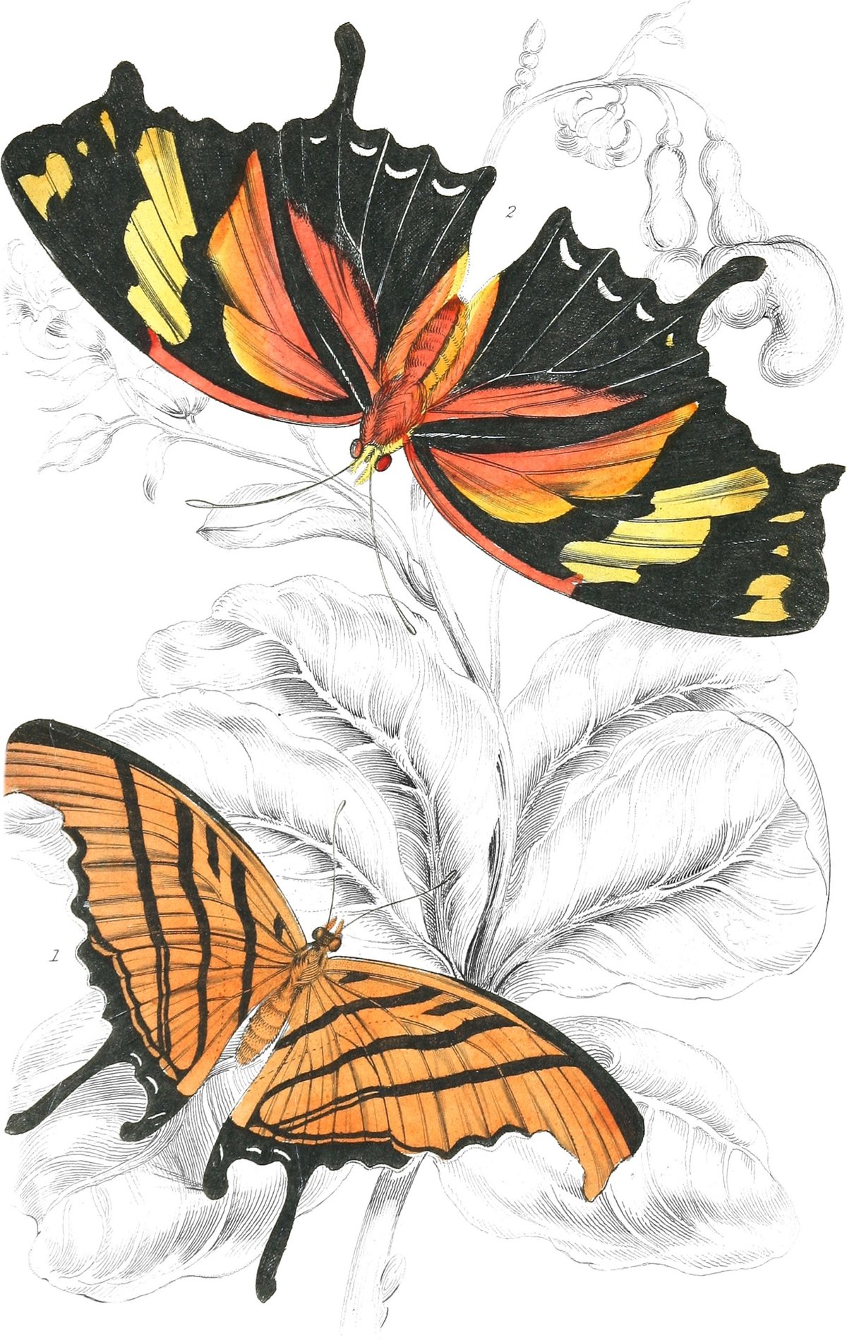
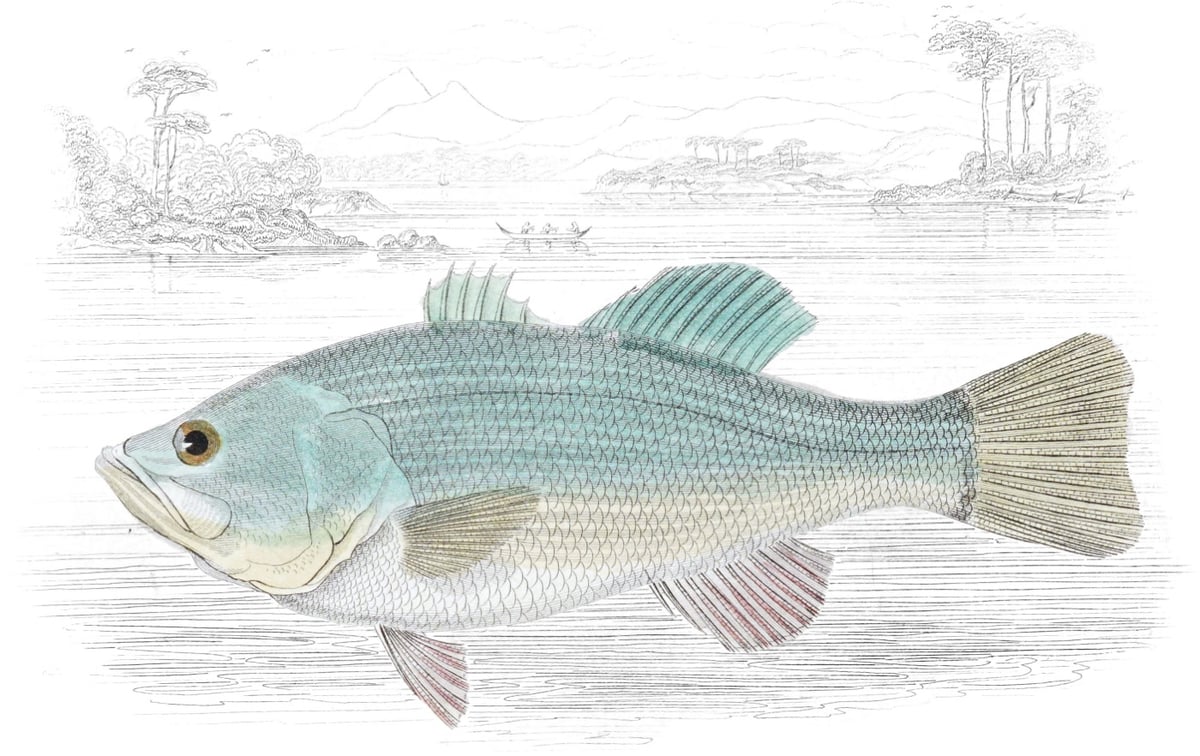
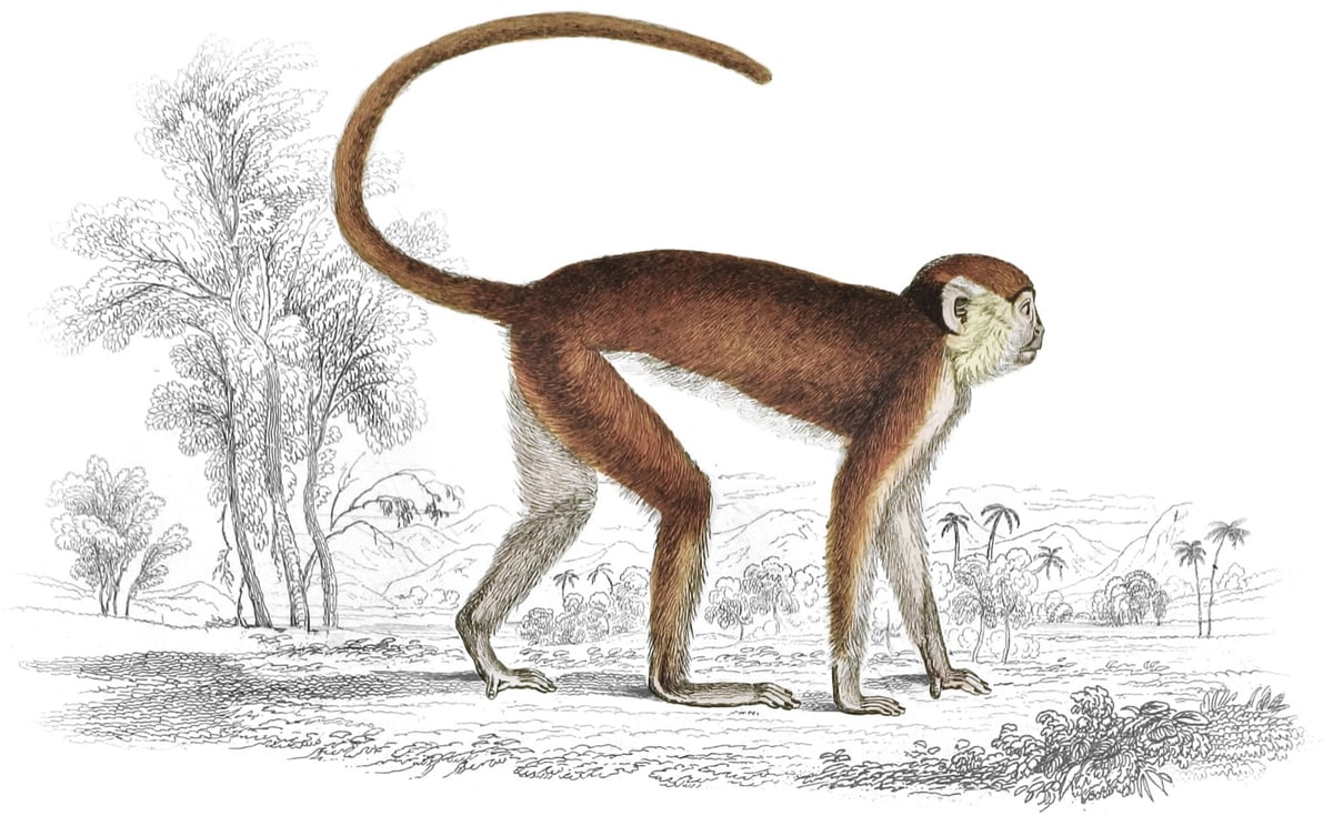
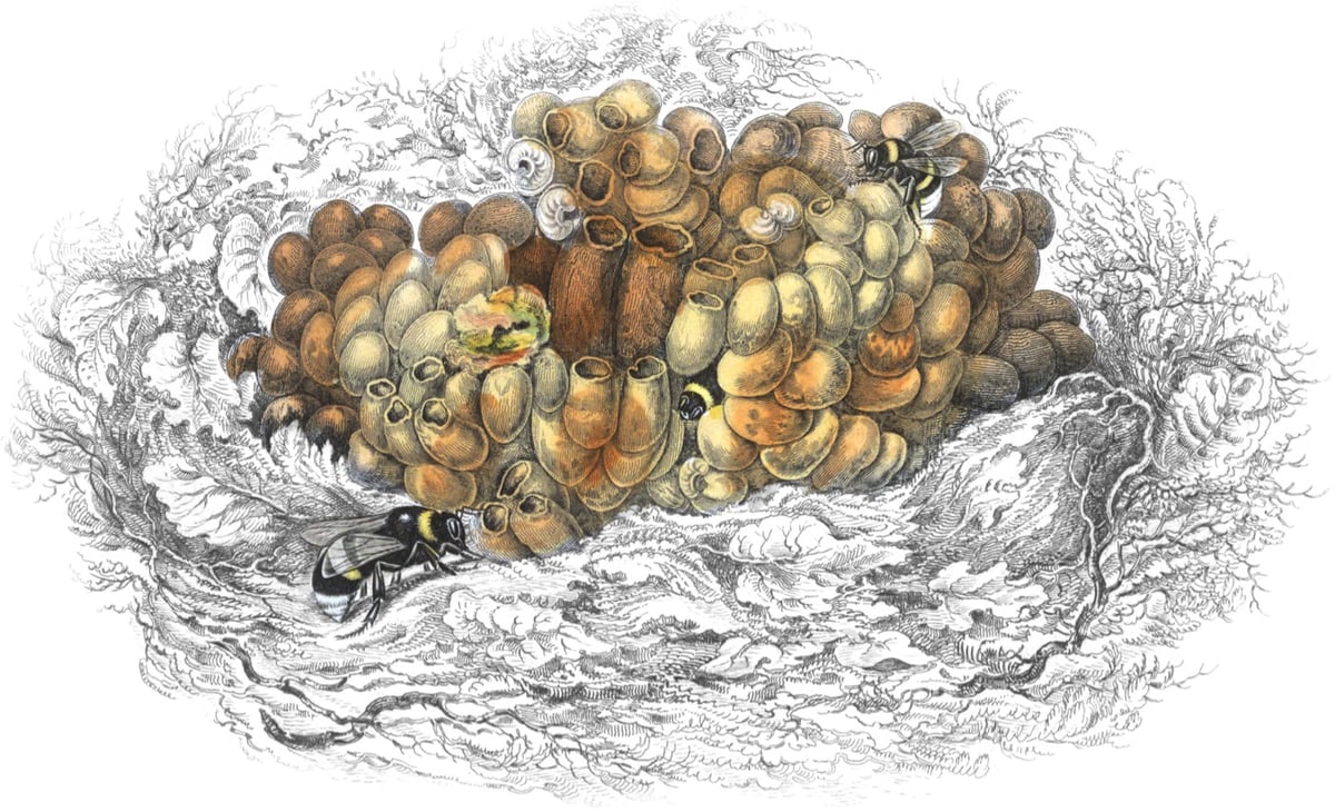
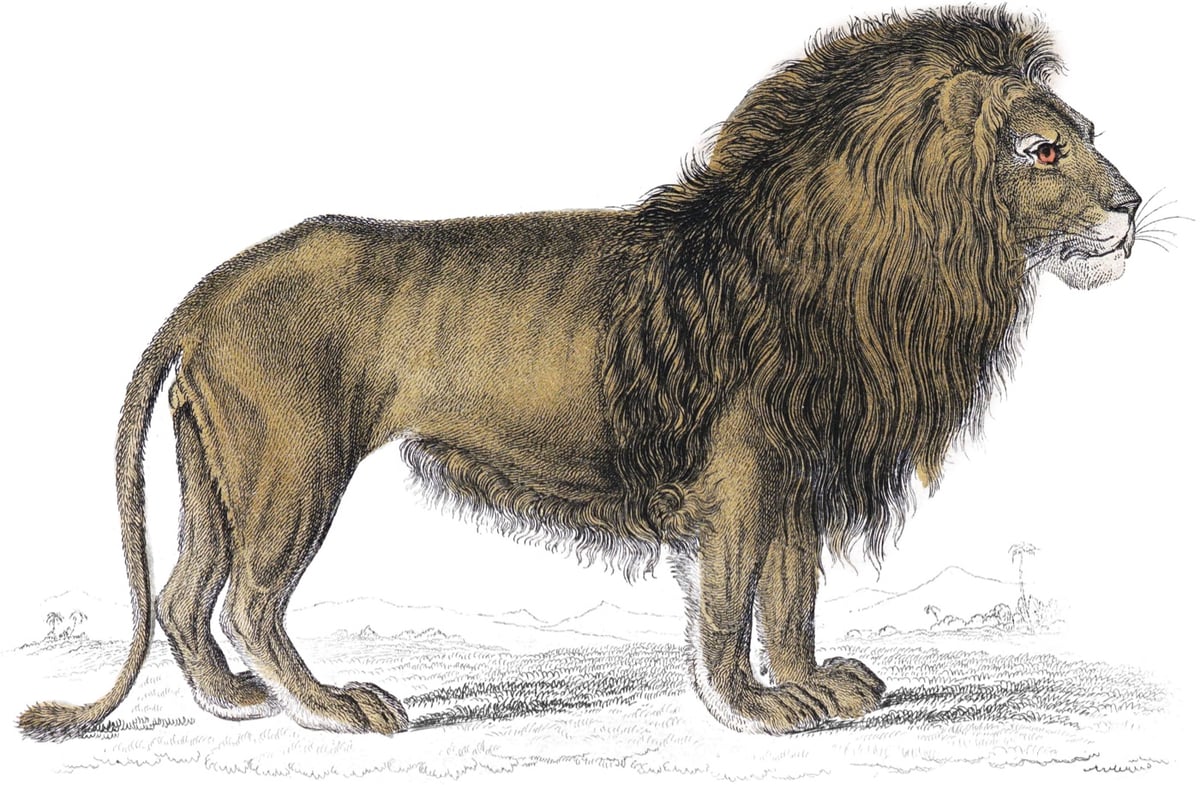
Rougeux wrote a post on the history of The Naturalist’s Library and how the project came about.
The Library is credited with having a significant democratizing effect on the study of natural history because Jardine and Lizars prioritized affordability and portability. Each book was only 4 by 6 inches and priced at six shillings, making them a much more accessible alternative to the “unwieldy folios” from other naturalists. This led to a tremendous demand for each one, resulting in tens of thousands of copies being printed overall. Just two years into publication, a notice appears at the beginning of one volume stating, “we have sold upwards of 60,000 volumes, in which there have been nearly 2,400,000 coloured plates given as Illustration.” Exact sales numbers are difficult to come by but history has shown that the series was very popular with estimates of 10,000 copies sold for each volume, totaling at least 400,000.
In order to help with his research, he borrowed a biography of Jardine from the library and built a custom rig out of K’nex construction toy pieces to scan the whole thing.
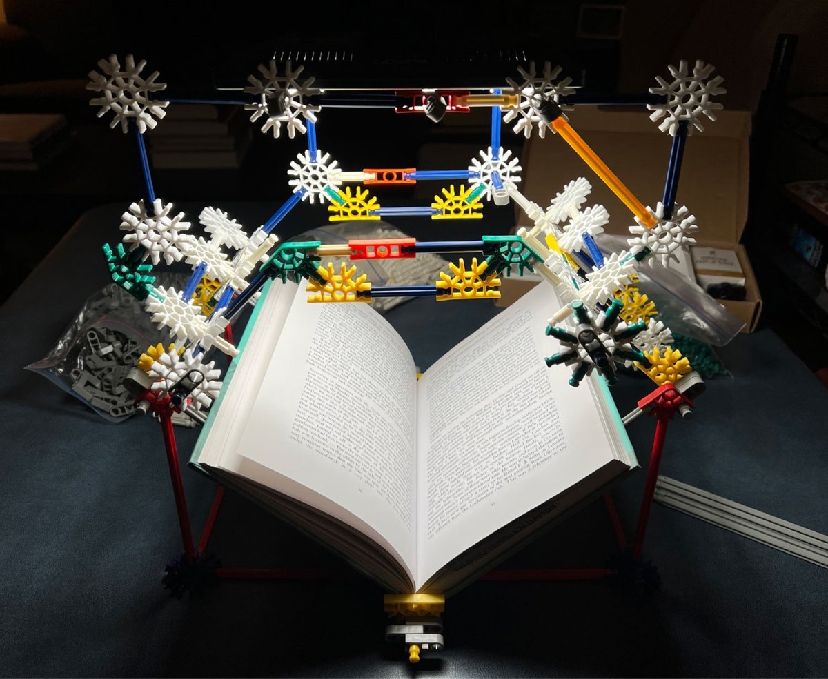
About a month later, I discovered a 2001 biography about Jardine, Sir William Jardine: A Life in Natural History, which only existed as a physical copy. I emailed the publisher to ask for a digital copy but had no luck. So I did what any self-respecting researcher would do and borrowed it on an inter-library loan and made my own digital copy by building a very janky custom rig out of old K’nex parts to take pictures of each page with my phone that I later combined into a searchable PDF. The OCR on it could be improved but having it available digitally allowed me to consult it in my research.
You can check out the shop for posters of the illustrations as well as a complete, bound, 800-page volume of all 1300+ illustrations.
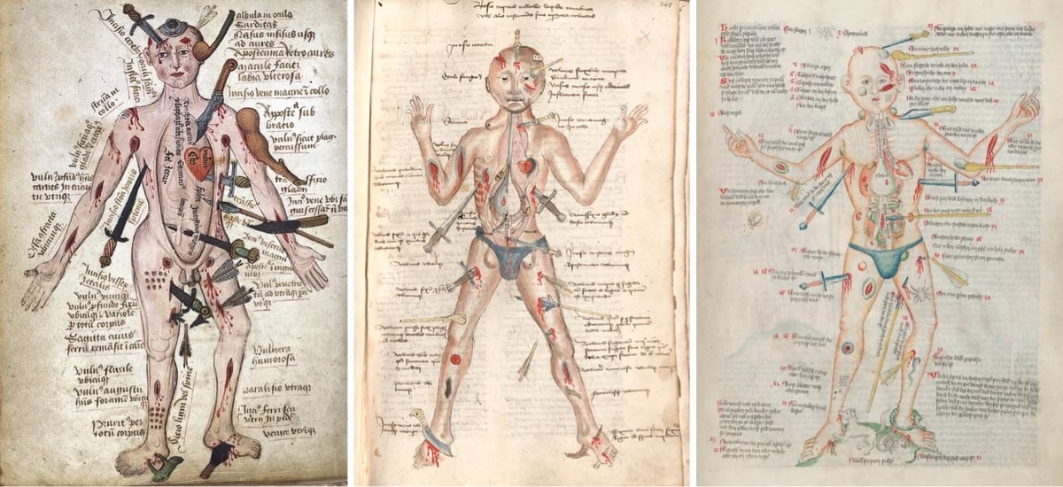
From The Public Domain Review, The Many Lives of the Medieval Wound Man, a diagram found in many medical texts beginning in the early 1400s.
Living on today in libraries from Copenhagen to Munich, the strange figure of the Wound Man gives modern viewers a glimpse of the worrying injuries that the medieval body could receive through war, accident, and epidemic. But at the same time, it shows that medieval people did not think of themselves as helpless victims in the face of these assaults. Far from reinforcing the common perception of the European Middle Ages as a backwards and bloody period of human history, the Wound Man reminds us that it was in fact a period busy with innovative medical treatments, a vital link between the long-standing cures of the classical world and developments that were to follow in early Renaissance medicine.
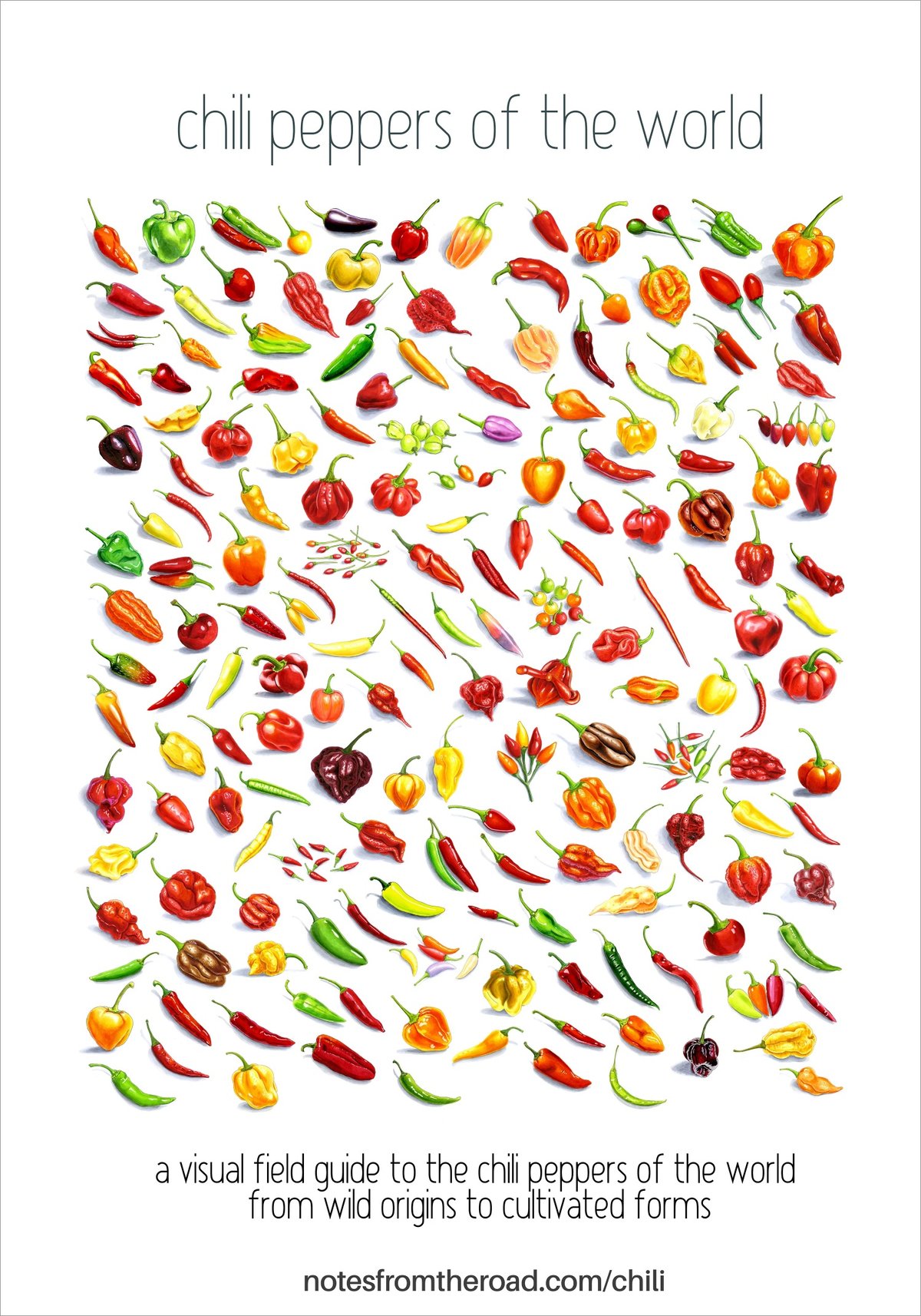
For his great visual field guide to the chili peppers of the world, Erik Gauger hand-drew 176 peppers from India, South America, Korea, Thailand, Africa, and seemingly every other place on the Earth.
Capsaicin, the compound that makes chili peppers hot is an evolutionary filter designed to punish mammals and reward birds. Mammals feel it as pain because mammal digestion destroys seeds. Birds don’t have the receptor that detects it, so they eat the fruit, fly off, and deposit the seeds far from the plant from which they ate. The plant needed birds, and birds didn’t mind the heat, because to them there was no heat to mind.
What we’ve built from that, from the paprika, the Thai bird’s eye, the ancho, the chocolate habanero, began as a dispersal mechanism. Humans entered the picture late and changed almost everything about the pepper’s form, flavor, and range. But the underlying logic is still there in every fruit: a molecule that says no to the animals who won’t deliver their seeds far from the tree.
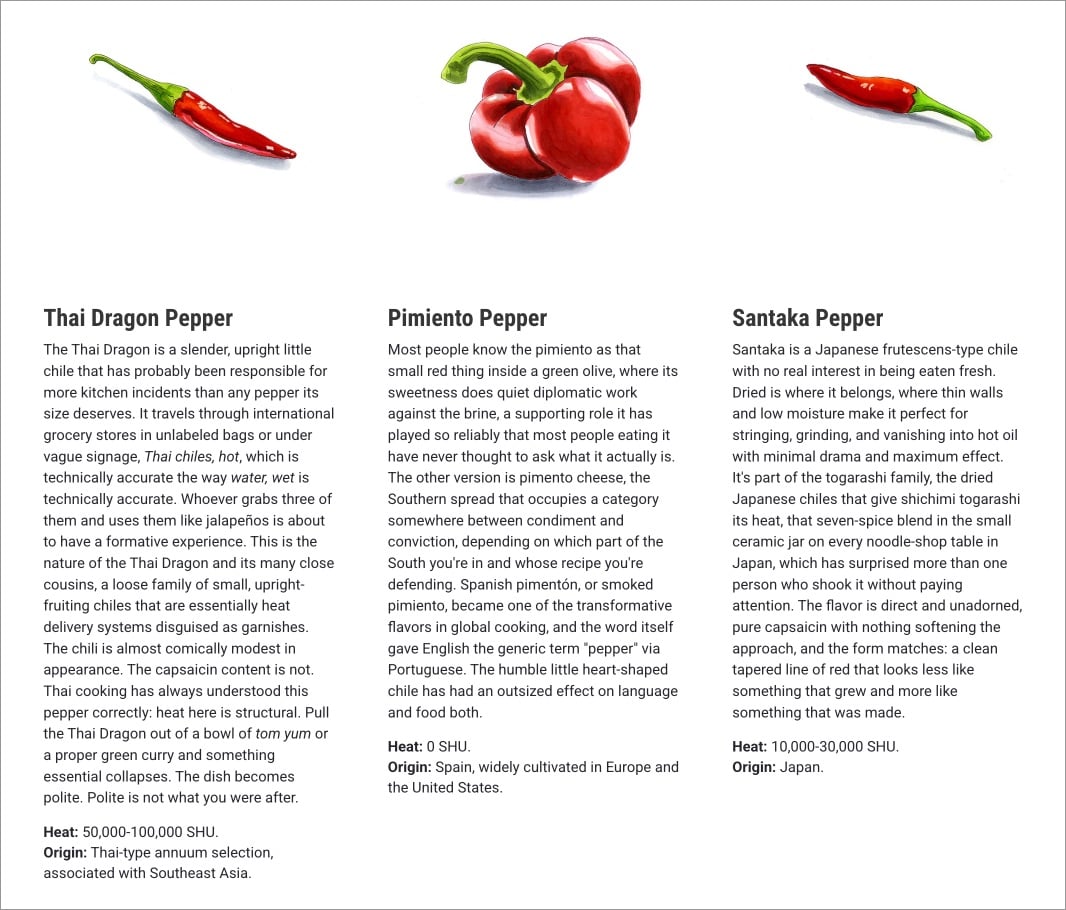
Each drawing is accompanied by a description of the pepper, where it originated, the heat level, and even what hot sauces feature it.
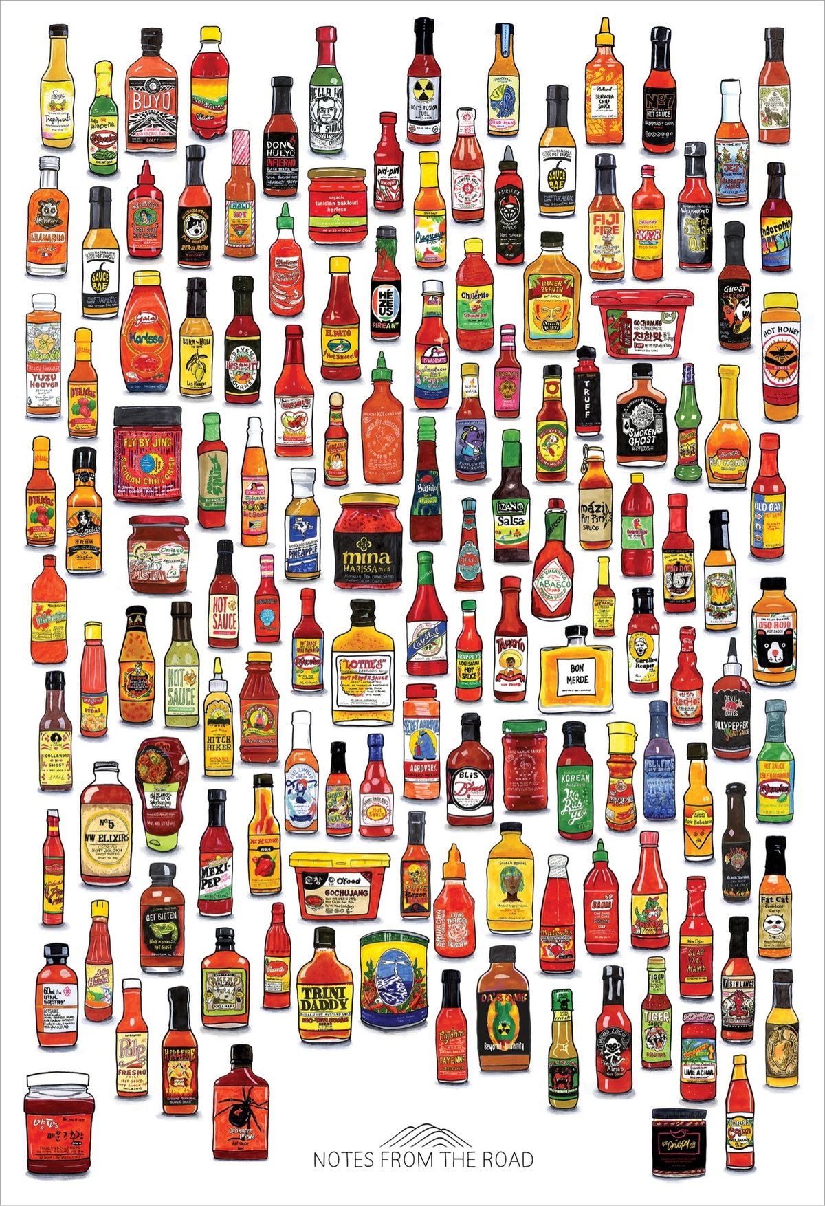
See also Gauger’s Hot Sauces of the World page & poster.
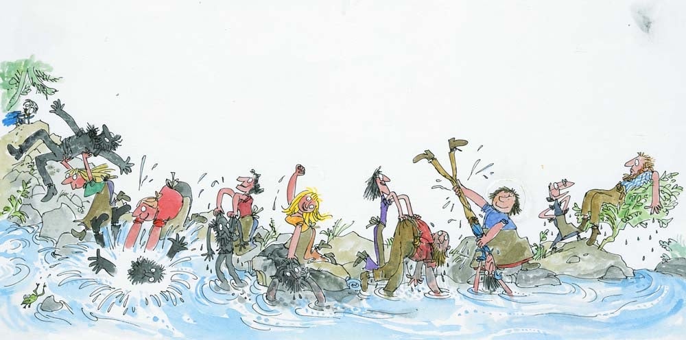
Illustrator Quentin Blake, who is most widely known for his energetic drawings for Roald Dahl’s books, generously shares his drawing process on his website and also in a series of videos.
I do a freewheeling sort of drawing that looks as though it is done on the spur of the moment. However even a single drawing needs a certain amount of preparation and planning. Most of the time I need to do a rough in which I find out how people stand, what sort of expressions they have and how they fit on the page.
Here are some of the videos he’s done. Quentin Blake draws a Hornswoggler:
Ten Minutes of Illustration (in three parts for some reason):
We Live in Worrying Times:
The illustration above is from The Wild Washerwomen.


These are some of my favorite portrait illustrations from Sofia Bonati.
In her art you’ll find female portraits that invite you into a dreamlike world where the woman and her surroundings intertwine, connect. They are women with deep, mysterious looks, who want to tell us something.
I especially like the more geometric ones that radiate. Prints and original works are available in her shop. (via colossal)


The Public Domain Review has published some lovely illustrations of goldfish from a 1780 monograph called Histoire naturelle des dorades de la Chine.
Histoire naturelle des dorades de la Chine (1780) — the dorades in the title refers not to sea bream but the fish’s gilded appearance — was the first monograph on goldfish published in Europe, from a time when the fish were still bound up with Eastern exoticism in the Western imagination.
You can peruse the entire document at the Internet Archive.


There’s something a little bit mesmerizing about Aled Thompson’s illustrations of birds. They are at once highly detailed and also slightly vectorish — and it shifts back and forth while I’m looking at them, like one of those young woman/old woman optical illusions.
You can find more of Thompson’s work on Instagram and Bluesky and can purchase prints here. (via @mims.bsky.social)


I love the colorful illustrative style of these adverts for the Queen City Printing Ink Company done by Augustus Jansson in the first decade of the 20th century.


Silenced Science Stories is a collaboration between scientists and artists to tell the stories of scientific experts who have been affected by the Trump regime’s purge of their ranks.
We are organizing an illustrated series of portraits and stories of scientific experts whose work is being affected by federal budget cuts and mass firings.
We have over 30 science artists who are volunteering to create these features to communicate the careers and the important scientific research of federally employed and funded scientists.
If you’d like to get involved, they are looking for both artists and scientists with stories to tell. You can read more about the project in Physics Today. (via jonathan hoefler)


From a 1968 book, a collection of illustrations of regional patterns & designs of the art of Ukrainian pysanky, or egg decorating. From the Center for Russian, East European, & Eurasian Studies at the University of Kansas:
Pysanky are raw eggs that are decorated using an ancient wax-resistance method. The word pysanky comes from the Ukrainian word pysaty (писати), “to write.” Pysanka is the singular and pysanky is the plural. The art of making pysanky is called pysankarstvo (писанкарство).
The designs are “written” in hot wax with a special tool called a kistka (кістка) which has a small funnel attached to hold a small amount of liquid wax. The wax protects the pores of the shell from the dye. The artist, known as a pysankarka (писанкарка) writes parts of the design, dyes the egg one color, and writes more until the end, when all the layers of wax are melted off to reveal the final design.
Pysanky are an ancient art, made in Ukraine and other Slavic countries for centuries. Though many people call them Easter eggs, pysanky were made long before Ukraine adopted Christianity. The ancient symbols were then reinterpreted through the lens of Christianity later on.
From more on the regional patterns of Ukrainian pysanky and some images of actual decorated eggs, check out this page. And for a look at how these intricate patterns are made, here’s a video:
(via present & correct)
80 years ago today, the Nazi death camp at Auschwitz-Birkenau was liberated. An estimated 1.1 million people (Jews, Poles, Russian POWs, Roma) were murdered at Auschwitz-Birkenau between 1940 and 1945, and this date was subsequently chosen by the United Nations as International Holocaust Remembrance Day.
One of the things you can do to mark the day is to join Yad Vashem’s IRemember Wall:
The IRemember Wall is a unique and meaningful opportunity for you to participate in an online commemorative activity marking International Holocaust Remembrance Day.
By joining our IRemember Wall, your name will be randomly matched to the name of a Holocaust victim from our Central Database of Shoah Victims’ Names, and will appear together on the Wall.
You can also choose a specific name to remember and match with on the Wall from our Central Database of Shoah Victims’ Names, which contains over 4.8 million names of Holocaust victims.
As he does every year, illustrator Christoph Niemann drew the person he matched with and shared the story of her life.
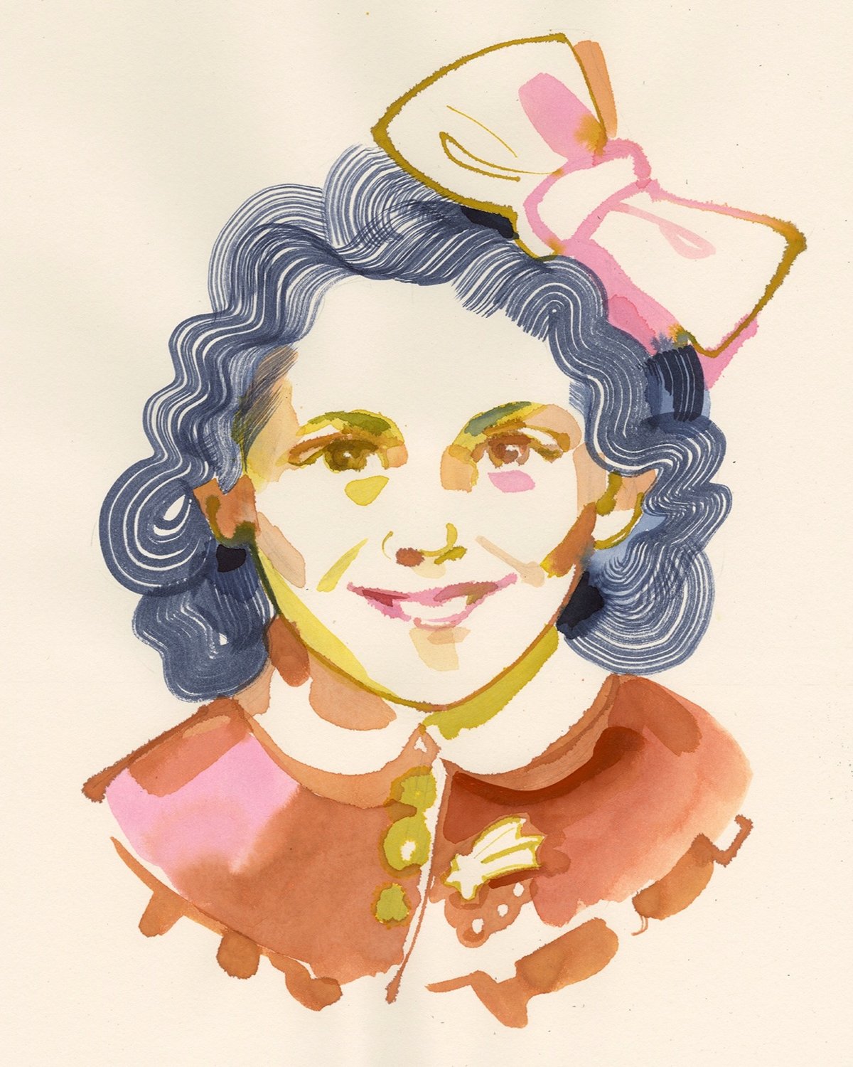
This year I was paired with Astro Cofino. We have very little biographical information: she was born in 1930 in Athens, her parents were called Benoua and Mairy. The first thing that caught my eye when I saw Astro’s photo was a little brooch she’s wearing: it looks like a comet, and I can’t help but thinking that it was meant as a reference to her name? Astro is maybe 11 or 12 in the picture, she smiles, with a tiny hint of giddiness in her eyes.
Here’s Astro’s information from Yad Vashem’s database — she was murdered by the Nazis at Auschwitz when she was 14.
Older posts




Socials & More