kottke.org posts about illustration
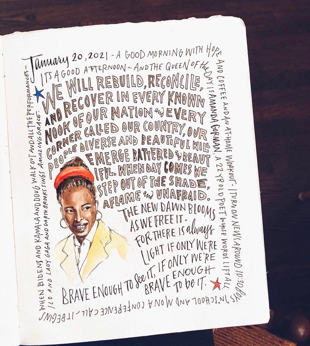
The rhetorical highlight of the Biden/Harris inauguration was Amanda Gorman reciting her poem, The Hill We Climb — I thought it was fantastic. It begins:
When day comes we ask ourselves,
where can we find light in this never-ending shade?
The loss we carry,
a sea we must wade
We’ve braved the belly of the beast
We’ve learned that quiet isn’t always peace
And the norms and notions
of what just is
Isn’t always just-ice
And yet the dawn is ours
before we knew it
Somehow we do it
Somehow we’ve weathered and witnessed
a nation that isn’t broken
but simply unfinished
We the successors of a country and a time
Where a skinny Black girl
descended from slaves and raised by a single mother
can dream of becoming president
only to find herself reciting for one
Here’s a transcript courtesy of CNN. You can read about how Gorman composed the poem in the NY Times:
“I had this huge thing, probably one of the most important things I’ll ever do in my career,” she said in an interview. “It was like, if I try to climb this mountain all at once, I’m just going to pass out.”
Gorman managed to write a few lines a day and was about halfway through the poem on Jan. 6, when pro-Trump rioters stormed into the halls of Congress, some bearing weapons and Confederate flags. She stayed awake late into the night and finished the poem, adding verses about the apocalyptic scene that unfolded at the Capitol that day.
The Times also has a lesson for students about Gorman and her poem. And from NPR:
Gorman is no stranger to having to change her work midstream. Like Biden, who has spoken openly about having stuttered as a child, Gorman grew up with a childhood speech impediment of her own. She had difficulty saying certain letters of the alphabet — the letter R was especially tough — which caused her to have to constantly “self-edit and self-police.”
Her delivery was amazing — powerful and lyrical. Brava!
Update: I included a link to a transcript of the poem above. I also wanted to include this illustration by Samantha Dion Baker because art inspires art.
Update: A book version of Gorman’s inaugural poem will be out in April and is available for preorder.
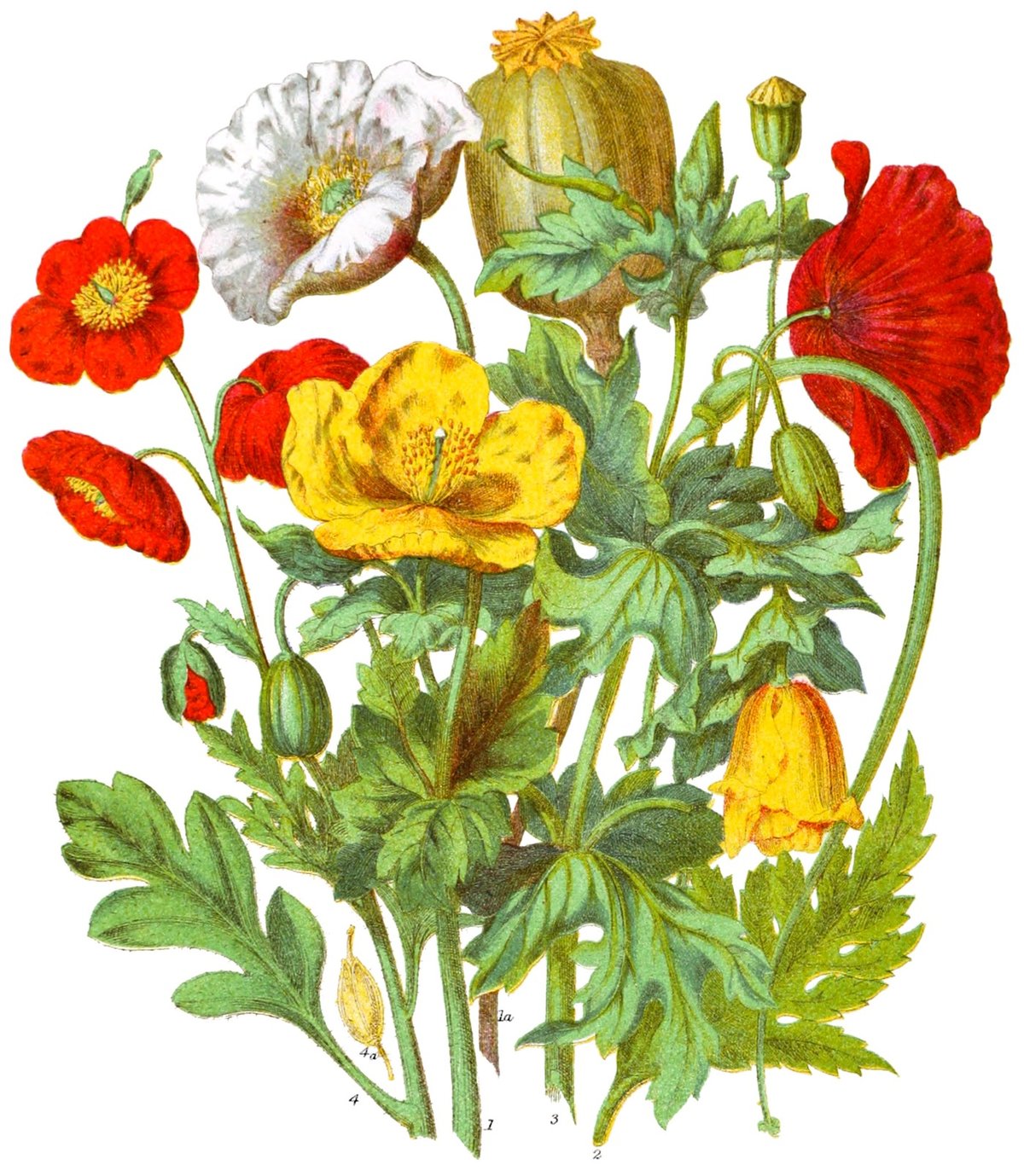
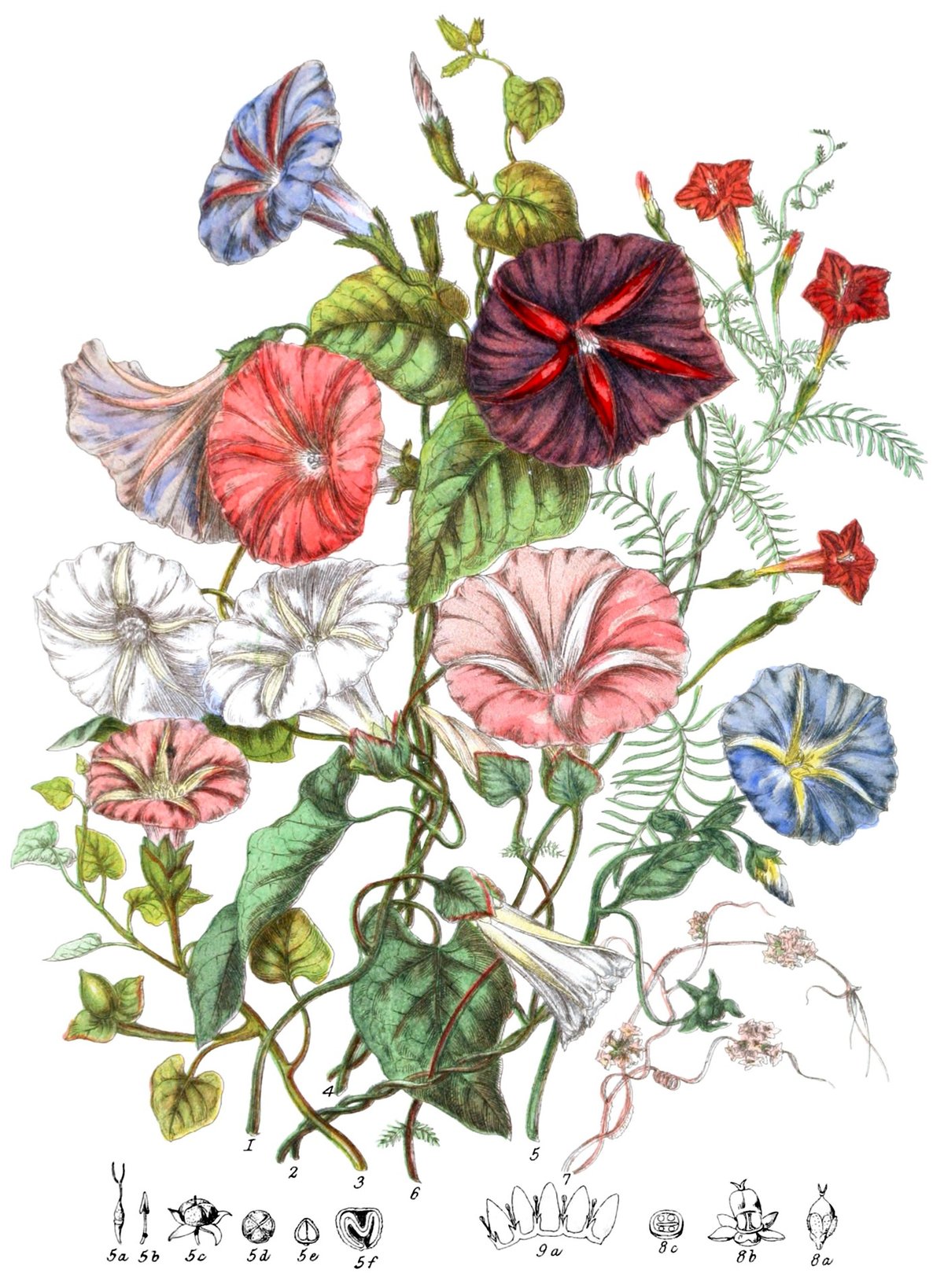
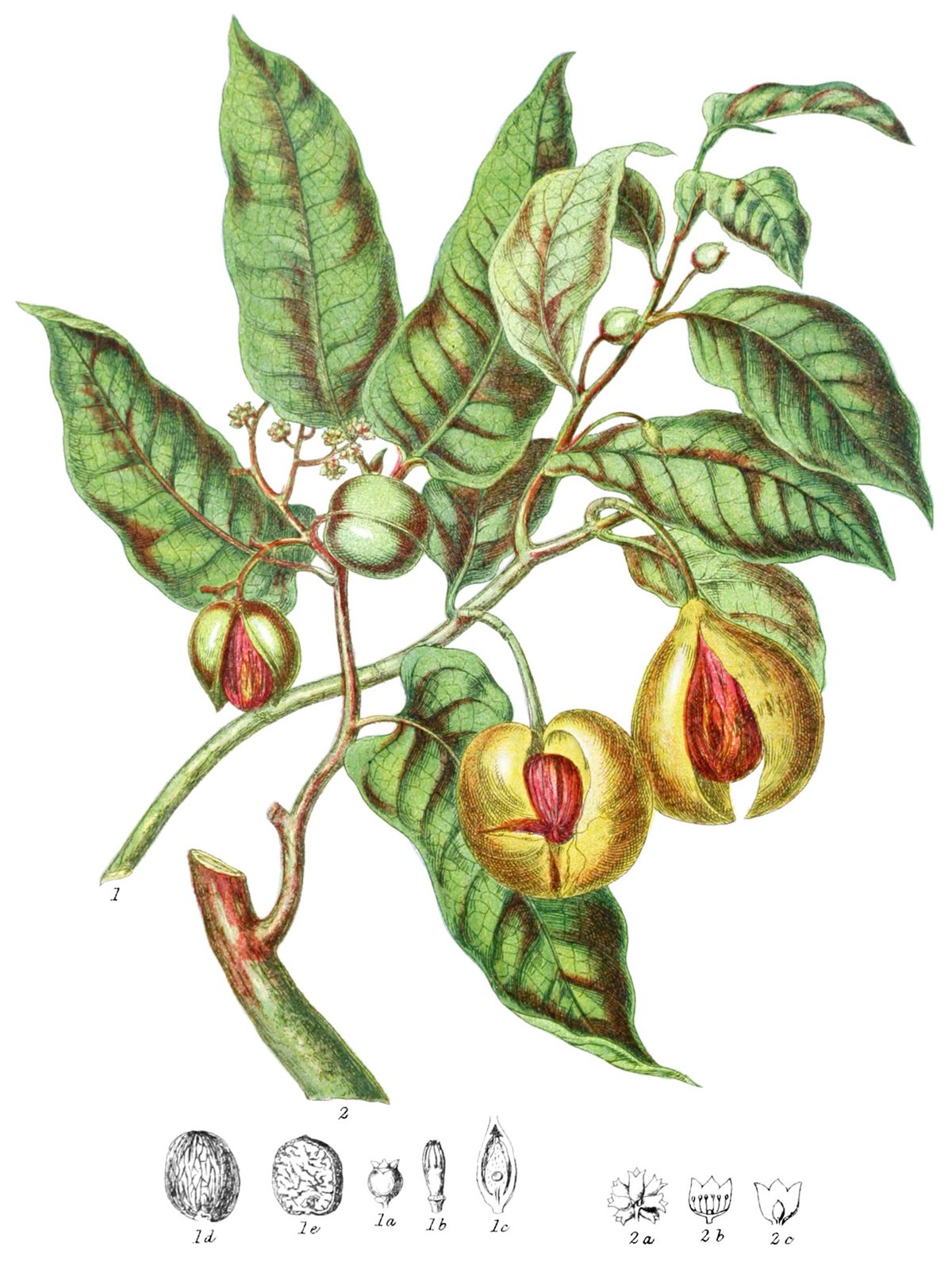
Nicholas Rougeux has beautifully reproduced & remastered botanical illustrator Elizabeth Twining’s catalog of plants and flowers from 1868, Illustrations of the Natural Orders of Plants. Each of the 160 illustrations is accompanied by explanatory text from the original book and an interactive version of the image (click on the highlighted plant for more info).
Posters based on the illustrations are available and, get this, so are puzzles!
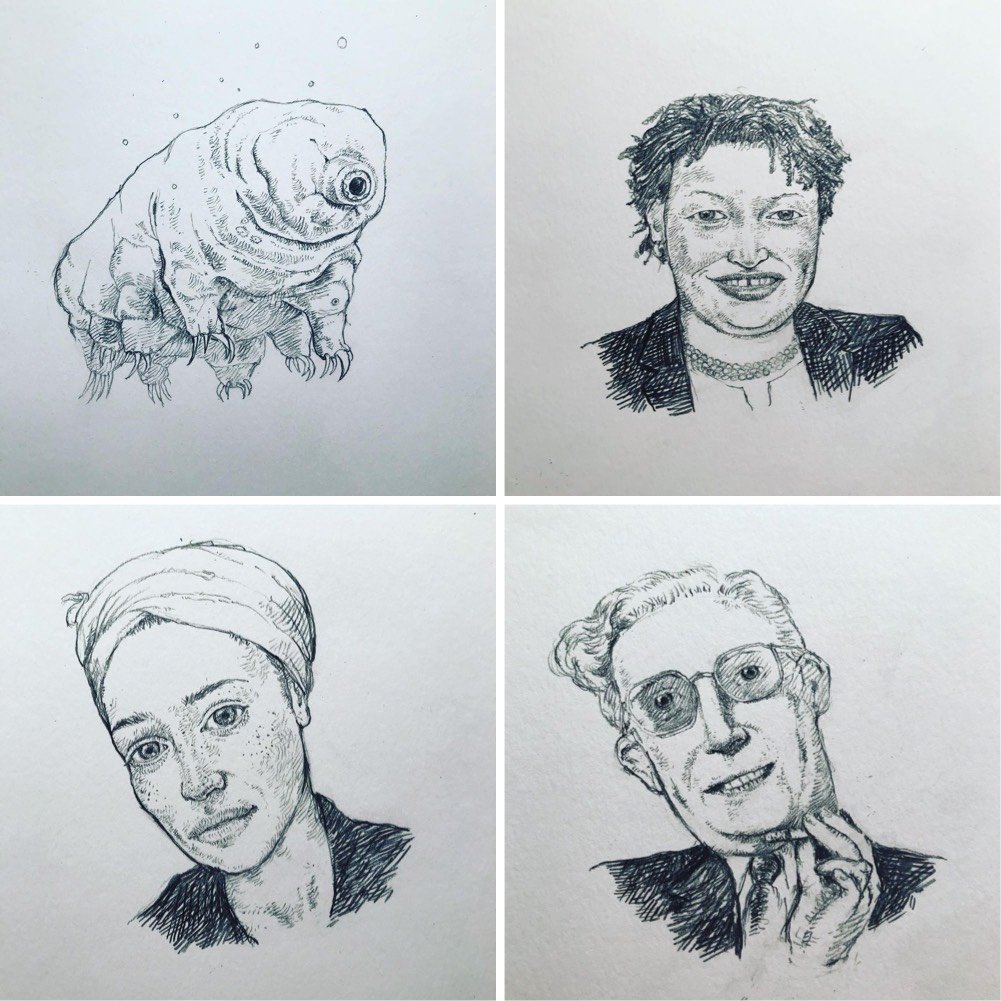
Author and illustrator Edward Carey has been making a drawing a day since the beginning of the pandemic. He recently completed his 250th drawing, with “no end in sight, alas”. He’s posting each day’s drawing to Instagram; here are a few of my recent favorites:
And the whole lot laid out on the floor:
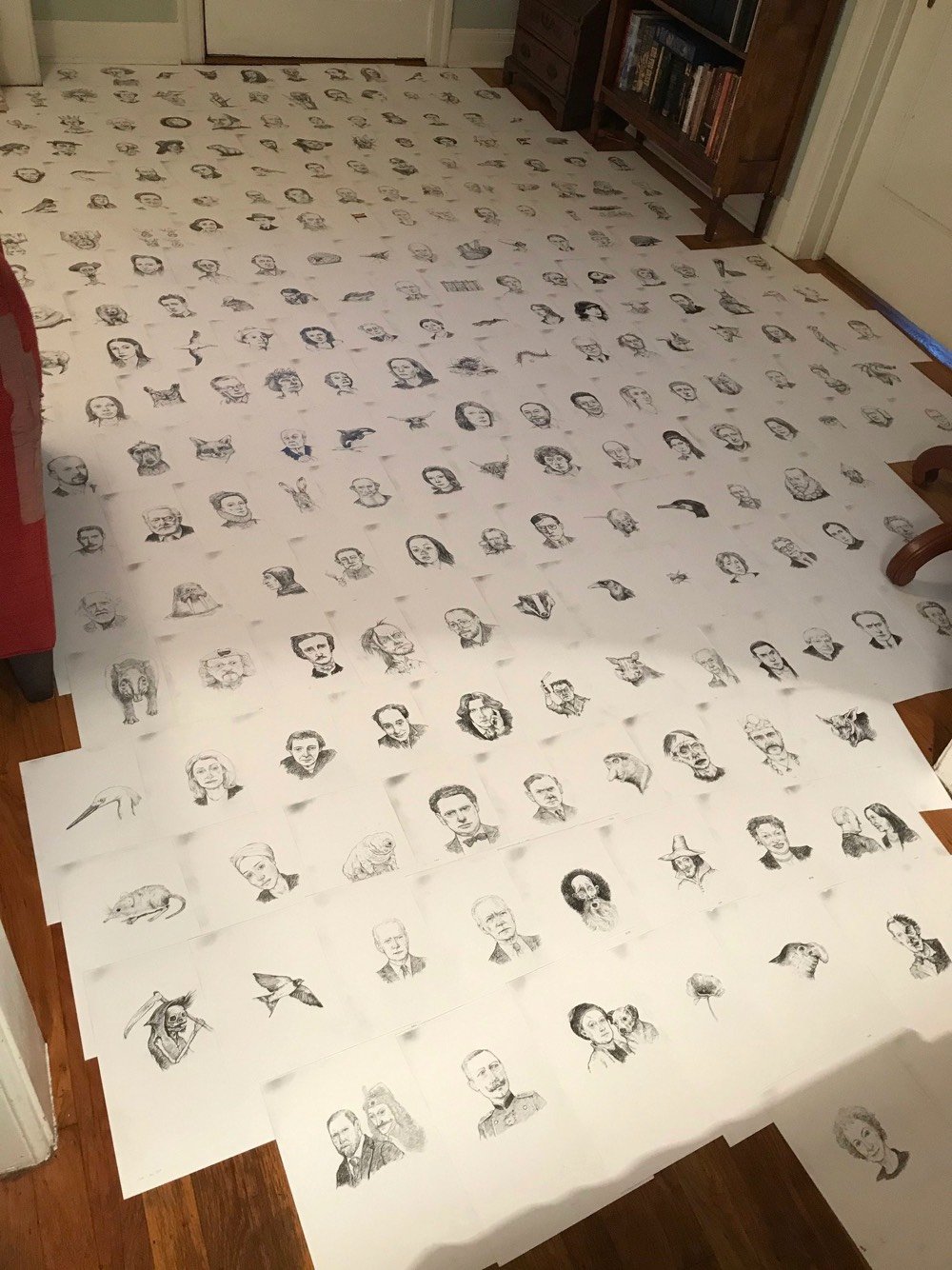
That’s so many days. (via austin kleon)
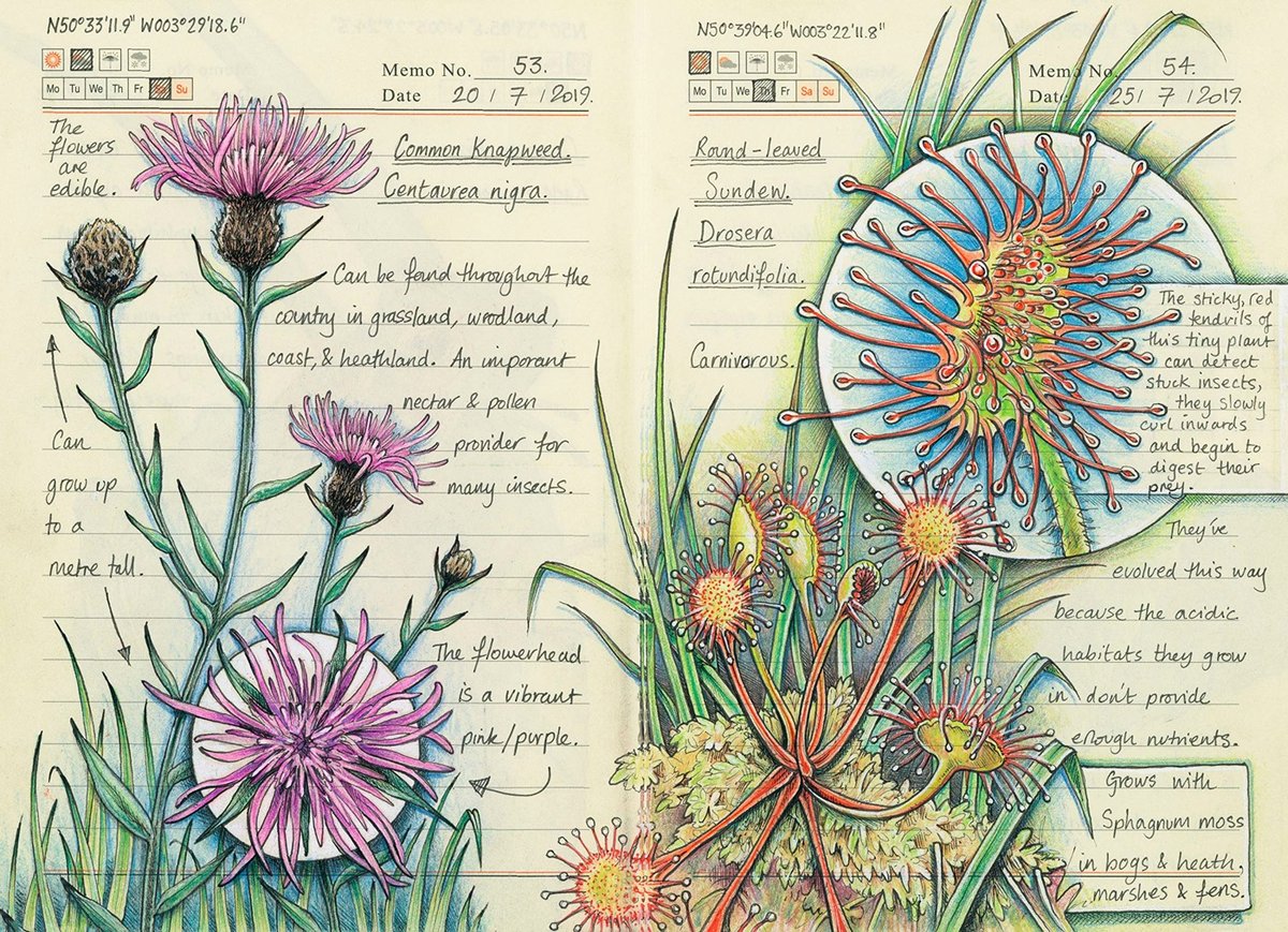
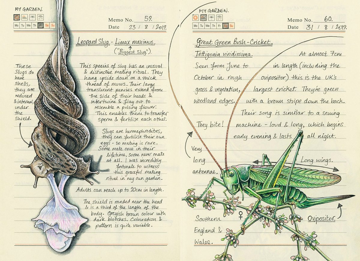
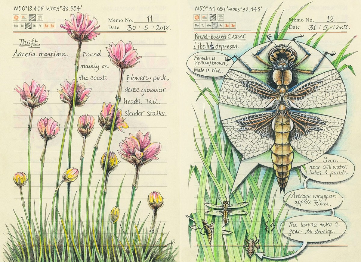
Just enjoying Jo Brown’s illustrations today. Using a Moleskine notebook, she sketches plants and wildlife near her home in Devon, England. A replica of that nature journal called Secrets of a Devon Wood has been recently published in the UK (US edition is out soon — Amazon is the only place I could find it). You can check out more of her artwork on Instagram. (via colossal)

Study of the Creative Specimens is a collection of fantastical hybrid creatures created for Adobe’s 99U conference by Mark Brooks and illustration studio alademosca. Prints are available from Paper Chase Press. (via colossal)
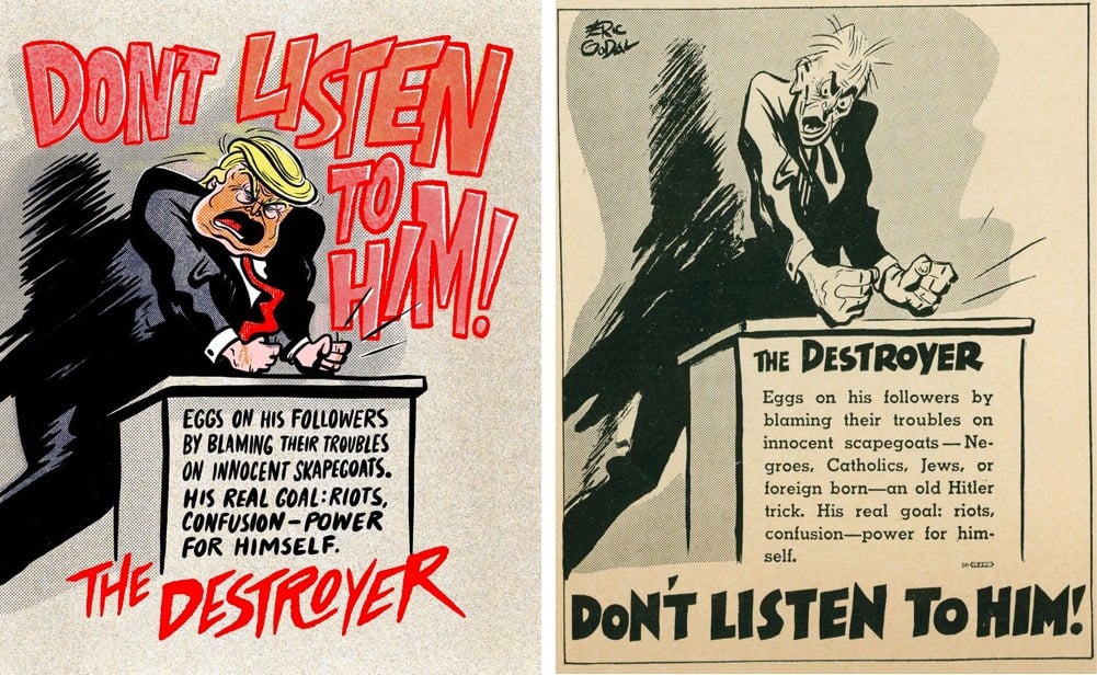
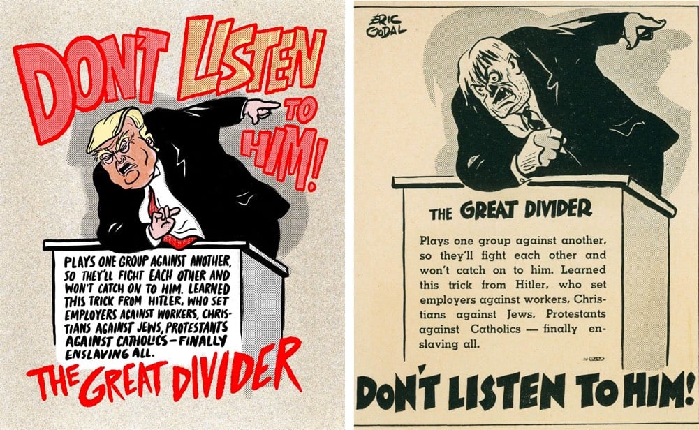
In the 1930s and 40s, artist Eric Godal drew some anti-fascist political cartoons that urged people not to listen to right-wing authoritarians who want to destroy and pillage society for their own ends. Godal, a German Jew, had escaped the clutches of Nazi Germany in the 30s and labored to warn America and the world about the fate of the Jews in Europe.1
Illustrator Chris Piascik has updated Godal’s drawings for 2020 to feature our own corrupt crackpot wannabe dictator. Calling Donald Trump a fascist is hardly controversial these days — he clearly is. What his supporters need to reckon with is: are they?
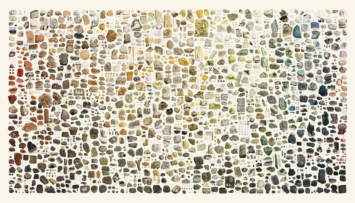
I love this zoomable interactive display of British & Exotic Mineralogy. To create it, Nicholas Rougeux collected 718 hand-drawn mineral illustrations by James Sowerby sourced from a pair of multi-volume books called British Mineralogy and Exotic Mineralogy, published between 1802 and 1817. Then he arranged them according to hue and brightness in a collage worthy of Knoll.
British Mineralogy and Exotic Mineralogy comprise 718 illustrations by James Sowerby in an effort to illustrate the topographical mineralogy of Great Britain and minerals not then known to it. Sowerby’s plates are some of the finest examples of hand-drawn mineral illustrations ever created. The detail and care with which these illustrations were created is incredible and worthy of close examination. See the samples below.
And, oh boy, he’s selling posters of it too.
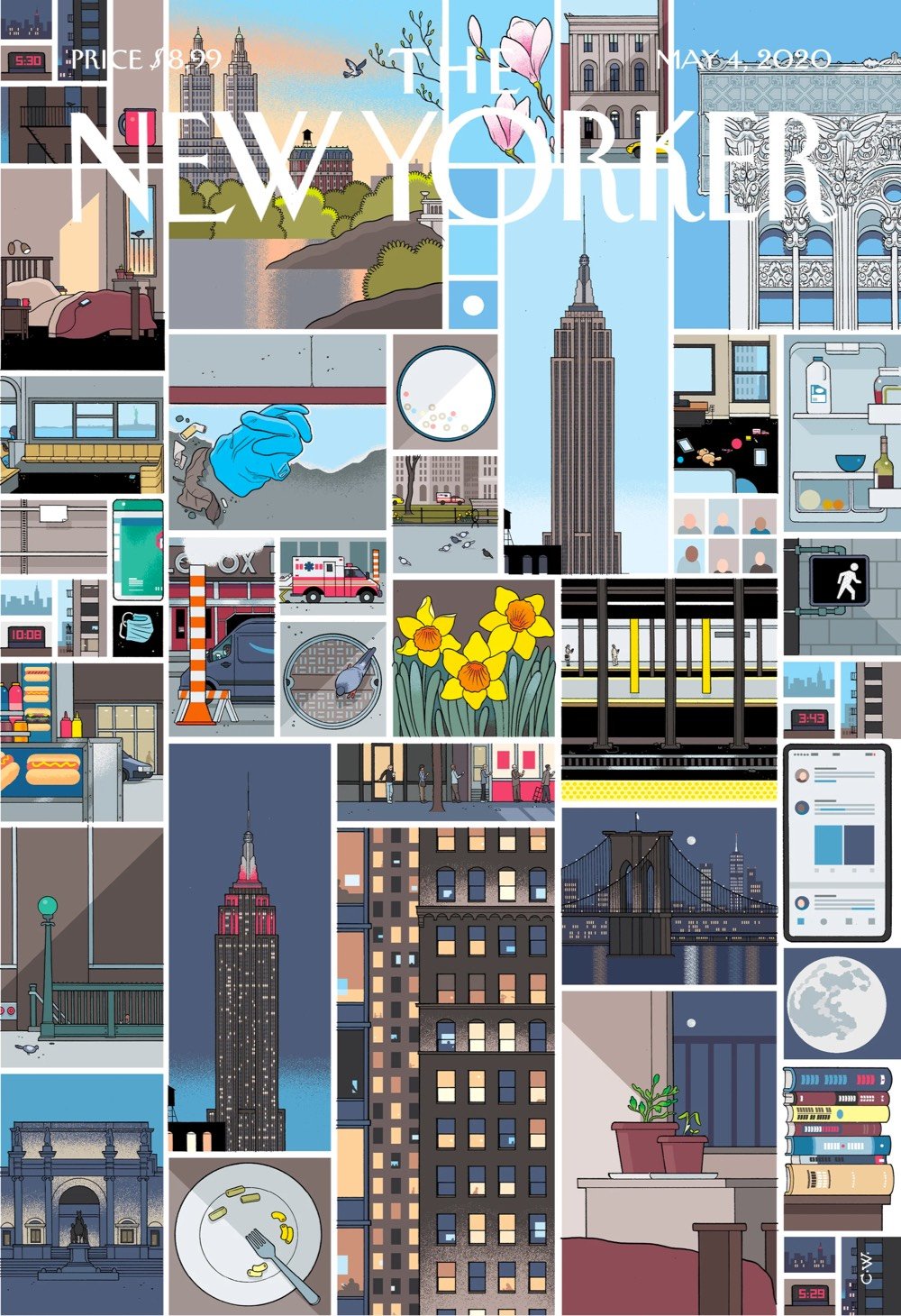
For the cover of this week’s New Yorker, Chris Ware drew several vignettes of NYC arranged in his trademark grid as a companion to this incredible piece about a single day of the Covid-19 crisis in the city. About the cover, Ware wrote:
Teeming with unpredictable people and unimaginable places and unforeseeable moments, life there is measured not in hours but in densely packed minutes that can fill up a day with a year’s worth of life. Lately, however, closed up in our homes against a worldwide terror, time everywhere has seemed to slur, to become almost Groundhog Day-ish, forced into a sort of present-perfect tense — or, as my fellow New Yorker contributor Masha Gessen more precisely put it, ‘loopy, dotted, and sometimes perpendicular to itself.’ But disaster can also have a recalibrating quality. It reminds us that the real things of life (breakfast, grass, spouse) can, in normal times, become clotted over by anxieties and nonsense. We’re at low tide, but, as my wife, a biology teacher, said to me this morning, “For a while, we get to just step back and look.” And really, when you do, it is pretty marvellous.

This is Chris Ware’s illustration for the cover of this week’s New Yorker, the magazine’s annual Health Issue. The pandemic had to be the topic for the cover, and Ware’s daughter suggested that the specific theme focus on the families of the healthcare workers on the front lines of the crisis.
“As a procrastination tactic, I sometimes ask my fifteen-year-old daughter what the comic strip or drawing I’m working on should be about — not only because it gets me away from my drawing table but because, like most kids of her generation, she pays attention to the world. So, while sketching the cover of this Health Issue, I asked her.
“‘Make sure it’s about how most doctors have children and families of their own,’ she said.
“Good idea. And a personal one: one of her friend’s parents are both doctors; that friend, now distilled into a rectangular puddle of light on my daughter’s nightstand, reported that her mom had temporarily stopped going to work, pending the results of a COVID-19 test.
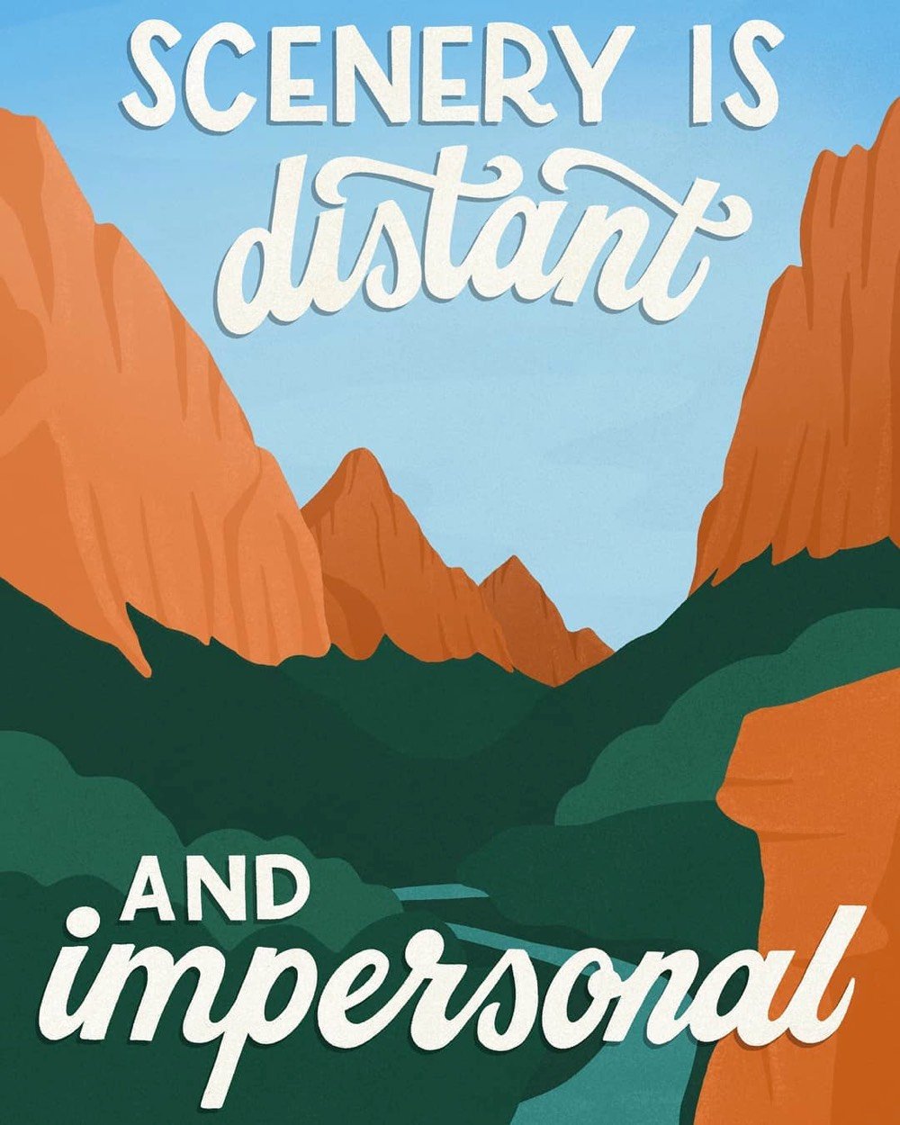
Amber Share of Subpar Parks is producing illustrations of real one-star reviews of America’s National Parks from apparently dissatisfied park visitors. Zion National Park is a bit standoffish:
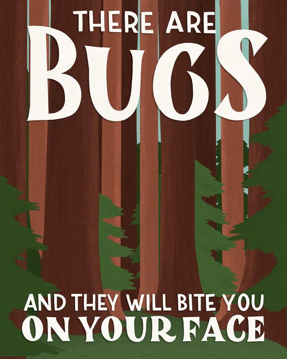
Newsflash: Sequoia National Park is outdoors and has insects:
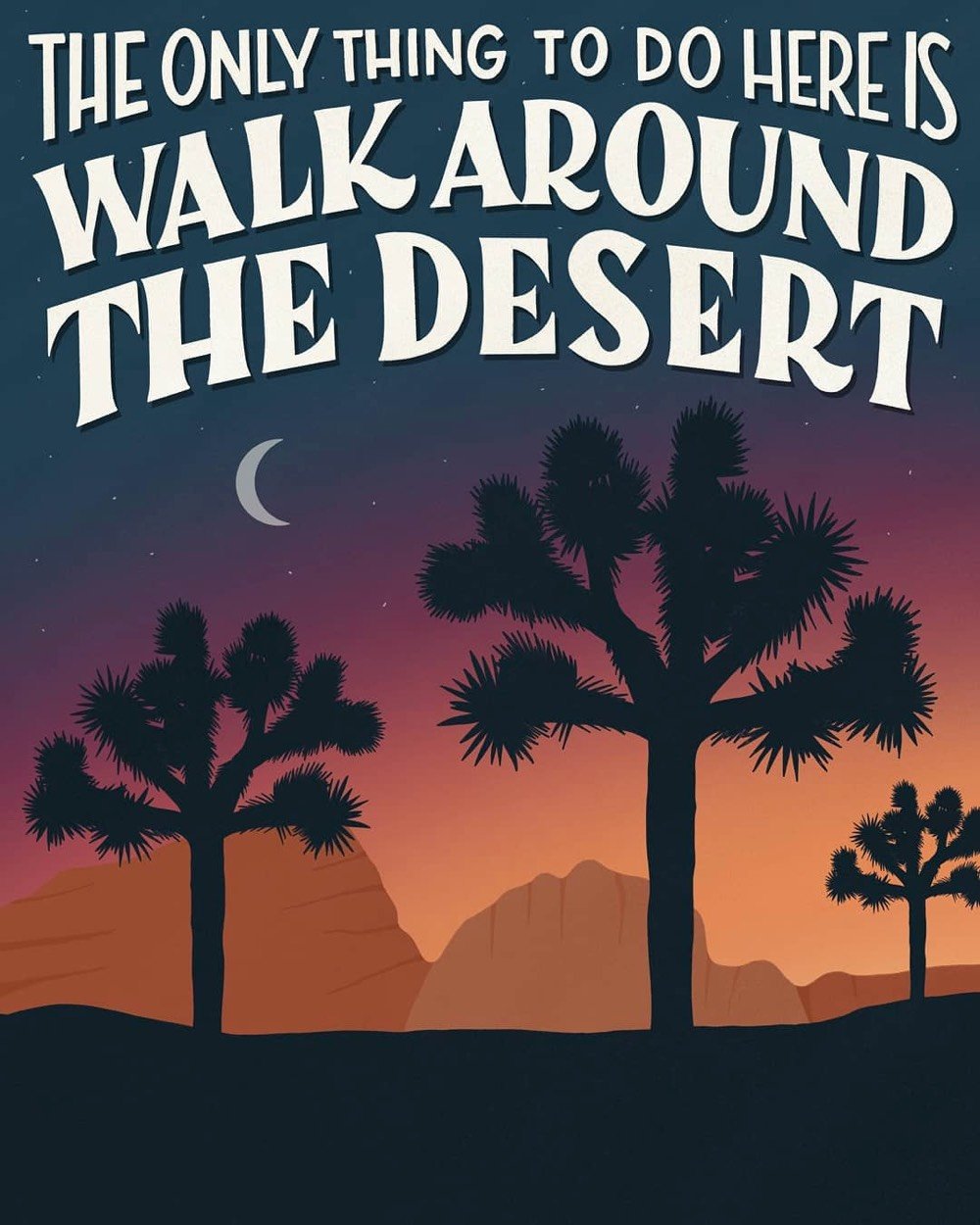
From a bored Joshua Tree guest:
Follow along with the rest of these on Instagram — Share is doing one drawing for each National Park and she’s got many more still to go. Prints, postcards, stickers, and tshirts are available from her shop (or will be soon).
Update: See also beautiful photos paired with one-star reviews of the places in question and Snowbird’s creative ad campaign based on one-star reviews. (via @ebellm & @mattgist)
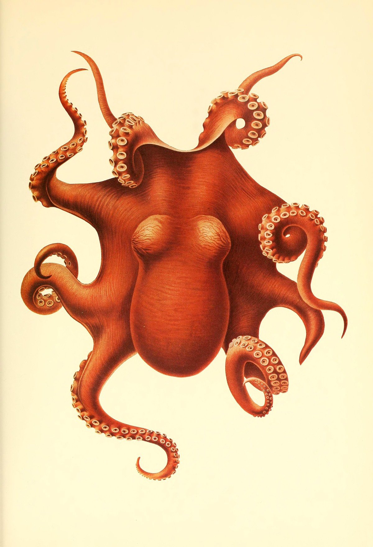
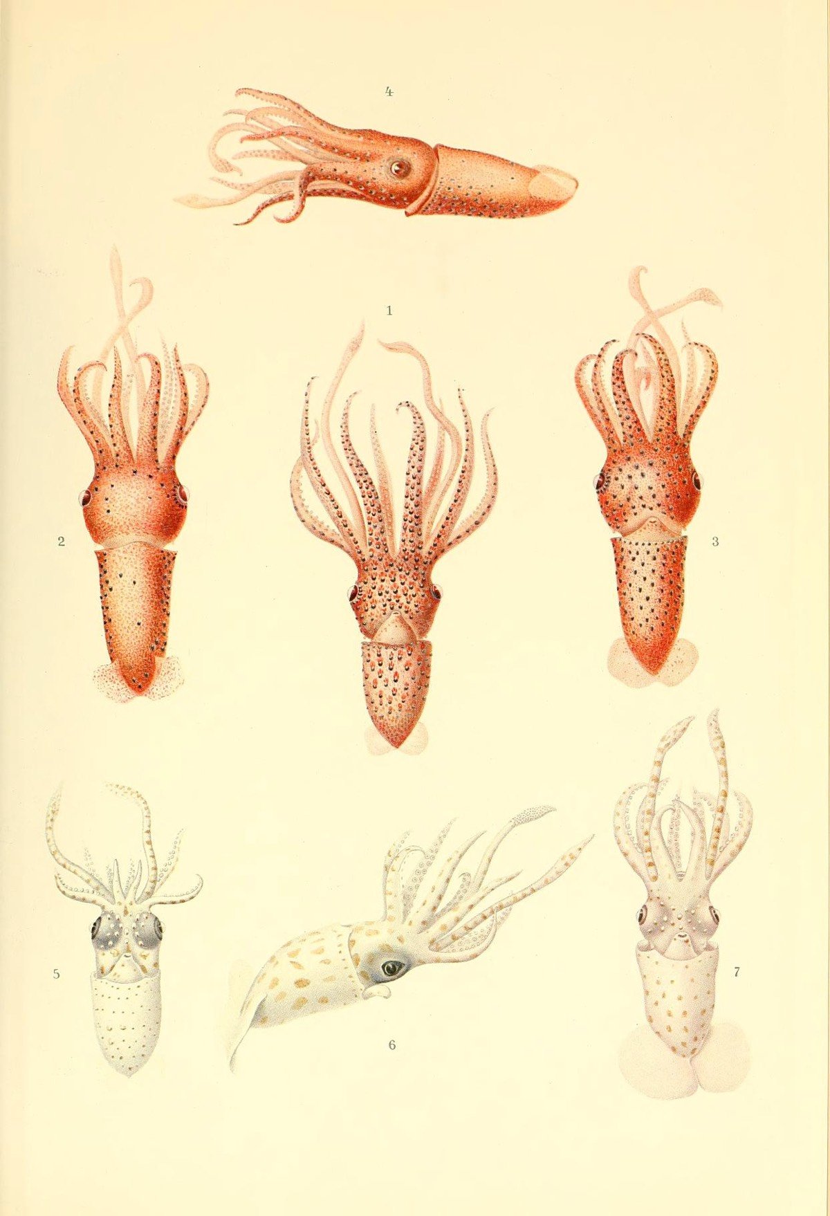
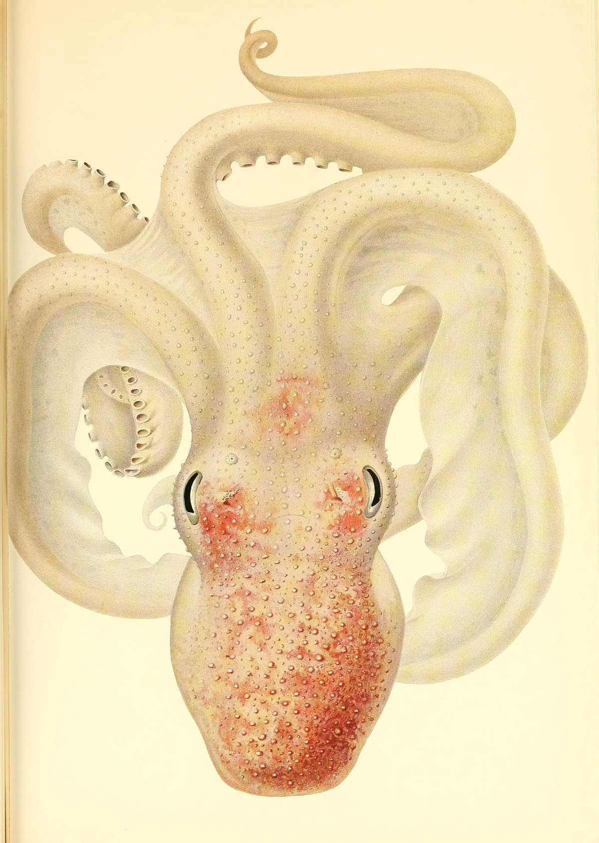
The Valdivia Expedition, led by German marine biologist Carl Chun in 1898-1899, was the first time humans had explored the ocean depths below 500 fathoms. What they found changed our conception of the oceans. The results, in the form of 24 volumes of text and illustrations, took decades to be published. Among the volumes was The Cephalopoda, published in 1910 and filled with colorful hand-illustrated drawings of octopuses and squid, courtesy of the Biodiversity Heritage Library.
I found this on Brain Pickings, which identifies the illustrator as Friedrich Wilhelm Winter, a credit I couldn’t find in the actual book itself. They’re also selling some of the illustrations as prints, like this one of the octopus featured above.
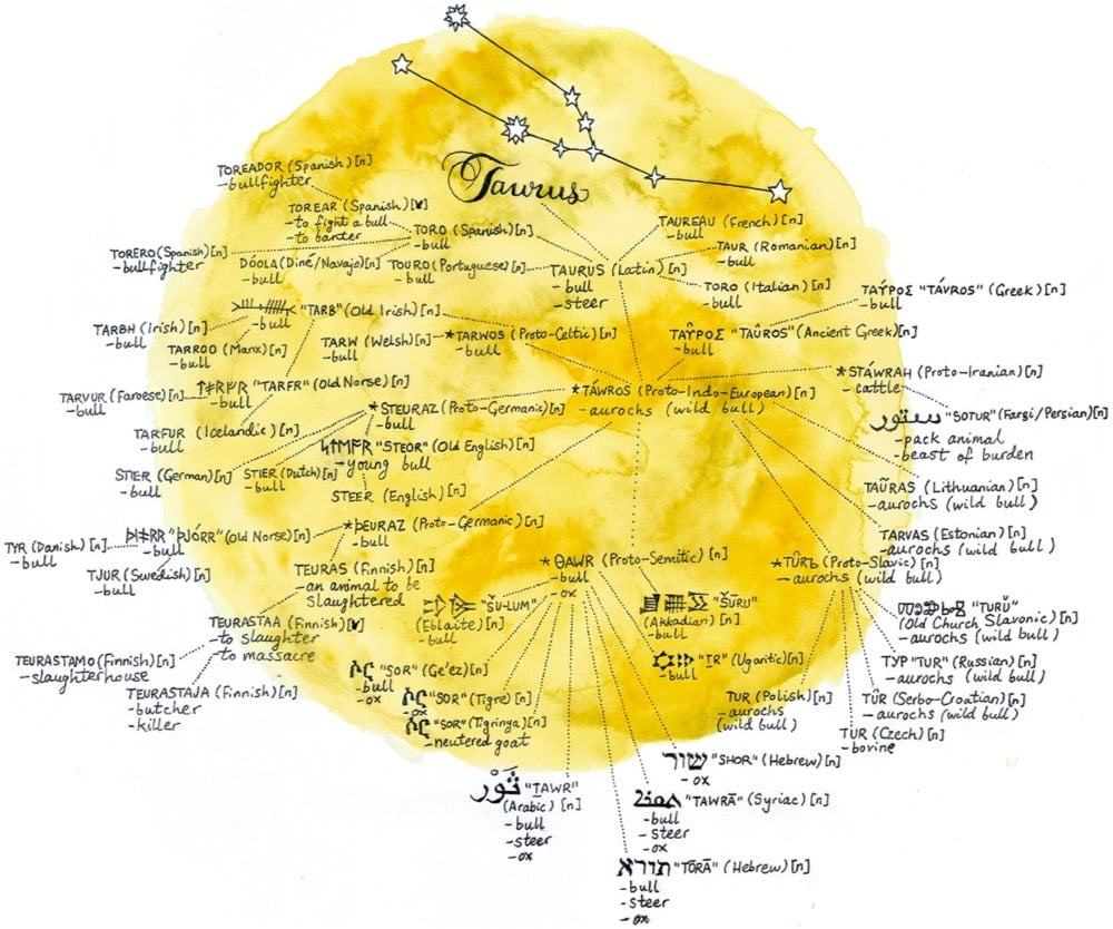
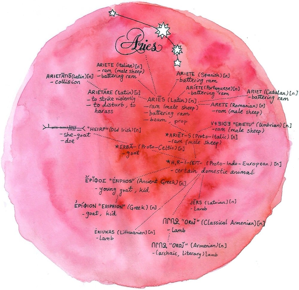
Illustrator Jerry M. Wilson has drawn a series of constellations that explore the etymology of the constellations’ names and related words in several languages. So for example, “Taurus” is Latin for “bull”, which is “toro” in Spanish & Italian and “tyr” in Danish. And then you also have associated words like “toreador” (“bullfighter” in Spanish) and “teurastamo” (Finnish for “slaughterhouse”)…a constellation of words related to “Taurus”.
Here’s an enormous library of thousands of old book illustrations, with searchable name, artist, source, date, which book it was in, etc. There are also a number of collections to browse through, and each are tagged with multiple keywords so you can also get lost in there in that manner.
Though the team behind the site doesn’t specifically list the whole site as public domain, chances are a lot of the illustrations you’ll find are way out of copyright in most jurisdictions.
For more than 11 years for a series he calls Everydays, Mike Winkelmann (aka Beeple) has been making a daily picture. As you might expect from the breakneck pace, some of them aren’t that interesting (there’s a lot of juvenile stuff here tbh), but my favorite ones are the Black Mirror-ish with decayed or repurposed pop cultural references.

You can view more of Winkelmann’s work on Behance, Tumblr, and his website. (via dense discovery)
I really like Owen Pomery’s illustrative style — his drawings are spare yet detailed, precise but a bit messy. You can see his work on his website, on Twitter, or on Instagram. He sells prints and books in his shop, including this field guide to modernist kiosk designs in a fictional country.

(via @dunstan)
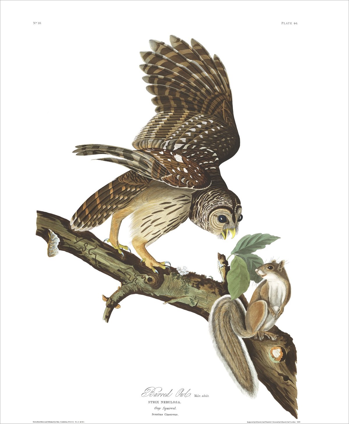
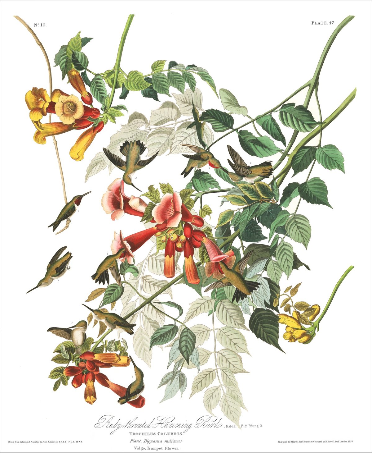
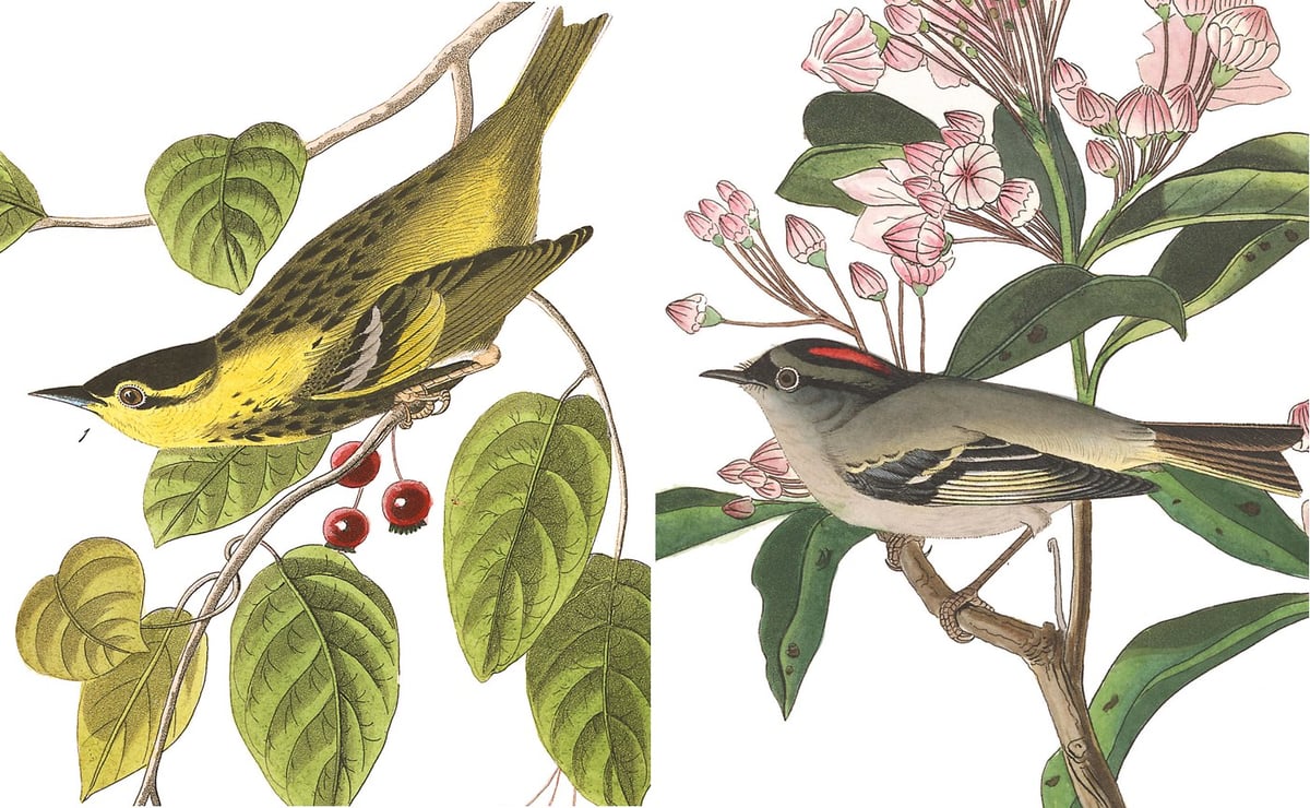
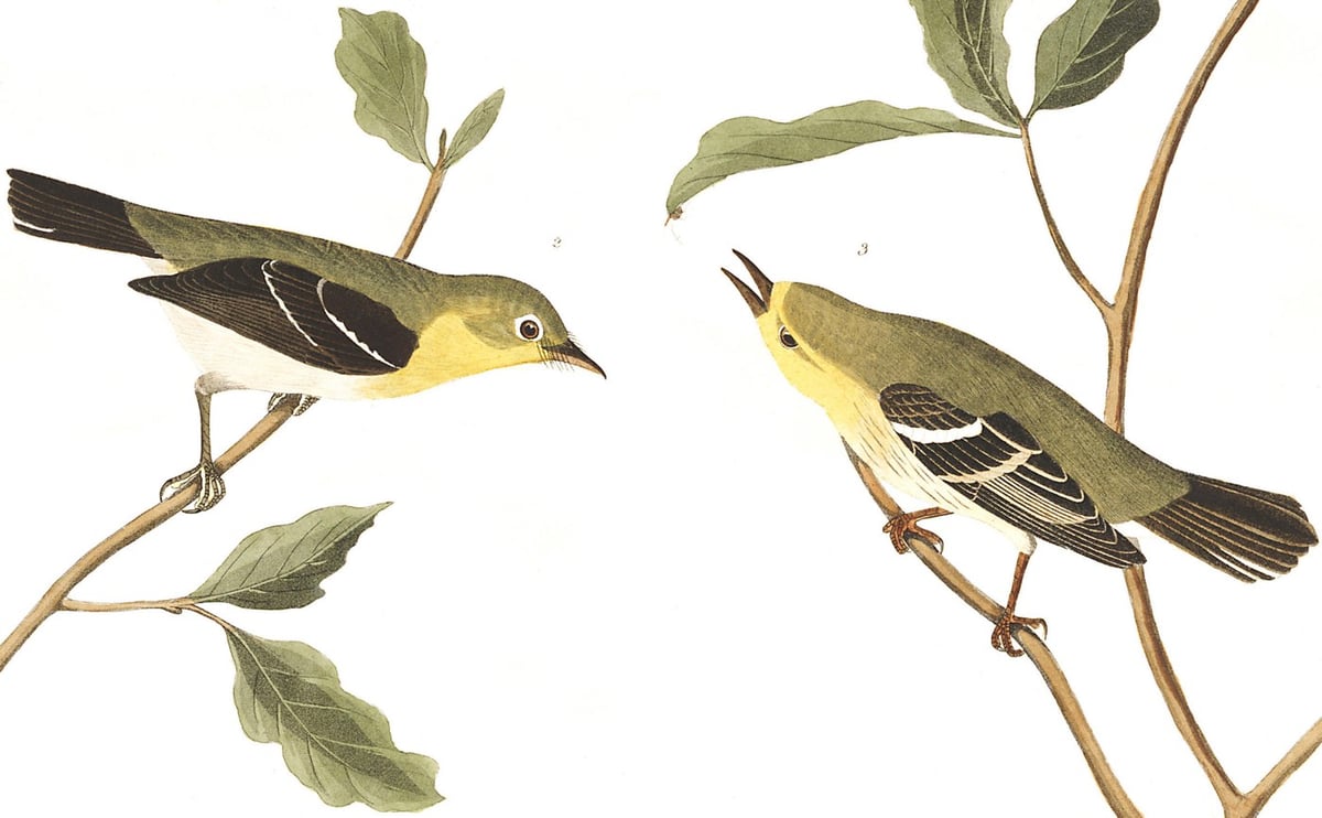
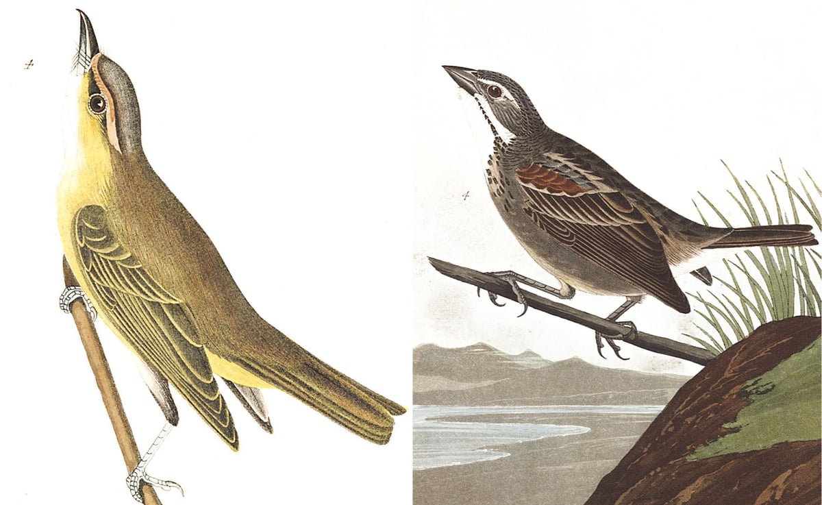
One of the (several dozen) posts I started writing ages ago but never finished was a collection of the hundreds of bird illustrations pictured in John James Audubon’s seminal Birds of America. The images have been floating around on the web forever, in various sizes and collections, and I wanted to group (or at least link to) all of them in one place. But now I don’t have to because the Audubon Society has put them up on their website.
John James Audubon’s Birds of America is a portal into the natural world. Printed between 1827 and 1838, it contains 435 life-size watercolors of North American birds (Havell edition), all reproduced from hand-engraved plates, and is considered to be the archetype of wildlife illustration.
Thumbnails of all 435 illustrations are presented on a single page (sortable alphabetically or chronologically by their creation date) and then each illustration is given its own page with Audubon’s notes on the bird pictured, a link to the bird in Audubon’s Bird Guide (where you can see photos and hear bird calls, etc.), and a link to download a high resolution image (if you sign up for their mailing list). The barred owl image is 111-megapixels. What a resource!
You can also see online copies of Birds of America at the University of Pittsburgh and Meisei University.
And if you’ve never had a chance to see some of these illustrations in real life, you should keep your eyes peeled for the opportunity. They really are something. (via open culture, which has been particularly great lately)
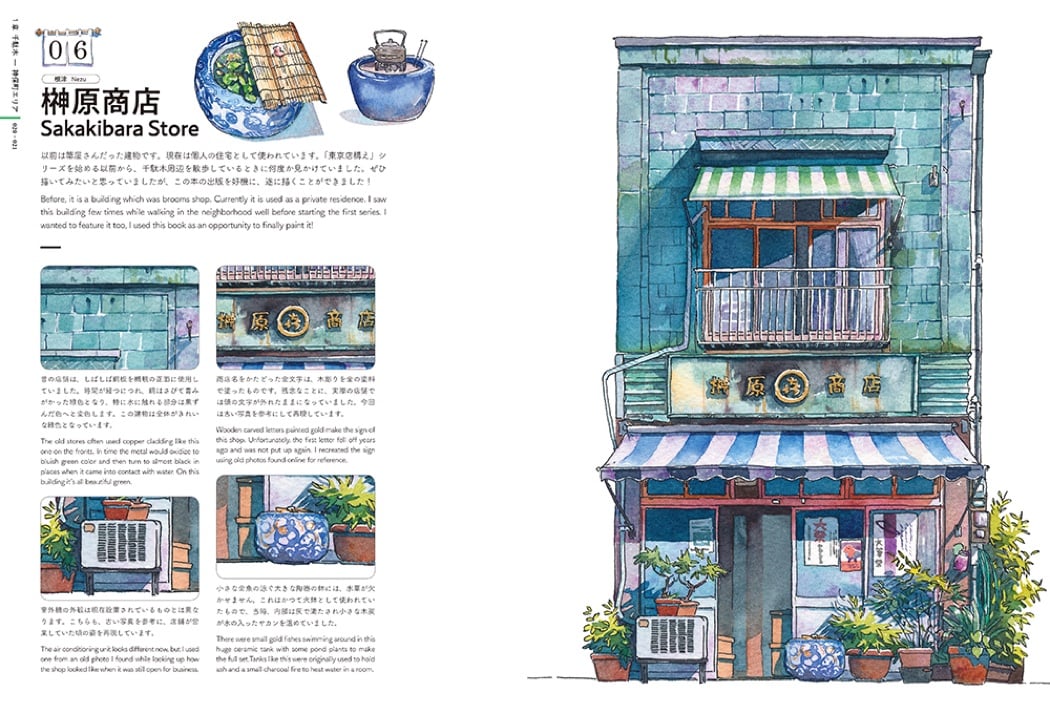
Gorgeous work by a Polish illustrator working in Japan. Originally found him through this page about his Tokyo storefronts book, which features a number of super detailed watercolor illustrations. You can see even more on the series page and the Tokyo by night ones are also worth a long look. He also links to this very detailed review of the storefronts book, with a page by page description (sounds boring but the work is so beautiful, it goes by fast).
Urbanowicz also has a Youtube channel with lots of making-of videos, including a series about the book above.
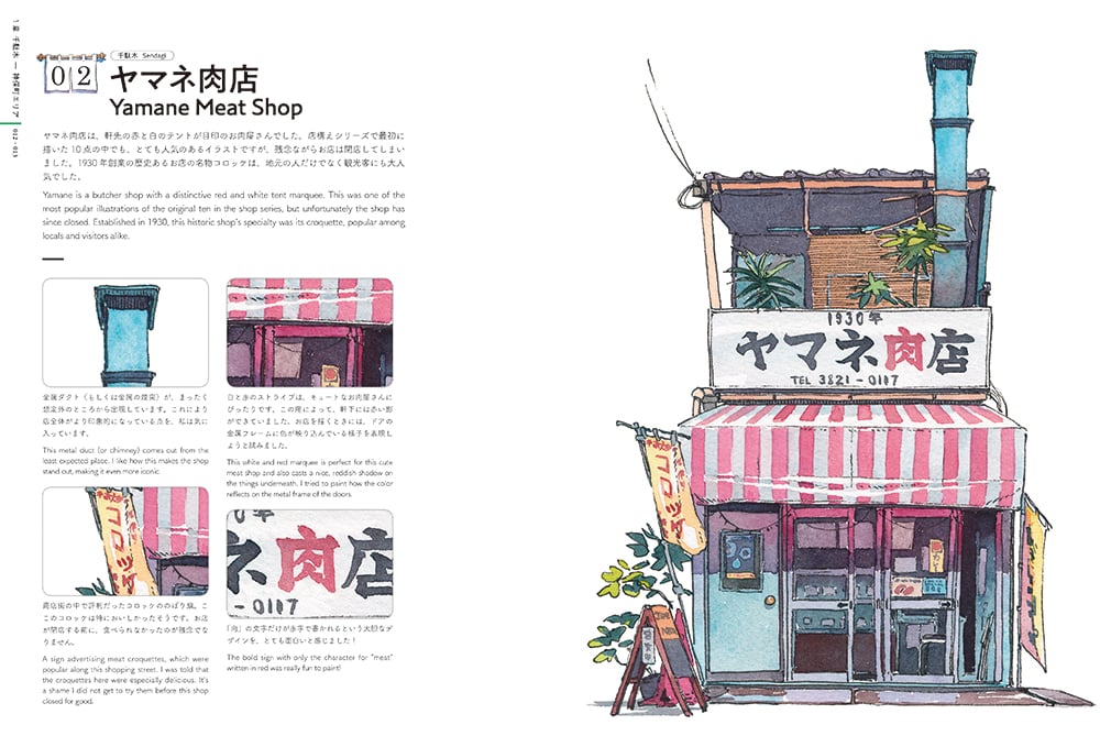
(Via Darran Anderson)
Illustrator Andrew DeGraff makes what he calls Cinemaps, maps of movies and their plots in the style of the dotted-line wanderings of The Family Circus comic strip or Harry Potter’s Marauder’s Map. He’s done maps for Star Wars, Indiana Jones, and The Princess Bride.
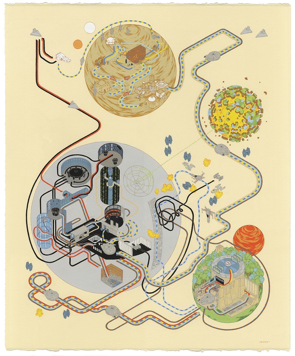
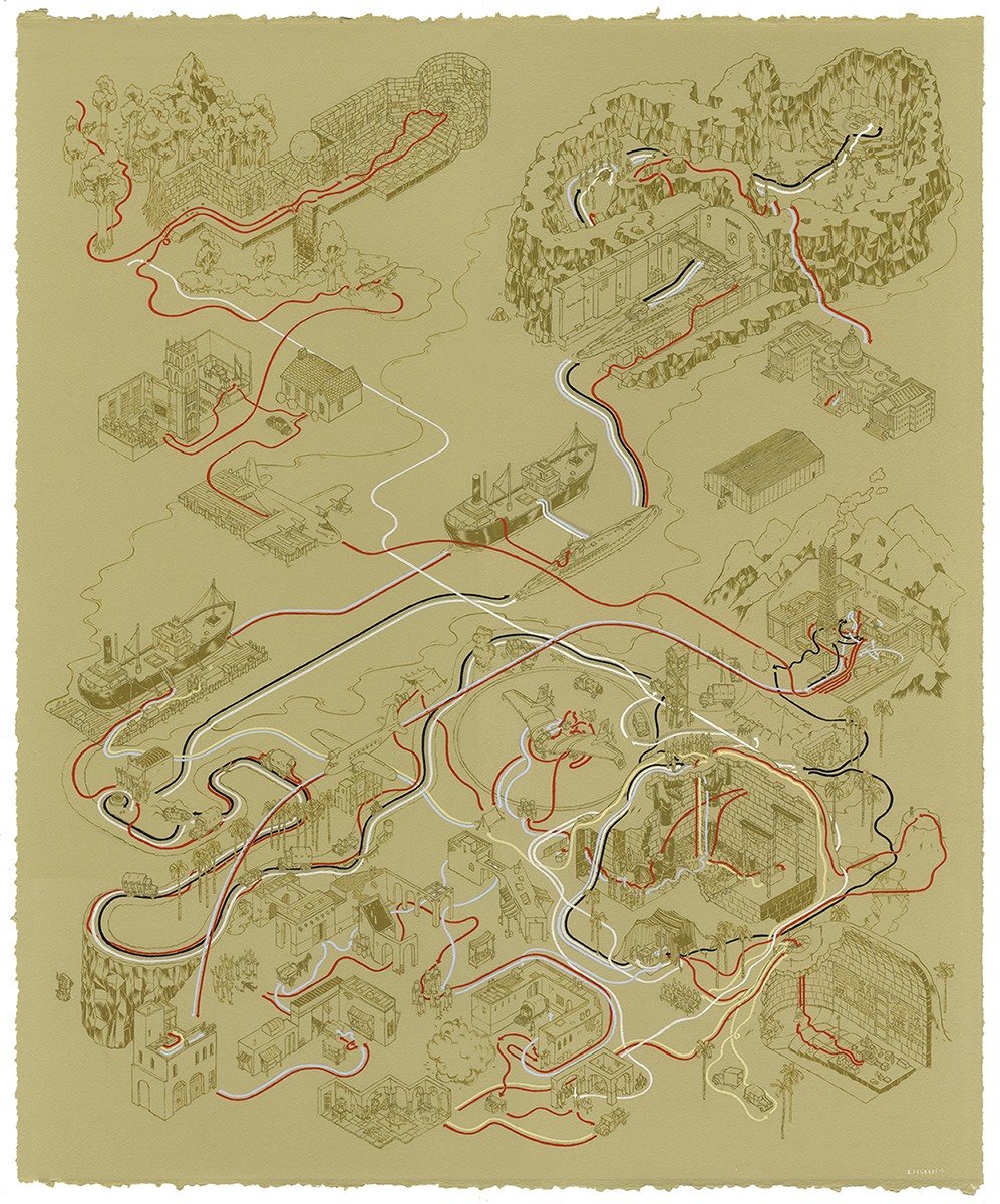
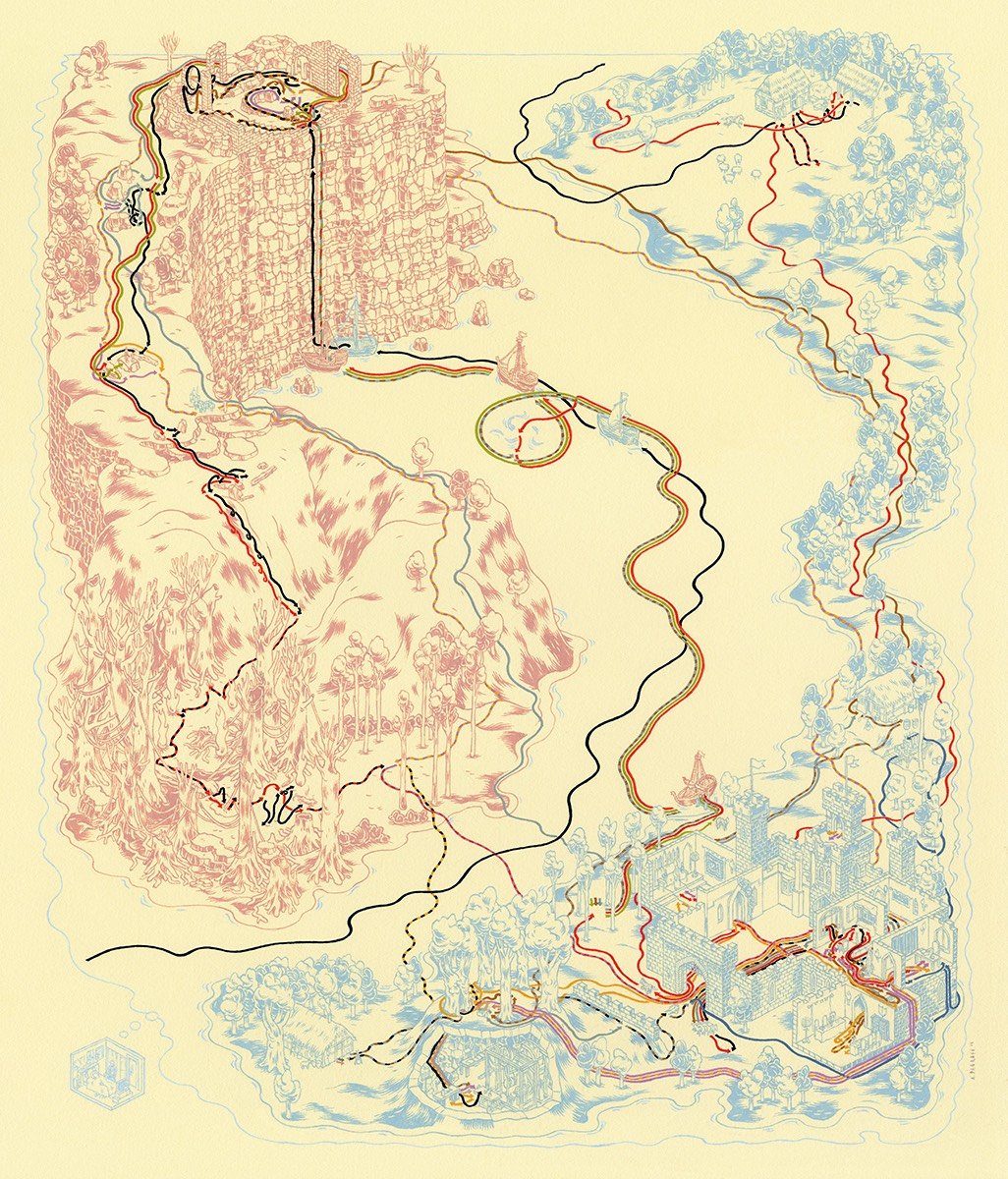
My favorite DeGraff drawing is probably Back to the Future, with Hill Valley represented twice on the same page: 1955 in pink underneath 1985 in blue.
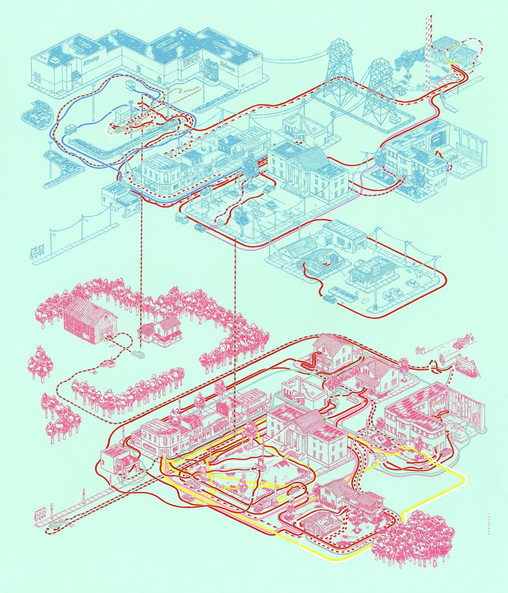
DeGraff collected these maps (and several more) into a book called Cinemaps. (via fairly interesting)
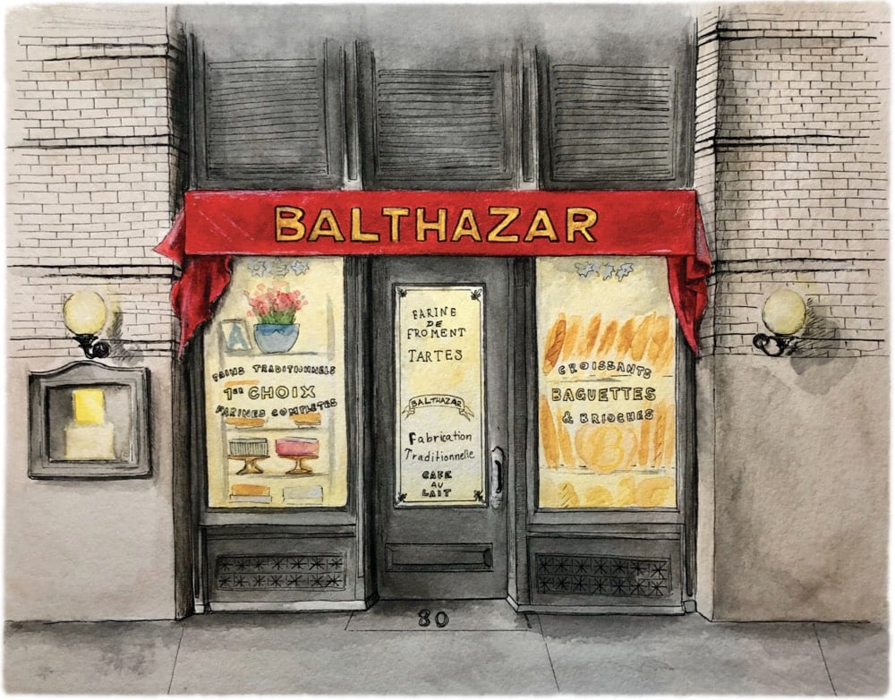
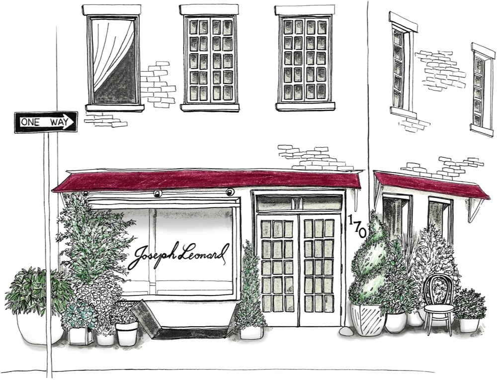
The Downtown Collective is a project by illustrator Kelli Ercolano in which she is drawing & painting all of the NYC cafes, restaurants, and bars she’s fallen in love with. You can check out more of her work and process on Instagram.
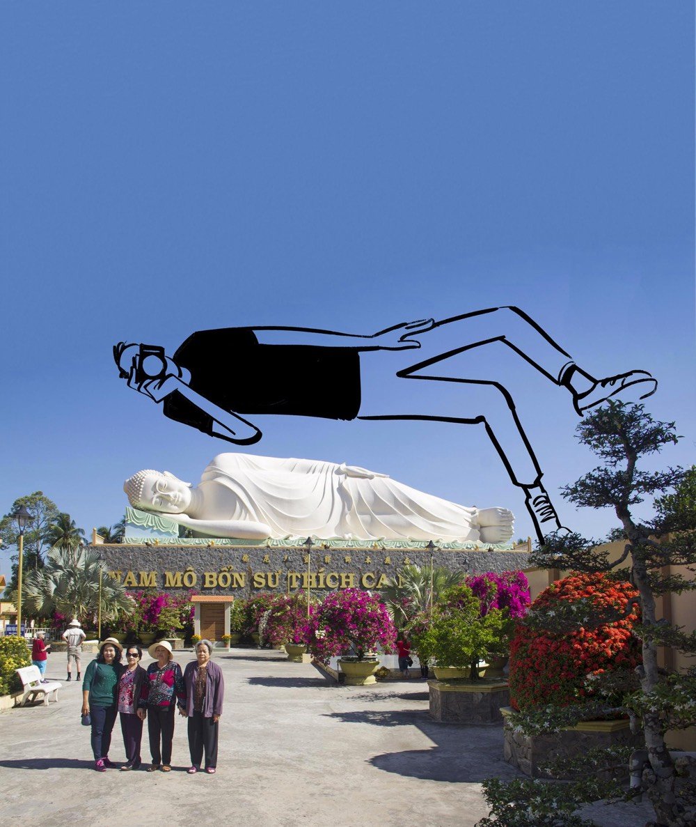
National Geographic sent illustrator Christoph Niemann to Cambodia and Vietnam and he returned with this series of drawings and observations. He talked about the trip in this behind-the-scenes video.
In a region with so much natural beauty, ancient architecture, and vibrant culture, travelers can easily get stuck behind their viewfinders — consumed with capturing the most vivid moments for their photo albums and Instagram feeds. But over the years, Niemann has developed a different method of documenting his trips.
“I always drew when I traveled … I draw just to calm down essentially, so I’m not constantly checking my phone,” he says.
Niemann believes that painting and drawing his experiences creates a dialogue between his mind and a place — this process ultimately allows him to turn the lens on himself. “Essentially the drawing is like a visual filter,” he explains. “You take the world — and you take it through the abstraction of your drawing — and you start seeing differently.”
Some my favorite posts I’ve written over the past few years have been about my travel: my western roadtrip, Berlin, Istanbul, the solar eclipse. Aside from the eclipse post (which gives me goosebumps every time I reread it), I hadn’t intended to start writing about travel. Ostensibly these trips are supposed to be vacations, my time off from constantly sifting through culture for observations. But Niemann is right…there’s something about applying the creative process to unfamiliar places that that makes the experience more worthwhile. For me, photographing and taking notes for a later post gives me a much better sense of a place, forces me to pay more attention & be more open, causes me to learn about myself, and produces a written document of my trip that I can go back to and experience again.
I *love* these simple visualizations of how different kinds of relationships change over time by writer and cartoonist Olivia de Recat.
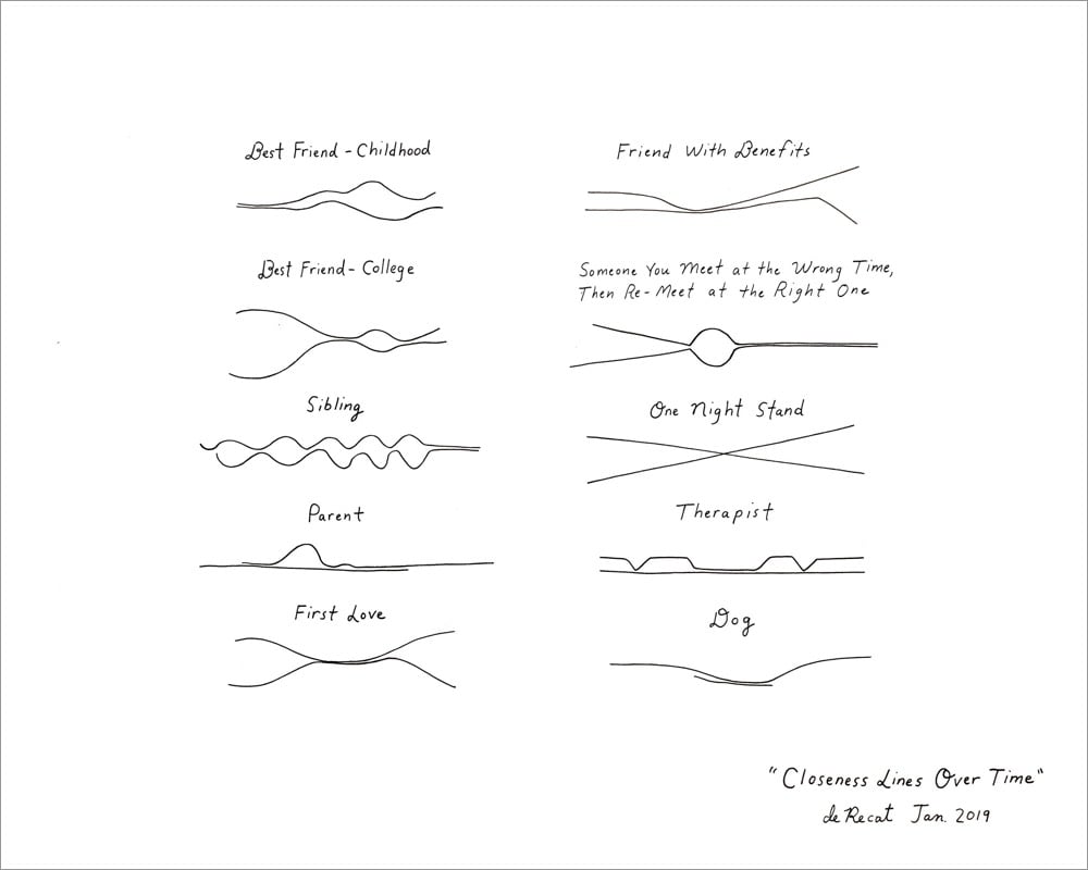
My pal Jesse James Garrett called them “Feynman diagrams of the heart” that depict “the vast entanglement of humanity”.
The illustration is available as a print but currently sold out. :( Hopefully it’ll be back in stock soon? In the meantime, you can take a look at some of her other cartoons (mostly for the New Yorker), peruse her shop, or follow her stuff on Insta.
Abbie Paulhus is selling copies of this great illustrated poster she made featuring a Wes Anderson alphabet on her Etsy shop.
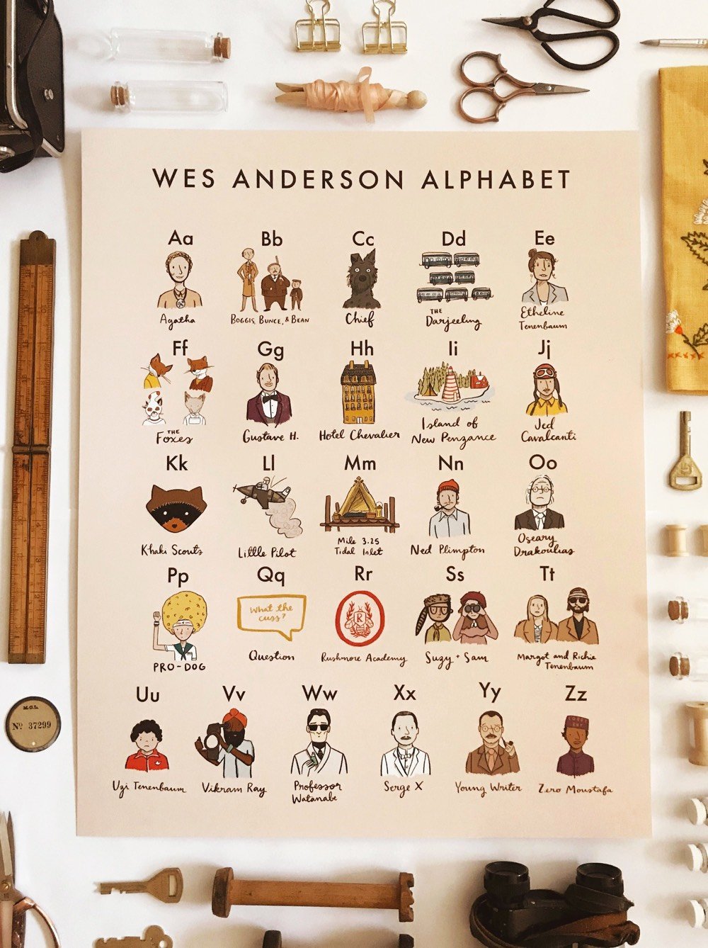
It features people, places, and objects from many of Anderson’s films (I didn’t see any Bottle Rocket references): B is for Boggis, Bunce, and Bean, N is for Ned Plimpton, and T is for Margot and Richie Tenenbaum.
I really like these drawings of NYC with a historical bent by illustrator and “amateur historian” Julia Wertz.
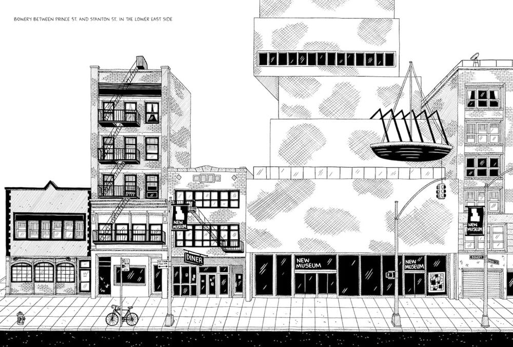
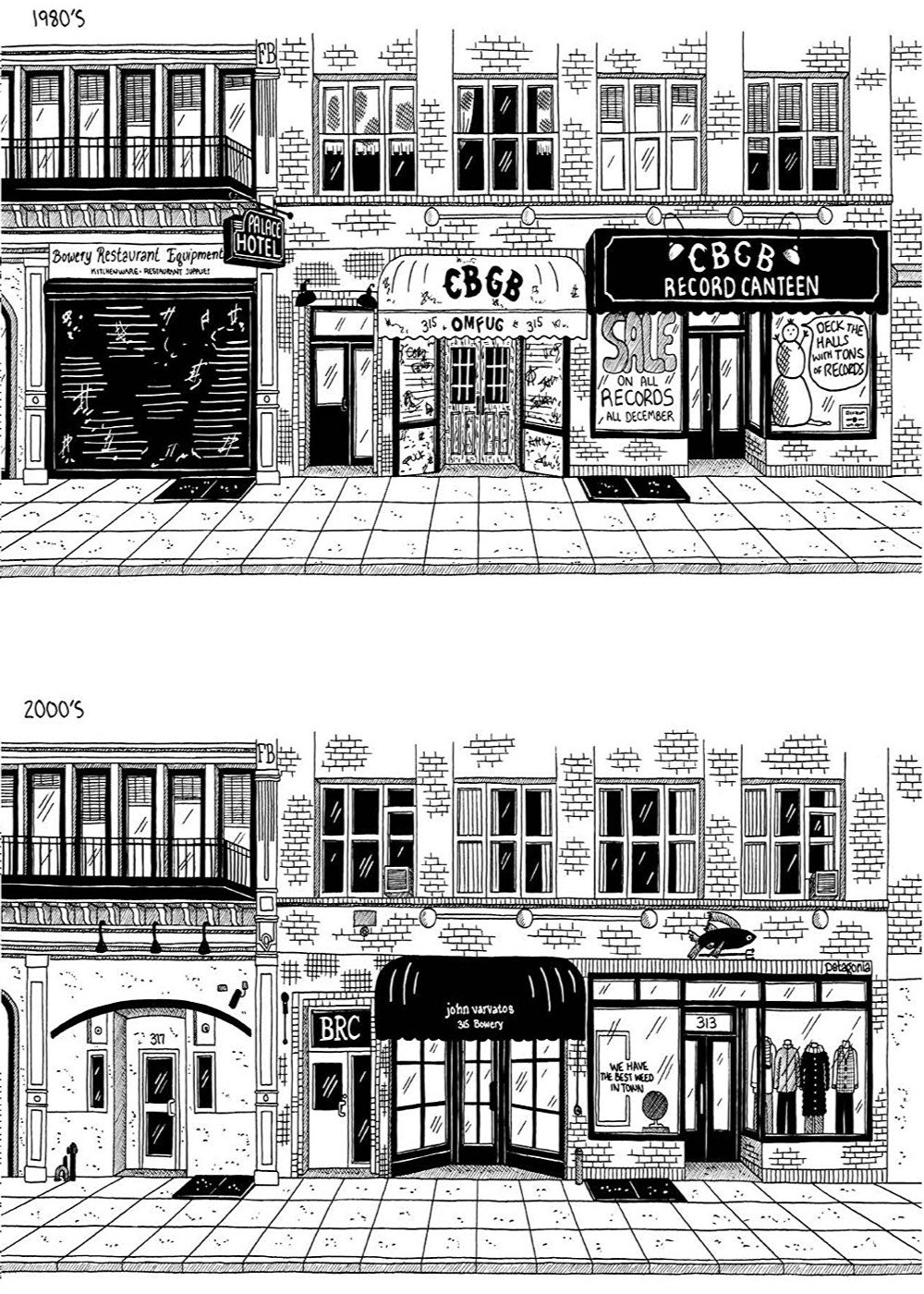
They’re from a book Wertz wrote & illustrated called Tenements, Towers & Trash: An Unconventional Illustrated History of New York City. Gothamist recently interviewed Wertz about the book and her work.
Q: Bob Dylan (and my boss, Jake Dobkin) both like to exclaim that “nostalgia is death.” Which probably says more about them, and their own particularly complex relationships with nostalgia, than anything else. But do you think of yourself as a nostalgic person? How does nostalgia play into your appreciation of the urban landscape?
A: I understand what people mean by that expression, but it categorizes nostalgia in too simple a way. Nostalgia is like an intoxicant — in moderation it can be a rewarding experience, but if abused/overused, it becomes toxic. To indulge in nostalgia is to romanticize the past and stop living in the present. This could be totally fine for short periods of time, just a nice way to remember a pleasant time you experienced, but if it becomes a way of thinking, it ruins the present because there’s no way the present moment can compare to a fabricated, romanticized version past. Nostalgia has a way of erasing the shitty parts of reality. Like when people are nostalgic for, say, NYC in the 1800’s — the horse and buggies, the handmade shop signs, the elaborate suits and dresses — they’re forgetting (or perhaps never knew) that the city then was a filthy cesspool of trash and sewage, disease was rampant, and the clothing was insufferably hot and restrictive, and sometimes even deadly for women cooking with open flame.
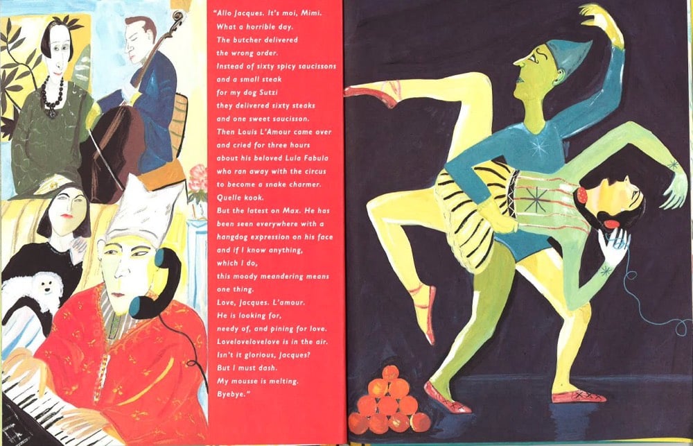
The New York Review is reissuing five of legendary illustrator Maira Kalman’s books for children that were originally published in the 90s. The books feature the adventures of Max the dog: Hey Willy, See the Pyramids, Swami on Rye: Max in India, Max Makes a Million, Max in Hollywood, Baby, and Ooh-la-la (Max in Love).
Kalman is a wonderful illustrator, one of my favorites. You can check out more of her work on her website.
Update: The Cut ran a long profile of Kalman by Rumaan Alam last month.
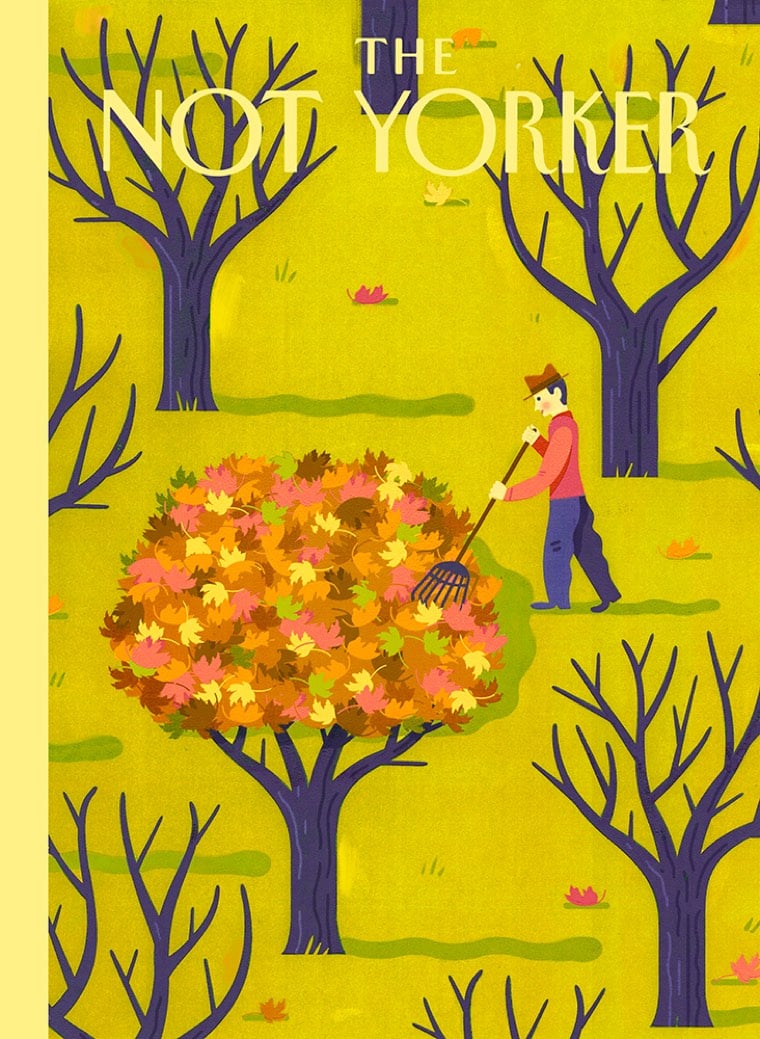
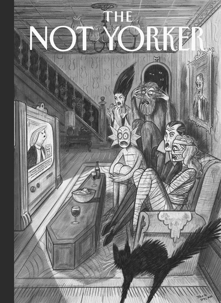
The Not Yorker is a blog collecting cover art rejected by the New Yorker. If you’re an illustrator who’s had a cover rejected, they’re soliciting submissions. (via the morning news)
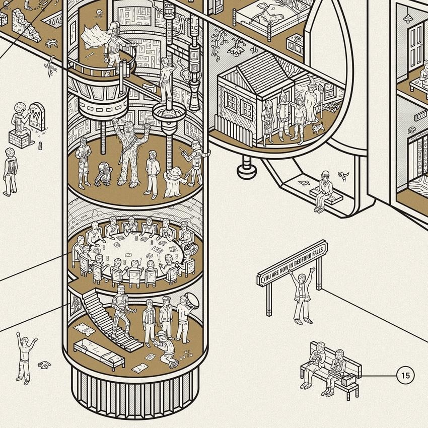
This might be Dorothy’s best print yet: a cutaway view of the Arriflex 35 IIC camera used extensively by directors like Stanley Kubrick but the guts of the camera has been replaced with some of the most iconic movies scenes of all time. The full print contains 60 scenes, but even in the small excerpt above, you can see The Wizard of Oz, Dr. Strangelove, The Empire Strikes Back, Forrest Gump, and The Godfather.


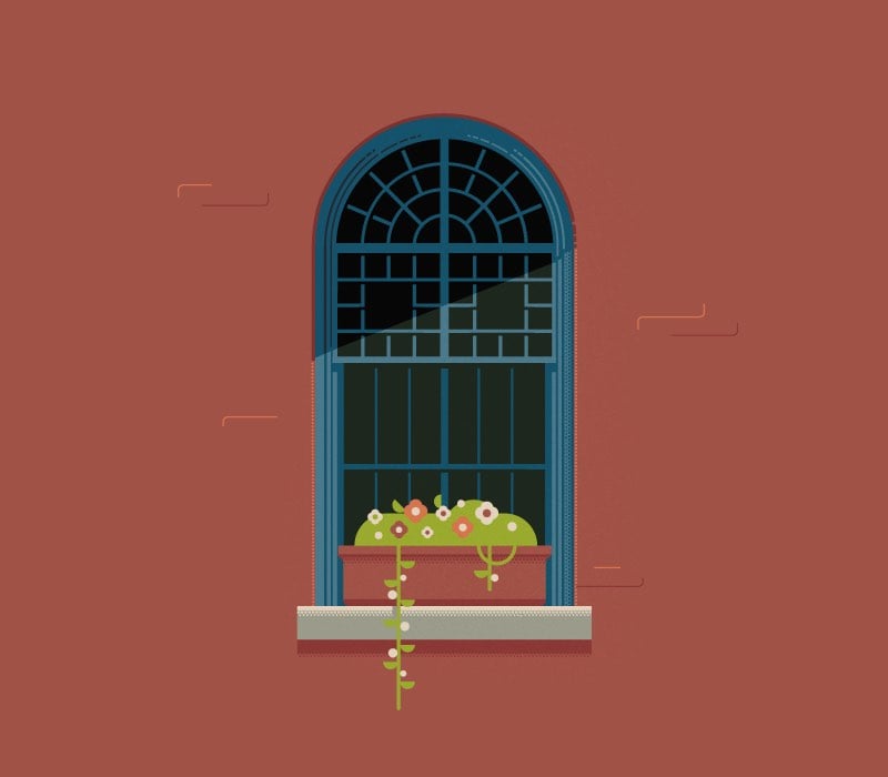

José Guizar is a Mexican designer living in NYC with an obsession for the city’s windows. For his Windows of New York project, he’s done dozens of illustrations of all styles of window from around the city (mostly lower Manhattan).
The Windows of New York project is a illustrated fix for an obsession that has increasingly grown in me since I first moved to this city. A product of countless steps of journey through the city streets, this is a collection of windows that somehow have caught my restless eye out from the never-ending buzz of the streets. This project is part an ode to architecture and part a self-challenge to never stop looking up.
(via @ladyslippers)
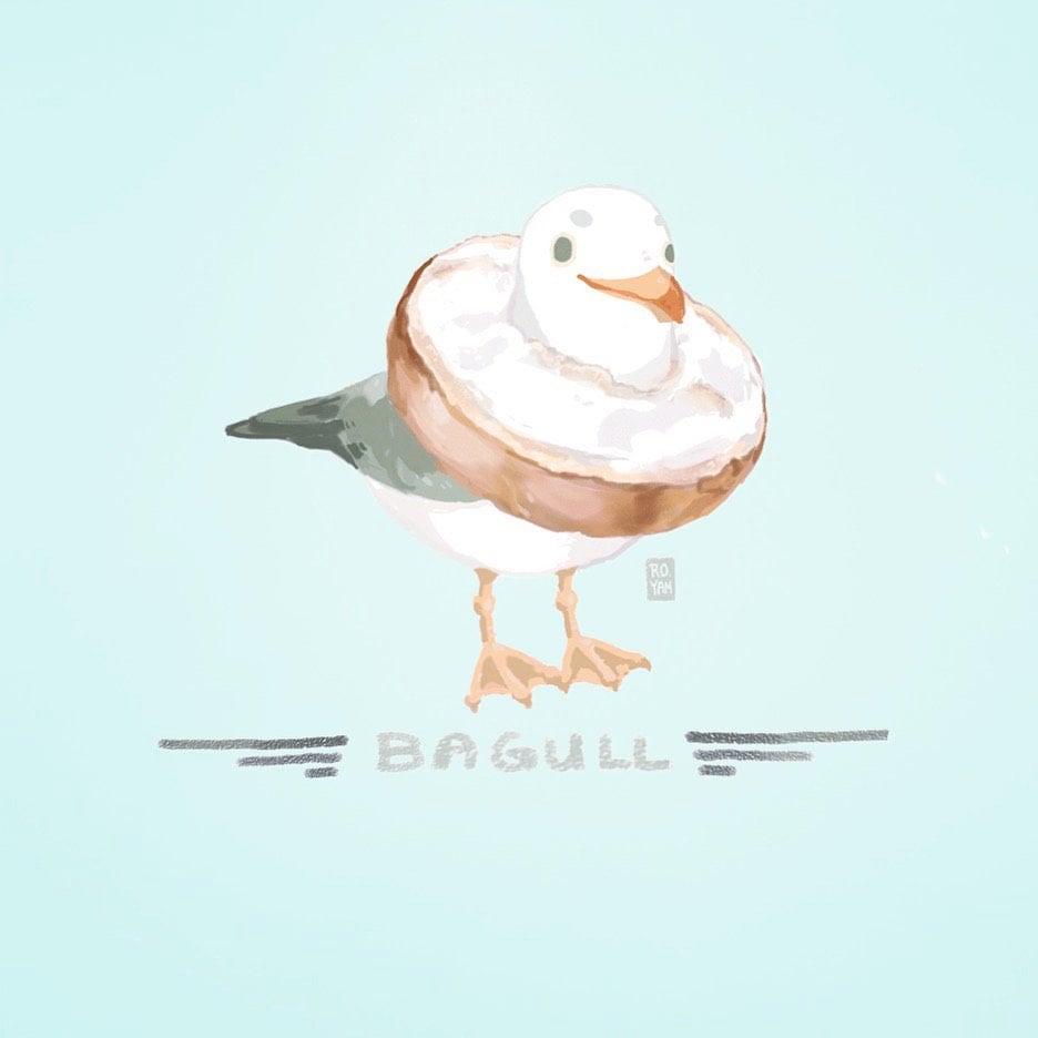
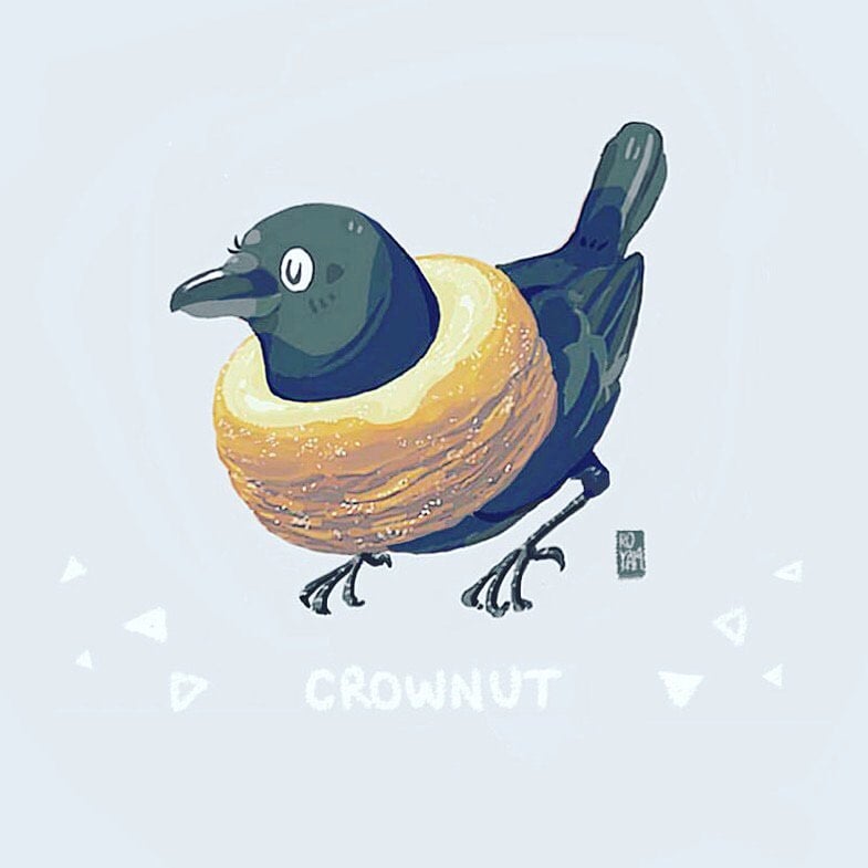
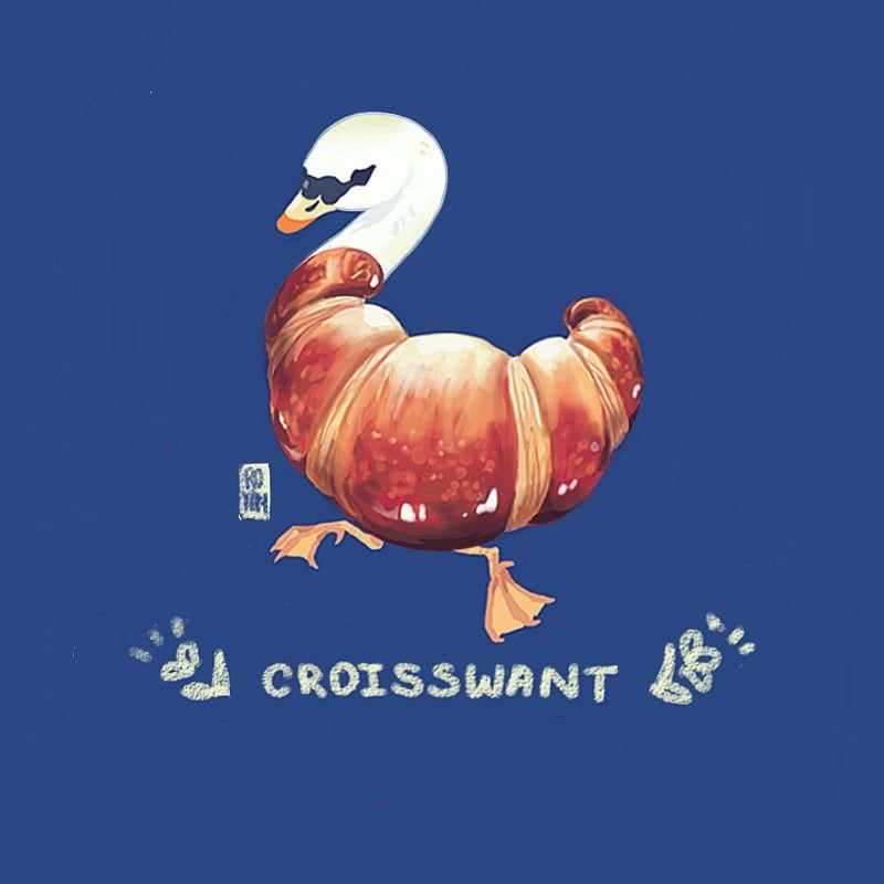
Twitter user @fuguhitman has recently done a series of bread birds with portmanteau names like Croisswant, Breadolark, Pidgingerbread, Bagull, and Crownut. Now I’m hungry and I want to go sit in a quiet forest with binoculars.
Over a period of thirteen years beginning in the 1820s, John James Audubon painted 435 different species of American birds.1 When he was finished, the illustrations were compiled into The Birds of America, one of the most celebrated books in American naturalism. Curiously however, five of the birds Audubon painted have never been identified: Townsend’s Finch, Cuvier’s Kinglet, Carbonated Swamp Warbler, Small-headed Flycatcher and Blue Mountain Warbler.
These birds have never been positively identified, and no identical specimens have been confirmed since Audubon painted them. Ornithologists have suggested that they might be color mutations, surviving members of species that soon became extinct, or interspecies hybrids that occurred only once.
The specimen that Audubon used to paint Townsend’s Bunting is now in the Smithsonian Museum of Natural History, identified as Townsend’s Dickcissel, but no bird exactly like it has been reported, Dr. Olson, an authority on Audubon’s work, noted in an email. Ornithologists suggest that it is either a mutation of the Dickcissel or a hybrid of Dickcissel and Blue Grosbeak, she said.
And that’s not counting the ones he got wrong for other reasons:
And indeed, there are several birds painted and explained in Birds of America that are not, in fact, actual species. Some are immature birds mistaken for adults of a new species (the mighty “Washington’s Eagle” was, in all likelihood, an immature Bald Eagle). Some were female birds that didn’t look anything like their male partners (“Selby’s Flycatcher” was a female Hooded Warbler).
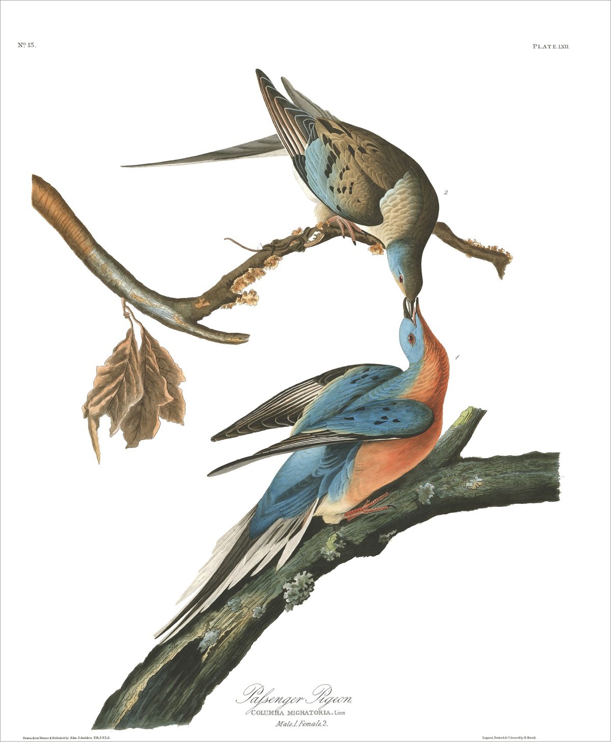
Audubon also painted six species of bird that have since become extinct: Carolina parakeet, passenger pigeon, Labrador duck, great auk, Eskimo curlew, and pinnated grouse. Here’s his portrait of the passenger pigeon:
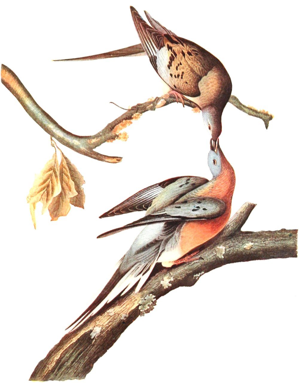
There were an estimated 3 billion passenger pigeons in the world in the early 1800s — about one in every three birds in North America was a passenger pigeon at the time. Their flocks were so large, it took hours and even days for them to pass. Audubon himself observed in 1813:
I dismounted, seated myself on an eminence, and began to mark with my pencil, making a dot for every flock that passed. In a short time finding the task which I had undertaken impracticable, as the birds poured in in countless multitudes, I rose and, counting the dots then put down, found that 163 had been made in twenty-one minutes. I traveled on, and still met more the farther I proceeded. The air was literally filled with Pigeons; the light of noon-day was obscured as by an eclipse; the dung fell in spots, not unlike melting flakes of snow, and the continued buzz of wings had a tendency to lull my senses to repose… I cannot describe to you the extreme beauty of their aerial evolutions, when a hawk chanced to press upon the rear of the flock. At once, like a torrent, and with a noise like thunder, they rushed into a compact mass, pressing upon each other towards the center. In these almost solid masses, they darted forward in undulating and angular lines, descended and swept close over the earth with inconceivable velocity, mounted perpendicularly so as to resemble a vast column, and, when high, were seen wheeling and twisting within their continued lines, which then resembled the coils of a gigantic serpent… Before sunset I reached Louisville, distant from Hardensburgh fifty-five miles. The Pigeons were still passing in undiminished numbers and continued to do so for three days in succession.
100 years later, they were all dead. Which may have had at least one interesting consequence:
But the sad echo of the loss of passenger pigeons still reverberates today because its extinction probably exacerbated the proliferation of Lyme disease. When the passenger pigeons existed in large numbers, they subsisted primarily on acorns. However, since there are no pigeons to eat acorns, the populations of Eastern deer mice — the main reservoir of Lyme disease — exploded far beyond historic levels as they exploited this unexpected food bonanza.
Newer posts
Older posts
Socials & More