Harsh review of the user interface for
Harsh review of the user interface for The Complete New Yorker. My experience was better (changing issues took me only a few seconds), but the interface does leave a lot to be desired.


This site is made possible by member support. 💞
Big thanks to Arcustech for hosting the site and offering amazing tech support.
When you buy through links on kottke.org, I may earn an affiliate commission. Thanks for supporting the site!
kottke.org. home of fine hypertext products since 1998.
Beloved by 86.47% of the web.
Harsh review of the user interface for The Complete New Yorker. My experience was better (changing issues took me only a few seconds), but the interface does leave a lot to be desired.
Jakob Nielsen’s latest Alertbox is about weblog usability. I actually think most of these are pretty good, but as with all such guidelines, they are made to be broken.
In the real world, the process of design depends on evolution: “To consider the iPod, it did not spring fully formed from the mind of a powerful Designer, but rather it represents one distinct point on a long evolutionary timeline.” Intelligent design is bad science and bad design. That doesn’t leave much.
Wonderful interview of Milton Glaser by Chip Kidd from a couple of years ago. Touches on his iconic I [heart] NY logo, the updated version (which the NY Commerce Dept. tried to sue him for), and the economics of design. (via df)
PingMag interviews designer Stefan Sagmeister about his work.
The AIGA has podcasts and presentation materials up for some of the speakers from the Design Conference (my full coverage here). Several of the main stage speeches are up, as well as backstage interviews with some of the participants. In particular, I would recommend:
These aren’t just for designers; they’re perfectly fine for non-designers as well. Here’s the RSS file with all the resources…it should work well with your favorite podcasting software or newsreader. It’s great that the AIGA is making these presentations freely available…you’re getting a lot of the conference for free here. If I remember correctly, not even O’Reilly offers the presentations or podcasts for download after their events like Etech.
Update: Wrong again! IT Conversations has several podcasts from the last Etech conference. (thx tim)
Profile of Google’s Marissa Mayer, Google’s answer to Apple’s Jonathan Ive. She grew up about 100 miles from me in northern WI.
Paula Scher: “My favorite job is the one I’m going to do tomorrow”.
Here’s a sampling of the rest of the AIGA Design Conference, stuff that I haven’t covered yet and didn’t belong in a post of it’s own:
1. Design is the easy part.
2. Learn from your clients, bosses, collaborators, and colleagues.
3. Content is king.
4. Read. Read. Read.
5. Think first, then design.
6. Never forget how lucky you are. Enjoy yourself.
For more of what people are saying about the conference, check out IceRocket. There’s a bunch of photos on Flickr as well.
Hillman Curtis has added some new (to me) videos to his series of interviews with designers, including interviews with the folks at Pentagram and David Carson.
I quite enjoyed Sagmeister’s presentation on happiness…where else but a design conference would you find a talk on that topic?[1] Early in, he suggested that visualizing happiness with design is easy (photos of someone laughing or a smiley face will do it) but that creating design that provokes happiness in the viewer is something else entirely. He then shared three designs that have made him happy recently:
Sagmeister wrapped up his talk with a list of things he has learned and how he’s used that list in a recent series of projects:
“Complaining is silly…” is my favorite, both as advice and his implementation of the design. A few of these are in this video shot by Hillman Curtis.
[1] Ok, maybe at a clown conference, but still.
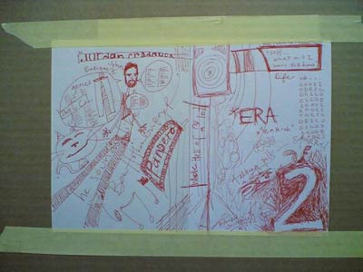
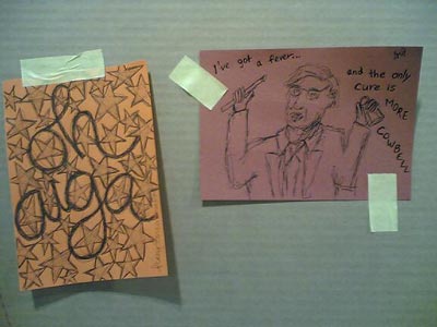
At the beginning of the conference, sketchbooks were distributed to every attendee. We were urged to sketch our thoughts during the sessions & panels in our books and then tape the results onto the Sketch Wall in the Design Fair. As I was too busy typing into my virtual sketchbook (plus, I can’t draw), I left the drawing to others, but I did head down to the Design Fair to see what other attendees had done. Here’s a couple I found interesting:


In addition to the sketches, the wall was also being utilized more generally for graffiti, both written (with marker and paint) and created with the tape used to fasten the sketches to the wall. Here’s a favorite bit of tape graffiti (tapeffiti?):
![I [heart] undo](/cdn-cgi/image/format=auto,fit=scale-down,width=1200,metadata=none//plus/misc/images/aiga-sk-undo.jpg)
That would make a great tshirt.
Coming soon to the MoMa: Safe: Design Takes on Risk “presents more than 300 contemporary products and prototypes designed to protect body and mind from dangerous or stressful circumstances, respond to emergencies, ensure clarity of information, and provide a sense of comfort and security”.
Update: Business Week has a preview of the exhibition as well as a slideshow of some of the objects in the exhibit.
A couple of guys calculated the average color of the universe to be turquiose. Then it turned out they had made an error and the actual color of the universe is beige.
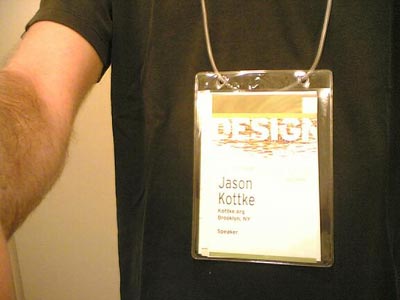
As part of my ongoing series of thoughts about conference badge and program design (Poptech 2004, Web 2.0 2004, PopTech 2003), here’s a quick review of the AIGA conference badges and programs. The badges are pretty good. Both first and last names are printed in large type for easy glancing and the schedule fits in the badge holder.

The badge lanyards are not the usual string/cloth, but a simple length of thin hollow plastic tube that’s looped together with a small piece of plastic that fits inside the tube like so:
![]()
If the lanyard is too long (as they often are at these things) and your badge is hanging down to your belt buckle, just grab a scissors, cut a bit off one end of the tube, and stick it back together. The program is a small thick book which I’ve left in my hotel room the entire time, preferring to rely on the Web site for event descriptions and the smaller schedule that fits in the badge holder for times, room numbers, etc. The schedule is actually not a booklet, but a series of folding pieces, one for each day of the conference, so when Friday is over, you can take the Friday schedule out of your badge holder and leave it behind, which is kind of handy.
Music video for Breathe Me by Sia, that song at the end of the last episode of Six Feet Under.
Nicholas Negroponte spoke this morning about the MIT Media Lab’s $100 laptop initiative. “One does not think of community pencils—kids have their own. They are tools to think with, sufficiently inexpensive to be used for work and play, drawing, writing, and mathematics. A computer can be the same, but far more powerful.” More info at BBC News and Technology Review.
I must be living in a cave because I hadn’t really heard of the Daily Show’s America the Book (more here) before today’s presentation by Paula Scher and Ben Karlin.
Designboom interview with designer/citizen Milton Glaser. Glaser is responsible for one of my favorite sayings: just enough is more.
Going all city is graffiti slang for putting your graffiti on trains in all five boroughs of NYC.
“I/O Brush is a new drawing tool to explore colors, textures, and movements found in everyday materials by ‘picking up’ and drawing with them. I/O Brush looks like a regular physical paintbrush but has a small video camera with lights and touch sensors embedded inside.”
Some miscellaneous bits I haven’t had a chance to post yet about the conference:
More tomorrow, already the last full day of the conference.
OPENSTUDIO was announced at the conference today by John Maeda. Keith sez about the project: “described as an experiment in creativity, collaboration, and capitalism, Open Studio is designed to simplify tools for the creative process and provide a pseudo-currency model for tool use and sharing.” Gotta go check this one out in the Media Lab space here.
Something to look forward to: podcasts from the AIGA Design Conference. I’ve been told they’ll be up in a week or two and that they will include many of the presentations as well as a lot of interviews with speakers. I’ll point to them when they’re available.
The Designing for User eXperience conference “[gathers] together researchers and practitioners of all the design disciplines and related fields to share their stories and experiences on how the needs and goals of both users and businesses are met through design”. Looks like the blog has yet to get going.
Are you at the AIGA conference? Are you taking notes? Are those notes on a computer or posted to a blog? There are several sessions going on at a time now and I’m trying to get to as many as I can without, you know, going insane. If you’ve got notes (especially from sessions I didn’t get to) and you don’t mind sharing them, send them along and I’ll put them up on the site. If you’re blogging, send your links or post them in the comments below. Thanks!
ps. Did anyone go to the yoga at 6:30am this morning? What percentage of the participants were hung over? Was everyone in black?
The Design Encyclopedia is a wiki that aims to be filled with definitions and descriptions of design terms, people, concepts, companies, etc. This could become a great resource. (thx armin)
UnBeige blogged the blog panel that I participated on with Michael Bierut, Jen Bekman, Armin Vit, and Steven Heller. More here and here.
Paul D. Miller (aka Dj Spooky) has a new book out about remix culture called Rhythm Science. More on the book at MIT Press and it’s available at Amazon.
Socials & More