kottke.org posts about remix
Back in November, Patrick Tanguay and I posted about Xavi Bou’s Ornitographies project, photographs of the paths traced by birds in the sky. Now Bou has released a video extension of the project, which shows the paths of starlings wheeling & swerving through the sky in huge groups called murmurations. Soothing soundtrack by Kristina Dutton. (via dunstan orchard)
Concatenation is a Rube Goldberg-esque video montage made up of cleverly arranged stock video footage. This is one of those things where I’m like, “ugh this is so good, why didn’t I think of this?” See also this clipart animation:
(via waxy)
Update: The music video for Cassius’ Go Up uses a similar technique of juxtaposing stock videos. (via @endquote)
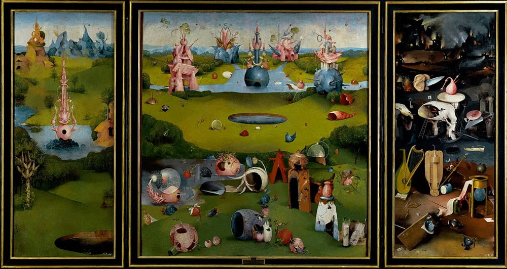
While it predates the COVID-19 pandemic and its accompanying social distancing by several years, José Manuel Ballester’s Concealed Spaces project reimagines iconic works of art without the people in them (like what’s happening to our public spaces right now). No one showed up for Leonardo’s Last Supper:
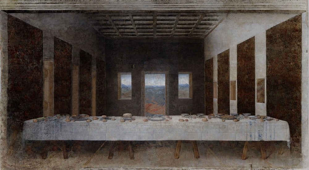
Hieronymus Bosch’s The Garden of Earthly Delights is perhaps just as delightful without people:
And Botticelli’s The Birth of Venus has been rescheduled:

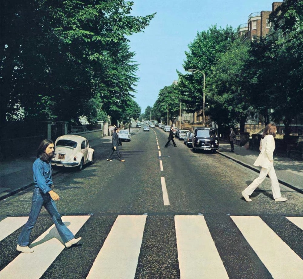
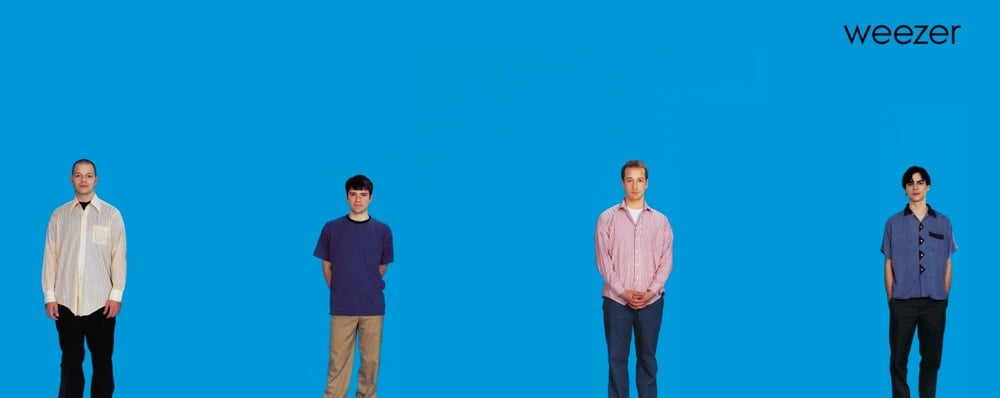
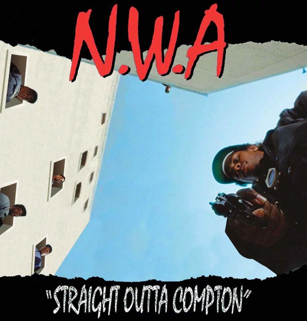
Ben Greenman, Andy Baio, and Paco Conde & Roberto Fernandez have some suggestions for new album covers:
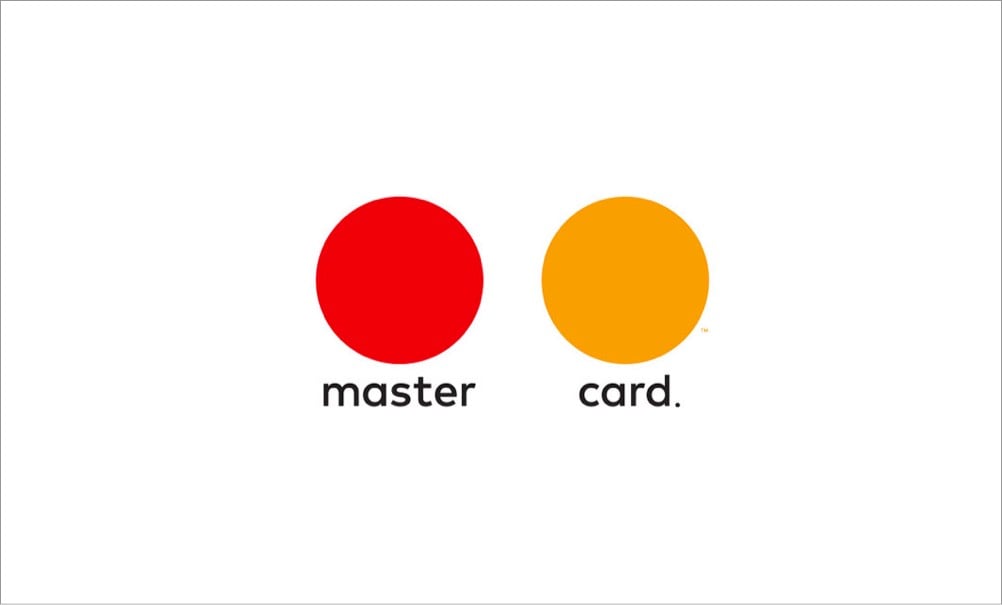
Designer Jure Tovrljan redesigned some company logos for these coronavirus times.


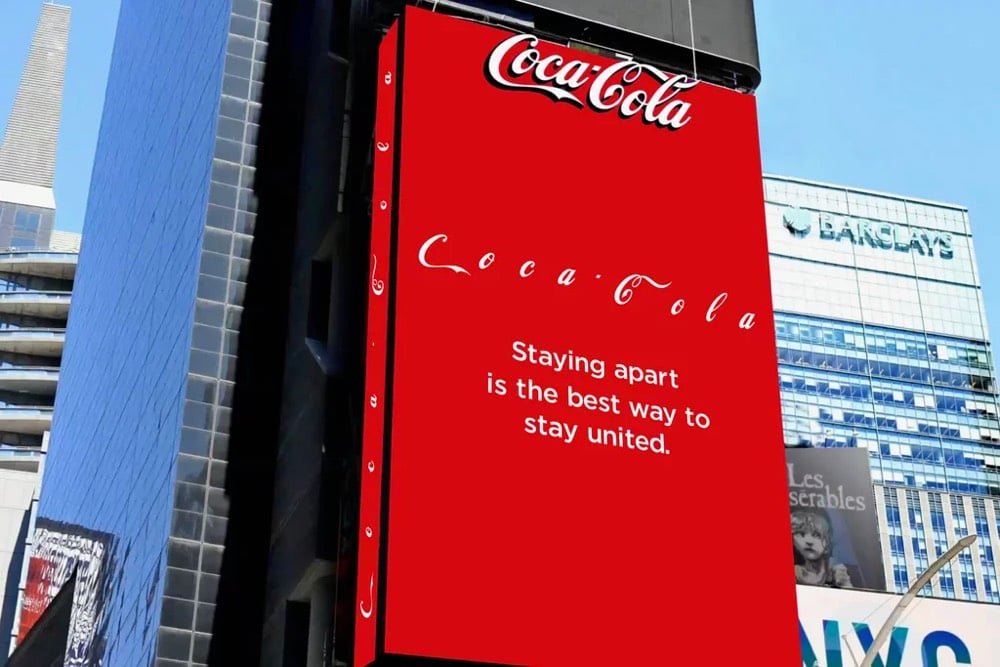
Coca-Cola even modified their own logo on a Times Square billboard to put some distance between the letters.
(via colossal & fast company)
Update: Some emoji designed specifically for COVID-19. The Earth with the pause button is my favorite. (via sidebar)
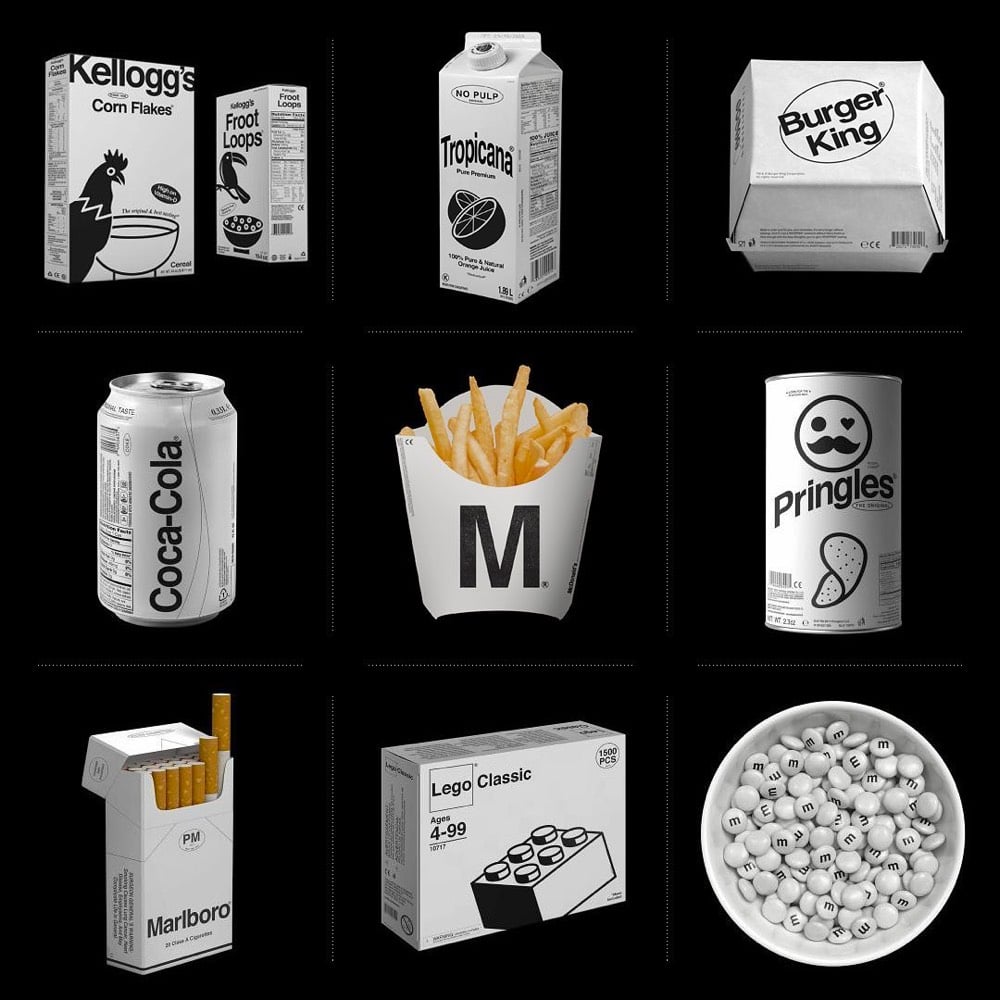


Designer Kunel Gaur, head of a creative agency called Animal, has redesigned the packaging for several familiar brands using minimal black & white graphics and unadorned typography. The designs don’t seem to be collected in one place, so you’ll have to poke around his Instagram to find them.
That LV bag actually looks like something Virgil Abloh would design — it would sell like hotcakes. Dye it millennial pink and you’ve got a freaking worldwide sensation. Fashion design is so easy!! (via moss & fog)

For New York Apartment, an art project commissioned by The Whitney, artists Sam Lavigne and Tega Brain compiled actual NYC real estate listings into a listing for one mega apartment for sale.
Compiled from actual online real estate listings, the artwork collapses the high and low ends of the market, architectural periods and styles, and neighborhoods and affordability into a single space that cumulatively creates a portrait of New York’s living spaces and the real estate market. Like a standard real estate ad, the listing shows the price, number of bed- and bathrooms, and square footage, all of which are updated weekly based on the city’s aggregated real estate listings.
Take some time to explore the project — take the 3D virtual tour, scroll through all of the bathrooms & closets, peruse the apartment features, and take the video tour:
Do you crave brilliant sunshine and the peace Zen behind closed doors at home, and the bustle and excitement of the big city at your doorstep?
Do you dream of a Manhattan life?
Do you dream of Brooklyn living with Manhattan in reach?
Do you have a thing for top floor apartments?
Do you have vision?
Do you like light?
Do you love to cook?
Do you love to entertain?
Do you need lots of closet space?
Do you own or plan to buy a car?
Do you prefer simple shaker style wood cabinets with solid surface counters or custom lacquer cabinets paired with a travertine marble?
Do you want a home just steps to the beach?
Do you want Katz Deli, Russ and Daughters or maybe some Economy Candy?
Contact information for all of the brokers is listed on the site in case you’re interested.


For his Cartoon Fossils series, Filip Hodas used 3D modelling software to create fossilized skulls of cartoon characters like Scrooge McDuck, Tweetie Bird, Minnie Mouse, and Goofy.
These remind me of Michael Paulus’s Character Studies, drawings of the skeletons of the likes of Lucy from Peanuts, Betty Boop, Marvin the Martian, and Pikachu. I have his Hello Kitty drawing hanging in my living room, purchased after Leslie Harpold pointed me towards his work back in the day. (via colossal)
Animator Pinot Ichwandardi, designer/illustrator Dita Ichwandardi, and their three young children decided to remake some of the iconic scenes from the Spider-Man: Into the Spider-Verse trailer using traditional animation techniques. You can see some of the process and the impressive results in the video above. They drew the scenes by hand, built their own multiplane camera setup (a la Disney), and constructed a camera rig using Lego. You can read more about their process in these two Twitter threads: one, two.
After they were done, Sony Animation invited the family to visit their California campus to meet some of the team that worked on the movie, including producers Phil Lord and Chris Miller.
See also How Animators Created Spider-Verse.
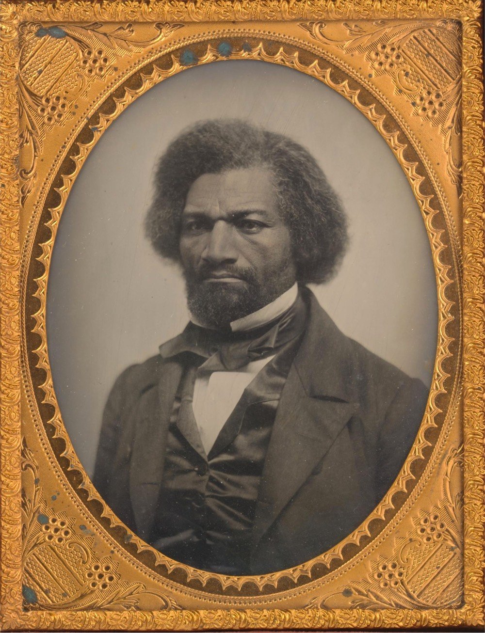
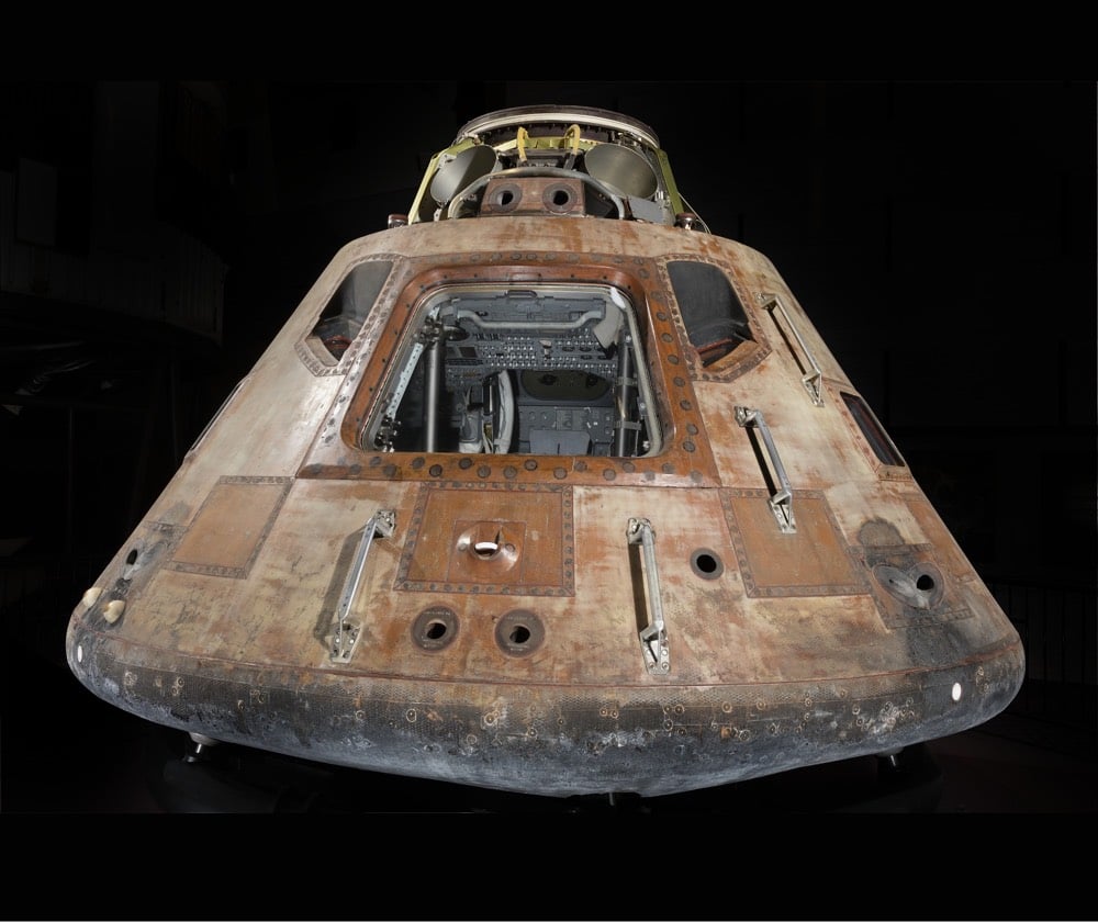

The Smithsonian Institution has released a massive trove of images and 3D models from their collections into the public domain, allowing the public to use the images however they see fit. From Smithsonian Magazine:
For the first time in its 174-year history, the Smithsonian has released 2.8 million high-resolution two- and three-dimensional images from across its collections onto an open access online platform for patrons to peruse and download free of charge. Featuring data and material from all 19 Smithsonian museums, nine research centers, libraries, archives and the National Zoo, the new digital depot encourages the public to not just view its contents, but use, reuse and transform them into just about anything they choose — be it a postcard, a beer koozie or a pair of bootie shorts.
And this gargantuan data dump is just the beginning. Throughout the rest of 2020, the Smithsonian will be rolling out another 200,000 or so images, with more to come as the Institution continues to digitize its collection of 155 million items and counting.
Part of the release is research data sets, 3D models of airplanes, chairs, and fossils, and developer tools like an API and GitHub repository. Here’s the Smithsonian’s official press release and a FAQ about the Open Access collection.

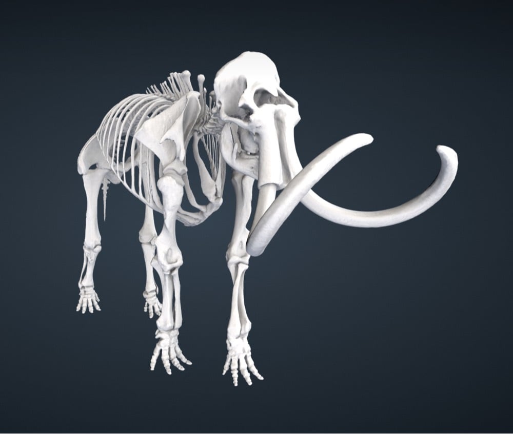
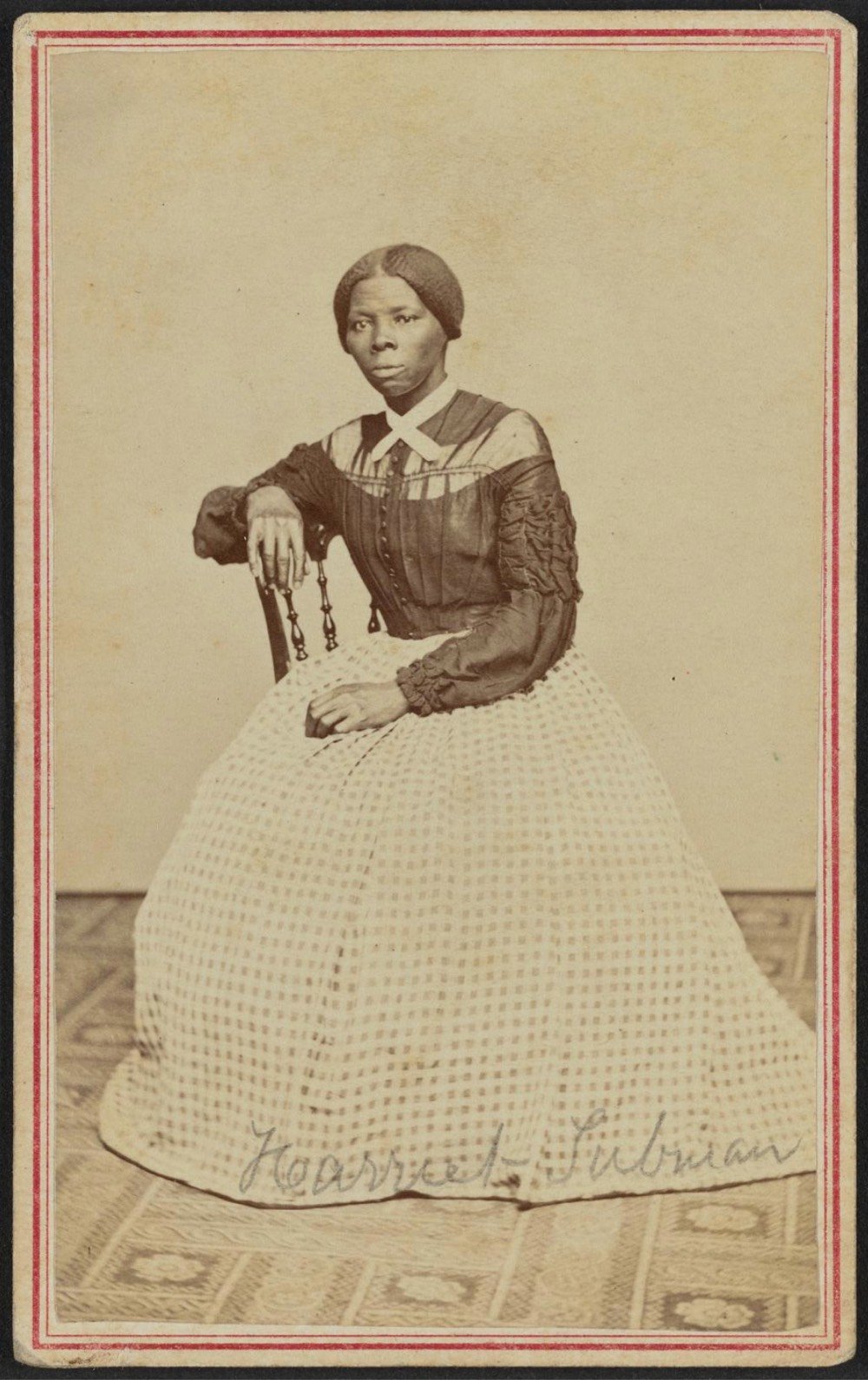

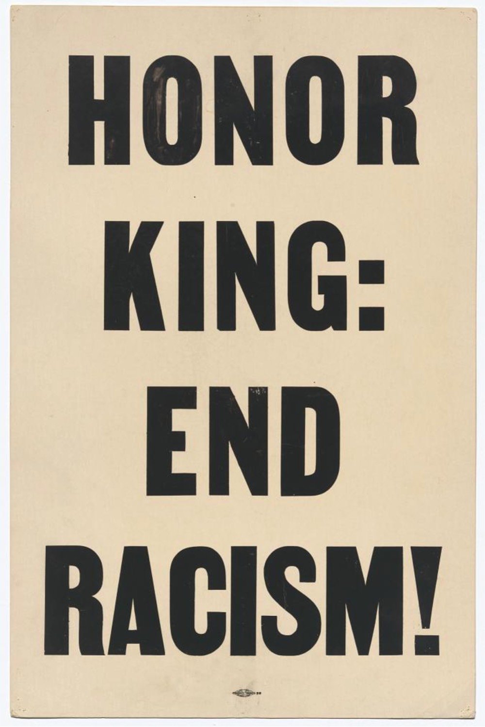
The images above are (from top to bottom): photograph of Frederick Douglass, 3D model of the Apollo 11 Command Module, inverted Curtiss Jenny stamp, 3D model & photographs of a tin of Madame C.J. Walker’s Wonderful Hair Grower, 3D model of a mammoth skeleton, carte-de-visite portrait of Harriet Tubman, 3D model of the 1903 Wright Brothers Flyer, a placard carried in the 1968 Memphis march.
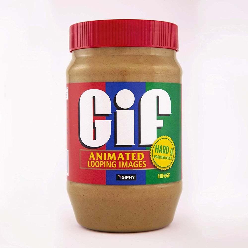
Online image emporium Giphy has partnered with Jif (the peanut butter people) to offer a limited edition jar of peanut butter with a dual-sided label: one side features the soft-G pronunciation of Jif and the other side the correct hard-G pronunciation of GIF. You can purchase a jar on Amazon. (via @waxpancake)
For her video “The Real Thing”, filmmaker Julianna Villarosa used footage of Coca-Cola’s famous “I’d Like to Buy the World a Coke” commercial ruined by pouring Coke on VHS and film copies to draw attention to the company’s water privatization practices in Chiapas, Mexico, where there’s a water shortage on. From the video:
The Chiapas Highlands, one of Mexico’s wettest regions, has a water shortage. Many drink Coca-Cola, which is bottled nearby and often easier to find than clean water. On average, residents drink more than half a gallon of soda per day. Indigenous Tzotzil use Coca-Cola in religious ceremonies and medicinal treatments. Diabetes has become the second-leading cause of death in Chiapas. The local Coca-Cola plant extracts more than 300,000 gallons of water per day.
Simple, direct, and brilliant activist art — Villarosa uses the company’s literally corrosive product to physically destroy their feel-good advertising to draw attention to the real harm this US company is doing to people & ecosystems around the world. Here’s more on the Chiapas region and the residents’ reliance on Coke:
Coca-Cola’s penetration of the market in Los Altos has also been aided by a strategy of charging less in remote rural areas where a Coke in a returnable glass bottle is often scarcely more expensive than bottled water. As in most of Mexico, clean drinking water is not generally available even to those who can count on running water in their homes, which means many turn to soft drinks for basic hydration.
The irony of this is clear in an area known for its constant downpours and abundant springs, such as the one that attracted the Coca-Cola bottling company. Local activists say the company has so overexploited the spring that the city of San Cristóbal is now facing water shortages.
The activists allege this has been possible in part because Coca-Cola has friends in high political places. Between 2000 and 2006 the country’s president was Vicente Fox, a former head of Coca-Cola Mexico.
It all adds up to a perfect storm of sugar-related health issues in Los Altos. María del Socorro Sánchez, who is in charge of nutrition at the main hospital in San Juan Chamula, says only about one in 10 of the indigenous patients with diabetes accept there is any need to cut out sugar-packed drinks. “They just don’t believe that it is bad for them,” she said.
(via the morning news)

From artist Nanan Kang, Corn with a Pearl Earring. I have a bit of a thing for riffs on Vermeer’s masterpiece. See also Girl with a Pearl Earring and Point-and-Shoot Camera, The Girl with the Grande Iced Latte, Rihanna with a Pearl Earring, Girl with a Pearl Earring at the beach, and a Lego version of the painting. (via colossal)
Update: This is fun (courtesy of @jschulenklopper):
In Dutch (Vermeer’s native language) this one is even better. The original painting is called “Meisje met de parel” in Dutch, and corn is “mais”. So this one could be named “Maisje met de parel” which is pronounced almost identically.
From DJ Mike 2600, a YouTube series called Songs That Sound The Same.
My hit series of DJ videos exploring pairs of songs that aren’t direct covers or rip-offs, but have similar melodies, riffs, or chord progressions and just fit together nicely.
Each video is about a minute long and features him playfully mixing two or more songs together that sound very similar. Here’s one of the early episodes, featuring Hot Fun in the Summertime by Sly & the Family Stone and Misunderstanding by Genesis:
T.I.’s Whatever You Like and Zombie by The Cranberries:
Whomst among us wouldn’t go nuts if the DJ laid this down at the club — M83’s Midnight City & Rihanna’s Diamonds:
And this one made me LOL — Draggin’ the Line by Tommy James mixes really well with the Baby Back Ribs song from the Chili’s commercial:
What a great combination of creativity and craft. Watching stuff like this always makes this non-musical person want to make some music. (via @hoodinternet)
This deepfake video of Back to the Future that features Robert Downey Jr. & Tom Holland as Doc Brown & Marty McFly is so convincing that I almost want to see an actual remake with those actors. (Almost.)
They really should have deepfaked Zendaya into the video as Lorraine for the cherry on top. Here’s an earlier effort with Holland as Marty that’s not as good.
In 1996, Dancing Baby was one of the earliest big memes to cross over from the nerd space of Usenet to the wider population; it even appeared on the popular TV show Ally McBeal. 18-year-old English college student Jack Armstrong, born more than 5 years after the meme debuted, decided to digitally remaster the original in 1080p and 60FPS:
Armstrong shared how he tracked down the original 3D file on Twitter. (via waxy)
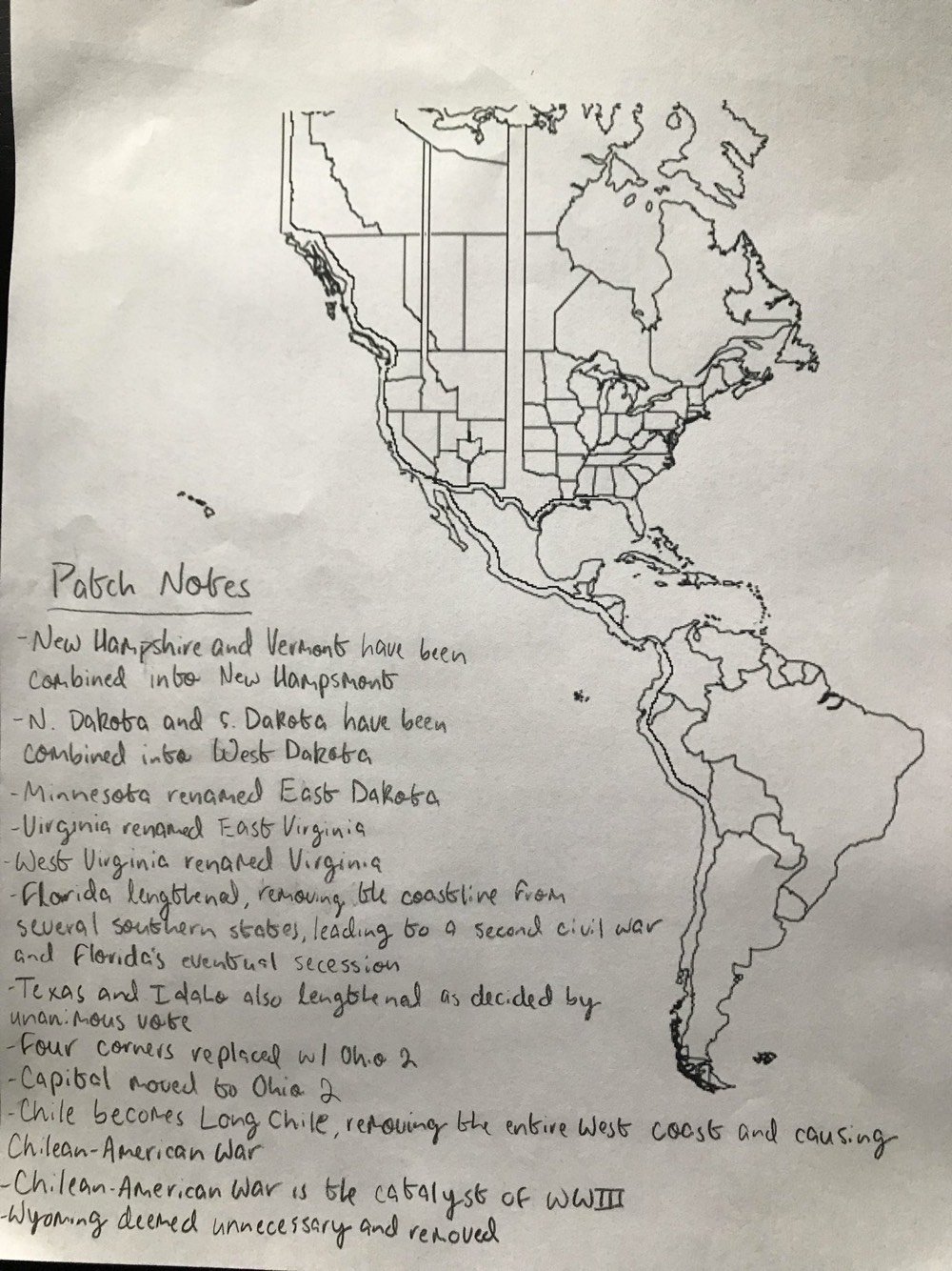
Long-time readers know that I like me some maps and in particular hand-drawn/homemade maps and maps of alternate realities. So I was charmed by Anna Calcaterra’s alternate map of the Americas, which features geographic entities like Long Chile, Ohio 2 (“Four Corners replaced w/ Ohio 2”), and East Dakota (RIP Minnesota). The kids are alright, y’all.
The premise is pretty simple and there’s no need to oversell it because you can imagine what this is going to sound like going in and it delivers perfectly: George Costanza’s father’s voice dubbed over Darth Vader’s dialogue in Star Wars. Serenity now!
(Quickly: Luke = Jerry, Han = George, Leia = Elaine, Chewie = Kramer. Does that even work? (Obi-Wan = Uncle Leo? Is 3PO Newman?))
I bet you never noticed that South America can kind of approximate most of the world’s other continents pretty well. XKCD’s Randall Munroe did and made a bad map projection of it.

This is only slightly worse than the Mercator projection tbh.
Although the announced Disney+ series about Obi-Wan Kenobi may shed some light on the matter, we don’t know too much about what “Ben Kenobi” was up to on Tatooine after the events of Revenge of the Sith, besides keeping an eye on Luke. This short film made by a group of Star Wars fans as a “love letter” to the series shows what may have happened after the Empire makes its presence known when Luke is just a young boy. (via kevin kelly)
The audience for Greta Gerwig’s Little Women is running about 2/3 women and 1/3 men. Bruce Handy has some suggestions for a title change that would entice more men to check the movie out.
“Star Wars, Episode X: The Rise of Amy”
“Four Girls, One Teacup”
“Into the Marchverse”
“The Jo Supremacy”
I saw Little Women on New Year’s Day and loved it — one of my favorite 2019 movies for sure. It’s idiotic that Gerwig didn’t get nominated for a Best Director Oscar.
See also Kaitlyn Greenidge’s opinion piece, The Bearable Whiteness of ‘Little Women’.
Including special shows, Mister Rogers’ Neighborhood ran for 912 episodes and at the beginning of each one, Rogers sang “Won’t You Be My Neighbor?” while putting his sweater on and changing his shoes. In the video above, you can compare his rendition of the song from the first episode (February 19, 1968) and the final episode (August 31, 2001). It would take a significant effort (and might actually be impossible because he sings the song at a different pace each time), but I’d love to see someone cut together a version of this that features all 912 openings strung together chronologically, so you can see Rogers get older as he sings (a la Noah Kalina’s Everyday).
The same YouTube channel also edited together the first and last times Rogers sang “Good Feeling”:
(via open culture)
This video catalogs every borrowed sample from Paul’s Boutique by the Beastie Boys, from the soundtrack to Car Wash to the Sugarhill Gang to the Eagles to the Ramones to the Beatles. They play the original first and then what they did with it on the album.
Somehow this video only has 31,000 views?! You can also listen to this remix of Paul’s Boutique on Soundcloud, which combines the source tracks with Beastie Boys vocals and some audio commentary.
Tim Carmody made a Spotify playlist of all the sampled songs or you can download zip files of the original songs sampled in Paul’s Boutique and five of their other albums.
They just don’t make ‘em like this anymore, mostly because clearing all of the samples would be prohibitively expensive if not impossible.
Hip-hop sampling began as a live technique, with DJs working turntables at parties and clubs. Whether it was strictly legal or not, nobody was going to try to sue anyone about it. As the genre’s popularity grew, people naturally started recording performances and releasing them as albums. Early sampling tended to come fast and furious. In the ’80s, short clips of existing recordings were the order of the day, often — as in the case of the Beastie Boys — lots of them, layered and shuffled in a clearly creative way. As hip-hop pushed further into the mainstream, however, the stakes got bigger and so did the samples.
1990 saw the release of both M.C. Hammer’s “U Can’t Touch This” and Vanilla Ice’s “Ice, Ice, Baby.” Not only did both songs sample, they each relied heavily on one particular sample — the baselines from Rick James’ “Superfreak” and Queen and David Bowie’s “Under Pressure” — for their main hook. Both hits resulted in legal controversy.
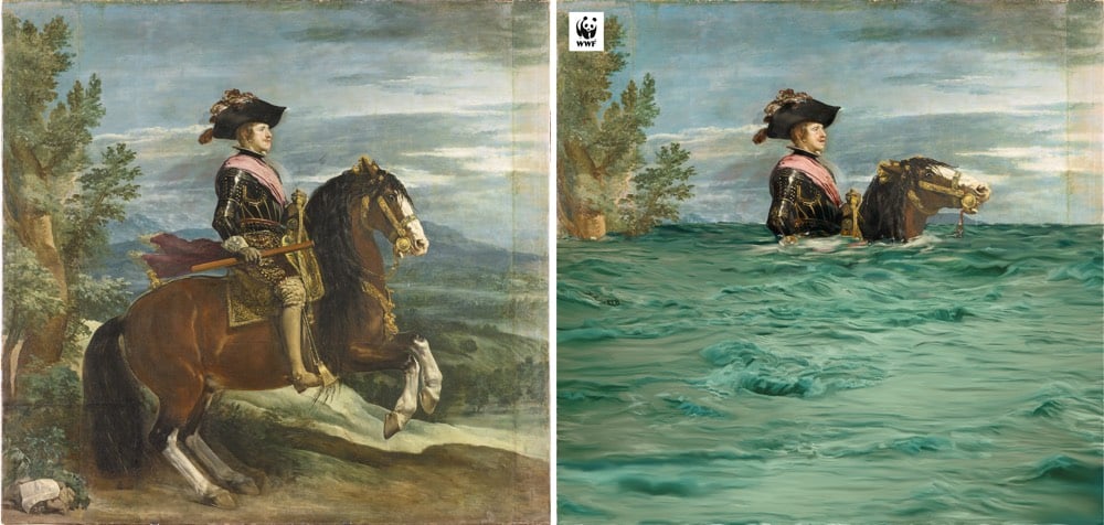
In collaboration with the Prado Museum in Madrid, the World Wildlife Fund altered a few paintings from the museum’s collection to highlight the future effects of climate change: extinction of species, sea level rise, desertification, and climate refugees.
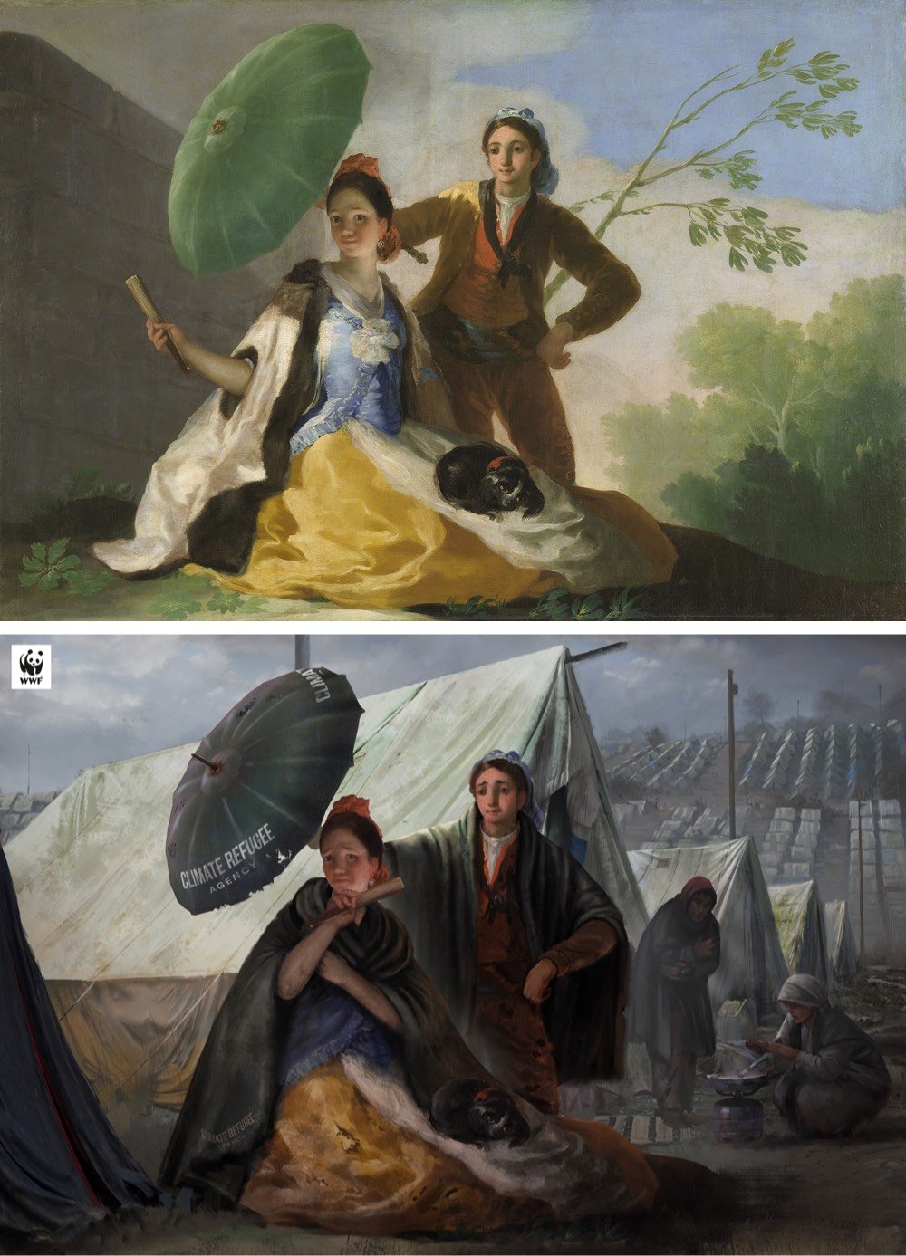
(via open culture)
This is a little slice of genius right here, a mashup of Radiohead’s Creep and Mariah Carey’s All I Want for Christmas is You. It takes a little bit to get going but I LOL’d when the vocals finally came in.
I have to say though that it’s not quite as entertaining as this All I Want for Christmas / This Is America combo, which might actually be the best thing on the internet.
This video of the familiar tune of Pachelbel’s Canon being played by different clips of train horns all edited together is both funny and charming. If you need a little pick-me-up right now, this should do the trick. Watch for the celebrity cameo around the 1:00 mark. (via the kid should see this)
For his Ornitographies project, Xavi Bou takes photographs of birds and stitches them together into single images so that you can see their flight paths through the sky.


My guest editor Patrick briefly shared one of Bou’s images on his exit post a couple of weeks ago, but I thought they were worth another look.
When Neil Armstrong and Buzz Aldrin landed safely on the Moon in July 1969, President Richard Nixon called them from the White House during their moonwalk to say how proud he was of what they had accomplished. But in the event that Armstrong and Aldrin did not make it safely off the Moon’s surface, Nixon was prepared to give a very different sort of speech. The remarks were written by William Safire and recorded in a memo called In Event of Moon Disaster.
Fifty years ago, not even Stanley Kubrick could have faked the Moon landing. But today, visual effects and techniques driven by machine learning are so good that it might be relatively simple, at least the television broadcast part of it.1 In a short demonstration of that technical supremacy, a group from MIT has created a deepfake version of Nixon delivering that disaster speech. Here are a couple of clips from the deepfake speech:
Fate has ordained that the men who went to the moon to explore in peace will stay on the moon to rest in peace.
The full film is being shown at IDFA DocLab in Amsterdam and will make its way online sometime next year.
The implications of being able to so convincingly fake the televised appearance of a former US President are left as an exercise to the reader. (via boing boing)
Update: The whole film is now online. (thx, andy)
Using almost 1300 photos from Instagram of iconic/stereotypical shots of NYC, Sam Morrison spent 200 hours creating what he calls a crowdsourced hyperlapse video of the city. I love it. Reminds me a little of the old Microsoft application Photosynth, which could stitch together hundreds of online photos of, say, the Eiffel Tower or Golden Gate Bridge into a composite 3D image. (via a newly resurgent waxy.org)
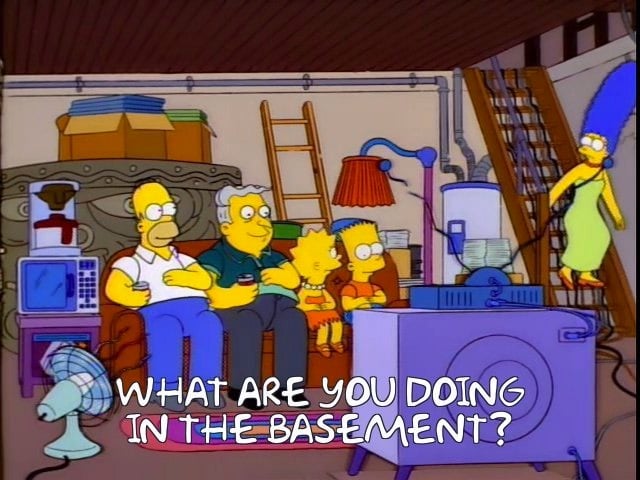
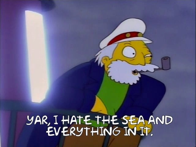
On Twitter, Hannah Woodhead posted a thread of screencaps from The Simpsons that uncannily encapsulate movies released in 2019. My two favorites are Parasite and The Lighthouse:
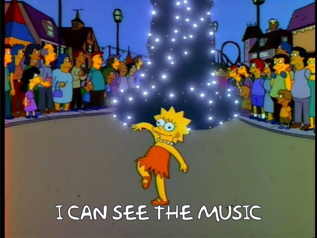
If you’d like, you can make your own using Frinkiac, the Simpsons screencap search engine. I did this one for Booksmart:
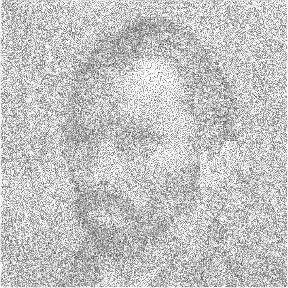

All art is bounded by one constraint or another. Mathematician Robert Bosch makes what he calls “optimization art”, which is best embodied by these images produced as solutions to the travelling salesman problem. Each image is made up of a continuous line that is the shortest possible route through a series of points without revisiting any single point, much like the optimal route of a travelling salesperson visiting cities. The rendition of a van Gogh self-portrait uses a solution for 120,000 “cities” while the single line forming the Girl with the Pearl Earring visits 200,000 cities.
I would love to see an Observable notebook where you could upload any photo to make images like these. (via @Ianmurren)
Newer posts
Older posts




Socials & More