A list of 63 must-have grunge fonts. Back
A list of 63 must-have grunge fonts. Back in 1996, this would have been my thing. Is grunge type coming back?
This site is made possible by member support. 💞
Big thanks to Arcustech for hosting the site and offering amazing tech support.
When you buy through links on kottke.org, I may earn an affiliate commission. Thanks for supporting the site!
kottke.org. home of fine hypertext products since 1998.
Beloved by 86.47% of the web.
A list of 63 must-have grunge fonts. Back in 1996, this would have been my thing. Is grunge type coming back?
The new design for UK coinage is fantastic.
As you can see in the image to the right, the Shield of the Royal Arms has been given a contemporary treatment and its whole has been cleverly split among all six denominations from the 1p to the 50p, with the £1 coin displaying the heraldic element in its entirety. This is the first time that a single design has been used across a range of United Kingdom coins.
This is my favorite bit of design so far this year. (via we made this)
Update: Jonathan Hoefler compares the new UK coins, designed by a first-time currency designer, to the new US five dollar bill.
Below, the new five dollar bill, introduced last month by the United States Department of the Treasury. The new design, which features a big purple Helvetica five, is the work of a 147-year-old government agency called the United States Bureau of Engraving and Printing. It employs 2,500 people, and has an annual budget of $525,000,000.
It looks like Purple Modernistan is invading the US from the southeast.
A golden oldie from Matt Jones in 2001: WebDogme.
Two Danish filmmakers, Lars von Trier and Thomas Vinterberg in 1995 responded to what they saw as the increasing inhumanity and formulaic commerciality of effects-heavy, franchise-friendly feature films. They created a vow of chastity that placed the stylistic presentation and formal tricks of film subservient to the narrative and characterisation.
WebDogme is an attempt to outline a similar approach for the web. kottke.org is doing pretty well on the rules…I’ve unwittingly followed 5 or 6 of them at least. I’d link to the original Dogme 95 manifesto, but the official web site does not adhere to WebDogme rule #3 (“The browser must not be violated”); the manifesto is hidden within a frame. (via preoccupations)
This is a surprisingly effective idea: using a Google Maps zoomable, scrollable interface to read magazines. (via information aesthetics)
Philippe Starck says that design is dead and that he’s retiring. Says Starck:
I was a producer of materiality and I am ashamed of this fact. Everything I designed was unnecessary. I will definitely give up in two years’ time. I want to do something else, but I don’t know what yet. I want to find a new way of expressing myself …design is a dreadful form of expression.
Comparison of old versions (5,10,12 years ago) of popular web sites (Yahoo, CNN, Starbucks) with the current versions. Here’s a comparison from a less popular site of your acquaintance. (via vitamin briefcase)
Short post about the favorite letters drawn by H&FJ type designers, including the awesomely named Sulzbacher Eszett character.
The designers at H&FJ are often asked if there are particular letters that we especially enjoy drawing. Office doodles testify to the popularity of the letter R, perhaps because it synopsizes the rest of the alphabet in one convenient package (it’s got a stem, a bowl, serifs both internal and external, and of course that marvelous signature gesture, the tail.)
I would love to see a collection of those office doodles.
Interesting gallery of Freakonomics book covers from around the world. I enjoyed the Turkish version — “just put a hot chick on the cover” — and the Penguin UK version.
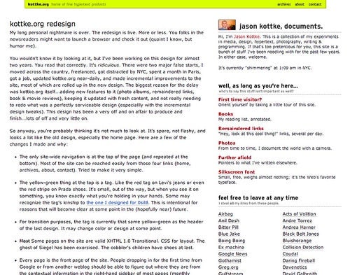
Three cities, two serious relationships, one child, 200,000 frequent flier miles, at least seven jobs, 14,500 posts, six designs, and ten years ago, I started “writing things down” and never stopped. That makes kottke.org one of a handful of the longest continually updated weblogs on the web…something to be proud of, I guess. The only thing I’ve done longer than kottke.org is sported this haircut. (Perhaps not something to be proud of…the hair-in-stasis, I mean.)
Being a digital packrat, I have screenshots of all the past designs the site has had. When I started, the posts were actually hosted on another site of mine, 0sil8, that I’d been doing since 1996. I didn’t know at the time that kottke.org would eventually kill 0sil8. This was the first design (full size):
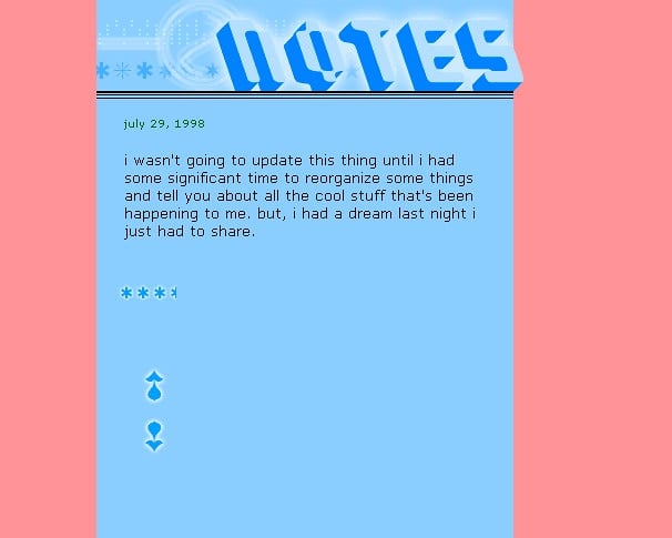
It’s a little misleading because there’s only one post shown on the page…there were usually more, displayed reverse chronologically. The stars were a rough rating of how well that day had gone called the fun meter.
When I moved the site to its own domain after a few months, I redesigned it to look like this (full size):
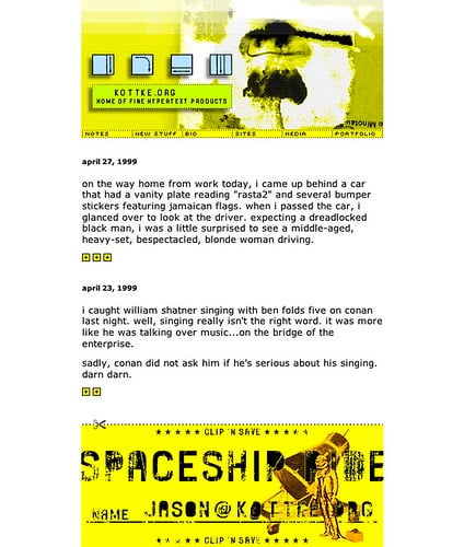
The aesthetic was influenced by the pixel grunge style of Finnish designer Miika Saksi…you can see some of his older work here. The font in the navigation is Mini 7…Silkscreen was still several months away at that point. The fun meter is still present as is the all-lowercase text, a house style I thankfully dropped a few months later. The cringeworthy writing took a few more years to iron out…if it ever fully was.
This one’s still my favorite; it turned a lot of heads back in the day (full size):
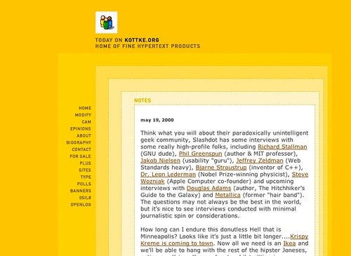
With dozens of spacer gifs and five concentric tables, it was a bitch to code. There was also a capability to modify the look and feel of the site…you could choose between this design, the older design pictured above, and a text-only version. Inline permalinks were introduced on kottke.org in March 2000 and subsequently the idea was spread across the web by Blogger.
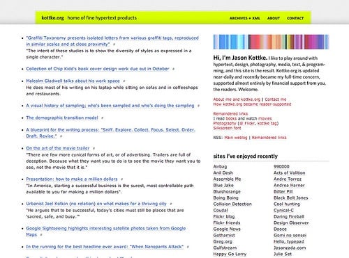
But it only lasted for about a year. In late 2000, I swapped it for this one (full size):
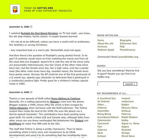
The familiar burn-your-eyes-out yellow-green makes its first appearance. I never really meant to keep it or for it to become the strongest part of the site’s identity. After this design launched, I cycled through a few colors (the old yellow, blue, red) before getting to the yellow-green…and then I just got lazy and left it. For 8 years and counting. The post style underwent several changes with this design. In June 2002, I switched to Movable Type after updating the site by hand for four years. Soon after that, I added titles to my posts. In late 2002, I added a frequently updated list of remaindered links to the sidebar. In late 2003, the remainders moved into the main column and have become an integral part of the site. I also started reviewing movies and books around this time…kottke.org became a bit of a tumblelog.
In July 2004, I refreshed the design a bit…tightened it up (full size):
After about a year, I changed it again to the current look and feel (full size):
Sorry, that got a little long…there’s a lot I didn’t remember until I started writing. Anyway, I didn’t intend for this to become a design retrospective. Mostly I wanted to thank you very sincerely for reading kottke.org. Over the last ten years, I’ve poured a lot more of myself than I’d like to admit into this site and it’s nice to know that someone out there is paying attention. [Cripes, I’m choking up here. Seriously!] Thanks, and I’ll see you in 2018.
If you can ignore the stupid one-logo-per-page interface, check out the 25 best band logos.
The Photoshop Disasters blog catalogs missteps in photo retouching and graphic design. The most recent post shows the cover of a Nintendo DS game that has an embarrassingly invisible iStockPhoto watermark on it. The three-handed lady is my favorite.
Good Thangs. It’s like Martha Stewart. But different.
Scott King: How I’d Sink American Vogue. His approach would include stories like “How To Dress Angry”, “635 Poor People Upside Down!”, and “Karl Lagerfeld Discusses Various Cancers”, as well as a 14-page advertisement-free issue.
Interview with Susan Bradley, who did some graphic design and designed a typeface for Pixar’s Ratatouille. I enjoyed her response when asked about “one thing everybody should do today”:
Something backwards or something analog you’d normally computerize.
You can find out more about Susan on her site. (via waxy)
On view at MoMA through May 12, 2008: Design and the Elastic Mind.
In the past few decades, individuals have experienced dramatic changes in some of the most established dimensions of human life: time, space, matter, and individuality. Working across several time zones, traveling with relative ease between satellite maps and nanoscale images, gleefully drowning in information, acting fast in order to preserve some slow downtime, people cope daily with dozens of changes in scale. Minds adapt and acquire enough elasticity to be able to synthesize such abundance. One of design’s most fundamental tasks is to stand between revolutions and life, and to help people deal with change.
I was surprised at how many of the show’s ideas and objects I’d seen or even featured on kottke.org already. But getting there first isn’t the point. The show was super-crowded and I didn’t have a lot of time to look around, but here are a couple of things that caught my eye.
Michiko Nitta’s Animal Messaging System (AMS), part of a larger project she did called Extreme Green Guerillas. The basic idea of the AMS is to use the radio ID tags worn by migratory animals to send messages from place to place. Nice map.
Molecubes are self-replicating repairing robots. Video here.
And I’ve been looking for Brendan Dawes’ Cinema Redux project for several months now…most recently I wanted to include his work in my time merge media post.
Using eight of my favourite films from eight of my most admired directors including Sidney Lumet, Francis Ford Coppola and John Boorman, each film is processed through a Java program written with the processing environment. This small piece of software samples a movie every second and generates an 8 x 6 pixel image of the frame at that moment in time. It does this for the entire film, with each row representing one minute of film time.
For more, check out the online exhibition (designed by Yugo Nakamura and THA Ltd, the folks behind FFFFOUND!). Thanks (and congratulations!) to Stamen for hosting a tour of the exhibition.
Paula Scher argues that the design of advertising has gotten a lot better in recent years but that the graphic design community isn’t paying too much attention.
I’m not sure that the graphic design community as a whole is paying any attention to this. I don’t see very many speakers from the advertising community invited to speak at design conferences (except for the very few who lead branding groups at agencies and in some circles they are still considered the enemy). I don’t read about it on design blogs, and I’m not seeing books published about it. I’m not seeing advertising, in any form, turn up in any design museum exhibitions, not at the Modern, not at the Cooper-Hewitt. The Cooper-Hewitt National Design Museum has an annual designer award category for Communication Design and I’ve never seen an advertising person nominated since the award’s inception.
(via quipsologies)
Interview with book cover designer Peter Mendelsund. I will read any interview in which the subject replies “I still don’t know” when asked how they got their job. I really like what I’ve seen of Mendelsund’s work (sorry…his site resizes the browser window…no, wait, I’m not sorry, *he* should apologize for that); his cover for War and Peace is lovely.
Nice design of a lens cleaning tissue packet.
Firstly, there’s a thumbprint placed at the bottom where they want you to put your thumb so that the tissues don’t fly away in the wind when you open it up. The thumbprint is in blue, as if it had been manually printed in finger-print ink directly onto the card.
Some really nice looking stamps done in the style of Otl Aicher.
Slideshow of lobby cards from a collection assembled by late screenwriter Leonard Schrader. Here’s a companion article about the collection’s discovery.
Screenwriter Leonard Schrader’s secret collection consisted of lobby cards, which were used to promote films in movie theaters from the silent era through the 1960s. Typically issued as a set of eight sequential 11”-by-14” mini-posters depicting scenes from a film, they pre-dated trailers as a promotional device. They were low tech even by 20s standards, but in a black-and-white era, they made up for it with their flashy graphics, riotous colors, and over-the-top salesmanship.
Much more about lobby cards and Schrader’s collection here.
The winners of this year’s DWR’s Champagne Chair Contest have been announced. The winning chairs are more professionally designed as the years go on.
Which actors would play the designers in Graphic Design: The Movie? Maybe Phillip Seymour Hoffman as Michael Bierut, Massimo Vignelli played by Sean Connery (Connery won’t do the Italian accent though), and Julie Christie as Paula Scher.
The New Yorker’s Eustace Tilley Contest just ended. Contestants were asked to design their own version of the New Yorker’s monocled mascot; here are all the entries. The winner will be announced on Feb 4. (via waxy)
Build your own Apple Store. Oobject tracked down the materials, furniture, fixtures, and finishes used in the Apple Stores, giving anyone enough information to turn their living room into one.
A video and accompanying text from Edward Tufte on Interface Design and the iPhone.
Update: Christopher Fahey posted a thoughtful critique of Tufte’s iPhone thoughts.
I feel like this happens to a lot of authors…the covers of their books end up being the opposite of what they should be.
Emigre is posting some essays from the back issues of its dearly departed magazine.
If you’re curious as to what designers mean when they talk about design, check out Paola Antonelli’s talk from last year’s TED conference. (BTW, TED has made publicly available a great number of talks from their conferences…like 40-50 hours of material.)
Grading the world’s flags. Gambia is a surprise #1. (via marginal revolution)
Socials & More