kottke.org posts about art
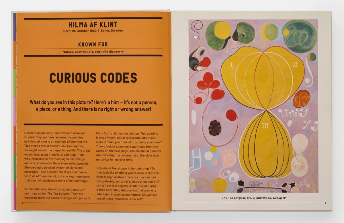
Phaidon has released a new version of their classic The Art Book for Children. Aimed at kids aged 7-12, the new version includes a selection of contemporary artists alongside familiar favorites.
This single volume features 60 artists through a wide range of large-scale, full-page reproductions of their artworks, including paintings, photographs, sculptures, video, prints, and installations from across time and space. Each page showcases defining artworks by the artists, combined with an interactive and informative conversation, giving relatable and memorable contexts for children, and inspiring a curiosity and appreciation for the Visual Arts that will continue into adulthood.
I’ve grown to love art as an adult but I don’t remember ever noticing or caring about any art when I was a kid. If this book had dropped into the lap of a young Jason, I wonder if it would have sparked anything?
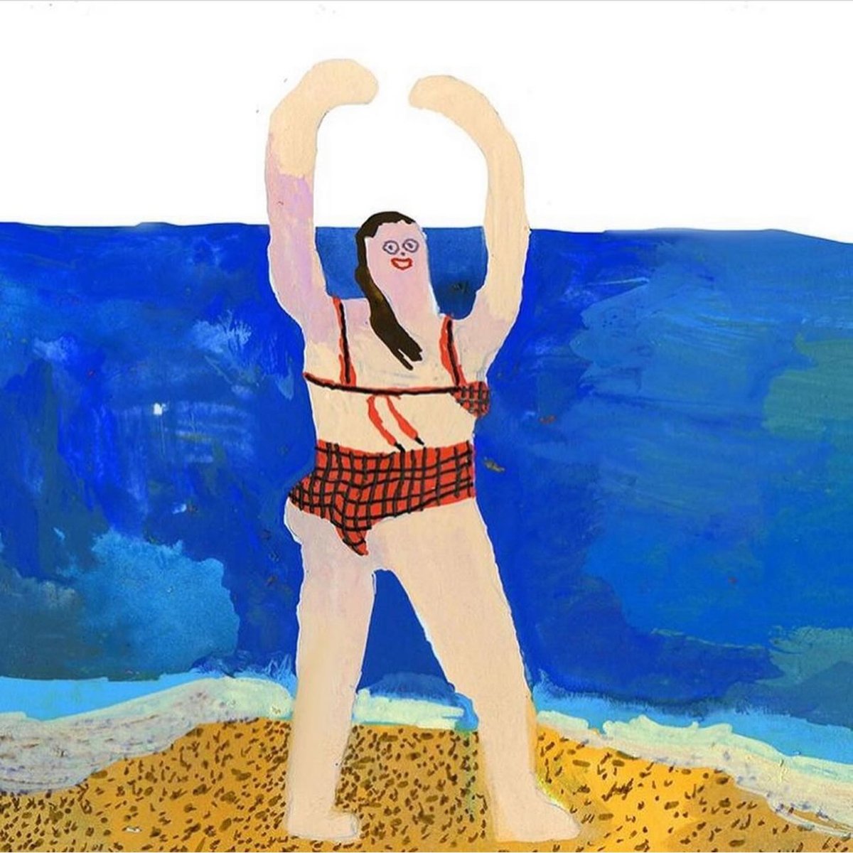
“who else is ready to get beat tf up by the ocean?” asks artist Tara Booth on Instagram. (If you click through, it’s a whole mini-story.)
More of Booth’s awesome work can also be found on her website. Is this the day I buy her art on a tote bag? Or a hoodie? Or a pillowcase?
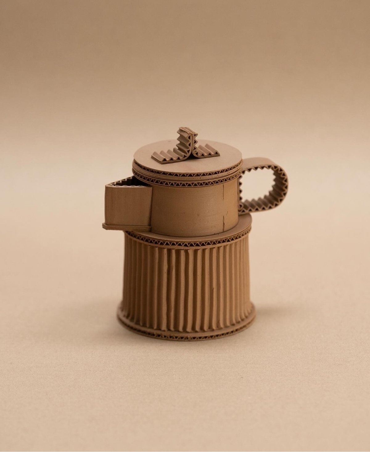
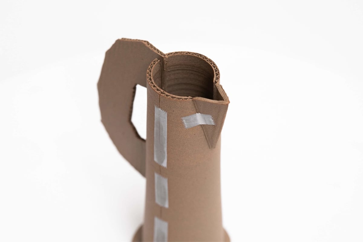
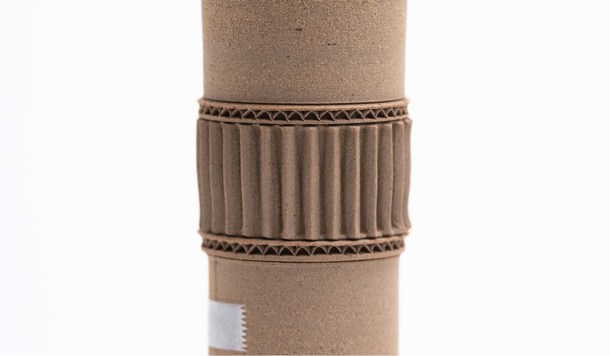
French potter Jacques Monneraud makes ceramic pots that look like teapots, vases, and pitchers made from cardboard and scotch tape. He offers these pots for sale, but they’re unsurprisingly sold out right now. More about Monneraud & his work on his website and Instagram. (via @presentandcorrect)
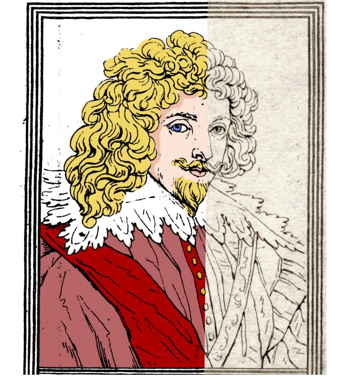
Hosted by the New York Academy of Medicine, #ColorOurCollections is a yearly assemblage of coloring books sourced from the collections of museums and libraries. You can download this year’s coloring books (as well as those from past years) for free from the website. (via open culture)
Bradley Hart creates pointillist paintings by painstakingly injecting acrylic paint into the individual bubbles in bubble wrap. The paint leaks out of the bubbles and onto a canvas backing, which also becomes part of the creative output (which he calls the “impression”). Here’s Hart’s version of Picasso’s Le Rêve, bubble wrap and impression:
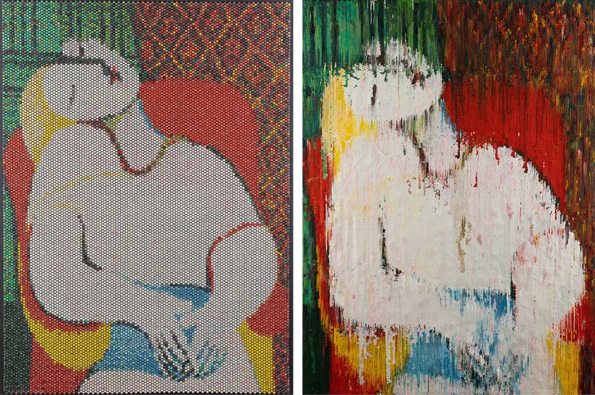
And here’s Georges Seurat’s A Sunday on La Grande Jatte:
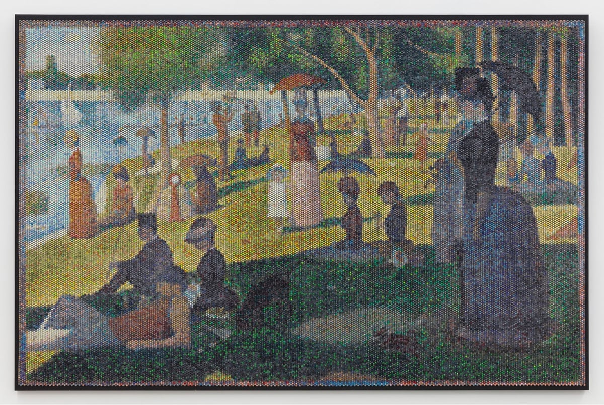
And the impression:
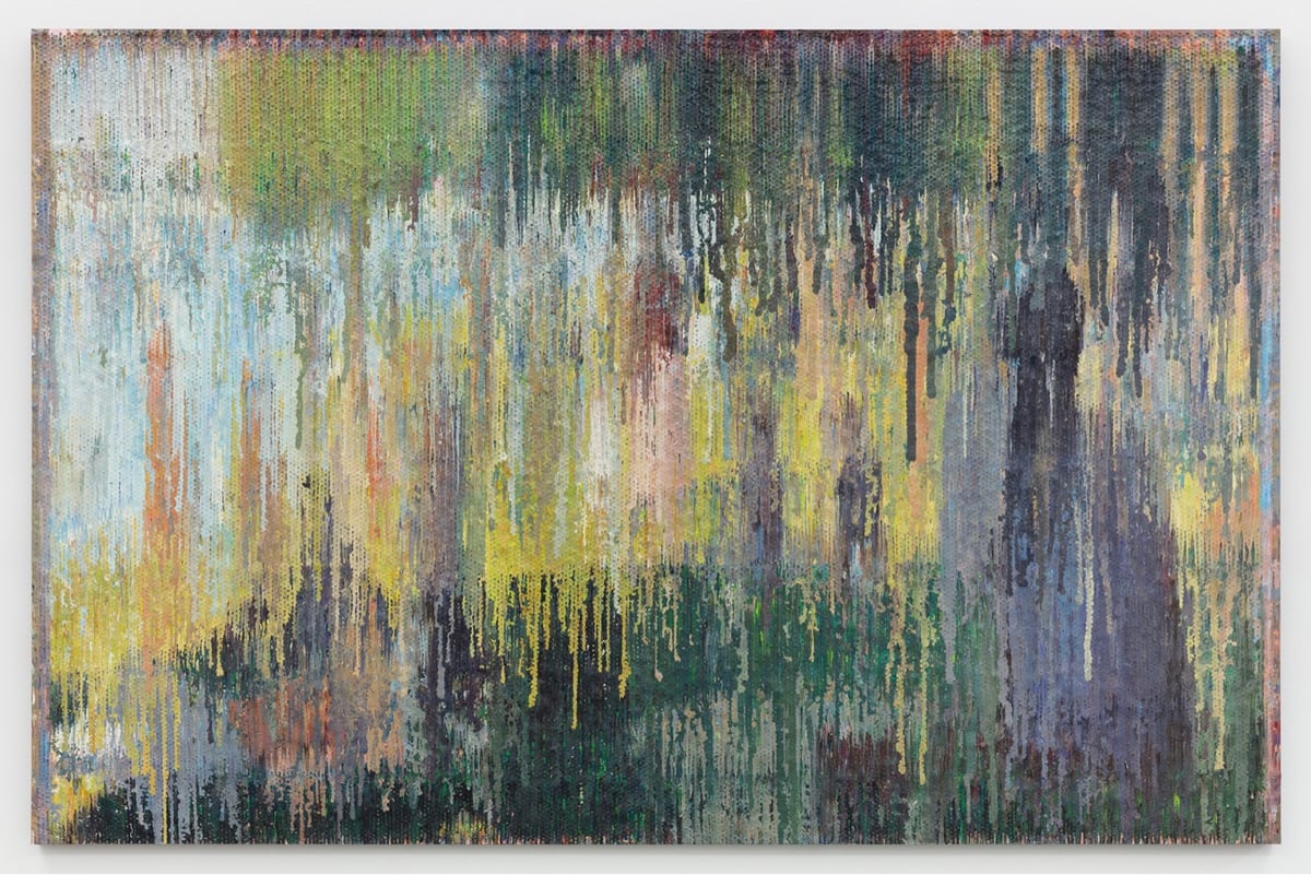
From Hart’s artist’s statement:
The bare bubbles in the bubble wrap reference dots or pixels, echoing various movements in art history and other media, including pointillism, screen-printing, TVs and LCD monitors. In today’s world people do not print their pictures for an album. Their albums are on Facebook, Flickr and Instagram, all exotic rote, yet combinations of 1’s and 0’s. The process of injecting paint into bubble wrap directly references pixilation (and those 1’s and 0’s) and at the same time harkens back to the time of family portrait painting, when a family’s personal “photo” album consisted of paintings hanging on its walls.
It’s such a genius idea to use the backing canvas as a separate artwork — I love that. (via clive thompson)
Ok, this is super freaky: this is a regular analog piano being played by a computer-controlled mechanical machine and it sounds like a person speaking. If you hadn’t seen this before, (it’s from 2009) take a listen:
Deus Cantando is the work of artist Peter Ablinger. He recorded a German school student reciting some text and then composed a tune for the mechanical player to sound like the recitation. I cannot improve upon Jason Noble’s description of the work:
This is not digital manipulation, nor a digitally programmed piano like a Disklavier. This is a normal, acoustic piano, any old piano. The mechanism performing it consists of 88 electronically controlled, mechanical “fingers,” synchronized with superhuman speed and accuracy to replicate the spectral content of a child’s voice. Watching the above-linked video, it may seem that the speech is completely intelligible, but this is partially an illusion. The visual prompt of the words on the screen are an essential cue: take them away, and it becomes much harder to understand the words. But it is still remarkable that the auditory system is able to group discrete notes from a piano into such a close approximation of a continuous human voice, and that Ablinger was able to do this so convincingly using a conventional instrument (albeit, played robotically).
This is so cool, I can’t believe I’d never seen it before. (via @roberthodgin)
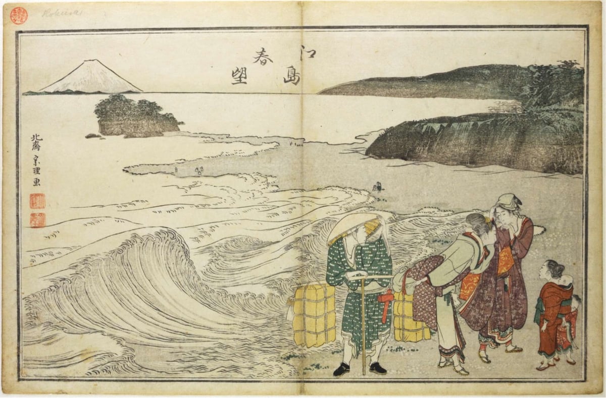
The Great Wave off Kanagawa by Katsushika Hokusai is one of the world’s most iconic pieces of art. Hokusai created the woodblock print in 1831 at the age of 71 as part of his series Thirty-six Views of Mount Fuji. But in some sense, he’d been working on it all of his life.
In 1797, at the age of 37, Hokusai made what could be interpreted as his first wave print, Spring at Enoshima (Enoshima shunbô):
Hokusai made his next attempt in 1803 (age 43) with View of Honmoku off Kanagawa (Kanagawa-oki Honmoku no zu):
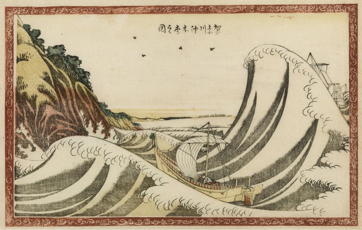
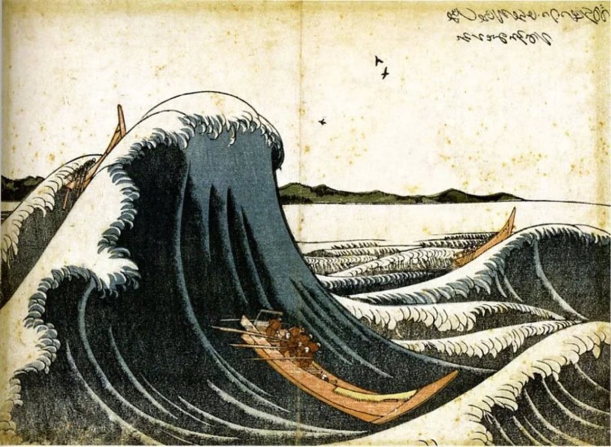
Two years later in 1805 (age 45) came Express Delivery Boats Rowing through Waves (Oshiokuri hatô tsûsen no zu) and it’s starting to look familiar:
A few waves show up in Hokusai’s three-volume Quick Lessons in Simplified Drawing (1812).
In 1831 at the age of 71, Hokusai returned to waves with The Great Wave off Kanagawa (Kanagawa-oki Nami Ura):
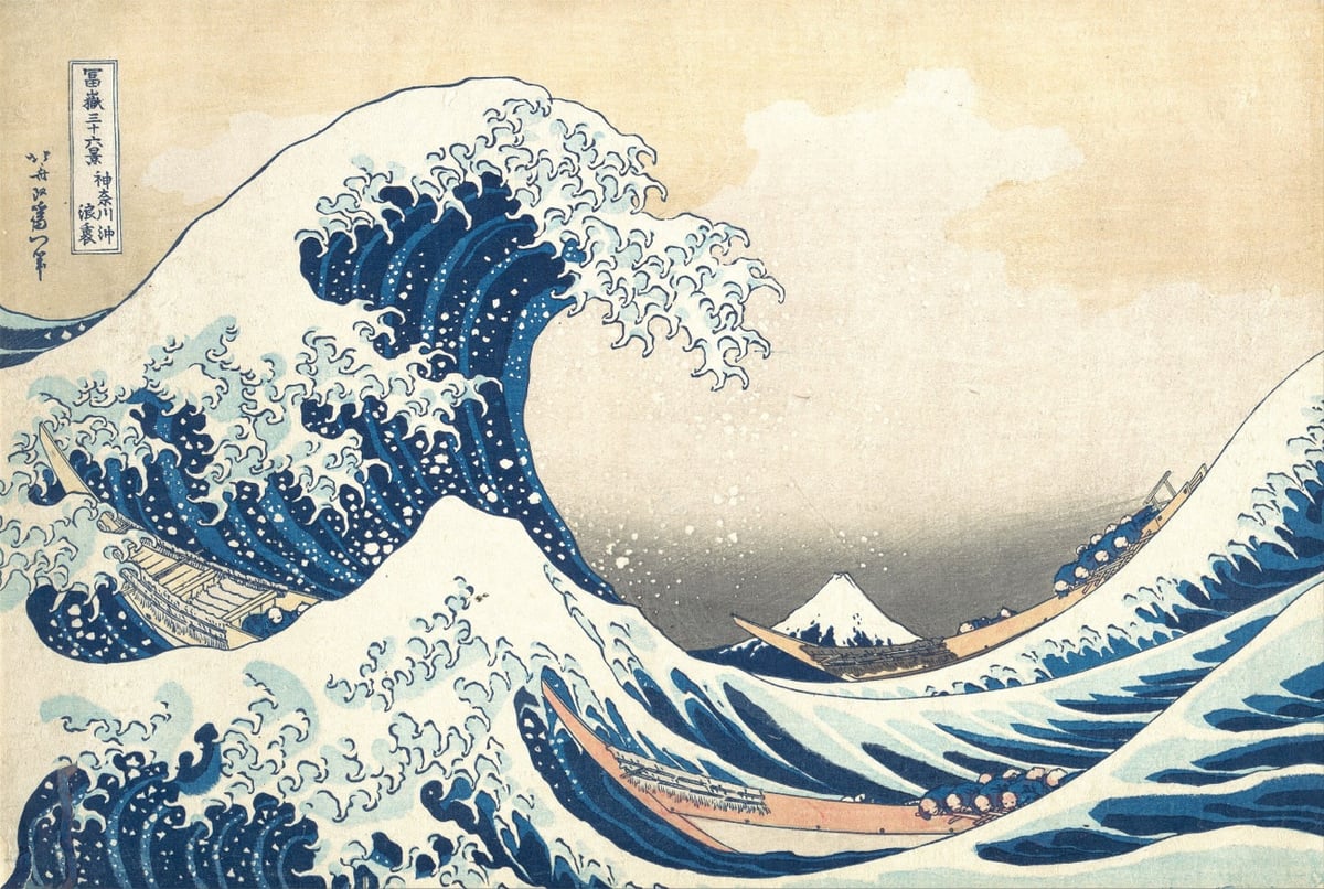
As others have noted, this version is fantastically impressionistic — it evokes a feeling just as much as it depicts a scene. The others are nice works of art, but this is the work of a master at the peak of his expressive powers.1
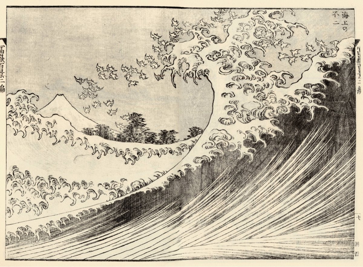
But that wasn’t the end of the story. Here’s Fuji at Sea (Kaijo no Fuji) from circa 1834, made at age 74 — it looks great in color:
Right around the same period, Hokusai made Kajikazawa in Kai Province (Kōshū Kajikazawa) and Fishing Boats at Choshi in Shimosa (Soshu Choshi). Later on, Hokusai allegedly made a pair of paintings referred to as Feminine Wave and Masculine Wave, but I can’t find any information about them online outside of sites selling prints. [Edit: the Feminine & Masculine Waves are featured in Hokusai: Beyond the Great Wave, based on an exhibition in the British Museum. (thx, jody)]
What did Hokusai make of this progression over his career? In a colophon to his series One Hundred Views of Mount Fuji (Fugaku hyakkei), he wrote:
From the age of six I had a penchant for copying the form of things, and from about fifty, my pictures were frequently published; but until the age of seventy, nothing that I drew was worthy of notice. At seventy-three years, I was somewhat able to fathom the growth of plants and trees, and the structure of birds, animals, insects, and fish. Thus, when I reach eighty years, I hope to have made increasing progress, and at ninety to see further into the underlying principles of things, so that at one hundred years I will have achieved a divine state in my art, and at one hundred and ten, every dot and every stroke will be as though alive. Those of you who live long enough, bear witness that these words of mine prove not false.
Note: Screenshots of a viral tweet from 2018 about this series of prints are going around again. I’m sure it will shock you to learn that some of the math and dates haven’t been fact-checked as well as they could have been. I’ve documented the names of the artworks shown here and relied on primary sources for their dates where possible. I’ve used 1760 as the year of Hokusai’s birth and the dates of works are when they were made, not when they were first published. Please let me know if I’ve made any errors…I’d love for this post to be as correct as possible.
From Business Insider’s series Still Standing, a look at La Maison du Pastel, a 300-year-old French company that makes pastels for artists by hand. Back in its golden age, the company supplied the likes of Monet & Degas but fell into neglect near the end of the 20th century. The newest generation of ownership has restored the company and they now offer over 1,900 different pastel colors.
Seriously, take a look at their online shop…there’s all sorts of amazing stuff in there. Like this antique watercolors set — get a load of these color names: Violet Lake, Burnt Lake, Carmine, Venice Red, Vermilion, Orange Chrome, Gamboge, Zinc White, Yellow Ochre, Burnt Umber, Van Dyck Brown, Lamp Black, Payne’s Gray, Indigo, Celestial Blue, Blue Ash, Prussian. You can even order a full set of their pastels for only €29,450.00 (the set comes with a custom-made chest of drawers).
I am not at all an artist but these colors all look so amazing that I’m eyeing one of the smaller sets for myself… (thx, caroline)
Queendom is a documentary film by Agniia Galdanova about queer Russian activist and performance artist Jenna Marvin and her unusual form of protest against the war in Ukraine and Russia’s treatment of LGBTQ+ people. From a short review in the Guardian:
When Russia invaded Ukraine in February last year, some brave souls took to the streets of Moscow to voice their horror at the war, and were met with batons and police brutality. Radical queer performance artist Gena Marvin took a different approach. Wearing platform boots, body paint and wrapped in barbed wire, she walked the streets of Moscow in a stark, silent statement against the war. To call Gena a drag artist fails to capture just how subversive and courageous are her public “performances”. Her otherworldly costumes, created from junk and tape, show the influence of Leigh Bowery; her fearlessness evokes the punk provocation of Pussy Riot.
Marvin’s performances can be intense — check out this video from Paris in 2022. France had just advanced into the semifinals of the World Cup and she went out on the streets dressed in an all-black costume straight out of Alien or Pan’s Labyrinth:
Queendom opens in theaters and will available on streaming on June 14.
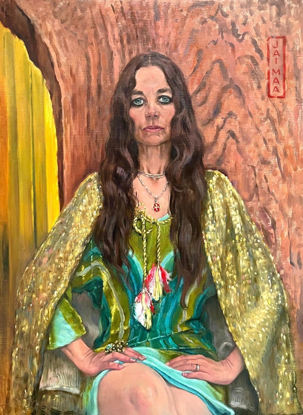
Thanks to the Instagram account New American Paintings, I recently came across the work of Los Angeles-based artist Delia Brown, including the above portrait, “Jai Maa! (Justine II),” which I love. A feature on Brown in Independent Art Fair magazine also includes an awesome painting of hers from 2000 called “What, Are You Jealous?” (probably NSFW).
Someday — someday! — I want to turn down an invitation to something because “I can’t, I’m sitting for my portrait at that time.”
Elsewhere in portraits: King Charles’s, by Jonathan Yeo. “In his interview with the BBC,” the NYT’s Vanessa Friedman writes, “Mr. Yeo noted that when the king first saw the painting, he was ‘initially mildly surprised by the strong color,’ which may be an understatement.”
Many more of Brown’s paintings can be found on her website and Instagram.
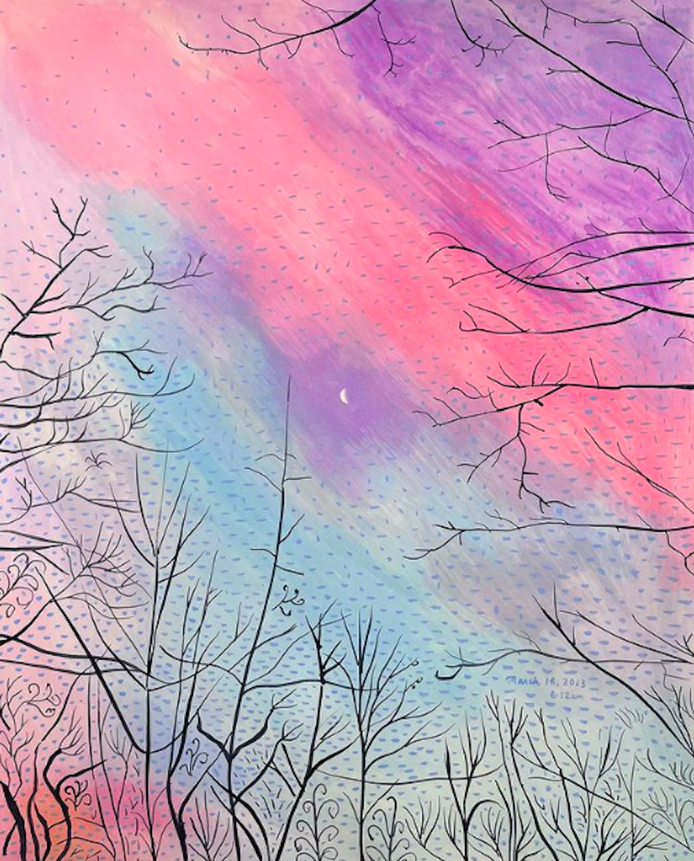
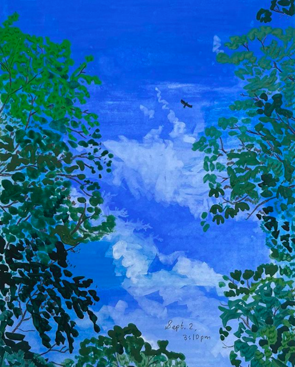
Just some lovely painted skies to end the day. (Above, below.)
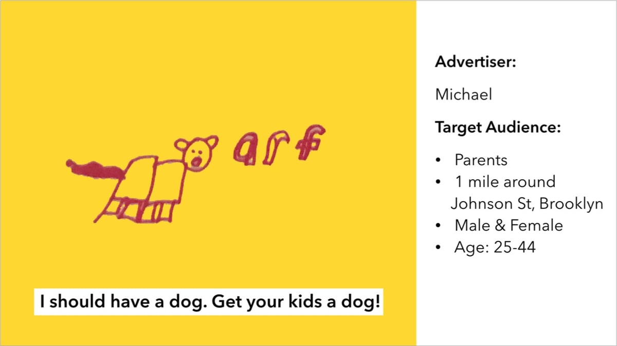
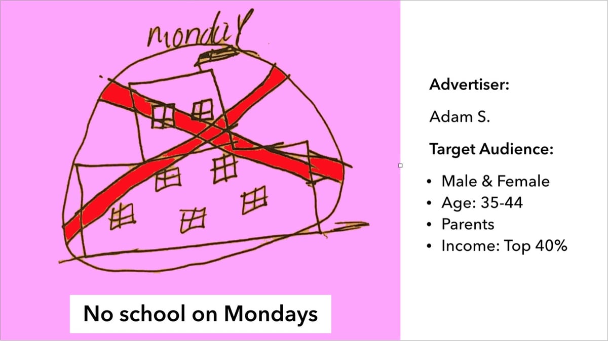
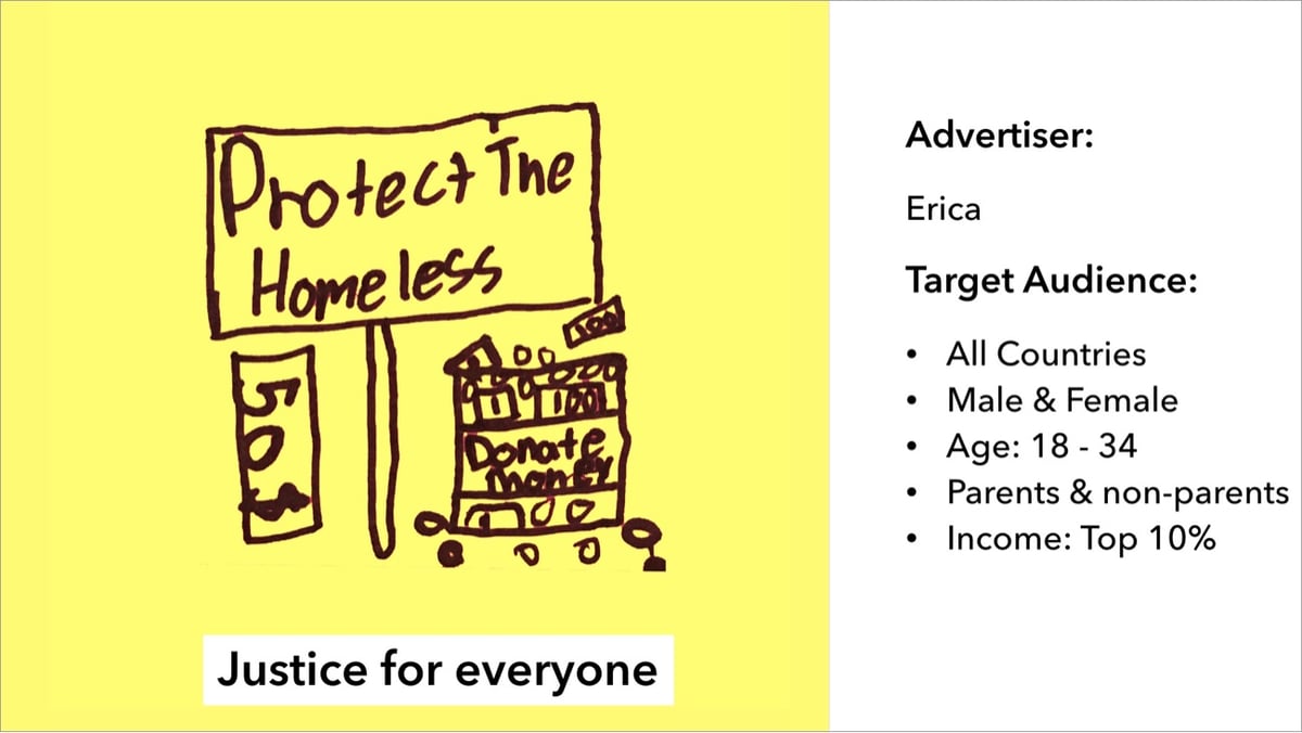
In 2019, artist and engineer Tega Brain gave some kids the opportunity to create targeted advertising relevant to their particular interests: Bushwick Analytica.
Politicians and marketers now use data and targeted advertising to try to change our behaviors and influence our worldviews. But why should these tools only be available to people in places like Washington DC, Manhattan and London?
Some of the kids’ ads targeted their parents:
While others were aimed at people who could help with causes the kids were interested in:
(via dens)
Recently, some of the items from the personal collection of the late artist Jason Polan were auctioned off. The NY Times wrote about the effort to preserve his legacy.
Jen Bekman, the founder of the online gallery 20x200, reflected on Mr. Polan’s legacy while she sat beside his sketches.
“These are not doodles,” Ms. Bekman said. “That word is diminishing. People remember him as an illustrator, but Jason was a great artist, and his practice was his life.”
I “lost” a bunch of time browsing through the collection this morning, which includes both work by Polan and things he collected & received from other artists.
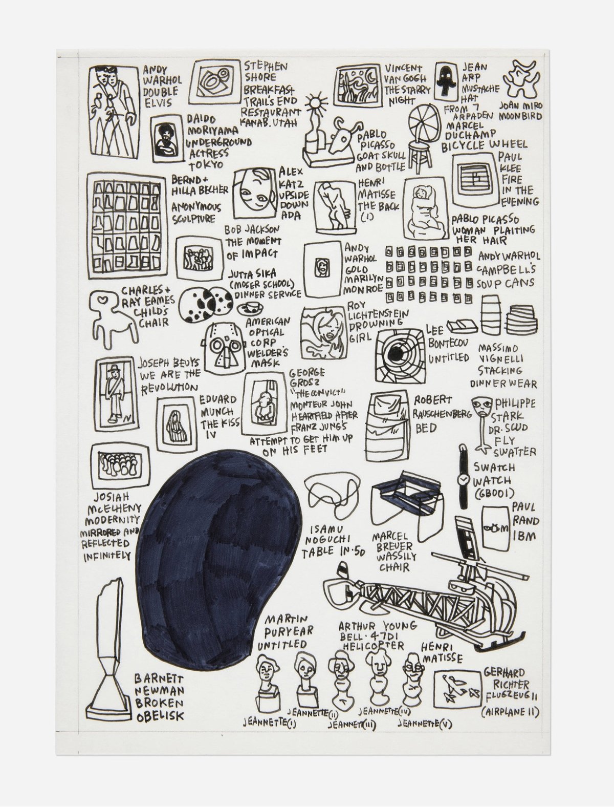
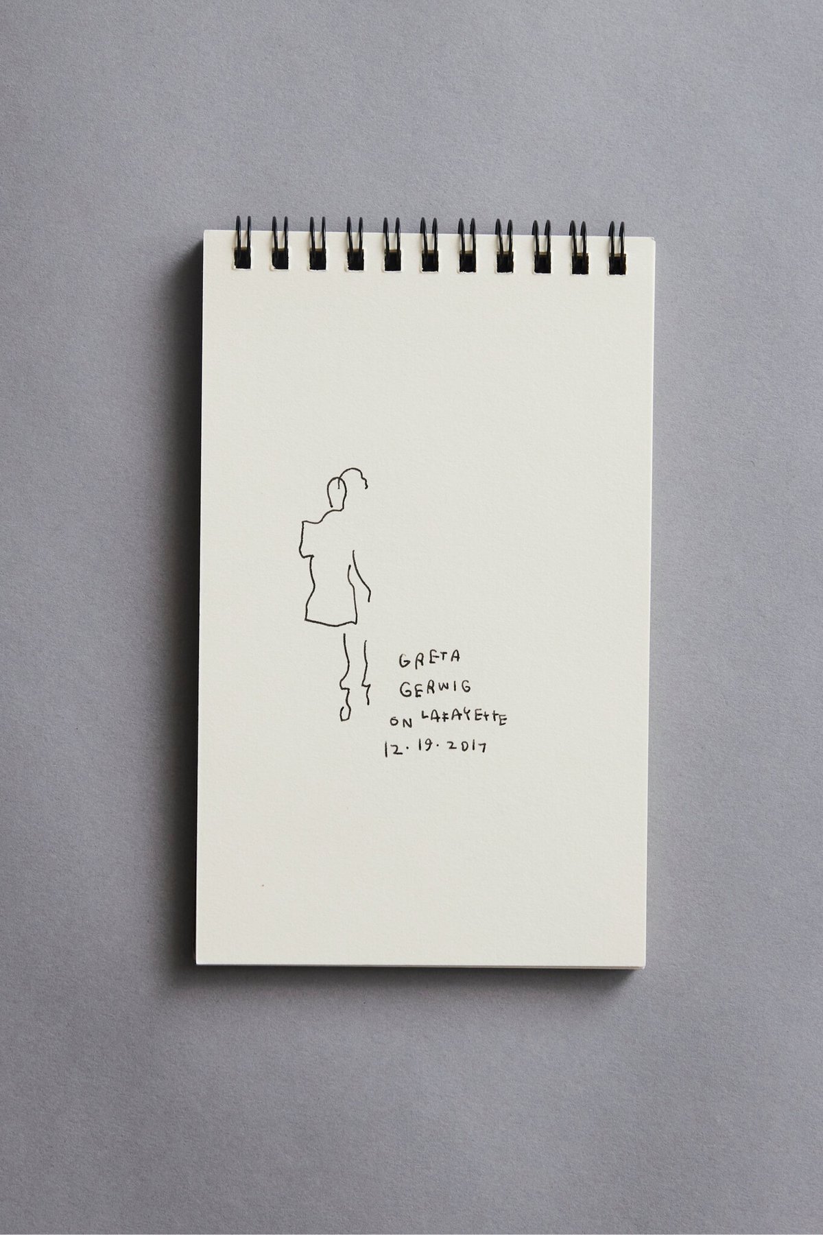
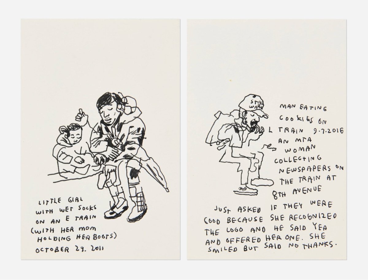
It’s great to see Polan’s legacy being preserved and his art being spread around the world. And to be reminded of that time he went to a fashion show.
I sort of stood still because I was a little confused as to what just happened. Kim walked right by me. Puff Daddy took a picture with someone right in front of me. I then saw Beyoncé walking toward me and I said, “Hi Beyoncé,” and she said, “Heeey,” and smiled and it was kind of like having a Bar Mitzvah. Then Jay Z walked by and I said, “Hi Jay,” and in the second I said that I thought, am I supposed to add a Z? but didn’t and he said hey but not as beautifully as Beyoncé. I love her so much. I drew a couple more people and then went outside and forgot where I was and then walked to the train and went home.
Reminder: you can buy prints and things of Polan’s work at 20x200. I have several of these, including the Zoo Baggu, which I get compliments on almost every time I use it for grocery shopping.
The Water Lilies paintings that French impressionist Claude Monet is most known for were all painted in the garden of his house in Giverny. Pay a relaxing visit to the set of the MBU (Monet Botanical Universe) with this leisurely video. Here’s another tour of the gardens with music.
See also Monet painting in his gardens, Claude Monet’s War Paintings, and Monet’s Ultraviolet Vision. (via the kid should see this)
These bubblegum sculptures created and photographed by artist Suzanne Saroff are delightfully disgusting.
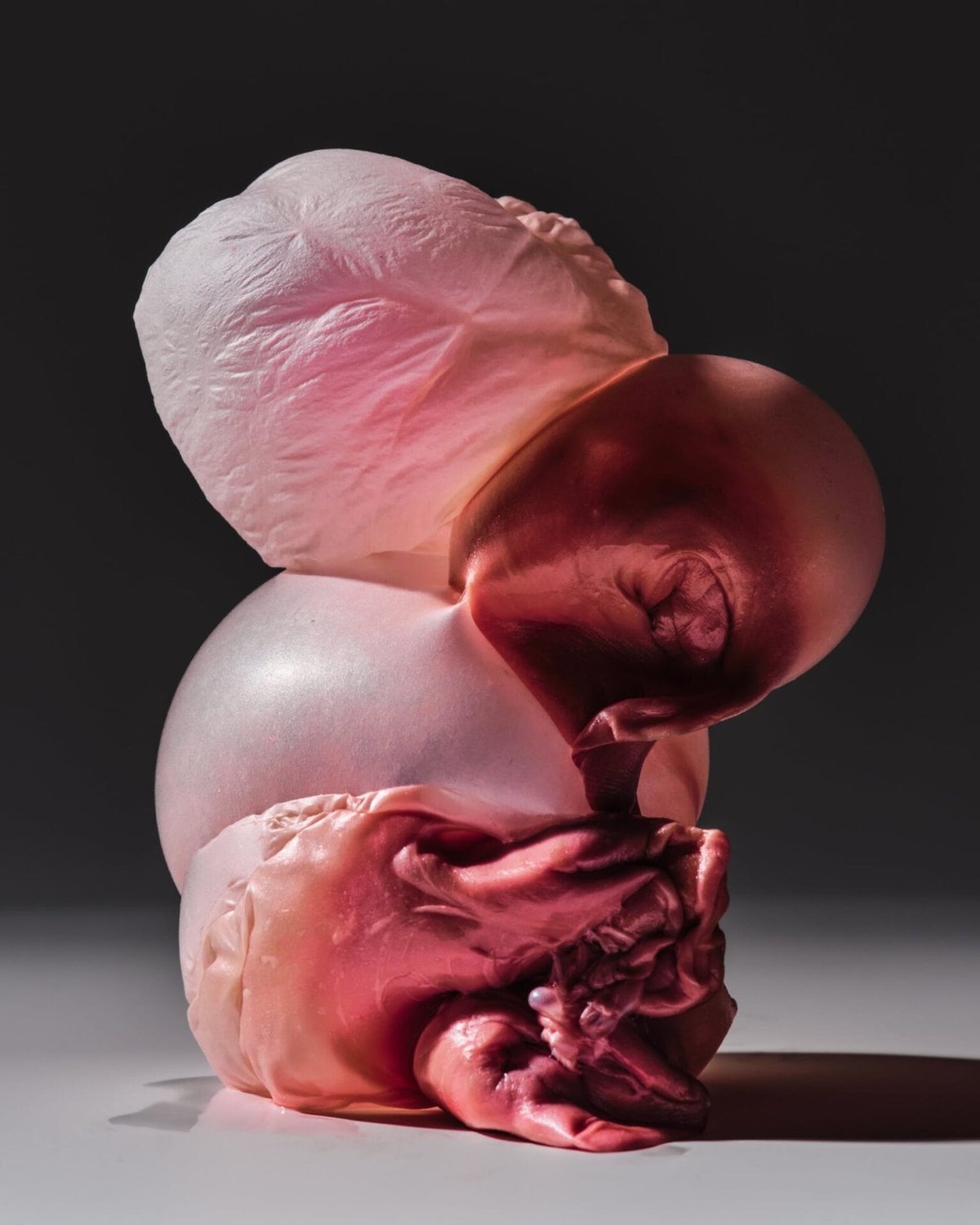
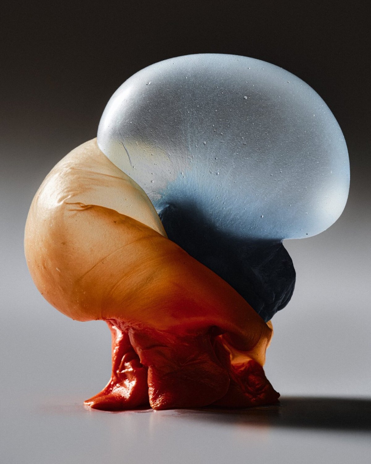
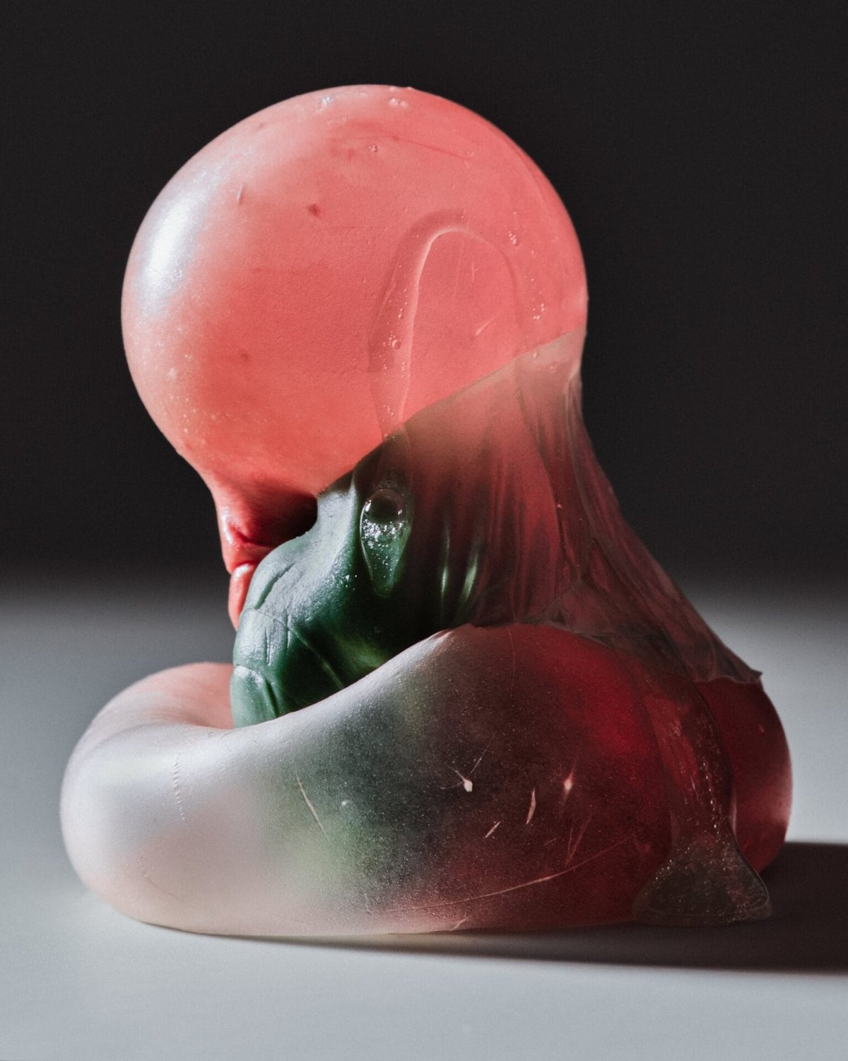
I found this via Grace Ebert at Colossal, who writes:
Conjuring memories of childhood competitions and absent-minded chomping, the photos zoom in on chewed wads of pink, blue, and green that appear almost corporeal, their pudgy folds and pockets evoking the beauty and repulsion of the human body.
I love these but grrrrossssss. (And I don’t know why, but these remind me of Roe Ethridge’s photo of Andrew W.K.)
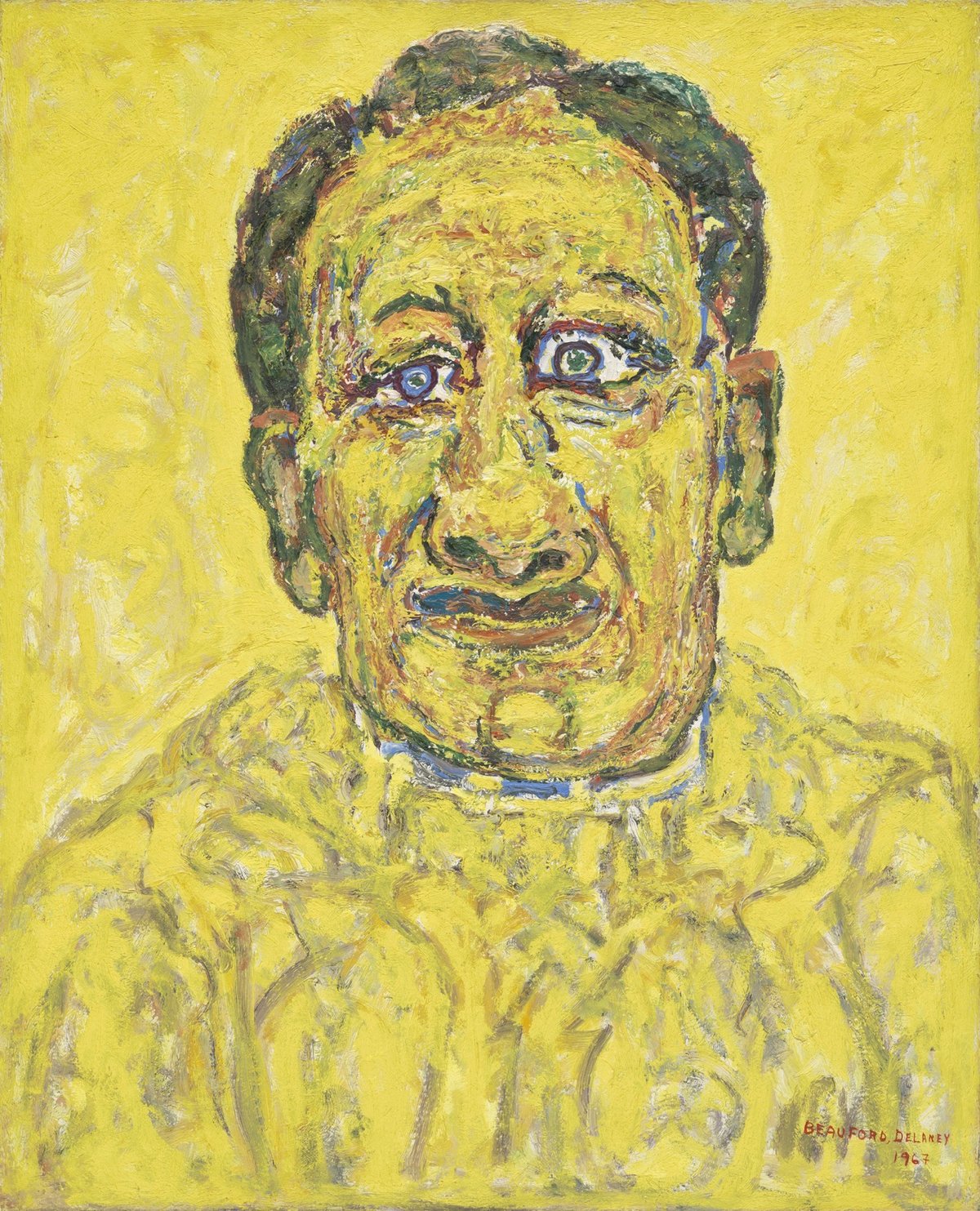
Whenever Beauford Delaney’s Portrait of Howard Swanson (1967) pops up in MoMA’s New Tab extension in Chrome, I’m like, “Jerry Seinfeld?!”
There are a number of celebrities who have art doppelgängers — the Robert De Niro and John Krasinski ones are particularly good. Have you noticed any of these?
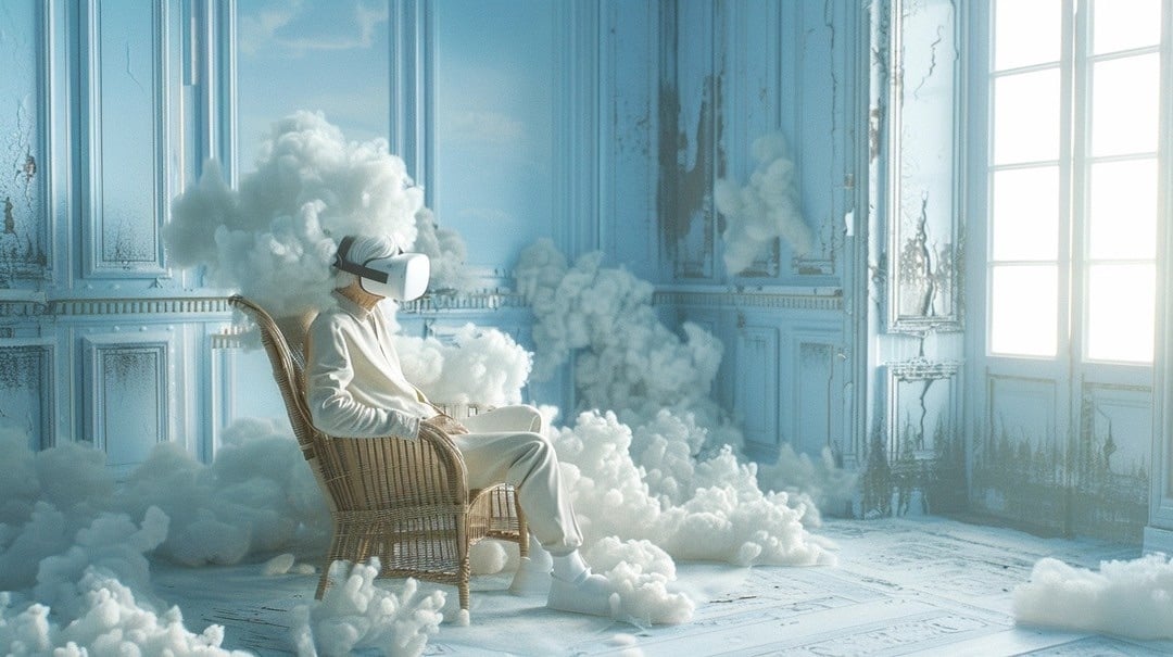
Data artist Robert Hodgin recently created a feedback loop between Midjourney and ChatGPT-4 — he prompted MJ to create an image of an old man in a messy room wearing a VR headset, asked ChatGPT to describe the image, then fed that description back into MJ to generate another image, and did that 10 times. Here was the first image:
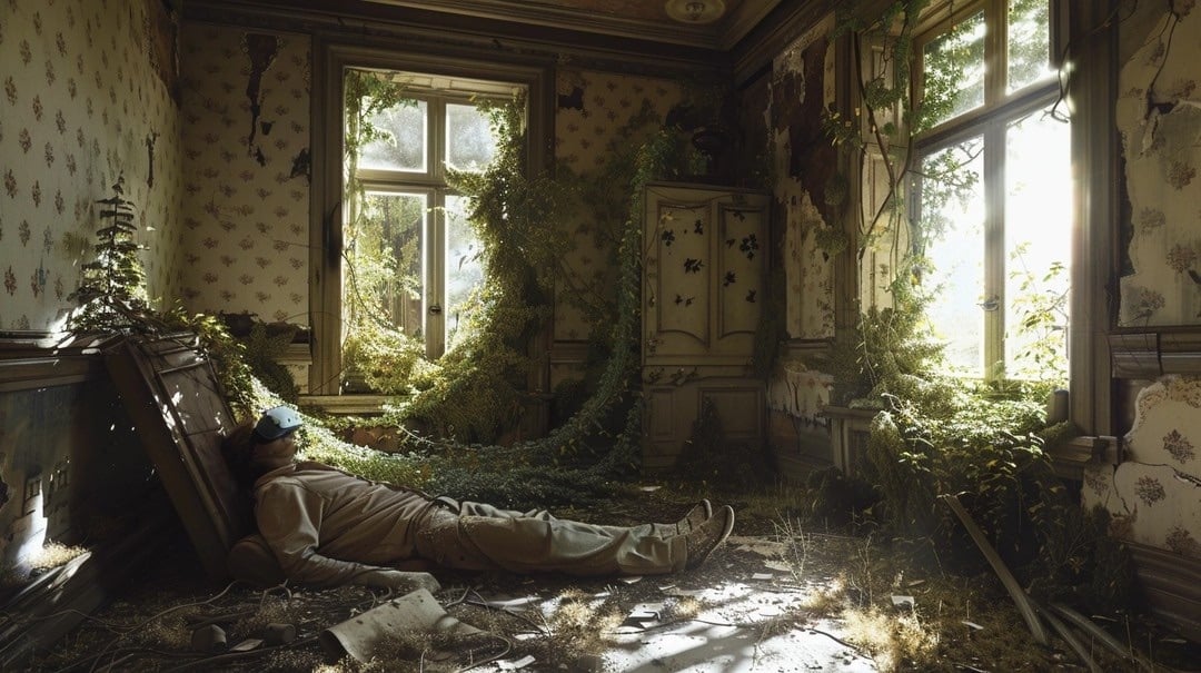
And here’s one of the last images:
Recursive art like this has a long history — see Alvin Lucier’s I Am Sitting in a Room from 1969 — but Hodgin’s project also hints at the challenges facing AI companies seeking to keep their training data free of material created by AI. Ted Chiang has encouraged us to “think of ChatGPT as a blurry jpeg of all the text on the Web”:
It retains much of the information on the Web, in the same way that a jpeg retains much of the information of a higher-resolution image, but, if you’re looking for an exact sequence of bits, you won’t find it; all you will ever get is an approximation. But, because the approximation is presented in the form of grammatical text, which ChatGPT excels at creating, it’s usually acceptable. You’re still looking at a blurry jpeg, but the blurriness occurs in a way that doesn’t make the picture as a whole look less sharp.
And we already know what you get if you recursively save JPEGs…
See also La Demoiselle d’Instagram, I Am Sitting in a Room (with a video camera), Google Image Search Recursion, and Dueling Carls.
Edith here. For the latest installment of my newish illustrated column, I interviewed my friend and neighbor, the artist and climate activist Zaria Forman. Zaria makes pastel drawings of ice, among other things, and her solo show “Fellsfjara, Iceland” is currently on exhibition at Winston Wächter gallery in New York until May 4. (I’ve rendered a miniature version of some of it right below these words, but definitely click here for the actual images.) Zaria is also on Instagram.
Zaria, have you read, watched, listened to, or otherwise experienced anything good recently?
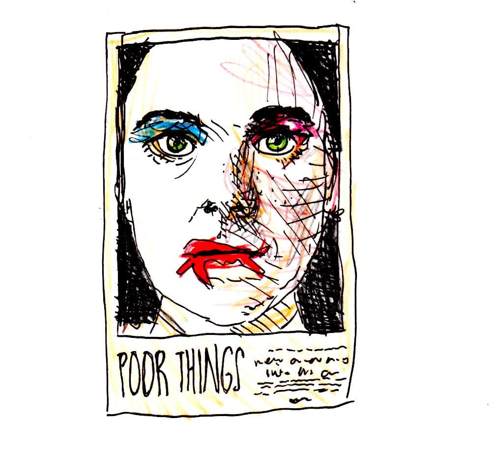
Poor Things. It was so visually stimulating and imaginative — more than anything I’ve seen in a while.
Possibly more interesting: the ice storm a few weekends ago! I’d never seen an ice storm before moving to upstate New York, and although the storms are destructive, they’re so beautiful. It was the most spectacular one I’ve ever experienced.
Seen anything bad?
Mr. and Mrs. Smith, the new version. I thought it was poorly cast and just plain dumb. OR: All the mud, now that the ice has melted ;)
What’s something you’ve read or seen that changed your life?
Seeing glaciers and icebergs for the first time absolutely changed my life. But if we’re sticking to books, etc., one that changed my way of thinking was Love Between Equals: Relationship as a Spiritual Path, by Polly Young-Eisendrath.
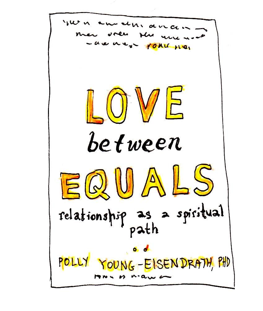
She’s a psychologist and couples therapist, and the book just kind of reframed the idea of relationships in my mind — of how you relate to someone you’re in a long-term relationship with, and how you can grow with them. And how, like, love is.
She talks about radical acceptance, fully accepting someone for who they are, learning how to do the same for yourself, and then figuring out how all of that can work together.
Another one that changed my way of thinking was Sex at Dawn: How We Mate, Why We Stray, and What It Means for Modern Relationships, by Christopher Ryan and Calcida Jetha.
Does anything make you laugh online?
Memes on Instagram!
What’s a recent one?
I just forwarded you the last one I sent to [my husband] this morning.
Are there any cultural moments you currently think about unusually often? Like are you haunted by a moment from a TV show, or anything like that?
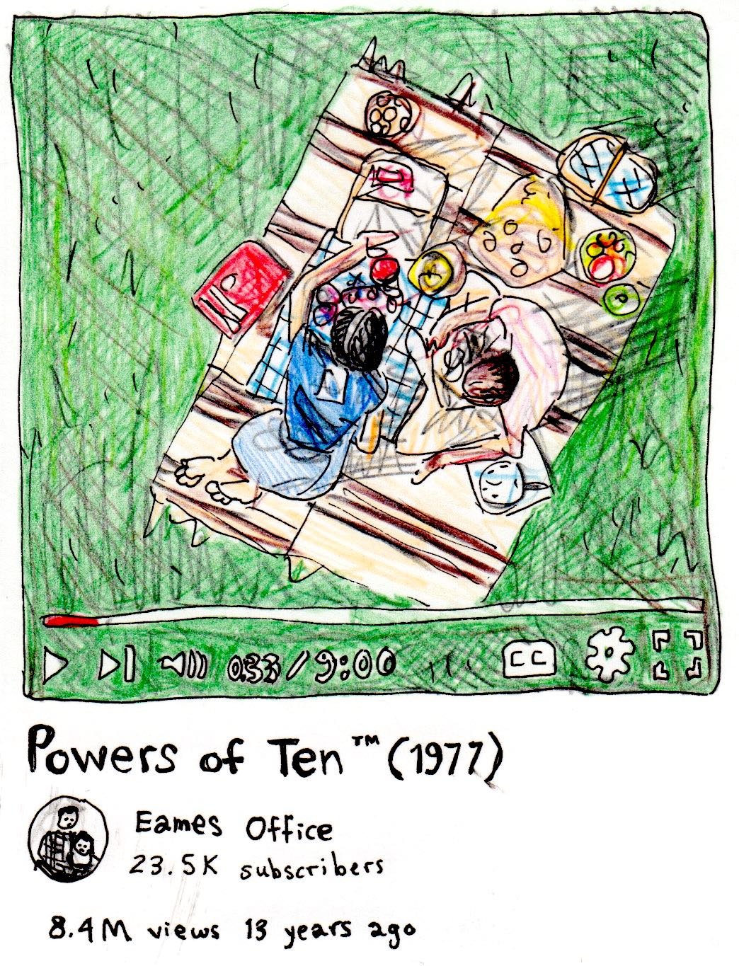
More “inspired” than “haunted,” but the artists Ray and Charles Eames made a 10-minute documentary in 1977 called “Powers of 10” that made a big impact on me. The Tang Teaching Museum in Saratoga Springs exhibited the film in a show during my years at Skidmore College, and it’s probably the one film I think about more than any other.
What’s it about?
It starts with a couple on a blanket having a picnic by a lake in Chicago. And then from one of their hands, the camera zooms back 10 meters. And then it continues zooming back by powers of ten. And so you see these squares get smaller and smaller, and it keeps going into the atmosphere, and the solar system, and it’s just mind-boggling how it keeps going.
And then it then zooms back down to the picnic and goes into their skin and all the way down to, like, a molecule inside the body. And it’s crazy to see the similarities between the two.
It’s on YouTube, if you want to watch — I highly recommend!
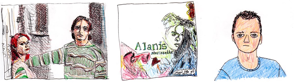
What were you really into when you were 12?
My So-Called Life, singing along to Alanis Morissette, and a boy named Ben.
Is there a book/movie/whatever you’d like to experience again for the first time?
Burning Man. There’s just no way to really know what it’s like until you’re there, in the middle of it. And when you know what to expect, it’s not as thrilling. But as a climate activist, it doesn’t feel right to continue attending over and over.
What’s a funny or weird way people have described your art?
As “finger painting.” It was a term used first (I think) in the Daily Mail, and then almost every writer used it to describe my work for several years. I wince at a line I say in my TedTalk: “I cringe when people call me a finger painter,” or something like that — my tone just sounds so snobby, I hate it — but I was attempting to detach my work from the term, and it did finally work. It pops up every now and then, but rarely.
Please tell me something silly that you love.
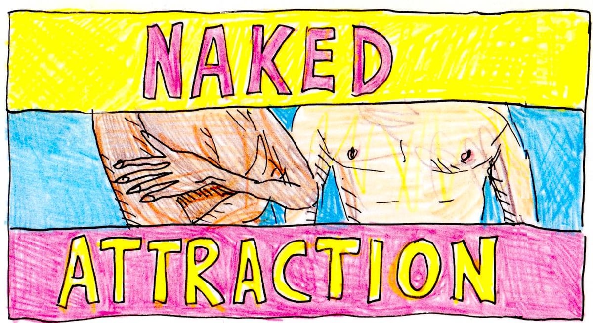
Naked Attraction, the dating show where people are naked.
Thanks, Zaria!
Zaria’s work can be found here. And past installments of Drawing Media can be found here.
TV critic James Poniewozik writing for the NY Times:
Mid TV, on the other hand, almost can’t be bad for some of the same reasons that keep it from being great. It’s often an echo of the last generation of breakthrough TV (so the highs and lows of “Game of Thrones” are succeeded by the faithful adequacy of “House of the Dragon”). Or it’s made by professionals who know how to make TV too well, and therefore miss a prerequisite of making great art, which is training yourself to forget how the thing was ever done and thus coming up with your own way of doing it.
Mid is not a strict genre with a universal definition. But it’s what you get when you raise TV’s production values and lower its ambitions. It reminds you a little of something you once liked a lot. It substitutes great casting for great ideas. (You really liked the star in that other thing! You can’t believe they got Meryl Streep!)
Mid is based on a well-known book or movie or murder. Mid looks great on a big screen. (Though for some reason everything looks blue.) Mid was shot on location in multiple countries. Mid probably could have been a couple episodes shorter. Mid is fine, though. It’s good enough.
Above all, Mid is easy. It’s not dumb easy — it shows evidence that its writers have read books. But the story beats are familiar. Plot points and themes are repeated. You don’t have to immerse yourself single-mindedly the way you might have with, say, “The Wire.” It is prestige TV that you can fold laundry to.
Bullseye. Although I also agree with this caveat from Alan Sepinwall:
I’d only take issue with this excellent Poniewozik essay in the sense that not all Mid TV is created equal. Poker Face and Mr. & Mrs. Smith are great examples of the kinds of shows they want to be. I’d rather have those than all these wild swings by people who don’t understand how to make TV.
For me, the problem with Mid TV is differentiating it from actual good TV…finding shows that you actually don’t want to fold laundry to. I’ve gotten burned a few times on shows that I thought were going to be challenging & interesting — Constellation, 1899, and Mrs. Davis come to mind — but were just sort of aggressively fine (so much so that it turned me off).
Two more thoughts, from the comments section of Poniewozik’s piece. I love this re: specificity:
Shogun is by far the best show released this year, and it has an enormous amount to do with its *specificity* of artistic vision. All of the “mid” shows otherwise referenced here are trying to achieve too many things at once or appeal to too many demographics to have much of an impact. They are content, not art.
It’s a contradictory truth that if you want to create something that really connects with people (even a lot of people), you gotta make it specific or personal (or both). Shōgun is right at the top of my to-watch list (after I finish the five shows I’m stinge watching).
Writer of TV here. I won awards for an iconic HBO show. I can tell you that 95 percent of the blame here lies with the executives who are now so scared to lose their jobs that they just go right down the middle — to the mid, if you will. It’s easier to say yes to a show they have seen before than take a risk on something outside the box.
And yes, they are using AI to give us “notes”. I feel very lucky to have worked in this medium when it still rewarded real creativity.
Sounds about right.
…By the artist Skevoulla Gordon. (Prints are available, too, and she’s a good follow on Instagram!)
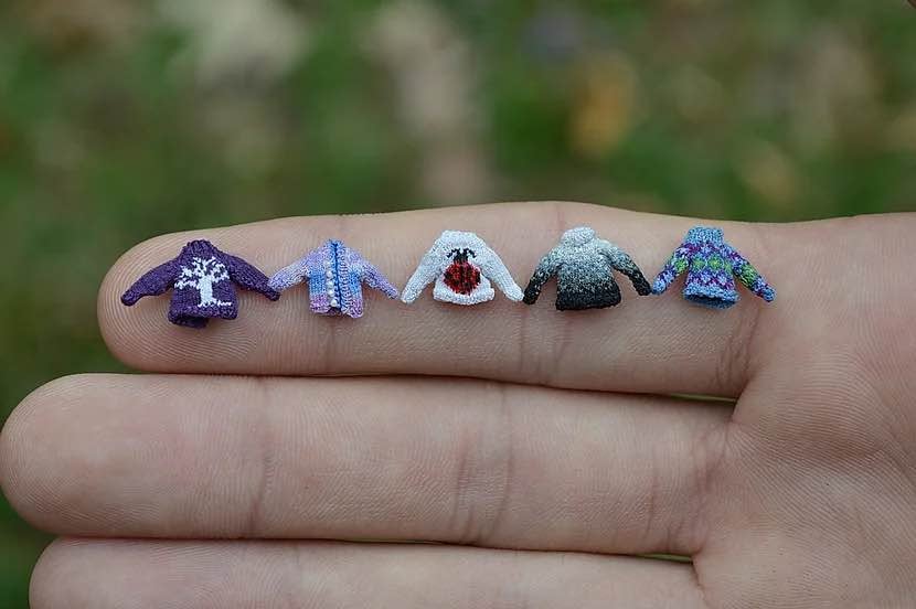
Oh my gosh — this video about making the teeny-tiny sweaters seen in the movie Coraline! Says artist Althea Crome:
I think knitters are often fascinated by the fact that I use such tiny needles. Some of the needles are almost the dimension of a human hair.
Sublimely absurd, perfection. More info in Reactor. [Thanks, Tobias!]
And here’s another pic, grabbed from Crome’s website:
I don’t know about you, but this makes me want to drop everything and disappear into the process of knitting a microscopic sweater for the next six months. Like her Starry Night one.
Actually, the Starry Night sweater should just be its whole own post:
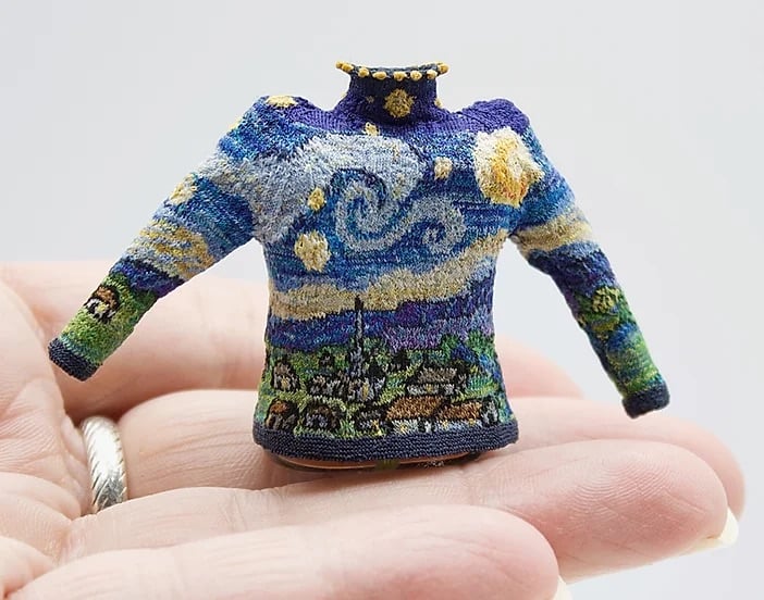
“I love the paradox of creating an object that takes the form of something you can wear,” Crome writes, “yet is impossible to wear.”
(Her work is also for sale.)
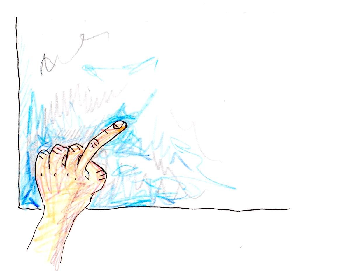
I love this: The Pudding ran an online experiment where they started with a shape (like a straight line or circle) and asked people to trace, as best they could, the tracing of the person before them. This resulted in a series of “flipbook” animation of how the shapes evolved over time — invariably, a squiggle.
One thing I noticed right away was how all the squiggles ended up squished over on the right side of the screen. The Pudding team had a theory on why that happened (the 3:20 mark in this video):
I found this study from like 35 years ago - they were trying to figure out why people kept missing their targets on touch screens. They found people tended to touch below their target and people tended to touch closer to the edges of the screen. And so I figure if it’s like right-handers who are missing, you’re going to be missing to the right. We probably had about half the users on mobile and 90% of the those half are probably going to be right-handed so it would make sense that it would gradually go to the right.
Go read the rest of the post — they also did an experiment about people’s inclination to draw penises on “any free-form drawing project on the internet”. (via waxy)
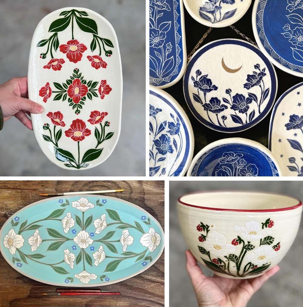
In the spirit of recommending things I truly love, I wanted to highlight the pottery of Northern California artist Naja Tepe. I’ve ordered from her twice now, and her work is fabulous. I love her strawberry-themed items, but the crescent moon on the plate in her most recent Instagram post (upper right in the composite above) made me want to have everything it appears on, too. Great for gifts. I don’t think my mom reads this site, so I will therefore reveal that I got her a Naja Tepe item for her birthday this year.
The NY Times Style Magazine recently published an entire issue dedicated to “what it means start an artistic life”. I have only scratched the surface of this multi-article package, but I locked into this one immediately: We asked 80 artists and other creative people to tell us what they’re starting right now or hope to very soon.
Filmmaker Boots Riley:
I’m getting ready to start filming a feature I wrote about a group of professional female shoplifters who find a device called a situational accelerator that heightens the conflict of anything they shoot it at. I also have a sci-fi adventure: a janky, lo-fi epic space funk opera. My dream is to use the same crew and shoot the two movies back to back in Oakland, Calif. [where I live]. That’s one thing about being 53 — I want to be able to spend more time with my kids.
Writer Alice McDermott:
There are three kinds of novels I’ve never taken to heart: science fiction, murder mysteries and novels about novelists. So I’ve decided to try my hand at each. If I fail, they’re probably not books I’d want to read anyway.
Cartoonist Daniel Clowes:
I’ve always had the desire to do fakes of artworks I admire — to figure out how they were done, and so I could have otherwise unaffordable artwork hanging in my living room. Painting [with oil] is as frustrating and exhilarating as I remember it being when I was in art school 43 years ago, and my paintings look alarmingly not unlike the ones I did at 19.
Artist and writer Nell Irvin Painter:
I’m way too old to be a beginner. I’m 81 and have already written and published a million (OK, 10) books. But a very different kind of project’s been tugging at me: something like an autobiographical Photoshop document with layers from different phases of my life in the 1960s and ’70s — spent in France, Ghana, the American South. I’d have to be myself at different ages.
Artist Christine Sun Kim:
I have a bit of an adverse reaction to people doing American Sign Language interpretations of popular songs on social media - they’re usually based entirely on the lyrics in English, when rhyming works differently in ASL. So I’ve been wanting to make a fully native ASL “music” video. One day.
Artist Eric Mack:
I’m starting to recharge in order to begin my next body of work. I journal, read, explore the Criterion Channel and get deep-tissue massages. I keep wishing I’d organize the fabrics in my studio.
I love that: Mack shared not what he’s working on next but that he’s using the time to recharge the batteries, a step that’s often neglected, either out of sheer economic necessity, obsession, or fear (I was *terrified* to take time off from the site for years). And I want to see both of those films by Boots Riley — “a situational accelerator”?!
So. What are you starting right now or hope to very soon?
I’ve been thinking about something I posted last week — in an excerpt from his new book The Work of Art, former New York magazine editor Adam Moss described the art he makes as bad: “When I left my job, I began to paint more seriously,” he wrote. “That was the beginning of my torment: I just wasn’t very good.” Or as he put it to The New Yorker: “I kind of just wasn’t any good.” Or to Vanity Fair: “I really wanted to be a good painter. What a fucking idiot I was.” Or on NPR, “I really wanted to be good, and it made the act of making art so frustrating for me.”
The book is mostly about how other artists make their work, but I’m currently more interested in what Moss has to say about himself and his art.
Later in the VF and NPR interviews, Moss says that the main lesson he learned from making the book is that with art, it’s the journey not the destination — or, “the making, not the made” (“It’s the most banal observation”) — but of course I still went looking for his paintings online. I want to see them! I didn’t find anything (per the VF article, he hasn’t shared anything publicly yet), but to Moss I say: Show them! Maybe it doesn’t matter if they’re not good. Maybe the worse, the better.
Several years ago in the Guardian, Oliver Burkeman wrote a piece called This column will change your life: Helsinki Bus Station Theory. It’s about how difficult it can be as a creative person to find your way to making work that feels like it’s uniquely yours.
There are two dozen platforms, Minkkinen explains, from each of which several different bus lines depart. Thereafter, for a kilometre or more, all the lines leaving from any one platform take the same route out of the city, making identical stops. “Each bus stop represents one year in the life of a photographer,” Minkkinen says. You pick a career direction — maybe you focus on making platinum prints of nudes — and set off. Three stops later, you’ve got a nascent body of work. “You take those three years of work on the nude to [a gallery], and the curator asks if you are familiar with the nudes of Irving Penn.” Penn’s bus, it turns out, was on the same route. Annoyed to have been following someone else’s path, “you hop off the bus, grab a cab… and head straight back to the bus station, looking for another platform”. Three years later, something similar happens. “This goes on all your creative life: always showing new work, always being compared to others.” What’s the answer? “It’s simple. Stay on the bus. Stay on the fucking bus.”
(via phil gyford)
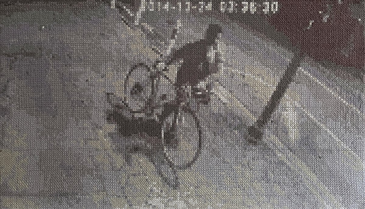
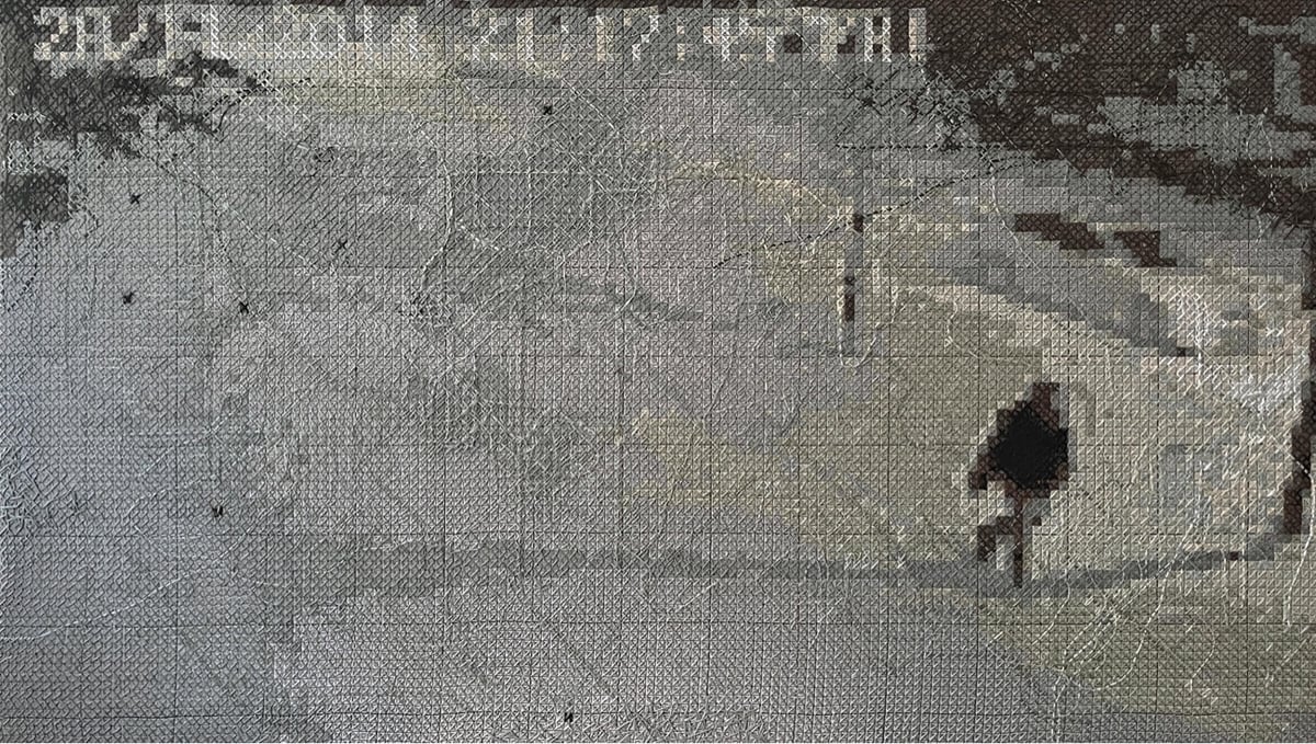
Oh man, I don’t think this could be any more in my wheelhouse: cross-stitch embroideries of CCTV camera images by Francine LeClercq. I’ve always had a soft spot for cross-stitch — it’s the ur-pixel art — and to see low-res, compressed, B&W security camera footage done in embroidery is just a real treat. There’s not much on LeClercq’s site about the work, but check out these posts at Colossal and designboom for more information and photos.
This is wonderful: a collection of video clips of Charles Schulz drawing his iconic Peanuts comic strip — “everything I could find of Charles Schulz drawing his Peanuts characters” in the words of the compiler.
Unfortunately, I’m not highly educated. I’m merely a high school graduate. I studied art in a correspondence course because I was afraid to go to art school. I couldn’t see myself sitting in a room where everyone else in the room could draw much better than I and this way I was protected by drawing at home and simply mailing my drawings in and having them criticized.
I wish I had a better education but I think that my entire background made me well-suited for what I do. If I could write better than I can, perhaps I would have tried to become a novelist and I might have become a failure. If I could draw better than I can, I might have tried to become an illustrator or an artist and would have failed there. But my entire being seems to be just right for being a cartoonist.
Charles Schulz: Unbothered. Moisturized. Happy. In his lane. Focused. Flourishing.
See also a 90-minute compilation of cartoonists working (from the same YT channel) and Chuck Jones demonstrating how to draw Bugs Bunny and other characters. (via open culture)
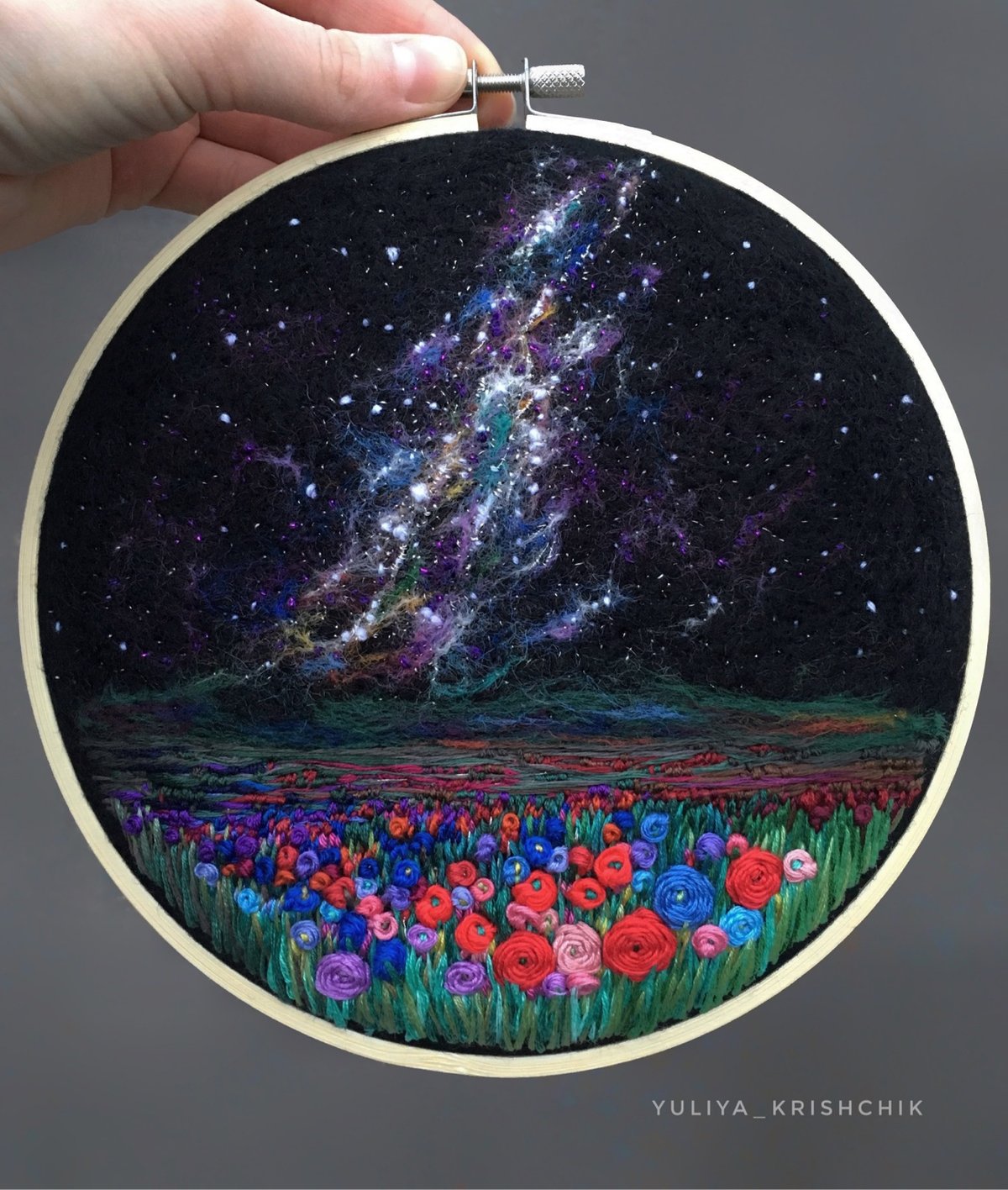
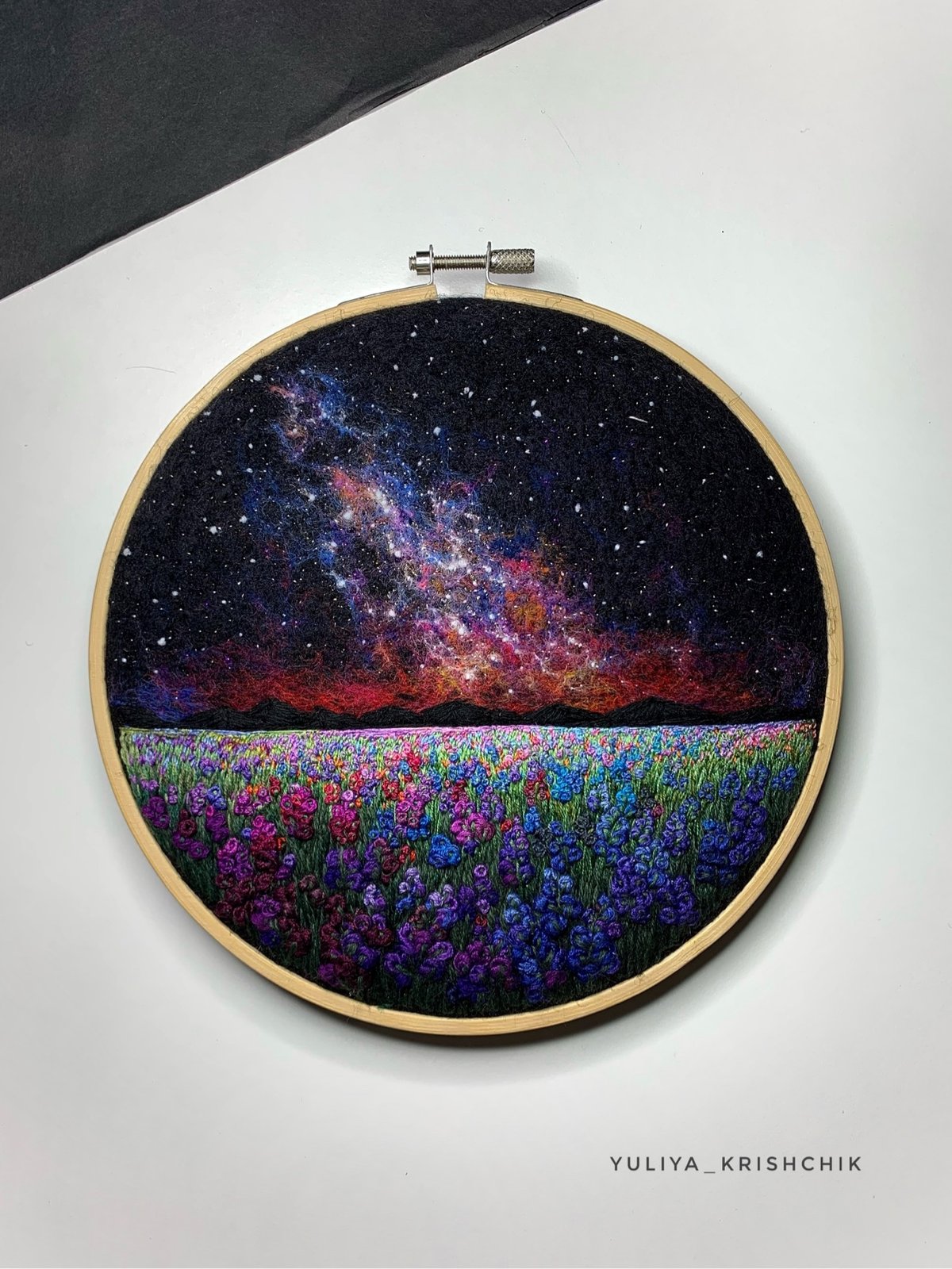
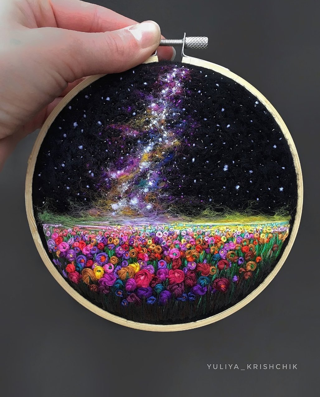
I love Yuliya Krishchik’s space-themed embroidery pieces, especially the ones featuring Milky Way-like star fields — she calls them “surreal space landscapes”. If you watch one of Krishchik’s videos, you can see that her pieces are just a bit 3D…a cool effect.
You can find more of her work on Instagram and her blog or buy original pieces in her store (they go quickly though).
Newer posts
Older posts
Socials & More