kottke.org posts about art


The Public Domain Review has published some lovely illustrations of goldfish from a 1780 monograph called Histoire naturelle des dorades de la Chine.
Histoire naturelle des dorades de la Chine (1780) — the dorades in the title refers not to sea bream but the fish’s gilded appearance — was the first monograph on goldfish published in Europe, from a time when the fish were still bound up with Eastern exoticism in the Western imagination.
You can peruse the entire document at the Internet Archive.
A few weeks ago, I posted about the hundreds of stills from their animated movies that Studio Ghibli has made available for free download. Since I’m a big fan of the weird little guys director Hayao Miyazaki loves to put in his films (e.g. the kodama in Princess Mononoke1 and Spirited Away’s soot sprites), I thought it would be cool to pull some images from the Ghibli archive featuring these lovable little freaks.


And an honorable mention to this frame from Porco Rosso:

The weird little guys category generally doesn’t apply to humans, but this image of little kids crawling all over a pig man’s airplane certainly classifies as an unusual swarm.


There’s something a little bit mesmerizing about Aled Thompson’s illustrations of birds. They are at once highly detailed and also slightly vectorish — and it shifts back and forth while I’m looking at them, like one of those young woman/old woman optical illusions.
You can find more of Thompson’s work on Instagram and Bluesky and can purchase prints here. (via @mims.bsky.social)


I love the colorful illustrative style of these adverts for the Queen City Printing Ink Company done by Augustus Jansson in the first decade of the 20th century.
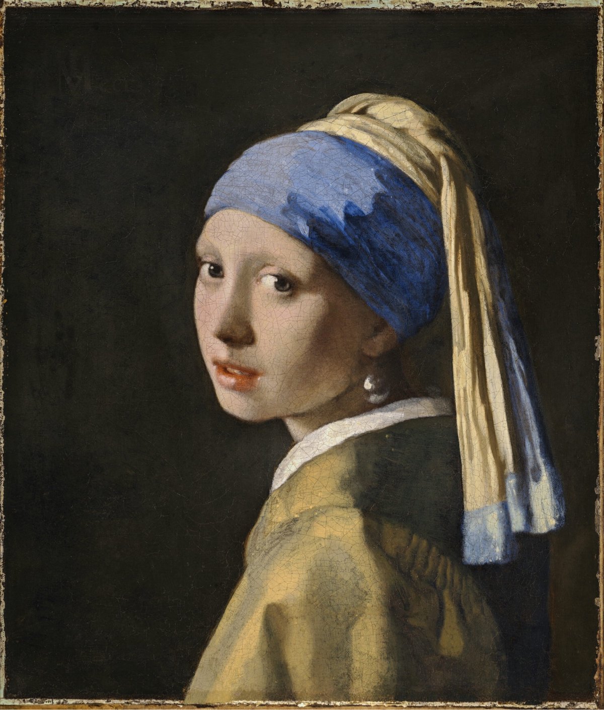


Several years ago, digital microscope technology company Hirox collaborated with The Mauritshuis museum to create a 10-gigapixel scan of Johannes Vermeer’s Girl with a Pearl Earring. Recently, Hirox upped the game with the creation of a 108-gigapixel scan of the painting. 108 billion pixels! And each pixel is 1.3 microns in size — 1000 microns is 1 millimeter. Incredible.
You can explore the scan of the painting courtesy of Hirox. Be sure to check out the 3D view (button at the bottom of the page); here’s a topographical view of the pearl:

For a look at how they captured this image, check out this behind-the-scenes video.
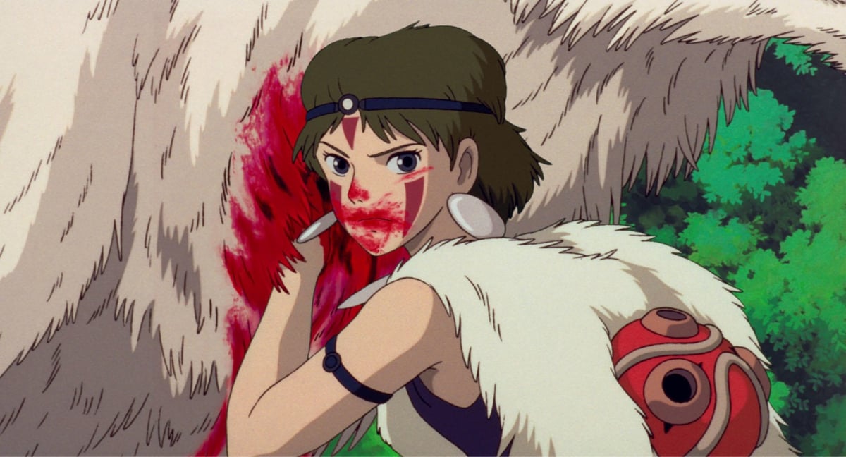


Well this is just wonderful: Studio Ghibli has uploaded hundreds of high-resolution still images from almost all of their films, including all of the major ones: Princess Mononoke, Sprited Away, My Neighbor Totoro, The Boy and the Heron, Howl’s Moving Castle, etc. etc. The images are labeled “solely for personal use by individual fans to further enjoy Studio Ghibli films” and people are urged to “please feel free to use the images within the bounds of common sense”.
Head to the list of Ghibli movies and click through to each film to find & download the stills. (via open culture)


Silenced Science Stories is a collaboration between scientists and artists to tell the stories of scientific experts who have been affected by the Trump regime’s purge of their ranks.
We are organizing an illustrated series of portraits and stories of scientific experts whose work is being affected by federal budget cuts and mass firings.
We have over 30 science artists who are volunteering to create these features to communicate the careers and the important scientific research of federally employed and funded scientists.
If you’d like to get involved, they are looking for both artists and scientists with stories to tell. You can read more about the project in Physics Today. (via jonathan hoefler)
This is a visualization created on the screen of an oscilloscope by a musical piece:
Primer is an introduction to oscilloscope music, a genre and art form where vector visuals are formed by the music itself. The image is produced by using the left audio channel to control the beam on the X axis, and the right audio channel to control the beam on the Y axis.
Once I wrapped my brain around what was happening here, I found this to be quite an impressive achievement: creating beautiful & coherent visuals from non-discordant music. (via waxy)


Spanish artist Sebas Velasco does these cool oil paintings that seem more like snapshots than conventional portraiture, still life, or landscape. They’re captured from the height & distance of a camera, they have photographic depth-of-field, etc. I like them a lot. (via colossal)


I like these collage-like artworks by Tavares Strachan. One of the figures depicted above in the third piece, just above the queen, is polar explorer Matthew Henson, who was the first person (maybe?) to reach the geographic North Pole in 1909 as part of Robert Peary’s expedition.


Using paint in water to simulate clouds or smoke, Rudy Willingham created these magical scenes of characters from Severance (Instagram).
Willingham also created this cool animated zoetrope record with dancing Severance characters.
A great behind-the-scenes look at the work and process of artist Amy Sherald in these two videos from Art21.
In her studio in New Jersey, artist Amy Sherald paints portraits that tell a story about American lives. Her face just inches away from a canvas, the artist carefully applies stroke after stroke, building her narrative through paint. “I really have this belief that images can change the world,” says Sherald, a belief she acts upon in her compelling paintings, which depict everyday people with dignity and humanity. Following the tradition of American realists like Andrew Wyeth and Edward Hopper, the artist uses her paintings to tell stories about America. Searching for models, settings, and scenarios that would convey the kinds of stories she wanted to tell, Sherald began to populate the world of her paintings with everyday people in everyday situations.
Sherald’s exhibition at The Whitney opens next month. (via the morning news)

The MFA in Boston is putting on an exhibition this spring and summer called Van Gogh: The Roulin Family Portraits.
Vincent van Gogh (1853–1890) once wrote, “What I’m most passionate about…is the portrait, the modern portrait.” This passion flourished between 1888 and ‘89 when, during his stay in Arles, in the South of France, the artist created a number of portraits of a neighboring family—the postman Joseph Roulin; his wife, Augustine; and their three children: Armand, Camille, and Marcelle. Van Gogh’s tender relationship with the postman and his family, and his groundbreaking portrayals of them, are at the heart of this exhibition, which is the first dedicated to the Roulin portraits and the deep bonds of friendship between the artist and this family.
The BBC has more on the show and the artist’s relationship with the Roulin family.
“So much of what I was hoping for with this exhibition is a human story,” co-curator Katie Hanson (MFA Boston) tells the BBC. “The exhibition really highlights that Roulin isn’t just a model for him — this was someone with whom he developed a very deep bond of friendship.” Van Gogh’s tumultuous relationship with Gauguin, and the fallout between them that most likely precipitated the ear incident, has tended to overshadow his narrative, but Roulin offered something more constant and uncomplicated. We see this in the portraits — the open honesty with which he returns Van Gogh’s stare, and the mutual respect and affection that radiate from the canvas.
The exhibition will run at the MFA from March 30 to September 7, 2025 and then move on to the Van Gogh Museum in Amsterdam from October 3 to January 11, 2026.
Am I excited to see this exhibition? Yes. Is this post an excuse to post 1889’s Portrait of Joseph Roulin, one of my favorite van Gogh’s? Also yes. Win win.

I don’t think I’ve ever seen this photo before, of artist Amy Sherald and former First Lady Michelle Obama sharing a hug during a session for Sherald’s iconic portrait of Obama. What a different time that was, huh?
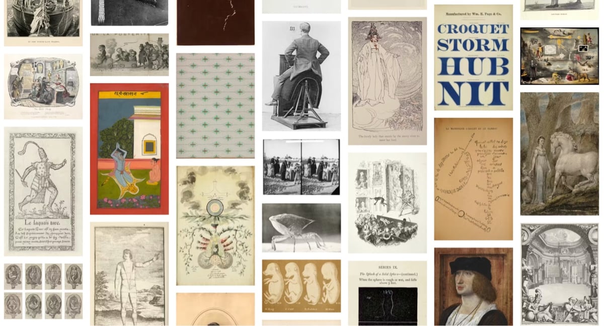
The Public Domain Review (a true gem of the web) has launched The Public Domain Image Archive, “a curated collection of more than 10,000 out-of-copyright historical images, free for all to explore and reuse”.
While The Public Domain Review primarily takes the form of an “arts journal”, it has also quietly served as a digital art gallery, albeit one fractured across essays and collections posts. The PDIA sets out to emphasise this visual nature of the PDR, freeing these images from their textual homes and placing them front and center for easier discovery, comparison, and appreciation. Our aim is to offer a platform that will serve both as a practical resource and a place to simply wander — an ever-growing portal to discover more than 2000 years of visual culture.
The “infinite view” is particularly fun…you can just pan & scroll and let the whole collection wash over your visual cortex. (via colossal)
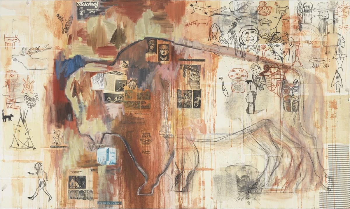
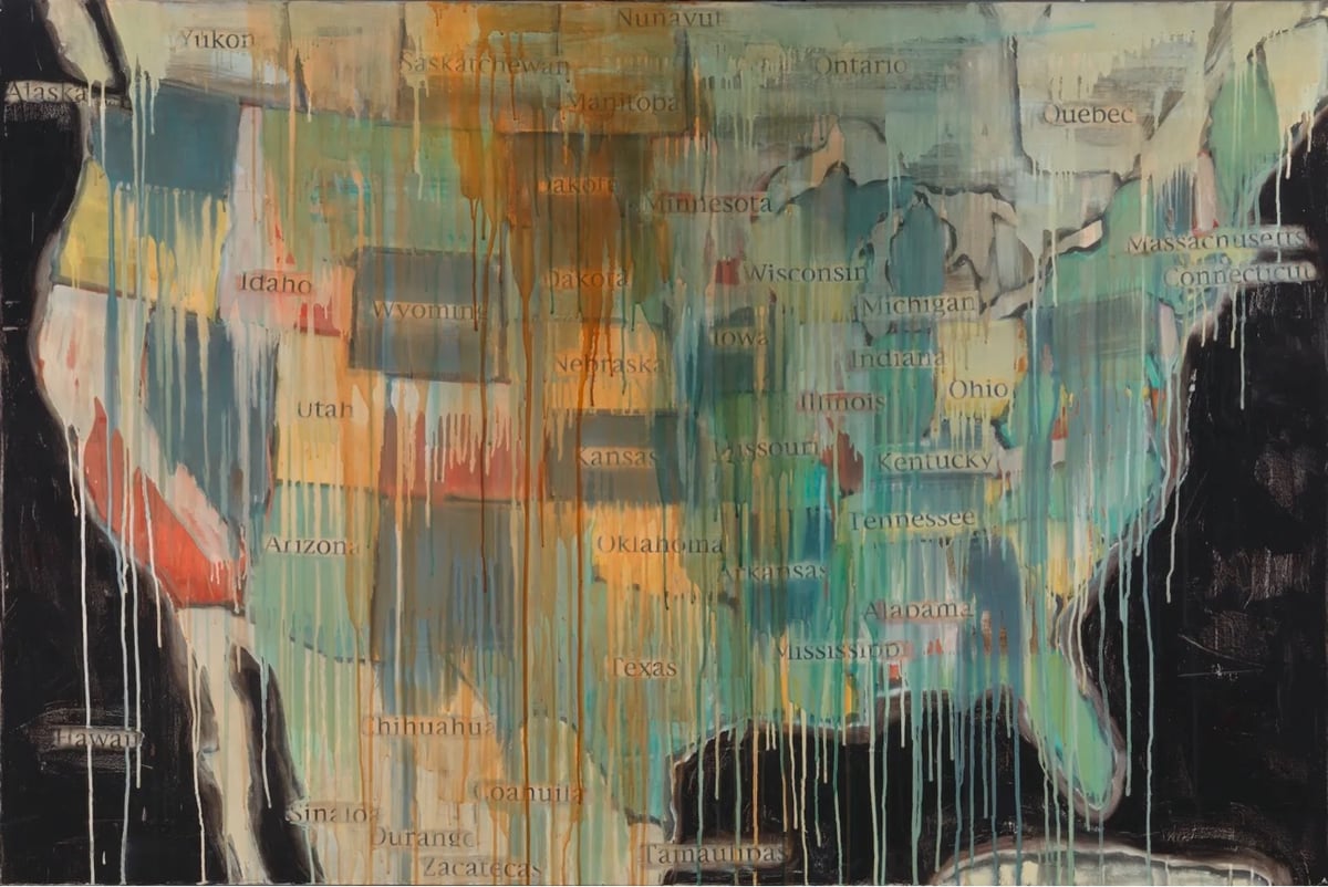
Artist and curator Jaune Quick-to-See Smith has died at the age of 85. From Hyperallergic’s obituary:
As part of a generation of Indigenous artists who tirelessly worked to “break the ‘buckskin ceiling’” in the art world, Smith (an enrolled Salish member of the Confederated Salish and Kootenai Nation) is known for a prolific arts practice that merged piercing humor and profound socio-political commentary with poetic depictions of Native American life. Her five-decade oeuvre, which spans painting, collage, drawing, print, and sculpture, is an intimate visual lexicon that bridges personal memories and joyful resilience, exemplifying her lifelong refusal to be defined by any singular narrative.
More obits: ARTnews, Artnet, The Art Newspaper.
Her art seems to me to be in conversation with Robert Rauschenberg, Jasper Johns, Jean-Michel Basquiat, and countless Native artists & European cave painters from millenia ago — as well as Leonardo da Vinci it seems…that marvelous painting above featuring the buffalo is called “Indian Drawing Lesson (after Leonardo)”.
You can see more of Smith’s work on her website, at The Whitney, at the Garth Greenan Gallery, the Missoula Art Museum, and at the Smithsonian.
80 years ago today, the Nazi death camp at Auschwitz-Birkenau was liberated. An estimated 1.1 million people (Jews, Poles, Russian POWs, Roma) were murdered at Auschwitz-Birkenau between 1940 and 1945, and this date was subsequently chosen by the United Nations as International Holocaust Remembrance Day.
One of the things you can do to mark the day is to join Yad Vashem’s IRemember Wall:
The IRemember Wall is a unique and meaningful opportunity for you to participate in an online commemorative activity marking International Holocaust Remembrance Day.
By joining our IRemember Wall, your name will be randomly matched to the name of a Holocaust victim from our Central Database of Shoah Victims’ Names, and will appear together on the Wall.
You can also choose a specific name to remember and match with on the Wall from our Central Database of Shoah Victims’ Names, which contains over 4.8 million names of Holocaust victims.
As he does every year, illustrator Christoph Niemann drew the person he matched with and shared the story of her life.
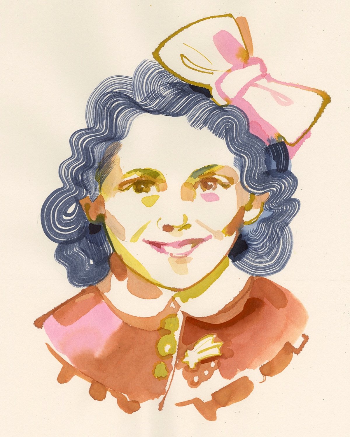
This year I was paired with Astro Cofino. We have very little biographical information: she was born in 1930 in Athens, her parents were called Benoua and Mairy. The first thing that caught my eye when I saw Astro’s photo was a little brooch she’s wearing: it looks like a comet, and I can’t help but thinking that it was meant as a reference to her name? Astro is maybe 11 or 12 in the picture, she smiles, with a tiny hint of giddiness in her eyes.
Here’s Astro’s information from Yad Vashem’s database — she was murdered by the Nazis at Auschwitz when she was 14.
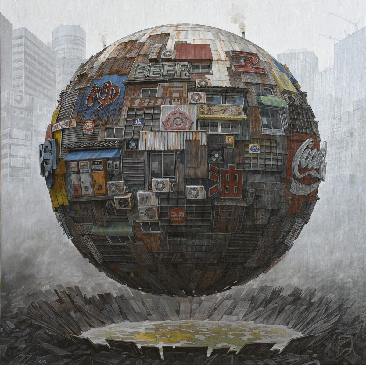
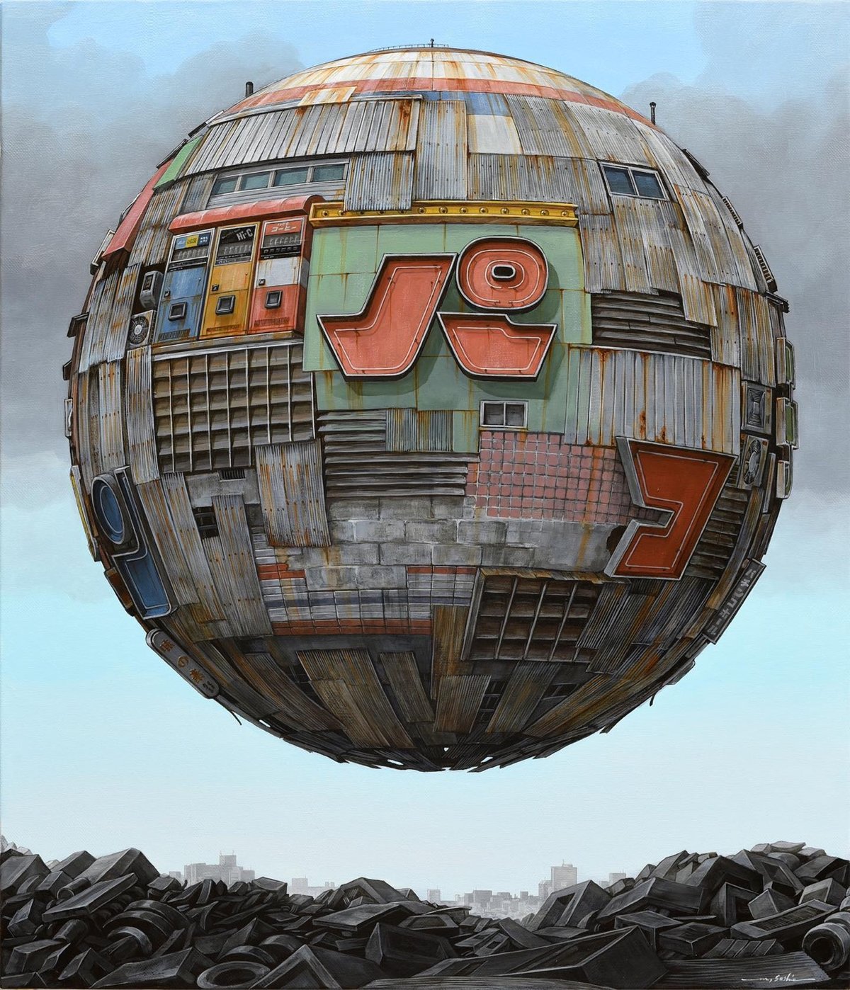
While these might look like they are AI-generated, these floating orb-structures created by Masakatsu Sashie are actually oil paintings. You can check out more of his work on Instagram and Facebook. (via colossal)
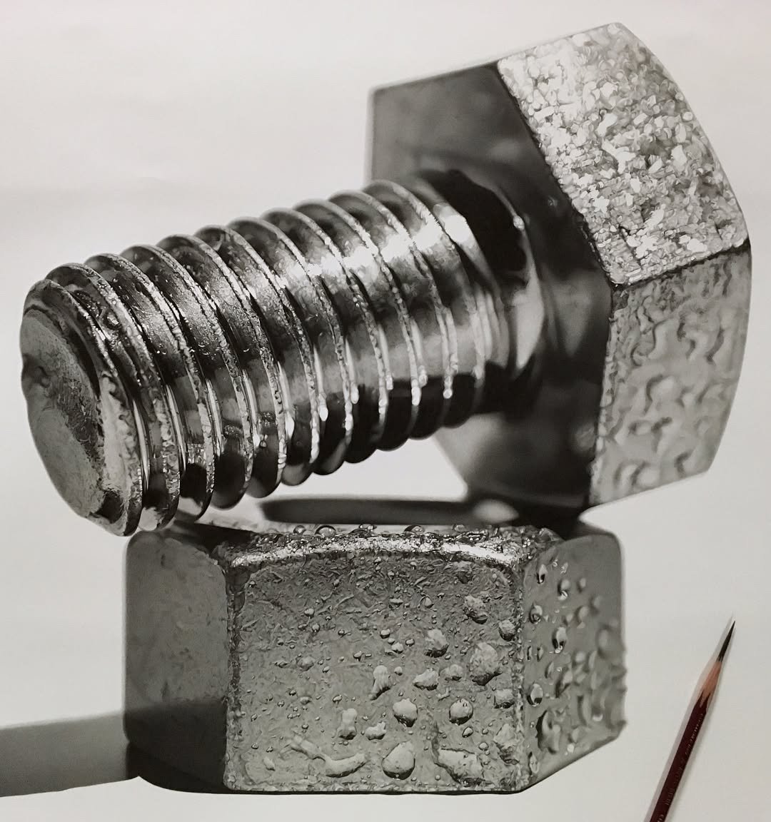
Wow, check out these amazing hyperrealistic pencil drawings by Kohei Ohmori. The detail is next-level…here’s a close-up view of the drawing above:
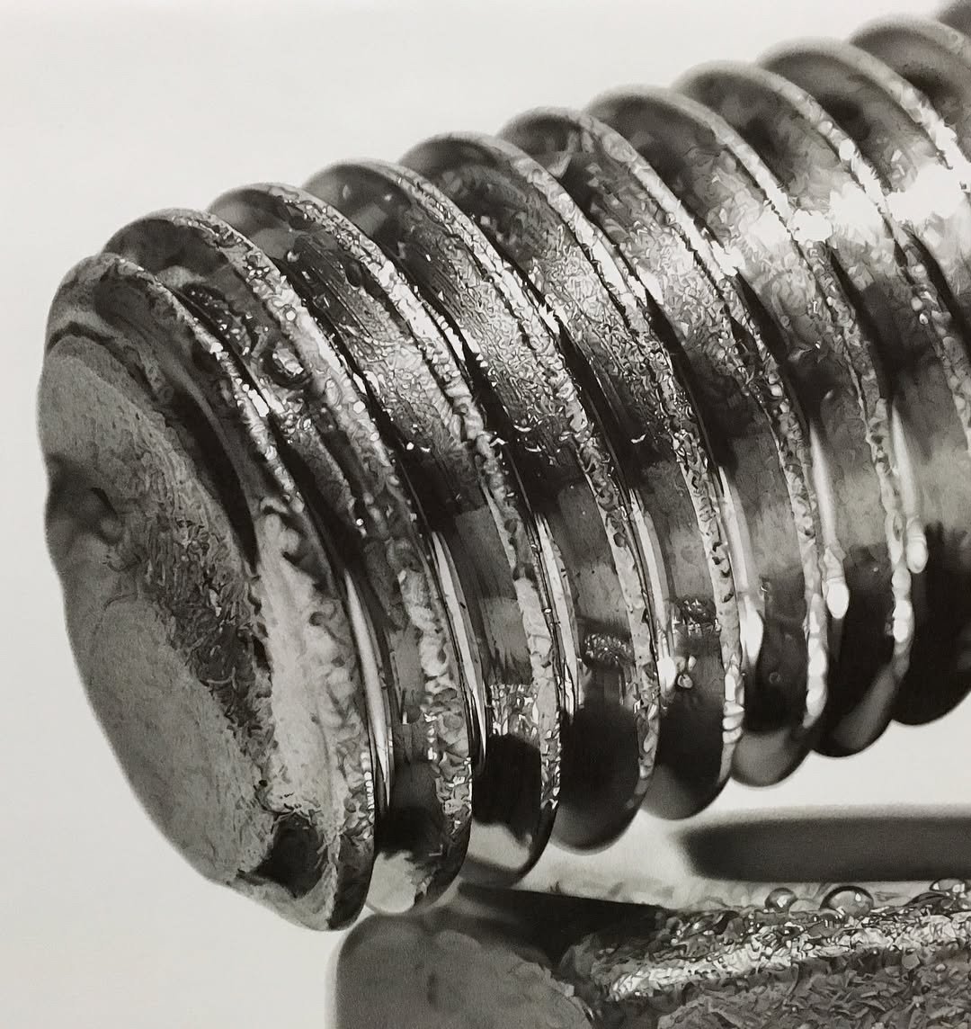
This drawing took 280 hours (~11.7 days) over a period of five months. You can check out some BTS and Ohmori’s other work on Instagram. (via clive thompson)
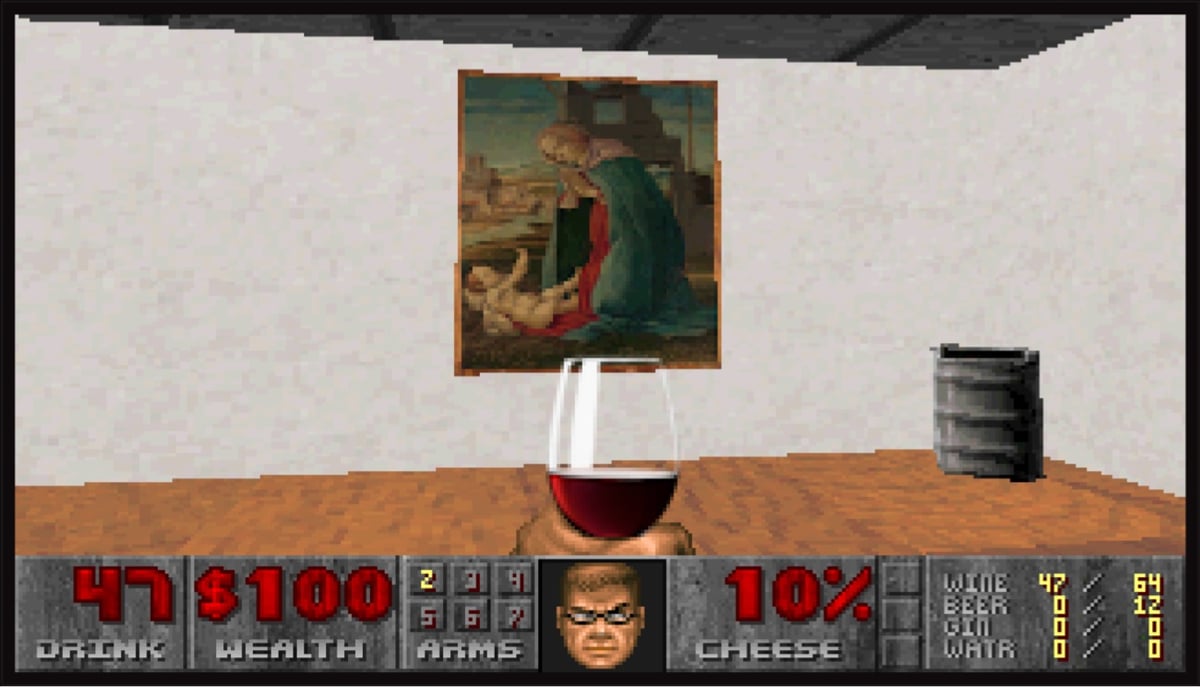
Have you ever wanted to browse art from the Metropolitan Museum in a first-person shooter interface? You are in luck because DOOM: The Gallery Experience exists.
DOOM: The Gallery Experience was created as an art piece designed to parody the wonderfully pretentious world of gallery openings.
In this experience, you will be able to walk around and appreciate some fine art while sipping some wine and enjoying the complimentary hors d’oeuvres in the beautifully renovated and re-imagined E1M1 of id Software’s DOOM (1993).
They sourced the art from the Met’s Open Access collection and in the game you can click through to see each piece on the Met’s website. Here’s a video of the gameplay:
And of course people are speedrunning it. (via waxy.org)
Curator James Payne’s Great Art Explained channel is one of YouTube’s gems. For his latest video, he takes a look at Leonardo da Vinci’s mural The Last Supper and explains what makes it such an unusual, impressive, and revolutionary work of art. Here’s how the main part of the video begins:
Milan, 1494: Leonardo da Vinci was an exceptional man, and everyone who met him described him as a genius. And yet, he was now 42 years old — a middle-aged man in an era when life expectancy was 40 — And he still hadn’t produced anything that would be considered a masterpiece by his contemporaries. Many of his works were unfinished or in private collections, there were no great public works that people could see, no architectural marvels and no distinguished altarpieces for cathedrals. Nothing that could be considered worthy of his potential.
Then, he was asked to paint a wall.
I found the discussion of how Leonardo’s knowledge of theatre — he was charged with “creating lavish plays and pageants for the Duke of Milan” — informed his work on The Last Supper particularly interesting. You’ll never see this painting the same way again after watching this video.
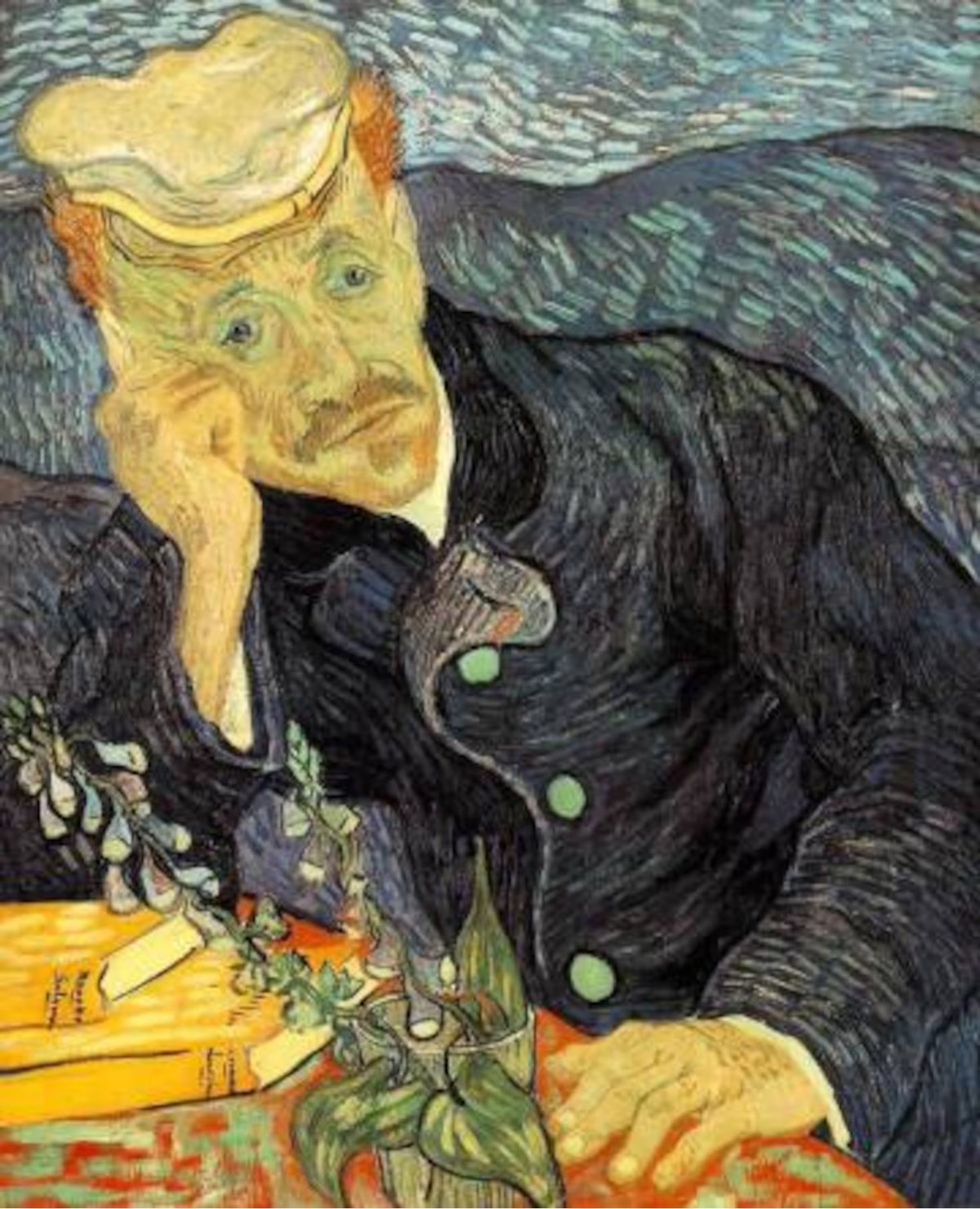
I didn’t know that the whereabouts of one of Vincent van Gogh’s most important works, a 1890 painting called “Portrait of Dr. Gachet”, is unknown and that the painting had not been seen publicly since the 1990s. This investigation into the potential location of the painting is an engrossing read as well as a good opportunity to appreciate van Gogh’s piece.
Many experts encountered along the way had no clue what had happened to the painting. Four art world insiders said they suspect the painting is held by a private, very rich European family. All parties had an opinion on the core question that drives such a quest: Do collecting families have any responsibility to share iconic works of art with the broader public?
The question has grown more relevant as it becomes clearer that most museums can no longer outbid billionaire collectors for the greatest works of art. Few paintings make that point plainer than Dr. Gachet’s portrait, a piece long on public display that has now vanished into someone’s private home or a climate-controlled warehouse.
For many in the art world, such a work is not just a creative expression, but part of a trade that survives because of the interest and deep pockets of collectors who may, or may not, choose to share their work.
“People are allowed to own things privately,” said Michael Findlay, who was involved as a specialist for Christie’s in the 1990 auction sale of the Gachet. “Does it belong to everybody? No, it does not.”
See also a new short documentary on the missing painting:
Watching these expert restorers mend & refresh a pair of vintage Star Wars posters (neither of which features the logo we’re familiar with today and one of which is signed by the designer) is both fascinating and relaxing. It’s like the posters are having a spa day: bit of a soak, a gentle scrub, some light bodywork, and voila, you’re brand new. (via meanwhile)
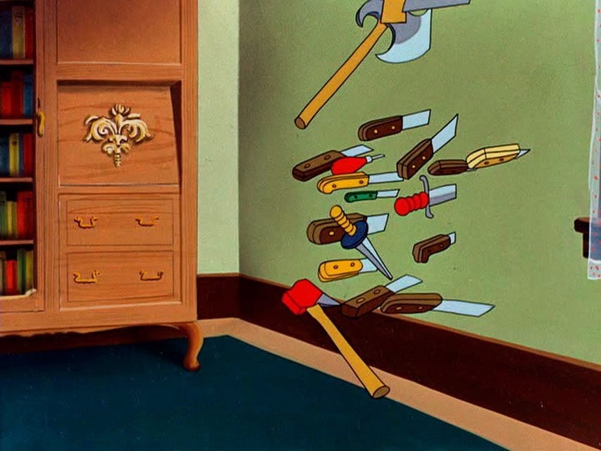
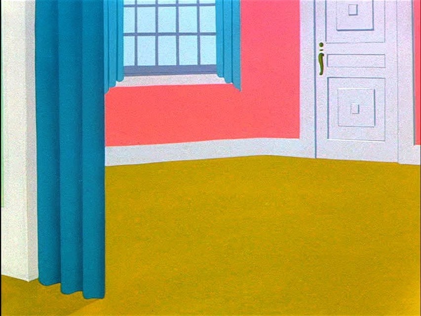
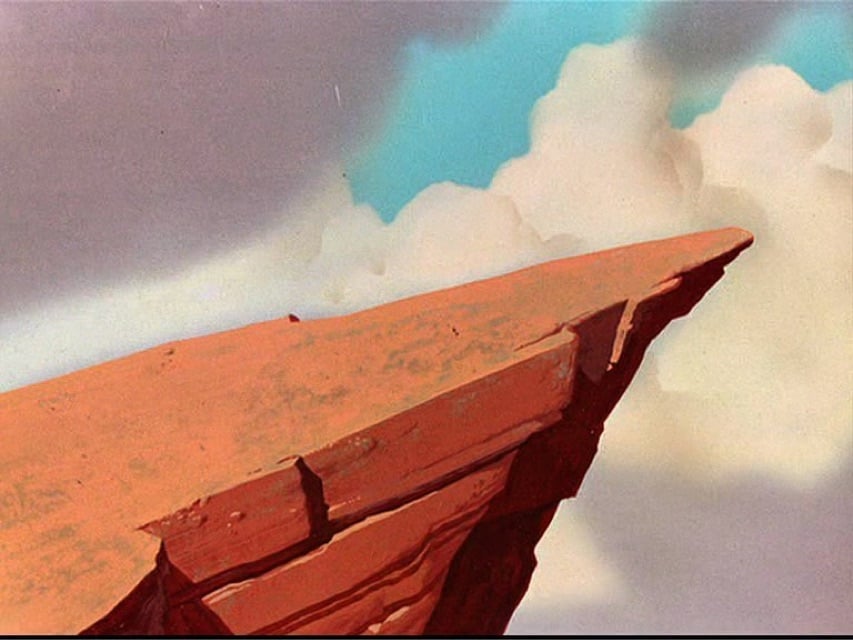
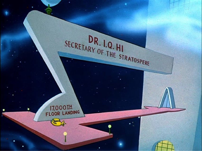
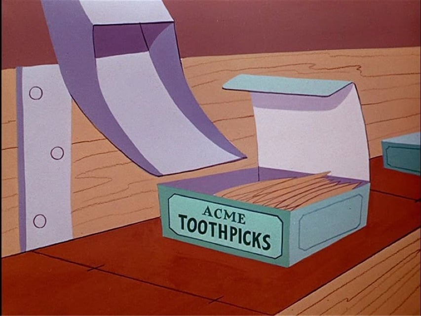
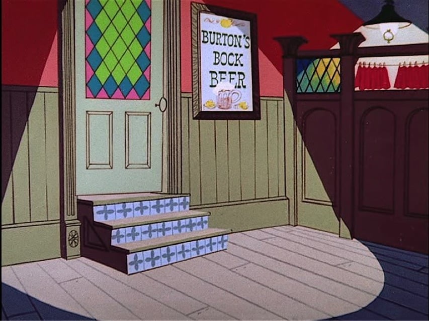
This Instagram account posts the backgrounds of Looney Tunes cartoons with the Looney Tunes characters removed. As @presentcorrect.bsky.social remarks, these images are also a great resource for color palettes.
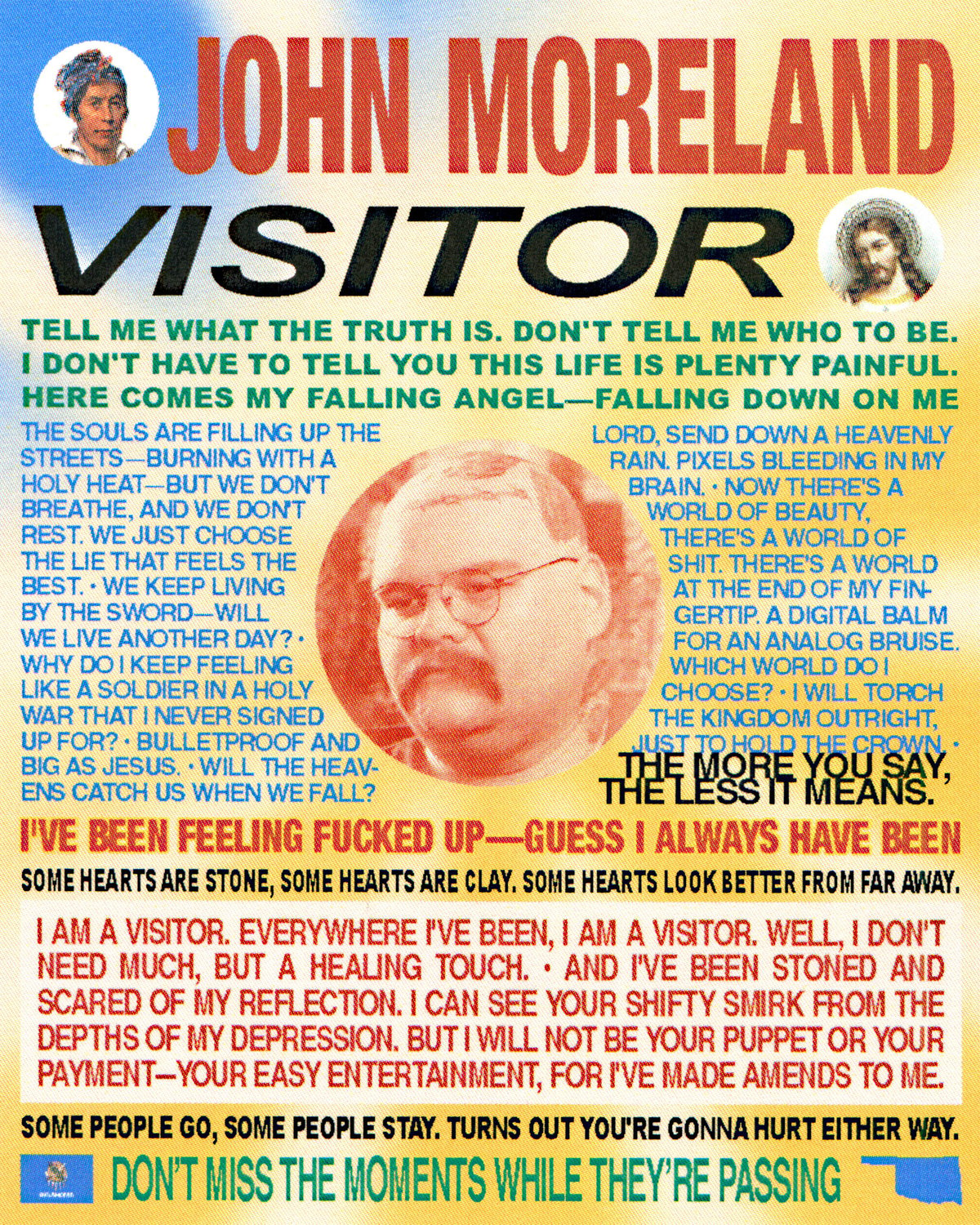
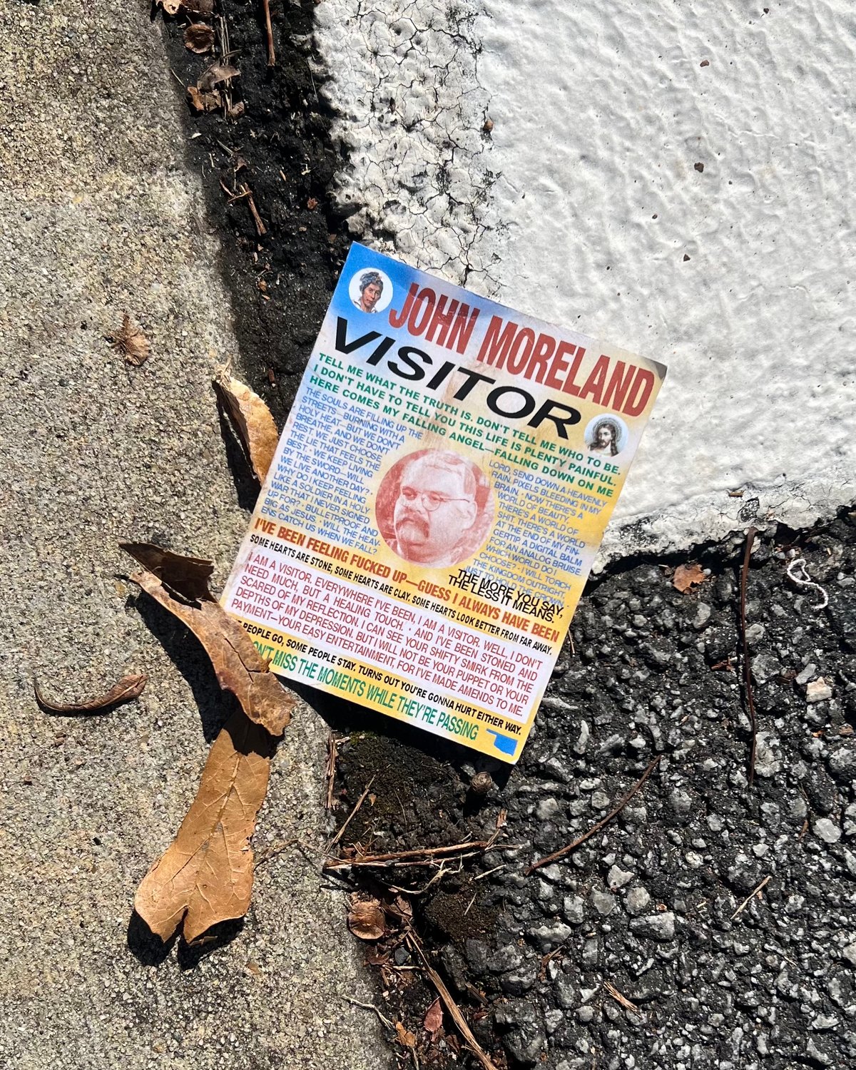
My friend Josh LaFayette spends the very last part of the year making fan art for his favorite albums of the year and despite all the pieces being visually different there’s a through line which make all of them immediately recognizable to me as his art. He’s putting out a few a week on his Instagram, but I grabbed these two because I also loved these albums.
John Moreland - Visitor
Laura Jane Grace’s - Hole in My Head
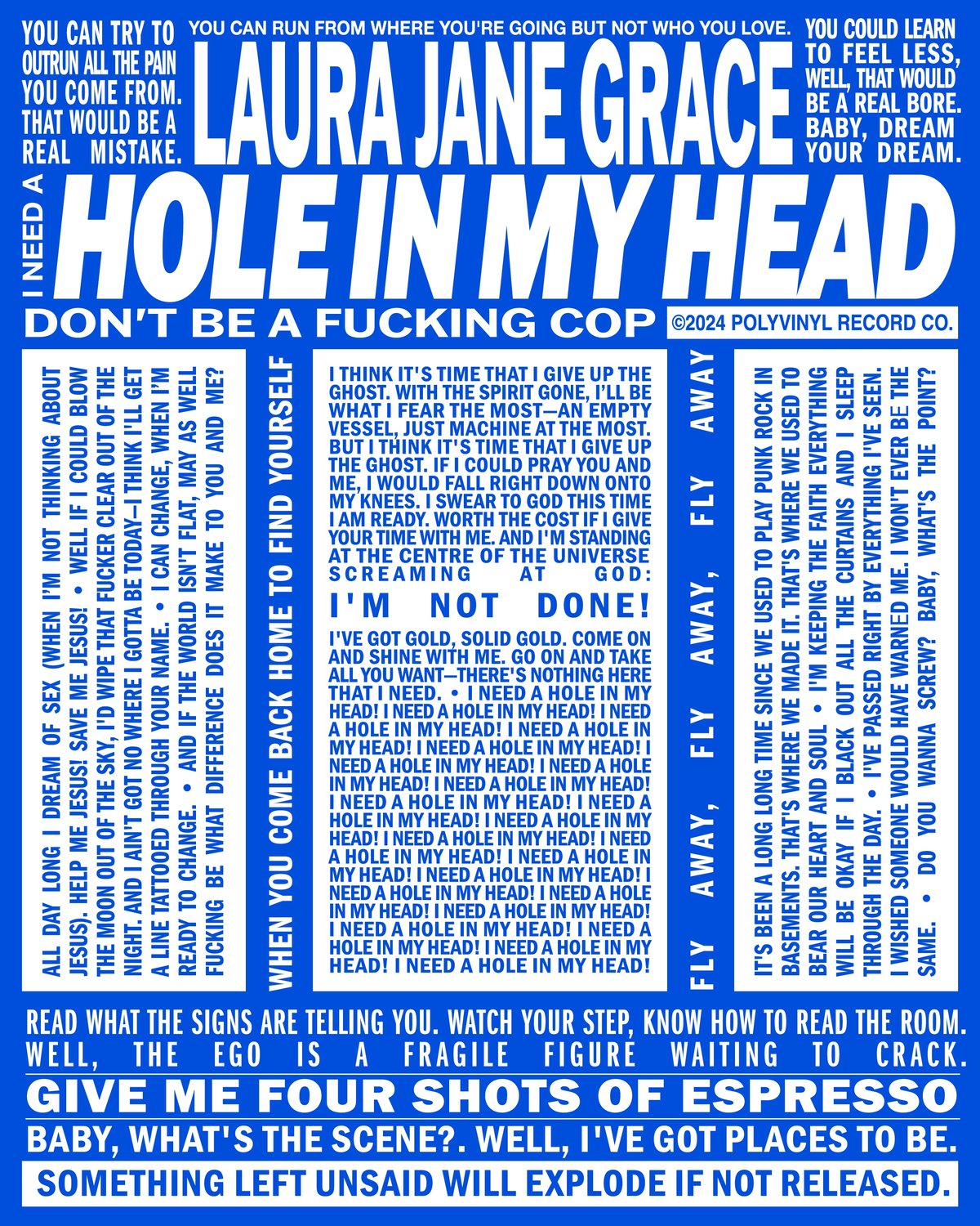
My favorite part of this series is all of the pieces are physical, not just a file on the computer. Every piece is a reference to the design language present in the age of accessible digital printing—they’re inspired by what some might call “naïve” or “uniformed” designs that are common in the American visual vernacular. The Moreland piece is a take on the flyers for psychics you see all over and the LJG piece is your favorite hippie soap.

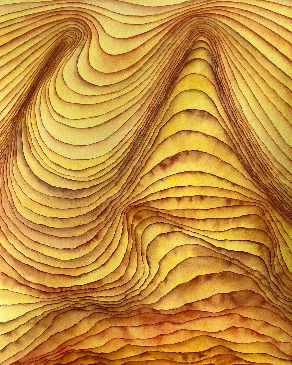
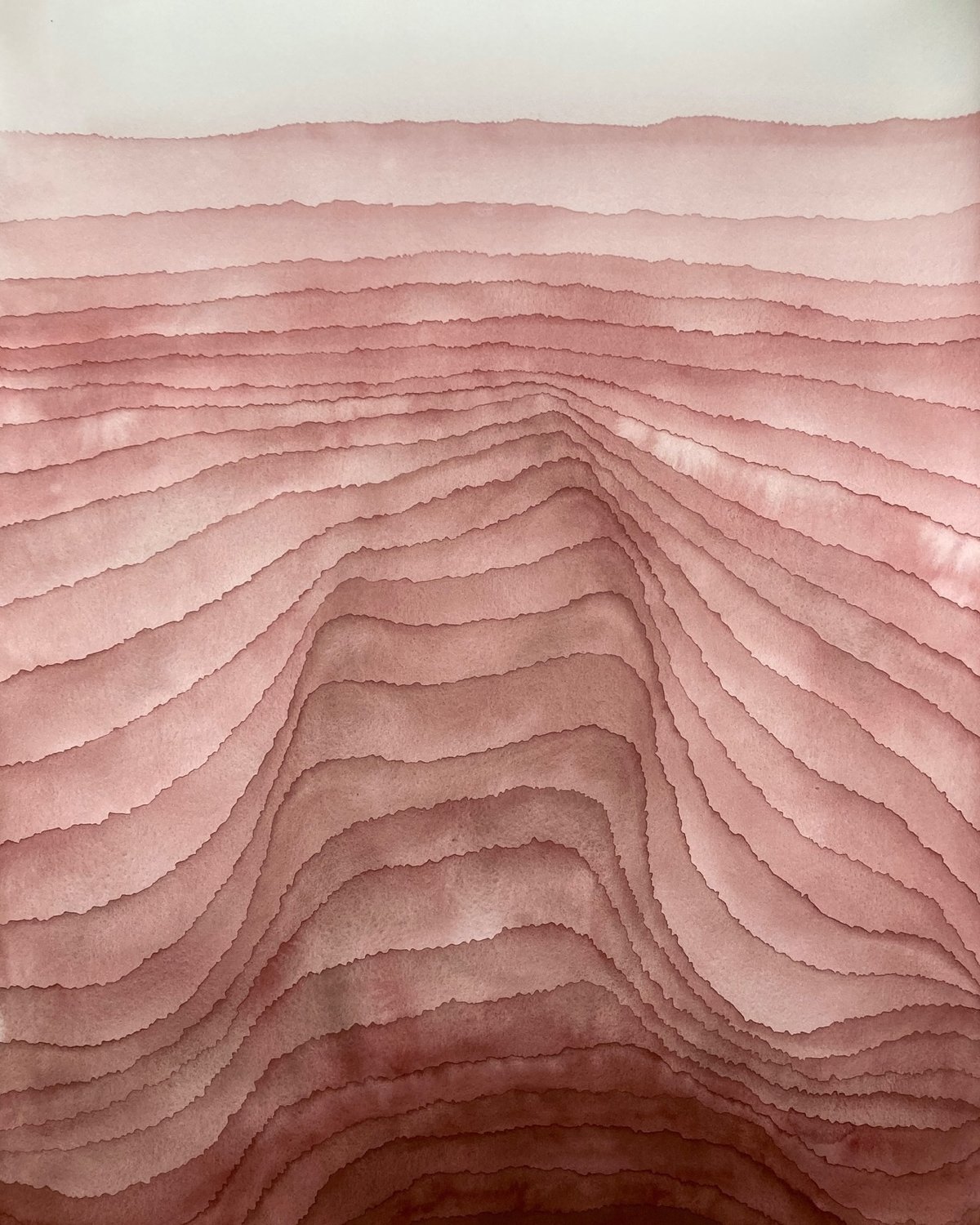
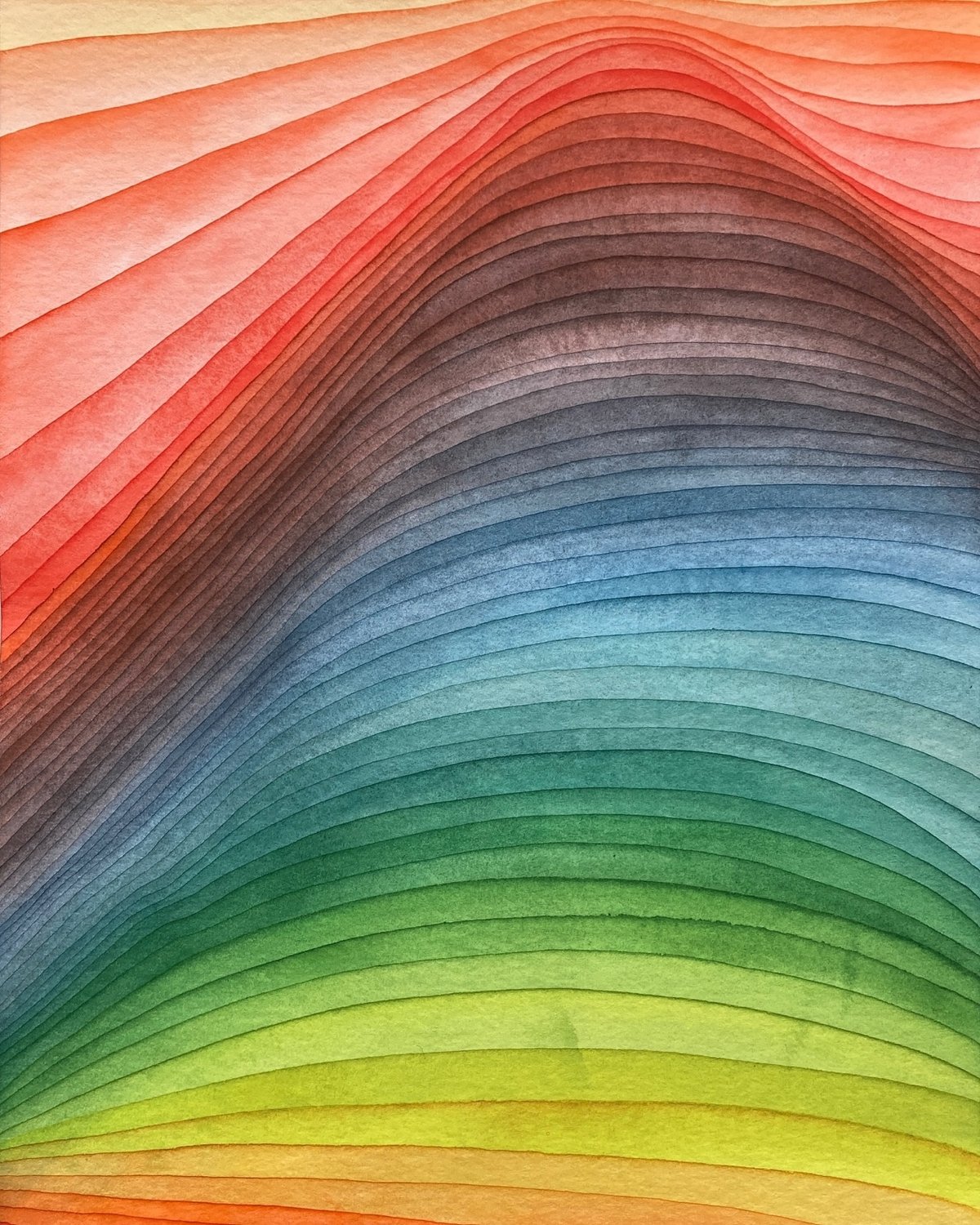
You know me, I love a good gradient. These watercolors are from a series called Strata by Mikael Hallstrøm Eriksen, an artist who uses “repetitive and accumulative mark-making” in his work.
The works in the Strata-series are inspired by geological and natural phenomena — sediments, horisons, bodies of water, etc. These works explore a colourful imagery of accumulation, distance and transformation. Within geology and archeology, strata (singular: stratum) refers to layers (of rock, soil, culture etc.) possessing internally consistent characteristics making them distinguishable from each other.
You can check out more of Eriksen’s work on Instagram.
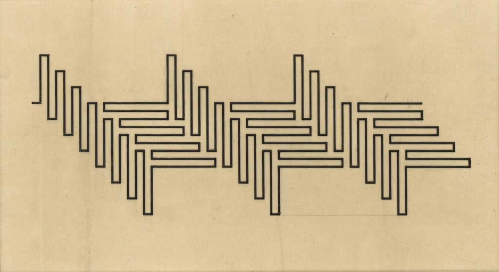

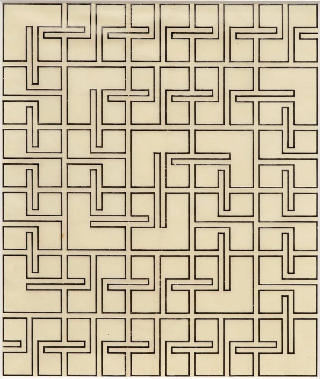
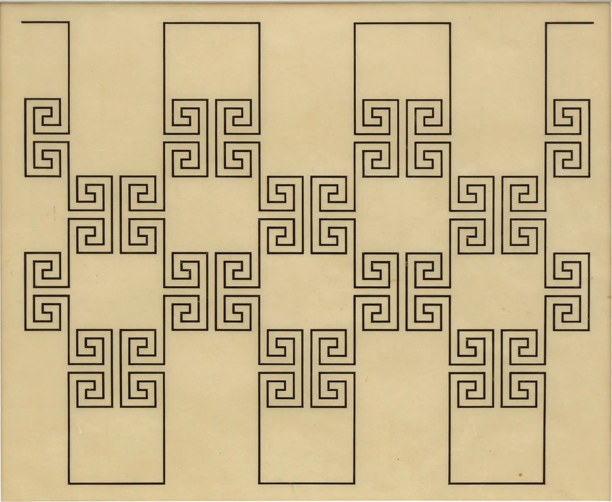
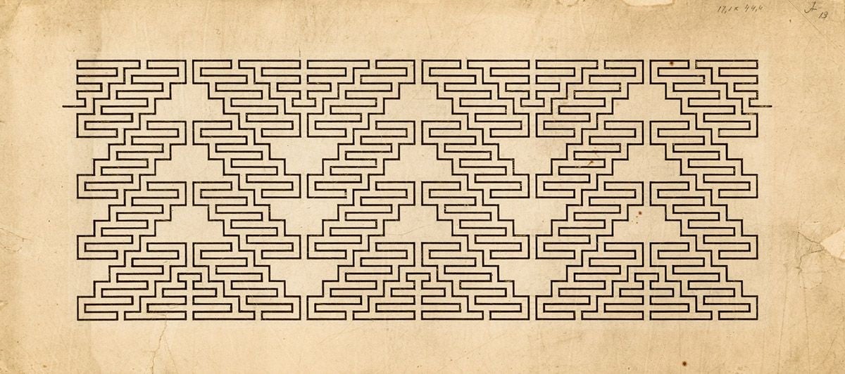
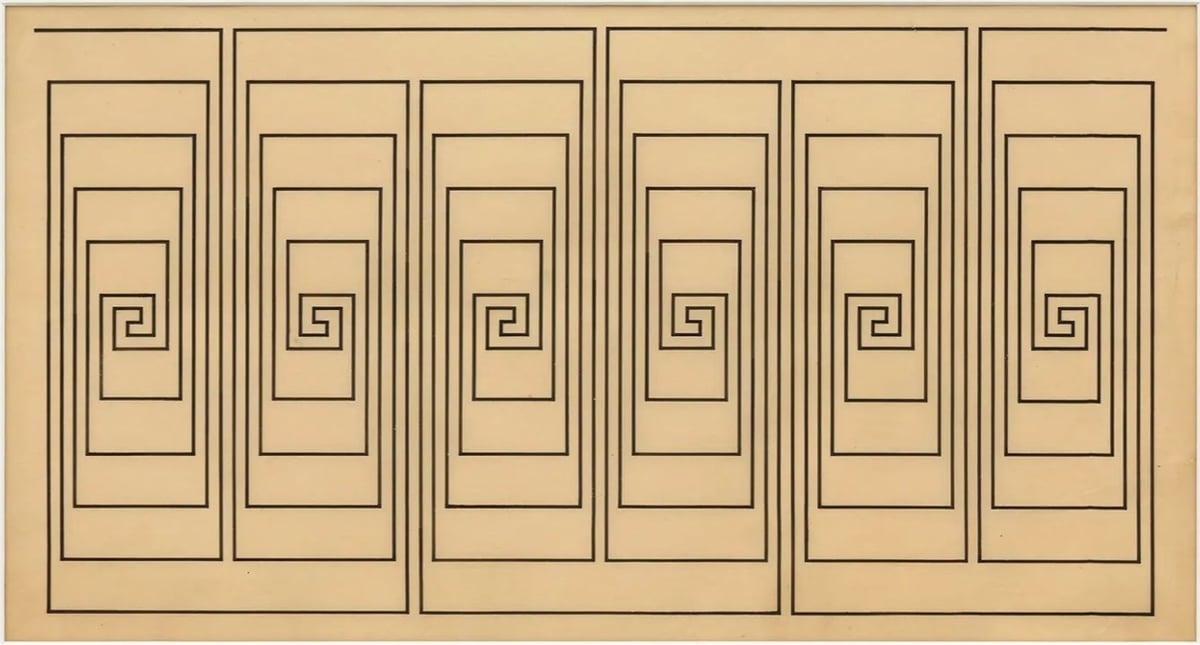
Wacław Szpakowski was a Polish architect and engineer who, over the course of his life and in secret, made a series of drawings of mazes from single continuous lines. From The Paris Review:
The drawings, he explains, “were experiments with the straight line conducted not in research laboratories but produced spontaneously at various places and random moments since all that was needed to make them was a piece of paper and a pencil.” Though the kernels of his ideas came from informal notebooks, the imposing virtuosity and opaqueness of Szpakowski’s final drawings are anything but spontaneous or random. His enigmatic process — how he could draw with such supreme evenhandedness, could make his designs so pristine and yet so intricate — is hinted at only in his few visible erasure marks.
Geoff Manaugh writes at BLDGBLOG:
But the appeal of Szpakowski’s work would appear to extend well beyond the architectural. At times they resemble textiles, weaving diagrams, computer circuitry, and even Arts & Crafts ornamentation, like 19th-century wallpapers designed for an era of retro-computational aesthetics.
Woodworking templates, patent drawings for fluidic calculators, elaborate game boards — the list of associations goes on and on.
Of course, I was reminded of Dom’s challenge to Ariadne to draw a difficult maze in Inception, the light cycles in Tron, and the Etch A Sketch…but to each their own.
You can explore more of Szpakowski’s work at his website, at culture.pl, and at the Miguel Abreu gallery website.
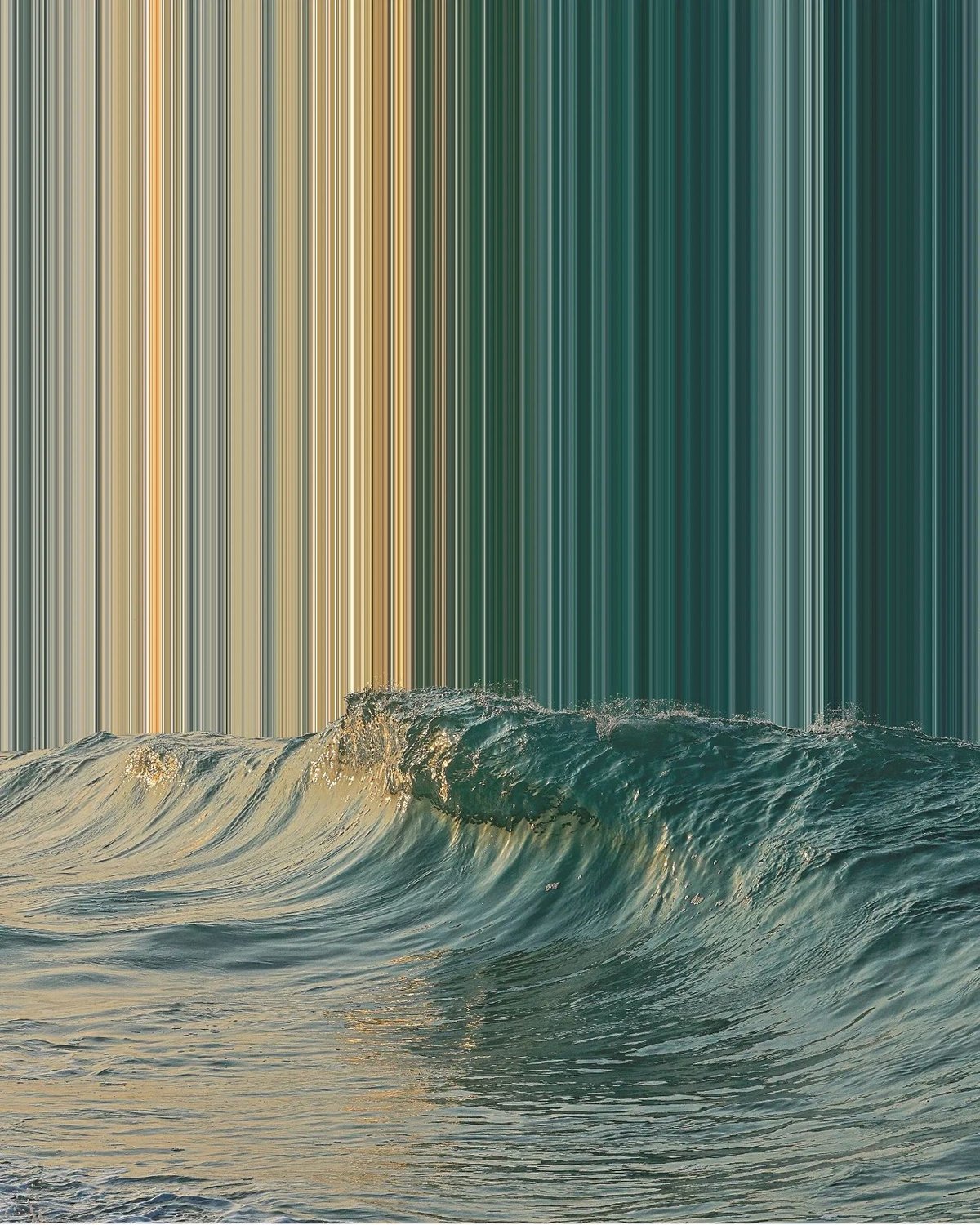
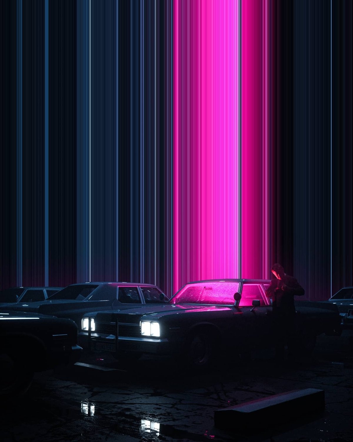
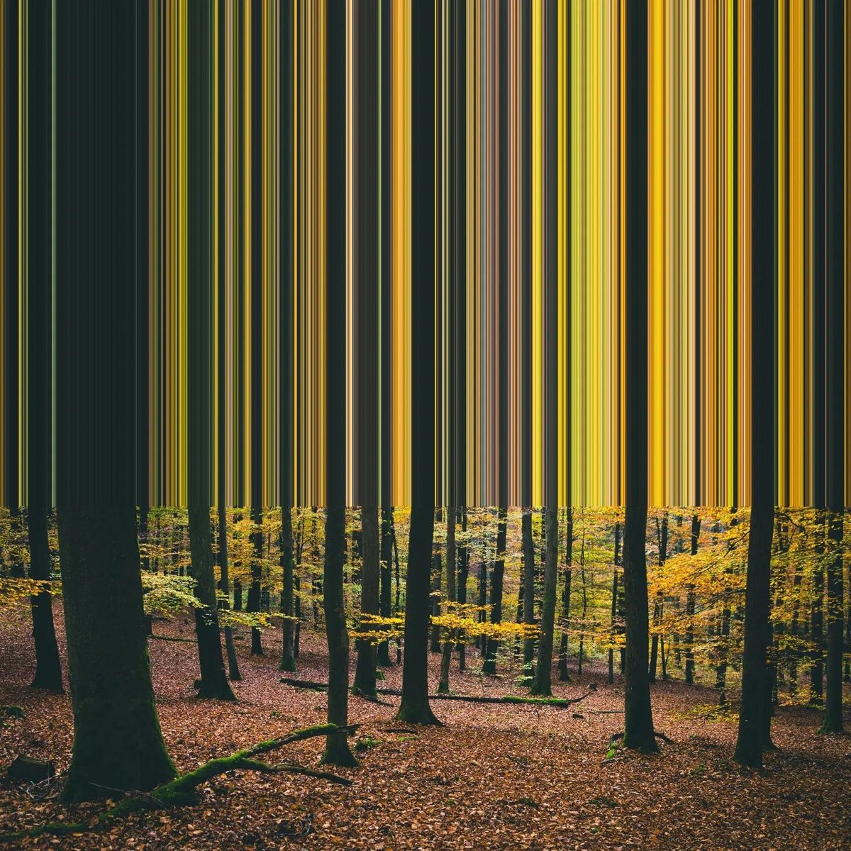
Artist and “pixel pusher” Niall Staines creates these slightly surreal scenes by pulling a 1-px slices to the edge of his images. I’ve used this technique myself but Staines deploys it to great effect here. I love these. You can find more of his work on his website and Instagram.

From the NIH, a collection of 2,000+ public domain science and medical art visuals (molecules, plants, viruses, proteins, brushes for repeating items like DNA, fungi, equipment…). High-resolution, free to use — scientists on social media seem pretty pumped about this.
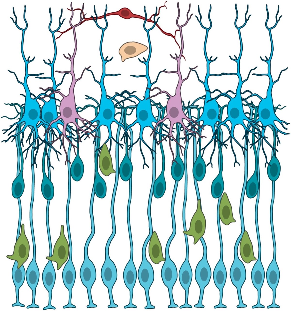


See also PhyloPic, a collection of 10,000 “free silhouette images of animals, plants, and other life forms, available for reuse under Creative Commons licenses”. (via @waldo.net)
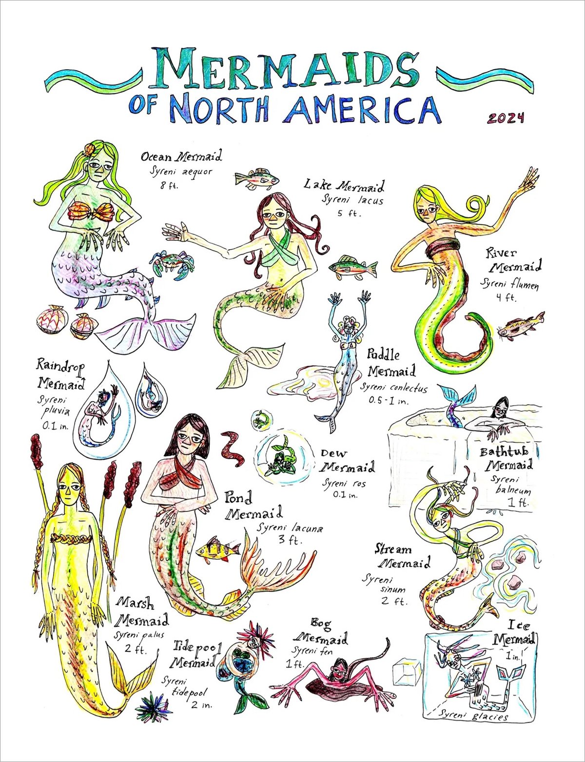
Edith Zimmerman has put some new stuff in her Etsy shop, including original watercolors and this print of Mermaids of North America (which I love).
Newer posts
Older posts




Socials & More